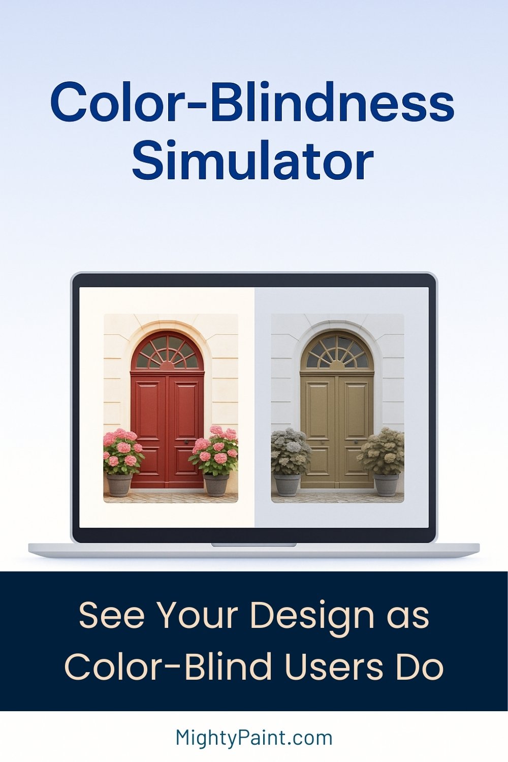
Color-Blindness Simulator – Preview Images for WCAG
Visual Impairment Simulator – Test Images for Accessibility
Original
Protanopia Simulation
How It Works
- Select your image
Click the Select Image button at the top of the page and choose any JPG, PNG or WebP file from your computer. The picture is processed entirely in your browser—nothing is uploaded or stored on MightyPaint’s servers. - Choose a vision-deficiency mode
Use the drop-down menu to switch between Protanopia (red-blind), Deuteranopia (green-blind), Tritanopia (blue-blind) or Achromatopsia (total monochrome). The simulated canvas on the right updates instantly whenever you change modes. - Compare side-by-side
The left canvas always shows the untouched original; the right canvas shows how a person with the selected form of color-blindness would perceive it. Flip between modes as often as you like to spot trouble areas—red/green status icons, pastel links on white backgrounds, subtle heat-map gradients, and more. - Iterate and re-test
Found a problem hue? Tweak your design in your editor, export a new image, and drop it back into the simulator. Rapid, on-device feedback means you can refine colors until every mode remains clear and distinguishable.
Why Simulate Color-Blindness?
- Inclusive design is essential
Roughly 1 in 12 men and 1 in 200 women experience some form of color-vision deficiency. If your interface relies on subtle red/green or blue/purple cues, that audience may miss critical information. - Meet accessibility standards
Web Content Accessibility Guidelines (WCAG 2.1) and many national laws (ADA, EN 301 549, AODA) require that color not be the sole means of conveying meaning and that sufficient contrast be provided. Visualising your work through a color-blind lens is the fastest way to spot violations. - Catch costly mistakes early
Redesigning charts, status indicators, or brand palettes after launch can be expensive and embarrassing. Running a quick simulation during the design phase highlights problem areas—think red “error” text that looks brown, or green map markers that disappear. - Improve data visualisations
Heat-maps, pie charts and infographics often depend on hue differences. Ensuring those hues remain distinct in Protanopia, Deuteranopia and Tritanopia keeps your data readable for everyone. - Strengthen brand trust
Companies that build inclusive products earn goodwill and reduce the risk of accessibility complaints. A simple simulation step shows stakeholders you’re serious about universal usability.
In short, a color-blindness check isn’t just a “nice-to-have”—it’s a quick safeguard against inaccessible, confusing, or non-compliant visuals.
When to Use the Image Color-Blindness Simulator
1. UI / UX Design Reviews
Before handing off a new component or screen to development, drop your latest mock-up into the simulator. Look for red/green status lights, pastel links on white, or color-only legends that could confuse users with red- or green-blindness.
Get the Fail-Safe Paint Color Playbook (Free PDF)
36 proven colors • 8 ready palettes • trim & sheen guide • printable testing cards.
2. Graphic & Print Proofing
Posters, brochures, product packaging, brand kits—if color carries meaning, run the artwork through the simulator to be sure key elements (warning labels, charts, brand accents) remain clear in every mode.
3. Marketing & Social Media Assets
Social feeds scroll fast. Make sure promo graphics, infographics, and call-to-action buttons keep their contrast and communicate the message even for viewers with Tritanopia or Achromatopsia.
4. Data Visualisation & Dashboards
Heat-maps, pie charts, and multi-line graphs depend on color distinctions. Test your dashboards so every series or range is still distinguishable when red, green, or blue cones are missing.
5. Classroom Demonstrations & Client Education
In accessibility workshops or design pitches, live-swap between Protanopia, Deuteranopia, Tritanopia, and full monochrome to show exactly why thoughtful color choices matter—far more convincing than static guidelines.
6. Quick Accessibility Audits
Combine this visual check with contrast-ratio testing for a fast, comprehensive color audit before more in-depth WCAG evaluations.
Simulation Modes Explained
| Mode | What It Simulates | Typical Pitfalls |
|---|---|---|
| Protanopia | Missing red cones (L-cones) | Reds appear dark; red vs. green look similar. |
| Deuteranopia | Missing green cones (M-cones) | Reds shift brown; red/green contrasts disappear. |
| Tritanopia | Missing blue cones (S-cones) | Blues lean green; blues ≈ purples. |
| Achromatopsia | No cone function (grayscale) | Color carries no meaning—only luminance matters. |
1. Protanopia — Red-Cone Absence
People with Protanopia lack functioning L-cones, making reds appear dark or even black and reducing overall brightness. Mixed reds and greens can look nearly identical, which is why red “error” text or red-green traffic-light icons often fail for this audience.
2. Deuteranopia — Green-Cone Absence
Deuteranopia removes the M-cones responsible for green perception. Reds and greens converge into brownish hues, while yellows remain fairly normal. Any design that relies on red-vs-green contrast (success / error states, positive / negative bars) should be double-checked in this mode.
3. Tritanopia — Blue-Cone Absence
A much rarer condition, Tritanopia eliminates S-cones, shifting blues toward green and confusing blue–purple distinctions. Links that rely on blue, or charts that separate data series with blues and cyans, should be tested here.
4. Achromatopsia — Total Color Blindness
Complete absence of all cone function results in a grayscale world. Even subtle luminance differences become critical. Viewing your image in Achromatopsia mode is an excellent stress-test: if information is still clear here, it will likely work everywhere.
Tips for Accessible Color Choices
- Combine Color with Icons/Text — A red “❌” vs. green “✔️” is clearer than colored dots alone.
- Check Contrast Ratios — Aim for ≥ 4.5 : 1 between foreground and background.
- Skip Problem Pairings — Avoid red/green and blue/purple juxtapositions.
- Add Patterns & Shapes — Use dashed lines, different markers, or hatches in charts and maps.
- Offer an Alt Palette — Provide a “color-blind friendly” theme with high-contrast blues, oranges, and yellows.
Apply these best practices, run your work through the simulator, and your visuals will stay clear and compliant for every viewer.
Get the Fail-Safe Paint Color Playbook (Free PDF)
36 proven colors • 8 ready palettes • trim & sheen guide • printable testing cards.
Related MightyPaint Tools
- Interactive HTML Color Picker – Click any swatch to copy its HEX code and build quick palettes.
- Color Format Converter – Instantly switch between HEX, RGB, HSL, HSV and CMYK (with live preview).
- Image Color Sampler – Hover-and-click to grab the exact HEX value from any photo.
- Shade & Tint Generator – Enter one color and get a full scale of lighter tints and darker shades.
- HTML Color Names & HEX Codes – Browse the complete list of 147 named web colors.
Use these tools together: sample a photo, convert to the format you need, then run your final artwork through the Color-Blindness Simulator to be sure every hue still communicates.
Frequently Asked Questions
Will my image be uploaded or stored?
No. All processing happens in your browser; nothing is sent to MightyPaint’s servers.
Which file types are supported?
JPG, PNG and WebP images up to the limits of your browser’s memory.
How accurate is the simulation?
The tool applies the same LMS-matrix transformations used in academic research and popular tools like Coblis, giving a close approximation for each deficiency type.
Get the Fail-Safe Paint Color Playbook (Free PDF)
36 proven colors • 8 ready palettes • trim & sheen guide • printable testing cards.
Do I still need to check contrast ratios?
Yes. Color-blind users also benefit from sufficient luminance contrast—use a contrast checker in tandem with this visual simulator.
Final Thoughts
Inclusive color choices aren’t just nice to have—they’re essential for the millions of people who see the world differently.
Use the Color-Blindness Simulator early and often, pair it with our other MightyPaint color tools, and you’ll ship visuals that look great and work for everyone.
Bookmark the page, share it with your team, and let us know what feature you want next!