21 Color Combinations That Will Transform Your Home Interiors
Color has the extraordinary ability to influence mood, define a space, and tell a story—all without a single word. Whether you’re designing a living room, building a brand, or refreshing a website, the right color combination can elevate your work from ordinary to unforgettable.
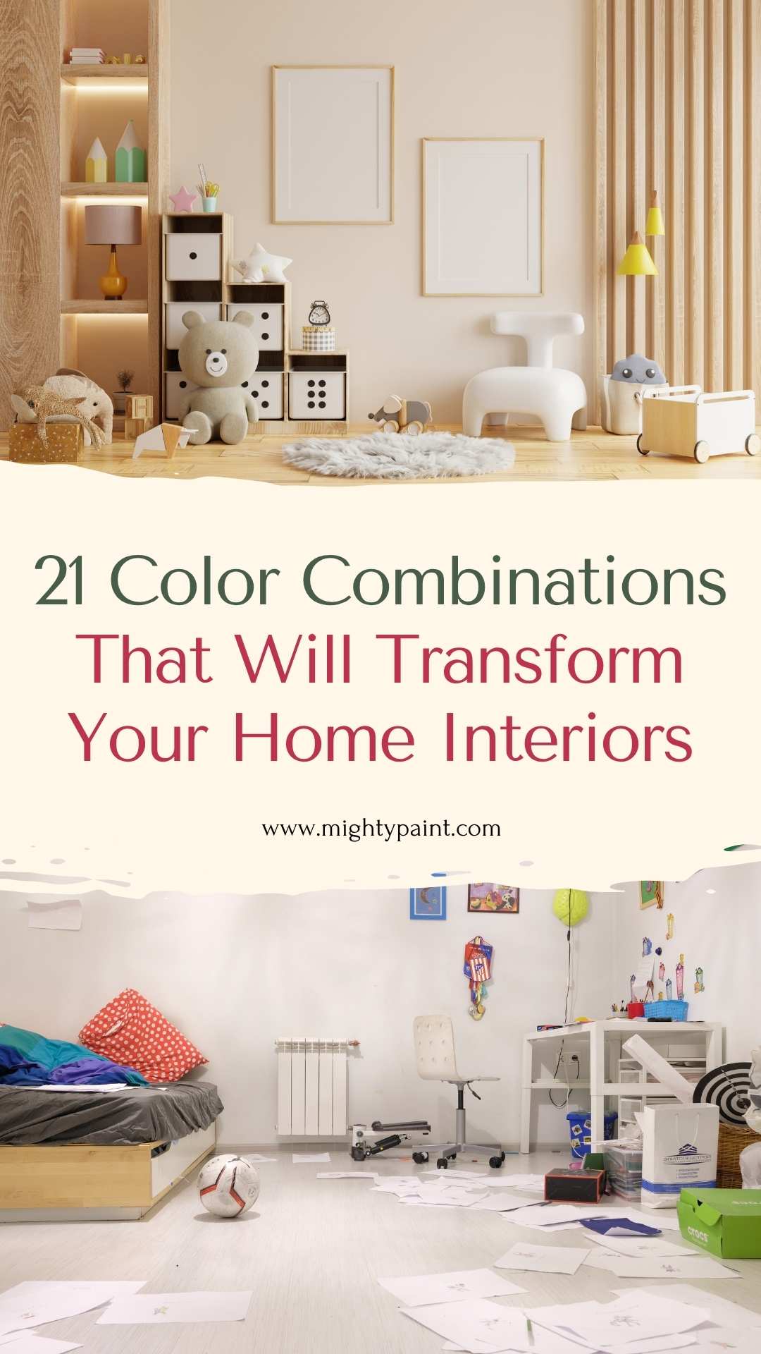
But with millions of shades and endless possibilities, choosing the perfect palette can be overwhelming. That’s where this guide comes in. We’ve curated 21 striking and versatile color combinations—from timeless classics to bold modern contrasts—to spark your creativity and simplify your design decisions.
Get the Fail-Safe Paint Color Playbook (Free PDF)
36 proven colors • 8 ready palettes • trim & sheen guide • printable testing cards.
Whether you’re a seasoned designer or just exploring color ideas for your home or project, this list will help you understand not just what colors go well together, but why they work. Let’s dive in and unlock the magic of color harmony.
Understanding Color Theory in Interior Design
Before diving into color combinations, it’s essential to grasp the basics of color theory—especially how it applies to home interiors. The color wheel is your best friend when planning a room’s palette. It consists of primary colors (red, blue, yellow), secondary colors (green, orange, purple), and tertiary colors (combinations like red-orange or blue-green). Understanding how these hues interact is the key to creating a space that feels harmonious and intentional.
In interior design, colors are often grouped by their relationship on the color wheel. Complementary colors, like blue and orange, sit opposite each other and offer high contrast. Analogous colors, such as green, yellow-green, and yellow, sit side-by-side and create a softer, more cohesive look. There are also triadic color schemes, which involve three evenly spaced colors (like red, yellow, and blue), and tetradic schemes, which involve two pairs of complementary colors.
Beyond visual harmony, colors also carry emotional weight. Cool colors like blue and green often promote calmness—ideal for bedrooms and bathrooms—while warm hues like red, orange, and yellow bring energy and are perfect for dining areas or family rooms. Understanding these dynamics helps in selecting the perfect combination to reflect the room’s purpose and desired ambiance.
Monochromatic Color Schemes: Simple Yet Sophisticated
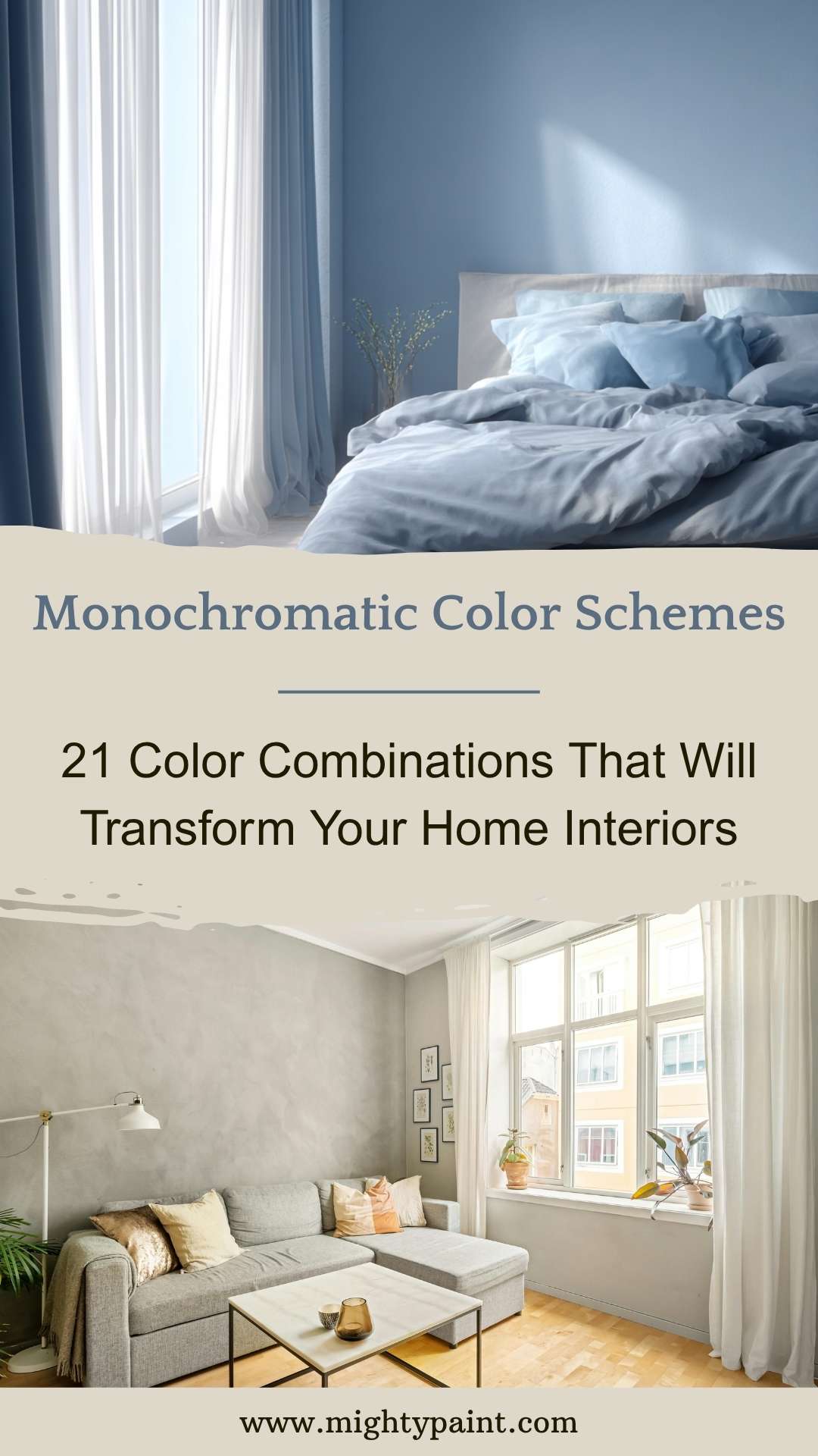
A monochromatic color scheme uses varying shades, tints, and tones of a single color. This approach creates a sleek, uniform look that’s both calming and elegant—perfect for modern or minimalist interiors. Far from being boring, monochromatic designs bring depth and texture when combined with the right materials and lighting.
For instance, a blue monochromatic scheme can range from pale sky blue to deep navy, giving a bedroom a serene and cohesive atmosphere. Similarly, greyscale interiors—ranging from soft dove gray to charcoal—are a popular choice for living rooms, offering a clean and sophisticated backdrop that can be easily accented with texture or metallic elements.
To keep monochromatic rooms from feeling flat, incorporate variation through textures (like velvet cushions, linen curtains, or matte vs. glossy finishes) and layered lighting. You can also introduce natural elements like wood or stone to add warmth and interest without disrupting the palette. Monochromatic schemes are particularly great for small spaces, as they can make rooms feel more expansive and uncluttered.
Complementary Color Schemes: Bold and Balanced
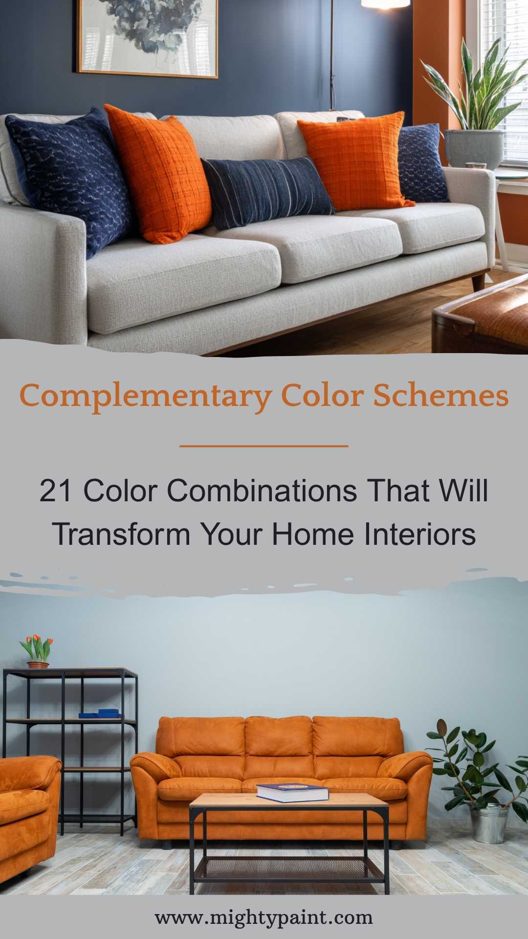
Complementary color schemes pair hues that sit directly opposite each other on the color wheel. These combinations are naturally high in contrast, bringing vibrancy and visual interest to any interior. Used wisely, complementary colors can define different zones in open-plan spaces or create focal points in more intimate rooms.
One of the most popular combinations is blue and orange. Think of a navy wall with burnt orange accents in a living room—this duo feels both energetic and grounded. Similarly, green and red, while often associated with the holidays, can be softened into olive and terracotta for a more timeless, earthy appeal in dining or study spaces.
The key to success with complementary schemes in interior design is balance. Typically, one color acts as the dominant backdrop, while its complement is used sparingly through accents—pillows, artwork, rugs, or statement furniture. This helps maintain visual harmony without overwhelming the space. Using neutral bases like white, beige, or grey can further help mellow the intensity and bring the look together seamlessly.
Analogous Color Schemes: Harmonious and Homey
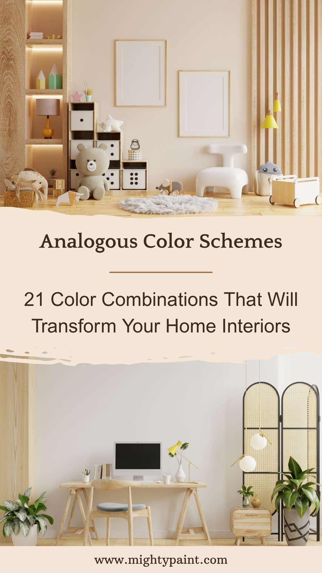
Analogous color schemes use colors that sit next to each other on the color wheel—like blue, blue-green, and green. This approach results in a harmonious and soothing palette that’s ideal for creating flow between rooms or within open-concept living spaces. These combinations feel organic, as they often mimic colors found together in nature.
In interior design, analogous schemes work particularly well in living rooms, hallways, or multi-use areas, where you want cohesion without monotony. For example, a palette of soft green, sage, and teal can bring a fresh and tranquil vibe to a home office or reading nook. Similarly, yellows, golds, and warm oranges can infuse warmth into a kitchen or dining space without becoming overpowering.
To make an analogous color scheme pop, use a dominant color for walls or larger furniture, a secondary shade for textiles or smaller furnishings, and an accent color for accessories or art. Integrating neutral tones like cream, taupe, or light grey can also help ground the space and keep it from feeling overly thematic. The beauty of this scheme lies in its subtlety—it’s perfect for those who want color without chaos.
Get the Fail-Safe Paint Color Playbook (Free PDF)
36 proven colors • 8 ready palettes • trim & sheen guide • printable testing cards.
Triadic Color Schemes: Vibrant and Visually Striking
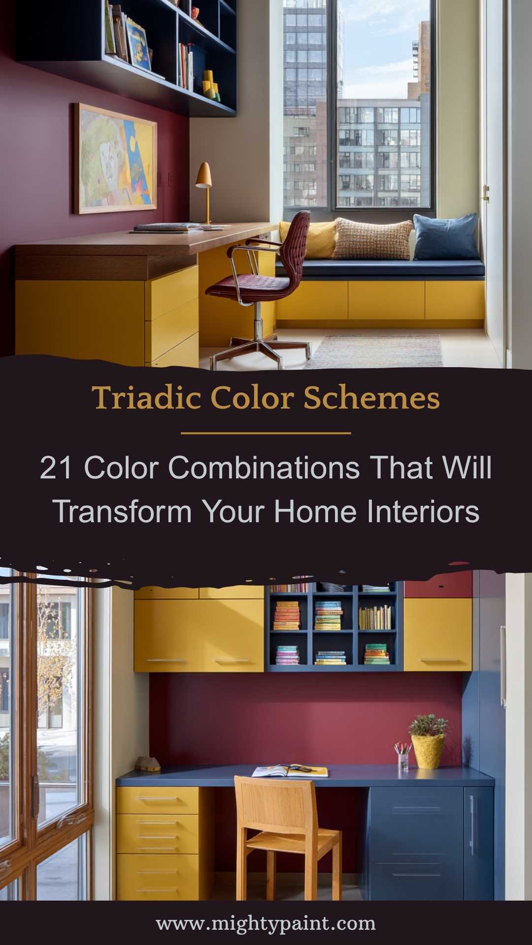
A triadic color scheme involves using three colors that are evenly spaced around the color wheel, creating a balanced yet dynamic look. While more vibrant than analogous or monochromatic palettes, triadic combinations are surprisingly versatile when tailored with the right shades and proportions.
One classic example for interiors is the red-yellow-blue trio. This can be interpreted in a more muted way, such as burgundy, mustard, and navy, for a cozy yet sophisticated living room or home library. Another elegant variant is teal, coral, and soft gold, which brings a bright and stylish feel to contemporary kitchens or bedrooms.
The trick with triadic color schemes is to choose one dominant color to anchor the room—typically used on walls or main furniture—and let the other two act as supporting elements. To prevent visual overload, stick with muted or pastel versions of these colors, especially in smaller rooms. Repetition of each color in subtle ways—like patterned textiles, vases, or throws—helps create visual rhythm and a cohesive look throughout the space.
Tetradic Color Schemes: Bold, Balanced, and Full of Personality
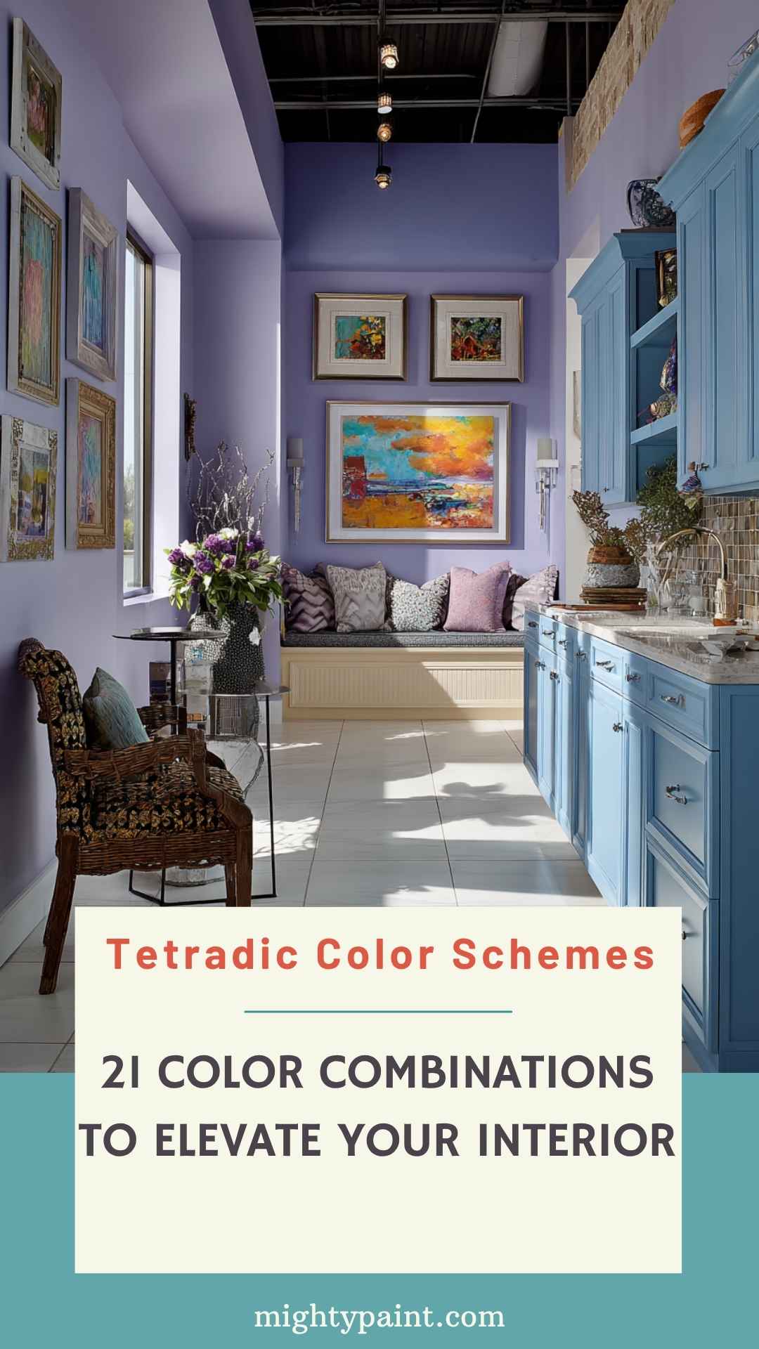
Tetradic color schemes—also known as double complementary—combine two sets of complementary pairs. This creates a rich and colorful palette with four distinct hues, offering tons of flexibility for personalization. While this can be a bold approach, when handled with care, tetradic schemes add depth and drama to interiors.
A popular home decor example is a mix of blue and orange with purple and yellow. While this sounds intense, it can be beautifully executed by using softer tones—like dusty blue, burnt sienna, lavender, and buttercream. This mix is especially effective in eclectic spaces, creative studios, or kids’ rooms where vibrancy and playfulness are welcome.
To keep tetradic schemes from clashing, use one pair as the main theme and treat the second pair as accents. Also, use neutral base elements (like white walls, wooden floors, or grey upholstery) to ground the colorful elements. Patterns—such as floral prints or geometric designs—are another great way to weave multiple colors into a space without making it feel chaotic.
Warm Color Combinations: Cozy and Inviting
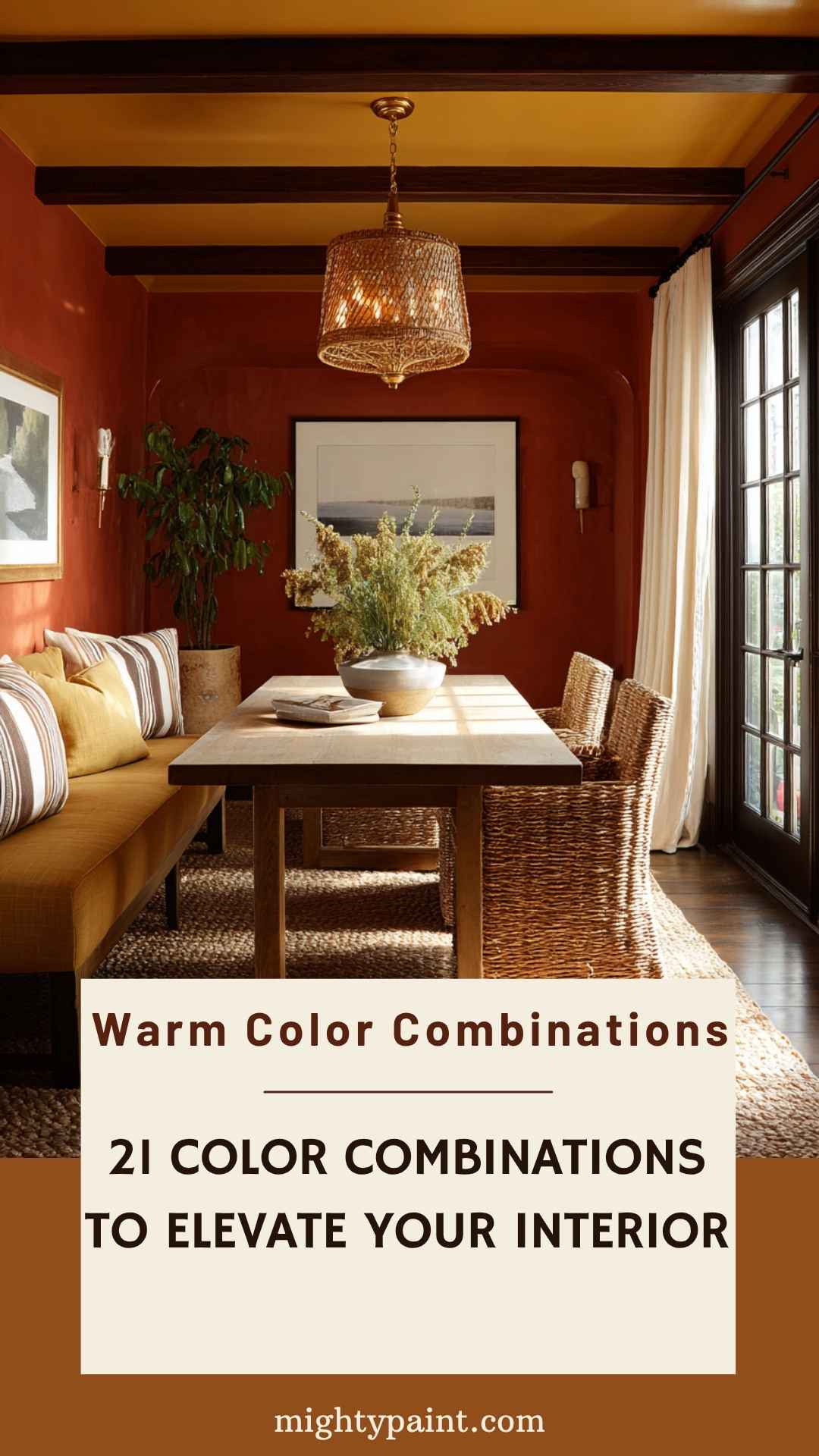
Warm colors—like red, orange, and yellow—are known for their ability to make spaces feel lively, welcoming, and cozy. When used thoughtfully, these colors can turn even the largest, most sterile rooms into warm, intimate havens. In home decor, warm color palettes are especially effective in social areas like living rooms, kitchens, and dining spaces where energy and interaction are encouraged.
A popular and timeless warm combination is terracotta and mustard, which works beautifully with natural textures like wood and jute. This pairing evokes a Mediterranean or boho-chic feel, perfect for laid-back yet stylish interiors. For a bolder look, try burnt orange and cranberry red with touches of gold or brass to add a sense of luxury and depth.
When working with warm palettes, it’s important to balance the intensity. Use lighter tones like peach or soft coral on walls and reserve deeper shades for accents such as cushions, rugs, or artwork. Incorporating warm neutrals like cream, beige, or tan helps tone down strong hues while keeping the overall look harmonious. The result is a space that feels both dynamic and deeply comforting—a true reflection of warmth in every sense.
Cool Color Combinations: Calm and Collected
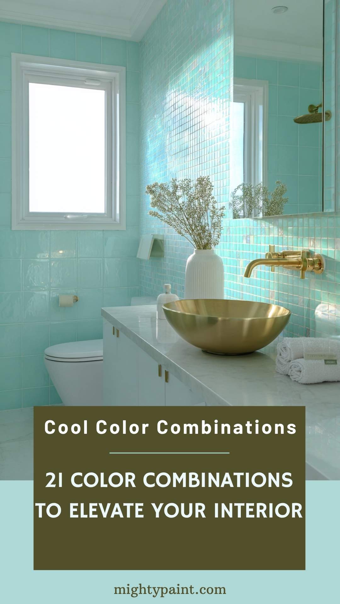
Cool colors—such as blues, greens, and purples—create tranquil and restful environments, making them ideal for bedrooms, bathrooms, and relaxation zones. These shades mimic elements from nature like water and sky, helping to foster a serene, refreshing atmosphere in your home.
A classic cool combo for interiors is sky blue and mint green, perfect for coastal-inspired spaces or children’s rooms. For a more mature and luxurious approach, try pairing deep navy with emerald green and soft lavender accents. These combinations feel fresh and composed, yet they don’t lack sophistication or personality.
Get the Fail-Safe Paint Color Playbook (Free PDF)
36 proven colors • 8 ready palettes • trim & sheen guide • printable testing cards.
To avoid cool palettes from appearing too cold or sterile, incorporate textured materials like linen, velvet, or rattan. Warm metallics like brushed gold or copper fixtures can also soften the look. Using soft white or grey as a backdrop enhances the soothing effect and keeps the space open and breathable. Whether you’re designing a peaceful retreat or a spa-like bathroom, cool colors help bring calm and clarity to any room.
Neutral Color Combinations: Timeless and Versatile
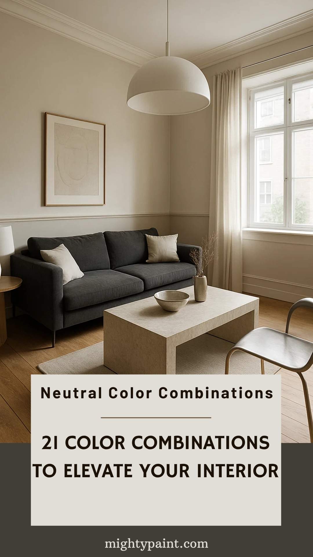
Neutral palettes are a cornerstone of modern home decor, praised for their flexibility, timelessness, and ability to pair with almost anything. Shades like white, cream, grey, beige, and taupe can create a sophisticated canvas that allows furniture, art, or architectural elements to shine. When layered well, neutral combinations can be anything but boring—they can be warm, elegant, and full of texture.
A favorite pairing is warm beige and soft ivory, which creates a serene, sun-kissed atmosphere. For a moodier look, charcoal grey and stone add depth and drama, especially when paired with rich materials like leather, marble, or dark wood. Even minimalist spaces benefit from mixing multiple neutrals, adding visual interest without relying on color saturation.
The key to making neutral combinations successful is texture and layering. Use a variety of finishes—matte paint, woven textiles, glossy tiles, natural wood—to add dimension. Incorporate subtle accents like black picture frames, green indoor plants, or metallic lighting fixtures to break the monotony while staying true to the neutral theme. These combinations work in every room and every style, making them a go-to for both designers and homeowners seeking understated elegance.
Pastel Color Combinations: Soft, Serene, and Stylish
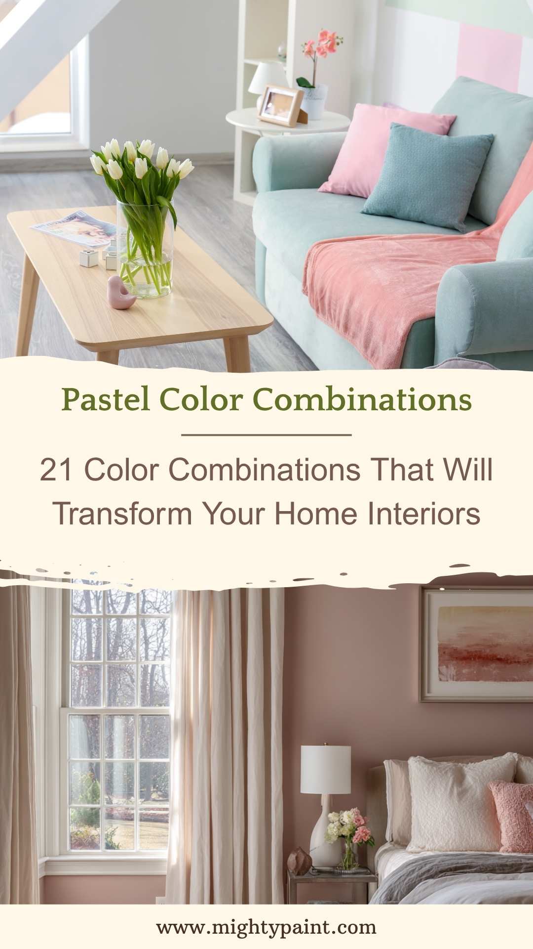
Pastel colors offer a light, airy aesthetic that’s perfect for creating gentle, inviting interiors. These hues—like blush pink, powder blue, mint green, and lavender—are especially suited for bedrooms, nurseries, and living spaces where softness and tranquility are desired. Despite their gentle nature, pastels are incredibly versatile and can be styled to suit both modern and traditional homes.
A beautiful and calming combination is dusty rose and soft grey, which works wonderfully in bedrooms or guest rooms. Pairing mint green with pale peach can bring a fresh and cheerful vibe to kitchens or bathrooms. For a more contemporary take, try lilac with muted mustard, balancing the sweetness of pastels with an unexpected pop of warmth.
To make pastel interiors feel grounded and not overly whimsical, incorporate earthy textures like wood, cane, or linen. Use white or neutral tones to balance the palette and create a clean backdrop. Layering pastel tones in different intensities—such as mixing a very light blue with a slightly deeper sky shade—can add depth and keep the space feeling dynamic yet serene.
Bold and Vibrant Color Combinations: Statement-Making and Full of Energy
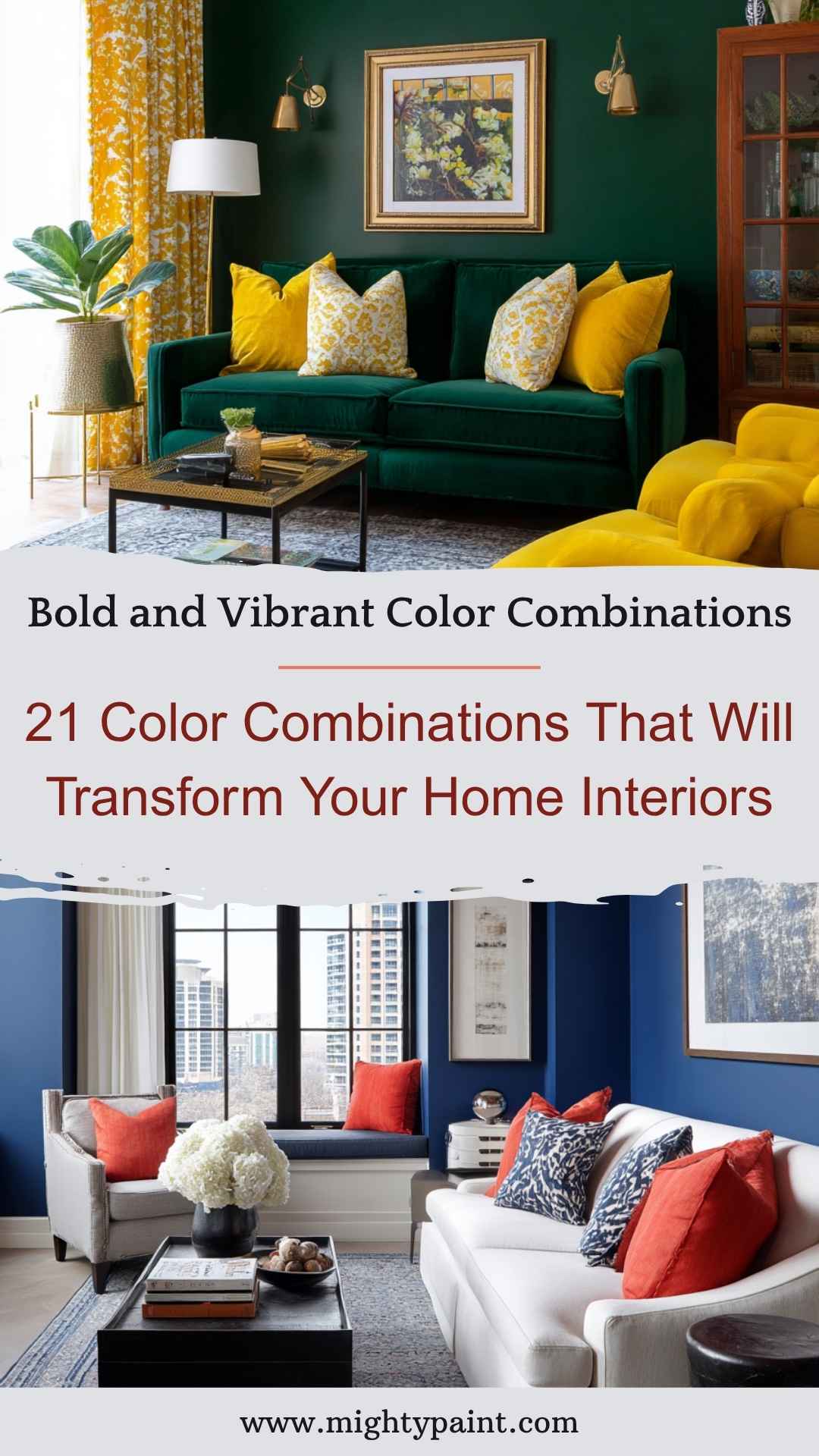
For those who love personality and drama in their interiors, bold and vibrant color combinations are the way to go. These pairings use high-saturation colors to create striking contrasts and energetic atmospheres, perfect for statement walls, eclectic living rooms, or creative home offices.
A standout example is cobalt blue and bright coral—an energetic duo that enlivens modern living spaces. Another dramatic pairing is emerald green and mustard yellow, which exudes retro charm and bold sophistication. For something truly eye-catching, try combining electric purple with turquoise, adding flair and vibrancy to entertainment rooms or play areas.
Get the Fail-Safe Paint Color Playbook (Free PDF)
36 proven colors • 8 ready palettes • trim & sheen guide • printable testing cards.
When working with bold colors, balance is essential. Typically, one color should dominate, while the other serves as an accent. Use neutral flooring, white ceilings, or minimalist furniture to anchor the look and prevent it from feeling overwhelming. Bold combinations are also excellent for zoning open-plan spaces, helping to define different areas through strategic color placement while maintaining visual interest and cohesion.
Earth Tone Combinations: Natural, Grounded, and Timeless
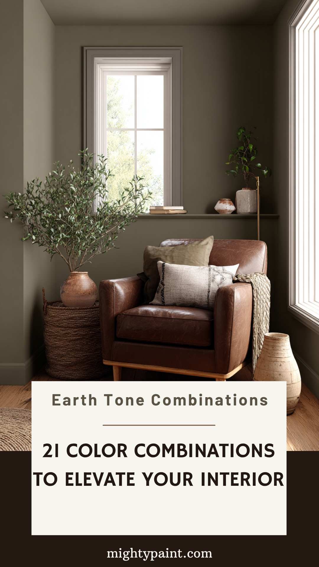
Earth tones are inspired by nature’s palette—think browns, ochres, clay, moss, and muted greens. These color combinations create interiors that feel warm, organic, and deeply connected to the environment. They’re particularly effective in creating restful, welcoming spaces like living rooms, dens, or reading nooks.
A popular and soothing earth tone combination is warm taupe with olive green, perfect for grounding a living room with natural elegance. Terracotta paired with sand or beige brings a Southwestern or Mediterranean vibe that feels both rustic and refined. For a more layered look, try mixing forest green, deep brown, and creamy tan to evoke the richness of a woodland retreat.
Earth tone interiors shine when paired with natural materials like wood, leather, jute, and clay. Incorporating handmade or artisanal décor can further enhance the grounded aesthetic. These color palettes work beautifully with plants, ceramics, and woven textiles, creating a space that’s not only visually soothing but also emotionally comforting.
Seasonal Color Combinations: Inspired by Nature’s Rhythms
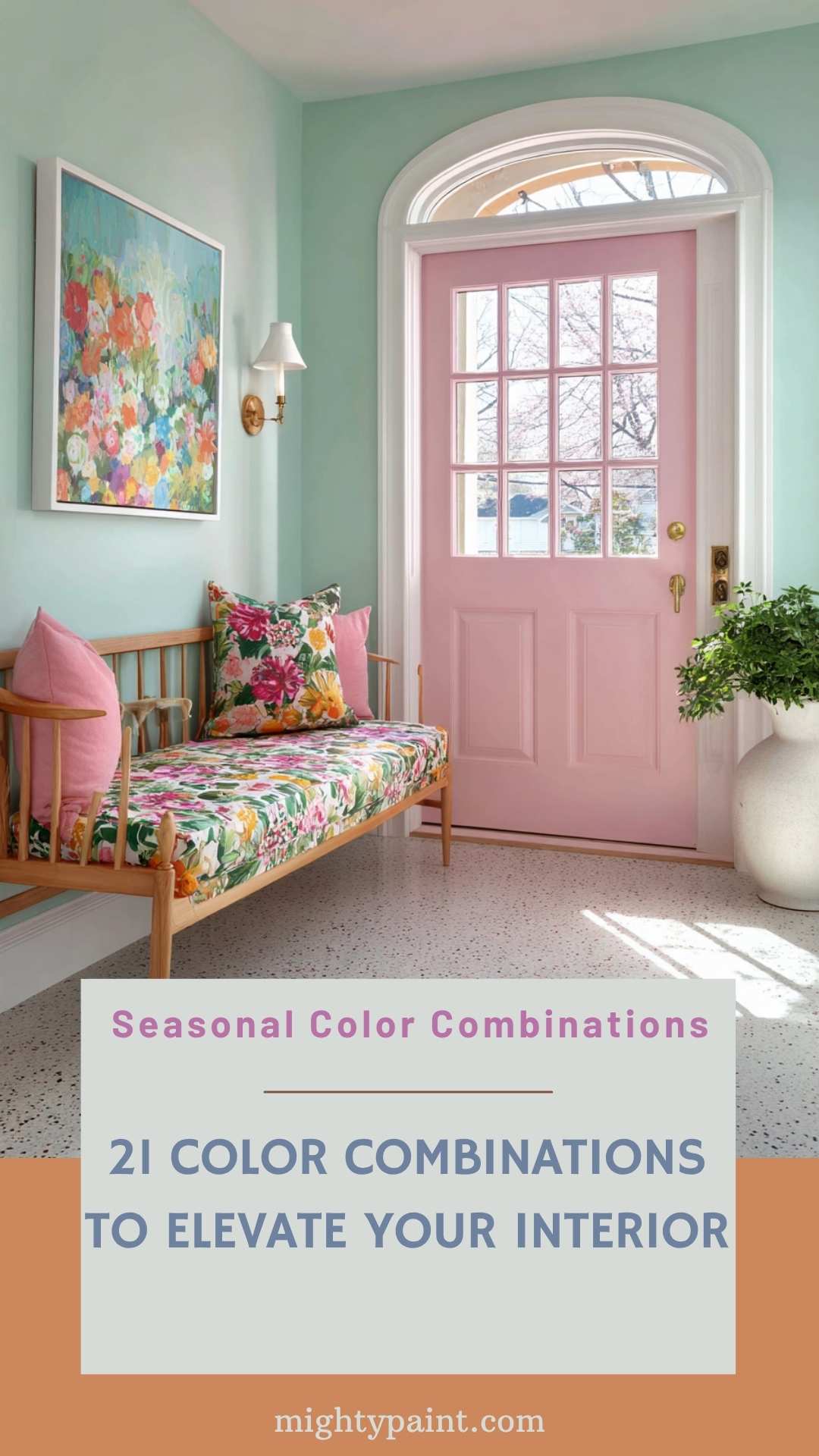
Drawing inspiration from the changing seasons is a timeless way to refresh your home’s color palette. Seasonal combinations reflect the tones and moods of the natural world, creating interiors that feel both timely and timeless. Whether you redecorate seasonally or just want a palette that channels your favorite time of year, these combinations offer endless possibilities.
Spring palettes often feature pastels and fresh greens, like soft lilac paired with mint or butter yellow with blush. These combinations bring a sense of renewal and optimism—perfect for kitchens or entryways. Summer colors lean bold and bright: think turquoise and coral, or sunny yellow and sea blue, ideal for creating a cheerful, beachy vibe in sunrooms or patios.
Autumn schemes are rich and earthy, with combinations like rust and olive or mustard and maroon, creating cozy atmospheres in dining rooms or lounges. Winter palettes tend toward cool sophistication—icy blue and silver, or charcoal and cranberry—perfect for bedrooms or formal living areas.
For year-round appeal, consider incorporating seasonal hues through accessories like throw pillows, curtains, and rugs. This allows you to update your interior’s mood with the seasons without major overhauls.
Cultural and Traditional Color Combinations: Celebrating Heritage Through Design
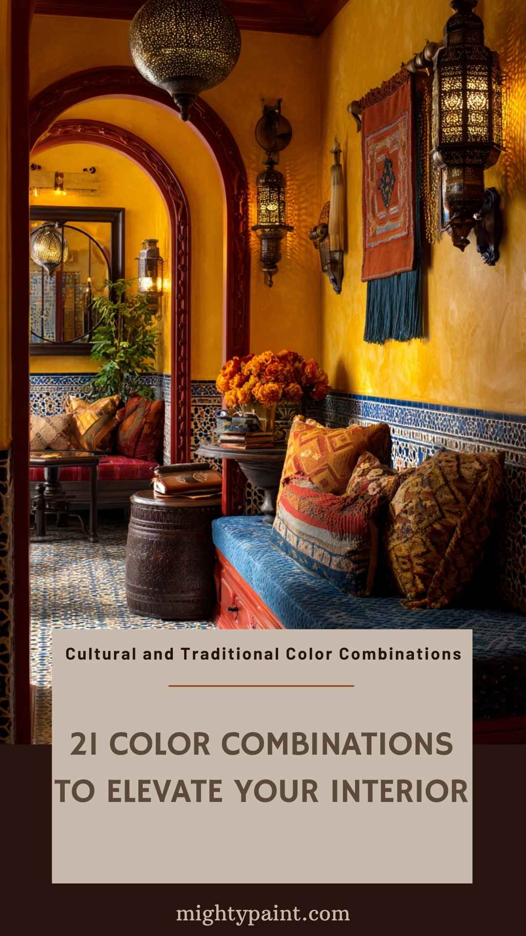
Colors hold deep cultural significance, and using culturally inspired color combinations in your home can add depth, meaning, and a personal touch. These palettes often come from traditional dress, architecture, festivals, or regional landscapes—and they carry a sense of storytelling that modern schemes sometimes lack.
For instance, red and gold is a classic pairing in Chinese decor, symbolizing luck and prosperity. In Moroccan interiors, vibrant combinations like cobalt blue, saffron yellow, and deep red are frequently used, creating rich and layered aesthetics. Scandinavian design, by contrast, often embraces white, soft grey, and pale blue, promoting calm and simplicity.
When incorporating cultural palettes, consider their symbolic meanings and how they reflect your heritage or travel inspirations. These combinations work particularly well in spaces like dining rooms, entryways, or lounges—areas where you can express personality and celebrate stories. Handcrafted pieces, ethnic prints, and traditional textiles can further enhance the authenticity of these color combinations, creating an interior that feels both curated and deeply meaningful.
Get the Fail-Safe Paint Color Playbook (Free PDF)
36 proven colors • 8 ready palettes • trim & sheen guide • printable testing cards.
Industry-Specific Color Combinations: Designing with Purpose
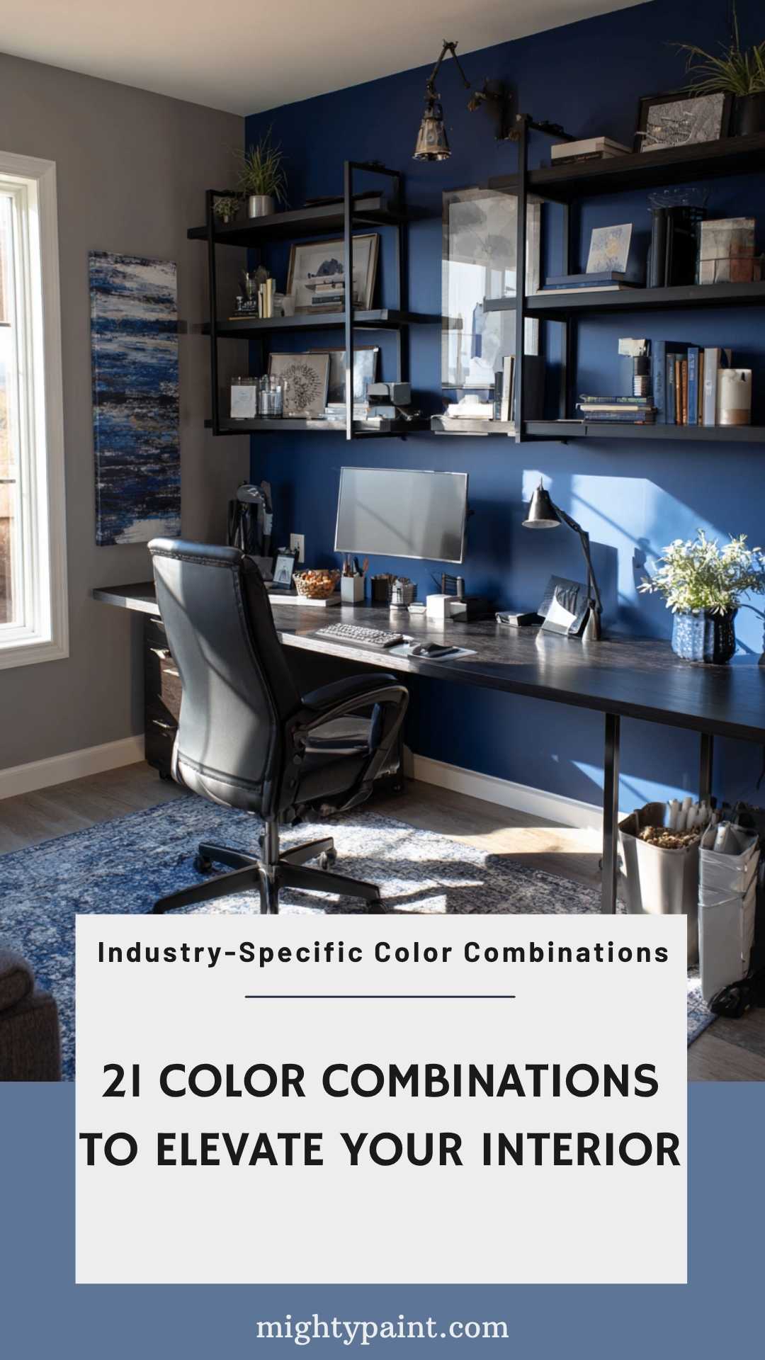
Different rooms in your home often serve different functions, and taking cues from industry-specific color psychology can help design spaces that truly support their intended use. By applying principles from fields like hospitality, wellness, and education, you can enhance both aesthetics and functionality in your interiors.
In home offices, for example, colors inspired by tech and corporate design—like blue and grey—can promote focus and professionalism. These hues help minimize distractions and create a productive atmosphere. For kitchens or dining areas, hospitality trends favor warm reds, earthy oranges, and golden yellows, which are known to stimulate appetite and conversation.
In bathrooms or wellness spaces, spa-like combinations such as sage green and crisp white, or soft beige and pale aqua, evoke cleanliness and relaxation, echoing the colors used in high-end wellness resorts. Meanwhile, kids’ rooms can benefit from combinations used in early education spaces—like primary colors with neutral grounding tones—to stimulate creativity while maintaining comfort.
Aligning color choices with how each room functions ensures that your home is not only beautiful, but also highly livable.
Gender-Neutral Color Combinations: Inclusive and Modern
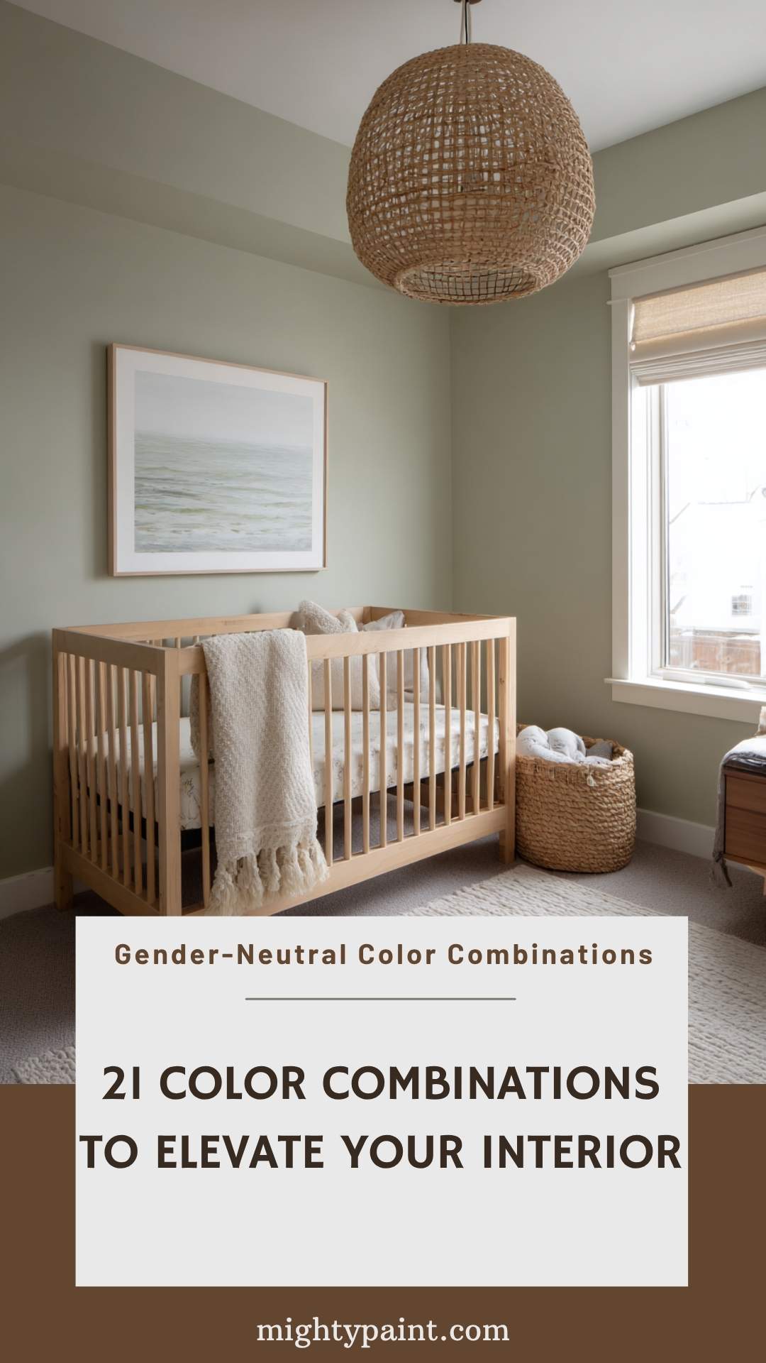
As design trends move toward inclusivity and flexibility, gender-neutral color palettes have become a thoughtful and modern approach in home interiors. These combinations step away from traditional pinks and blues, focusing instead on versatile hues that work beautifully for everyone—regardless of age or gender.
A popular choice is sage green and soft beige, a pairing that feels fresh, balanced, and adaptable across any room, from nurseries to shared bedrooms. Another modern duo is mustard yellow and slate grey, combining warmth and stability in a way that appeals broadly. For a more contemporary feel, try dusty teal with off-white, creating a soft yet sophisticated ambiance.
Gender-neutral palettes excel in multi-functional or shared spaces, such as guest rooms, play areas, or family zones. To make the most of these combinations, mix in natural textures like wood or rattan, and keep lines clean with simple, unisex decor elements. These combinations not only promote inclusivity, but they also support design longevity, as they’re easy to update and reinterpret over time.
High-Contrast Color Combinations for Accessibility: Stylish and Functional
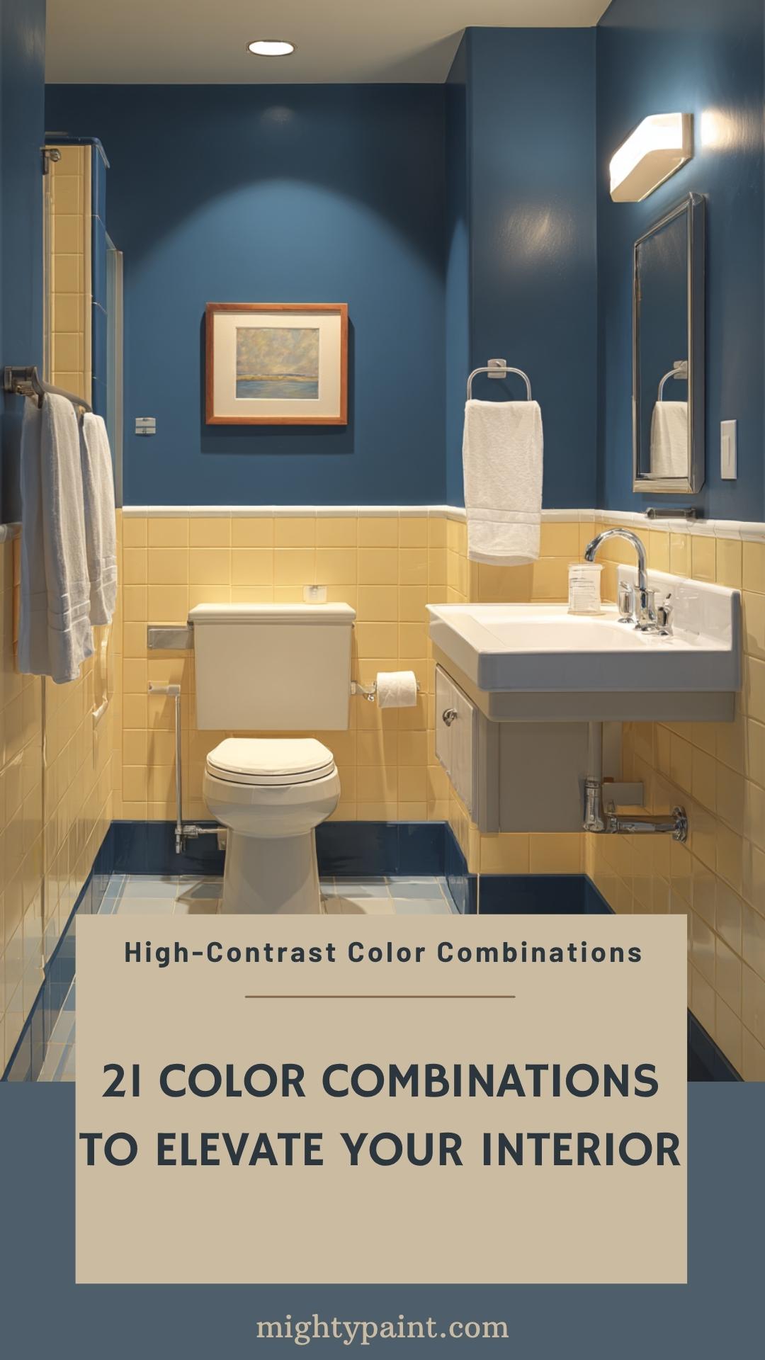
Designing an inclusive home means considering accessibility—and color contrast plays a key role. High-contrast combinations improve visibility and readability, which is essential for individuals with visual impairments. Fortunately, functional doesn’t have to mean boring; these pairings can be just as beautiful as they are practical.
A classic high-contrast example is black and white, offering timeless sophistication while maximizing legibility. For a softer yet still effective approach, consider navy and cream, or charcoal and pale yellow. These combinations work well in kitchens (for appliance buttons and switches), staircases (for visible edges), and bathrooms (with contrasting tiles or towels).
When using high-contrast schemes, it’s essential to maintain visual clarity without causing visual strain. Avoid overly busy patterns and instead focus on clean, defined borders between colors. You can also incorporate textured contrasts—such as matte vs. gloss finishes—to support both visual and tactile navigation. The result is a home that’s thoughtful, inclusive, and stylishly practical.
Nature-Inspired Color Combinations: Bringing the Outdoors In
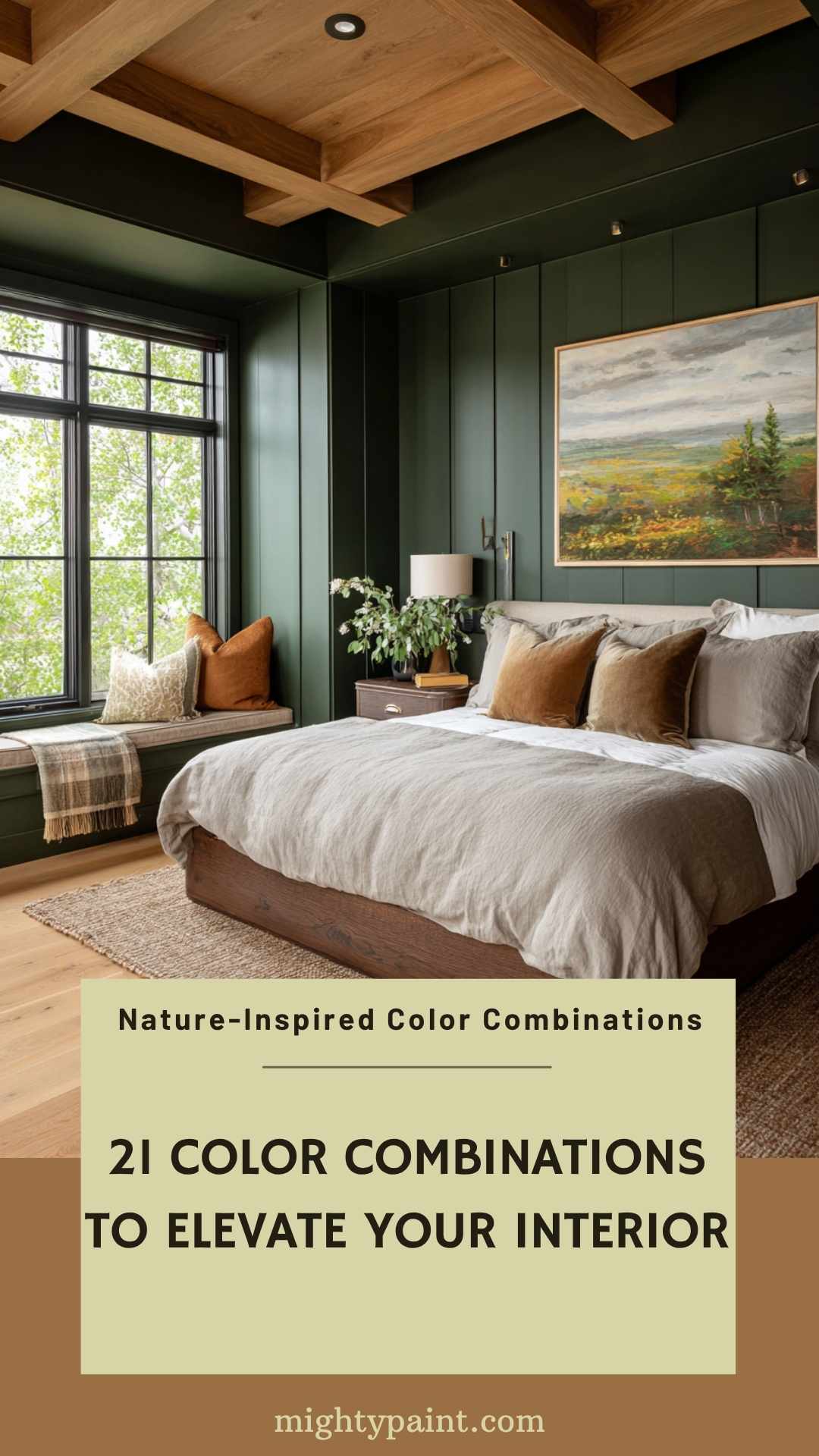
Nature has always been one of the richest sources of inspiration for interior design. By borrowing from the colors found in landscapes—forests, oceans, deserts, and skies—you can create interiors that feel peaceful, restorative, and deeply connected to the environment.
A soothing and popular combination is forest green and warm brown, ideal for living rooms and bedrooms where a sense of calm and stability is desired. Ocean-inspired palettes, such as seafoam green with sandy beige, bring a breezy, coastal charm to bathrooms and sunrooms. For a more rustic or desert-inspired look, try terracotta with soft sage, a grounded and earthy pair perfect for kitchens or reading nooks.
To fully embrace nature indoors, layer in natural materials like stone, wood, wool, and ceramics. Add in plenty of natural light and houseplants to complete the look. These palettes not only beautify your space—they also promote well-being, reduce stress, and make your home feel like a retreat from the outside world.
Urban and Industrial Color Combinations: Sleek and Sophisticated
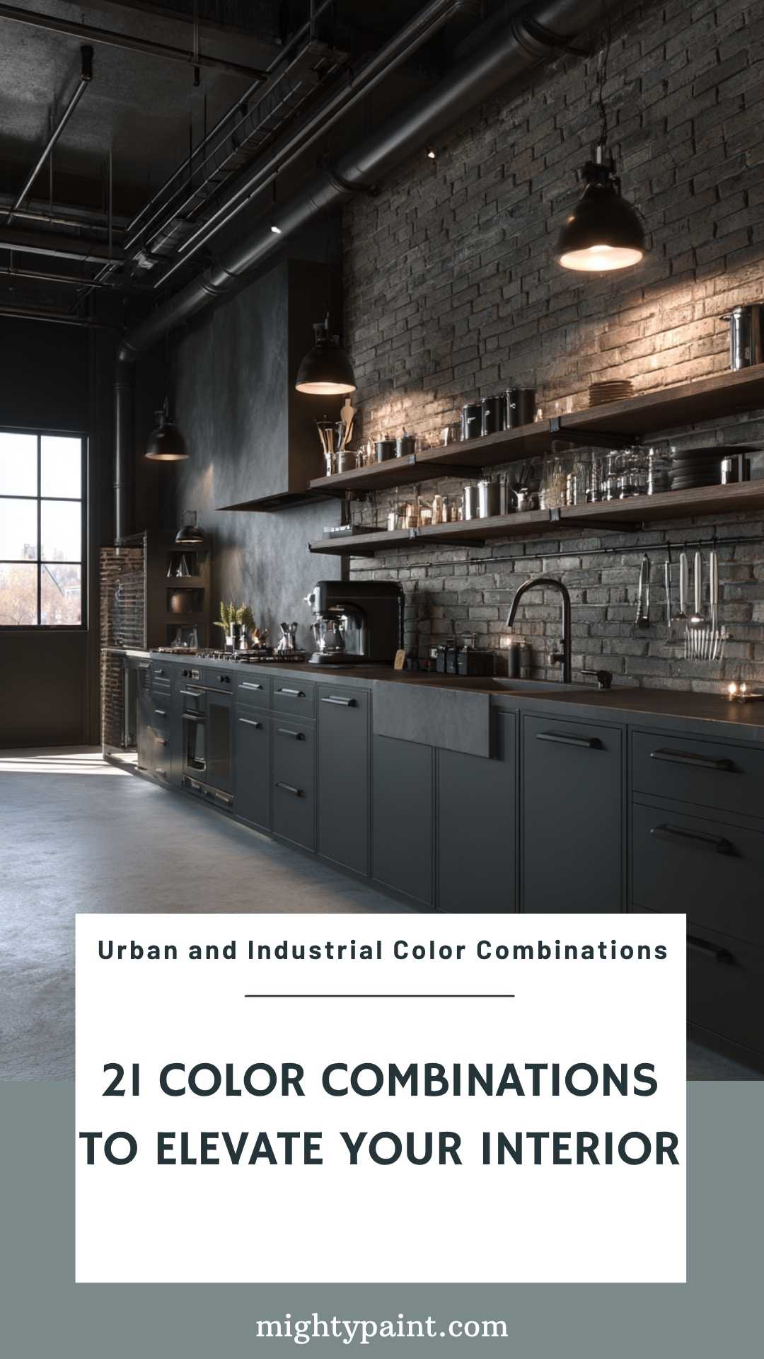
Urban and industrial design schemes draw inspiration from cityscapes and repurposed industrial spaces, often featuring a palette of grays, blacks, and metallics. These combinations create a modern, edgy aesthetic that’s both functional and stylish.
A classic pairing is charcoal gray with brushed steel, offering a sleek look ideal for kitchens or loft-style living areas. Incorporating exposed brick with matte black accents can add depth and character to a space, evoking the feel of a converted warehouse. To soften the industrial edge, consider adding warm wood tones or textured textiles like wool or leather.
Lighting plays a crucial role in these spaces. Edison bulb fixtures or metal pendant lights can enhance the industrial vibe while providing ample illumination. The key is balancing raw, unfinished elements with polished, modern touches to create a cohesive and inviting environment.
Vintage and Retro Color Combinations: Nostalgic and Charming
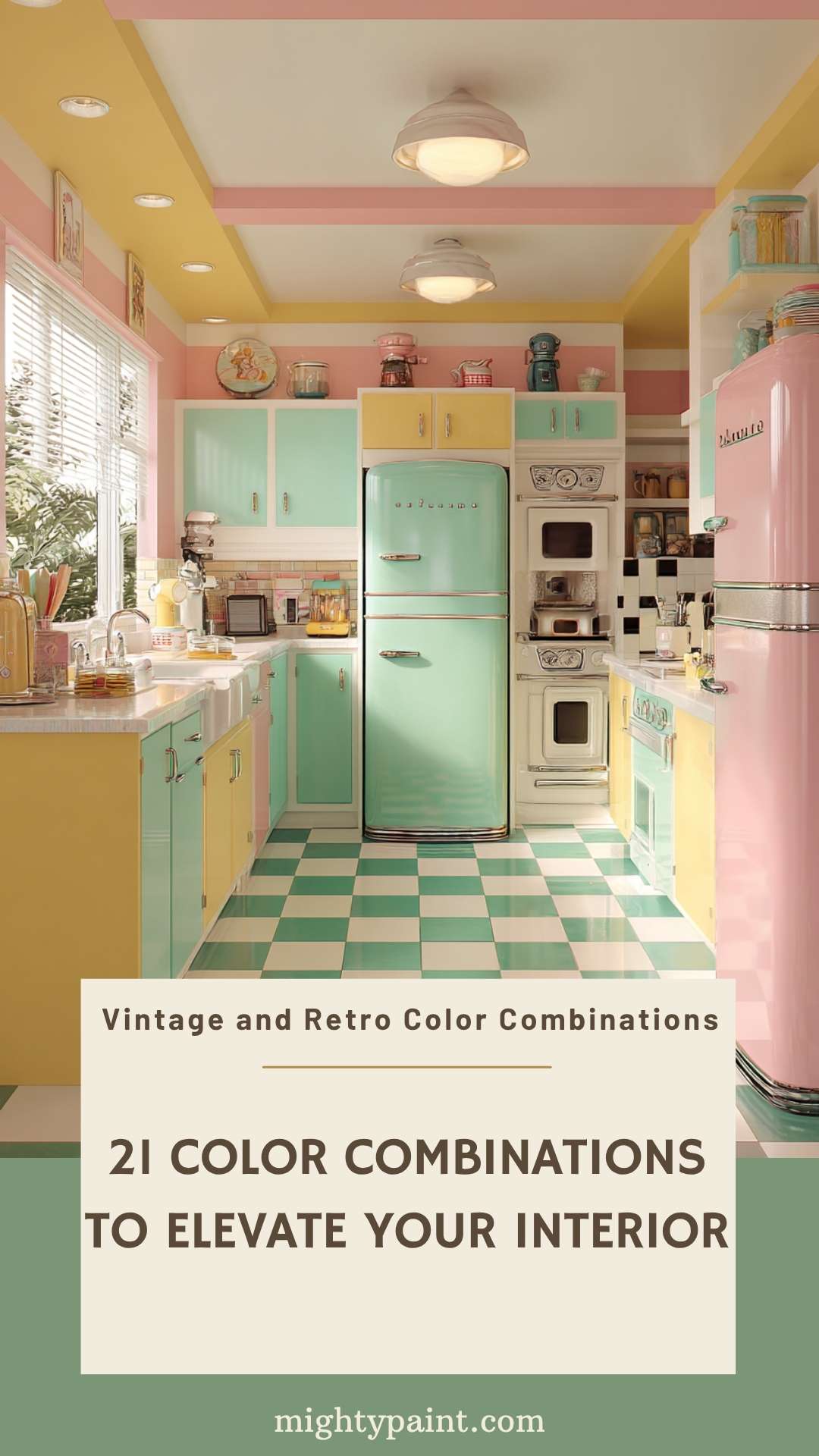
Vintage and retro color schemes transport us back in time, evoking the charm of past decades. These combinations often feature bold, contrasting colors that add personality and warmth to interiors.
Think of mustard yellow paired with teal for a 1960s-inspired living room, or soft pink with mint green for a 1950s diner-style kitchen. Incorporating patterned wallpapers, mid-century furniture, and retro accessories can further enhance the nostalgic feel.
When working with vintage palettes, it’s essential to strike a balance between old and new. Mixing retro colors with contemporary furnishings or neutral backdrops can prevent the space from feeling dated. The goal is to celebrate the past while maintaining a fresh and livable environment.
Get the Fail-Safe Paint Color Playbook (Free PDF)
36 proven colors • 8 ready palettes • trim & sheen guide • printable testing cards.
Futuristic and Tech-Inspired Color Combinations: Innovative and Cutting-Edge
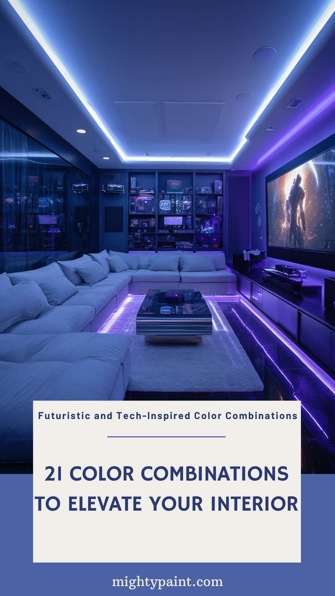
For those looking to embrace a forward-thinking aesthetic, futuristic and tech-inspired color combinations offer a sleek and innovative approach to interior design. These schemes often utilize high-contrast colors and modern materials to create a sense of advancement and sophistication.
A popular combination is neon blue with stark white, which can make a bold statement in a home office or entertainment area. Pairing metallic silver with deep purple can add a luxurious, sci-fi feel to a bedroom or lounge. Incorporating LED lighting, glossy surfaces, and minimalist furniture can further enhance the futuristic ambiance.
When designing with tech-inspired colors, consider the functionality of the space. Integrating smart home technology and ergonomic designs can complement the aesthetic, ensuring the space is not only visually striking but also highly functional.
Conclusion
Exploring various color combinations allows you to tailor your home’s interior to reflect your personal style and the atmosphere you wish to create. Whether you’re drawn to the raw appeal of industrial designs, the nostalgic charm of vintage palettes, or the sleek innovation of futuristic schemes, there’s a color combination to suit every preference.
Remember, the key to successful interior design lies in balance and cohesion. Consider the interplay of colors, textures, and lighting to create harmonious spaces that are both beautiful and functional. Don’t be afraid to experiment and let your creativity guide you in transforming your home into a true reflection of yourself.
