
The Best Exterior Front Door Colors to Instantly Boost Curb Appeal
A fresh front door color is the fastest, most affordable way to transform your home’s first impression. As the focal point of your facade, the right hue can make your exterior feel more inviting, elevate your style, and even hint at your personality before guests step inside.
Choosing well goes beyond picking a pretty paint chip. Consider your home’s architecture, your siding or brick undertones, and how light hits your entry through the day. Then layer in color psychology: energizing reds, refined blacks, calming sages, coastal teals, classic navies, cheerful yellows, and warm wood tones all tell a different story.
Get the Fail-Safe Paint Color Playbook (Free PDF)
36 proven colors • 8 ready palettes • trim & sheen guide • printable testing cards.
In this guide, you’ll find curated front door color ideas that work with real-world exteriors, plus quick tips on finishes, hardware pairing, and contrast with trim. Whether you love modern, farmhouse, cottage, or traditional styles, you’ll discover shades that boost curb appeal and feel effortlessly cohesive with your exterior palette.
Best Exterior Front Door Colors for Curb Appeal and Resale Value
Exterior Front Door Colors shape first impressions and can lift curb appeal and perceived value significantly. The best hue respects your home’s architecture—Colonial symmetry, Craftsman warmth, or sleek Mid-Century lines. Factor in fixed elements like roof tone, brick or stone undertones, window cladding, and surrounding landscape greens. Sun exposure shifts how pigments read; south-facing entries amplify warmth while north-facing shade cools and mutes saturation. Regional context matters too—coastal glare favors deeper colors, whereas wooded lots welcome softened, nature-echoing hues. Start with your exterior body and trim palette, then select a complementary or contrasting door color that highlights hardware and architectural details.
- Classic Black: crisp contrast suits white siding, brick, and stone; hides smudges; pairs with brass or polished nickel hardware; feels stately on colonials and urbane on modern facades.
- Timeless Navy: maritime depth flatters shingle, gray, and tan exteriors; reduces sun fade; coordinates with chrome or stainless hardware; anchors coastal cottages, Craftsman bungalows, and transitional builds confidently.
- Inviting Red: energizes neutral facades; reads welcoming in overcast climates; complements black shutters; choose muted brick-red for tradition or cherry-red for contemporary pop, balancing saturation with neighboring landscaping hues.
- Modern Charcoal: softer than pure black, it hides dust while framing glass; pairs with warm woods and black windows; ideal for contemporary, Scandinavian, and industrial elevations seeking minimal drama.
- Fresh Sage: gray-green undertone echoes surrounding plantings; cools sunbaked stucco; coordinates with oil-rubbed bronze hardware; excellent on ranch, farmhouse, and cottage styles aiming for relaxed, organic charm.
Choose a durable exterior enamel with UV blockers, especially for saturated reds, blues, and greens prone to fading. Satin or semi-gloss finishes resist scuffs and shed rain, while high gloss accentuates panel profiles but reveals surface imperfections. Always sand, clean, and prime properly—use stain-blocking primer on previously oiled doors or tannin-rich woods like mahogany and cedar. Test large swatches on poster board taped to the door, evaluating color across morning, midday, dusk, and artificial lighting. Coordinate metals thoughtfully; black and charcoal love matte black or satin brass, whereas navy sings with chrome or stainless. Finally, repeat the hue subtly in planters, doormats, or porch furniture to create a cohesive, professionally designed entry.
Greige on Stone: The Versatile Neutral That Elevates Natural Facades
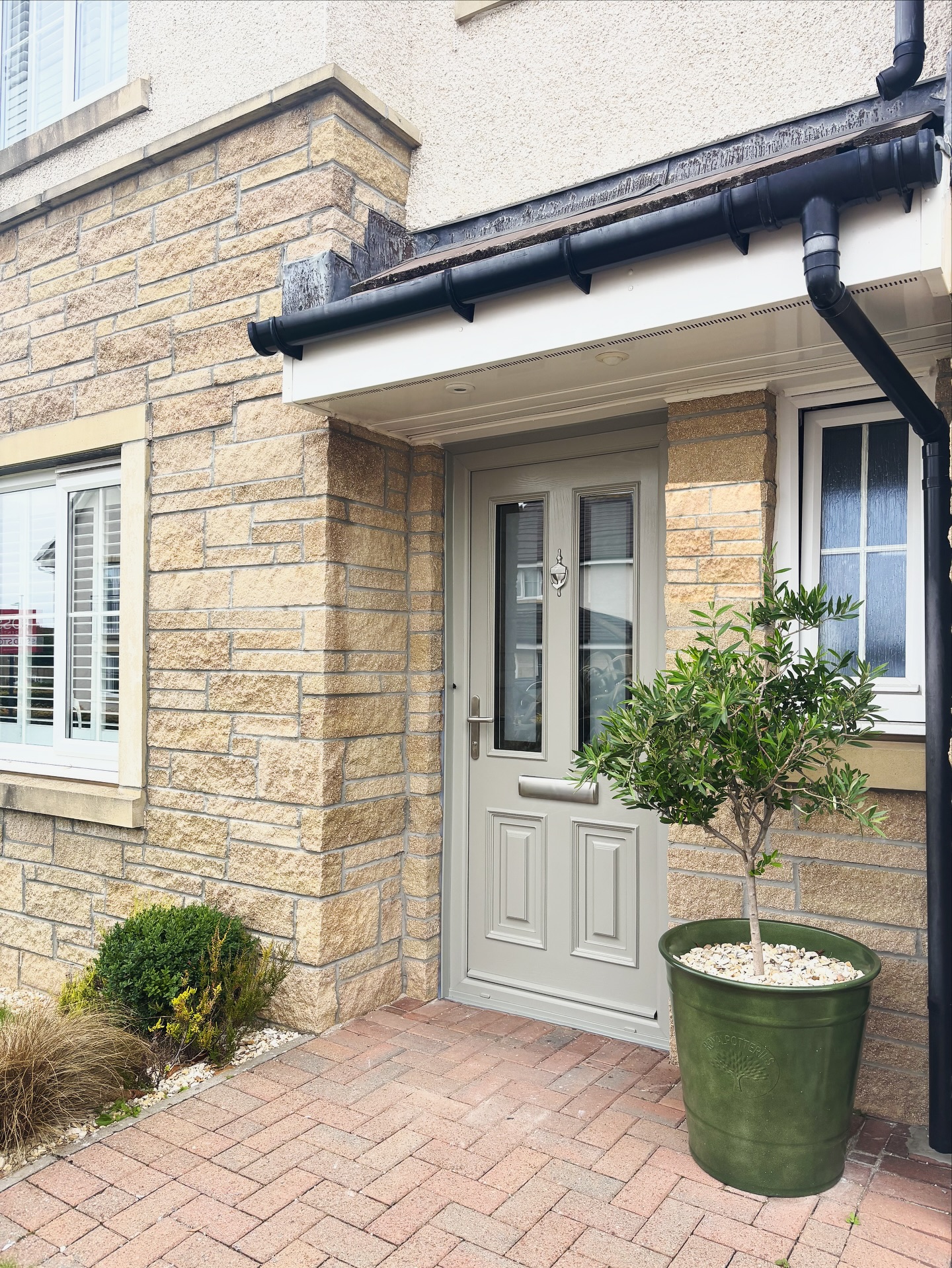
If your exterior features mixed masonry, a greige front door is a guaranteed upgrade. This soft putty hue bridges the warm tan and honey undertones of stone with cream stucco and white trim, creating a calm, cohesive first impression. Because greige leans neither too warm nor too cool, it flatters the subtle color shifts you see across brick pavers, mortar, and stacked stone. Opt for a satin or semi‑gloss finish so panel details read crisply beneath a small porch roof. Brushed nickel or pewter hardware keeps the palette elegant and understated, while existing black gutters and downspouts supply just the right amount of graphic contrast. Bring the look to life with evergreen structure—an olive or boxwood in a deep green planter repeats the door’s muted sophistication. Sampling tip: test two directions—one slightly warmer (think approachable taupe‑greige) and one slightly cooler (a gray with a drop of green) and check them morning to evening. You’ll land on a timeless neutral that won’t fight your stone’s movement, instantly boosting curb appeal without shouting for attention.
Dusty Blue on Red Brick: A Tried‑and‑True Charmer
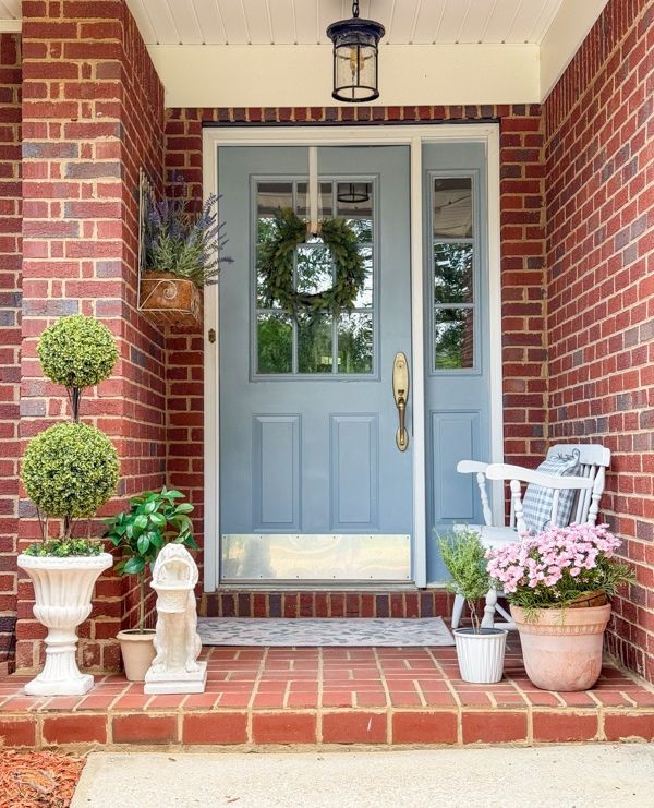
Cool, dusty blue is a front door classic for red brick homes because it tempers brick’s warmth while highlighting crisp white trim. The trick is choosing a blue with a gray base so it feels sophisticated—more heirloom than beachy. Paired with traditional paneling and divided‑light side windows, this color family reads welcoming and long‑lasting. Burnished brass hardware warms the blue and echoes the golden flecks often found in old brick; repeat that glow with a lantern or door knocker for a layered, heritage feel. Boxwood topiaries, soft pink blooms, and a simple wreath add softness without competing with the saturated masonry. If you’re sampling, look for mid‑light LRV blues that don’t go chalky in full sun. This palette loves black shutters, warm gray mortar, and terracotta porch steps, making it an easy, high‑ROI update. The result: a porch that feels gracious in every season, from spring florals to holiday greenery, with a front door color that flatters brick’s natural depth.
Citrus Chartreuse on Navy Siding: Modern Energy Done Right
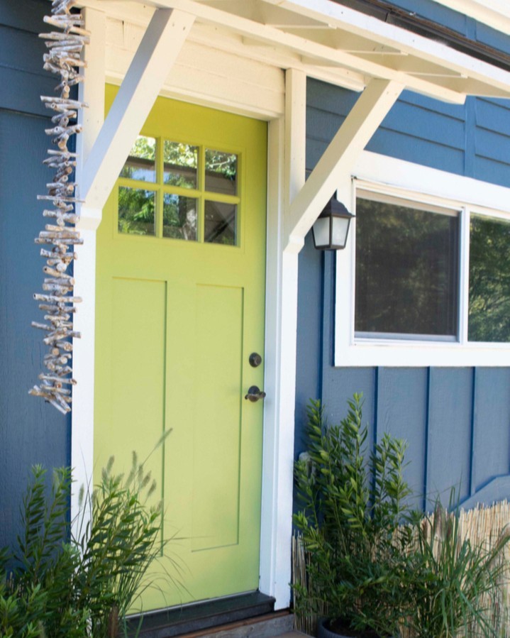
Ready to make a confident statement? A chartreuse front door against deep blue siding delivers playful curb appeal with designer restraint. This high‑contrast duo works because it’s grounded by clean white trim and simple lantern lighting, letting the door be the hero. Choose a yellow‑green with a touch of gray so it reads modern rather than neon; in shade it feels fresh and botanical, while in sun it glows. Matte black hardware sharpens the look, and vertical boards on the door echo the home’s siding for visual harmony. Landscape with upright grasses or ferns to reinforce the organic vibe. From a color‑theory standpoint, blue and yellow‑green sit near each other on the wheel, creating a lively yet cohesive scheme—perfect for coastal bungalows and contemporary cottages. Test samples with varying saturation; a mid‑range LRV keeps the hue vivid without glare. If you love personality-packed entries, this combo turns a simple porch into a memorable welcome point.
Heritage Blush with Brass: Playful, Polished, and Perfect for Period Details
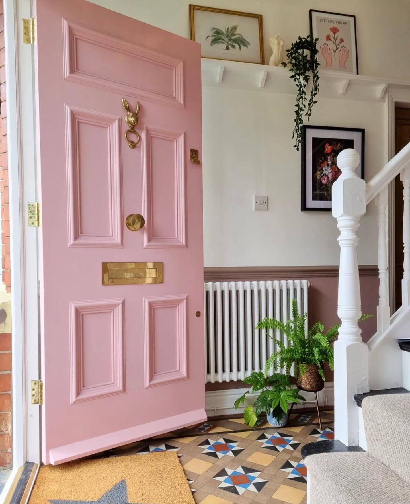
A blush front door can feel grown‑up when the color is softened with brown and gray undertones—more vintage rose than bubblegum. On a paneled, traditional door with ornamental hardware, that subtle pink becomes a love letter to historic style. Warm brass (think unlacquered or satin) pairs beautifully, casting a gentle glow that complements encaustic or geometric floor tiles and creamy trim. This palette suits brick, stone, and painted masonry because blush behaves like a warm neutral; it flatters greenery at the threshold and looks stunning with taupe or mushroom wainscoting inside. To nail the look outdoors, keep surrounding elements restrained—simple planters, classic lanterns, and white casing—so the color reads sophisticated. Sampling tip: pick two blushes, one earthier and one slightly cooler; evaluate next to existing brick or stucco to avoid a clash with orange or purple undertones. The payoff is a door that signals charm and hospitality before guests even ring the bell.
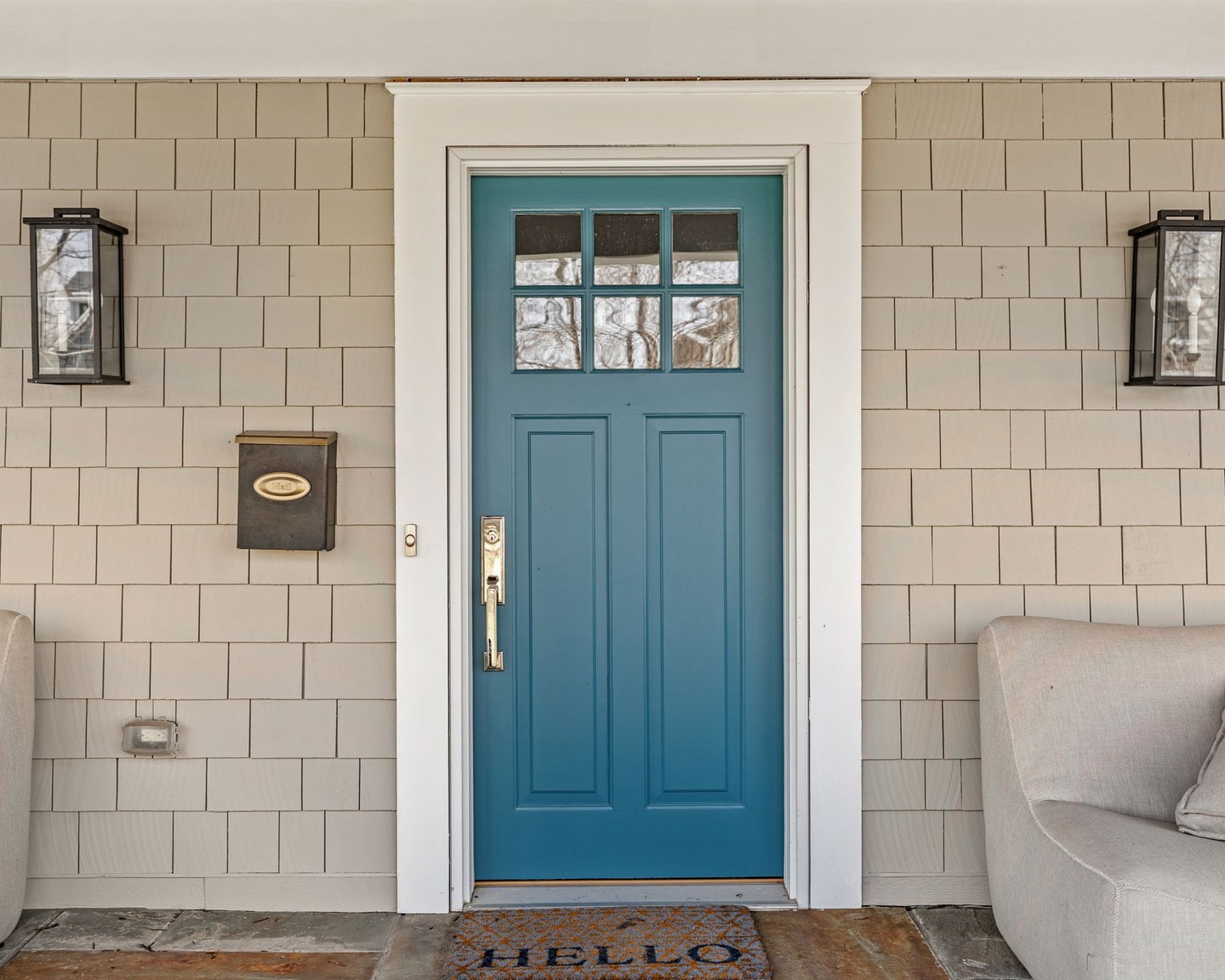
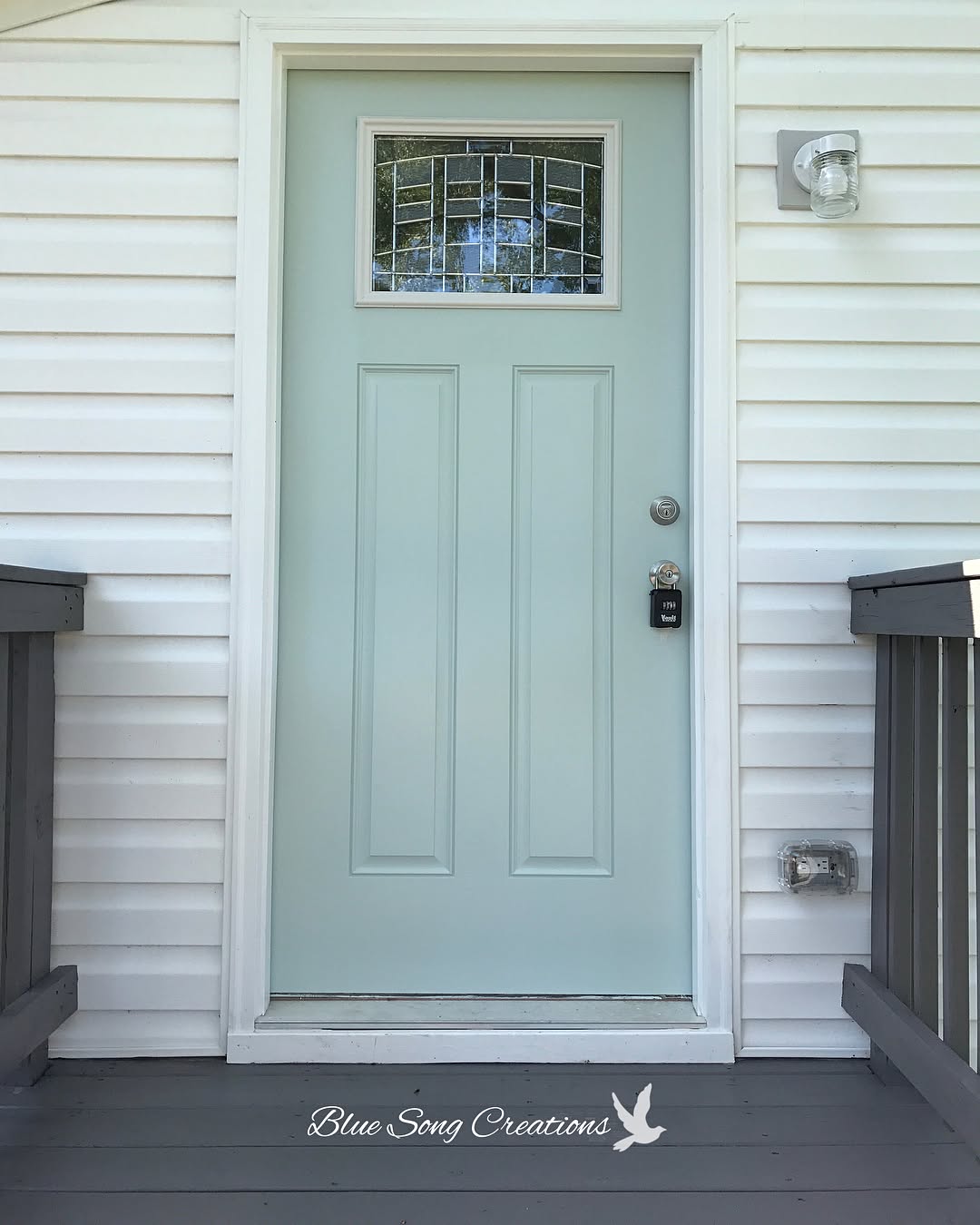
Seaglass Teal on Crisp White: A Calm Coastal Welcome
For homeowners who want color without intensity, seaglass teal is a sweet spot—balanced between blue and green with enough gray to feel refined. Against white siding and trim, the hue looks clean and intentional, instantly lifting curb appeal on traditional porches and Cape‑style facades. Here, strong architectural symmetry and a wood‑clad porch ceiling add warmth that keeps teal from feeling cold. Choose a semi‑gloss finish so panel lines pop under a covered entry and pair with matte black hardware for contrast. This palette is especially effective near water or wooded lots, where the surrounding blues and greens echo the door. To extend the scheme, use deep charcoal shutters, a natural coir mat, and planters in white or zinc. Sampling tip: avoid overly bright aquas; a gray‑cast teal stays sophisticated in full daylight. The result is a friendly, coastal‑leaning entry that reads fresh year‑round and photographs beautifully for listings.
Slate Blue Double Doors: Balanced, Classic, and Curb‑Appeal Rich
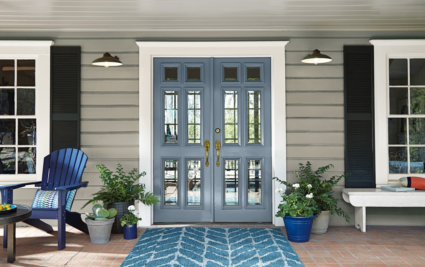
A slate blue front door is a perennial favorite, but doubling it on a symmetrical facade multiplies the impact. This gray‑blue bridges the gap between cool siding and black shutters, letting white casing act as a clean frame. Because slate carries a hint of warmth, it coordinates easily with brick pavers and brass hardware—two porch staples. Add layered blues via a rug and planters to create depth without visual noise; the monochrome approach feels intentional and soothing. For paint selection, look for a medium value slate (not too dark) with a distinctly gray undertone to avoid competition with navy accents. Semi‑gloss keeps the doors crisp and more durable in high‑touch zones. If your porch already has multiple focal points—window grids, sconces, Adirondack chairs—this measured blue ties them together. It’s an elegant way to introduce color on traditional homes while preserving that stately, invitation‑ready feel.
Moody Teal with Taupe Shingles: Elevated Craftsman Style
When your exterior leans warm—think taupe shingle siding and natural stone—a saturated teal front door adds just the right punch. This blue‑green carries enough depth to feel sophisticated, yet it’s vibrant enough to read from the street. Framed in bright white trim and flanked by boxy lanterns, the color sharpens the Craftsman profile and highlights the door’s upper lites. Choose a teal with a whisper of gray to keep it moody rather than tropical; a satin or semi‑gloss finish spotlights panel lines without glare. Brass or antiqued bronze hardware warms the composition and connects to earthy hardscapes. Styling is simple: a neutral doormat, evergreen planters, and clean house numbers let the hue take center stage. This palette is tailor‑made for north‑facing entries that need color presence in softer light. Expect instant curb‑appeal gains with a door that feels custom, architectural, and timeless.
Soft French Gray: A Quiet Modern‑Farmhouse Moment
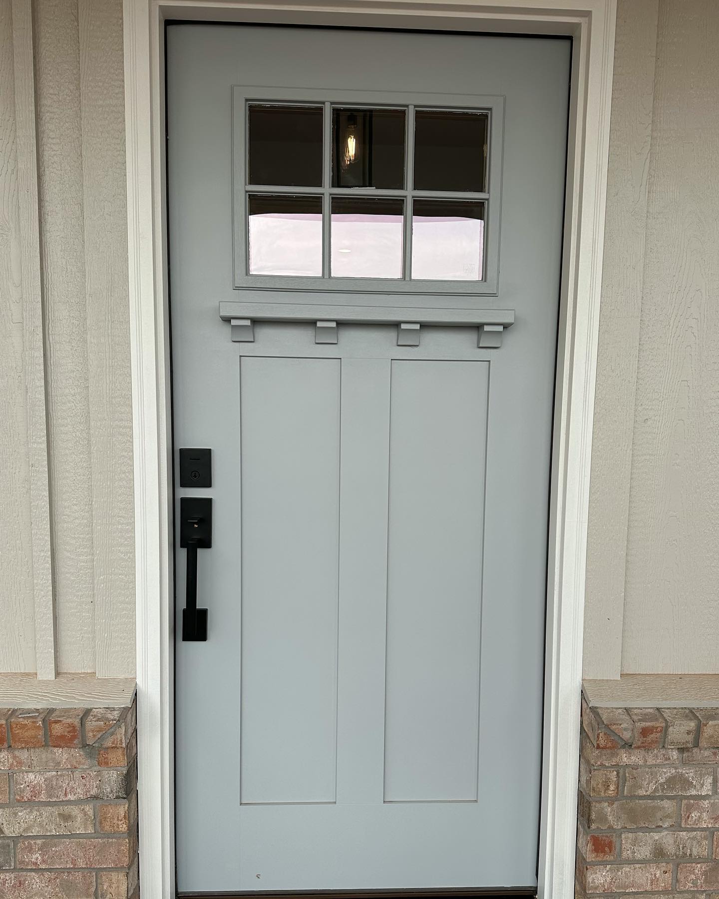
If you prefer serene curb appeal, a French gray door delivers calm sophistication—especially against greige board‑and‑batten siding and a brick water table. This cool‑leaning gray subtly contrasts warm cladding, proving that warm‑cool mixes can look intentional and layered. The door’s simple panels and divided‑lite window nod to Craftsman style, while matte black hardware adds a modern edge and ties into exterior lighting. Choose a gray with a trace of blue to keep it airy but not icy; in overcast light it remains elegant rather than dull. Finish in semi‑gloss for durability and easy wipe‑downs. To round out the palette, use off‑white trim, black planters, and natural textures like cedar or jute at the threshold. This understated color is a smart pick for resale: it photographs well, complements stone and brick, and allows landscaping and architectural lines to shine. Quiet doesn’t mean boring—it’s curated calm.
Dusty Rose with Sage Accents: Romantic Yet Refined
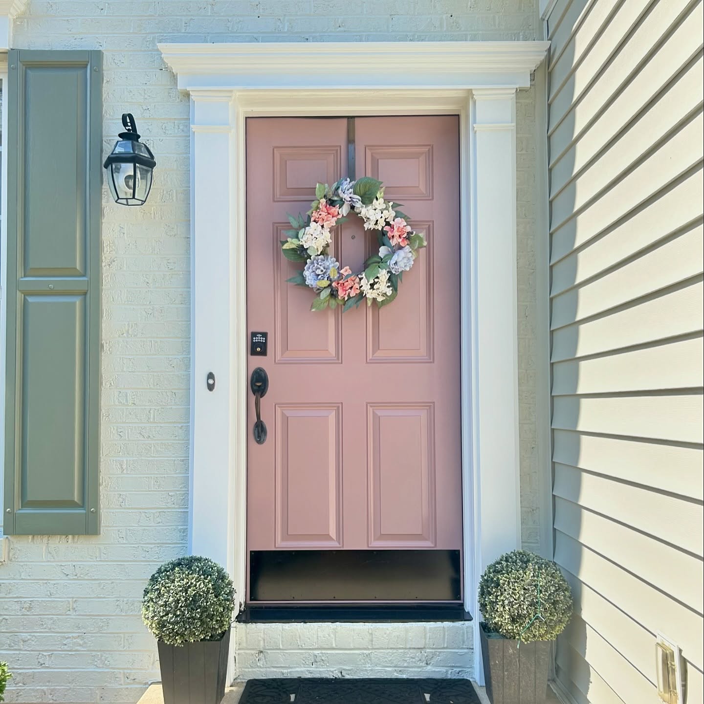
A muted mauve‑rose front door offers a sophisticated take on pink—especially when paired with crisp white casing and sage shutters. The color reads inviting and elegant rather than loud because it’s grounded by brown and gray undertones. Matte black hardware and a simple spring wreath prevent the palette from skewing too sweet, while symmetrical topiaries supply structure. This scheme flatters painted brick and light siding, and it’s a clever way to add personality to traditional elevations. To keep it cohesive, repeat the green from your shutters in planters or seasonal foliage. Sampling tip: test against your siding in full sun; dusty rose can look warmer outdoors, so choose one notch grayer than you think. The payoff is a front door color that feels current and romantic, bridging cool and warm neutrals across your exterior.
Fresh Mint on White Siding: Airy Cottage Curb Appeal
Pale mint is a mood‑lifting front door color that brings breezy cottage energy to compact entries. Against bright white vinyl siding and gray decking, the pastel reads crisp and clean while the leaded‑glass lite adds sparkle. Because mint is inherently cool, keep surrounding elements simple—chrome or polished nickel hardware, clear glass lanterns, and soft gray railings—so the palette stays airy. This shade is ideal for porches that don’t receive strong sun; its higher LRV bounces light and makes small stoops feel larger. To style, think white planters, lavender, and galvanized accents for a relaxed coastal nod. When sampling, choose a mint with a drop of gray to avoid baby‑pastel territory; semi‑gloss will help the color hold up to weather and frequent use. The result is a fresh, welcoming entry that suggests serenity from the street and pairs effortlessly with both cool and warm roof colors.
Get the Fail-Safe Paint Color Playbook (Free PDF)
36 proven colors • 8 ready palettes • trim & sheen guide • printable testing cards.
Tangerine Pop on Powder‑Blue Siding: A Friendly Modern Hello
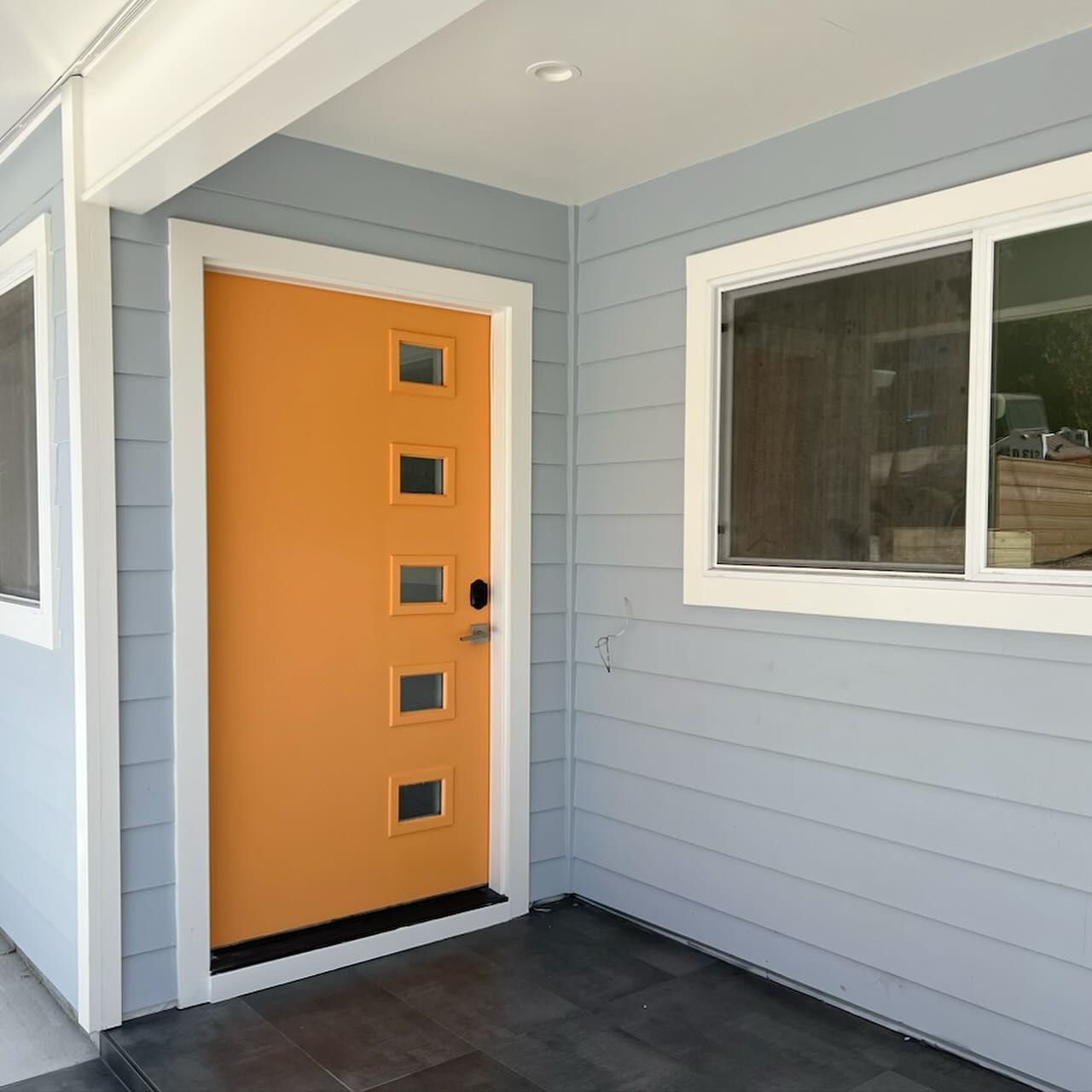
A bold orange door is curb appeal rocket fuel, especially when it meets cool, misty-blue siding. This tangerine hue reads sunny but sophisticated thanks to a touch of ochre that keeps it from veering neon. The squared lites and streamlined lever skew mid-century, so the color choice feels intentional—more design move than novelty. For similar results, sample oranges with warm undertones (think marigold or paprika) and set them against blue-gray clapboard or fiber cement; the complementary pairing heightens contrast without shouting.
Finish matters with saturated colors. A durable satin or semi-gloss exterior enamel will pop under shade and resist fingerprints near the handle. Brushed nickel or black hardware both suit the scheme; here, satin chrome keeps the entry crisp. If your porch is shaded, paint a sample board and check the color at different times of day—orange can deepen dramatically in low light. Round out the palette with slate porch tile, white trim, and a natural coir mat. The result is a modern, welcoming front door color that signals personality before anyone rings the bell.
Atomic Orange with Breeze Blocks: Mid‑Century Curb Appeal Amplified
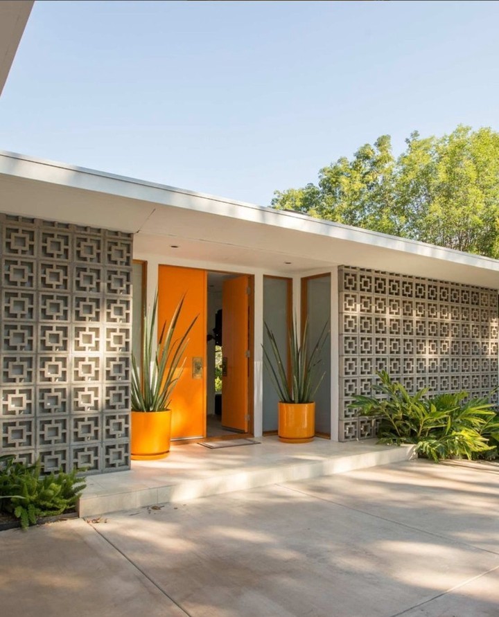
When your architecture leans mid-century, lean into it with citrus. This entry pairs electric orange double doors with classic breeze-block screens and a low, linear roofline—a timeless Palm Springs formula. The trick is rhythm: repeating the door color in glossy planters unifies the facade, while sculptural, upright plants echo the rectilinear pattern of the blocks. Gray concrete and the breeze block’s cool undertones keep the orange from feeling juvenile; it reads chic, not cheeky.
For a similar exterior palette, test oranges labeled “modern” or “retro” with a hint of red; they’ll stay saturated in full sun. Use semi-gloss for maximum wipeability and UV resistance, and balance the warmth with soft gray or putty on walls. If you have sidelights or clerestory windows, a slender black or stainless handle adds just enough edge. Finish with oversized house numbers and low, layered greenery to ground the front step. The payoff is an entry that photographs beautifully, boosts perceived value, and nails that breezy, optimistic mid-century mood.
Get the Fail-Safe Paint Color Playbook (Free PDF)
36 proven colors • 8 ready palettes • trim & sheen guide • printable testing cards.
Stormy Teal with Brass Hardware: A Polished, Period‑Friendly Blue‑Green
Smoky teal is the unsung hero of front door colors: deeply pigmented, endlessly adaptable, and elegant on traditional panel doors. Here, a moody blue‑green sits within crisp white trim, instantly sharpening the millwork and glazing details above. The color has gray in its base, which keeps it sophisticated and prevents the dreaded “nursery teal” effect. Warm brass hardware is the smart pairing—its golden tone lifts the blue, adds heritage character, and looks intentional with patterned porch tiles.
If your facade is brick, stone, or white siding, a stormy teal reads as a flattering accent that plays well with both warm and cool materials. Choose a satin or low‑sheen exterior enamel to emphasize the door’s raised panels without spotlighting imperfections. Sampling tip: place swatches beside your trim and flooring; patterned or encaustic tiles love this hue. Layer the look with a leafy plant inside the vestibule and a polished letter plate for an elevated, townhouse-worthy welcome that ages gracefully.
Espresso Double Doors on Cream Stucco: Warm Contrast, Lasting Sophistication
Dark, espresso-brown doors bring refinement to light exteriors without the starkness of jet black. On this stone-and-stucco home, the chocolate tone echoes the roof and window frames, stitching the palette together while letting the creamy body color glow. Glass panes temper the depth, keeping the entry light-filled from morning to dusk, and the paired lanterns anchor the porch architecturally.
If you’re juggling multiple materials—stone, stucco, shingle—rich brown is a unifier. Opt for a stain or paint with subtle warmth (no red cast) in a satin sheen; it reads luxe and pairs seamlessly with oil-rubbed bronze or aged brass hardware. Consider repeating the color on garage carriage doors or shutters for continuity. Because deep browns can recede, ensure your porch lighting is ample and bulbs are warm white to enhance the door’s richness at night. The effect is classic, inviting, and resale-friendly: an exterior front door color that flatters traditional and transitional homes alike.
Mulberry on Victorian Brick: A Jewel‑Tone Statement That Honors the Past
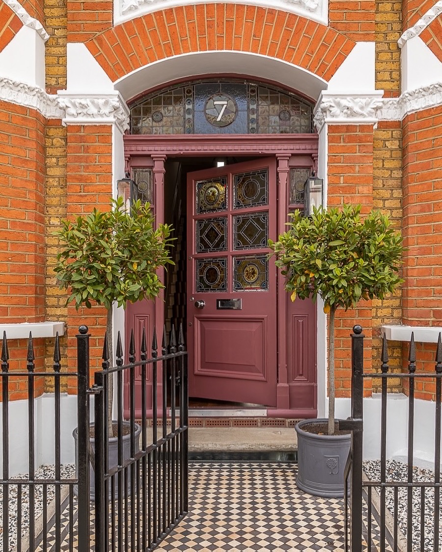
Victorian entries love drama, and a mulberry door delivers it with grace. Against warm red brick and crisp white detailing, this berry hue harmonizes rather than competes—its muted, muddy base bridges orange brick and cool grout. Period glazing and paneling sing in this shade, which feels original to the architecture yet refreshingly current. Black ironwork and checkered tile underline the heritage vibe while letting the door remain the star.
To get the look, choose a mauve-plum or raisin color with a dash of brown; overly purple reads too sweet. Gloss or high-satin finishes flatter ornate millwork and make seasonal wreaths pop. Nickel or antique brass furniture both work—nickel leans smart and urban, brass leans romantic. Keep surrounding planters simple (evergreen topiaries are perfect) so pattern and color don’t compete. The result is a richly layered front door color idea that respects period character and supercharges curb appeal in one stroke.
Inky Navy‑Black with Glass Sidelights: High‑Contrast, Light‑Filled Entry
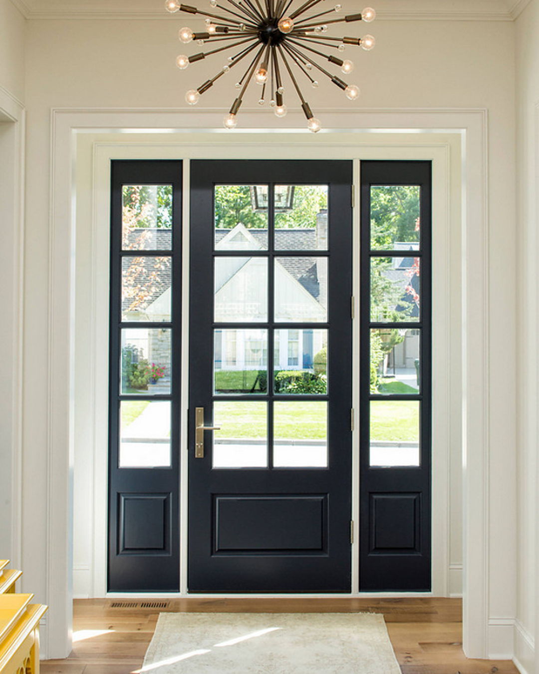
If you crave the crispness of black but want a touch more softness, go inky navy. This near‑black blue reads tailored and dramatic against white walls and trim, while divided‑lite glass keeps the foyer bright. It’s an ideal transitional move—traditional paneling feels modernized, and contemporary fixtures (hello, sputnik chandelier) look at home. From the street, the door still reads dark and substantial; up close, the blue undertone adds dimension.
Get the Fail-Safe Paint Color Playbook (Free PDF)
36 proven colors • 8 ready palettes • trim & sheen guide • printable testing cards.
Paint both sides of the door in the same hue for a seamless threshold and pair with warm brass or champagne bronze hardware to balance the coolness. Because navy-blacks can shift with daylight, sample two shades—one with a green cast and one with a violet cast—and check them at noon and dusk. Keep sidelights and transom grilles painted to match for a cohesive frame. This front door color works with stone, white siding, or soft gray exteriors and remains timeless year after year.
Matte Black on White Stucco: Crisp, Modern, and Instantly Elevated
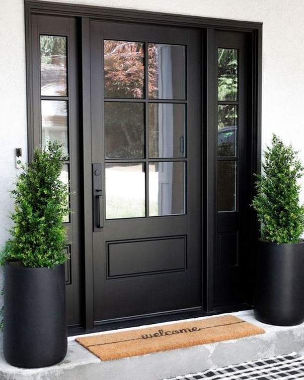
There’s a reason black doors dominate inspiration boards: they deliver instant architecture. On a white stucco facade, a matte or satin black door with matching sidelights creates sharp negative space that photographs beautifully and hides everyday scuffs. The minimal grille pattern and streamlined hardware nod to modern farmhouse and transitional styles, while tall evergreens in black planters echo the verticals for an intentional, entry-as-vignette moment.
To avoid a flat, chalky look, choose a true neutral black (no blue or brown lean) in a durable exterior formula. Repeat black in light fixtures, house numbers, or planter rims for balance, and warm up the palette with a natural coir mat and wood-toned porch accents. Because high-contrast schemes magnify proportions, ensure the door trim is crisp and the sidelights are evenly painted. The payoff is a front door color choice that is low-maintenance, design-forward, and universally flattering across brick, stucco, and lap siding homes.
Black Door on Forest Green Siding: Layered Neutrals for Cozy Curb Appeal
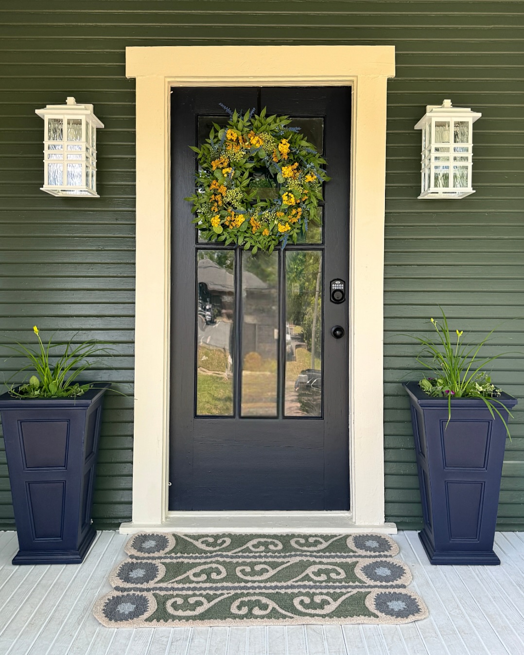
Deep-on-deep palettes feel sophisticated and cocooning. Here, a black door anchors forest-green clapboard while warm cream trim outlines the opening like a picture frame. The effect is cozy yet composed—perfect for bungalows and Craftsman-era homes. A yellow-green wreath adds a cheerful hit that harmonizes with the siding’s undertone, and navy planters provide a subtle, related accent without competing.
When working with dark siding, black can either disappear or look custom depending on contrast. The key is lighter trim; creamy off‑white keeps the entry legible and classic. Choose a satin sheen so black looks rich, not plastic, and keep hardware black for a seamless line or antique brass for a little heritage glow. Incorporate porch lanterns with textured glass to bounce light at night, and ground the look with a patterned runner in olive or taupe. This layered approach creates a timeless, nature-inspired front door color story that feels grounded in every season.
Jet Black with Red Brick: Heritage Drama with Seasonal Versatility
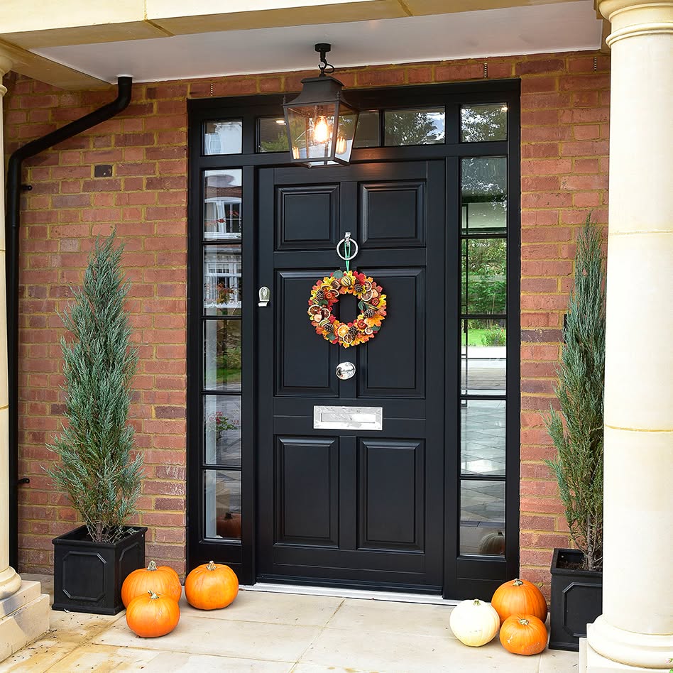
Against red brick, a jet-black door is the definition of stately. Panel detailing and flanking sidelights add formality, while a classic lantern and tall evergreens frame the entrance. Black works here because it cools the red brick just enough, letting mortar and trim shine. Polished chrome or nickel hardware reads crisp and updated; brass leans traditional and warm—either direction looks intentional with black.
Consider a satin or low-gloss finish to spotlight the panels without showing every speck of dust. Paint sidelights and transom to match for a unified surround, and keep planters symmetrical to echo the door’s geometry. Seasonal styling—from pumpkins in autumn to an evergreen wreath in winter—pops brilliantly on black, making this a flexible, year‑round front door color choice. If your brick skews orange, test blacks with a neutral base; blue-blacks can feel inky in shadow. The result is enduring curb appeal with effortless holiday readiness.
Pale Sage Double Doors with Fanlight: A Breezy, Historic Welcome
Soft sage green brings quiet luxury to ornate millwork and white clapboard. These double doors, capped by a classic fanlight, prove that pastels can be grown-up: the color has plenty of gray, which mutes the green and complements warm brass accents and traditional hardware. In bright sun, pale sage brightens the porch; in shade, it settles into an elegant neutral that flatters white trim and aged bronze lanterns alike.
For similar charm, sample greens labeled “celadon,” “pistachio,” or “historic sage” and view them against your trim at midday. A satin sheen keeps the look velvety and durable. Echo the softness with a woven mat, potted palm, or limestone urns, and consider painting interior-facing panels the same hue for a seamless threshold. This is a front door color that reads coastal, Southern, or cottage depending on styling—translation: HOA-friendly and resale-smart while still distinctive. It’s the gentlest way to freshen a traditional facade without sacrificing gravitas.
Get the Fail-Safe Paint Color Playbook (Free PDF)
36 proven colors • 8 ready palettes • trim & sheen guide • printable testing cards.
How to Choose Exterior Front Door Colors: Lighting, Materials, and Regional Climate
Selecting Exterior Front Door Colors starts with reading your architecture and neighborhood context. Audit the existing palette: siding body, trim, shutters, roof granules, masonry, and pavers all carry undertones that can clash or harmonize. Note cardinal orientation and surrounding reflectance; white porch ceilings and concrete can bounce brightness, skewing how dark or vivid a color appears. Decide the mood—welcoming, serene, or bold—and narrow to two families, such as inky darks, earthy greens, or sunlit corals. Shortlist three to five candidate paints from different brands, comparing LRV values to ensure visibility, depth, and contrast against the facade. Confirm HOA guidelines and historic district rules before purchasing gallons to avoid costly repaints and delays.
- Paint a 24-by-36-inch sample board in two coats, move it around the porch, and compare beside trim, masonry, and hardware across sunny and overcast hours.
- For north-facing doors, warm up with reds, terracotta, or olive; for south-facing, balance glare with navy, charcoal, or forest green to retain richness.
- Map undertones: orange brick likes blue-based greens; pink-tan stone prefers grayed blues; red roofs welcome charcoal or sage that won’t compete with saturated clay tiles.
- Match hardware thoughtfully: brass warms black and navy, nickel cools reds and whites, and oil-rubbed bronze grounds greens and taupes while coordinating mailboxes, knockers, and house numbers.
- Choose finish for function: satin hides fingerprints, semi-gloss sheds rain and dust, and gloss delivers drama on smooth doors but magnifies flaws on textured or weathered panels.
In humid or coastal regions, prioritize marine-grade paints and meticulous edge sealing to block salt spray and moisture intrusion. In high-altitude sun, pick lower-LRV darks formulated with strong UV resistance to prevent chalking and premature fade. Glass inserts, sidelights, and transoms introduce reflections; favor slightly darker hues to avoid washed-out edges and preserve silhouette. For layered palettes, echo the door color in a planter glaze or striped doormat, linking porch decor without overwhelming the facade. When experimenting, keep trim crisp white or soft off-white to frame the statement and ensure legible house numbers. Reassess seasonally; foliage shifts, sun angles change, and minor tweaks in sheen or hardware can refresh the entry without repainting fully.
Front Door Color Playbook: Quick Expert Answers
Which Exterior Front Door Colors tend to add the most resale value?
Buyer surveys consistently favor deep neutrals such as black, charcoal, and navy for a polished, high-contrast look. These colors photograph well in listings and feel timeless across styles and regions.
Get the Fail-Safe Paint Color Playbook (Free PDF)
36 proven colors • 8 ready palettes • trim & sheen guide • printable testing cards.
Should my exterior front door match the trim or shutters exactly?
It doesn’t need to match; it should coordinate. Aim for deliberate contrast so the door reads clearly from the street, typically a 50–70% contrast in value against the body or trim.
What paint type and finish are best for a high-traffic entry door?
Use premium exterior acrylic latex enamel for flexibility and fast drying; oil-based works for metal but can yellow. Choose satin or semi-gloss for durability, easy cleaning, and weather resistance.
Can bold colors work on a small porch or townhouse facade?
Yes—control brightness with lower LRV and richer saturation to avoid visual noise. Deep teal, emerald, or aubergine create presence without overwhelming, especially when framed by crisp, consistent trim.
Final Verdict: Choose a Front Door Color that Honors Your Home—and Turns Heads
A standout entry begins with a shade that complements what’s already working: your architecture, siding or brick, roof tone, and the surrounding landscape. Whether you lean classic with slate, espresso, and inky near-black; coastal with seaglass, mint, and stormy teal; or expressive with mulberry, citrus, and tangerine, the winning choice balances contrast, undertone harmony, and style cues from your facade. Bold hues enliven modern and mid‑century lines, soft sages and blushes flatter cottages and heritage details, and time-tested neutrals steady stone, stucco, and mixed-material exteriors. The right color doesn’t shout—it spotlights your entry, ties the palette together, and elevates curb appeal at a glance.
Make the decision with confidence by testing big swatches on the door and trim, viewing them morning to evening and under your porch lighting. Match finishes to the mood: satin or semigloss exterior paint for durability and wipeability; brass, matte black, or antique bronze hardware to reinforce the palette; and simple upgrades like a coir mat, planters, and house numbers for a cohesive look. Prep and prime well, respect HOA guidelines, and aim for purposeful contrast against trim so the door reads cleanly from the street. Choose a front door color that feels like you—welcoming, polished, and season-proof—and your exterior will look curated, intentional, and ready to impress.