
How to Paint Water in Watercolours
Water is perhaps the most captivating and elusive subject in art, requiring a unique combination of technical skill, deep observation, and patience to depict convincingly. When attempting to paint water in watercolors, the challenge is not just capturing a blue hue, but replicating its ever-changing nature, its subtle translucency, and its complex reflective properties. Whether the goal is a serene, still lake reflecting the sky, a dramatic cascading waterfall, or the powerful, foamy crash of ocean waves, mastering the art of water is a continuous journey of refinement.
This comprehensive guide is designed to walk you through the intricate science and art of painting water in watercolors. We will move beyond basic washes to explore advanced techniques—from understanding light interaction and atmospheric perspective to mastering the delicate balance between transparency and reflection. By following these detailed steps, you will gain the technical knowledge and artistic insight needed to breathe life into your artwork.
Get the Fail-Safe Paint Color Playbook (Free PDF)
36 proven colors • 8 ready palettes • trim & sheen guide • printable testing cards.
Quick answer: To Paint Water in Watercolours, start with the safest first step for the material involved, test a small area when needed, and follow the process in thin, controlled stages. Use proper ventilation and protective gear when chemicals, sanding, spraying, or solvents are involved.
Preparing for this project requires more than just good paint; it demands careful planning and an understanding of the physical properties of water itself. We will cover everything from selecting the correct paper weight to troubleshooting common issues like paint bleeding, ensuring that you feel prepared and confident before the first brushstroke touches the paper.
Planning Your Water Scene: Observation and Composition
Before you even think about mixing paint, the most critical step in painting water is preparation—specifically, preparation of the mind and the composition. Water is inherently dynamic, so a successful painting starts with meticulous observation. Treat your subject not as a single blue area, but as a complex interplay of light, shadow, and surface tension.
Assessing the Scene and Light Source
The single most important decision you must make is identifying the light source. Is the sun high and direct (creating harsh, bright highlights)? Is it diffused and overcast (resulting in soft, uniform tones)? Knowing this determines the entire tonal range of your painting. If the light source is warm (like sunset), your colors should lean toward yellows, oranges, and reds. If it’s cool (like a cloudy day), focus on blues, violets, and cool grays. The light source dictates the contrast, the temperature, and the perceived movement of the water.
Sketching the Structure and Focal Points
Treat your composition like an architectural plan. Lightly sketch the boundaries of the water, but also sketch the elements *around* the water—the shoreline, the distant mountains, the objects reflecting in it. Identify the main focal point (the element you want the viewer to look at first), whether it’s a specific wave, a lone boat, or a patch of reeds. This focal point must be balanced by the surrounding elements to create a harmonious composition. Use the rule of thirds to position these key elements for maximum visual impact.
Materials and Tools for Mastery
The quality of your materials directly impacts the final outcome. Because watercolor is such a sensitive medium, investing in professional-grade supplies is essential for achieving the desired luminosity and wash quality. Do not skimp on these tools.
Watercolor Paints: Understanding Pigment and Tone
When selecting paints, look for high pigment concentration and good lightfastness. You will need a varied palette, including:
- Blues and Cyans: For the water base and sky reflections.
- Greens and Earth Tones: For depth, vegetation, and shadows.
- Yellows and Ochres: For sunlight, warmth, and reflections.
- Cool Grays and Violets: Crucial for shadows and deep, atmospheric tones.
Remember that the water itself is often not pure blue; it contains the colors of the elements above it—the sky, the surrounding landscape, and the sediment.
Brushes and Paper: The Foundation of Control
The right brushes are your primary tools for control and blending. You will need:
- Large Wash Brushes (e.g., mop brushes): Ideal for applying the initial, broad base layers and graded washes across large areas.
- Round Brushes (Various Sizes): Essential for details, defining ripples, and controlling pigment flow.
- Flat Brushes: Useful for sharp edges, creating the illusion of foam, or applying defined washes.
- Watercolor Paper: This is non-negotiable. Choose heavyweight (300 GSM or more) paper that is specifically designed for watercolor. Cold press texture is often best, as it allows for some tooth (texture) to catch detail without being too rough.
Auxiliary Tools
Beyond the basics, these tools provide specialized control:
- Masking Fluid: Absolutely vital for protecting highlights, foam crests, or specific areas of reflection that you do not want paint to touch.
- Palette: A clean, non-porous surface for mixing large quantities of paint.
- Spray Bottle: Used to uniformly dampen the paper for wet-on-wet techniques.
Step-by-Step Techniques for Depicting Water
Painting water is not a single technique; it is a sequence of complementary methods. Follow these steps to build depth, movement, and realism.
1. Establishing the Base Wash and Value (Wet-on-Wet)
Begin by wetting the entire water area with clean water, ensuring an even dampness. This is the ‘wet’ canvas. Next, apply a very diluted, translucent wash of the general ambient color (e.g., a pale mix of blue and gray). Because the paper is wet, the colors will spread and mingle organically, establishing a soft, atmospheric base layer. This base wash should be light, suggesting depth without committing to details.
2. Creating Depth with Graded Washes and Glazing
To create the illusion of depth, you must build value. Use graded washes, transitioning smoothly from darker, cooler tones at the bottom (suggesting deeper, cooler water) to lighter, warmer tones near the surface (where light hits). After the base wash dries completely, use the glazing technique: apply thin, transparent layers of color over the dried base. These glazes are key to richness, allowing the underlying colors to show through while adding subtle shifts in tone and mood. Never apply a dark color directly onto a dry, light wash, as it will look flat.
3. Capturing Reflections (The Mirror Effect)
Reflections are perhaps the most technically challenging aspect. They are rarely perfect mirrors. They are often slightly darker, slightly blurred, and distorted by movement. To paint reflections:
- Observe Distortion: Look at how the object’s reflection is stretched or broken by ripples.
- Paint the Source: Start by painting the object (e.g., a mountain or tree) that is above the water line.
- Apply the Reflection: Using cooler, slightly more muted tones, replicate the shape below the water. The reflection should always be less defined and darker than the actual object.
- Dissolve the Edge: Use a clean, damp brush to gently feather the transition line between the reflected object and the water itself, making the boundary soft and natural.
4. Painting Movement: Ripples and Waves
Moving water requires controlled energy. For ripples and waves, do not paint them as solid lines. Instead, focus on the *effect* of the movement:
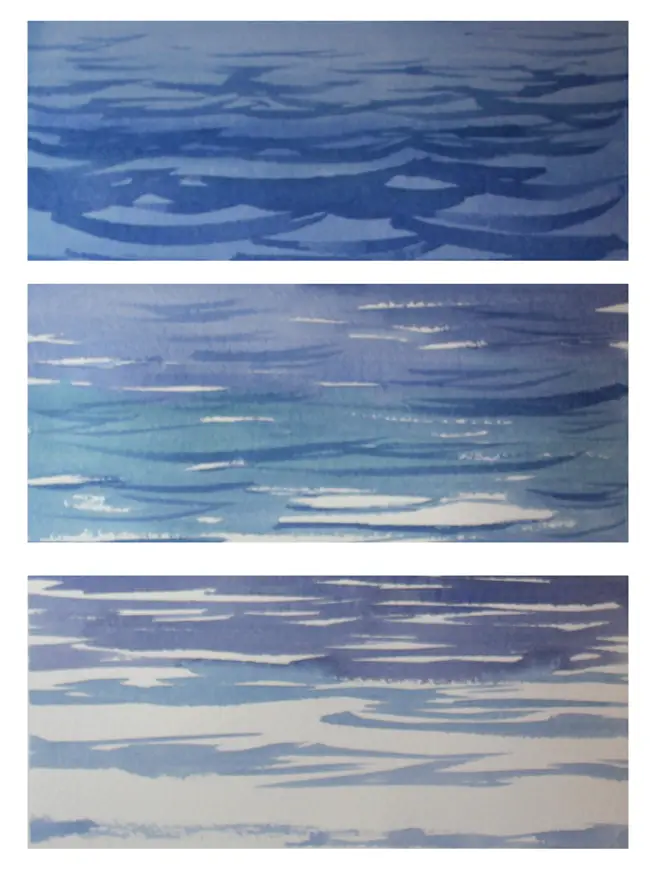
- Ripples: Use the round brush and quick, overlapping strokes of slightly darker, cooler tones to suggest the peaks and troughs. The area between the ripples should be lighter, suggesting the undisturbed water surface.
- Waves: For larger waves, use a mix of wet-on-wet and dry brush techniques. The crest of the wave should be highlighted with the lightest, most vibrant color, while the underside should be the deepest, darkest shadow.
- Foam and Crests: Use masking fluid on the peaks of the waves before they dry. Once the paint is dry, remove the fluid to reveal bright, opaque white highlights, mimicking the froth of breaking water.
5. Adding Texture and Final Details
The final layer of detail adds the sense of life. Use dry brush techniques with minimal paint and quick, controlled strokes to suggest texture—this is perfect for foam, wet rocks, or the rough surface of a distant shoreline. Where the water meets the land, use varied, small strokes to imply wetness and saturation, contrasting the smooth wash of the open water.
Design and Color Tips for Water Scenes
The color palette and how light interacts with it are what separate a simple wash from a masterful piece. Understanding undertones, sheen, and lighting conditions is paramount.
Water is rarely just “blue.” Its true color is dictated by its environment. Deep, deep water often has a cool, greenish-blue undertone (due to suspended sediment). Shallow, sunlit water often carries a warmer, turquoise or emerald undertone. Always consider the undertone of the sky and the surrounding foliage; the water will absorb and reflect those colors. If the sky is hazy and yellow, the water’s reflection will carry that warmth.
The Role of Sheen and Finish
In the context of paint, “sheen” translates to the perceived surface quality. Still water has a glassy, high sheen, requiring very smooth, blended washes. Moving water has a matte, energetic finish, requiring visible brushstrokes and high contrast. When painting, use the highest contrast (lightest highlight next to darkest shadow) to maximize the illusion of wetness and depth.
Utilizing Atmospheric Perspective
When painting distant water, remember that the atmosphere affects visibility. Objects far away appear lighter, cooler, and less detailed. Use paler, more diluted washes and softer edges for distant shorelines or distant reflections to mimic this atmospheric perspective, making the scene feel vast and deep.
Common Mistakes to Avoid
Even experienced artists can fall into common traps when painting water. Recognizing these errors allows for correction and improvement.
Mistake 1: Over-Saturating the Washes
The most common error is applying paint too thickly or using too much water initially. This leads to muddy, dull washes that lack contrast and depth. Correction: Always build up color in thin, translucent layers (glazes). If a wash is too dark or opaque, let it dry and try to correct it by adding a very thin, diluted wash of the surrounding color.
Mistake 2: Treating the Water as a Single Color
Thinking that the water should be uniformly blue, green, or gray. This is the fastest way to create a flat, lifeless piece. Correction: Divide the water into zones: the foreground (most detail, highest contrast), the middle ground (transition, moderate detail), and the background (softest focus, lowest contrast). Each zone must have a slightly different color temperature and value.
Mistake 3: Ignoring the Light Source
Painting water without establishing a consistent light source means the shadows and highlights will feel arbitrary. Correction: Before starting, decide where the sun is and what time of day it is. Every shadow and highlight must be consistent with that source. If the light comes from the upper right, all highlights must fall on the upper right side of the ripples, and all shadows must fall to the lower left.
Safety and Practical Notes
While painting is an artistic endeavor, it still involves chemicals, materials, and tools, so adopting safe practices is essential. Although the risks are minimal compared to structural work, proper care ensures a positive experience.
Ensure your workspace is well-ventilated, especially when using fixatives, solvents, or certain binding agents for other decorative elements. Keep the area clean and organized to prevent slips and falls. Always work on a stable surface to prevent the paper from tipping or running.
Handling Materials
Always test new paints or mediums on a scrap piece of paper first. This prevents accidental staining of your work and allows you to gauge the color’s true tone and behavior. When using specialized tools like masking fluid, always follow the manufacturer’s instructions for application and removal.
When to Call a Professional
While painting water is a purely artistic pursuit, if you were applying these techniques to a physical wall, structure, or surface (e.g., painting a mural of water), always call a licensed professional. For any structural concerns, lead paint remediation, or large-scale mural application, consult a professional painter or restoration artist to ensure safety and structural integrity. For artistic work, simply follow these guidelines and trust your practiced hand.
Frequently Asked Questions
What type of paper is best for painting water?
Always use heavyweight watercolor paper, ideally 300 GSM or higher. Look for “cold press” texture, as this provides enough tooth to allow pigments to settle and hold detail (like ripples) without being too rough. Using thinner paper will cause the paper to buckle or warp when saturated with water, making detailed washes impossible.
Get the Fail-Safe Paint Color Playbook (Free PDF)
36 proven colors • 8 ready palettes • trim & sheen guide • printable testing cards.
How can I make the water look deep and voluminous?
Depth is achieved through value contrast, not just color. Use graded washes, ensuring that the colors become progressively darker and cooler (blues, violets, deep greens) toward the bottom of the composition. Remember the glazing technique: build depth by applying many thin, transparent layers of color over the dried base, allowing underlying tones to enrich the overall depth.
My colors are mixing into mud. What should I do?
Muddy washes occur when you mix too many unrelated colors or apply paint too thickly. To correct this, let the muddy area dry completely. Instead of trying to paint over it, you can gently apply a very thin, highly diluted wash of a neutral color (like a pale gray or pale blue) over the top. This translucent layer will unify the tones and lift the opacity without covering up the underlying structure.
When should I seek professional advice?
For the artistic act of painting, no professional help is required—practice and observation are your best teachers. However, if you plan to apply these advanced painting techniques to a large physical surface, such as a structural mural or a large-scale decorative piece, always consult a professional muralist or art restorer. They can advise on the structural integrity of the surface and the appropriate, durable paints and mediums to use.
Conclusion
Painting water in watercolors is an exercise in controlled chaos. It demands that the artist be as much an observer of physics and light as they are an artist of color. By approaching your subject with meticulous planning, understanding the interplay of reflections and transparency, and building your piece through careful layering and contrasting highlights, you can achieve a level of realism that captures the very essence of flowing water.
Do not view this as a rigid set of rules, but as a framework for exploration. Embrace the unexpected drips, the accidental blends, and the challenges—these are often where the most unique and beautiful discoveries in your art will be found. Practice, observe, and let the fluid nature of water inspire your most creative work.