
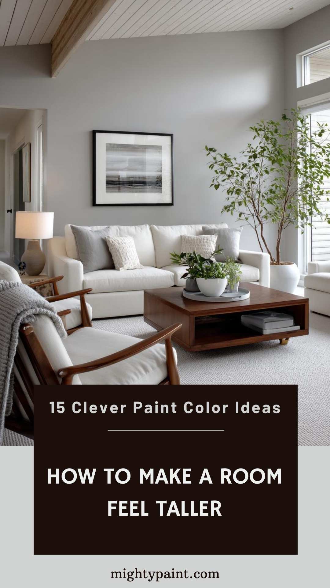
15 Paint Colors that Make Low‑Ceiling Rooms Feel Taller
Low ceilings can make a room feel closed-in, dated, or even claustrophobic—but with the right paint colors, you can completely change that perception. Design experts agree that strategic use of color can visually stretch a space, making low ceilings appear significantly taller and more expansive than they really are.
While architectural renovations can be costly and time-consuming, a can of paint is a quick, affordable, and powerful tool for creating height illusion. Certain shades and finishes work wonders in brightening a room, blending transitions, and drawing the eye upward—all crucial elements in maximizing vertical space.
Get the Fail-Safe Paint Color Playbook (Free PDF)
36 proven colors • 8 ready palettes • trim & sheen guide • printable testing cards.
In this guide, we’ll reveal 15 expert-recommended paint colors that not only beautify your home but also trick the eye into perceiving more height. Whether you’re aiming for modern minimalism or soft, cozy vibes, these shades offer both style and spatial enhancement. Keep reading to find the perfect color—and technique—to give your low-ceiling rooms a lifted, airier feel.
the Impact of Paint on Perceived Height
The Psychology of Color and Space
Colors influence how we perceive the dimensions of a room. Light, airy hues often make a space feel open and expansive, while darker tones can make walls appear closer. For low ceilings, opting for colors that recede visually helps push the ceiling “upward” in the mind’s eye. Cool shades like pale blues, soft greens, and gentle greys often have this effect, invoking a sense of openness and calm.
Light Reflection and Its Role
Light reflection is a key factor in making ceilings appear taller. Paints with higher light reflective value (LRV) bounce natural and artificial light around the room, making the space feel brighter and more voluminous. Whites and off-whites generally have high LRV, which can dramatically increase the perceived ceiling height, especially in rooms with limited natural light.
Monochromatic Magic
Monochromatic color schemes—using various tones of the same color—help eliminate visual boundaries. When walls, ceilings, and even trim share similar hues, the lines between them blur. This seamless transition creates the illusion of continuity, making the ceiling feel like an organic extension of the walls rather than a visual cap. It’s a subtle but powerful way to trick the eye and elevate the sense of space.
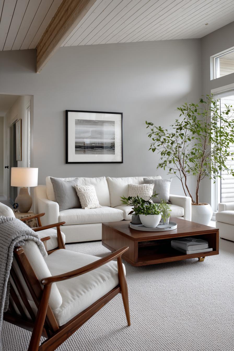
Top 15 Paint Colors to Elevate Low Ceilings
Choosing the right paint shade can instantly transform how tall your ceiling feels. Here’s a curated list of 15 paint colors that designers often recommend for creating height illusion in low-ceiling rooms:
1. Benjamin Moore Simply White (OC-117)
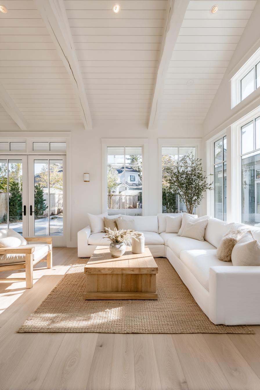
Simply White is one of Benjamin Moore’s most beloved and versatile whites, and for good reason. This shade offers a pure yet warm white that feels fresh without being cold or clinical. With a high Light Reflectance Value (LRV) of 91.7, Simply White is particularly effective in bouncing natural and artificial light around a room, making it a powerful choice for enhancing the feeling of space in low-ceilinged rooms.
What makes Simply White stand out is its subtle warmth, which prevents it from feeling sterile. It’s perfect for a variety of interior styles—from minimalist to farmhouse to modern—because it complements both cool and warm color palettes. Using it on both walls and ceilings can create a seamless transition that visually expands the vertical dimension. Pair it with light-colored floors and minimal crown molding (or none at all) to maintain an uninterrupted flow that draws the eye upward, creating the illusion of taller ceilings.
2. Sherwin-Williams Alabaster (SW 7008)
Sherwin-Williams’ Alabaster is a warm, creamy white that exudes a soft, tranquil charm. Its balanced blend of warmth and brightness makes it a go-to choice for designers aiming to create spaces that feel open, inviting, and subtly elegant. With an LRV of 82, Alabaster reflects ample light without becoming overpoweringly bright, making it ideal for rooms with low ceilings where maximizing natural light is crucial.
Alabaster’s understated warmth works beautifully with wood accents, soft textiles, and warm metallics, making it a flexible choice for various design themes from traditional to Scandinavian. It’s also an excellent option for color drenching—using the same color on walls, ceiling, and trim—to eliminate visual breaks that can make ceilings feel lower. When used in a monochromatic scheme, Alabaster helps blur the line between wall and ceiling, enhancing the vertical dimension and fostering a sense of architectural height and spaciousness.
3. Farrow & Ball Pointing (No. 2003)
Pointing by Farrow & Ball is a delicate white with a creamy undertone, named after the color of lime pointing used in traditional brickwork. It has a warmth that adds character and softness to a room without compromising its ability to reflect light effectively. This makes it an excellent candidate for spaces with lower ceilings, where creating the illusion of more headroom is often a design priority.
What sets Pointing apart is its historical, timeless feel. It pairs wonderfully with natural textures such as linen, stone, and wood, which can help enhance the vertical visual space by adding subtle depth and warmth. When used on both the walls and ceiling, it fosters a seamless flow that visually elongates a room’s vertical profile. Its soft, nuanced white tone avoids starkness and instead introduces a sense of calm sophistication. Whether you’re designing a cozy cottage bedroom or a classic-modern living space, Pointing elevates without overwhelming.
4. Behr Swiss Coffee (12)
Behr’s Swiss Coffee is a timeless and inviting off-white with creamy, beige undertones that lend a touch of coziness without making a space feel enclosed. With an LRV of approximately 84, it provides excellent light reflection, enhancing brightness and helping small or low-ceilinged rooms feel more expansive and airy.
What makes Swiss Coffee so versatile is its subtle warmth, which works beautifully in both contemporary and traditional interiors. It blends seamlessly with a wide range of palettes, from soft pastels to rich, earthy tones. Its slightly creamy character adds depth and prevents the starkness that sometimes accompanies pure whites, making it particularly suitable for family rooms, kitchens, and living spaces where comfort and openness are both desired.
Get the Fail-Safe Paint Color Playbook (Free PDF)
36 proven colors • 8 ready palettes • trim & sheen guide • printable testing cards.
When applied to ceilings in conjunction with similarly hued walls, Swiss Coffee creates a seamless, uninterrupted line that visually lifts the ceiling. It also complements natural elements like wood and stone, enhancing a room’s verticality through tonal harmony and soft contrast.
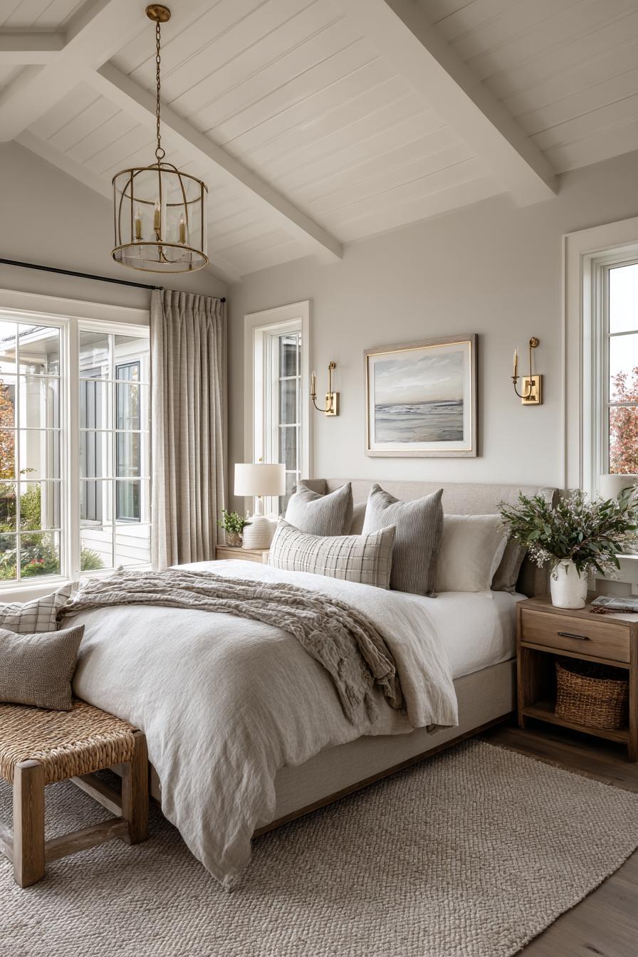
5. Benjamin Moore Pale Oak (OC-20)
Pale Oak is a refined and sophisticated light greige (a blend of gray and beige) from Benjamin Moore that strikes a perfect balance between cool and warm tones. With an LRV of 69.89, it reflects enough light to keep a space feeling open while introducing a gentle depth that adds elegance and nuance.
Ideal for creating a serene, upscale atmosphere, Pale Oak adapts effortlessly to various lighting conditions. In rooms with abundant natural light, it leans toward a soft beige, while in dimmer spaces, its gray undertones become more prominent. This color is perfect for those who want to avoid the starkness of white but still desire the brightness and expansiveness that lighter hues provide.
For low-ceiling rooms, Pale Oak offers a subtle sophistication that draws the eye upward without overwhelming. Using it in a monochromatic scheme with slightly lighter or glossier ceiling paint enhances the sense of height and cohesion, creating an environment that feels both open and grounded.
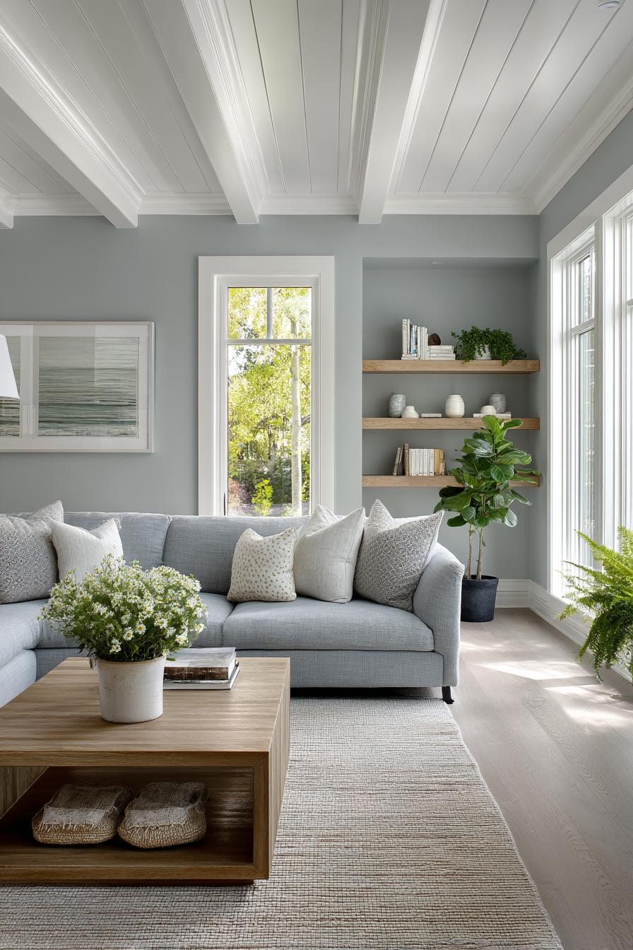
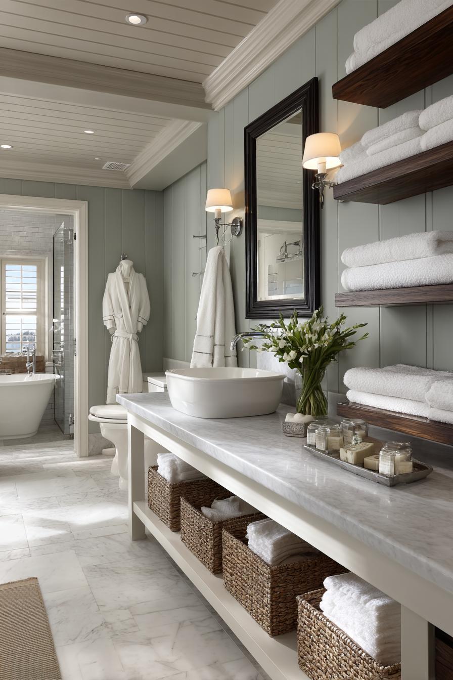
6. Sherwin-Williams Sea Salt (SW 6204)
Sea Salt by Sherwin-Williams is a serene blend of green and gray with a soft blue undertone, reminiscent of spa-like tranquility. With an LRV of 63, it’s light enough to open up a room while still adding a gentle wash of color that introduces freshness and calm.
Sea Salt’s subtle nature makes it a favorite for bedrooms, bathrooms, and other personal spaces where relaxation is key. It pairs beautifully with white trim, natural wood, or brushed metals, enhancing its soft coastal charm. While it isn’t as reflective as a white, its delicate tone still plays well with light, bouncing enough around to keep ceilings from feeling low or oppressive.
When used on walls with a slightly lighter ceiling in a complementary tone (like Sherwin-Williams Spare White), Sea Salt creates a smooth transition that elongates the room’s vertical lines. Its tranquil color profile gently encourages the eye to move upward, making it an excellent choice for visually elevating ceilings.
7. Farrow & Ball Skylight (No. 205)
Skylight by Farrow & Ball is a delicate and refined pale blue with a whisper of gray undertone. As the name suggests, this color is reminiscent of a clear, calm sky—a visual cue that naturally draws the eye upward. With its soft, cool tone, Skylight helps low-ceiling rooms feel more open and ethereal, making it a particularly popular choice for ceilings themselves or for full-room applications in bathrooms, bedrooms, and serene living spaces.
What makes Skylight exceptional is its chameleon-like quality under different lighting conditions. In natural daylight, it feels airy and open; under artificial lighting, it retains a soothing presence without feeling cold. When used on both the walls and ceiling, or paired with a slightly deeper trim color, Skylight can stretch the room vertically by blurring horizontal boundaries.
Skylight pairs effortlessly with whites, soft grays, or warm neutrals, and it beautifully complements natural textures like linen or pale wood. It’s an ideal choice for those looking to subtly lift their ceiling while adding personality and peaceful elegance.
8. Behr Silver Drop (790C-2)
Silver Drop is one of Behr’s most versatile and user-friendly light grays, offering a silvery softness that lends itself well to both modern and transitional interiors. With an LRV of around 69, Silver Drop reflects a respectable amount of light, which helps keep low-ceilinged rooms feeling bright and open.
Get the Fail-Safe Paint Color Playbook (Free PDF)
36 proven colors • 8 ready palettes • trim & sheen guide • printable testing cards.
This color sits right at the sweet spot between cool and warm, depending on surrounding elements and lighting. It reads as a soft dove gray in most cases, offering just enough contrast to bring interest without overwhelming a space. Silver Drop works particularly well in monochromatic schemes where walls, ceilings, and trim are kept in close tonal harmony—a technique that visually elongates the space.
Its neutral profile makes it a perfect backdrop for almost any decor palette, from minimalist Scandinavian designs to cozy farmhouse styles. For small rooms with limited vertical clearance, Silver Drop adds depth and dimension without drawing the eye downward, making the ceiling appear subtly higher.
9. Benjamin Moore Gray Owl (OC-52)
Gray Owl is a crisp, clean light gray with slight blue-green undertones that lend it a refreshing coolness. With an LRV of 65.77, it sits on the lighter end of the gray spectrum, reflecting enough light to brighten up spaces with lower ceilings while still introducing a gentle dose of color and sophistication.
Gray Owl is a designer favorite for good reason: its balanced tone works equally well in bright and dim rooms, adapting beautifully to natural and artificial light. In spaces with lower ceilings, Gray Owl helps prevent the room from feeling boxed in. When used across both walls and ceilings, or paired with white ceiling paint like Benjamin Moore’s Chantilly Lace, it creates an elegant vertical flow that enhances room height.
Its understated hue makes it ideal for contemporary, coastal, or minimalist interiors. It also pairs harmoniously with wood tones, white accents, and metallic finishes, making it a flexible choice for elevating both ceiling height and design appeal in any room.
10. Sherwin-Williams Repose Gray (SW 7015)
Repose Gray is a highly adaptable, neutral gray with a touch of warmth that keeps it from feeling stark or sterile. With an LRV of 58, it sits just below the brighter end of the spectrum but still performs well in rooms that need a sense of airiness and openness—especially when combined with effective lighting and light-colored decor.
What sets Repose Gray apart is its slight taupe undertone, which gives it a cozy and welcoming vibe without sacrificing the modernity that gray shades often bring. It can be used effectively in low-ceiling rooms because it adds visual interest while still receding into the background, helping create a taller perception of space. When applied with a lighter ceiling shade like Sherwin-Williams Alabaster or Pure White, Repose Gray adds subtle contrast that pushes the ceiling line higher visually.
Ideal for bedrooms, living rooms, and transitional spaces, Repose Gray complements a wide range of accent colors, from deep navies to warm woods. Its quiet sophistication makes it a staple for those looking to visually elevate without overwhelming.
11. Farrow & Ball Slipper Satin (No. 2004)
Slipper Satin is a classic, understated off-white from Farrow & Ball with a chalky softness that gives it an almost powdery appearance. With a warm beige undertone, this color is perfect for low-ceiling rooms where a crisp white might feel too harsh or clinical. Its muted tone makes a space feel calm, refined, and subtly brighter without being overbearing.
Get the Fail-Safe Paint Color Playbook (Free PDF)
36 proven colors • 8 ready palettes • trim & sheen guide • printable testing cards.
With its elegant neutrality, Slipper Satin is an ideal candidate for color drenching—using the same shade on walls, trim, and ceiling—which creates a smooth, uninterrupted vertical flow. This technique helps visually elongate the room, lifting the ceiling and opening up the space. The soft finish of Slipper Satin is also flattering in all types of light, from golden daylight to cooler artificial lighting.
Pair it with soft greys, pale woods, or antique metals for a timeless look. Slipper Satin is especially well-suited for vintage, minimalist, or cottagecore interiors where the goal is to balance comfort with an airy aesthetic.
12. Behr Cameo White (MQ3-32)
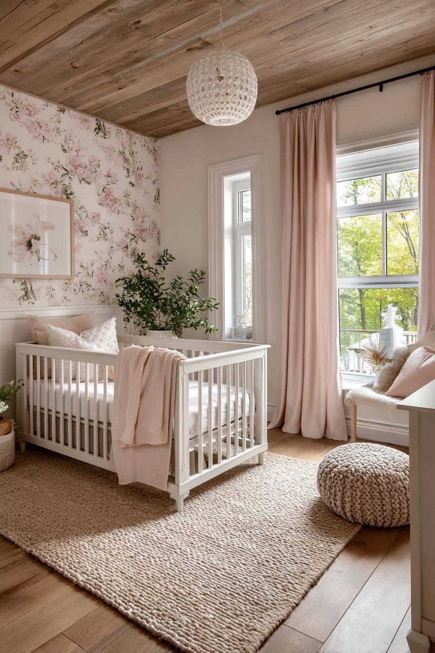
Cameo White is a charming and soft white from Behr with a barely perceptible pink-beige undertone, making it a great option for rooms that need a touch of warmth and femininity. With a high LRV, it reflects light generously, helping small or low-ceiling rooms appear brighter and more expansive.
Get the Fail-Safe Paint Color Playbook (Free PDF)
36 proven colors • 8 ready palettes • trim & sheen guide • printable testing cards.
Cameo White’s subtle warmth gives it character without making it feel too colorful. It pairs well with both warm and cool palettes, making it a flexible choice for diverse interior styles—from shabby chic and classic to transitional and modern farmhouse. When used on ceilings, its creamy undertones soften the transition between wall and ceiling, helping diminish visual lines that can lower the perceived height of a room.
Ideal for bedrooms, nurseries, or soft-toned living spaces, Cameo White offers a welcoming, almost romantic quality. Pair it with blush tones, dusty greens, or soft golds to enhance its gentle hue while maximizing the sense of vertical openness in any room.
13. Benjamin Moore Horizon (OC-53)
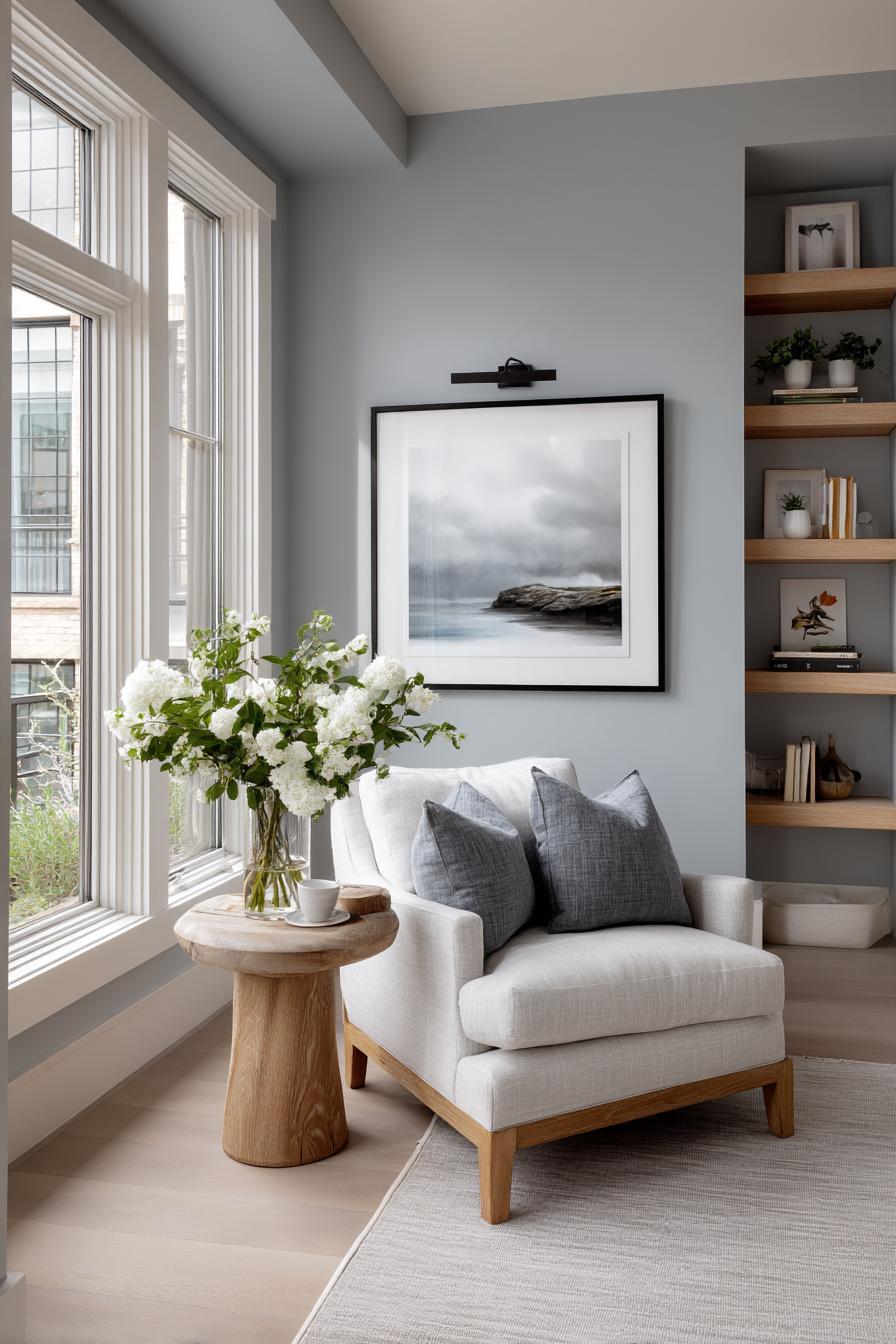
Horizon by Benjamin Moore is a misty, pale gray-blue that captures the subtle tones of early morning skies. With an LRV of 72.47, this hue effectively reflects light and introduces a sense of clarity and openness, making it a strong candidate for rooms with low ceilings. Its cool undertones add serenity and depth without overwhelming the senses, striking a balance between color and neutrality.
Horizon is particularly effective in spaces where natural light is limited. The blue-gray tone imparts a fresh, airy quality that visually lifts the ceiling and expands the room. When used on both walls and ceilings, or paired with soft white trim like Benjamin Moore’s Simply White, it creates a seamless, floating effect that encourages upward visual movement.
This color is an excellent choice for contemporary and coastal-themed rooms, especially bedrooms, bathrooms, or reading nooks. Horizon’s sophisticated coolness also pairs beautifully with light woods, silver accents, and minimalist decor, enhancing the vertical dimension without sacrificing comfort or style.
14. Sherwin-Williams Creamy (SW 7012)
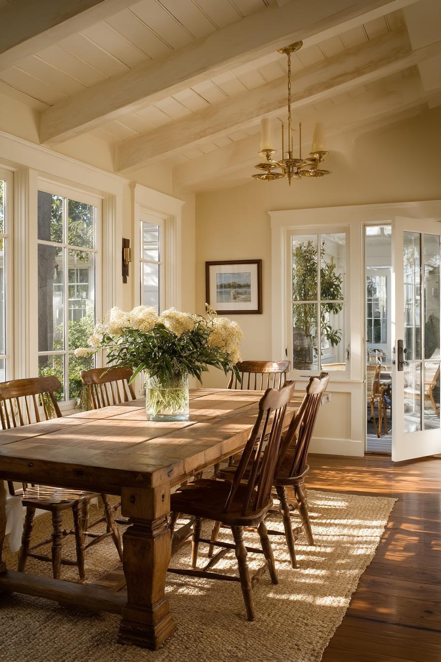
Creamy by Sherwin-Williams is a rich, off-white hue with a soft yellow undertone that brings warmth and brightness to a space without appearing overly saturated. With an LRV of 81, Creamy reflects plenty of light, making it a fantastic option for making low-ceiling rooms feel higher and more expansive.
Unlike stark whites, Creamy has a gentle depth that works well in traditional, transitional, and rustic interiors. It’s especially effective when used on both ceilings and walls, creating a continuous, boundary-free surface that naturally draws the eye upward. The warm undertones introduce a cozy, inviting feeling while still maximizing light and space.
This versatile shade pairs wonderfully with warm metallics like brass or bronze, rich wooden furniture, or earthy textile accents. In rooms with limited natural light, Creamy adds brightness and cheerfulness without the coldness of cooler whites—making it a favorite for kitchens, dining rooms, and low-ceilinged hallways.
15. Farrow & Ball Pale Powder (No. 204)
Pale Powder is a soft, muted green-blue with a whisper of gray, giving it a powdery pastel elegance. Known for its calming and cooling effect, this color is ideal for creating a relaxed, elevated atmosphere in rooms with lower ceilings. Its subtle tone offers a refined splash of color without overpowering the space, making it a favorite in bathrooms, bedrooms, and light-filled sitting areas.
With a medium-high light reflectance, Pale Powder helps bounce natural and artificial light around the room, enhancing the feeling of openness. When used across walls and ceilings, the soft, tonal continuity visually removes harsh boundaries, helping to “lift” the ceiling line. Its serene color profile mimics elements of the sky and sea, which psychologically promote upward focus and expansion.
Pale Powder pairs beautifully with off-whites, warm neutrals, and soft textures like cotton or wool. It’s a gentle yet sophisticated color that makes small or vertically challenged rooms feel fresh, open, and subtly elegant.
Design Techniques to Enhance Ceiling Height Perception
Color Drenching for Seamlessness
Color drenching involves using one color across walls, ceiling, and trim. This technique minimizes visual interruptions and creates a continuous flow, helping the ceiling feel like part of the room’s vertical plane rather than a cut-off point.
Vertical Stripes and Patterns
Vertical stripes, whether painted or wallpapered, naturally guide the eye upward. Even subtle striping can emphasize room height. Consider tone-on-tone stripes or narrow vertical paneling to achieve this effect without overwhelming the space.
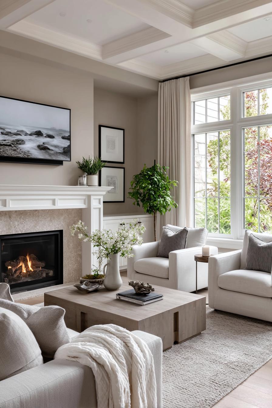
High Contrast Ceilings and Walls
Painting the ceiling a lighter shade than the walls can lift it visually. This contrast creates depth, especially when paired with upward lighting or reflective surfaces. Lighter ceilings act like an open sky in a room, pulling attention up.
Glossy and Reflective Finishes
Using semi-gloss or satin finishes on ceilings can reflect light more effectively than flat finishes. This adds dimension and draws attention upward. However, be cautious—glossy finishes may highlight imperfections, so a smooth ceiling surface is ideal.
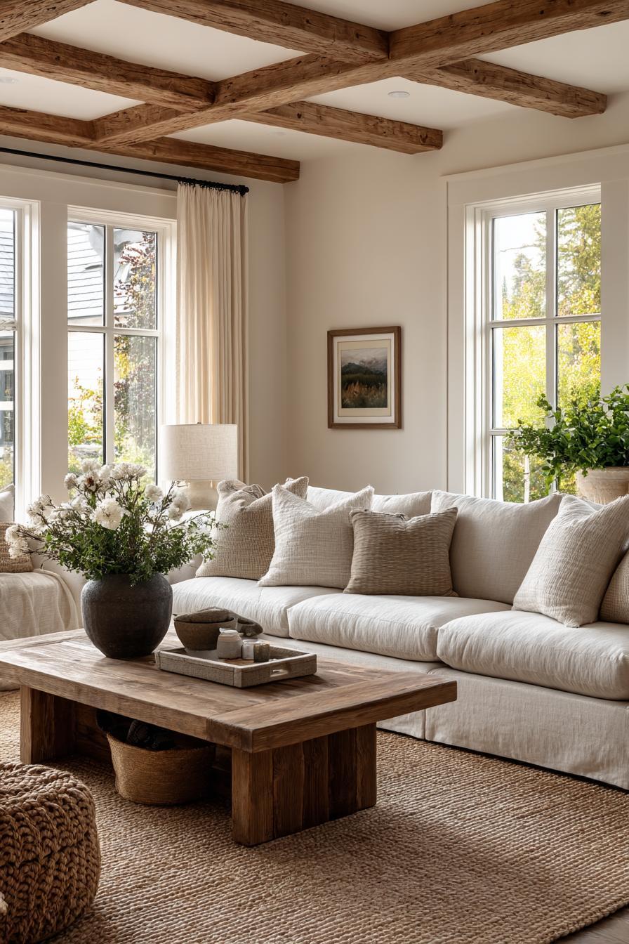
Say No to Crown Molding
Crown molding, while elegant, can visually “cap” the room and lower the perceived ceiling height. Opt for a minimalist transition or extend wall paint onto the ceiling by a few inches to soften the boundary and create visual lift.
Additional Tips for Making Low Ceilings Feel Taller
Designing around low ceilings involves more than just the right paint colors—it’s about creating an overall impression of vertical space. Here are some additional techniques that work in tandem with your paint choices to boost perceived height.
Strategic Lighting Choices
Lighting can make or break the illusion of height. Choose recessed or flush-mount lighting fixtures that don’t hang down and visually intrude into the room. Uplighting—through floor lamps or sconces—bounces light off the ceiling, creating a visual lift. Avoid heavy chandeliers or pendant lights in low-ceiling rooms, as they draw attention downward.
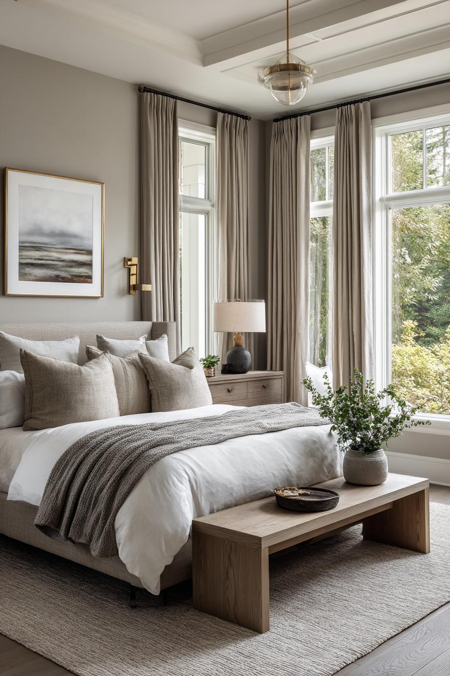
Elevated Window Treatments
Curtains hung just above the window frame can actually shorten the wall’s visual line. Instead, mount curtain rods close to the ceiling and let the fabric fall all the way to the floor. This vertical stretch draws the eye upward and emphasizes height. Similarly, using vertical blinds or long, sleek drapes can help elongate the look of the space.
Get the Fail-Safe Paint Color Playbook (Free PDF)
36 proven colors • 8 ready palettes • trim & sheen guide • printable testing cards.
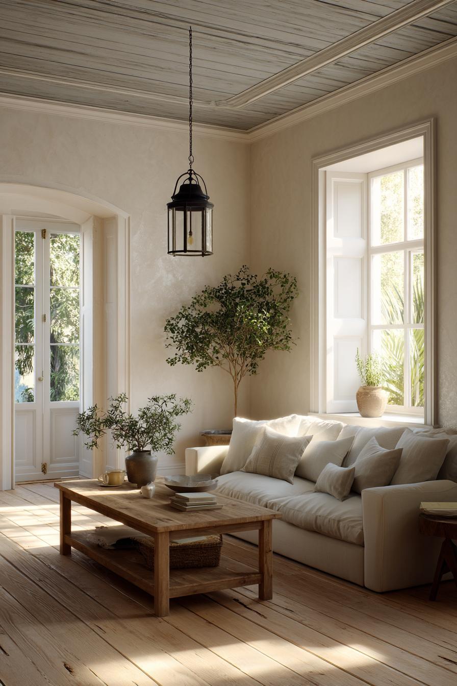
Choosing Low-Profile Furniture
Furniture height plays a subtle but significant role in how tall a ceiling feels. Opt for pieces with lower backs and streamlined silhouettes. By creating more space between the furniture and the ceiling, you give the impression of added vertical space. Avoid bulky or tall furniture that crowds the room’s upper third.
Smart Decor Placement
Where you place artwork and shelves also affects perceived ceiling height. Positioning them higher on the wall draws attention upward, reinforcing the illusion of taller walls. Gallery walls that gradually rise, tall mirrors leaning against walls, and vertically arranged frames all contribute to this effect.
Conclusion
Transforming a low-ceilinged room doesn’t always require expensive renovations or drastic architectural changes. Sometimes, the right paint color—combined with thoughtful design techniques—can make all the difference. By understanding how color impacts perception and using shades that reflect light, blend boundaries, or draw the eye upward, you can create the illusion of height and openness.
The 15 paint colors we’ve explored offer a diverse range of styles—from airy whites and subtle greiges to sky-like blues and calming greens—each capable of visually lifting your ceilings. Paired with clever techniques like color drenching, high-placed decor, and recessed lighting, these shades can reshape how your room feels and functions.
Ultimately, every space has potential. With a bit of creativity and the right palette, even the lowest ceilings can feel taller, lighter, and more inviting. Embrace the power of paint and let your ceilings rise.