
How To Make Grey Blue Paint
The enduring appeal of grey blue paint lies in its sophisticated ability to bridge the coolness of blue with the grounding neutrality of grey. This nuanced, muted color palette is universally celebrated in interior design for creating an atmosphere of calm, serenity, and timeless elegance. Whether you are updating a coastal bathroom, refreshing a rustic living room, or painting delicate architectural trim, grey blue offers an adaptable backdrop that feels both modern and deeply classic.
While professional paint colors are readily available, creating a custom, perfect shade of grey blue allows you to tailor the color exactly to the specific light, mood, and existing decor of your unique space. This guide will take you far beyond simply mixing colors; we will teach you the professional techniques of pigment formulation, color theory, and, crucially, how to select the correct finish and prepare your surfaces for a flawless, durable, and custom-designed result.
Get the Fail-Safe Paint Color Playbook (Free PDF)
36 proven colors • 8 ready palettes • trim & sheen guide • printable testing cards.
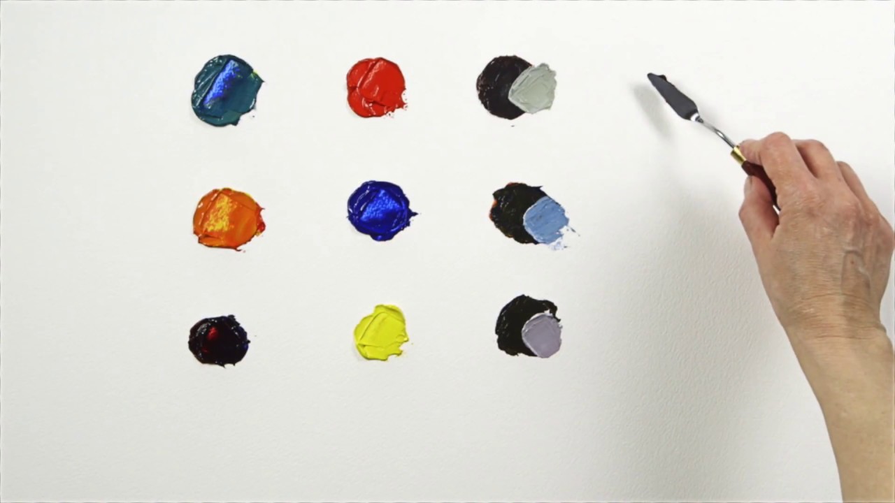
Quick answer: To Make Grey Blue Paint, start with the safest first step for the material involved, test a small area when needed, and follow the process in thin, controlled stages. Use proper ventilation and protective gear when chemicals, sanding, spraying, or solvents are involved.
Planning Your Project Before You Begin
Before you even open a pigment jar, thorough planning is essential. Successful painting is 80% preparation and 20% application. Your initial assessment must cover not only the desired color, but also the environment, the surface, and the intended function of the painted area.
Assessing the Surface and Substrate: Determine what you are painting. Is it smooth drywall, rough plaster, painted wood trim, or unsealed concrete? Different substrates require different levels of preparation and specific primers. For porous materials like plaster, a specialized bonding primer is critical to ensure the paint adheres deeply and evenly. For smooth, non-porous surfaces like tile or metal, a specialized bonding agent might be necessary to achieve proper adhesion.
Understanding the Environment and Lighting: Natural light is the most deceptive element in painting. A shade that looks perfect in the mixing room’s artificial light may appear dramatically different in direct sunlight, shaded corners, or under warm artificial evening lighting. Note the direction of the predominant light source (north-facing rooms receive cool, consistent light; south-facing rooms receive bright, warm light). This observation will guide your final color adjustments, helping you choose a grey blue that remains true to its intended tone throughout the day.
Selecting the Right Finish and Sheen: The finish (sheen) is as important as the color itself. This dictates the level of reflectivity and durability. Consider the function of the room:
- Matte/Flat: Best for large wall areas, as it minimizes imperfections and provides a soft, velvety depth. However, it is the least durable and hardest to clean.
- Satin: The most versatile choice. It offers a slight sheen, making it durable, washable, and ideal for kitchens, hallways, and living areas where some scuffing is expected.
- Semi-Gloss/Gloss: Highly durable and extremely washable, ideal for trim, molding, doors, and cabinetry. The high shine emphasizes edges and details but can highlight surface imperfections.
Materials and Tools for Custom Paint Creation
To achieve a professional-grade, consistent custom paint, you need more than just pigments. You need a proper binder (medium) and precise tools. Understanding the difference between these elements is key.
| Pigment | Description |
|---|---|
| Ultramarine Blue | A deep blue pigment with excellent lightfastness and color strength. |
| Payne’s Grey | A neutral grey pigment with a slight blue undertone. |
| Cerulean Blue | A light blue pigment that adds brightness and transparency. |
| Raw Umber | A warm brown pigment that can be used to adjust the color’s warmth. |
Pigments (Color): These are the finely ground, pure color materials (e.g., cobalt blue, Payne’s grey, iron oxides). They provide the hue and tone. Start with high-grade, finely milled pigments for the best consistency.
Medium/Binder (The Carrier): This is the liquid that holds the pigment and allows it to adhere to a surface (e.g., acrylic emulsion, latex, or oil). For most home interior applications, a premium acrylic latex emulsion is recommended because it provides excellent durability, washability, and quick drying times suitable for drywall.
Essential Tools:
- Mixing Surface: A non-porous, smooth surface (like glass or ceramic) is best for blending.
- Mixing Utensils: Palette knives, spatulas, or dedicated mixing sticks.
- Measuring Tools: Accurate measuring cups and scales are non-negotiable for consistency.
- Testing Swatches: Cardboard or drywall scraps that can be primed and covered for testing.
The Step-by-Step Guide to Mixing Grey Blue Paint
The mixing process requires patience, precision, and systematic adjustment. We will approach this in three phases: establishing the base, adjusting the value, and refining the tone.
Phase 1: Establishing the Base Color (The Initial Mix)
- Measure the Medium: Start by measuring the total volume of your chosen paint medium (e.g., 1 gallon of acrylic emulsion). This volume determines the final yield and consistency.
- Introduce the Grey Base: Add your primary grey pigment. This pigment establishes the neutral foundation. Start with a generous amount, as grey is the dominant tone.
- Introduce the Blue Pigment: Slowly begin incorporating the blue pigment. Because blue is the contrasting color, add it incrementally. Mix thoroughly after each small addition to prevent streaks and ensure even distribution.
- Initial Blending: Use a spatula or palette knife to mix the pigments into the medium. The goal is a uniform suspension, not a slurry. The paint should pour easily but maintain enough body to coat a surface.
Phase 2: Adjusting the Value (Lightness and Darkness)
The initial mix may be too light or too dark for the desired effect. Value adjustment is done using pure white and pure black pigments.
- To Lighten (Increasing Value): Add the white pigment in very small increments (e.g., one teaspoon at a time). Mix well and check the color. Remember that adding white does not just “lighten”; it increases the paint’s reflectance, making the color appear paler and softer.
- To Darken (Decreasing Value): Add the black pigment sparingly. Black is highly concentrated, so use it cautiously. Adding black decreases the overall brightness and increases the depth, pushing the grey blue toward a slate or charcoal tone.
Phase 3: Refining the Undertone (Chroma and Tone)
This is the most artistic step. Tones are secondary pigments used to shift the *feeling* of the color. For instance, adding green will shift the grey blue toward a seafoam or teal; adding purple will deepen it toward indigo.
- Cooling the Tone: Add a tiny touch of green or cyan to achieve a cooler, more oceanic feel.
- Warming the Tone: Add a touch of brown or yellow ochre to counteract any excessive coolness, making the grey blue feel more grounded and earthy.
- Deepening the Drama: Incorporating a small amount of deep violet pigment can give the grey blue a rich, dramatic depth, excellent for accent walls.
Always mix these secondary pigments in tiny amounts—a single drop or a pinch—and fully blend them before assessing the impact on the overall shade.
Advanced Color Theory: Understanding the Nuances of Grey Blue
To truly master custom color mixing, you must understand the relationship between Hue, Value, and Chroma. This knowledge moves you beyond simply following a recipe.
Hue vs. Value vs. Chroma:
- Hue: This is the pure color itself (blue, grey, green).
- Value: This refers to the lightness or darkness (value). White increases value; black decreases value.
- Chroma (Saturation): This is the intensity or purity of the color. Adding pure pigments keeps the chroma high; adding white or grey tones reduces the chroma, making the color appear more muted and sophisticated.
The Importance of Undertones: Grey blue, by nature, is a complex color because it contains both a neutral component (grey) and a primary color (blue). The undertone determines the character:
- Cool Undertones: These are often achieved by adding cyan or deep indigo. They reflect blue light and are ideal for coastal, minimalist, or contemporary spaces.
- Warm Undertones: These are achieved by adding hints of yellow or brown. They reflect yellow light and ground the color, making it suitable for rustic, transitional, or traditional settings.
- Neutral Undertones: These are maintained by careful balancing and are best for universal, timeless looks.
When mixing, always ask: “Do I want this grey blue to feel more like the ocean (cool) or more like a storm cloud (neutral/dark)?” This mental check ensures your pigment additions serve a purpose.
Testing, Application, and Finishing Touches
The final stages—testing and applying the paint—are where theory meets reality. Never rely on a single swatch test.
The Large-Scale Test Swatch: After mixing, apply the paint to a test board that is at least 2 feet by 2 feet. This large surface area is essential because it allows the pigment ratios to interact with the binder and the substrate in a way a small swatch cannot replicate. Let this swatch dry completely (this may take 24–72 hours, depending on the medium and humidity).
Observing Light Interaction: Critically, observe the dried swatch at three points in time:
- Mid-day Natural Light: This reveals the color’s true balance and undertones.
- Overcast/Cloudy Light: This reveals the color’s inherent grey quality, as the light is diffuse and neutral.
- Evening/Artificial Light: This reveals the color’s reaction to artificial sources (e.g., warm yellow incandescent bulbs vs. cool LED bulbs).
Addressing Sheen and Finish Consistency: When applying the paint, use the appropriate tools for the finish. For a smooth satin or matte finish, use high-quality synthetic brushes and rollers with a nap suitable for the substrate. Apply the paint in a consistent pattern, ensuring you overlap passes slightly to prevent visible roller marks or lap lines. For trim work, use a high-quality angled brush and cut in the edges meticulously before rolling the main wall area.
Troubleshooting Application Issues:
- Dripping/Runs: If the paint drips, it often means the paint is too liquid or the temperature is too high. Allow the paint to cool slightly, or slightly increase the viscosity by adding a small amount of appropriate thickening agent (check manufacturer guidelines).
- Uneven Coverage: If certain areas are patchy, the surface may be overly absorbent or the primer was insufficient. Re-prime the area and ensure the primer is fully cured before applying the custom color.
- Muddiness: If the color looks dull or muddy, the pigments may be too highly saturated, or the undertones are fighting each other. Try adjusting the chroma by adding a very small amount of pure white to mute the intensity.
Safety, Storage, and Professional Precautions
Working with solvents, pigments, and paint mediums requires strict adherence to safety protocols to protect your health and the integrity of the paint.
Mandatory Safety Protocols:
- Ventilation: Always work in a well-ventilated area. Open windows and use fans to draw out fumes from the paint medium and solvents. Never work in a confined space.
- Personal Protective Equipment (PPE): Wear chemical-resistant gloves, safety goggles, and an appropriate respirator rated for VOCs (Volatile Organic Compounds) when handling concentrated pigments or solvents.
- Substrate Safety: If the surface you are painting is suspected to contain lead-based paint or asbestos, DO NOT attempt sanding, scraping, or major repair. These tasks require licensed professionals and proper containment procedures.
Proper Storage and Longevity:
To maximize the lifespan of your custom batch, transfer all leftover paint into clean, non-reactive, airtight containers. Label these containers with the exact pigment list, the date, and the name of the color. Store the paint in a cool, dry, and temperature-stable location, away from direct sunlight or extreme heat sources. While acrylic mediums are durable, pigments can settle, so always thoroughly stir the paint before use to ensure a consistent mix.
Mistakes to Avoid
Do not skip assessment just because the project looks simple. Most paint, cleaning, repair, and tool-care problems come from poor prep, incompatible products, rushed drying time, or using a method that does not match the material.
Avoid working without ventilation, gloves, eye protection, or a cleanup plan when coatings, solvents, sanding dust, or business/studio supplies are involved. Test first, read manufacturer directions, and pause if the surface, tool, or client setting creates safety questions you cannot answer confidently.
Safety and Practical Notes
Work in a well-ventilated space and wear gloves, eye protection, and a respirator when needed. Keep children and pets away from wet surfaces and open containers.
Follow manufacturer drying times between coats. Dispose of rags and leftover materials according to local regulations. If the project involves heights, lead paint, or structural work, consider hiring a licensed professional.
Frequently Asked Questions
What is the most critical step before mixing the paint?
The most critical step is thorough surface preparation and understanding the environment. Before mixing, you must assess the substrate (drywall, plaster, wood, etc.) to determine the correct bonding primer. Furthermore, observe the natural light in the room (is it consistently cool like north light, or warm like south light?). This observation dictates the undertone you must incorporate into the mix to ensure the color looks correct throughout the day.
Get the Fail-Safe Paint Color Playbook (Free PDF)
36 proven colors • 8 ready palettes • trim & sheen guide • printable testing cards.
How can I troubleshoot a color that looks too dull or muddy?
If the resulting grey blue paint looks dull or muddy, it usually means the pigments are too highly saturated, or the undertones are conflicting. To remedy this, do not try to adjust the chroma by adding more primary pigments. Instead, try muting the intensity by adding a very small amount of pure white pigment. Alternatively, ensure your base pigment ratios are balanced, as too much saturation can overwhelm the natural depth of the grey blue.
Do I need to worry about the finish (sheen) when mixing?
Yes, the finish dictates durability and appearance. If you are painting high-traffic areas, trim, or cabinets, use a Satin or Semi-Gloss finish for washability and durability. If the area is a large, low-traffic wall and you want a sophisticated, velvety look, use a Matte finish. Remember that the sheen is determined by the medium and the application, not just the pigment mix. Always choose a medium appropriate for the desired sheen level.
What safety precautions are mandatory when mixing custom paint?
Safety is paramount. Always work in a well-ventilated area to dissipate fumes from the paint medium and solvents. You must wear appropriate Personal Protective Equipment (PPE), including chemical-resistant gloves, safety goggles, and a respirator rated for VOCs (Volatile Organic Compounds). If the surface you are painting is suspected to be lead-based or contains asbestos, do not attempt sanding or scraping; these tasks require licensed professionals.
Conclusion
The journey of creating your own grey blue paint is a rewarding blend of art and practical science. By mastering pigment ratios, understanding the subtle language of undertones, and meticulously preparing your surfaces, you gain the power to realize a perfectly custom shade that enhances the character of your home.
Remember that the goal is not just a beautiful color, but a durable, harmonious finish. Take your time, test thoroughly, and never hesitate to refine your mixture. With this knowledge, you are equipped to tackle any color challenge, transforming your vision into a lasting, sophisticated reality.