
How to Paint Dandelion: A Guide to Yellow and Green Home Decor
The dandelion, with its burst of sunshine yellow petals and the delicate, ethereal promise of its seed head, represents resilience, renewal, and the vibrant spirit of spring. Incorporating this natural motif into your home decor or painting a room with its colors can bring a wonderful, cheerful energy into any space.
Achieving that perfect “dandelion glow” in your home design is more than just painting a single accent wall; it involves understanding the specific undertones of yellow and green, pairing them with grounding neutrals, and mastering the balance between whimsical charm and sophisticated style. This guide provides the comprehensive steps needed to use the dandelion aesthetic—a blend of bright yellows and fresh greens—to transform your space.
Get the Fail-Safe Paint Color Playbook (Free PDF)
36 proven colors • 8 ready palettes • trim & sheen guide • printable testing cards.
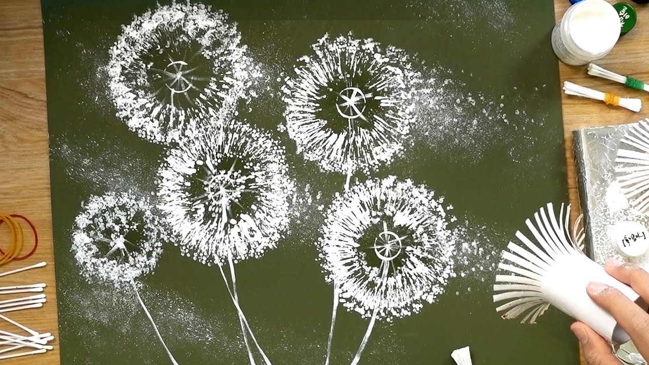
Quick answer: To Paint Dandelion, start with the safest first step for the material involved, test a small area when needed, and follow the process in thin, controlled stages. Use proper ventilation and protective gear when chemicals, sanding, spraying, or solvents are involved.
Planning Your Spring Refresh: Assessing the Space
Before opening a single can of paint or buying a single piece of decor, careful planning is essential. The success of the dandelion palette—which is inherently high-energy—depends entirely on how it interacts with your existing architecture, the natural light, and the overall function of the room. Treat this initial phase as a design consultation for yourself.
Consider the following factors to determine if the yellow and green accents are appropriate for your project. Do not rush this step; gathering samples and observing the light at different times of day will save you significant time and money later on.
Evaluating Natural Light and Undertones
Natural light is the single most critical factor when dealing with yellow and green hues. A yellow that looks perfect in the store under fluorescent lights can look sickly or too bright in a north-facing room, while a pale yellow might appear muddy in a heavily shaded space.
- North-Facing Rooms: These rooms receive cool, indirect light, which often makes warm colors appear dull. If using yellows, opt for warmer, creamy butter tones rather than crisp lemon yellows. Greens tend to look best as soft sage or moss tones.
- South-Facing Rooms: These rooms receive intense, warm light all day. They can handle brighter, more saturated yellows (like a true dandelion yellow) and vibrant greens without looking washed out. Be cautious, however, as bright light can also fade colors quickly, so consider using washable, durable finishes.
- East/West-Facing Rooms: These rooms get strong, directional light. East-facing rooms are great for soft, golden yellows in the morning. West-facing rooms are ideal for deeper, more saturated tones that can hold up to the intense afternoon glow.
Determining the Room’s Function and Mood
The mood you want to create dictates the intensity of the colors. A kitchen or dining room, which are highly social spaces, can handle more vibrant accents. A primary bedroom, which needs to be a sanctuary, might require a more muted, restful palette.
- High Energy Areas (Kitchen, Dining Room): Here, the dandelion motif can be more pronounced. Consider a bright yellow backsplash or pops of saturated green in textiles.
- Restful Areas (Bedroom, Reading Nook): Focus on muted, desaturated tones. Think dusty yellows, pale chartreuse, and soft sage greens. These colors evoke freshness without causing visual fatigue.
- Formal Areas (Living Room): Use the colors sparingly. Perhaps a single piece of art, a throw blanket, or a decorative vase that features the yellow/green palette, allowing the paint colors to remain neutral and grounding.
Step-by-Step Guide to Implementing the Palette
Once the planning is complete, the implementation phase requires structure. We will approach the application by focusing on the *role* the color plays in the room, rather than just painting a specific item.
| Materials | Description |
|---|---|
| Paintbrushes | Various brush sizes and types suitable for different techniques. |
| Paints | Acrylic or watercolor paints in your desired colors. |
| Canvas or Paper | Choose a suitable surface for your painting, whether it’s a canvas or paper. |
| Palette | Use a palette for mixing and blending colors. |
| Water Container | A container to rinse your brushes and keep them clean during the painting process. |
| Paper Towels | Handy for cleaning brushes and drying excess water. |
Step 1: Selecting the Grounding Neutral Base
The first step is to ensure that the majority of the walls, trim, and large structural elements are painted a solid, neutral color. This neutral acts as the “negative space” that allows the bright yellows and greens to pop without overwhelming the viewer. Ideal neutrals for the dandelion aesthetic include warm off-white, creamy beige, or a light greige (gray/beige mix).
Application Tip: When painting the base, pay meticulous attention to surface preparation. Ensure all surfaces are clean, sanded, and primed. A flawless base is crucial for making the accents look deliberate and high-end, rather than accidental.
Step 2: Choosing the Primary Accent (Yellow)
Decide where the main pop of color will go. This could be an entire accent wall, built-in shelving, or even the cabinetry in a kitchen. The yellow must be carefully chosen. Avoid primary, cadmium yellow, as it can look cheap or overly aggressive. Instead, opt for:
- Mustard Yellow: Excellent for grounding the palette. It reads as warm, earthy, and sophisticated, pairing beautifully with deep greens and natural woods.
- Butter Yellow: A softer, lighter choice that feels airy and cheerful. It works well in smaller spaces or rooms with abundant natural light.
- Saffron Yellow: A slightly more saturated, golden tone that works beautifully in traditional or Mediterranean-inspired spaces.
| Materials | Description |
|---|---|
| Masking Tape | Use masking tape to create clean edges or sections in your painting. |
| Easel | An easel provides a stable support for your canvas or paper. |
| Sketching Materials | Pencils, erasers, and paper for sketching a preliminary design. |
Step 3: Introducing the Secondary Accent (Green)
The green element should balance the yellow. This color is best used on trim, built-in cabinetry, or through textiles. The choice of green must complement the specific yellow you selected.
- Pairing Mustard Yellow: Use deep, sophisticated greens like forest green, olive, or sage. These pairing creates a rich, grounded, and historically inspired look.
- Pairing Pale/Butter Yellow: Use cool, light greens like seafoam or mint. This combination keeps the overall feel light, airy, and coastal.
Step 4: Layering Depth with Accents and Decor
The final layers involve incorporating the dandelion motif through small details. This is where you introduce the textures and patterns associated with the flower. Instead of painting the whole room, use decorative elements:
- Textiles: Pillows, curtains, or rugs in patterned yellow and green.
- Artwork: Framed botanical prints or abstract art featuring the palette.
- Hardware: Kitchen cabinet pulls or bathroom fixtures painted in a subtle gold or matte brass finish to mimic the yellow glow.
Materials and Tools for the DIY Decorator
Successful home decor projects require the right tools and materials. Since we are dealing with multiple colors and different finishes, organization and quality materials are paramount.
Paint and Medium Selection
The type of paint you choose affects the durability, sheen, and ease of application. Always check the manufacturer’s specifications for the room’s humidity and temperature.
- Interior Latex Paint: This is the standard choice for most walls. It is breathable, washable, and dries relatively quickly.
- Semi-Gloss Paint: Ideal for trim, baseboards, and doors. The slight sheen is durable and easy to wipe clean, making it perfect for high-traffic areas.
- Matte/Flat Paint: Best for accent walls or cabinetry where you want the color to be the focus without glare. It provides a sophisticated, velvety finish.
Essential Tools
Do not skimp on your tools. High-quality brushes and reliable equipment make a massive difference in the final, professional look.
- Painter’s Tape: Use high-quality, low-tack painter’s tape to achieve crisp lines when painting trim or separating accent walls.
- Brushes: A mix of angled sash brushes (for cutting in corners) and wide foam rollers (for flat wall surfaces) is recommended.
- Prep Supplies: Sandpaper (various grits), drop cloths, and painters’ drop cloths are non-negotiable for protecting floors and furniture.
The key to making the dandelion palette sophisticated is managing the undertones and the sheen. A simple yellow can easily veer into a tacky or juvenile look if the undertones are wrong.
Yellows are complex. When shopping for paint samples, test them against wood tones, metals, and natural materials, not just white paper.
- Golden Yellows: These contain slight orange or red undertones. They are warm, inviting, and pair well with natural woods and terracotta. They evoke the golden hour sunlight.
- Mustard/Ochre Yellows: These are muted, often containing brown or gray undertones. They are the most sophisticated choice, lending an antique or global feel.
- Lemon/Canary Yellows: These are bright and cool. They should be used sparingly, perhaps only on small decorative items, as they can overpower a room if used on large surfaces.
Matching Sheen (Finish) to Function
The finish (sheen) of the paint dramatically changes how the color reads in the light.
- Matte/Flat: Absorbs light, making the color appear deep and velvety. Best used on accent walls or ceilings to create a dramatic, enveloping feel.
- Eggshell/Satin: Offers a slight sheen, making it durable and washable. Ideal for living room walls or high-use areas where some scuffing might occur.
- Semi-Gloss: Highly durable and easy to clean. Best reserved for trim, doors, and cabinetry where durability is the primary concern.
Complementary Pairings for Balance
To prevent the yellow and green from clashing, always introduce a third, stabilizing color.
- Warm Wood Tones: The rich, warm brown of natural wood (like oak or walnut) acts as a perfect neutral anchor, preventing the yellow and green from floating aimlessly.
- Cream/Taupe: Using a warm, light gray or a creamy taupe on the largest surface area (like the main wall) grounds the entire palette, making the yellows and greens feel intentional and luxurious.
- Black Accents: Minimal use of black (e.g., picture frames, light fixtures) adds crisp definition and modern sophistication, preventing the palette from becoming too rustic or cottage-core.
Mistakes to Avoid in the Dandelion Decor Project
Even with a beautiful palette, several common decorating and painting mistakes can undermine the entire design. Being aware of these pitfalls ensures a polished, professional result.
- Over-Saturating the Space: The biggest mistake is using the bright yellow in too many places. If every piece of art, every cushion, and every accent wall is yellow, the room feels chaotic and aggressive. Use the yellow as a single, powerful focal point.
- Ignoring the Undertones of Green: Mixing a vibrant, cool green (like a primary emerald) with a warm, golden yellow can create a jarring contrast. Always ensure your green has a slight gray or beige undertone (like sage) to blend seamlessly with the warmth of the yellow.
- Poor Surface Preparation: Skipping the priming or sanding steps means that the paint will not adhere properly. The paint may chip, peel, or fade unevenly over time, making the entire project look amateurish.
- Forgetting the Scale: If the accent yellow is used on a massive surface (like an entire wall), it can feel overwhelming. It is often better to contain the yellow within a defined area, such as a niche, a piece of furniture, or a small grouping of built-ins.
Safety and Practical Notes
Any DIY painting or decorating project requires adherence to safety protocols. Please prioritize your well-being and the structural integrity of your home.
- Ventilation is Key: Always ensure proper ventilation when using paint, primer, or any solvents. Open windows, use exhaust fans, and keep the area well-ventilated to prevent the buildup of fumes.
- Protective Gear: Wear appropriate protective gear, including gloves and safety glasses, when handling chemicals or sanding dry materials.
- Manufacturer Directions: Always follow the manufacturer’s instructions regarding drying times, curing times, and required dilution ratios. Rushing the drying process can lead to paint failure or streaking.
- Professional Intervention: For any structural changes, electrical wiring, or mold remediation, do not attempt the work yourself. Always call a licensed and insured professional contractor.
Bringing the cheerful, resilient spirit of the dandelion into your home is a rewarding design journey. By focusing on sophisticated undertones, using neutrals to ground the bright accents, and adhering to proper planning and safety measures, you can achieve a space that feels both effortlessly fresh and beautifully curated.
Remember that the goal of decor is to enhance life, not just decorate walls. Experiment with varying the intensity and placement of the yellow and green accents to create a space that truly reflects your unique sense of style and joy.
Frequently Asked Questions
How does natural light affect the choice of yellow and green paint tones?
Natural light is the most critical factor. Yellows appear dramatically differently depending on the room’s orientation. For north-facing rooms, which receive cool, indirect light, opt for creamy, warm butter yellows rather than sharp, cool lemon yellows. South-facing rooms, which receive intense, warm light, can handle more saturated, true dandelion yellows and vibrant greens. Always test samples on the wall at different times of day before committing to a color.
Get the Fail-Safe Paint Color Playbook (Free PDF)
36 proven colors • 8 ready palettes • trim & sheen guide • printable testing cards.
What is the single most important step before starting the paint application?
Thorough surface preparation. Before painting, all surfaces must be meticulously cleaned, sanded, and primed. Skipping these steps will result in poor paint adhesion, causing the paint to chip, peel, or fade unevenly. A flawless, properly primed base is what makes the accents look professional and deliberate.
How do I prevent the yellow and green accents from clashing and looking overwhelming?
The key is introducing a stabilizing “third color.” This grounding neutral prevents the high-energy yellow and green from clashing. Use warm wood tones (like oak or walnut), creamy beige, or a light greige on the largest surface areas. Additionally, ensure your green has a slight gray or beige undertone (like sage) to complement the warmth of your chosen yellow, rather than using a cool, primary emerald.
Which paint sheen (finish) should I use for different areas of the house?
The sheen dictates the durability and how the color is perceived in light. Use Semi-Gloss for trim, doors, and cabinetry because it is highly durable and easy to wipe clean. Use Eggshell or Satin for general living room walls, as it offers a slight sheen and is washable. Reserve Matte or Flat paint for accent walls or ceilings when you want the color to appear deep, velvety, and non-reflective.
Conclusion
How to Paint Dandelion works best when the plan, materials, safety steps, and finish goals all line up before work begins. Review the surface or tool condition, choose compatible products, and leave enough time for drying, cleanup, and final checks.
Use the guidance above as a practical checklist, then adjust it to the specific surface, workspace, product directions, and risk level. When the project involves fumes, damaged materials, business liability, or uncertain conditions, slow down and get qualified help before moving forward.