
How to Paint Seascapes in Oil: A Step-by-Step Guide for Beginners
The mesmerizing beauty of the sea, with its ever-changing colors, rhythmic waves, and vast horizons, has captivated artists for centuries. Creating a seascape in oil is a deeply rewarding endeavor that allows you to translate the raw, dynamic energy of the ocean onto a static canvas. This guide is designed to be your comprehensive, actionable blueprint, taking you through every stage—from initial composition planning to final varnishing.
Oil paints are the perfect medium for capturing the luminosity, textures, and profound depth of the sea. Because oil allows pigments to dry slowly, it offers artists unparalleled time to blend, layer, and refine colors, making it ideal for the subtle transitions found in both the sky and the water. Whether you are aiming for a dramatic stormy scene or a serene, foggy morning, understanding the underlying techniques is the key to success.
Get the Fail-Safe Paint Color Playbook (Free PDF)
36 proven colors • 8 ready palettes • trim & sheen guide • printable testing cards.
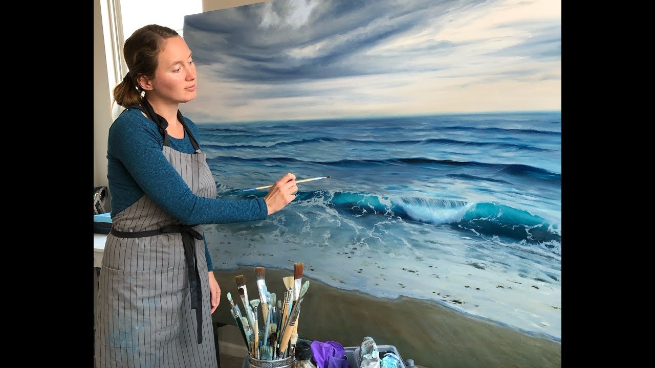
Quick answer: To Paint Seascapes in Oil, start with the safest first step for the material involved, test a small area when needed, and follow the process in thin, controlled stages. Use proper ventilation and protective gear when chemicals, sanding, spraying, or solvents are involved.
Planning and Preparation Before You Start
A successful seascape begins long before the first brushstroke touches the canvas. Proper planning involves selecting the right reference, understanding the light, and preparing your workspace. Skipping this preparation phase is the most common mistake and can lead to a composition that feels flat or unmoored.
Start by selecting a high-quality reference photograph. Don’t just look for a pretty picture; analyze it. Identify the primary light source—is it midday sun, golden hour, or an overcast day? Note the direction of the light, as this dictates the shadows and the color temperature. Does the light feel warm (yellow/orange) or cool (blue/gray)? Understanding this will guide your entire palette.
Next, consider the composition. Use the Rule of Thirds by mentally dividing your canvas into nine sections. Instead of placing the horizon line dead center, position it along the top or bottom third line. This immediately creates a more dynamic and balanced visual flow. Furthermore, incorporate leading lines—such as a receding shoreline, a path of waves, or a line of distant boats—to guide the viewer’s eye deep into the painting, enhancing the illusion of vast distance.
Essential Materials and Tools for Oil Painting
Having the correct tools is crucial for achieving the diverse textures required in a seascape, from smooth reflections to frothy surf. Investing in quality materials will save you frustration later.
| Attribute | Prominence | Popularity | Relevance |
|---|---|---|---|
| Oil Paint Types | High | High | High |
| Color Palette | High | High | High |
Selecting the Right Pigments and Mediums
For seascapes, your palette must be diverse. Beyond the primary blues (Ultramarine, Phthalo Blue) and greens (Viridian, Sap Green), you need earth tones (burnt umber, raw sienna) for foreground rocks and browns. Crucially, gather a range of white (Titanium White) and black (Ivory Black) to manipulate values, and several muted colors for atmospheric effects.
Do not rely on just one blue. Use different shades to capture the depth variation: a dark, rich indigo for deep, unknown ocean trenches, and a lighter, turquoise hue for shallow, tropical waters. Mixing pigments carefully is how you achieve the illusion of natural depth.
Choosing Brushes and Texturing Tools
You will need variety. A large, flat brush (like a wide filbert) is perfect for blocking in the sky and the base water layer. A medium, round brush is excellent for blending and defining cloud edges. For the most detailed work, invest in smaller, pointed synthetic brushes. Finally, palette knives are indispensable; they allow you to apply thick, sculptural paint (impasto) to simulate crashing waves, rugged rocks, or spray foam, giving the painting its physical dimension.
Preparing the Support
While pre-primed canvases are convenient, understanding your support is important. Most professional artists use canvas treated with gesso or acrylic gesso to ensure the surface is stable and non-absorbent. This prevents the oil paint from soaking into the canvas fibers too quickly, allowing you more control over the layers and blending time.
Step-by-Step Guide to Painting Seascapes in Oil
The process of painting a seascape is best broken down into distinct, sequential phases. Treating the painting like a construction project—where each layer must dry and set before the next—is key to avoiding muddy colors and ensuring luminosity.
| Attribute | Prominence | Popularity | Relevance |
|---|---|---|---|
| Brush Types | High | High | High |
| Additional Tools | Medium | Medium | Medium |
Phase 1: Underpainting and Blocking In (The Foundation)
This initial layer is not about color; it is about value and value relationships. Using a thin wash of diluted paint (often a mix of raw umber and diluted blue/green), quickly block in the main areas: the sky, the water, and the land. Do not worry about detail or precise color. Focus only on establishing the darkest darks (shadows) and the lightest lights. This acts as a tonal map, giving you a structural backbone for the entire piece.
Pay special attention to the horizon line. The contrast between the sky and the water at this boundary should be carefully managed. If the light is coming from the horizon, the sky and water will share similar color values, requiring subtle blending.
Phase 2: Establishing Atmosphere and Color Layers
Once the underpainting is dry, begin building up the color. Start with the largest, most general areas first—the sky and the main body of water. Use blending techniques here. For the sky, transition smoothly from the horizon (where light is brightest) up to the zenith (the darkest point). When painting the water, use broad, directional strokes that follow the implied movement of the waves. Remember that the sky and water are reflections of each other; they should share a complementary relationship in their color values.
Phase 3: Mastering Water and Movement Techniques
This is the core of the seascape. To depict the water, think in terms of light interaction. The water is never a uniform color; it reflects the sky, the land, and the light source. Use a variety of blues and greens, adjusting the value to show depth. For the mid-ground, use directional, horizontal strokes to suggest movement. When painting the crest of a wave, transition rapidly from deep shadow (the hidden curve) to brilliant, almost pure white (the peak). Use palette knives or stiff brushes to apply this thick, opaque paint (Impasto) to simulate the solid, breaking foam, creating a physical point of focus.
Phase 4: Detailing the Sky and Horizon Line
The sky requires masterful blending. If painting a cloudy day, use thin, transparent paint (Glazing) to build up the cloud layers, allowing the underlying blue tones to show through. To create the effect of distance, implement atmospheric perspective: the colors of objects or clouds far away must be lighter, paler, and cooler in value than elements in the foreground. Pay special attention to the blending where the sky meets the water; this transition should feel seamless, often using the lightest, most diffused color palette.
Advanced Techniques for Depth and Realism
To elevate your seascape from a simple painting to a masterful work, you must master specific techniques that manipulate light and texture.
| Attribute | Prominence | Popularity | Relevance |
|---|---|---|---|
| Priming the Canvas | High | High | High |
| Canvas Size | Medium | Medium | Medium |
Glazing and Scumbling: The Luminosity Boost
Glazing is applying a very thin, transparent wash of color over a completely dry layer. Use this technique sparingly—perhaps a layer of pale yellow glaze over the water to suggest sunlight, or a faint blue glaze over the sky to enhance atmospheric haze. It adds depth and saturation without losing the underlying structure.
Scumbling involves dragging a semi-dry, opaque paint over a dry layer using a dry brush. This is perfect for adding texture to distant fog, cloud wisps, or the uneven surface of rocks, giving the paint a dusty, aged quality.
Impasto and Texture Mediums: The Physicality of the Sea
Impasto is not just for waves. Use it for anything solid or highly textured—the rough surface of a cliff, the crystalline look of sea spray, or the distinct ridges of exposed coral. Mixing specialized texture mediums with your oil paint can simulate things like wet sand or barnacle-covered rocks, adding a tactile element that draws the viewer into the piece.
Managing Light and Color Temperature
Always consider the color temperature of the light. If the light source is the sun during the golden hour, the entire painting—sky, water, and foreground—must be infused with warm tones (yellows, oranges, pinks). If it is a cloudy day, the palette should lean heavily into cool tones (muted grays, slate blues, soft violets). Consistency in temperature creates immediate realism.
Even experienced artists encounter hurdles, but knowing the pitfalls allows you to troubleshoot proactively. These mistakes are often related to patience or over-working the paint.
- The Muddy Mix: This is the most common error. It happens when you mix too many colors or when paint hasn’t dried enough. If a section looks muddy, stop, let it dry completely, and only then, try applying a very thin, semi-transparent glaze of a pure color (like pure blue or white) to unify the area.
- Ignoring Atmospheric Perspective: If distant elements (like islands or cliffs) have the same contrast and color saturation as foreground elements, the painting will look flat. Always remember that distance = paler, cooler, less saturated.
- The Hard Horizon: Do not let the line where the sky meets the water be a sharp, defined line. Even on clear days, the atmosphere blurs the boundary. Use soft blending and subtle color shifts to mimic the natural haze.
Mistakes to Avoid
Do not skip assessment just because the project looks simple. Most paint, cleaning, repair, and tool-care problems come from poor prep, incompatible products, rushed drying time, or using a method that does not match the material.
| Attribute | Prominence | Popularity | Relevance |
|---|---|---|---|
| Finding Inspiration | High | High | High |
| Factors to Consider | Medium | Medium | Medium |
Avoid working without ventilation, gloves, eye protection, or a cleanup plan when coatings, solvents, sanding dust, or business/studio supplies are involved. Test first, read manufacturer directions, and pause if the surface, tool, or client setting creates safety questions you cannot answer confidently.
Safety and Practical Notes for Oil Painting
Working with oils, solvents, and mediums requires respect for the materials and your environment. Safety is paramount and should never be rushed.
- Ventilation is Non-Negotiable: Always work in a well-ventilated area. Solvents like mineral spirits and turpentine release volatile organic compounds (VOCs). Proper ventilation prevents inhaling fumes and minimizes health risks.
- Protective Gear: Wear appropriate protective gear, including gloves and a dust mask, especially when cleaning brushes or disposing of solvents.
- Waste Disposal: Never pour solvents, thinners, or paint residue down household drains. Follow local waste disposal guidelines for proper chemical waste disposal.
- Drying Time Management: Oil paint dries slowly and unpredictably. Be patient. Rushing layers or trying to blend wet paint too quickly can lead to finger painting effects rather than smooth transitions.
Finishing Touches and Preservation
The journey doesn’t end when the final detail is added. Proper finishing ensures your work remains vibrant for generations.
| Attribute | Prominence | Popularity | Relevance |
|---|---|---|---|
| Rule of Thirds | High | High | High |
| Creating Depth and Perspective | High | High | High |
Varnishing for Protection and Depth
Once the entire painting is fully cured—which can take several weeks or even months depending on thickness—it must be varnished. Use a varnish specifically designed for oil paints. This layer protects the pigments from dust, UV damage, and environmental changes, while also unifying the colors and deepening the overall luminosity. Apply thin, even coats, allowing the manufacturer’s recommended drying time between each application.
Framing Considerations
The frame should complement, not compete with, the artwork. For a seascape, muted tones (like driftwood grays, deep navy, or matte black) often work best, allowing the vibrant colors of the painting to remain the focal point. Use acid-free mats and backing boards to protect the canvas from environmental acidity and moisture.
Frequently Asked Questions
How long must I wait between painting layers?
Patience is the most crucial element in oil painting. Because oil paint dries slowly and unpredictably, you must allow each major layer (especially the underpainting) to dry completely before applying the next layer of color or glazing. Rushing this process can lead to muddiness and prevents you from achieving the smooth, luminous transitions required for realistic water and sky. Always follow the drying times recommended by your specific mediums.
Get the Fail-Safe Paint Color Playbook (Free PDF)
36 proven colors • 8 ready palettes • trim & sheen guide • printable testing cards.
What is the best technique for making the water look deep and dimensional?
To achieve depth, remember that water is never a single color. Use multiple shades of blues and greens, varying the value (lightness/darkness) to suggest depth. For the deepest sections, use dark, rich indigo tones. For areas closer to the surface or catching light, incorporate lighter, turquoise hues. Furthermore, utilize directional, horizontal strokes that follow the implied movement of the waves to enhance the illusion of vastness.
How do I simulate the texture of crashing waves or sea spray?
The key technique here is Impasto. Instead of blending the paint smoothly, use a palette knife or a stiff brush to apply thick, opaque paint. This physical application of paint gives the wave crests, foam, and spray a tangible, three-dimensional quality that mimics real-life action. Do not skimp on this thick paint; it is what makes the water feel dynamic and solid.
What are the most critical safety steps when using solvents and mediums?
Safety is paramount. Always work in a well-ventilated area to prevent inhaling volatile organic compounds (VOCs) from solvents like mineral spirits or turpentine. Wear appropriate protective gear, including gloves and a dust mask, especially when cleaning brushes or disposing of materials. Never pour solvents down household drains; follow local guidelines for chemical waste disposal.
How should I handle the meeting point of the sky and the water?
Never treat the horizon line as a sharp, defined boundary. The atmosphere naturally blurs this meeting point. Use soft blending techniques and subtle color shifts to mimic natural haze. If the light is diffused (like on a foggy day), the color values of the sky and water will be similar, requiring gentle blending rather than sharp contrasts. This seamless transition is key to realism.
Conclusion
Painting seascapes is a practice of observation, patience, and technical mastery. By treating your canvas like a structured project—planning the light, building the values, and layering the colors—you can capture the ephemeral, magnificent power of the ocean. Continue practicing these techniques, studying the interplay of light and shadow in the natural world, and let the sea continue to inspire your unique artistic voice.