
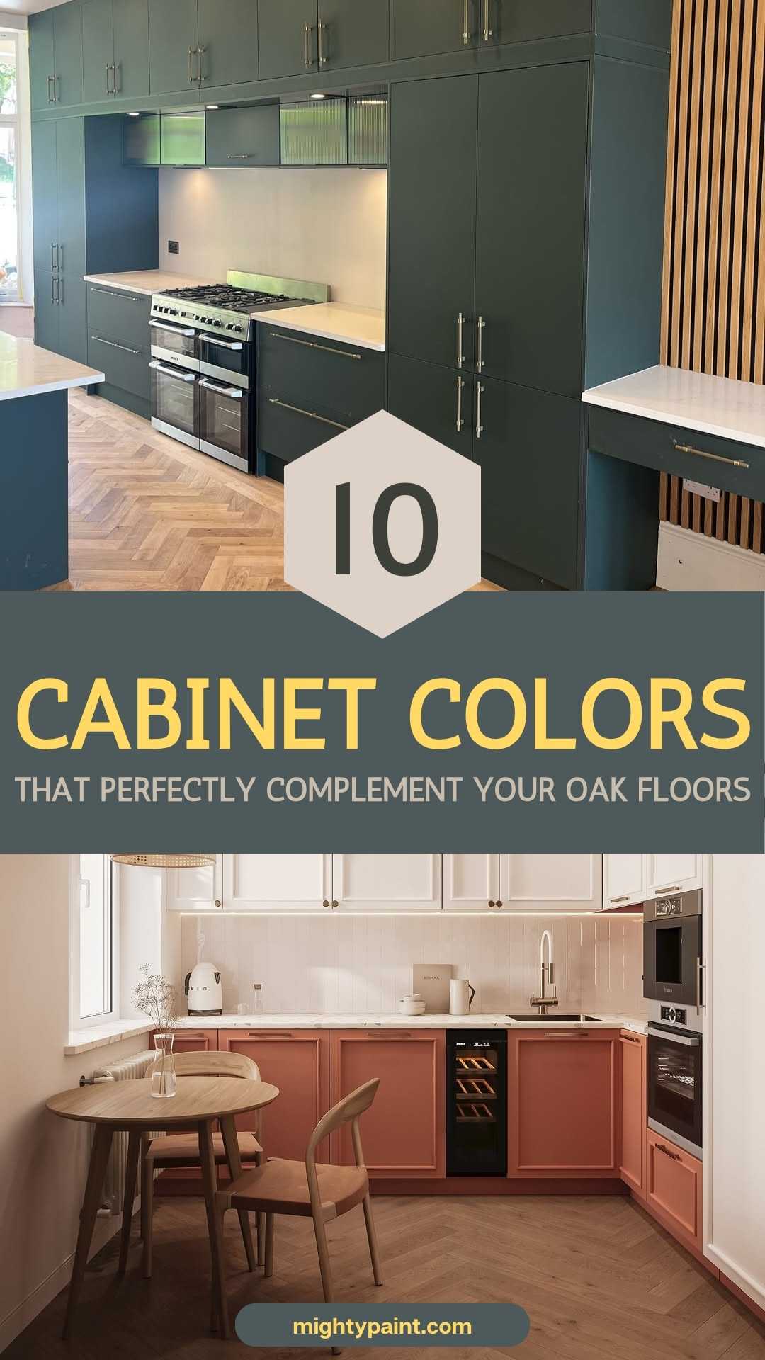
What Color Cabinets Go With Oak Floors?
I still remember the day we ripped up our builder-grade vinyl and uncovered the oak floors hiding underneath. The warm, honey-gold planks instantly made the kitchen feel brighter—until I noticed our existing maple cabinets looked painfully orange beside them. My Pinterest board said, “Just paint them white.” My designer friend said, “Slow down and read the undertones first.” Two paint swatch decks and one very confused spouse later, I realized pairing cabinets with oak isn’t a one-size-fits-all decision; it’s a balancing act between wood species, lighting, and the mood you want the room to carry.
Oak is tricky because it changes personality with every shift of daylight. In the morning, my floors lean fresh and yellow; by evening, they reflect the sunset and flirt with orange. Pick a cabinet color that’s too close, and everything blends into a wall of wood. Swing too far in the opposite direction, and you risk a jarring, checkerboard contrast. The secret lies in reading the oak’s undertone—red, yellow, or neutral—then choosing a paint or stain that either softly harmonizes or confidently contrasts.
Get the Fail-Safe Paint Color Playbook (Free PDF)
36 proven colors • 8 ready palettes • trim & sheen guide • printable testing cards.
Over the next sections, I’ll walk you through ten cabinet colors that consistently flatter oak floors, from warm whites that brighten a honey finish to charcoal blacks that add drama without overpowering. Think of this as your cheat sheet to keeping those gorgeous planks center stage while giving your cabinets a starring role of their own.
Why Oak Floors Need Thoughtful Pairing
Oak isn’t a single look; it’s a spectrum that shifts with species, stain, and even the hour of the day. White-oak planks sit on the cooler, neutral side, while red-oak swings rosy and honey-oak glows almost amber at sunset.
If your cabinets land too close to that background color, everything melts into a wood-on-wood blur—pretty in theory, bland in real life. Push the contrast too far, and every seam screams for attention like a checkerboard.
Texture also plays a role. Oak’s grain is bold and linear, so lacquer-smooth cabinet doors can feel disconnected unless their color either repeats an undertone or confidently counters it. In short, oak floors set the keynote of the space; the right cabinet color becomes harmony, not competing melody.
Key Design Factors Before You Pick a Paint Chip
Before you tape a single swatch to a cabinet door, step back and study three fixed elements that won’t budge as easily as paint:
- Counters & Backsplash
Marble veining, butcher-block tones, and grout color can nudge a “perfect” cabinet hue into clash territory. - Lighting
LED under-cabinet strips skew cooler; afternoon sun warms everything. Always view swatches under both. - Room Vibe
Decide whether you want seamless warmth (think greige on greige) or bold punctuation (navy against honey-oak) before you fall in love with a color name.
Pro tip: Paint large poster-board samples and move them around for a full day; oak undertones morph from morning to evening, and your cabinets must handle the whole show.
10 Cabinet Color Winners for Oak Floors
A reminder before we dive in: oak’s undertone decides the rules. Tape a postcard-size paint sample to an inside-corner of your cabinet and watch it all day; what glows at noon can fall flat at dusk. Now, on to the colors.
1. Warm White & Soft Cream
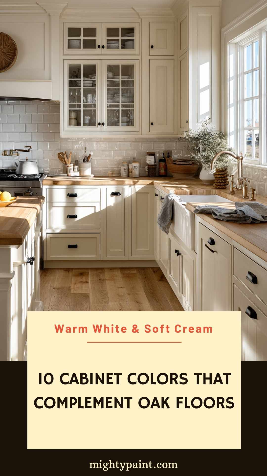
A creamy off-white feels like sunshine captured in paint. It brightens honey-oak planks without turning stark or hospital-cold, because the tiny hint of yellow inside the formula echoes the floor’s own warmth.
Pair it with matte-black knobs for a modern farmhouse vibe, or brushed brass if you want a gentler, classic look. Just steer clear of pure, blue-based whites—they exaggerate oak’s orange notes and can leave the room looking patchy.
2. Greige (Grey-Beige Blends)
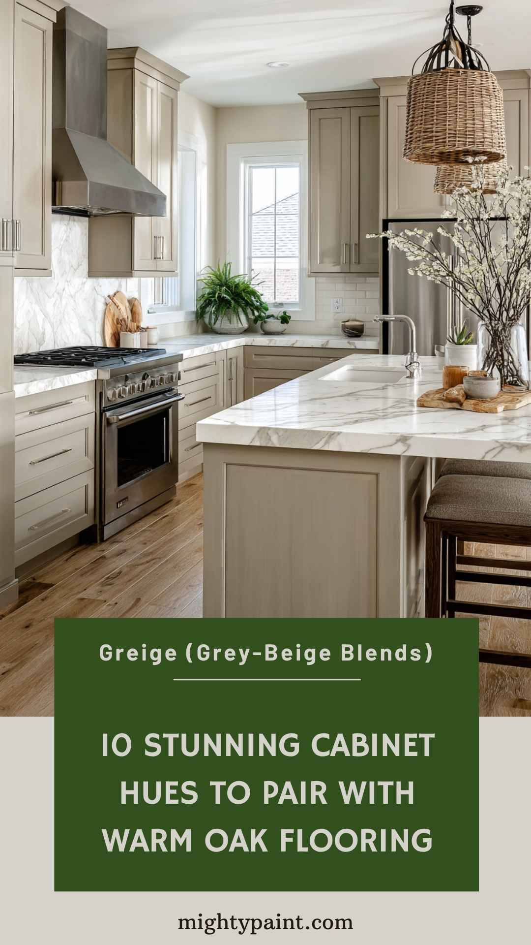
Greige is the diplomatic passport of paint colors. The soft beige keeps red-oak’s pink cast in check, while the grey half cools honey tones just enough to feel contemporary.
I like to bring the same greige onto the crown moulding so the cabinets read as one tidy block. Add satin-nickel pulls, a white-veined quartz counter, and suddenly the floor’s grain becomes a subtle texture instead of the star of the show.
Get the Fail-Safe Paint Color Playbook (Free PDF)
36 proven colors • 8 ready palettes • trim & sheen guide • printable testing cards.
3. Cool Gray with a Whisper of Blue
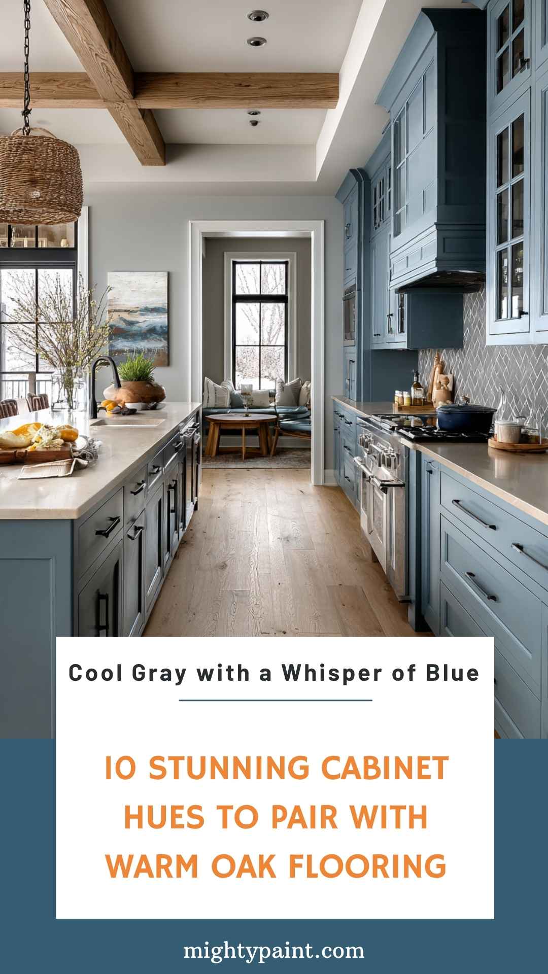
A misty gray that leans ever-so-slightly toward blue cuts through yellow-leaning oak like crisp linen against summer skin. It’s fresh without feeling icy.
In kitchens starved for natural light, swap polished chrome hardware for something warmer—aged pewter or antique brass—to keep the palette from sliding into storm-cloud territory after sunset.
4. Sage & Muted Green-Greys
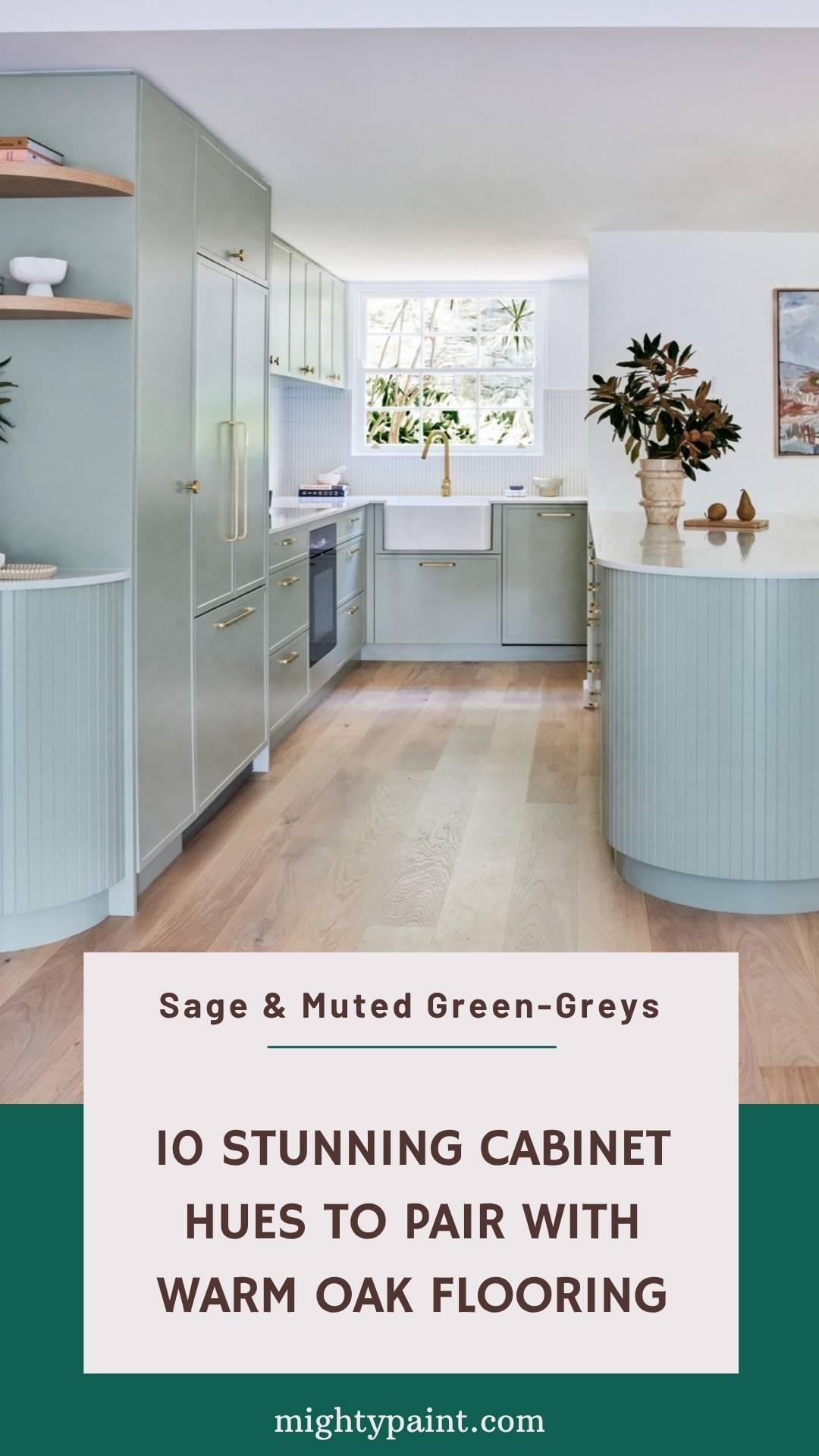
Earthy sages sing with oak because both belong to the “outdoor” half of the color wheel. The gentle green calms the wood’s busy grain and invites plants, rattan barstools, and linen towels into the mix.
Get the Fail-Safe Paint Color Playbook (Free PDF)
36 proven colors • 8 ready palettes • trim & sheen guide • printable testing cards.
Pick a shade with more gray than yellow—think eucalyptus, not lime—so the combo feels modern, not minty. A butcher-block island top or terracotta vase ties the entire palette back to nature.
5. Navy & Ink-Blue
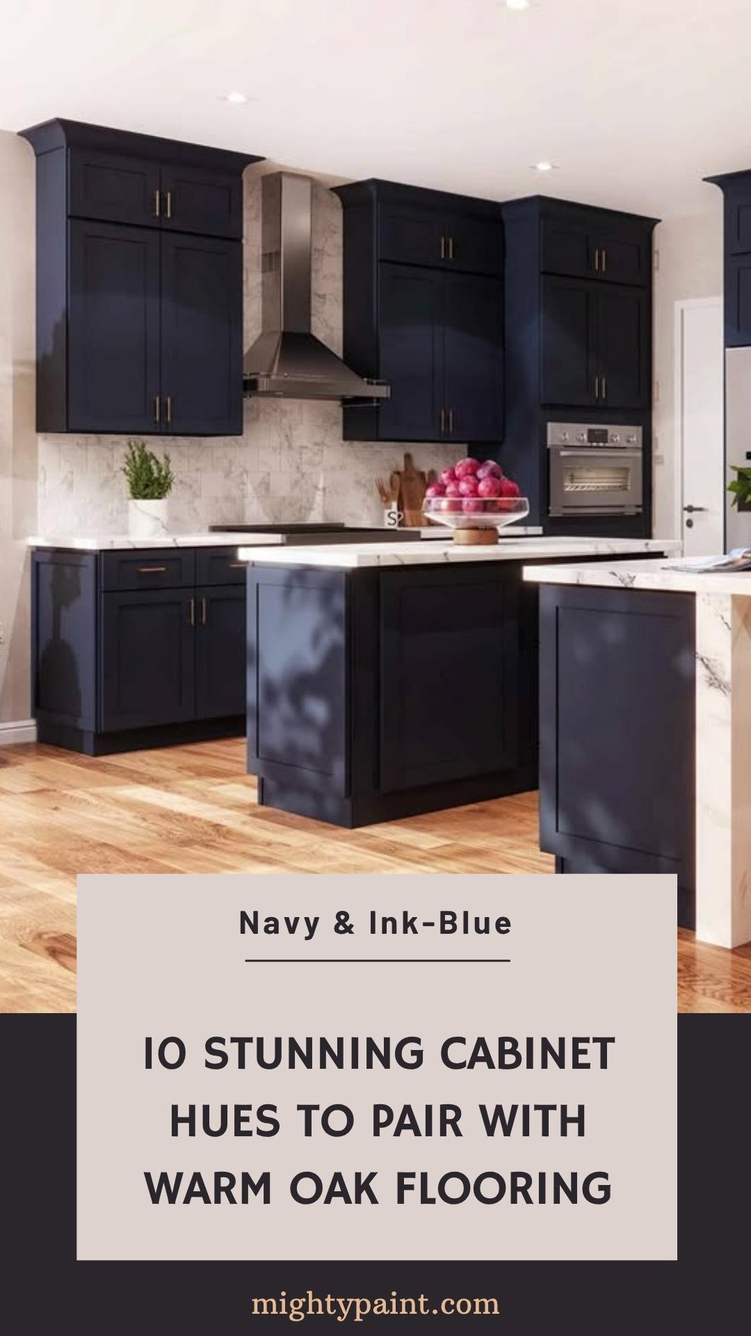
Deep navy delivers instant drama without the risk of feeling trendy-today, dated-tomorrow. Against mid-tone oak, it behaves like a dark denim under a tan belt—bold but familiar.
Balance the depth with lots of white elsewhere: a subway-tile backsplash, bright dishes behind glass doors, or a crisp ceiling. Brass pulls sparkle like cufflinks and keep the mood polished rather than nautical.
6. Charcoal & Almost-Black
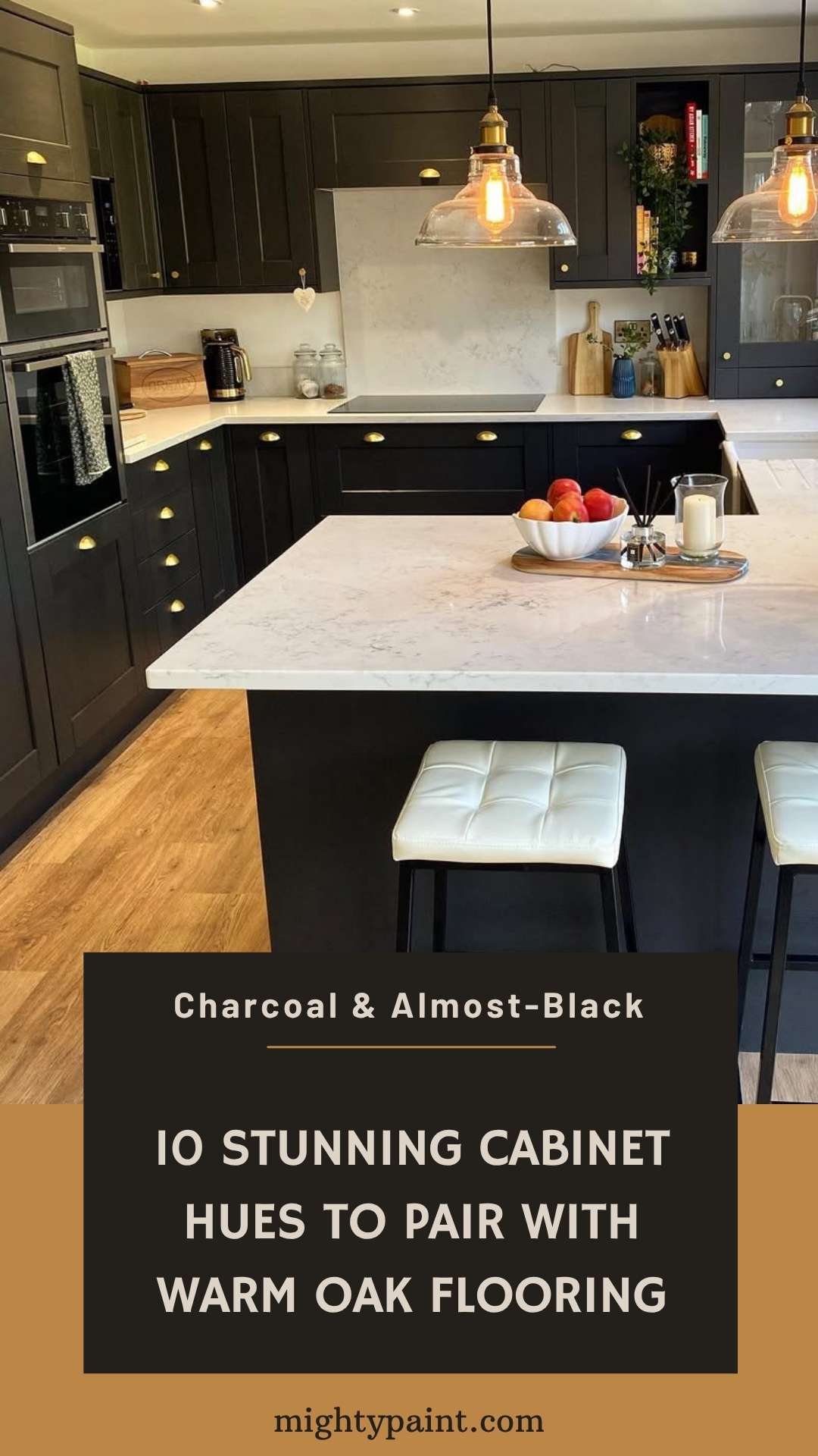
If your kitchen is awash in southern light, charcoal cabinets can ground the space and let golden oak glow rather than overwhelm. The high contrast creates magazine-worthy photos and hides everyday smudges.
Keep door styles simple—Shaker or flat slab—so grain and color stay the focus. To dodge a cave effect, bounce light with satin brass hardware and a backsplash in glossy zellige tiles.
7. Deep Chocolate & Walnut Brown
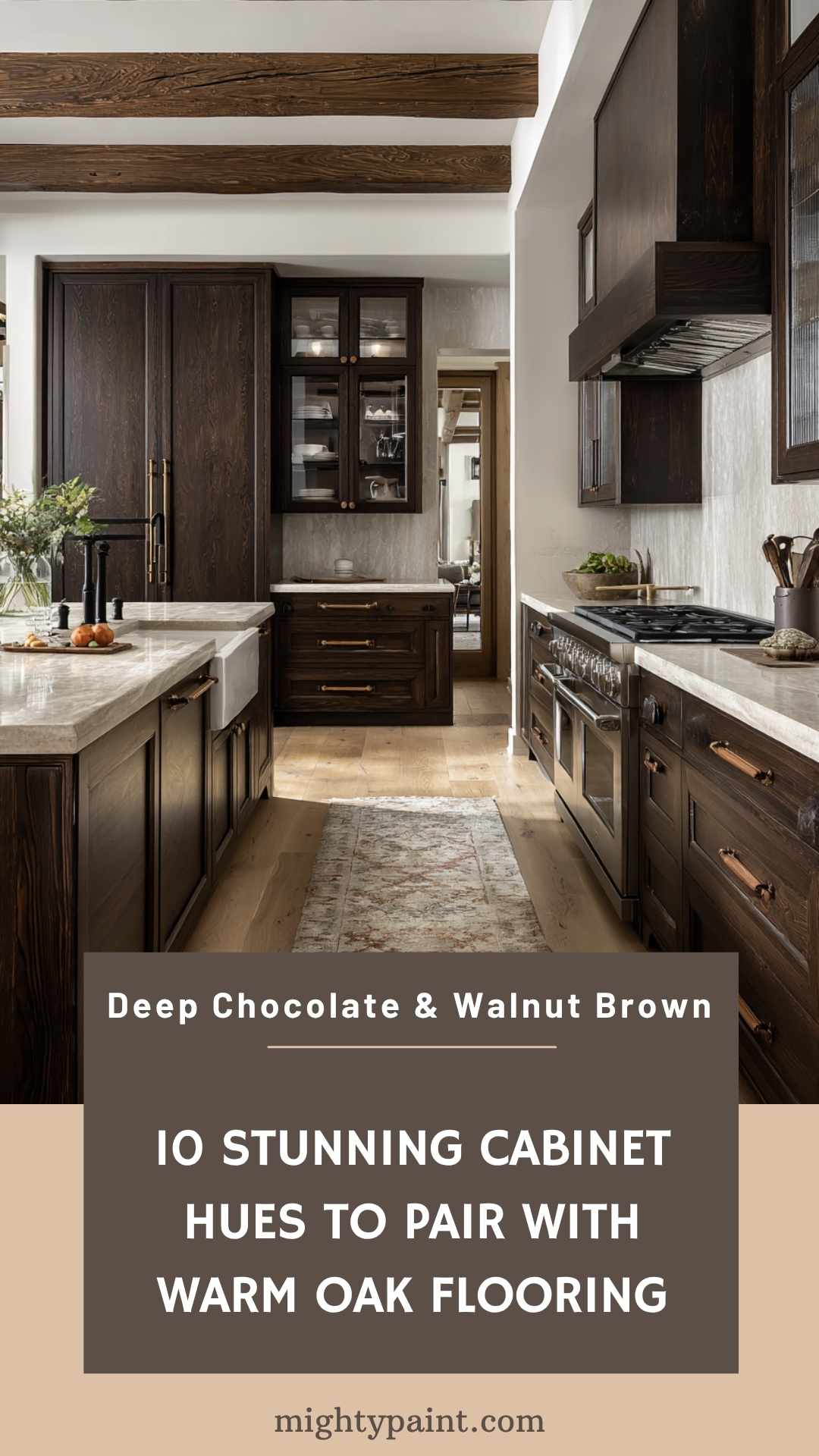
Going tone-on-tone sounds risky, yet a cabinet stain two shades darker than the floor reads intentional and luxe. Imagine espresso cabinets meeting latte-colored planks—a layered mocha palette that feels custom.
I love this combo in open-plan homes because the floors and cabinets flow without hard color breaks. Add creamy quartzite counters and leather pulls for a warm, organic finish.
8. Terracotta & Softened Apricot
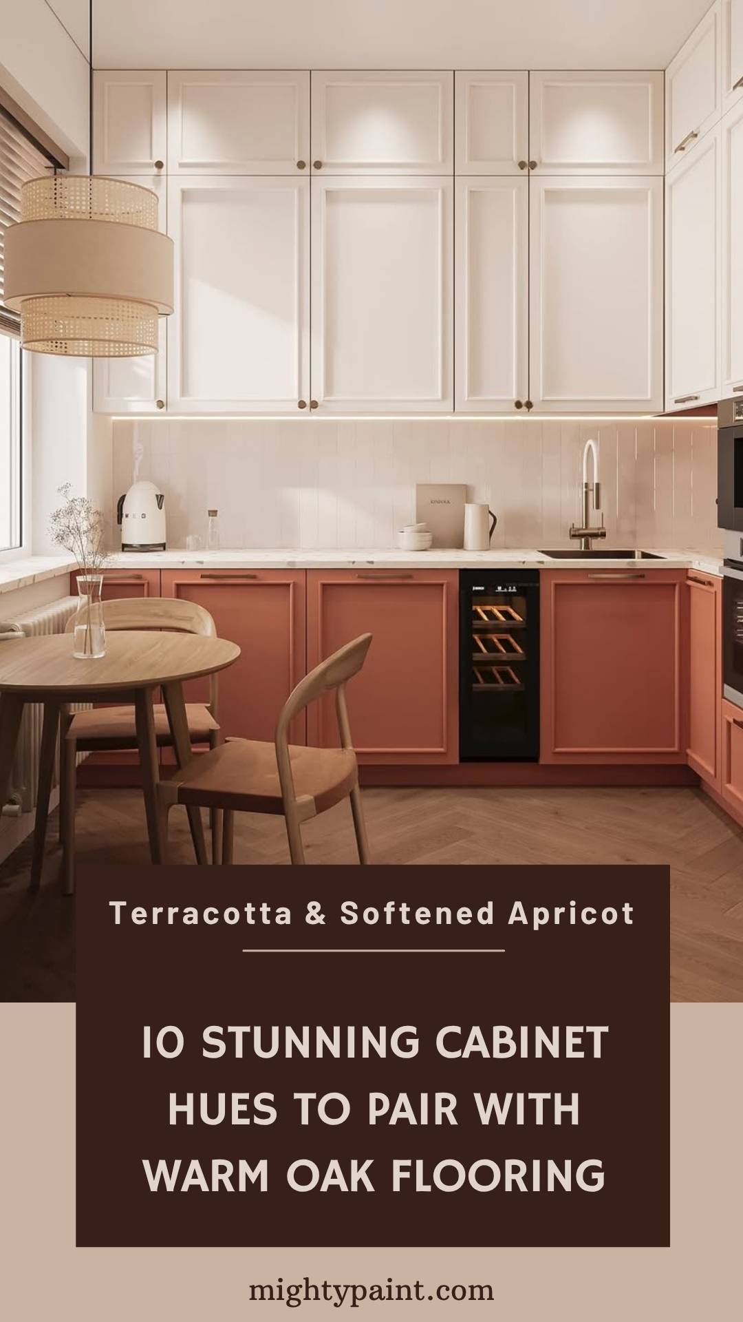
Soft terracotta kisses honey oak’s orange undertone instead of competing with it, creating a sun-washed Mediterranean vibe. The key is dusty, muted pigments—not bright pumpkin.
Finish the story with handcrafted clay tiles or copper pendants, and the space feels collected, not themed. If you’re nervous, test it on a pantry door first—you’ll be surprised how forgiving the earthy hue is.
9. Dusty Blush or Mauve-Taupe
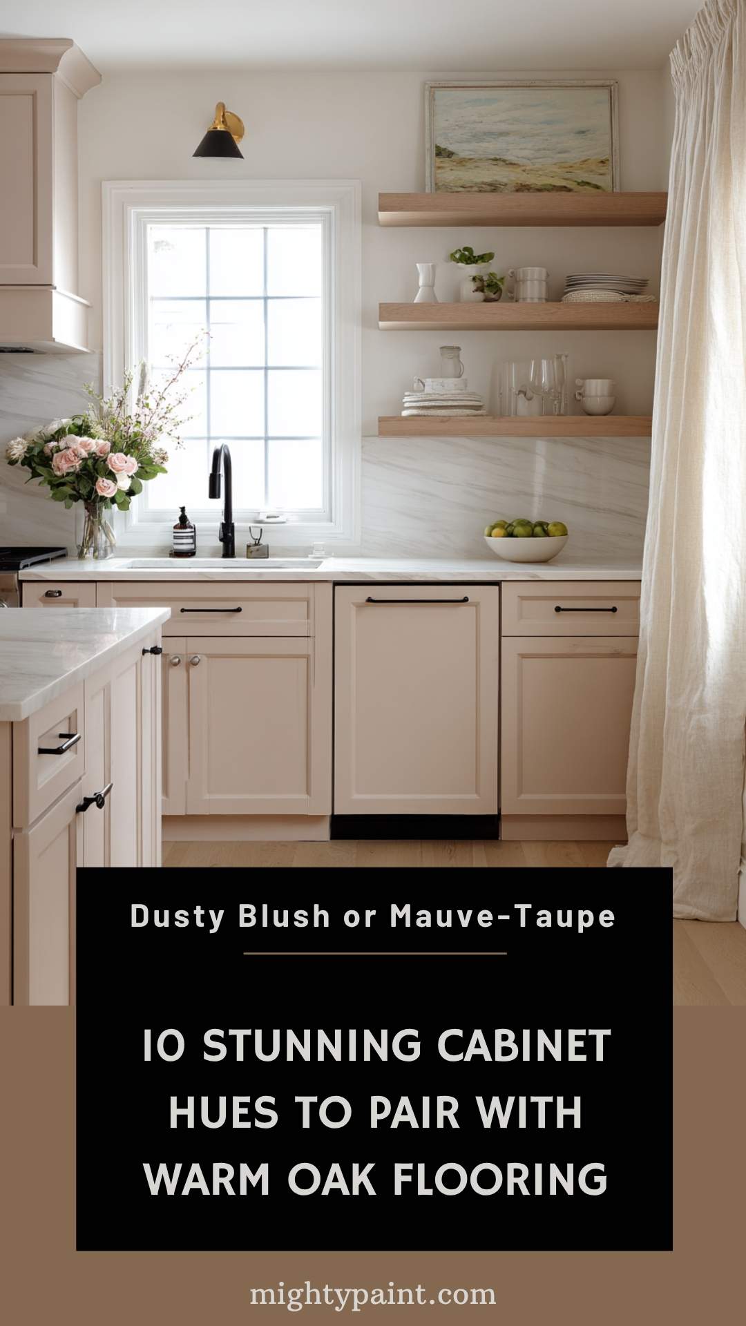
A hushed blush seems daring until you see it flanking pale white-oak planks: suddenly the combination is airy, Scandinavian, and anything but girly. The touch of taupe in these pinks keeps things sophisticated.
Dress it up with matte-black fixtures for contrast, or lean romantic with unlacquered brass. Either way, the oak stays neutral, letting the cabinets supply all the color.
Get the Fail-Safe Paint Color Playbook (Free PDF)
36 proven colors • 8 ready palettes • trim & sheen guide • printable testing cards.
10. Two-Tone Combos (Paint + Natural Wood)
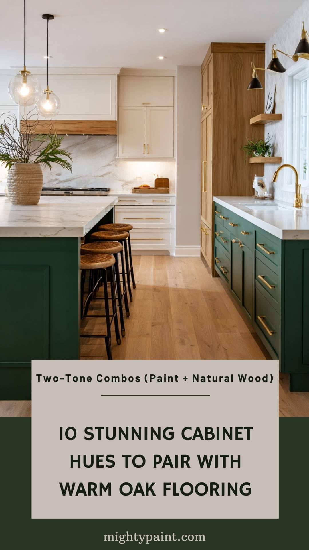
Can’t commit to one shade? Paint upper cabinets in a light neutral—warm white or mist grey—and leave the lowers in a medium-oak stain. The eye travels upward, making ceilings feel taller while the darker base camouflages scuffs.
Another twist is a painted island set against stained perimeter cabinets. That single block of color—navy, forest green, even charcoal—reads like furniture and keeps oak floors from feeling repetitive.
Two-tone schemes demand a unifying detail: matching hardware finish or repeated counter material. Tie those elements together and the mix looks curated rather than chaotic.
Styling Touches That Tie It All Together
A spot-on cabinet color still needs supporting actors. Start with hardware—black iron adds crisp definition to warm whites, while brushed brass softens navy or charcoal. If you’ve gone greige or sage, satin-nickel or antique pewter keep the palette relaxed rather than flashy.
Countertops bridge cabinet and floor. White quartz with subtle caramel veining harmonizes honey oak + warm white, whereas a dark soapstone look-alike anchors pale floors beneath cool-gray cabinets. For backsplashes, glossy bevelled subway tiles bounce light; handcrafted zellige adds texture that mirrors oak’s grain without more wood. Finally, weave in textiles—linen café curtains, a patterned runner—that repeat your undertone and finish the story.
Get the Fail-Safe Paint Color Playbook (Free PDF)
36 proven colors • 8 ready palettes • trim & sheen guide • printable testing cards.
Quick-Reference FAQ
Should cabinet stain ever match oak exactly?
Only if you crave a seamless, furniture-built-in look. Most homeowners prefer a shade lighter or darker for visual depth.
Will dark cabinets shrink a small kitchen?
Not if you balance them with light counters, reflective backsplashes, and adequate lighting. Depth at eye level can actually make walls recede.
How big should my paint sample be?
At least an A4 sheet (letter size). Move it around the room for a full day to watch undertone shifts.
Can I shift my existing cabinet color without stripping?
Yes—de-gloss, prime with a high-bond primer, then top-coat. Scuff-sanding plus a bonding primer reduces chipping on factory finishes.
Get the Fail-Safe Paint Color Playbook (Free PDF)
36 proven colors • 8 ready palettes • trim & sheen guide • printable testing cards.
Conclusion
Pairing cabinets with oak floors isn’t about memorizing a single “right” color—it’s about reading your wood’s undertone and deciding whether you want harmony or contrast. Warm whites, greiges, and sage greens melt into honey oak for a soft, inviting palette, while navy, charcoal, and two-tone schemes create high-end drama. Test large samples, view them in every light, and let hardware, counters, and backsplash knit the palette together. Do that, and those oak planks you loved enough to uncover will finally get the spotlight they deserve—without the cabinets stealing the show or fading into the wings.