
Shade & Tint Generator – Free Online Tool to Create CSS Color Palettes
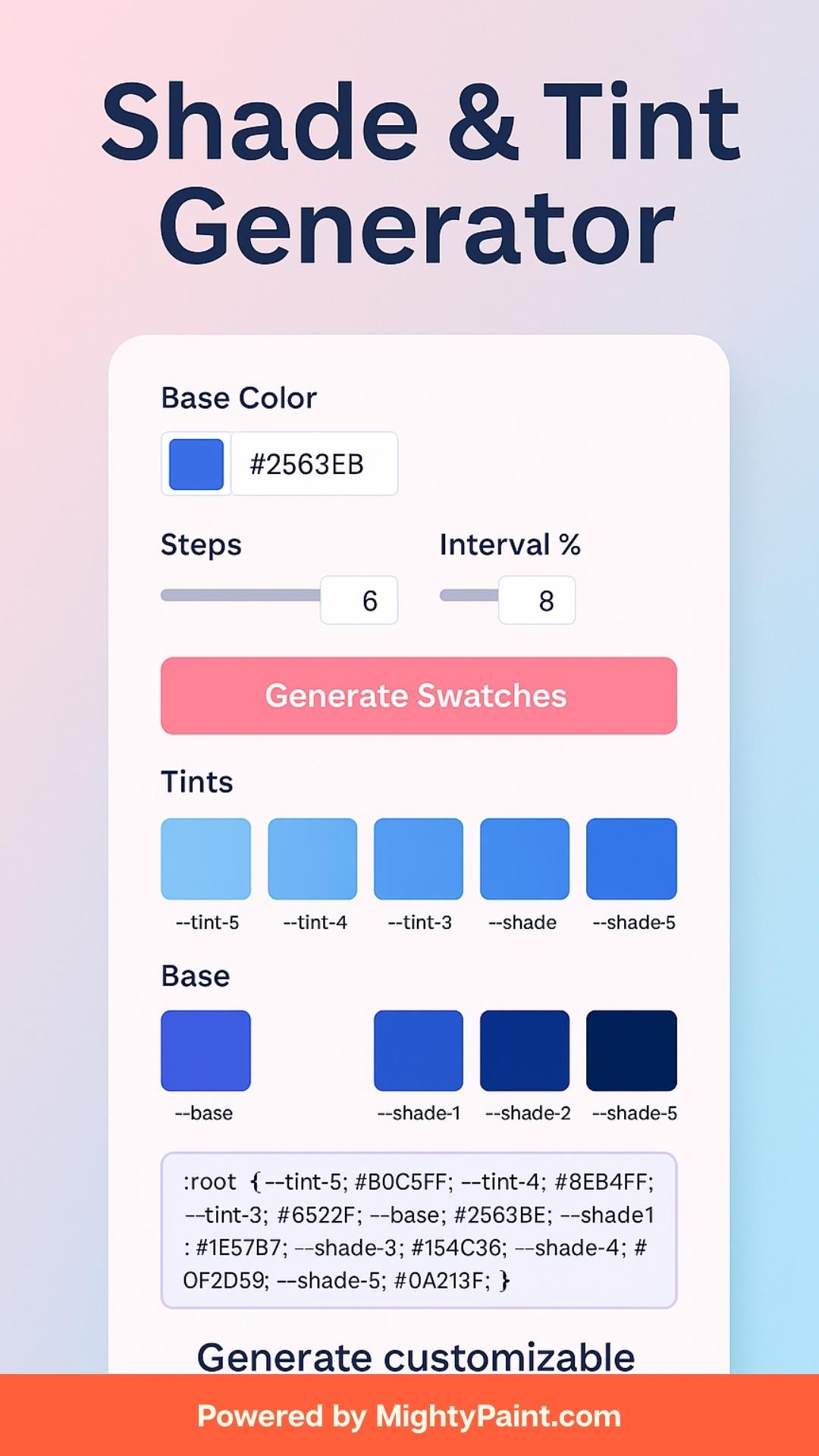
Shade & Tint Generator
Generate lighter tints and darker shades from a base color. Copy individually or grab all CSS in one click.
How the Shade & Tint Generator Works
Get a full spectrum of lighter tints and darker shades in just three quick steps:
- Enter your base color
Paste a HEX value (e.g.#2563EB) or click the color-picker to choose any hue from your brand palette. - Adjust steps & interval
- Steps controls how many tints/shades you’ll receive (2–20).
- Interval % sets how much lighter or darker each swatch should be (1–20 % increments).
- Generate swatches & export CSS
Hit Generate Swatches to render:- A row of tints (lightest → base)
- The base color block (double-width for emphasis)
- A row of shades (base → darkest)
Copy individual HEX codes with one click, or grab the entire:root { … }CSS variable set from the export box.
What Are Shades and Tints?
- Tints are created by mixing your base color with white, which increases its lightness in HSL space. Each tint step raises the lightness value, resulting in a progressively paler hue.
- Shades come from mixing your base color with black, decreasing lightness in equal intervals. Lower lightness values yield deeper, richer tones.
- Under the hood, the tool converts your HEX to HSL, then nudges the L (lightness) channel up or down by your chosen interval percentage for each step.
By understanding this HSL-based approach, you can predict exactly how each swatch will look—and maintain consistent color relationships throughout your UI or brand palette.
Why Extend Your Palette?
Expanding your base color into systematic tints and shades delivers tangible benefits:
- Faster Design Iterations
Rather than manually eyeballing lighter or darker variants, a generator gives you all options at once—so you can quickly swap swatches in mockups without constant color tweaking. - Consistent Visual Hierarchy
Using evenly spaced lightness steps ensures that each level of emphasis (backgrounds, cards, buttons, accents) maintains a predictable relationship to your base hue, reinforcing clarity and brand coherence. - Seamless Theme Variations
Whether you’re crafting light/dark modes, status indicators (success, warning, error), or component states (hover/active/disabled), having pre-calculated tints and shades means you’ll never fall outside your brand’s color system. - Improved Accessibility Checkpoints
Some extreme tints or shades can fail contrast requirements—by generating a full range you can immediately test each against a WCAG Contrast Checker to catch any potential readability issues before they go live.
With an automated palette extension, you spend less time mixing colors and more time designing beautiful, consistent, and accessible interfaces.
Using the Generator Controls
- Base Color
- Enter any 6-digit HEX code (with or without the
#) into the text field, or click the color picker to choose visually. - The two inputs stay in sync—typing updates the picker, and picking updates the HEX field—so you can work however you prefer.
- Enter any 6-digit HEX code (with or without the
- Steps
- Use the “Steps” slider to select how many tints and shades you want on each side of your base color.
- Fewer steps (e.g. 2–4) give broad jumps for dramatic contrast; more steps (8–12+) yield a fine-grained spectrum for subtle UI nuances.
- Interval %
- This slider determines how much to lighten or darken per step.
- A small interval (1–5 %) produces gentle shifts; a larger interval (10–20 %) creates more pronounced tints and deeper shades in fewer swatches.
- Generate Swatches
- Once you’ve dialed in your base color, step count, and interval, click Generate Swatches.
- The tool instantly renders three sections—tints, the emphasized base block, and shades—each with copy-able HEX labels.
- CSS Export
- Below the swatches, the complete
:root { … }block appears, ready to copy into your stylesheet as custom properties (--tint-1,--base,--shade-1, etc.).
- Below the swatches, the complete
Inspecting Your Swatches
Once generated, your expanded palette is neatly organized into three distinct sections:
- Tints (Lightest → Base)
- Displayed in descending lightness order, each block shows a progressively paler version of your base hue.
- Use these for backgrounds, disabled states, or subtle highlights.
- Base (Emphasized Block)
- Centered between tints and shades, the base color appears in a rectangular block (2× width) for immediate visual reference.
- Ideal for primary buttons, headers, or key brand elements.
- Shades (Base → Darkest)
- Rendered in descending darkness, these swatches help you pick deeper accent colors—perfect for text, borders, and shadows.
Each swatch includes:
- A color block displaying the exact hue.
- A hex label below for quick identification.
- A Copy button to instantly copy that HEX value to your clipboard.
Copying & Exporting Your Colors
Every swatch in your generated palette comes equipped with a Copy button—just click to copy that individual HEX code to your clipboard for instant pasting into your design tool or CSS.
Below the visual swatches, you’ll find a polished CSS export box containing a complete :root { … } block of custom properties:
:root {
  --tint-6: #F0F4FF;
  …
  --tint-1: #E0E8FF;
  --base: #2563EB;
  --shade-1: #2357CB;
  …
  --shade-6: #1A2B6B;
}
- Copy a single variable: select just the lines you need.
- Copy the whole block: click and drag or Cmd/Ctrl + A to grab the entire palette.
- Paste directly into your global stylesheet or component-level CSS file—no additional formatting required.
By combining per-swatch copy buttons with the bulk export, you get maximum flexibility: pick and choose individual accents, or import an entire, ready-to-use palette in one go.
Best Practices for Palette Expansion
- Choose a balanced step count (4 – 8):
Too few steps can produce jarring jumps; too many can be overkill. Aim for 4–8 swatches per side to give designers enough options without clutter. - Test extreme hues for contrast:
Run your lightest tints and darkest shades through a WCAG Contrast Checker (like our Contrast Checker & Fixer) against your intended text or background to ensure legibility at both ends of the spectrum. - Name your variables semantically:
Use tokens like--primary,--primary-light,--primary-darkor numbered steps (--tint-1,--shade-1) consistently across your codebase or design system to make maintenance and handoffs crystal-clear. - Integrate into your design system:
Store your exported CSS variables in a single theme file or design token manager (Figma, Token Studio), so every component pulls from the same source of truth. - Combine with other MightyPaint tools:
After extending your palette, sample real-world colors with our Image Color Sampler, then verify accessibility with the WCAG Contrast Checker & Fixer and the Color-Blindness Simulator for a full end-to-end color workflow.
Frequently Asked Questions
Q: What formats does this generator support?
A: You can enter any 6-digit HEX value (with or without the #). The built-in color picker will sync automatically.
Q: Can I generate only tints or only shades?
A: Not separately—this tool always produces both. If you need just one side, you can ignore the other or delete its CSS variables after export.
Q: How do I integrate the CSS export into my project?
A: Copy the :root { … } block directly into your global stylesheet or component-level CSS. Use the CSS variable names (e.g. --tint-1, --shade-1) wherever you need those colors.
Q: Are these swatches guaranteed to meet accessibility contrast?
A: Not automatically—you should run critical tints and shades through a contrast checker (like our WCAG Contrast Checker & Fixer) to ensure readability against your chosen backgrounds or text colors.
Conclusion & Next Steps
With the Shade & Tint Generator, you can transform a single hue into a robust, working palette in seconds—complete with copy-ready swatches and CSS variables.
What to do now:
- Bookmark this tool for your next design sprint.
- Share it with your team or embed it in your design system docs.
- Explore our other MightyPaint color utilities to sample real-world images, test accessibility, and refine your brand’s visual language.
Have feedback or a new feature request? Drop us a line—we’re here to help you paint the web with perfect color.