
13 Whimsigoth Paint Colors for a Moody, Layered Room
Whimsigoth interiors balance deep, atmospheric colors with lighter details, varied texture, and personal objects. This guide compares 13 paint-color ideas and shows where each might fit—from a dramatic accent wall to a quieter bedroom or reading corner.
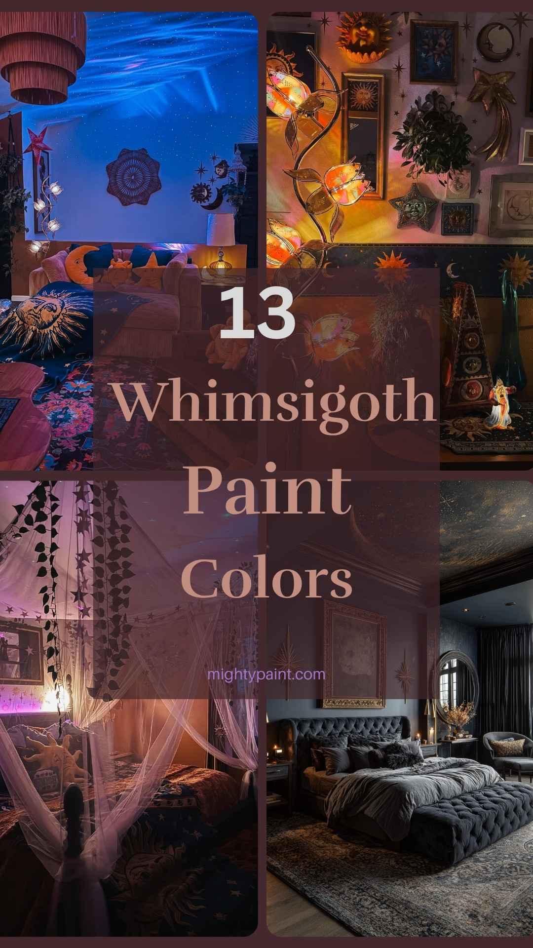
Treat manufacturer colors as starting points: check the current name and code on the paint brand’s own listing, then view a physical sample in your room’s lighting before choosing.
Get the Fail-Safe Paint Color Playbook (Free PDF)
36 proven colors • 8 ready palettes • trim & sheen guide • printable testing cards.
What Is Whimsigoth?
Before you start swatching colors, it’s important to understand the soul of the Whimsigoth aesthetic. At its core, Whimsigoth is where gothic drama meets playful fantasy. Imagine combining the moody elegance of a Victorian manor with the quirky magic of a fairy tale—this style is all about contrast and charm.
You’ll notice Whimsigoth spaces embrace deep, dramatic tones like eggplant purple, forest green, and midnight blue. But they’re also layered with whimsical touches: celestial motifs, vintage trinkets, tarot imagery, and soft, romantic fabrics. It’s a mix that’s nostalgic yet timeless, dark yet inviting.
Unlike traditional gothic decor, which can feel heavy or severe, Whimsigoth softens the darkness with a sense of wonder. And while bohemian styles might lean toward bright, earthy tones, Whimsigoth leans into shadows—enhancing them with glimmers of gold, flickers of candlelight, and textures that feel like spells woven into fabric. If your style says “witchy but warm,” you’re already on the right path.
The Whimsigoth Color Palette
Choosing the right paint colors is where the magic truly begins. The Whimsigoth palette is rooted in deep, saturated hues that instantly evoke mystery and emotion. These colors don’t just coat your walls—they create atmosphere.
Start with the foundations: rich jewel tones like amethyst purple, emerald green, garnet red, and sapphire blue. These shades feel luxurious and grounding, especially in dim lighting. Then, balance them with soft gothic neutrals like charcoal, plum-gray, and dusky mauve. You’ll also want to add accents of metallic gold, antique bronze, and silver for a touch of enchantment.
The key is layering. You might paint your walls a dramatic navy and then introduce lighter touches through decor—lavender curtains, gold-framed mirrors, or candles in muted pink holders. This dynamic mix keeps your space from feeling too heavy, while still wrapping it in that cozy, moonlit vibe.
Pro tip: test your color choices in different lighting throughout the day. The best Whimsigoth shades transform as the light shifts, just like a good spellbook.
13 Whimsigoth Paint Colors to Transform Your Space
Ready to pick your perfect potions? Here are 13 Whimsigoth paint-color ideas that will infuse your rooms with magic and mood. Each one offers a unique vibe, so you can find the right fit for your vision.
Images in this list show room-design inspiration, not exact paint swatches. Some graphics include decorative product-name overlays; do not treat those overlays or the photographed wall as verified paint samples. Confirm the names and codes in the article with current manufacturer listings and a physical sample in your own lighting.
Black Flame (PPG PPG1043-7), Midnight Blue (Benjamin Moore 1638), Darkroom (Sherwin-Williams SW 7083), and Nocturne Blue (BEHR HDC-CL-28) are identified manufacturer colors. The other entries below are color-family directions rather than verified product names. Paint names and screen colors can vary, so check each brand’s current listing and sample the color in your room before committing.
You don’t need to use them all—just pick two or three that speak to your style, and start layering them with intention.
🎨 1. Black Flame – PPG Paints (PPG1043-7)
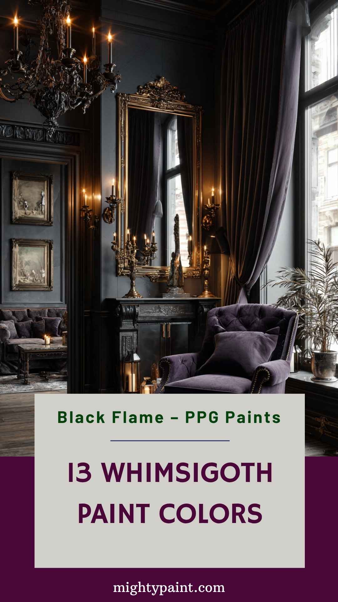
Black Flame is a deep, rich black infused with violet undertones, making it a quintessential choice for a Whimsigoth-inspired space. This color exudes sophistication and mystery, perfect for creating a dramatic backdrop in any room. Its unique blend of black and purple hues adds depth and intrigue, setting the stage for a moody, enchanting atmosphere.
Ideal for accent walls or entire rooms, Black Flame pairs beautifully with metallic accents like gold or brass, enhancing its luxurious feel. Consider using it in a dining room to create an intimate, opulent setting, or in a bedroom for a cozy, cocoon-like retreat. Complement this shade with rich textures such as velvet or silk to elevate the gothic charm.
When using Black Flame, ensure adequate lighting to prevent the space from feeling too enclosed. Incorporate mirrors or light-colored furnishings to balance the darkness and maintain a harmonious ambiance. This color’s versatility allows it to adapt to various styles, from classic gothic to modern chic, making it a timeless addition to your home.
🎨 2. Midnight Blue – Benjamin Moore (1638)
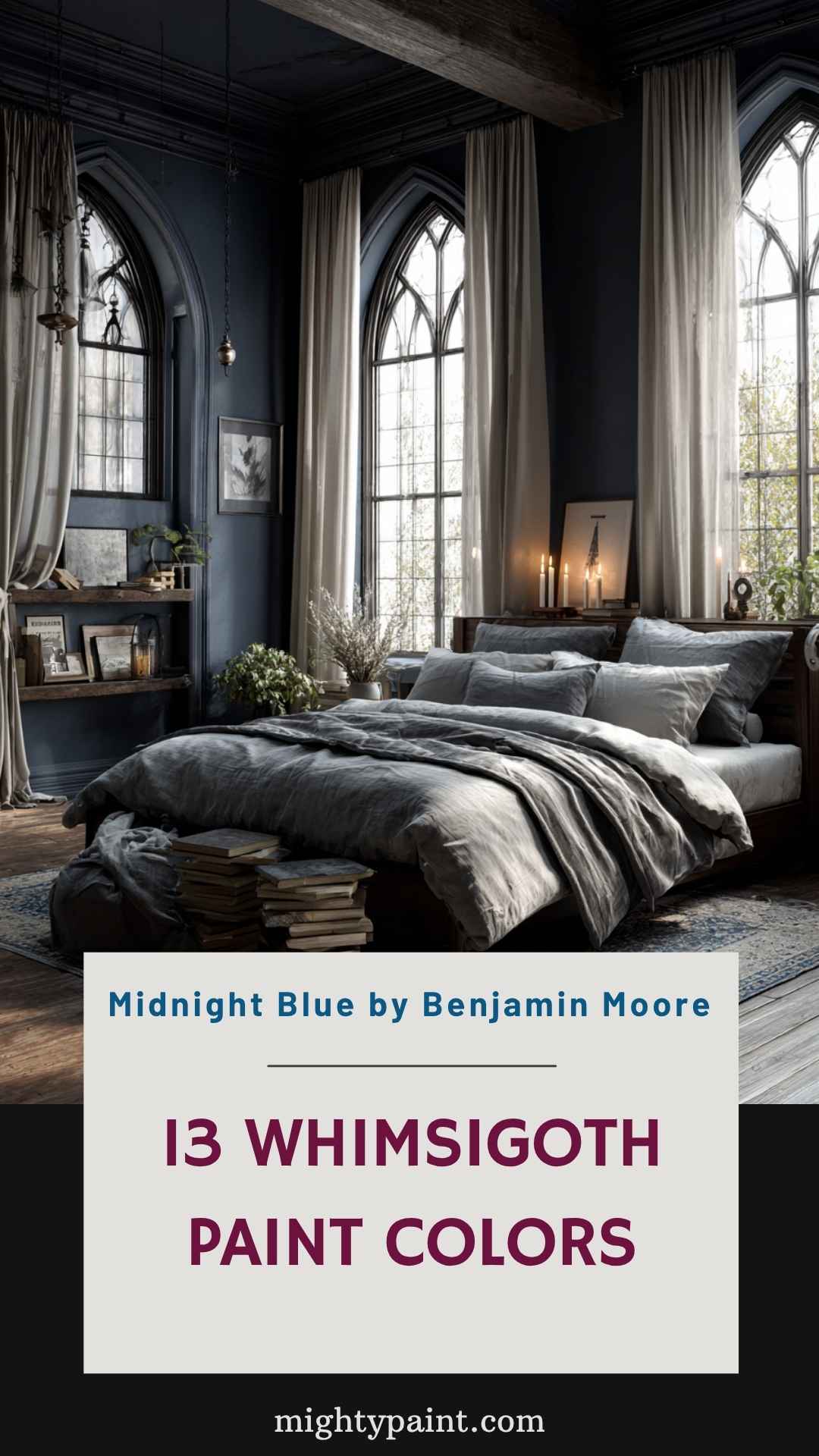
Midnight Blue is a deep, intriguing blue that borders on black, offering a sophisticated and calming presence in any room. With an LRV (Light Reflectance Value) of 8.22, it reflects minimal light, making it ideal for creating a cozy, intimate environment. This shade is part of Benjamin Moore’s Classics® collection, known for its timeless appeal.
Perfect for bedrooms or libraries, Midnight Blue provides a serene backdrop that encourages relaxation and contemplation. Pair it with lighter accents like cream or soft gray to prevent the space from feeling too dark. Incorporating natural textures, such as wood or linen, can add warmth and balance to the cool tones of the blue.
This color works well with both traditional and modern decor, offering flexibility in design choices. Whether used on all walls or as an accent, Midnight Blue brings depth and elegance, making your space feel both grounded and expansive.
🎨 3. Darkroom – Sherwin-Williams (SW 7083)
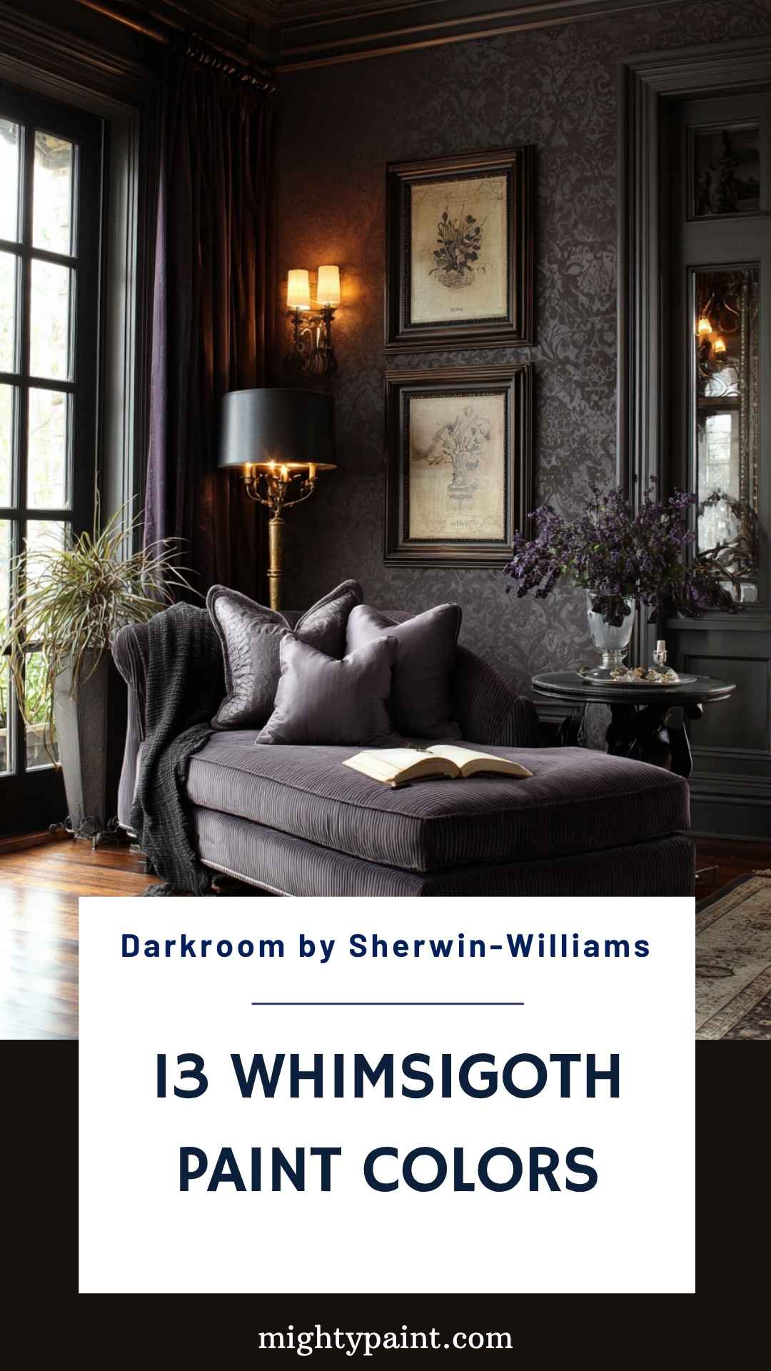
Darkroom is a deep, muted purple that brings a sense of luxury and depth to any space. Its rich hue creates a moody atmosphere, perfect for those looking to add a touch of drama to their interiors. This color is versatile, working well in various rooms, from living areas to bedrooms.
When using Darkroom, consider pairing it with lighter colors or metallic accents to prevent the space from feeling too heavy. Soft furnishings in complementary shades can enhance the cozy, inviting feel of the room. Incorporating different textures, such as velvet or silk, can add dimension and interest to the overall design.
This shade is particularly effective in spaces where you want to create a sense of intimacy and comfort. Whether used on all walls or as an accent, Darkroom adds a sophisticated touch that elevates the overall aesthetic of your home.
🎨 4. Deep Plum
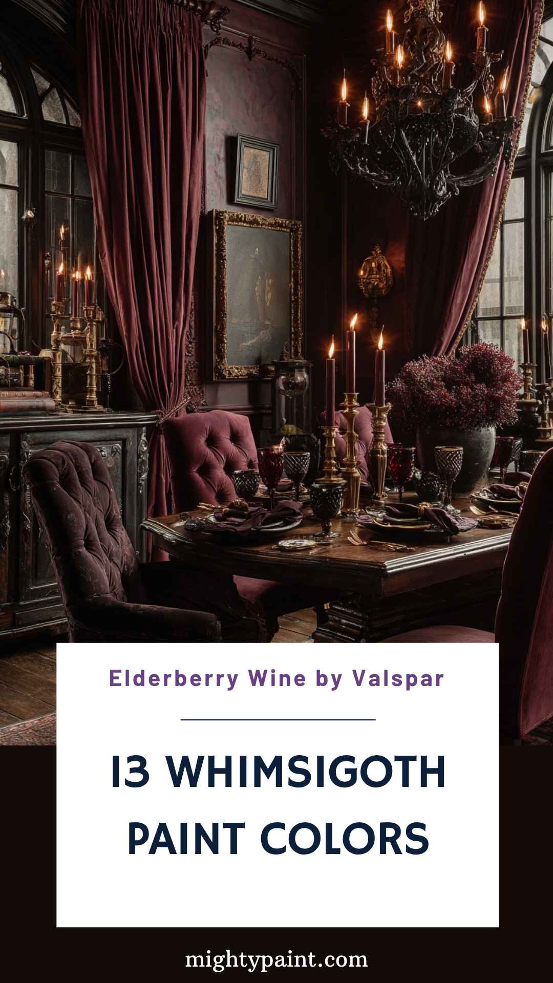
If you’re aiming to infuse your space with romantic mystery, Deep Plum is a stellar choice. This rich, dark plum hue is reminiscent of aged velvet and vintage wine—perfect for setting a sultry, luxurious tone. It brings both warmth and drama, making it a natural fit for Whimsigoth interiors where depth and emotion are key.
Deep Plum works beautifully in dining rooms or entryways, where you want to make a strong yet sophisticated first impression. Pair it with antique gold fixtures, candlelight, and heavy drapes to evoke an old-world ambiance. For balance, layer in soft textures like velvet cushions or lace curtains in muted pinks or creams.
This color is particularly striking against dark wood or black furniture. When used with low lighting or dimmable sconces, it transforms a room into a scene straight out of a gothic fairytale. Deep Plum isn’t just a paint color—it’s a mood.
🎨 5. Mossy Forest Green
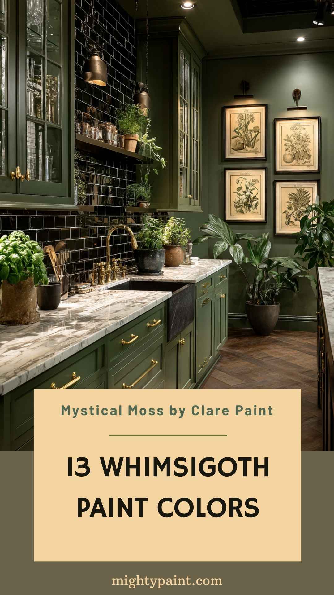
Mossy Forest Green offers a rich, velvety green that evokes the essence of an overgrown forest under moonlight. It’s lush, grounding, and a little mysterious—the kind of color that makes you feel like you’ve stepped into a hidden realm. For Whimsigoth spaces, it introduces the earthy counterbalance to deeper purples and inky blues.
Use Mossy Forest Green in bathrooms, kitchens, or even on cabinetry to bring nature-inspired calm into your home. It pairs exceptionally well with brass hardware, white marble, or black countertops. For a softer touch, mix in rose-toned accents or sheer curtains to lighten the visual weight.
In terms of texture, this shade thrives with natural elements like stone, wood, and linen. It’s also the perfect backdrop for botanical prints or mystical artifacts like crystal clusters and herb bundles. Mossy Forest Green adds a grounded enchantment to your home that feels both magical and deeply rooted.
🎨 6. Nocturne Blue – BEHR (HDC-CL-28)
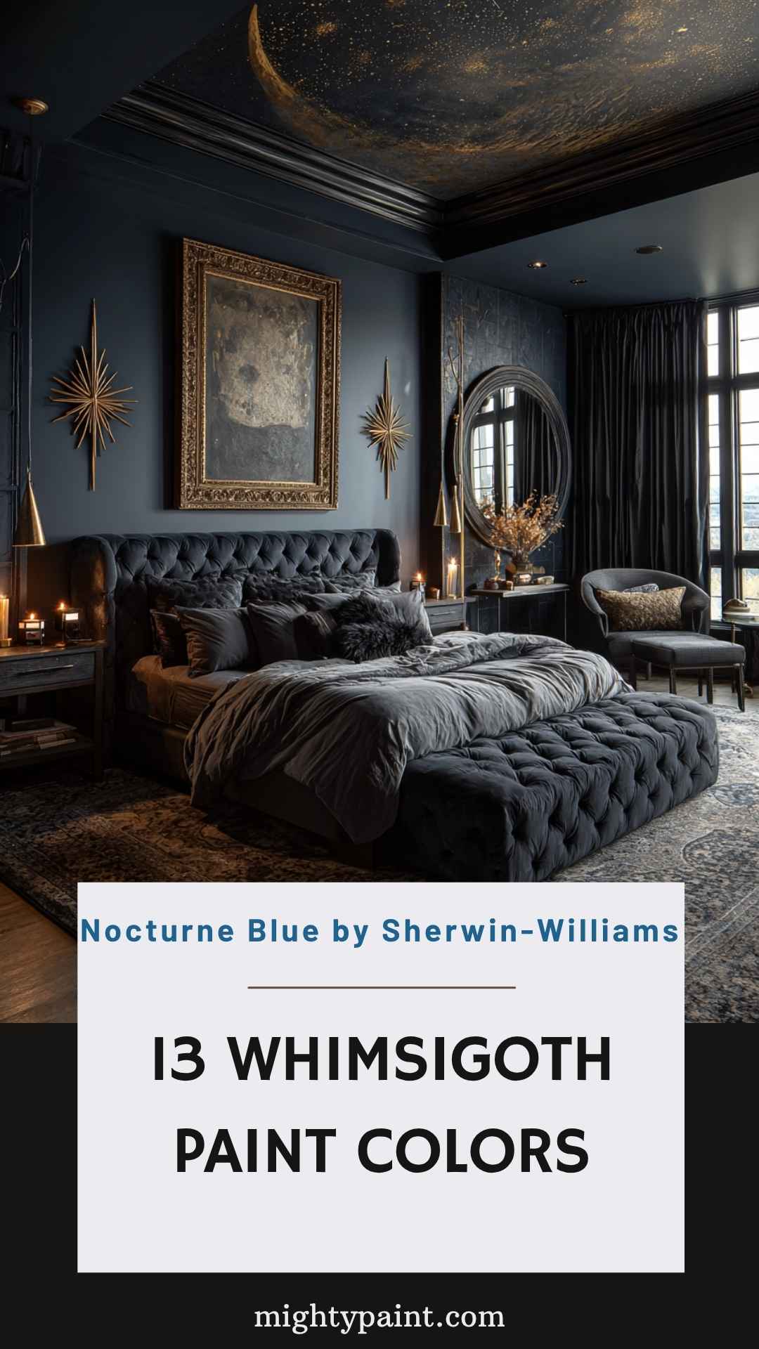
Nocturne Blue is a moody, enigmatic shade that combines the drama of navy with a hint of black. It captures the quiet intensity of a midnight sky, making it perfect for creating a deeply immersive space. With a high pigment concentration, this color reads differently throughout the day, shifting from navy to nearly black depending on lighting.
Ideal for a statement wall or an entire bedroom, Nocturne Blue wraps a space in elegance and serenity. Pair it with metallics like antique brass or burnished silver for a sophisticated contrast. If you’re going full Whimsigoth, add in celestial elements like moon phase wall art or starburst mirrors.
Texturally, this shade loves to be paired with heavy drapes, plush throws, and tufted furniture. Its depth makes it especially effective in creating a sense of stillness and reflection. Use Nocturne Blue when you want your room to feel like a personal sanctuary under the stars.
🎨 7. Candlelit Burgundy
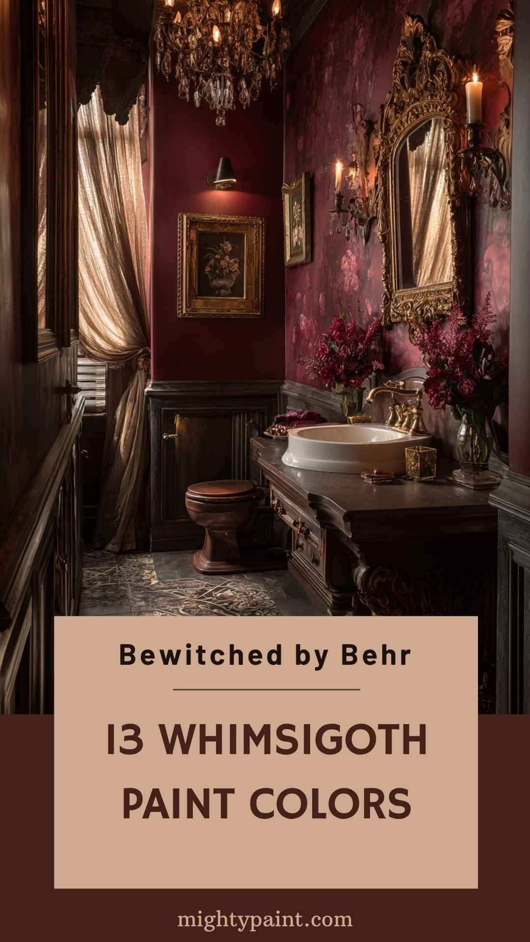
Candlelit Burgundy is a deep, sumptuous burgundy with brown and purple undertones—evoking candlelit rooms and the pages of ancient spellbooks. This color wraps a room in a warm, mysterious glow, making it an excellent choice for Whimsigoth interiors that blend coziness with gothic drama.
Use Candlelit Burgundy in intimate spaces like bedrooms or powder rooms, where its richness creates a cocooning effect. It pairs beautifully with soft gold accents, vintage crystal chandeliers, and dark wooden furniture. Velvet pillows, lace table runners, and antique mirrors will elevate the color’s romantic side.
This paint is especially impactful when used with dimmable lighting, allowing the undertones to shift subtly throughout the day. If you’re hesitant to go full wall-to-wall, try it as an accent wall or in alcoves to create visual interest. Candlelit Burgundy is perfect for those who want a paint color that feels like a love letter to the mystical and old-world elegant.
🎨 8. Cosmic Dust – PPG (PPG1157-6)
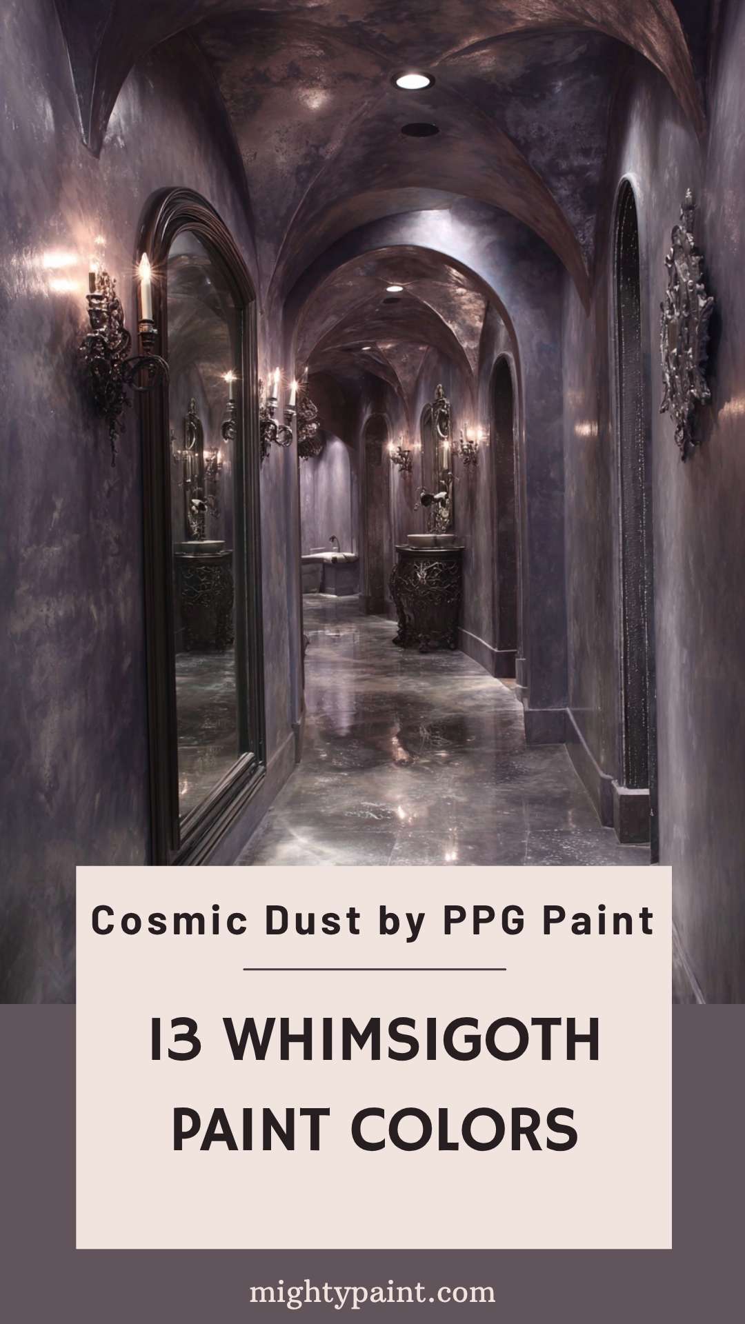
PPG identifies Cosmic Dust (PPG1157-6) as a deep, muted sapphire blue with a nautical undertone. In a Whimsigoth palette, it can add cool depth without the near-black intensity of navy. Screen colors are only a guide; test a physical sample in your own lighting.
Use this saturated blue on an accent wall or in a smaller room when you want color with presence. Pair it with softer gray, plum, and warm metallic details for contrast, and let natural light and nearby finishes influence how it reads.
If you prefer a softer lavender-gray, choose a separate verified paint color rather than relying on the room photo. Confirm the current product listing and view a physical sample before buying.
🎨 9. Amulet – Benjamin Moore (AF-365)
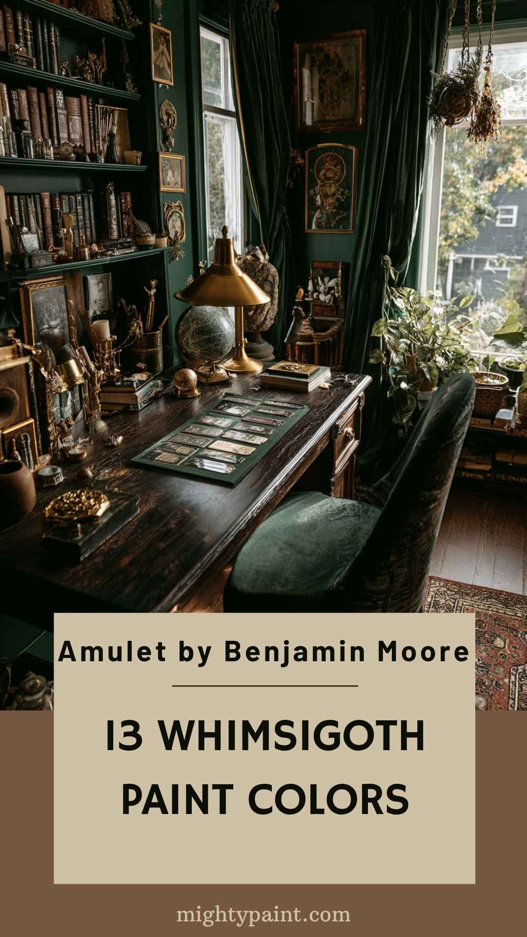
Benjamin Moore describes Amulet AF-365 as a warm, toasty tan with yellow tones. It offers a quieter counterpoint to the deep blues and purples in a Whimsigoth palette. Sample it at home, since light and nearby colors can change how a paint shade appears.
Use a warm tan as a softer backdrop alongside dark wood, plum, deep blue, or brass accents. The accompanying room photo is a design reference, not a swatch or proof of the paint color shown on its walls.
Check the manufacturer’s current listing for the exact color name and code, then test a physical sample in the room before committing. Digital photos and screen colors are not reliable substitutes for a paint sample.
🎨 10. Stormy Slate Blue
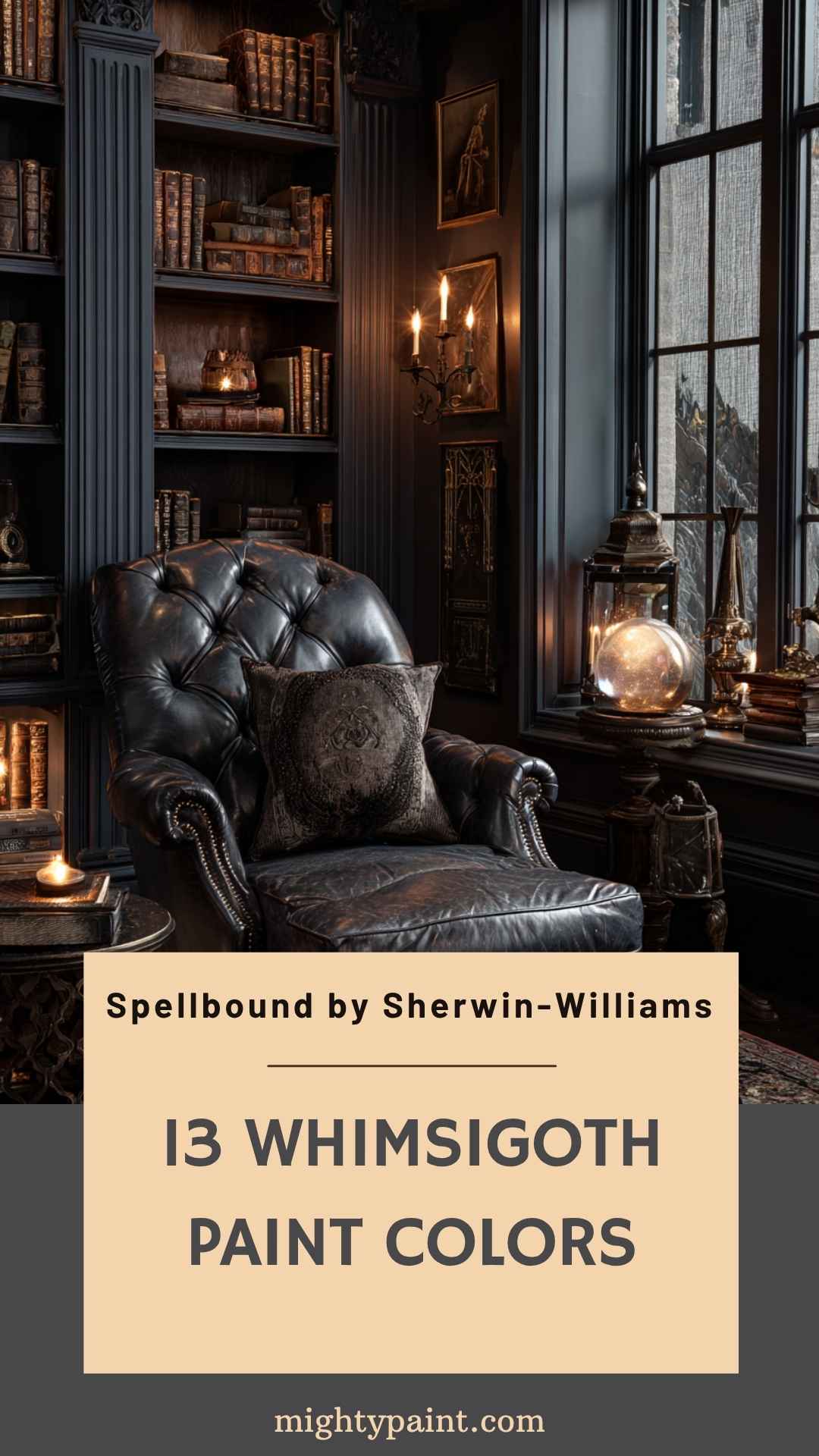
Stormy Slate Blue is a deeply captivating navy-gray blend that adds an immediate air of mystery and sophistication to any room. This shade flirts with both moody and muted, offering the best of both worlds for a truly Whimsigoth palette. It’s introspective, quiet, and full of depth—like the color of stormy skies before twilight.
Perfect for living rooms, reading nooks, or studies, Stormy Slate Blue thrives in spaces where you want to encourage reflection and calm. Pair it with rich wooden tones, oil-rubbed bronze, or even leather furnishings to give it a grounded feel. Soft lighting brings out its velvety finish, creating a room that feels enveloping but never overwhelming.
It also pairs well with soft grays, antique golds, or dusty pinks, allowing you to play with both light and shadow. If you’re after a color that embodies elegance with a side of spellcraft, Stormy Slate Blue might be your perfect match.
🎨 11. Inky Blue-Black
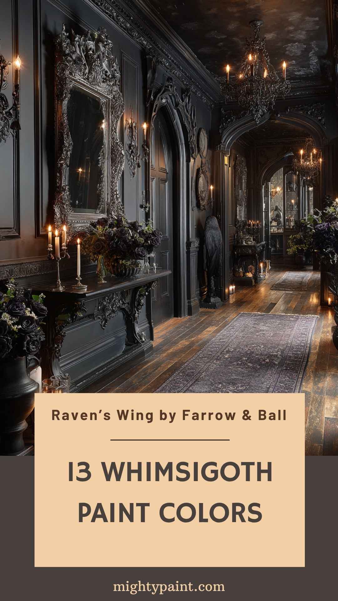
Inky Blue-Black is an almost-black hue with deep navy undertones that creates instant drama and gothic refinement. It’s as rich and elegant as the name suggests—bold without being flat, mysterious yet incredibly versatile. This is the paint color equivalent of a velvet cloak swishing through a candlelit corridor.
Use Inky Blue-Black in hallways, libraries, or as a ceiling color to make a bold statement. It works beautifully with high gloss for a more modern gothic vibe or in matte for a softer, vintage touch. Pair it with silver or antique gold accents, and layer in ornate picture frames, dark florals, or celestial-themed decor for maximum Whimsigoth impact.
Lighting is crucial—this color can absorb light, so make sure to add mirrors, reflective surfaces, or strategic lighting to keep your space from feeling too enclosed. Inky Blue-Black is the kind of color that transforms your room into a poetic, brooding sanctuary.
🎨 12. Dusky Plum
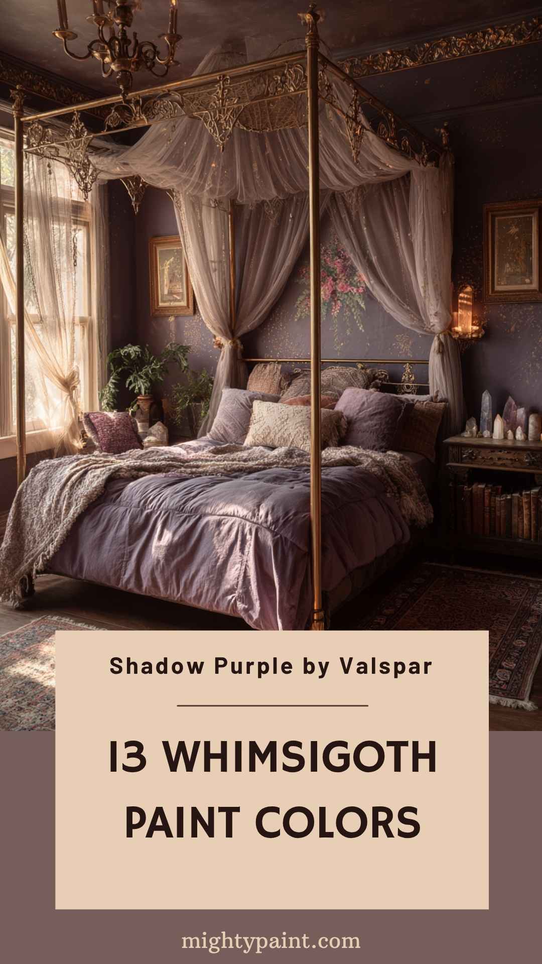
Dusky Plum is a muted, dusty plum that balances softness with mystery. Unlike more vibrant purples, this one leans toward gray, giving it a sophisticated, aged look that works wonderfully in vintage-inspired or romantic Whimsigoth spaces.
Ideal for bedrooms, bathrooms, or even a moody foyer, Dusky Plum creates an atmosphere of quiet charm. Pair it with cream trims, brass lighting, and floral or celestial motifs to bring out its nostalgic beauty. Velvet curtains or damask wallpaper can add rich texture to complement this dreamy shade.
This color shifts subtly in different lighting—more violet in daylight, more charcoal in dim evening light—making your space feel alive and ever-changing. Dusky Plum is perfect if you want a hint of color that doesn’t overpower, yet still adds that enchanting, moody flair that defines Whimsigoth style.
🎨 13. Warm Velvet Burgundy
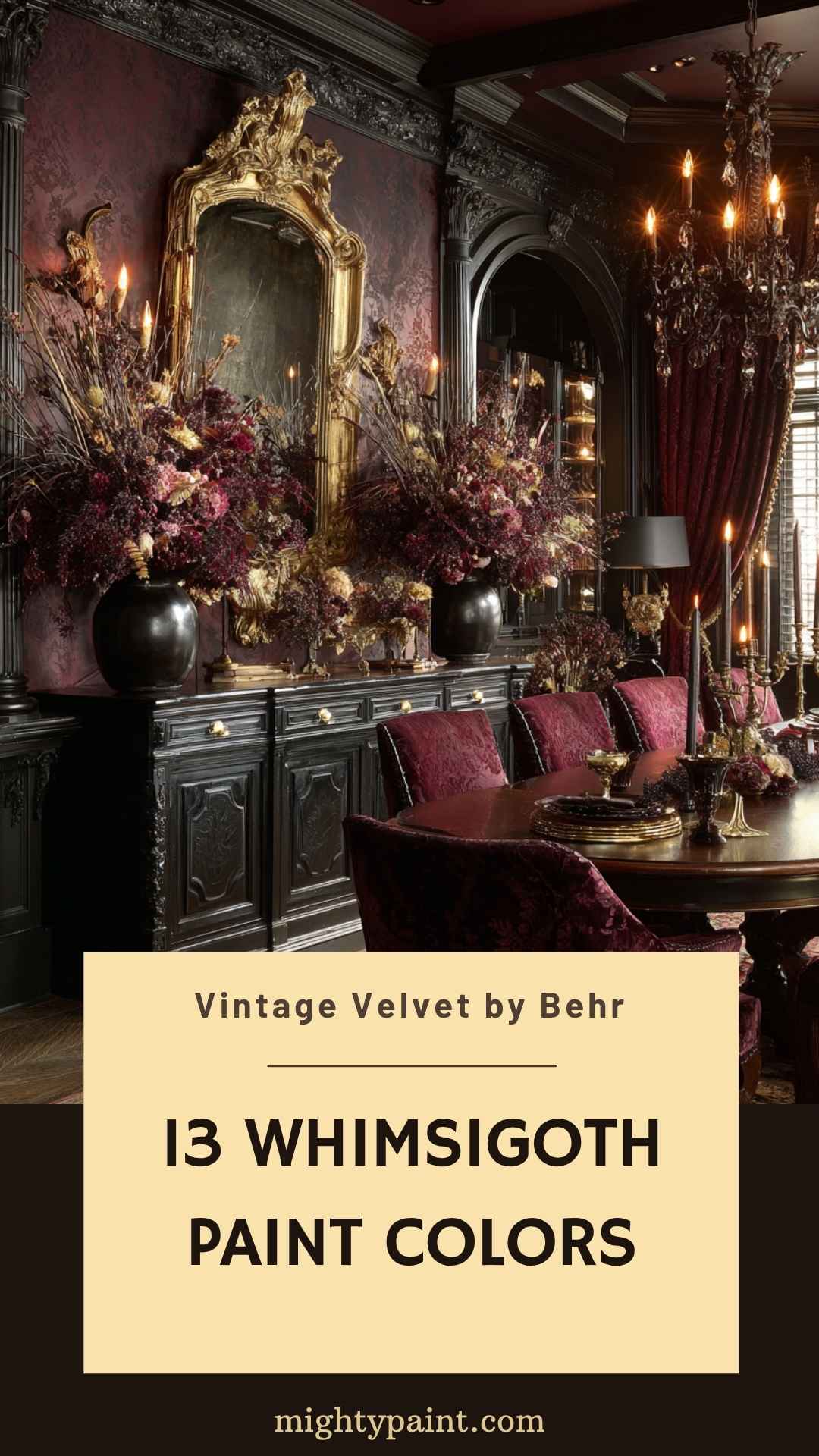
Warm Velvet Burgundy is a rich, desaturated burgundy with brown undertones, evoking antique textiles and moody romance. It’s a color that instantly adds soul and character, perfect for creating a space that feels like it has a story to tell.
Use this shade in dining rooms, hallways, or as a feature wall behind a fireplace or bed. It pairs beautifully with gilded frames, dark wood, and layered lighting from candles or warm bulbs. Add in plush furnishings—velvet chairs, embroidered cushions, or even brocade curtains—to amplify the opulence.
Warm Velvet Burgundy also complements natural elements like dried flowers, stone, and leather, grounding its richness with earthy textures. If you’re aiming for that gothic-meets-vintage library look, this color will help you create a room that feels both lived-in and magical.
Incorporating Whimsigoth Colors into Different Rooms
Whimsigoth colors aren’t just about paint—they’re about atmosphere. Here’s how you can bring these magical hues into each area of your home, turning every room into its own chapter of an enchanted story.
Living Room: Dramatic Elegance
The living room is your stage for bold color expression. Choose a deep shade like Inky Blue-Black or Deep Plum for the walls to ground the space in gothic sophistication. Layer with celestial wall art, brass sconces, and vintage bookshelves to tell your Whimsigoth story. Don’t forget the textiles—velvet drapes and jewel-toned pillows in colors like Mossy Forest Green or Warm Velvet Burgundy create cozy, layered depth.
Balance the darker tones with reflective elements—mirrors, glass coffee tables, or even a chandelier can add airiness and contrast. If full walls feel too intense, try an accent wall or painted ceiling.
Bedroom: Enchanted Retreat
Your bedroom is the perfect place to get truly atmospheric. Shades like Midnight Blue, Dusky Plum, or Darkroom create a moody cocoon ideal for rest and reflection. Use soft lighting and draped canopies to enhance the dreamy, romantic feel.
Keep your bedding layered in luxurious fabrics like silk, lace, or velvet. Add personal touches like vintage candle holders, crystal clusters, and celestial-themed accessories to capture the full Whimsigoth essence. Lighter accents—like soft lavender-gray trims—can brighten without breaking the spell.
Kitchen & Dining Room: Warm Whimsy
Yes, even kitchens and dining spaces can embrace Whimsigoth charm. Deep greens like olive green or Mossy Forest Green work wonderfully on cabinetry or lower walls, especially when contrasted with lighter countertops and metallic hardware.
In dining areas, opt for a statement wall in Candlelit Burgundy or Warm Velvet Burgundy, then complement with antique chairs, candlelight, and ornate tableware. Use layered textures—linen napkins, dark wood, and crystal goblets—to create a look that feels like a gothic dinner party waiting to happen.
Bathroom: Small Space, Big Mood
Bathrooms are ideal for experimenting with bold hues. A color like Stormy Slate Blue or Nocturne Blue can turn a small bathroom into a moody, spa-like haven. Pair with vintage-style fixtures, ornate mirrors, and lush towels in coordinating shades.
Even a simple half-bath can transform with Black Flame or Deep Plum paired with a dramatic wallpaper and gold or bronze accents. Think of the bathroom as your mini-moonlit manor—a place of private retreat and quiet magic.
Tips for Choosing and Applying Whimsigoth Paint Colors
Working with moody hues requires a bit of finesse. Here’s how to get the most out of your Whimsigoth palette.
1. Test in Different Lighting
Always sample your colors at different times of the day. Whimsigoth shades are highly reactive to lighting—what looks rich and mysterious in the evening may feel flat in daylight if not carefully chosen.
2. Balance with Light Accents
Dark walls work best when paired with lighter trims, ceilings, or furnishings. Consider soft metallics, muted pastels, or neutral creams to avoid a cave-like feel.
3. Choose the Right Finish
Matte finishes enhance the gothic mood, absorbing light and adding richness. For added drama, go with high gloss on trim or cabinetry to reflect light and add contrast.
4. Layer with Texture
Whimsigoth is about sensory richness. Pair your paint with velvet furniture, brocade curtains, natural wood, or patterned rugs. The interplay of color and texture will elevate your space.
5. Don’t Be Afraid to Mix
Use multiple shades from the Whimsigoth palette in one space. A Midnight Blue wall can pair with a soft lavender-gray ceiling and olive green accents, creating a layered, mystical feel that evolves with each detail.
Get the Fail-Safe Paint Color Playbook (Free PDF)
36 proven colors • 8 ready palettes • trim & sheen guide • printable testing cards.
Complementary Decor and Accessories
Color is only part of the Whimsigoth magic. Complete the look with carefully chosen decor:
- Furniture: Opt for vintage or gothic revival pieces—dark woods, claw-foot chairs, tufted velvet sofas.
- Textiles: Think luxurious—velvets, lace, embroidered linens in jewel tones or metallics.
- Lighting: Use warm, dimmable lighting. Chandeliers, sconces, and vintage-style table lamps help set the mood.
- Accessories: Celestial motifs (moons, stars), old books, potion bottles, crystals, and botanical prints bring your magical story to life.
- Art & Mirrors: Frame your space with gothic or baroque mirrors and mystical artwork—tarot illustrations, alchemical symbols, or dark floral prints.
Conclusion
Bringing Whimsigoth paint colors into your home isn’t just a style choice—it’s a declaration of mood, mystery, and magic. With the right hues and thoughtful layering, you can transform any space into a moonlit manor that reflects your unique taste and personality.
Start with a single wall, a cozy nook, or go all in—there’s no wrong way to embrace the Whimsigoth aesthetic. Let your creativity guide you, and don’t be afraid to mix, match, and enchant.
Which color cast the strongest spell on you? Your moonlit manor awaits.