
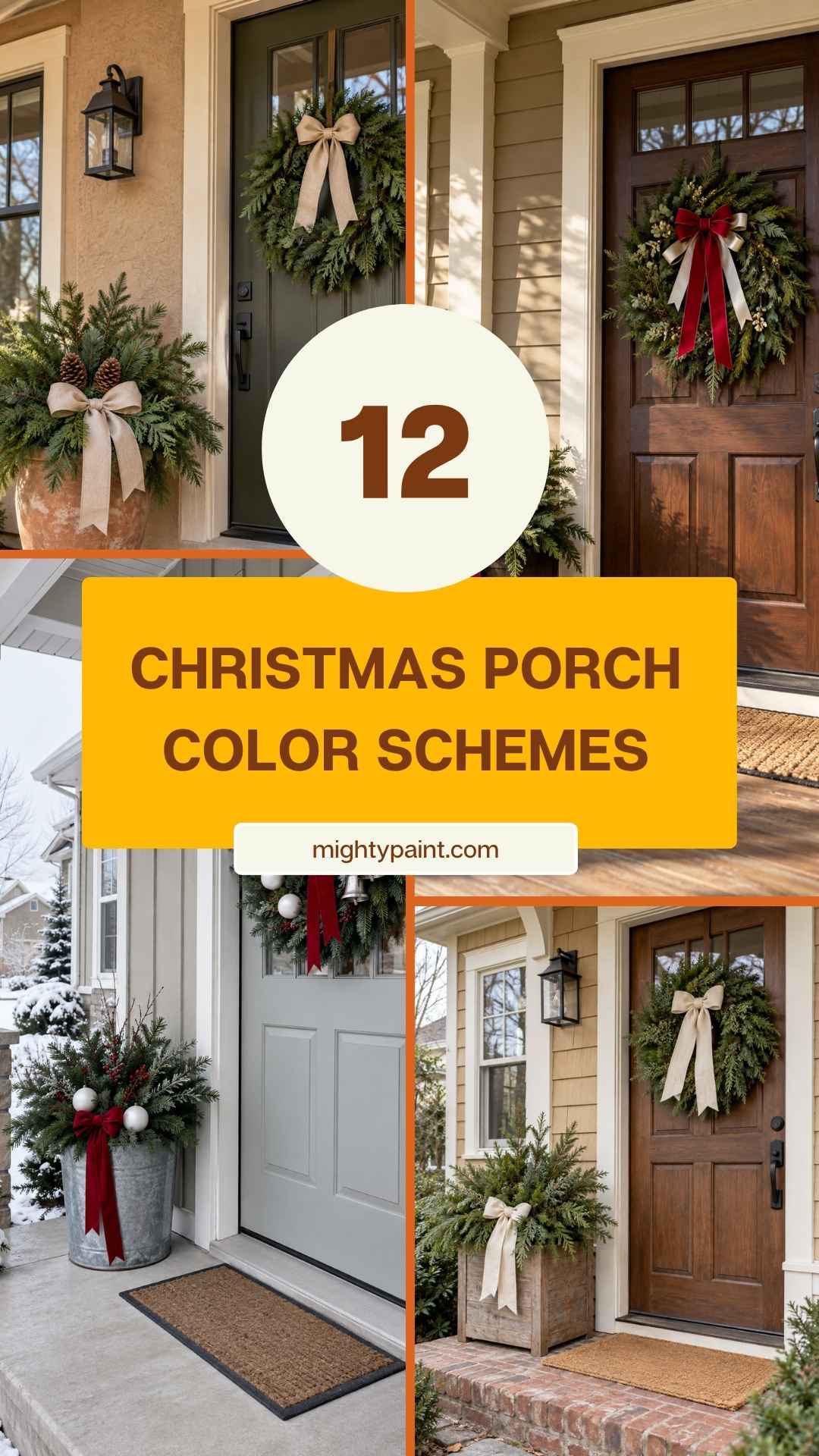
12 Christmas Porch Color Schemes That Look Beautiful Against a Tan House
Christmas decorations can look quite different against tan siding than they do against a white house. Cream ribbon might blend into the trim, bright gold can disappear against a yellow-toned wall, and a dark wreath may be difficult to see on a brown door.
That doesn’t mean you need a new set of decorations. Often, changing the ribbon or introducing one contrasting color is enough to pull the porch together.
Get the Fail-Safe Paint Color Playbook (Free PDF)
36 proven colors • 8 ready palettes • trim & sheen guide • printable testing cards.
The easiest approach is to treat your siding, trim and front door as part of the Christmas palette. Choose decorations that work with those existing colors, then repeat them across a few places: the wreath, a container arrangement and perhaps a railing or small tree.
These 12 schemes offer different ways to do that, from soft neutrals to deeper jewel tones. Each can work on a full porch or a small doorstep.
First, Look at the Tan You Already Have
Take a look at your exterior in daylight before choosing ribbon or ornaments. If possible, hold the materials beside the door and siding rather than judging them indoors.
Your tan may lean toward one of these families:
- Golden tan: a warmer color with noticeable yellow or sandy undertones.
- Peach or pink-toned tan: a beige that looks slightly rosy, particularly beside white.
- Muted or grayish tan: a quieter shade with less obvious warmth.
These are useful descriptions, not strict categories. Brick, stone and siding can also contain several colors.
Next, look at the trim. Bright white creates a different contrast from creamy trim, while dark brown or black introduces a stronger outline.
Finally, consider the door. If it already supplies a bold color, let that color participate in the arrangement. You don’t have to hide it behind a large wreath.
1. Forest Green, Burgundy and Warm White
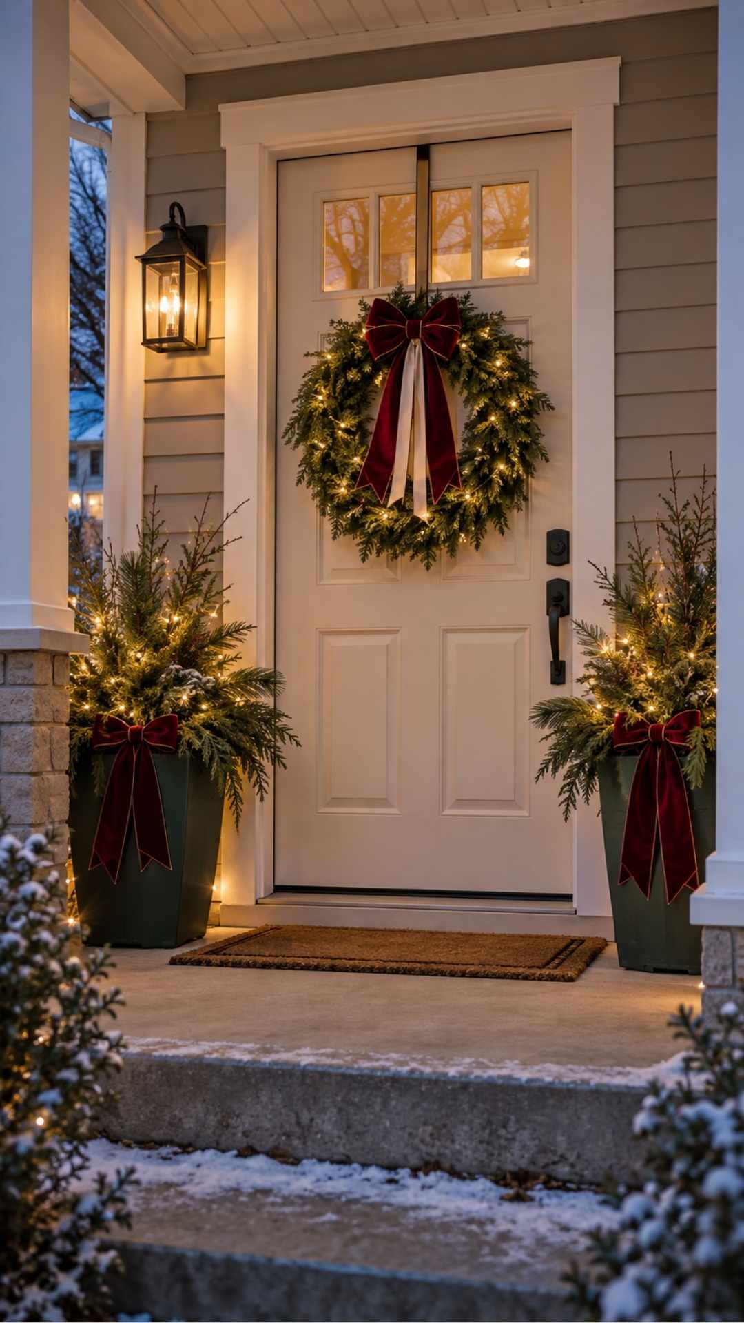
Forest green and burgundy give pale tan siding enough contrast without relying on bright red.
Start with an evergreen wreath and a burgundy bow. Carry the same ribbon into one or two porch containers, then use warm white lights to connect the greenery after dark.
White or cream details can help separate the wreath from a dark door. Try a narrow lighter ribbon layered with the burgundy rather than adding several new ornament colors.
On a porch with white trim, keep the arrangement simple. The trim already provides the lighter part of the palette.
For a small stoop, use the wreath and one evergreen container. You’ll still get the color combination without needing matching decorations on both sides of the entrance.
Watch for: burgundy disappearing against a reddish-brown door. Hold the ribbon against the door first, and add a lighter edge or accent if needed.
2. Cream, Evergreen and Natural Wood
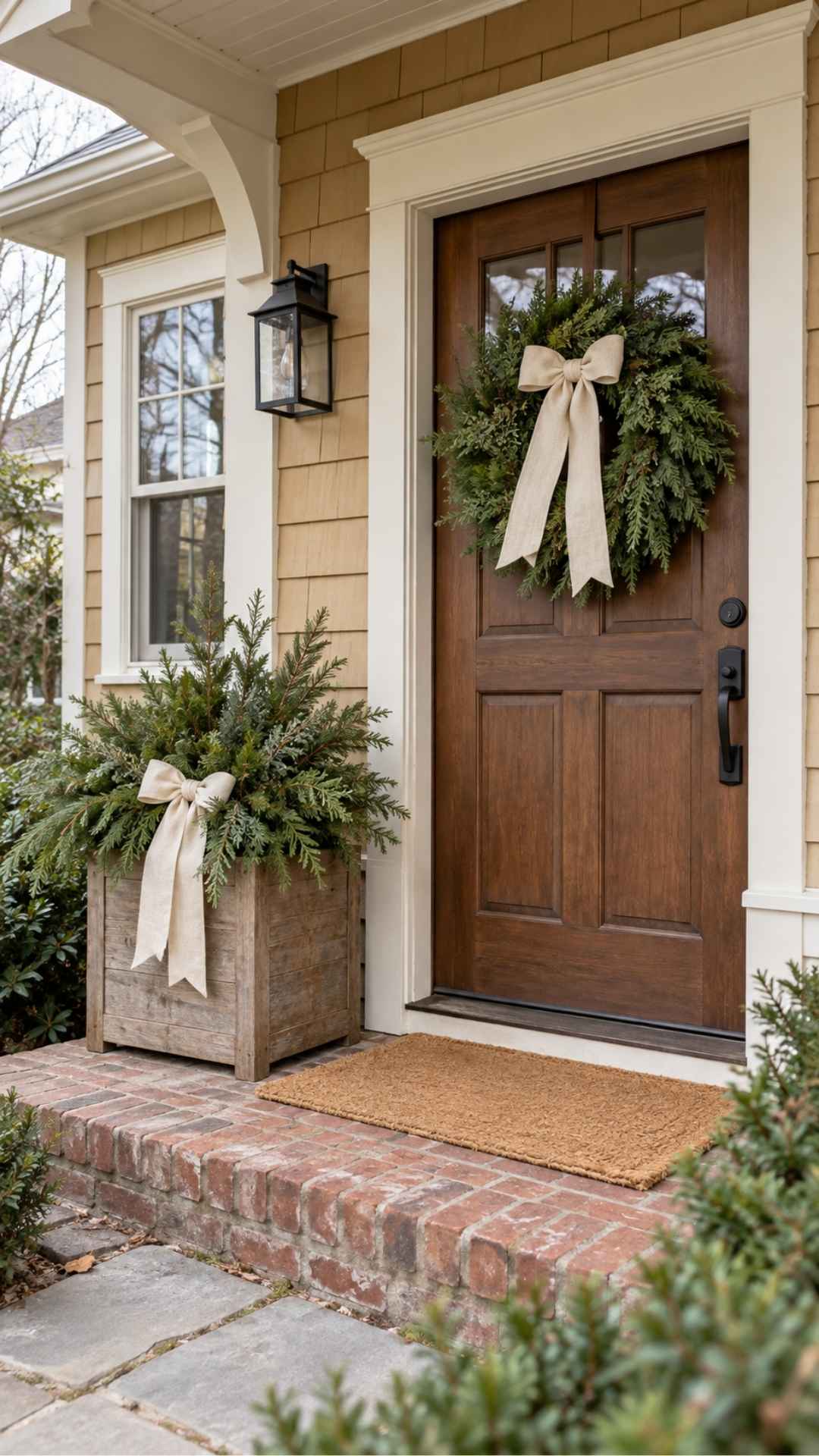
This is a gentle scheme that works well when you want the porch to feel seasonal without becoming brightly colored.
Use natural greenery for the wreath, cream ribbon for contrast and a wood element such as a planter or simple decorative sign. Texture matters here: woven ribbon, rough greenery and visible wood grain keep the neutral colors from looking flat.
Check the cream against your trim. A strongly yellow ribbon can look out of place beside crisp white paint. If the difference bothers you, choose an oatmeal or linen-colored ribbon instead of trying to match the trim exactly.
Natural wood can come from containers you already own. You don’t need to add rustic objects to every corner.
Watch for: pale decorations blending into the house. Keep enough dark greenery around the cream pieces to make their shapes visible.
3. Black, Evergreen and Muted Gold
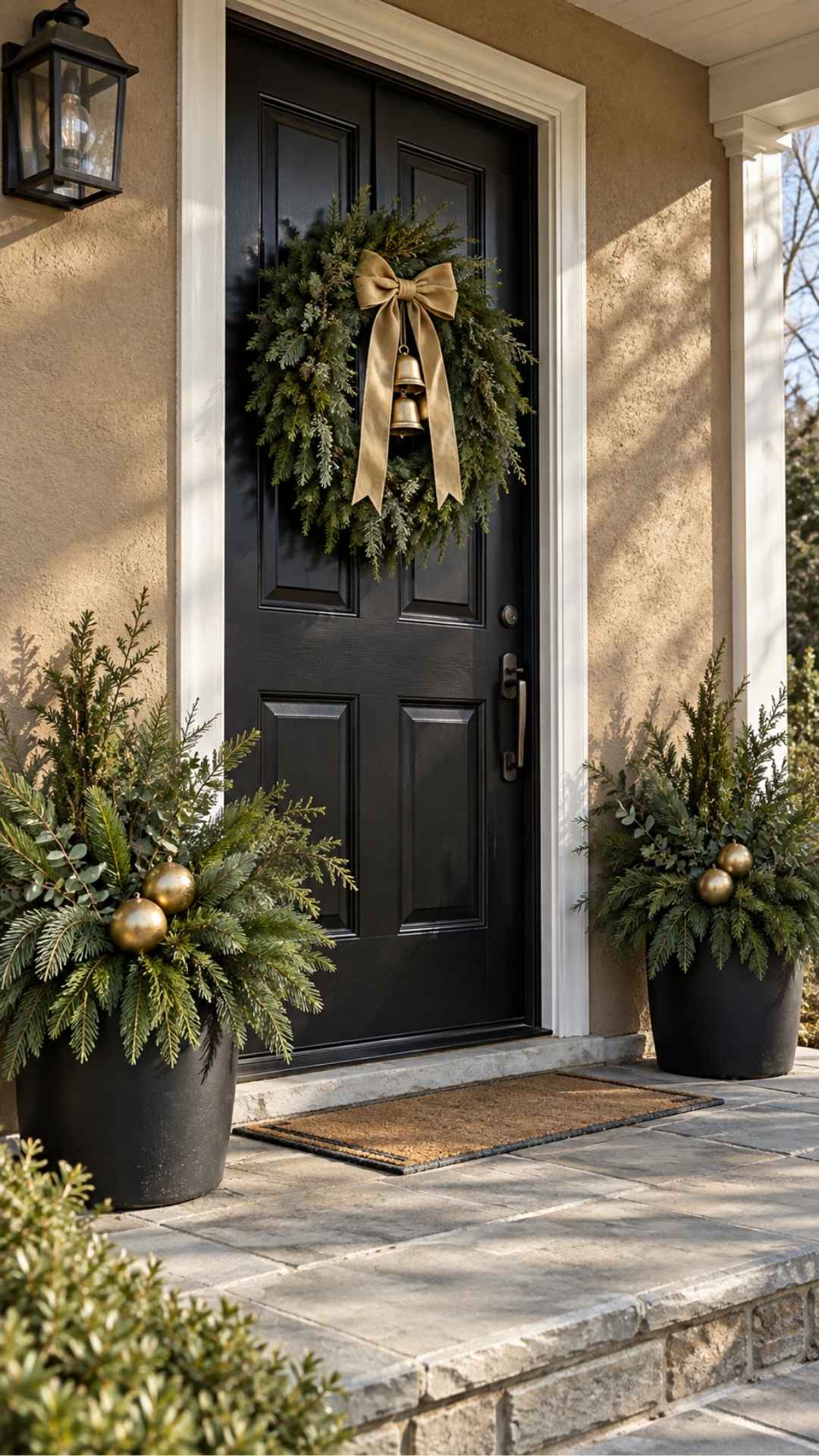
Black containers or an existing black front door give this scheme a clear structure. Greenery softens the dark surfaces, while muted gold adds a few details that catch the light.
Try an evergreen wreath with a restrained gold bow, or use black ribbon and a small group of gold bells. Repeat the gold once in a container arrangement rather than placing metallic ornaments everywhere.
Choose the finish carefully. A softly aged gold looks different from a bright, reflective yellow gold. See how it looks against the siding before buying more.
If your door is pale, black containers can supply the contrast. If the door is already black, leave some of its surface visible around the wreath.
Watch for: filling a dark doorway with dark greenery and black ribbon. Add a readable gold or cream focal point so the wreath doesn’t disappear.
4. Navy, Champagne and Greenery
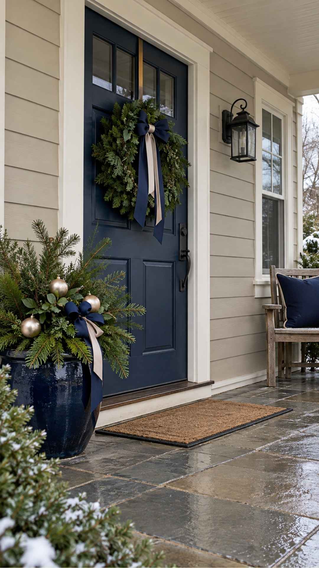
Navy introduces a cooler color against warm tan siding without feeling as bright as royal blue.
A navy bow on an evergreen wreath is a good starting point. Add a soft champagne-colored ribbon or a few ornaments to keep the darker elements visible.
This combination can work particularly well when the porch already has navy cushions, a blue door or dark blue containers. Use those existing pieces rather than adding unrelated blue decorations.
Look for navy materials that remain visibly blue outdoors. Some very dark ribbons read almost black in shade.
Champagne finishes also vary. Choose one that looks soft beside your tan, rather than strongly yellow.
Watch for: several different blues competing. Keep the main ribbon and any large accessories close enough in color to look intentional.
5. Copper, Rust and Deep Green
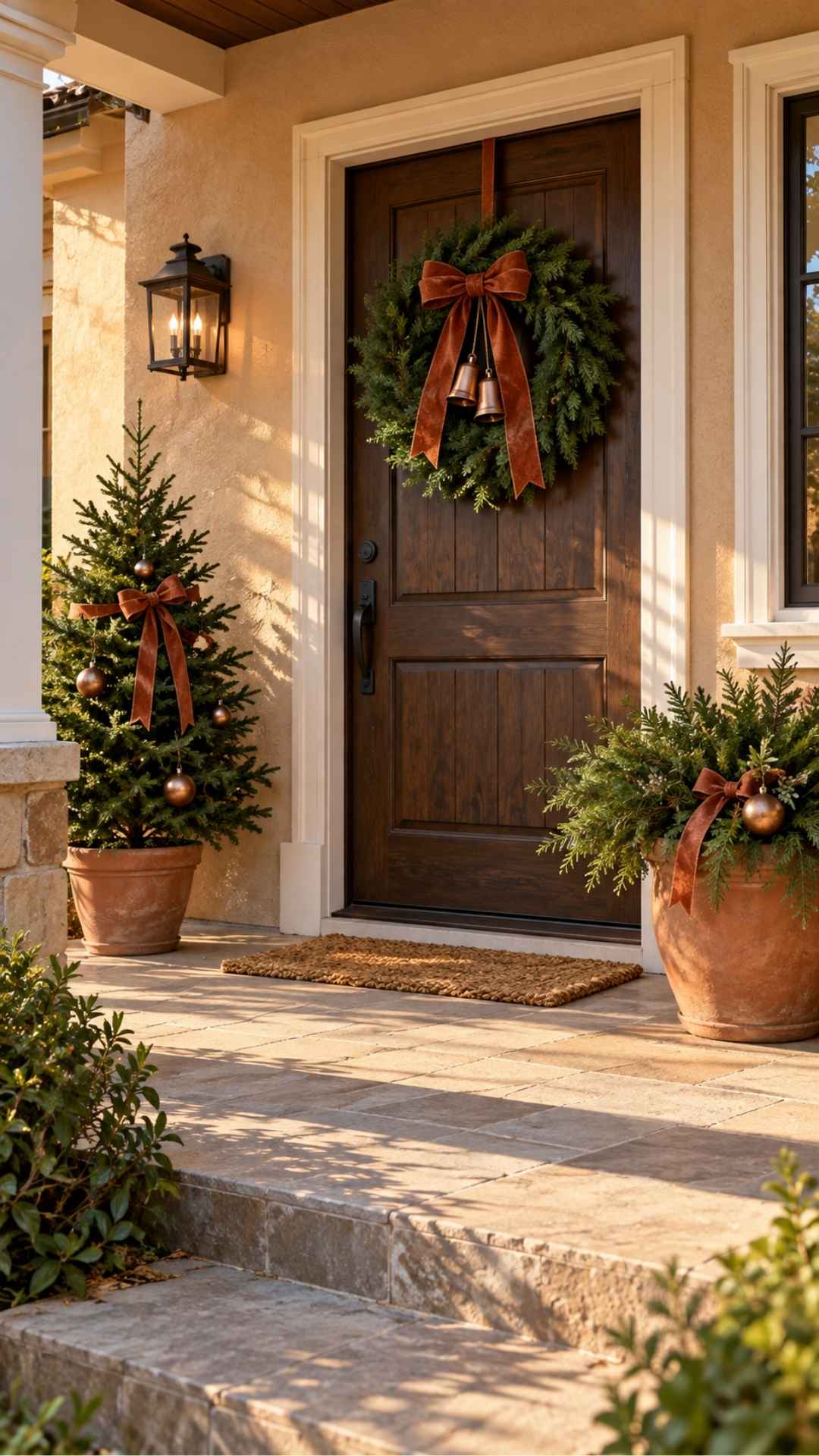
If your porch already has terracotta pots or warm wood, copper and rust can help carry those materials into Christmas.
Fill the containers with deep green foliage, then add rust-colored ribbon and a few copper-toned details. A wreath, bells or a small decorated tree will make the seasonal theme clear.
You can reuse some autumn pieces, but remove obvious fall accents if you want a Christmas look. The greenery should take over as the main texture.
Against golden tan siding, concentrate the rust and copper in specific places rather than spreading them across every surface. Deep green provides the contrast that stops the warm colors from blending together.
Watch for: too many orange-brown elements. If the house, pots, ribbon and doormat all look similar, introduce a little cream to separate them.
6. Cranberry, White and Silver
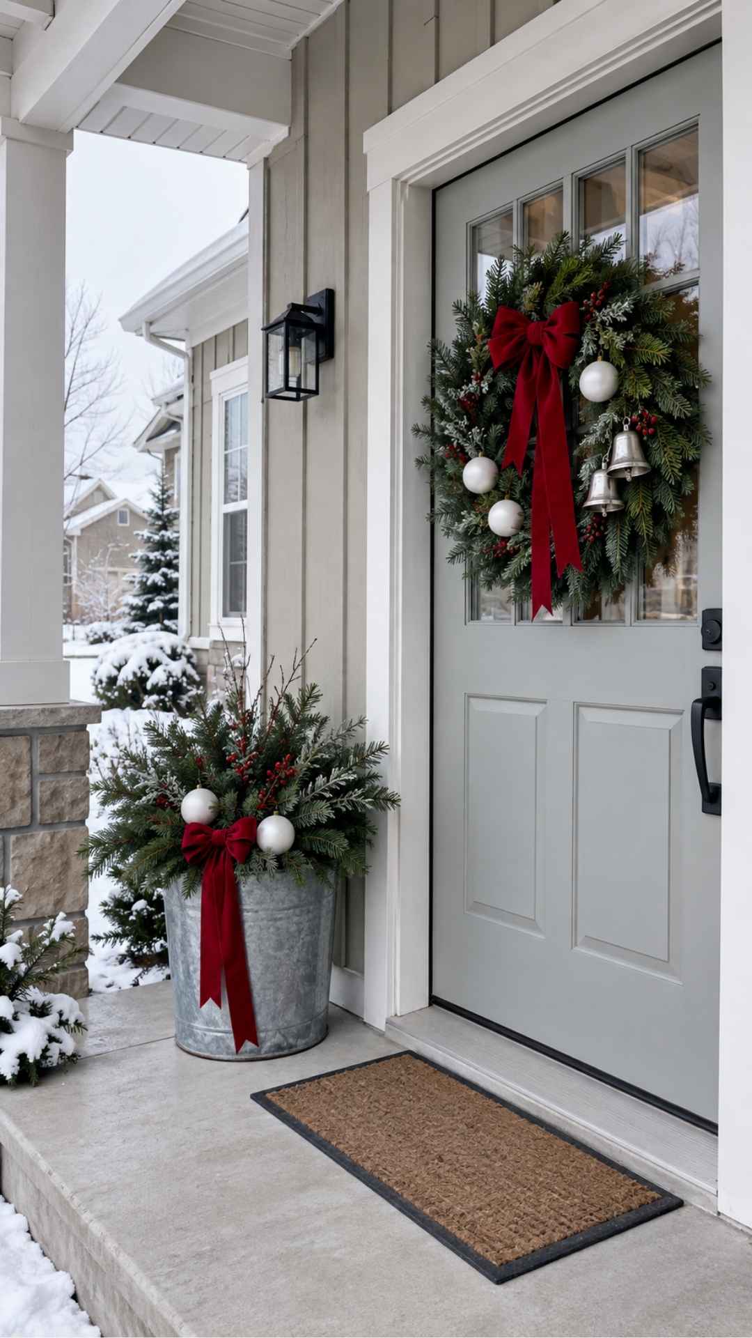
Cranberry gives this scheme a strong focal color, while white makes the arrangement easier to read against muted tan siding.
Use cranberry ribbon on the wreath and repeat it in one container or small tree. White ornaments or pale branches can brighten the arrangement, with silver kept to a few smaller details.
Check how the silver looks in daylight. Highly reflective pieces can show their surroundings more than their own color, while matte or brushed finishes tend to look quieter.
If your trim is bright white, echo that white in the decorations. With creamy trim, try a softer white and see whether it sits comfortably beside the paint.
Watch for: tiny silver details that vanish from a distance. Choose a few visible accents rather than many miniature ornaments.
7. Plum, Antique Gold and Evergreen
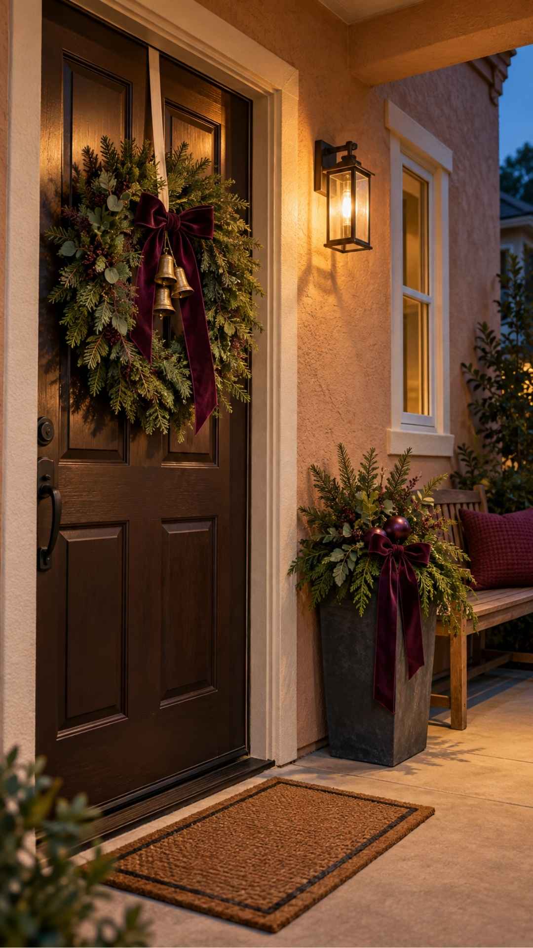
Plum offers a richer alternative to red, especially if you like darker Christmas decorating indoors.
Start with a plum velvet bow on an evergreen wreath. Add a few antique-gold bells or ornaments near the bow, where they will provide contrast.
Repeat plum once more in the porch arrangement. That might be ribbon on a container, a few ornaments on a small tree or a cushion on a sheltered bench.
Against a brown door, test the plum carefully. If both colors are dark, a narrow cream ribbon or lighter gold detail can help define the wreath.
You don’t need celestial ornaments or elaborate decorations to make this scheme work. The colors themselves give it character.
Watch for: making every piece dark. Leave some tan siding, trim and lighter details visible around the greenery.
8. Sage, Ivory and Natural Wicker
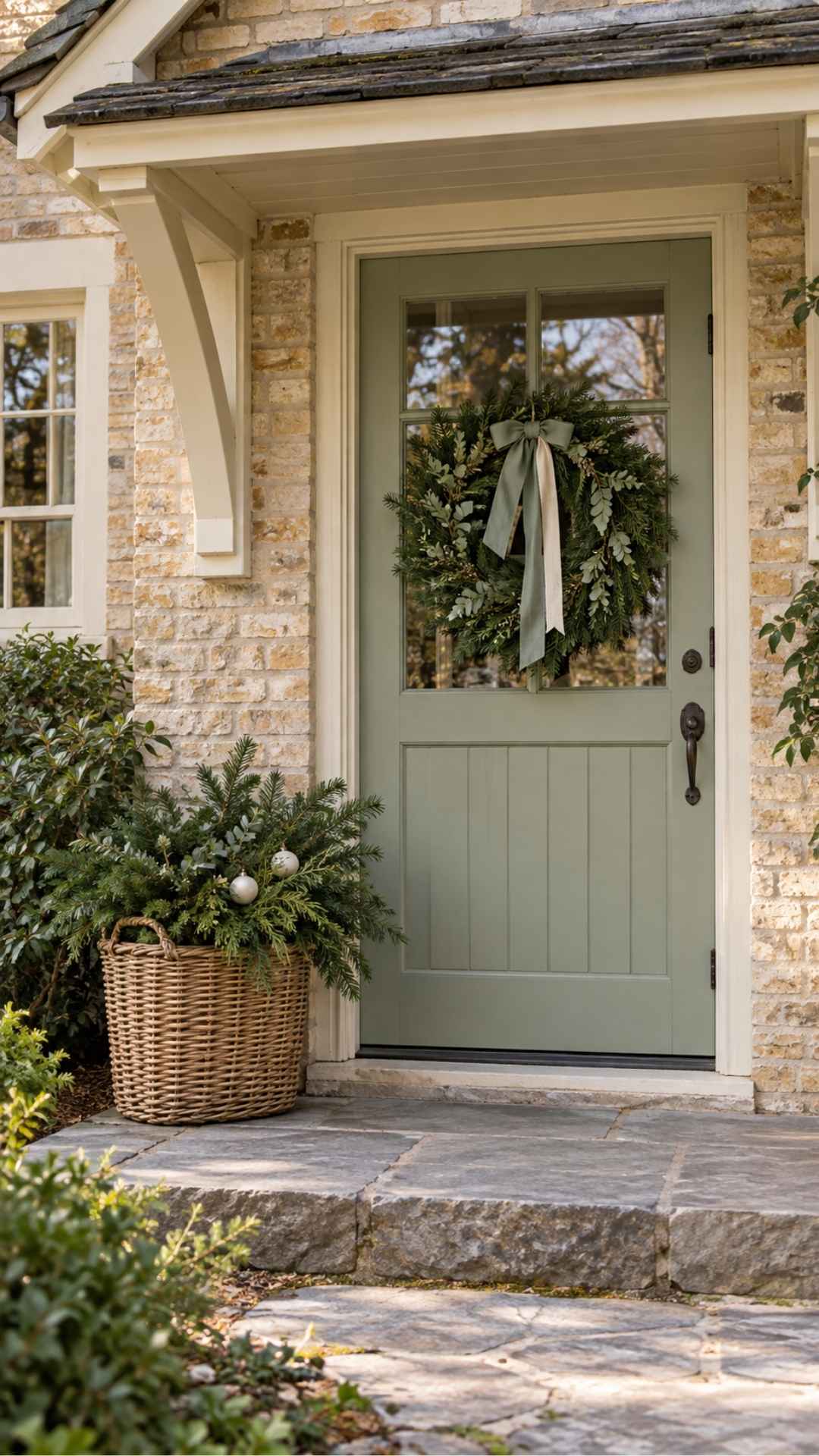
Sage, ivory and wicker create a softer porch palette for readers who prefer understated decorations.
Use darker evergreen foliage as the foundation, then add sage ribbon and a few ivory details. The darker green keeps the wreath readable; sage supplies a gentler accent.
A wicker basket can hold a seasonal arrangement on a protected porch. Check whether the basket is suitable for the conditions where you plan to use it. A decorative indoor basket may not tolerate rain or prolonged dampness.
Ivory ribbon with a visible weave works nicely here. Smooth, shiny fabric will give the same colors a more formal feel.
On a tiny stoop, one basket and a wreath are enough.
Watch for: using only pale sage foliage and ivory accents against pale tan siding. Without a darker element, the arrangement can lose definition.
9. Chocolate Brown, Cream and Deep Red
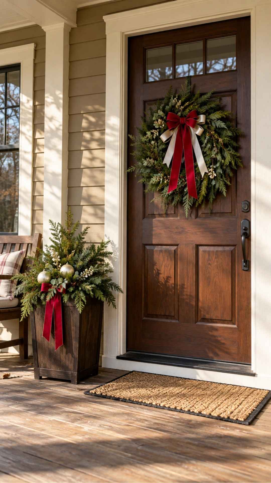
A brown front door doesn’t need to be treated as something to work around. Let it become the base of the palette.
Choose deep red ribbon for the wreath, then introduce cream through a second ribbon, a few ornaments or a container. Keep the greenery visible between the colors.
Cream is especially useful because it separates the wreath from the door. If the door and foliage both look dark, place the lighter detail near the center of the arrangement.
Brown containers or an existing wood bench can continue the palette. There’s no need to add more brown just because it appears in the scheme.
Watch for: red that is so dark it blends into the door. View the ribbon outdoors and from the approach to the house, not just up close.
10. Dusty Blue, White and Evergreen
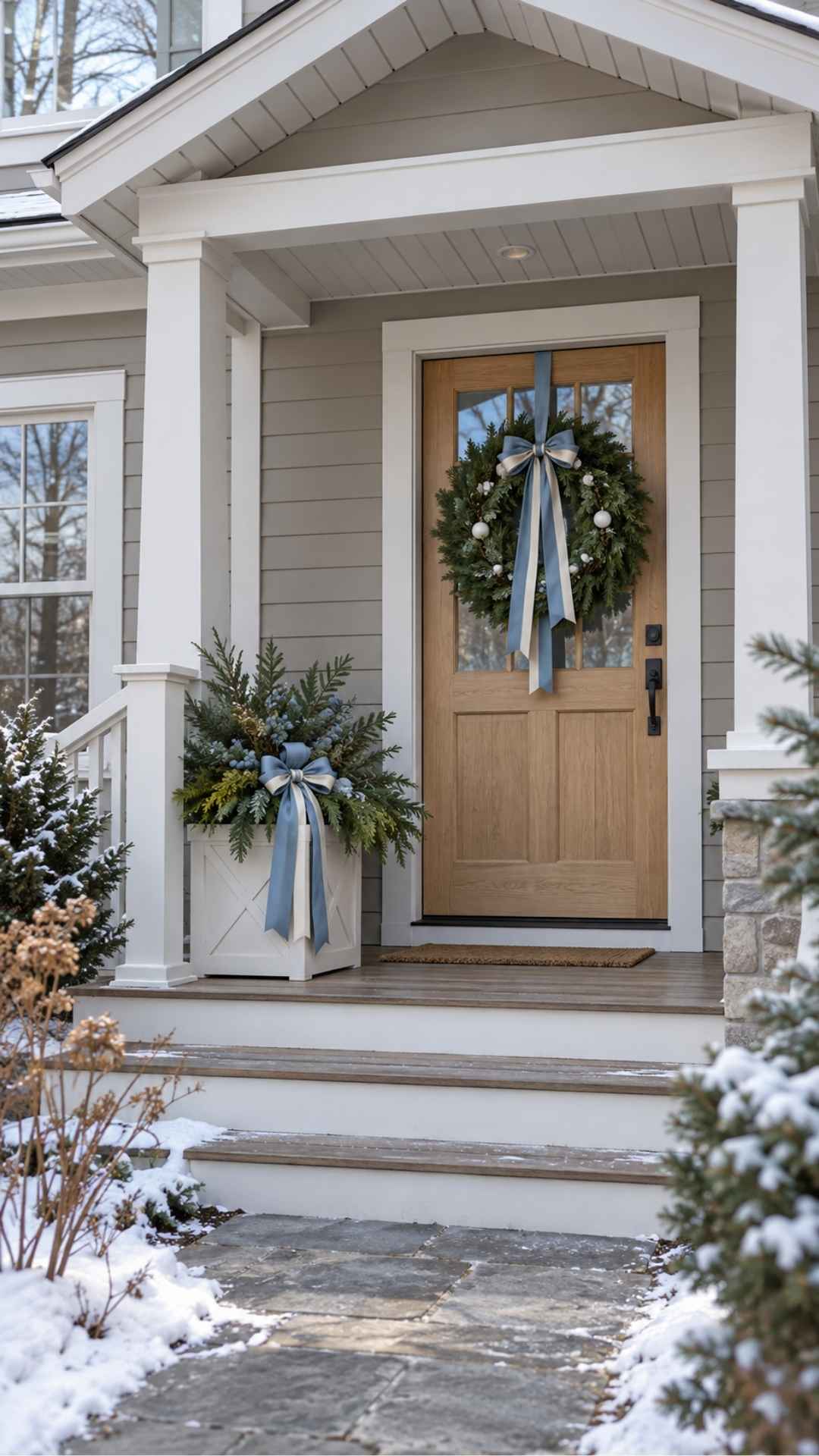
Dusty blue can give a tan porch a quiet winter feel while still looking appropriate for Christmas.
Use the blue in ribbon or a few ornaments, with evergreen foliage as the main material. White accents add separation and keep the scheme from becoming too muted.
A blue-and-white bow works on a wreath, or you can use plain dusty blue ribbon and repeat white in the containers.
This scheme is easy to simplify after Christmas. Remove the ornaments and overtly festive details, then keep the greenery and blue ribbon if they still suit your winter porch.
Look at the blue beside any cream trim. You may prefer a softer white accent rather than a crisp, bright white.
Watch for: adding several icy or glittery finishes. A small amount of shine is enough to keep the blue visible.
11. Terracotta, Oatmeal and Forest Green
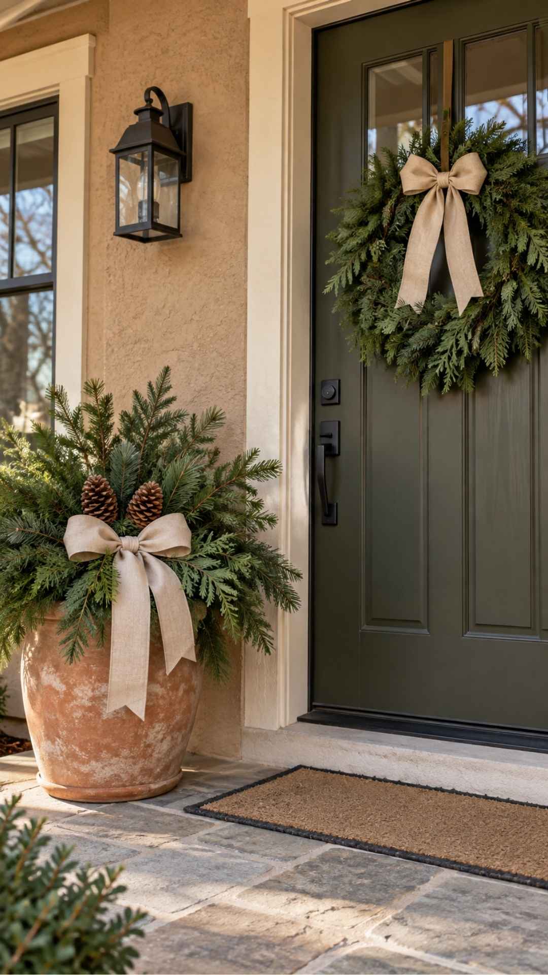
Existing terracotta pots can become the foundation of a Christmas display rather than something you need to conceal.
Fill them with forest-green foliage and add oatmeal-colored ribbon. A few pinecones can repeat the warm tones without introducing another strong color.
The dark greenery does most of the visual work. Oatmeal provides a lighter detail, while the pot connects the arrangement to the tan exterior.
For an entrance with only one container, place it where it won’t interfere with the door or the walking route. A matching wreath can carry the same ribbon without requiring a second pot.
If the terracotta and siding are very similar, let the foliage extend beyond the pot’s outline so the arrangement is easier to see.
Watch for: placing fabric outdoors that absorbs water and stays wet. Choose ribbon suited to the exposure or keep the arrangement under cover.
12. Classic Red, Green and Black
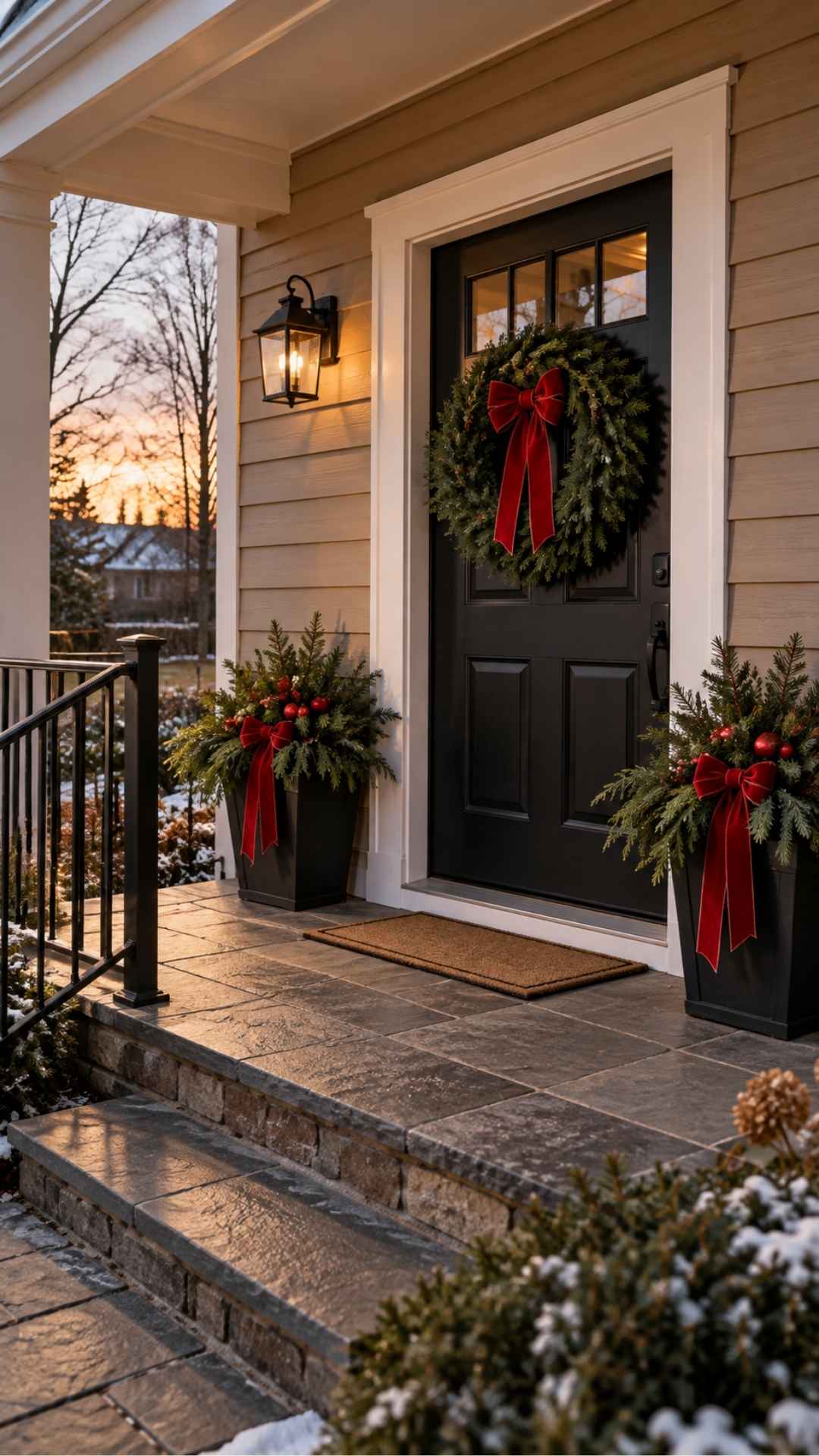
Traditional red and green can look organized against a tan house when black gives the arrangement a consistent outline.
Use black containers, an existing black door or black lanterns as the foundation. Add evergreen foliage and choose one main red ribbon.
Repeat the red in a few visible places, such as the wreath and containers. You don’t need red ornaments on every branch.
If you have several plaid ribbons, choose one pattern rather than mixing them all. Plain red ribbon is also useful when the porch already has patterned cushions or a busy doormat.
Black is a supporting color here. It should frame the greenery and red details rather than dominate the whole display.
Watch for: layering several shades of bright red. Keep the largest red pieces reasonably consistent, then allow smaller variations.
How to Adapt Any Scheme to a Tiny Stoop
A small entrance doesn’t need a reduced version of every decoration on a large porch. Choose fewer pieces that have enough presence to be seen.
A useful starting point is:
- One wreath that fits the door.
- One stable container arrangement.
- One practical doormat.
Use the same ribbon on the wreath and container. That repetition connects the two without taking up more space.
Check the door swing before placing the container. You should also be able to reach the handle, use the steps and carry things through the entrance comfortably.
If there’s no sensible place for a container, leave it out. A well-proportioned wreath and a clean entrance can be a complete display.
Check the Porch After Dark
An arrangement that works in daylight may look quite different at night.
Dark ribbon can disappear, small metallic ornaments may barely show, and strong lights can wash out the colors you chose.
Turn on the porch light and view the entrance from the path. Add lighting only where it helps you see the display or use the entrance.
If you’re using string lights, choose products rated for the conditions and follow their installation instructions. Plan the cable route before decorating so cords don’t cross the walking area.
Avoid combining several noticeably different light colors unless that contrast is intentional. A warm porch light and very cool string lights can make the same greenery look like two separate arrangements.
Common Color and Placement Mistakes
Buying decorations before checking the door
Your front door is a large part of the finished display. Hold ribbon and ornaments against it before committing to a scheme.
Trying to match every shade of cream
Cream trim, ivory ribbon and a beige doormat don’t have to be identical. Look for a combination that sits comfortably together. If one item looks unexpectedly yellow or gray, replace that item rather than changing everything.
Using too many small details
Tiny ornaments may look attractive while you’re assembling the wreath, but they can disappear from the path. Choose a few readable focal details.
Repeating every color everywhere
A three-color scheme doesn’t mean every object needs all three colors. Let greenery dominate one area, ribbon lead another and containers supply the supporting color.
Ignoring weather exposure
A covered porch and an open doorstep need different materials. Check the suitability of ribbons, containers, lights and decorative objects for the location where they’ll be used.
Blocking the entrance
Keep wreaths clear of handles and locks, and place containers outside the door swing. The decorations should fit the entrance you have, not force people to squeeze past them.
Get the Fail-Safe Paint Color Playbook (Free PDF)
36 proven colors • 8 ready palettes • trim & sheen guide • printable testing cards.
Frequently Asked Questions
Which Christmas colors work with a brown front door?
Forest green, burgundy and cream are a useful starting point. Plum and antique gold can also work, but darker ribbon may need a lighter accent to stand out. Check the materials directly against the door.
Can cool colors work against warm tan siding?
Yes. Navy or dusty blue can create contrast against warm tan. The result depends on the trim, door and specific shades, so test the combination outdoors before buying a full set.
Should the wreath match the planters?
They don’t need to match exactly. Repeating the ribbon color or one decorative detail is usually enough to connect them. Different foliage textures can keep the display interesting.
How can I decorate without repainting anything?
Treat the existing door, trim and containers as part of the palette. Introduce the seasonal colors through ribbon, greenery, ornaments and lighting. A different wreath bow can change the look without altering the house.
What is the easiest way to make the porch look coordinated?
Choose one main accent color and repeat it in two or three places. Keep the other decorations simpler, then check the whole entrance from the path to see whether the colors remain visible.