17 Best Paint Colors for a Kitchen: Top Picks for a Stunning Space
Choosing the right paint color for your kitchen can transform it from a simple cooking space into the heart of your home. Whether you prefer calming neutrals or bold hues, the right color can set the mood and bring everything together.
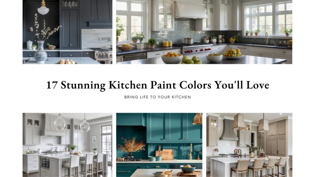
With a little inspiration and some guidance, you can pick a color that not only enhances your kitchen’s aesthetics but also makes it a place where you’ll love spending time. Ready to discover some top choices?
Get the Fail-Safe Paint Color Playbook (Free PDF)
36 proven colors • 8 ready palettes • trim & sheen guide • printable testing cards.
1. Pale Oak by Benjamin Moore
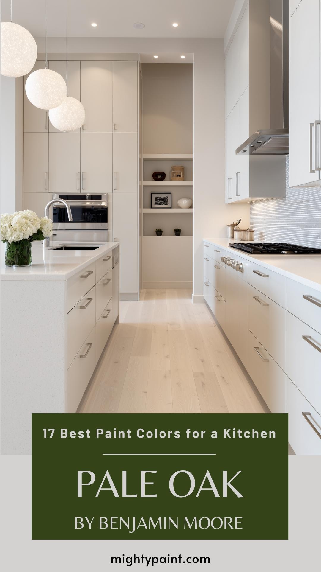
Pale Oak by Benjamin Moore (OC-20) is a light neutral paint color that your kitchen will love. It’s a beautiful mix that sits right between gray and beige. Imagine the soft elegance it brings.
In bright, natural light, Pale Oak appears as a warm off-white, perfect for brightening up your space! In rooms with less natural light, it shifts to a sophisticated light greige.
Pale Oak is a versatile choice for those dealing with varied lighting in their kitchen. It adapts wonderfully to both southern exposure and north-facing light. This makes it suitable for a variety of kitchen layouts and designs.
You can pair Pale Oak with moody blues or light greens for a refined look. Additionally, it complements warm wood furniture and floors beautifully, adding a cohesive and stylish touch to your kitchen.
2. White Dove by Benjamin Moore
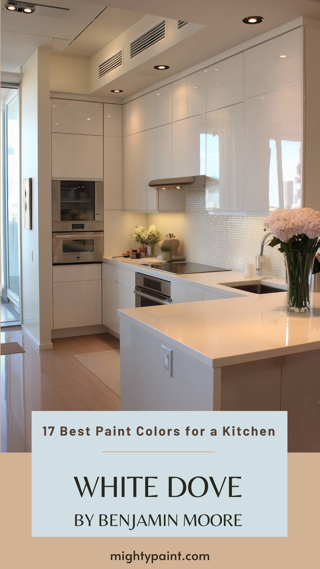
White Dove by Benjamin Moore is a favorite for kitchens. It’s a warm and versatile white paint color, perfect for cabinets, walls, and trim. If you’re looking for a clean and classic look, this might be your ideal choice.
White Dove has a Light Reflectance Value (LRV) of 83.16, meaning it reflects a lot of light. This helps make your kitchen feel bright and spacious.
One of the best things about White Dove is its soft yellow undertones. These undertones are grayed out, making them nearly invisible but adding a cozy warmth to the white. This balance makes White Dove suitable for both well-lit and darker kitchens.
Consider White Dove if you want a timeless and adaptable color for your kitchen. It helps create a welcoming atmosphere that never goes out of style.
3. Hale Navy by Benjamin Moore
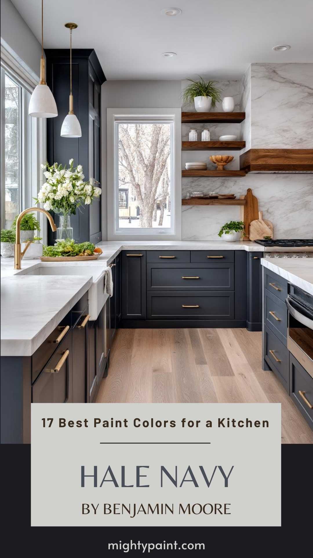
Hale Navy by Benjamin Moore is a fantastic dark blue shade that adds a touch of sophistication to any kitchen. It’s a popular choice for kitchen cabinets, walls, and even accent pieces.
This navy blue is versatile and pairs well with many colors. Imagine it with white countertops or light wood floors. The combination can give your kitchen a modern and updated look.
Using Hale Navy in your kitchen doesn’t mean you need to redo everything. Sometimes, just painting the cabinets or an accent wall can make a huge difference without costing a ton of money.
With Hale Navy, you’re adding a bit of elegance while keeping things cozy. Perfect for entertaining or just enjoying a quiet meal at home.
4. Simply White by Benjamin Moore
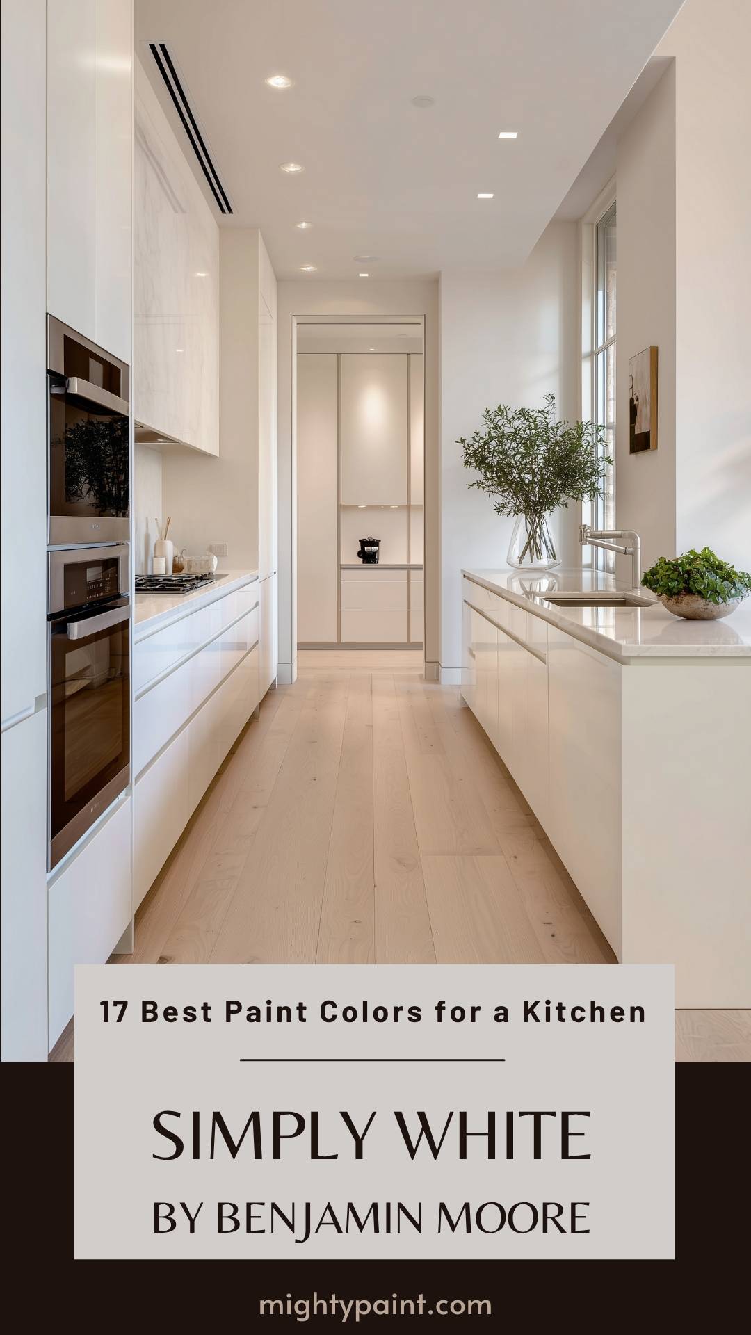
Simply White by Benjamin Moore (OC-117) is a warm and inviting white that works wonders in a kitchen. This color was Benjamin Moore’s Color of the Year in 2016. Many homeowners love it for its versatility. You can use it on walls, cabinets, trim, and ceilings.
Get the Fail-Safe Paint Color Playbook (Free PDF)
36 proven colors • 8 ready palettes • trim & sheen guide • printable testing cards.
Simply White has a slight creaminess to it. This gives it a soft and welcoming feel without looking too yellow. It’s less stark than some other whites, making your kitchen feel cozy.
In rooms with plenty of natural light, Simply White shines bright and looks very clean. However, in spaces with less natural light, it can take on a slightly creamy tone. This makes it a friendly option for a variety of lighting conditions.
When comparing Simply White to other similar shades, it’s bright but not harsh. It’s perfect if you want a white that is warm yet still fresh. Give it a try in your kitchen for a timeless look.
5. Revere Pewter by Benjamin Moore
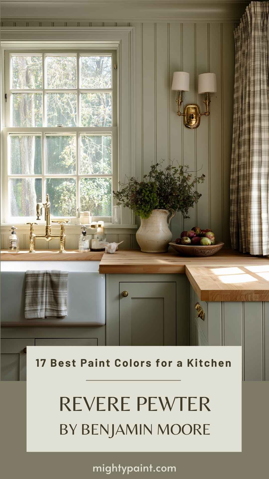
Revere Pewter, HC-172 by Benjamin Moore, is a warm gray with subtle green undertones. This color shines in spaces with plenty of sunlight. It’s especially good for kitchens, where you want a calm but welcoming feel.
You may notice Revere Pewter can look darker in rooms with less light. But in a bright kitchen, it brings a soft, cozy vibe you’ll love.
This paint pairs well with many other colors. If you like to change up your decor often, Revere Pewter makes a versatile backdrop.
Choosing the right white for trim is key. Consider a warm white to keep the cohesive look.
6. Swiss Coffee by Kelly-Moore
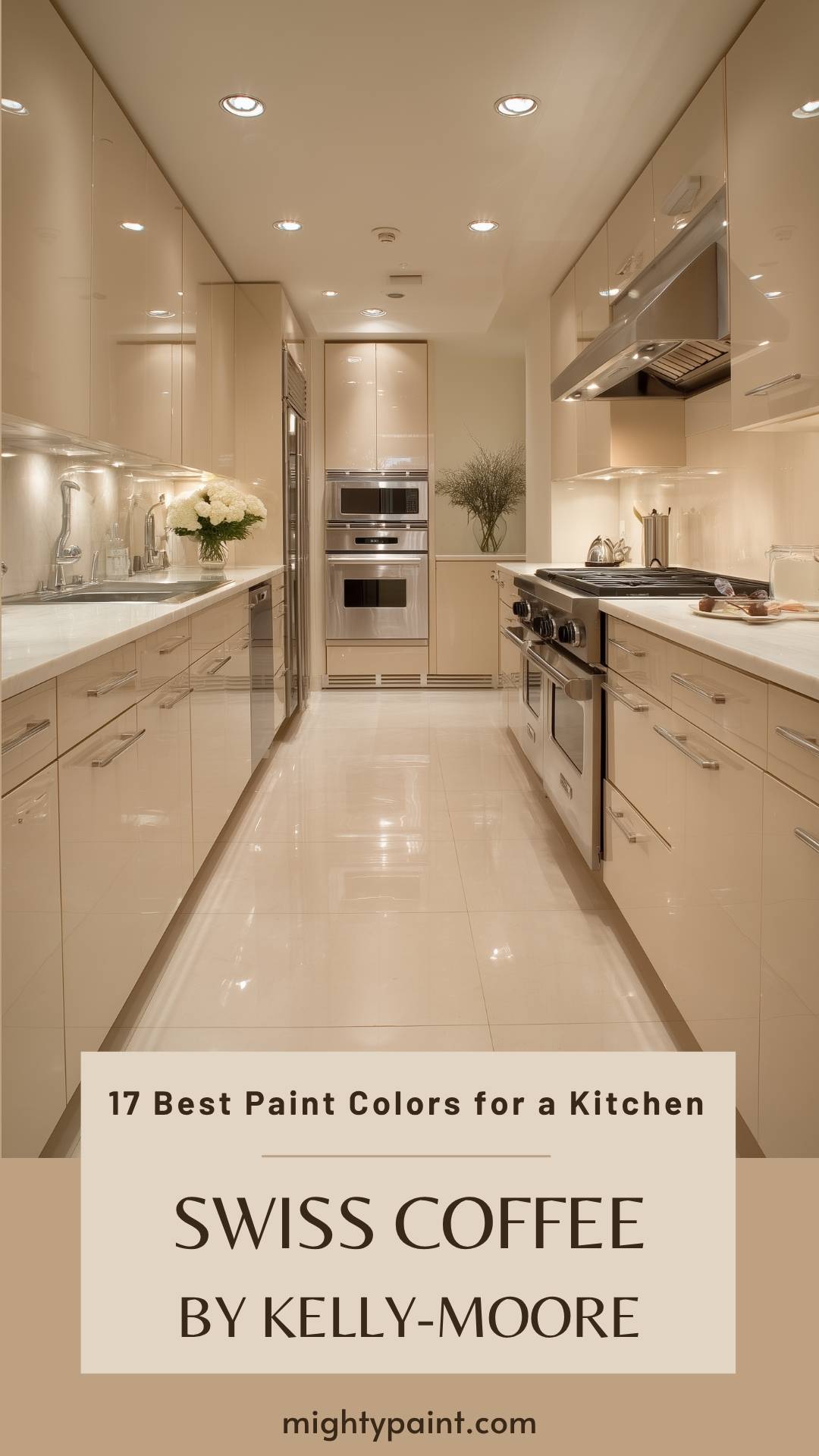
Kelly-Moore’s Swiss Coffee is a warm and inviting white that works wonders in a kitchen. This color was Benjamin Moore’s Color of the Year in 2016. Many homeowners love it for its versatility. You can use it on walls, cabinets, trim, and ceilings.
Swiss Coffee stands out with its soft, creamy white hue. It’s not too bright, making it a cozy choice. This color blends effortlessly with both modern and classic kitchen designs.
One thing you’ll love about Swiss Coffee is its versatility. Whether your kitchen has wooden cabinetry or sleek stainless steel appliances, this shade complements them well. It’s a great backdrop for colorful accents too.
With a Light Reflectance Value (LRV) in the mid-80s, Swiss Coffee by Kelly-Moore reflects a good amount of light, brightening up your kitchen without being overpowering. This makes it perfect for creating a fresh and inviting atmosphere.
Get the Fail-Safe Paint Color Playbook (Free PDF)
36 proven colors • 8 ready palettes • trim & sheen guide • printable testing cards.
If you want a timeless color that adds warmth and elegance to your kitchen, Swiss Coffee is a solid choice.
7. Sea Salt by Sherwin Williams
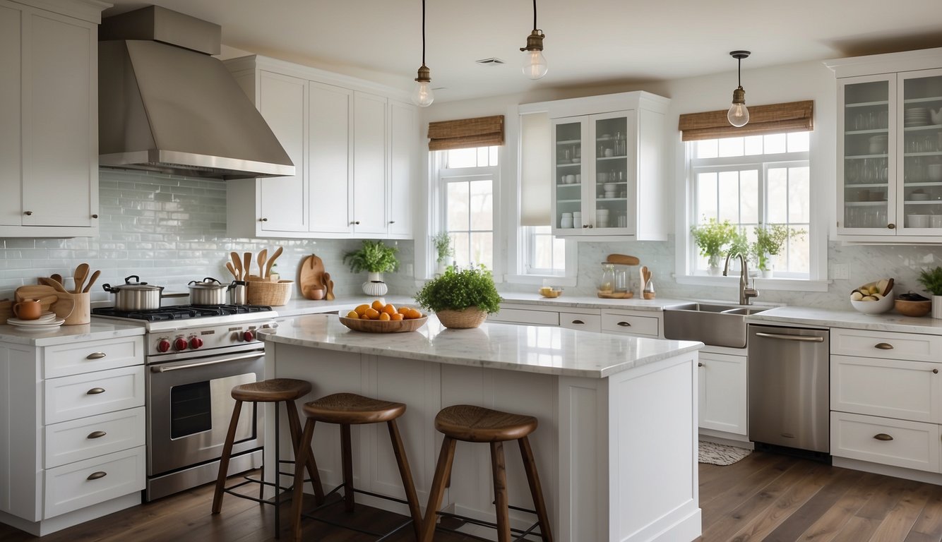
Sea Salt by Sherwin Williams (SW 6204) might just be the paint color your kitchen needs. It’s a beautiful blend of green and gray, with hints of blue. Some people even say it looks more blue than green!
One thing’s for sure, Sea Salt brings a calm, beachy vibe to your kitchen. It reminds you of soft ocean waves and cool breezes. It’s soothing and works well with many kitchen styles.
The Light Reflectance Value (LRV) of Sea Salt is around 63. This means it reflects a good amount of light, making your kitchen feel bright and airy. Pair it with crisp white or warm beige for a fresh look.
Sea Salt can fit almost anywhere in your kitchen. Whether you’re painting cabinets, walls, or even accents, it adds a touch of tranquility. Just be aware, it might not be the best choice for high-traffic areas since it can show dirt more easily.
8. Gray Owl by Benjamin Moore
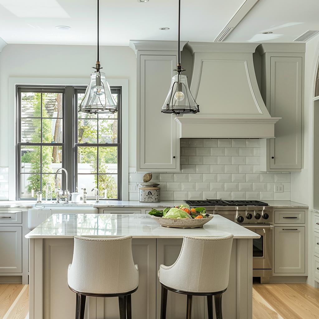
Gray Owl by Benjamin Moore is a fantastic choice for your kitchen. This light gray paint color has subtle undertones of blue and green. These undertones change depending on the lighting in your kitchen.
Got north-facing windows? Gray Owl might look cooler and greener in these spaces. On the other hand, in south-facing rooms or kitchens with warm lighting, this shade appears warmer and slightly beige.
This versatility makes Gray Owl super flexible for different decor styles. Whether your kitchen is modern or traditional, it blends beautifully. Plus, it’s neutral, so it pairs well with many other colors like white, navy, or even brighter shades.
If you want a kitchen that feels calm and fresh, Gray Owl is worth considering. It’s one of those classic colors that stays stylish year after year.
Get the Fail-Safe Paint Color Playbook (Free PDF)
36 proven colors • 8 ready palettes • trim & sheen guide • printable testing cards.
9. Stonington Gray by Benjamin Moore
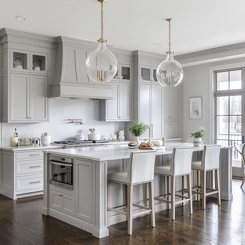
Stonington Gray (HC-170) by Benjamin Moore is a classic and versatile gray paint color. Its neutral undertones make it a great choice for any kitchen design.
The Light Reflectance Value (LRV) of Stonington Gray is 59.36. This means it reflects a moderate amount of light, making your kitchen bright without being overpowering. If your kitchen lacks natural light, this can help lighten up the space.
Stonington Gray pairs well with both warm and cool color schemes. You can match it with white cabinets for a clean look or darker accents for a more sophisticated feel.
Looking for a soft, silver-gray that’s easy to coordinate? Stonington Gray’s neutral tones help to balance out bold countertops or colorful backsplashes.
Considering another option? Compare it with Wickham Gray. Wickham Gray has an LRV of 69, meaning it’s a bit lighter than Stonington Gray but still offers a similar stylish vibe.
10. Agreeable Gray by Sherwin Williams
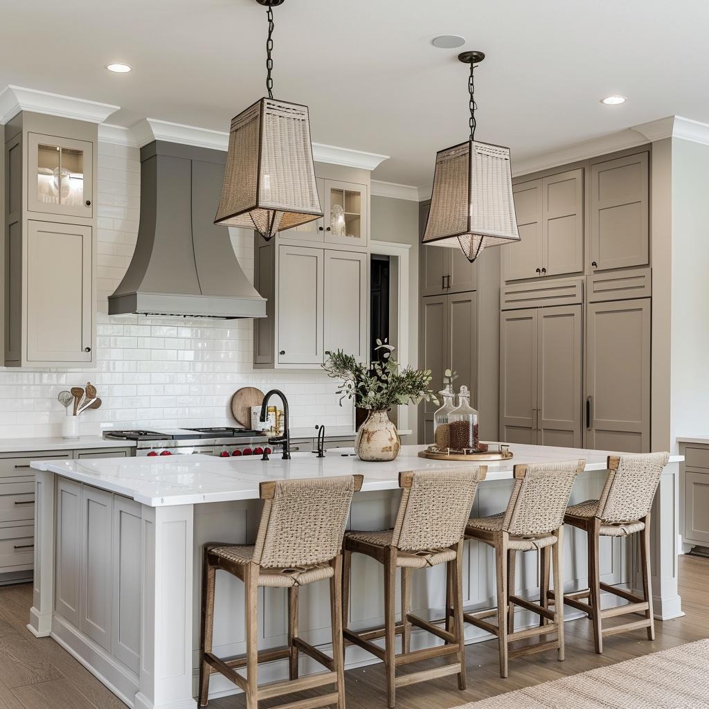
You’ll love Agreeable Gray by Sherwin Williams for your kitchen. It’s not just any gray; it’s a warm gray with a mix of beige, often called greige. This makes it super versatile!
Agreeable Gray has a light reflectance value (LRV) of 60. What does this mean for you? It means it reflects a decent amount of light, making your kitchen feel brighter and more welcoming.
If your kitchen gets plenty of natural light, this color really shines. But if your kitchen is on the darker side, it might look a little drab. Pair it with whites like Sherwin Williams Pure White for trim and cabinets to keep things fresh and clean.
This color also plays well with other grays. Try using it with Sherwin Williams Gauntlet Gray or Light French Gray for a stylish, coordinated look. Imagine your kitchen walls in Agreeable Gray with darker gray accents—that’s a designer’s dream!
11. Naval by Sherwin Williams
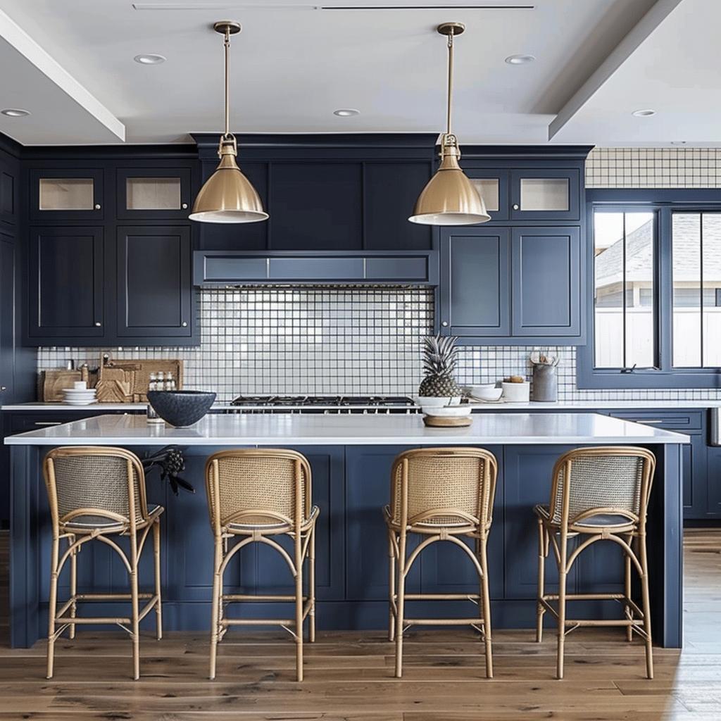
Naval by Sherwin Williams is a standout navy blue. It’s not just any blue; it was even named the 2020 Color of the Year. Why? Because it’s rich, bold, and dramatic.
This deep navy brings a sophisticated touch to any kitchen. Imagine your cabinets painted in Naval paired with crisp white countertops. The contrast is striking and elegant.
Naval’s versatility is a big plus. It can act as a neutral backdrop while adding depth and moodiness. You might see it described as reminiscent of the midnight sky—that’s pretty accurate! It has a way of making the space feel both cozy and upscale.
Another great feature? Naval has gray undertones. This makes it a bit more muted and less overpowering, fitting well in various design styles from modern to traditional. It really allows other elements in your kitchen to shine while still being a strong color on its own.
12. Peppercorn by Sherwin Williams
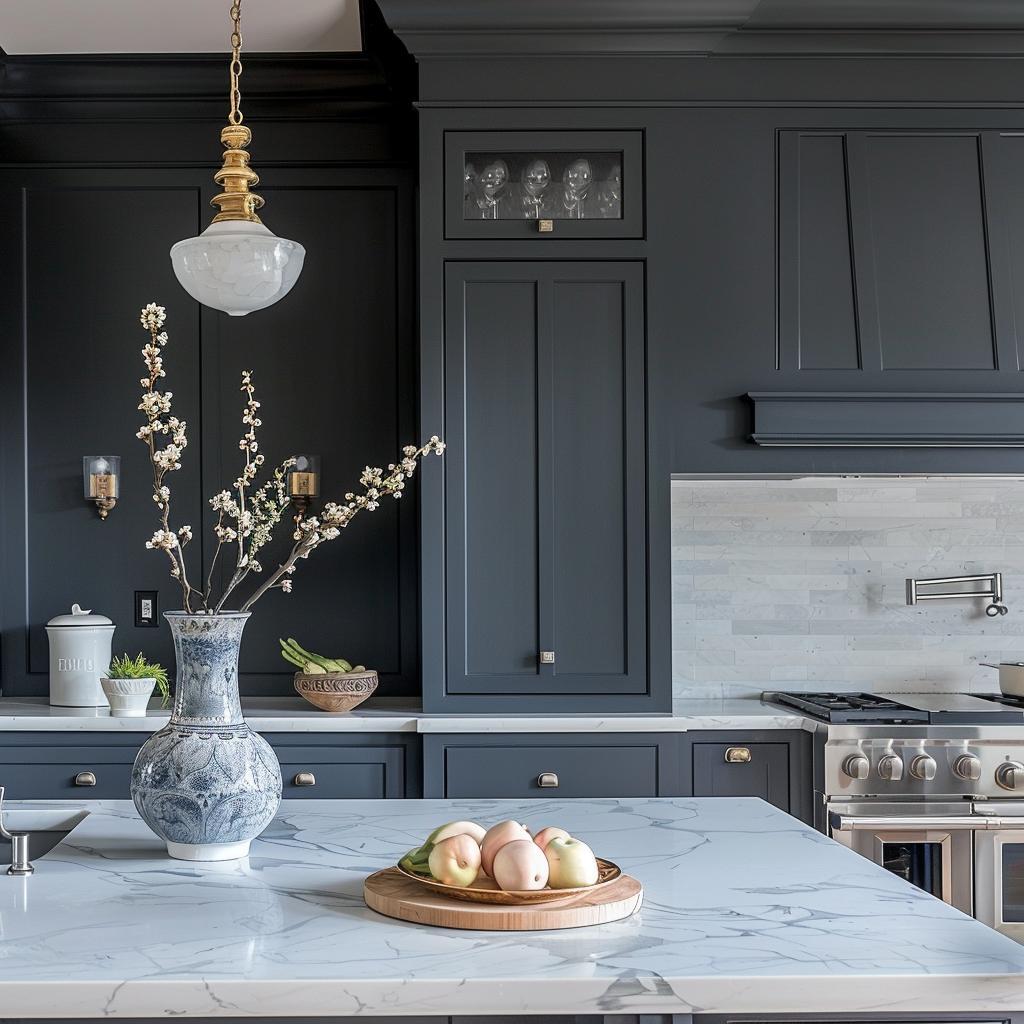
Peppercorn by Sherwin Williams is a dark, neutral gray that adds depth to your kitchen. Are you tired of plain walls? Give this shade a try for a bold look.
This color is versatile. It pairs well with white paint colors like Benjamin Moore Chantilly Lace.
In kitchens, Peppercorn can make cabinets and islands stand out. Ready for a change? Peppercorn might be just what you need!
13. Alabaster by Sherwin Williams
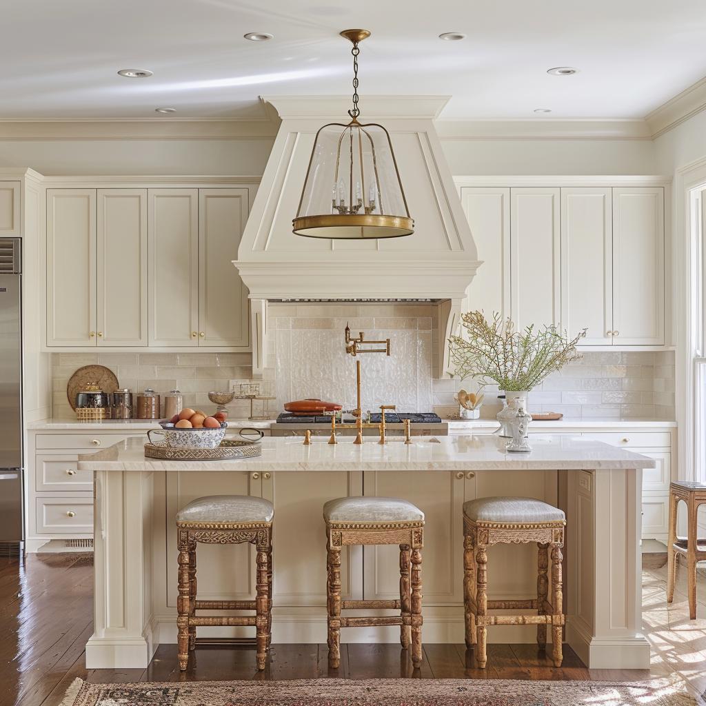
Alabaster by Sherwin Williams is a soft, warm white paint color. It’s a popular choice for kitchens because it works well on walls, trim, and cabinets. With an LRV (Light Reflectance Value) of 82, it reflects a good amount of light, making your kitchen feel bright and welcoming.
Does your kitchen have north-facing light? Alabaster’s warmth comes across as soft and creamy, not harsh or too yellow. This can make your space feel cozy and inviting.
Pair Alabaster with other colors for a versatile look. It goes beautifully with shades of brown and tan for a neutral palette. Feeling bold? A daring red for the cabinets offers a striking contrast. For a more modern feel, pair it with warm colors like Urbane Bronze.
14. Iron Ore by Sherwin Williams
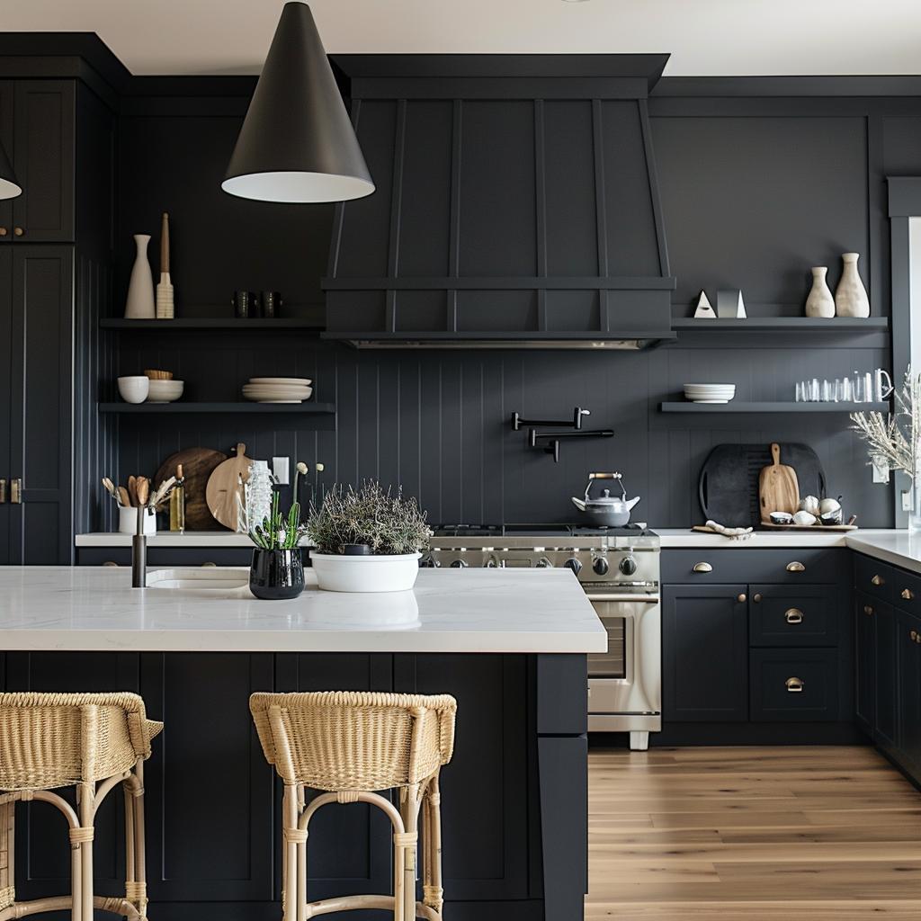
Iron Ore by Sherwin Williams is a beautiful and rich soft black. It’s perfect if you’re looking to add depth to your kitchen.
With an LRV (Light Reflectance Value) of 6, it’s not the darkest black out there, but it’s close. This makes it a great choice for cabinets, doors, or even an accent wall.
Imagine this: you paint your kitchen cabinets in Iron Ore. Your white or light-colored countertops and backsplash will pop right out. Plus, any stainless steel appliances will look extra sleek against this color.
Iron Ore is versatile. Whether your kitchen style is modern, traditional, or rustic, this color fits right in. It’s a timeless shade that stays stylish through the years.
15. Chantilly Lace by Benjamin Moore
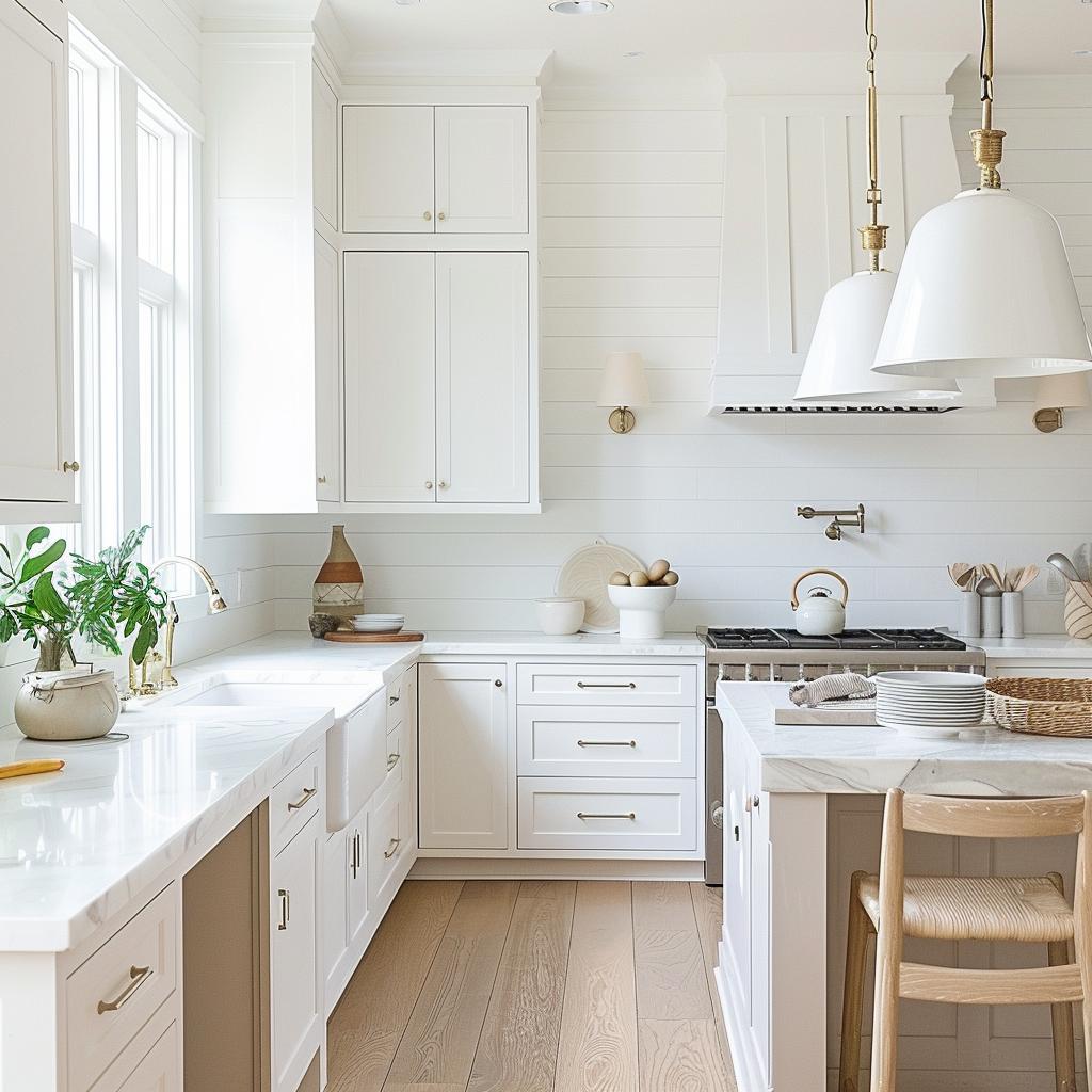
Chantilly Lace OC-65 by Benjamin Moore is a popular choice for a clean, crisp white paint. It’s known for its neutral undertones, making it an excellent option when you want a true white without any hints of yellow or blue.
This paint color works well in kitchens because it can make the space feel bright and welcoming. Whether you use it on walls, cabinets, or trim, this white paint can create a fresh and modern look.
Chantilly Lace has been praised in many homes for its versatility. You can pair it with almost any other color, and it holds up well in different lighting conditions. That means whether you have a lot of natural light or rely on artificial lighting, this color will look great.
16. Black Fox by Sherwin Williams
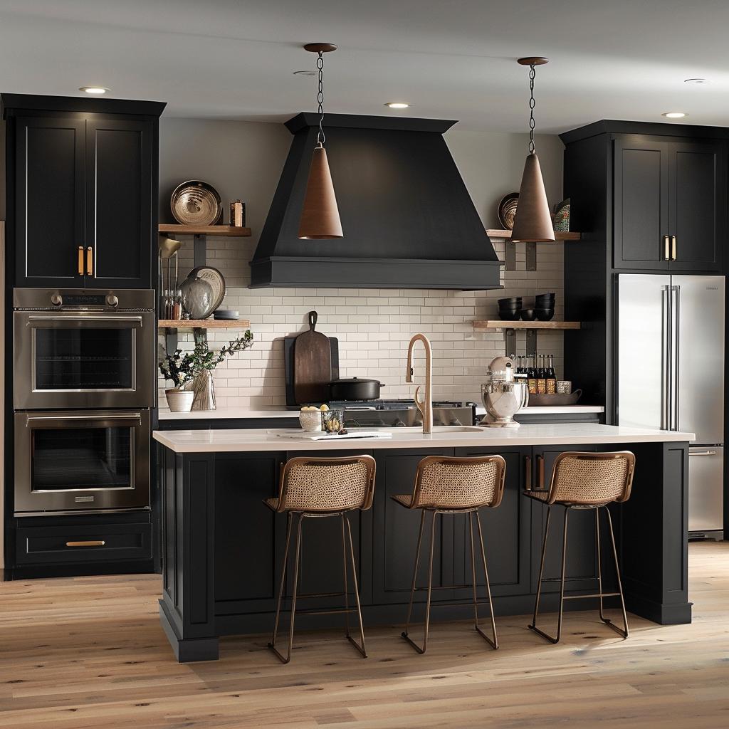
Thinking about going bold in your kitchen? Black Fox by Sherwin Williams might be the color for you.
Black Fox is a deep, rich hue that combines both black and brown tones. With a light reflective value (LRV) of 7, it absorbs most light and creates a cozy, intimate space. Imagine the elegance of dark cabinets or an accent wall in this striking shade.
If you’re aiming for a modern look, pair Black Fox with stainless steel appliances and white countertops. This contrast will make your kitchen pop.
On the other hand, combining Black Fox with warm wood tones can give your kitchen a rustic, inviting feel. It’s versatile and can match various styles, from contemporary to farmhouse.
Get the Fail-Safe Paint Color Playbook (Free PDF)
36 proven colors • 8 ready palettes • trim & sheen guide • printable testing cards.
Feel like experimenting? Try Black Fox on lower cabinets while keeping the upper ones lighter. This mix can add depth and visual interest to your kitchen space.
17. Aegean Teal by Benjamin Moore
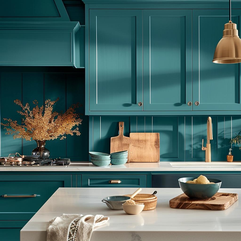
Aegean Teal by Benjamin Moore is a beautiful blue-green shade inspired by the deep waters of the Aegean Sea. It’s like bringing a bit of the ocean into your kitchen.
This color, 2136-40, was actually named the 2021 Color of the Year by Benjamin Moore. That tells you it’s a popular, trendy choice.
Aegean Teal works well with both neutral and bold colors. You can pair it with whites like Atrium White or even bolder tones like Kingsport Gray for a dramatic effect.
It’s a balanced mid-tone with a hint of gray, giving it a natural and calming vibe. Perfect for making your kitchen feel cozy yet stylish.
Remember, if you’re unsure, you can always get a peel-and-stick sample before committing. Having a sample helps you see how the color looks in your specific lighting.
Understanding Kitchen Paint Colors
Picking the right kitchen paint colors involves understanding how colors impact mood and choosing shades that complement your space.
Impact of Color on Mood
Colors can significantly influence how you feel in your kitchen. Red, for example, is known to stimulate appetite and excitement, making it ideal for dining areas. Blue, on the other hand, offers a calming effect that can make cooking more relaxing.
Warm colors like yellow and orange can make a kitchen feel cozy and welcoming. Yellow, in particular, can brighten up the space and evoke happiness. Cooler shades like green convey a sense of freshness and tranquility.
You should consider how you and your family use the kitchen. If it’s a busy, bustling area, you might benefit from calming shades. If it’s more of a relaxation spot, warmer tones can make it feel homier.
Choosing the Right Shade
Selecting the right shade goes beyond just picking a color you like. You’ll want to think about the light in your kitchen. Natural light can enhance the appearance of lighter shades, making them glow.
Meanwhile, dark colors like navy or deep green add depth and sophistication. They work great as accent walls or on the cabinets.
Consider how your paint color complements your cabinets, countertops, and appliances. A harmonious color palette can tie the room together. Tools like color swatches and paint samples can help you visualize the shades in your kitchen.
Always test a small patch first to see how the color looks in different lighting throughout the day.
Maintenance and Practicality
When choosing the best paint colors for your kitchen, it’s necessary to think about maintenance and how easy the paint is to clean. Some finishes are more durable and easier to maintain than others.
Durability of Paint Finishes
Kitchen walls endure a lot of wear and tear. That’s why you need a paint finish that can stand up to daily use. Satin and semi-gloss finishes are popular choices because they are tough and can handle scrubbing.
Satin finishes offer a balance between matte and glossy. They are less shiny than semi-gloss but still durable. They hide small imperfections well, which is helpful in kitchens where walls might get dinged up.
Semi-gloss finishes are shinier and even more durable. This makes them perfect for areas near stoves and sinks where splashes happen often. They are resistant to moisture, which helps prevent mold and mildew.
Easy-to-Clean Options
Cleaning is a big part of kitchen maintenance. You want a paint that can handle a good scrub without wearing down.
Get the Fail-Safe Paint Color Playbook (Free PDF)
36 proven colors • 8 ready palettes • trim & sheen guide • printable testing cards.
Gloss and semi-gloss paints are the easiest to clean due to their smooth surfaces.
Gloss finishes are very shiny and slick, making spills and splatters easy to wipe off. Scrubbing won’t dull the finish, which makes these paints ideal for cabinets and trim.
Semi-gloss paints, while slightly less shiny, also clean up well. They can handle frequent cleaning, making them great for high-traffic areas in the kitchen. You can use a damp cloth or sponge without worrying about removing the paint.
Choosing the right finish can make your kitchen not only look good but also be a breeze to maintain. Make your cooking space beautiful and practical by picking durable, easy-to-clean paint finishes.
