
What Paint Color Goes Well With Travertine Tile
Introducing the timeless beauty of travertine tile into your home adds an immediate sense of organic elegance and enduring warmth to any space. Because of its natural, porous composition, travertine brings with it a complex tapestry of warm, earthy undertones—shades of cream, tan, and beige that ground a room and provide a sense of permanence.
However, selecting the perfect paint color to complement this natural stone can feel like navigating a minefield of color theory. You want a shade that doesn’t compete with the tile’s inherent beauty, but rather enhances it, creating a harmonious and visually sophisticated environment. This guide provides expert, actionable advice to ensure your paint choices elevate, rather than overpower, your travertine feature.
Get the Fail-Safe Paint Color Playbook (Free PDF)
36 proven colors • 8 ready palettes • trim & sheen guide • printable testing cards.
Quick answer: The right color depends on lighting, undertones, surrounding finishes, room size, exterior exposure, and the mood you want. Test samples in real light before committing, because paint can look very different on the wall than it does on a chip.
Planning Before You Start: Assessing Your Space and Undertones
Before even looking at a paint swatch, you must conduct a thorough assessment of the room. The success of your paint job hinges on understanding the unique characteristics of three key elements: the travertine itself, the natural light, and the room’s function.
Analyzing the Travertine Undertone
Travertine is not a single color; it is a spectrum of natural mineral deposits. Its undertone is the most critical factor. Does your tile lean yellow or peach (a warm undertone)? Or does it lean toward soft gray or pink (a cooler undertone)? Knowing this dictates whether you should lean toward warm or cool paint complements. If the tile is distinctly warm, introducing cool grays can create a modern contrast, while matching it with warm neutrals will create a seamless, traditional flow.
The Impact of Natural and Artificial Light
Color perception is wildly influenced by light. Never make your final decision based on a single photograph or time of day. You must observe the sample at three points: mid-morning (often cooler light), high noon (brightest, most intense light), and late afternoon (warm, golden light). Furthermore, identify your light source: if you have warm-toned incandescent bulbs, they will naturally cast a yellow glow, making cool paint colors appear warmer than they truly are. Conversely, natural daylight, especially from a north-facing window, tends to be cooler and more bluish.
Considering Room Function and Scale
The purpose of the room dictates the mood and durability required. A high-traffic bathroom or hallway requires paint with high washability and durability (like satin or semi-gloss finishes). A formal living room or bedroom can accommodate the softer, velvety texture of a matte finish. Additionally, consider the room’s scale. In a small room, using a light, monochromatic palette will help the space feel more expansive. In a large, open area, you have the luxury of using deeper, more saturated accent colors.
Choosing the Perfect Palette: Complementing Travertine’s Earthy Tones
The best paint colors do not fight the travertine; they exist in conversation with it. We can categorize these successful pairings based on color theory and desired mood.
| Paint Color | Description |
|---|---|
| Beige | A classic choice that complements the warmth of travertine tile. Choose from light beige to deeper tan shades. |
| Cream | Light and airy, cream tones provide a soft and elegant backdrop for travertine tile. |
| Soft Taupe | A blend of gray and brown, soft taupe adds sophistication and complements the natural tones of travertine. |
| Tan | Similar to beige but with more golden undertones, tan colors add warmth and depth to the space. |
The Warm Approach: Cozy and Mediterranean
If you want a welcoming, sun-drenched, Mediterranean feel, stick with warm neutrals. These colors share the same yellow, tan, and gold undertones as the travertine, creating a seamless, enveloping glow. These are ideal for living rooms or dining areas.
- Cream and Off-White: Opt for shades with a hint of yellow or beige, rather than stark, cool white. These shades keep the space feeling soft and inviting.
- Warm Greige (Gray-Beige): This is perhaps the most popular choice. It offers the sophistication of gray but retains enough warmth to pair seamlessly with the travertine, acting as a perfect bridge color.
- Taupe: A rich, dusty brown-gray. Taupe adds depth without making the room feel dark, grounding the space and emphasizing the natural, earthy aspects of the stone.
The Cool Approach: Modern and Serene
To give the space a crisp, contemporary edge, use cool neutrals. These shades (soft grays, muted blues) provide a deliberate contrast to the travertine’s inherent warmth. This contrast is what makes the travertine pop and look intentional.
- Soft Dove Gray: A light gray that has been tempered with a touch of blue or lavender. This pairing feels airy and sophisticated, perfect for a modern bathroom or powder room.
- Muted Blue-Gray: Excellent for creating a coastal or spa-like atmosphere. The subtle coolness of the gray tones complements the warmth of the stone without clashing.
- Pale Sage: A light, muted green-gray. Sage is a natural complement to earth tones and adds a sense of calm, organic tranquility, making it excellent for wellness-focused spaces.
The Dramatic Approach: Deep and Grounded
If you are comfortable with high contrast, deep colors can be used effectively, especially on a single accent wall. These colors pull depth from the travertine and give the room an immediate sense of drama or luxury.
- Deep Forest Green: This pairing is luxurious and dramatic. The depth of the green contrasts beautifully with the light, porous tan of the stone, invoking a sense of natural richness.
- Deep Indigo or Teal: These jewel tones are striking. They pair particularly well in bathrooms or mudrooms, creating a spa-like, opulent feel.
- Charcoal Gray: Using charcoal on an accent wall can make the travertine appear lighter and more golden by contrast. This is best suited for industrial or modern farmhouse aesthetics.
The difference between a good pairing and a great one often lies in the details: the undertone and the finish.
Understanding Undertone Harmony
The concept of “undertone” is critical. A color labeled “beige” can be warm (yellow/gold undertone) or cool (pink/red undertone). If your travertine has a yellow undertone, choosing a paint with a strong blue undertone will make the whole room look disjointed. Always test a color to see if the undertone clashes with the natural, underlying hues of the stone. For the most cohesive look, ensure the paint color’s undertone is either very close to the travertine’s or provides a clean, contrasting counterpoint (like soft gray against warm tan).
| Paint Color | Description |
|---|---|
| Gray | Gray hues, ranging from light to dark shades, provide a contemporary and versatile choice that pairs well with travertine tile. |
| Greige | A combination of gray and beige, greige offers a subtle balance between warmth and coolness, making it a popular choice for modern interiors. |
Selecting the Right Paint Sheen (Finish)
The sheen determines the paint’s reflectivity and washability. This choice is purely functional and aesthetic:
- Matte or Flat: Offers zero reflectivity and provides a soft, velvety, non-distracting backdrop. Ideal for bedrooms, formal living rooms, or areas where you want the focus to remain entirely on the natural stone.
- Eggshell: The most versatile choice for general living areas. It offers a slight, subtle sheen that is much easier to wipe clean than flat paint, while still maintaining a soft, sophisticated look.
- Satin or Semi-Gloss: These higher-sheen finishes are highly durable and washable. They are essential for high-humidity or high-contact areas like bathrooms, powder rooms, and kitchens, where moisture and cleaning agents are common.
When designing, remember these principles to guide your accent choices:
- Monochromatic: Using varying shades of one color (e.g., light beige, medium tan, deep mocha). This is the safest, most elegant choice and requires minimal effort to achieve a harmonious look.
- Analogous: Using colors next to each other on the color wheel (e.g., soft green, sage, and light gray). This creates a subtle, natural transition that feels effortless and soothing.
- Complementary: Using colors opposite each other (e.g., blue and orange). This creates the highest visual contrast and should be used sparingly—perfect for a small piece of art or a single accent wall, not the entire room.
Materials and Tools: Preparation is Half the Battle
A flawless paint job requires preparation equal to the quality of the paint itself. Do not rush this stage.
| Paint Color | Description |
|---|---|
| Olive Green | Shades of olive green and sage can add a touch of nature and tranquility, complementing the earthy tones of travertine tile. |
| Warm Brown | Warm brown shades, reminiscent of earthy soil or rich woods, can create a cozy and grounded atmosphere in the room. |
| Terracotta | Terracotta hues, with their reddish-brown undertones, can bring a touch of warmth and Mediterranean charm to the space. |
- Surface Cleaning: Thoroughly clean the walls and surrounding areas. Dust, grease, and grime will prevent paint from adhering properly, leading to streaks and peeling.
- Masking and Taping: Use painter’s tape to protect trim, baseboards, and window casings. Use drop cloths to protect floors.
- Priming: If the wall surface is porous (like new drywall or previously unpainted stone), apply a high-quality primer. Primer ensures the paint adheres uniformly and prevents the underlying surface material from bleeding through the paint color.
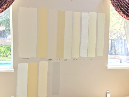
- Testing Swatches: Always acquire large, rectangular swatches (at least 2 ft x 2 ft) and apply them to the actual wall surface, not cardboard. This ensures the color interacts correctly with the room’s substrate and humidity.
Mistakes to Avoid When Pairing Paint and Tile
Even with expert guidance, common mistakes can derail a beautiful project. Be aware of these pitfalls:
- Ignoring the Undertone: Assuming a paint color is “neutral.” If the paint’s undertone (e.g., pink) clashes with the stone’s undertone (e.g., yellow), the resulting color will look muddy or sickly, regardless of how “neutral” the paint is labeled.
- Over-Saturating the Space: Using too many deep or bold colors. Because travertine is already a strong, earthy element, pairing it with multiple deeply saturated colors (e.g., deep green walls, deep blue furniture, and dark brown accents) will make the room feel heavy, dark, and overwhelming.
- Skipping the Test Swatch: Buying paint based on a small sample cup is insufficient. You must test swatches on the actual wall and observe them throughout the entire day to account for shifting natural light.
- Underestimating the Sheen Requirement: Using a matte finish in a bathroom or kitchen. The low sheen of matte paint, while beautiful, is difficult to clean and can quickly accumulate soap scum and water marks, making the surface look dirty.
Safety and Practical Notes: Professional Care
Paint is a physical process that requires respect for both the material and the environment. Safety protocols must be strictly followed.
Ventilation is paramount. When painting, especially with new paint, ensure maximum ventilation to dissipate volatile organic compounds (VOCs). Keep windows open and use fans where possible. Always wear appropriate personal protective equipment (PPE), including gloves, eye protection, and dust masks, as directed by the manufacturer.
Manufacturer Guidelines: Always follow the manufacturer’s recommended drying, curing, and recoating times. Applying paint too quickly can lead to poor adhesion, streaks, or peeling. If you are unsure about complex preparation or surface treatment, always call a licensed professional.
Frequently Asked Questions
The most critical step is identifying the travertine’s inherent undertone—is it warm (yellow, peach, tan) or cool (gray, faint pink)? If your tile is warm, avoid paint colors that have strong blue or cool undertones, as they will clash. For a cohesive look, choose paint colors that either share the stone’s warmth (like warm greige or taupe) or provide a deliberate, complementary cool contrast (like soft sage or dusty blue).
Get the Fail-Safe Paint Color Playbook (Free PDF)
36 proven colors • 8 ready palettes • trim & sheen guide • printable testing cards.
Should I rely on a single paint sample or test the color throughout the day?
Never rely on a single sample or photo. Color perception changes drastically with light. You must test your chosen paint swatch on the actual wall surface and observe it at three distinct times: mid-morning (cooler light), high noon (brightest, most intense light), and late afternoon (warm, golden light). This comprehensive testing ensures the color remains harmonious regardless of the time of day.
What is the difference between using a matte and a satin finish, and which is best for my room?
The finish determines durability and reflectivity. A Matte/Flat finish is best for formal areas like bedrooms where a soft, non-distracting backdrop is desired. It is difficult to clean. Satin or Semi-Gloss finishes are highly durable and washable. They are essential for high-humidity areas like bathrooms, powder rooms, and kitchens, as they can resist soap scum and water marks much better than matte paint.
What are the most important steps to take before applying any paint?
Preparation is half the battle. Before painting, you must thoroughly clean all surfaces to remove dust, grease, and grime. Use painter’s tape and drop cloths to protect trim and floors. If the wall surface is porous (like new drywall), apply a high-quality primer first. Proper priming ensures the paint adheres uniformly and prevents the underlying material from bleeding through the color.
Conclusion
Choosing a paint color for a room featuring travertine tile is ultimately about balance. The goal is not to match the stone, but to create a sophisticated conversation between the two elements. By understanding your space’s light, identifying the travertine’s precise undertone, and selecting a paint finish that matches the room’s function, you can achieve a cohesive and timeless design.
Remember that the most successful color schemes use neutrals as the foundation, allowing bold or rich colors to act as carefully placed accents. With careful planning and diligent testing, your painted walls will serve to enhance the enduring, natural beauty of your travertine tile, transforming your space into a sanctuary of sophisticated design.