10 Best Paint Colors for North Facing Rooms: Brighten Up Your Space
For a dim north-facing room, start with a creamy off-white or a light warm greige if you want the walls to feel warmer. Try Benjamin Moore Ballet White OC-9 (LRV 71.97) for a creamy off-white or Pale Oak OC-20 (68.64) for a light greige. If you like a cooler look, compare Wickham Gray HC-171 (67.87), a light blue-gray. Light Reflectance Value (LRV) compares how much available light a color reflects. It doesn’t add light or tell you how warm the color will look.
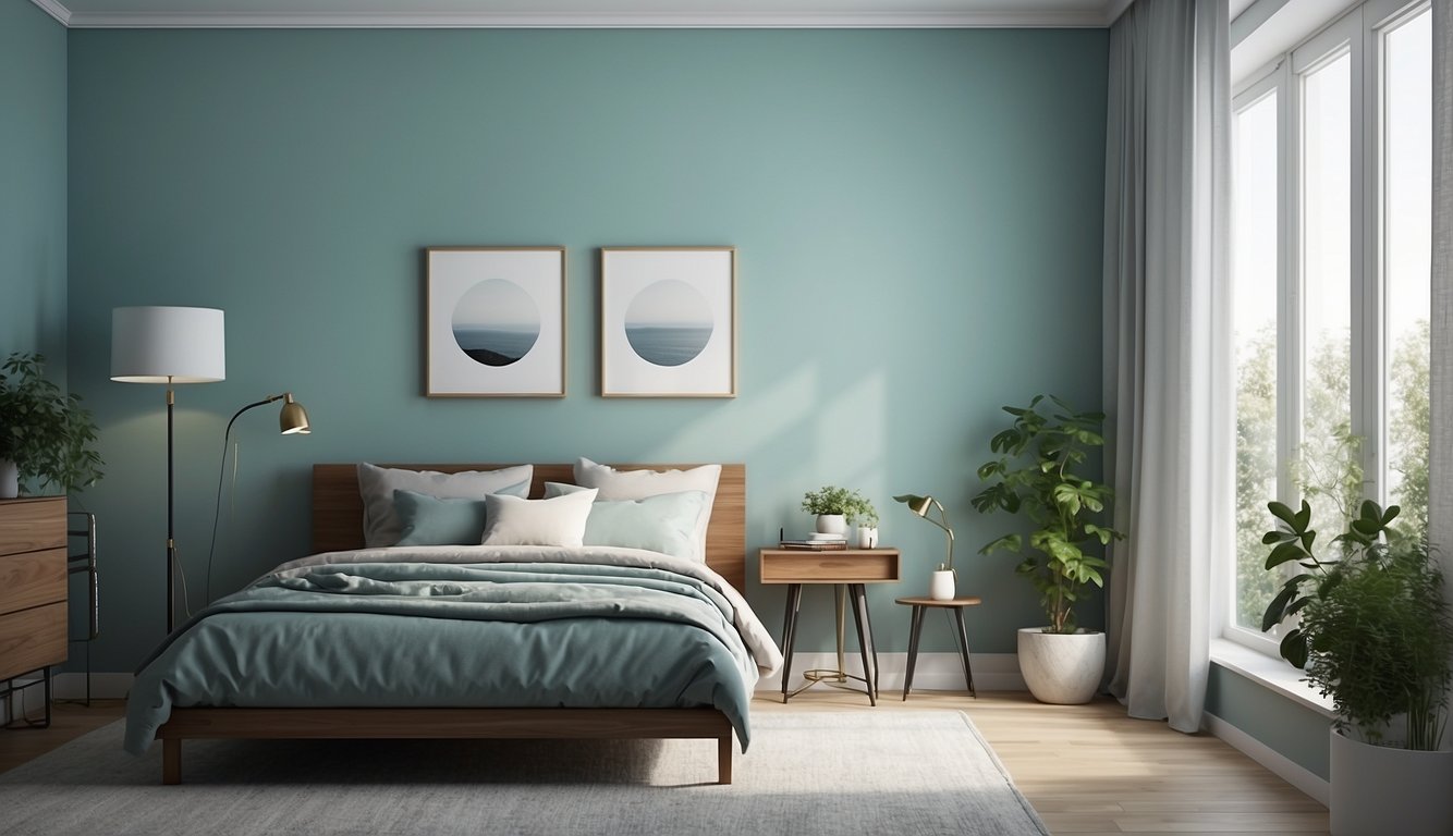
Cool, muted daylight is common in rooms with mainly north-facing windows in the Northern Hemisphere. The actual light still depends on window size, shade and season. To see how paint can change the feel of a room, compare physical samples beside your trim and floors both in daylight and under your usual evening lights.
Get the Fail-Safe Paint Color Playbook (Free PDF)
36 proven colors • 8 ready palettes • trim & sheen guide • printable testing cards.
1. Pale Oak by Benjamin Moore
Pale Oak by Benjamin Moore is a popular choice for north-facing rooms. This light neutral color sits perfectly between gray and beige, making it a versatile option.
In rooms with lots of natural light, Pale Oak tends to look like a warm off-white. However, in north-facing rooms with less natural light, it reads more as a soft light greige.
Benjamin Moore lists Pale Oak OC-20 at LRV 68.64. Compare it with a creamy off-white if you want a little more depth without committing to a darker gray. Its appearance can vary with the light and the finishes around it.
Pale Oak’s warm gray undertones can soften the look of cool daylight. Compare it with your trim and flooring first: surrounding finishes can change which undertones stand out.
2. Repose Gray by Sherwin-Williams
Repose Gray by Sherwin-Williams (SW 7015) is a fantastic choice for north-facing rooms. It’s a warm gray neutral that doesn’t feel cold, thanks to its slight green and taupe undertones.
Sherwin-Williams lists Repose Gray SW 7015 at LRV 58.22. It reflects less light under comparable conditions than the higher-LRV options in this guide. Sample it beside a lighter neutral if the room is already dim.
It’s also popular and often appears on Sherwin-Williams’ best-seller list. Its versatility means it works in any room, no matter the type of decor you have.
In a north-facing room, Repose Gray can be a good candidate if you prefer a more defined wall color. Check it in the darkest corner before committing to a full room.
3. Classic Gray by Benjamin Moore
Classic Gray by Benjamin Moore is a fantastic option for north-facing rooms. This color is light and almost white, but it has a hint of gray to it. Perfect if you want a soft, neutral backdrop.
It won’t make your space feel too cold or stark.
In low natural light, Classic Gray maintains its brightness without becoming overpowering. This makes it a suitable choice for rooms that don’t get a lot of sunlight. Its subtle warmth brings a cozy feeling to the space.
You’ll find it blends well with many other colors and styles, adding versatility to its charm.
For those looking to avoid stark white but still wanting a light shade, Classic Gray offers a nice balance. It feels sophisticated and welcoming. If you’re unsure about your choices, this can be a safe and stylish bet.
4. Gray Owl by Benjamin Moore
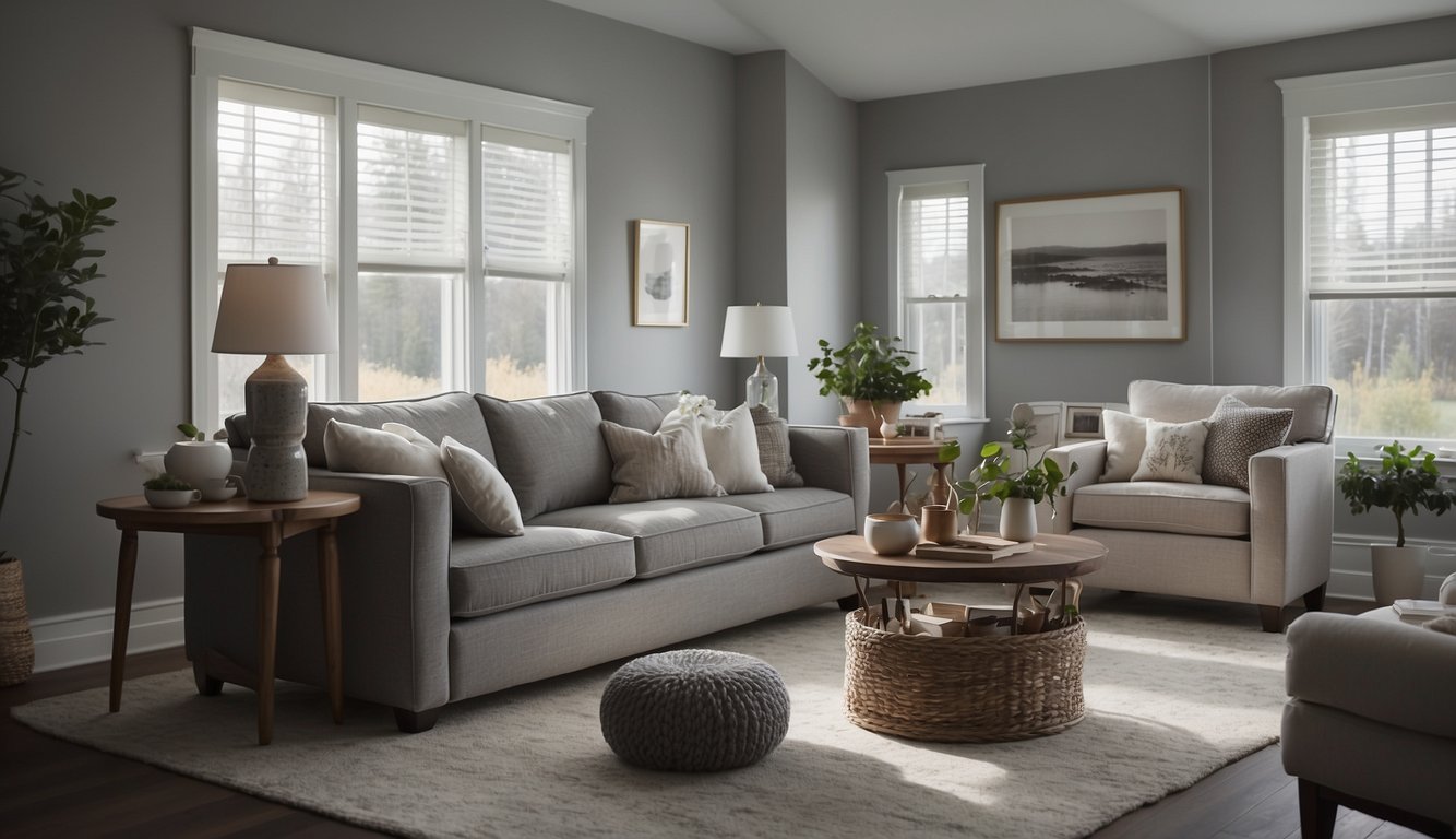
Gray Owl by Benjamin Moore is a popular choice for north-facing rooms. It’s a versatile gray with subtle blue and green undertones, which keep it cool and refreshing.
The blue or green notes can show up differently depending on the light, trim and furnishings. Compare Gray Owl with a warmer gray in both daylight and lamplight if you want to see which looks cooler in your room.
If you’re concerned about the color feeling too cold, pair Gray Owl with warm whites for trim. This helps balance the coolness and adds a touch of warmth.
Give Gray Owl a try if you want a stylish and sophisticated look for your north-facing room.
5. Edgecomb Gray by Benjamin Moore
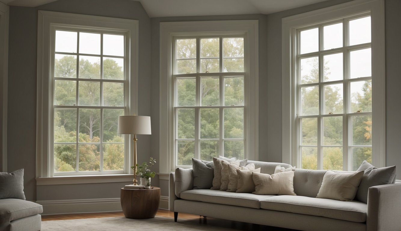
Edgecomb Gray HC-173, also known as Baby Fawn OC-15, is a warm neutral paint color that perfectly balances gray and beige. This makes it a greige or taupe hue. It’s fantastic for creating a soft, warm, and organic vibe in your room.
Benjamin Moore lists Edgecomb Gray HC-173 at LRV 63.09. It has more depth than Pale Oak. Compare the two if you like greige but are deciding how much contrast you want against pale trim.
Pair Edgecomb Gray with wood tones or white trims like Dove Wing by Benjamin Moore for a cozy look. It also works well with both warm and cool accent colors, giving you plenty of decorating flexibility.
Perfect for a living room or bedroom, this color is one of Benjamin Moore’s bestsellers, and it’s easy to see why!
6. Wickham Gray by Benjamin Moore
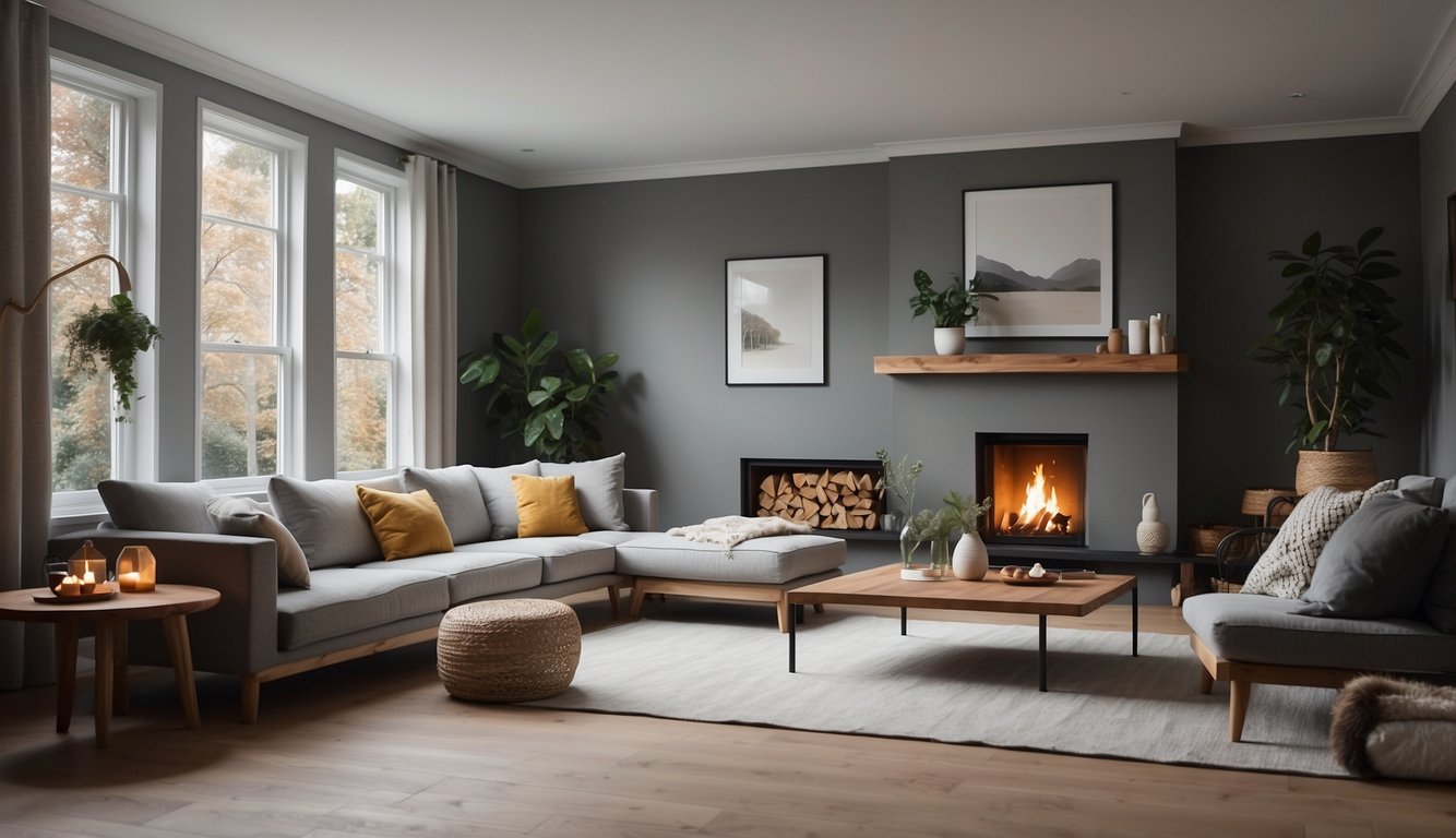
Have you ever thought about giving your north-facing room a fresh look? Wickham Gray by Benjamin Moore could be your solution.
Wickham Gray (HC-171) is the light blue-gray in the opening shortlist. Try it if you want to keep the cooler character of the daylight rather than choose a shade to offset it.
Imagine walking into a room that feels serene and calming. That’s what Wickham Gray can do. The color’s versatility means it can appear slightly different depending on the lighting. In darker rooms, it leans more towards an icy gray, while in brighter, south- or west-facing rooms, it softens up.
Choosing the right white color to pair with Wickham Gray can make a big difference. Think about combining it with crisp whites to highlight its subtle elegance.
Considering Wickham Gray for your north-facing room is an excellent choice if you want a classic, dependable, and sophisticated color.
7. Ballet White by Benjamin Moore
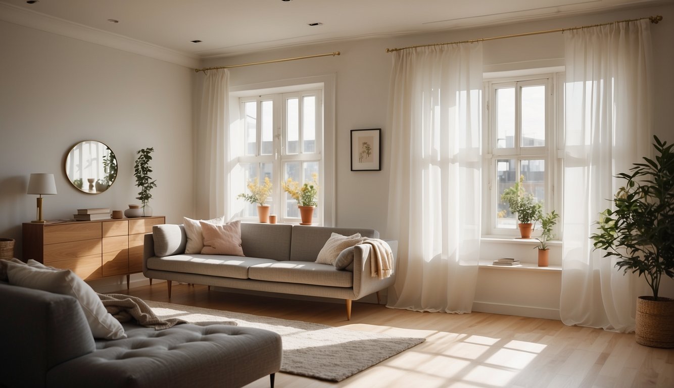
Ballet White (OC-9) is a creamy off-white. Compare it with a crisper white next to your existing trim; the softer undertone can be more apparent when the two are side by side.
You’ll love how Ballet White has those creamy undertones. These soft hints help counteract the cool light that north-facing rooms often get.
Imagine this paint in your living room or bedroom. It’s subtle, but it makes a statement. It’s versatile too, fitting with both modern and traditional decor.
Check Ballet White in the room rather than relying on photos. Move the same sample from the trim to a shadowed corner to see how much the warmth changes.
Try pairing it with warm accents like wooden furniture or soft textiles. This combination can make a north-facing room feel cozier and more inviting.
8. Balboa Mist by Benjamin Moore
Balboa Mist by Benjamin Moore is a warm, light gray paint. It’s known as “greige,” a blend of gray and beige.
Benjamin Moore lists Balboa Mist OC-27 at LRV 65.53. Its slightly warm cast is worth comparing with Pale Oak if you want a light neutral but don’t want a pronounced cream tone.
This color is versatile. It can appear slightly different depending on your lighting—sometimes looking more lavender. It pairs well with white trims, creating a beautiful contrast that can enhance your space.
If you’re looking for a neutral option for your north-facing room, Balboa Mist might be the perfect choice. Its soft warmth and adaptability make it a favorite among interior designers and homeowners.
Balboa Mist isn’t too dark or too light. It’s right in the middle, making it a balanced choice for various room styles.
9. Silver Satin by Benjamin Moore
Silver Satin (OC-26) is an off-white with crisp gray undertones. It’s a candidate for a cooler, understated look rather than a creamy one.
Benjamin Moore lists Silver Satin OC-26 at LRV 74.9, slightly higher than Classic Gray OC-23 (73.67). Compare swatches rather than relying on that small difference. If you’re painting over a dark wall, check coverage separately from the new color’s reflectance.
In rooms with white trim, Silver Satin stands out beautifully. It creates a soft, dreamy look, especially when paired with white and off-white furniture. In smaller spaces, it can make the room feel airy and open.
If you want to add some contrast, use black picture frames or gold accents. This will make the Silver Satin walls pop and add a touch of sophistication to your room.
10. Chantilly Lace by Benjamin Moore
Chantilly Lace (OC-65) is a clean white. Consider it if you like a crisp look or want a white trim reference beside the warmer samples.
In a dim room, a clean white can still look subdued or cool in shadow. Put Chantilly Lace beside Ballet White under the same light if you’re deciding between crisp and creamy.
This white paint works well with various styles. Whether your decor is modern or traditional, you can rely on Chantilly Lace to complement your space.
Using Chantilly Lace can make a room feel more open and airy. If you want to give your home a fresh, inviting look, it’s a great option.
Understanding Light in North Facing Rooms
In Northern Hemisphere rooms dominated by north-facing windows, daylight often looks softer and cooler. Check your own room before relying on the compass alone: glazing, trees and nearby buildings can all change the light.
The Impact of Natural Light
A north-facing window in the Northern Hemisphere often receives mostly indirect light. The strength and color of that light still vary by location, season and what is outside the window. This is one reason a swatch can look cooler at home than it did in the store.
Warm whites, soft yellows and light beige are starting points if you want to offset a cool cast. Consider undertone and reflectance separately: a shade can reflect more of the available light without making that light look warmer.
Differences Between Northern and Southern Exposure
In much of the Northern Hemisphere, south-facing windows often receive more direct sunlight than north-facing windows, all else being equal. Bright direct light may make some colors look washed out; shaded glazing can change the comparison.
Where northern light is softer, a cool paint color may look more muted than expected. If you like blue or green walls, try a physical sample before ruling them out.
Choosing the right color can make a huge difference. Warmer shades can help make a north-facing room feel more inviting and balanced, even on cloudy days.
Choosing the Right Paint Color
Selecting the best paint color for a north-facing room can be tricky, but understanding color theory, the difference between warm and cool colors, and how undertones affect room perception can make the process easier. Let’s explore each of these topics.
Color Theory Basics
Color theory helps you understand how colors interact and affect mood. Primary colors (red, blue, yellow) combine to make secondary colors (green, orange, purple). Knowing this can help you mix and match.
A color wheel is a great tool to visualize relationships between colors. For example, colors opposite each other on the wheel (complementary colors) can create dynamic contrast. Analogous colors, which sit next to each other, offer a more harmonious look.
Under cooler or weaker daylight, a shade can look more muted than it does on a store card. Try a warmer option alongside it rather than assuming one color will look the same throughout the room.
Warm vs Cool Colors
When picking paint for a north-facing room, you need to decide between warm and cool colors. Warm colors like reds, yellows, and oranges can add a sense of comfort and coziness. Cool colors such as blues, greens, and purples can provide a calming effect.
Get the Fail-Safe Paint Color Playbook (Free PDF)
36 proven colors • 8 ready palettes • trim & sheen guide • printable testing cards.
Warm whites, beige and warm taupe are starting points if you want a warmer look. A cool color can also work if that’s the mood you want. Compare both under the bulbs you actually use.
Swatch test: Paint each finalist on a large movable sample board, following the sample directions, or use large peel-and-stick samples. Move them between the window wall and the darkest corner. Compare them with your trim and floor in morning light, afternoon light and under your usual evening bulbs. See Benjamin Moore’s north-facing room sampling advice.
How Undertones Affect Room Perception
Undertones are the subtle hues beneath the main color. They can change how a paint color looks in different lighting. Understanding undertones helps in selecting a color that will look great in your north-facing room.
For example, a beige paint might have pink, yellow, or green undertones. In a north-facing room, yellow undertones can make the space warmer. On the other hand, blue undertones might make the room feel colder.
Compare the samples against the trim and finishes you’ll keep, not just against each other. If you need ideas beyond these three starting points, our room paint color finder can suggest a palette direction, but use real samples to choose the final paint.