
How to Blend Paint by Number: Guide to Professional Blending Techniques
Paint by number is a wonderfully accessible hobby, providing a satisfying way to create beautiful, finished artwork without needing formal artistic training. It’s a perfect entry point for anyone looking to explore the world of color and design within the comfort of their own home. However, if your goal is to move beyond simply filling in numbered sections and achieve a depth that looks truly professional, blending techniques are the key to unlocking that next level of artistry.
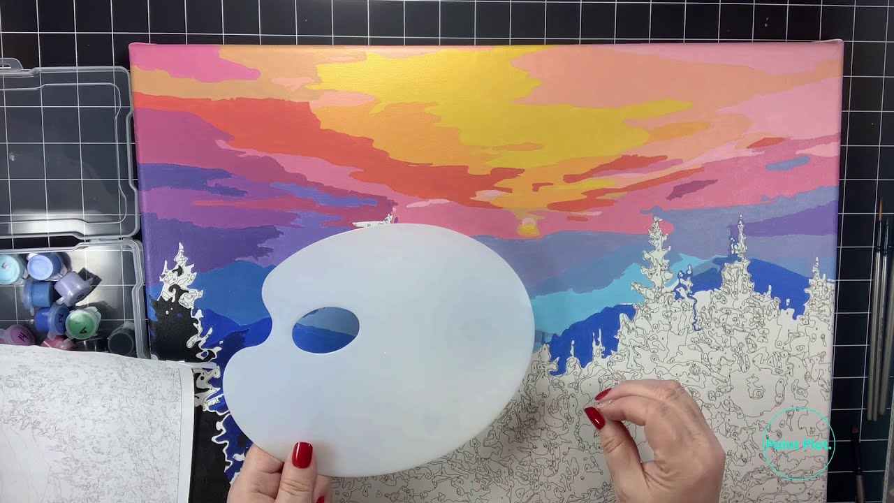
Blending paint by number involves mastering the art of merging colors—creating smooth, natural gradients and dimension that give your artwork the richness of a master painter’s piece. By understanding foundational color theory, preparing your surface properly, and applying advanced techniques like wet-on-wet or glazing, you can transform a simple kit into a sophisticated, gallery-quality piece that showcases true skill and dedication.
Get the Fail-Safe Paint Color Playbook (Free PDF)
36 proven colors • 8 ready palettes • trim & sheen guide • printable testing cards.
Quick answer: To blend paint by number, finish the numbered areas first, then soften borders by mixing small amounts of the two neighboring colors on a damp brush. Feather across the line with light strokes while the paint is workable. For dry sections, add a thin glaze that overlaps both colors instead of scrubbing the canvas.
Planning Your Masterpiece: Assessing the Artwork and Surface
Before a single drop of paint touches the canvas, proper planning is essential. Think of your art surface not just as a canvas, but as a structural element that requires preparation, just like any painted wall or piece of furniture. Assess the complexity of your chosen piece: Does it require subtle, gradual shifts (like a sunset gradient)? Or does it need stark, textural contrast? Understanding the desired final effect will dictate your required materials and techniques.
Next, examine the surface itself. Is it pre-primed wood, a standard canvas board, or a specialized panel? The substrate material determines the type of primer and sealant you must use. For most acrylic blending, a good quality acrylic gesso or primer is necessary to seal the surface, preventing the paint from soaking into the material unevenly and ensuring optimal adhesion for subsequent layers. If the surface is heavily textured, you may need to plan for the blending techniques to emphasize that texture, rather than trying to smooth it out completely.
Successful blending relies heavily on having the right tools and high-quality materials. Do not skimp on these items, as inferior supplies can lead to frustrating color shifts and poor adhesion.
Essential Supplies:
- Acrylic Paints: Use professional-grade acrylics, as they offer superior pigment load and consistency compared to craft paints. Having a range of complementary colors is vital for achieving rich transitions.
- Acrylic Mediums: This is crucial for blending. Invest in a combination of flow improvers (to make paint thinner and spreadable), retarders (to slow drying time, allowing you more time to blend wet areas), and gel mediums (to build opaque, durable layers).
- Brushes: You will need a variety of synthetic brushes. Use flat, broad brushes for laying down large base areas, and smaller, softer synthetic rounds or filbert brushes for detailed blending and feathering edges.
- Primers and Sealants: A quality acrylic gesso or specific primer designed for your surface is non-negotiable.
- Masking Tape and Plastic Sheeting: These are used for masking off areas you want to protect, ensuring a clean, professional edge.
Surface Preparation Steps:
- Cleaning: Wipe the entire surface with a mild detergent solution (like a TSP substitute) to remove any dust, grease, or oils. Rinse thoroughly and allow it to dry completely.
- Sanding (Optional but Recommended): Lightly sanding the surface with fine-grit sandpaper (180-220 grit) helps remove any factory finish or grime and creates a slightly porous surface that enhances paint adhesion.
- Priming: Apply 1-2 thin, even coats of your chosen primer, following the manufacturer’s recommended drying time between coats. This seals the pores and provides a uniform, neutral base for your blending efforts.
Materials and Tools
Gather brushes, rollers, painter’s tape, drop cloths, and the correct primer and paint for your surface. A sturdy ladder, sanding block, and cleaning rags will also help.
Do not forget safety gear: gloves, eye protection, and a respirator if ventilation is limited. Having everything ready before you start prevents mid-project delays and reduces mess.
Mastering Color Theory for Blending
Color theory is the backbone of blending. It dictates how colors interact, preventing your beautiful gradients from turning into muddy, dull messes. You must understand three key concepts: Hue, Value, and Saturation.
1. Hue: This is the pure color itself (red, blue, yellow). On the color wheel, primary colors (red, yellow, blue) mix to create secondary colors (orange, green, purple). Blending often involves moving smoothly between adjacent hues.
2. Value: Value refers to how light or dark a color is. To create depth, you rarely use just one color; instead, you manipulate the value. To darken an area, you add black or a deep complementary color; to lighten it, you add white or a tint. Gradual changes in value are what create the illusion of light and shadow.
3. Saturation: This is the intensity or purity of the color. Highly saturated colors are vibrant; desaturated colors are muted or grayed out. When blending, you might intentionally desaturate a color slightly in the shadows to make the highlights (high saturation) pop, giving the piece more visual depth.
Advanced Blending Techniques: Step-by-Step Guide
Once the surface is prepped and the theory is understood, you can tackle the physical blending techniques. Each method is best suited for different effects, from smooth transitions to rugged textures.
Wet-on-Wet Blending (For Smooth Gradients)
This technique is ideal for simulating natural, gradual transitions, like a sunrise or a misty atmosphere. It is the most time-sensitive method.
- Preparation: Apply the base color (Color A) to a section and allow it to become damp, but not soaking wet.
- Application: Immediately introduce the second color (Color B) adjacent to Color A, while both areas are still wet.
- Blending: Using a clean, damp brush, gently feather the two colors together at the border. The wet paint will allow the pigments to physically mix on the surface, creating a seamless transition.
- Tip: If the paint starts to dry and the colors look separated, stop and apply a small amount of retarder medium to the area to give yourself more working time.
Glazing (For Depth and Patina)
Glazing involves applying a thin, transparent layer of color over a completely dry base layer. This technique does not mix colors physically; rather, it modifies the perceived color and adds a rich, aged depth.
- Preparation: Ensure the underlying layer is 100% dry and cured.
- Mixing: Mix your desired glaze color (Color C) with a high ratio of medium (e.g., 3 parts medium to 1 part paint). The mix should be thin, like stained glass.
- Application: Apply the glaze over the dry area in thin, even coats. The glaze will sit atop the existing color, subtly altering its hue and adding depth, mimicking the effect of patina or aging.
Dry Brushing (For Texture and Highlights)
Dry brushing is excellent for adding a weathered, scumbled, or textured effect, making the piece feel less smooth and more tactile. It is often used to simulate distressed metal or aged wood.
- Preparation: Load a stiff, clean brush with a minimal amount of paint (just enough to barely coat the bristles). Wipe the brush on a paper towel until the brush feels nearly dry.
- Application: Drag the brush lightly and quickly across the surface. Because the paint is barely adhering, it will only catch on the raised edges and textures of the underlying paint, emphasizing dimension and grit.
- Tip: Use this technique sparingly. Too much paint will negate the dry brushing effect and just create a solid wash.
Achieving Depth and Dimension: Advanced Tips for a Professional Finish
To elevate your blending beyond mere technique, focus on the artistic principles of light and shadow. These elements are what give a piece its “life.”
Creating Gradients: Instead of just blending two colors, think in terms of a value scale. If you want to transition from a bright yellow highlight to a deep orange shadow, you must introduce the yellow, then the orange, and then gradually add a touch of red and black (or a deep complementary tone) to deepen the value smoothly. Never jump directly from light to dark.
Controlling Contrast: Use contrast to guide the viewer’s eye. By keeping certain areas highly saturated and vibrant, while allowing the surrounding areas to be more muted or desaturated, you create a focal point. The deepest shadows and the brightest highlights should contrast sharply with the mid-tones.
Medium Control: Experiment with different mediums. A pure gel medium will create an opaque, thick build-up (good for structural elements). A flow improver will keep the paint wet and mobile (essential for wet-on-wet). Knowing which medium to use for which effect is critical to professional results.
Common Mistakes and Troubleshooting
Even professionals encounter blending mishaps. Knowing how to spot and fix these common errors can save hours of frustration.
- The Muddy Color Problem: This occurs when too many different, non-complementary colors are mixed together (e.g., mixing too many greens, browns, and reds). The solution is to simplify your palette and work with complementary colors (e.g., blue and orange) to create a balanced, natural transition.
- Patchy Transitions: If the blend looks like it has distinct bands of color rather than a smooth gradient, it usually means you rushed the blending process or the underlying layer was not uniformly dry. The fix is to let the area dry completely and then re-apply a thin glaze coat to unify the colors.
- Overworking the Paint: Blending is not about scrubbing. Excessive movement with the brush can lift the underlying paint or create visible brush streaks. Use light, feathering motions and lift the brush off the surface frequently.
- Adhesion Failure: If the paint seems to flake or lift, it means the underlying surface was not properly primed or cleaned. Always re-examine the surface preparation steps for the next piece.
Safety, Curing, and Preservation Notes
When working with solvents, acrylic mediums, and strong primers, safety must be your top priority. Always take appropriate precautions to ensure a safe and healthy working environment.
- Ventilation: Always work in a well-ventilated area. Many acrylic mediums and solvents can emit strong fumes. Keep windows open or use an exhaust fan.
- Protective Gear: Wear appropriate gloves and eye protection when handling solvents, strong cleaners, or thick primers.
- Drying and Curing: Allow ample drying time between every major layer—especially between the primer, the base coats, and the final glaze. Check the specific drying times listed on your medium and paint containers. Rushing this process can lead to warping, poor adhesion, or chemical incompatibility.
- Sealing: Once the piece is completely dry and cured (which can take days depending on thickness), apply a final protective varnish (matte, satin, or gloss finish). This sealant protects the blend from dust, moisture, and accidental physical damage, preserving your work for years to come.
Safety and Practical Notes
Work in a well-ventilated space and wear gloves, eye protection, and a respirator when needed. Keep children and pets away from wet surfaces and open containers.
Follow manufacturer drying times between coats. Dispose of rags and leftover materials according to local regulations. If the project involves heights, lead paint, or structural work, consider hiring a licensed professional.
Frequently Asked Questions
Do I need professional-grade paints and mediums to blend effectively?
Yes, while you can practice with craft paints, professional-grade acrylics and mediums are highly recommended for achieving true blending depth. Professional paints offer superior pigment load and consistency, while specialized mediums (like flow improvers and retarders) are crucial because they physically manipulate the paint’s drying time and viscosity, giving you the necessary working window to blend colors seamlessly.
Get the Fail-Safe Paint Color Playbook (Free PDF)
36 proven colors • 8 ready palettes • trim & sheen guide • printable testing cards.
How do I prevent my blended colors from looking muddy?
Muddy colors happen when too many unrelated pigments are mixed together. To prevent this, always think in terms of color theory, specifically focusing on complementary colors (colors opposite each other on the wheel, like blue and orange) or analogous colors (colors next to each other, like yellow, yellow-green, and green). When in doubt, simplify your palette and test your intended blend on scrap material first.
What is the safest way to handle solvents and mediums?
Safety is paramount. Always work in a well-ventilated area, preferably outdoors or under an exhaust fan, as many mediums and solvents can emit strong fumes. Wear appropriate personal protective equipment (PPE), including chemical-resistant gloves and safety goggles, when handling primers or strong cleaning agents. Never mix unknown chemicals and always check the Material Safety Data Sheet (MSDS) for any product you use.
Does the surface material affect my blending technique?
Absolutely. The substrate dictates your preparation. For porous materials like raw wood, a thorough priming process (using acrylic gesso) is non-negotiable to seal the pores and ensure even paint adhesion. If you are working on a heavily textured surface, instead of trying to smooth it out, plan your blending techniques (like dry brushing) to actually emphasize and celebrate the existing texture, making it part of the final piece’s character.
Conclusion: The Journey from Hobby to Art
The ability to blend paint is a skill that evolves with practice. View the initial paint-by-number kit not as the final destination, but as your foundational training ground. By systematically applying color theory, mastering the wet-on-wet technique, and utilizing mediums to build depth through glazing, you transform a simple coloring exercise into a sophisticated exploration of color science and fine art.
Remember that the most critical element is patience. Take your time, experiment with different paint ratios, and always test your blends on scrap material first. By treating your art surface with the structural care it deserves, you will not only enhance the beauty of your piece but also gain the confidence to tackle any color combination, turning every project into a masterful display of blended color.