
How to Paint Rocks in Watercolor
Painting rocks in watercolor is a uniquely meditative and highly rewarding art form that bridges the gap between natural observation and artistic skill. It requires more than just a love for art; it demands an acute understanding of geology, light physics, and the delicate transparency of the watercolor medium. Whether you are depicting the smooth, water-tumbled pebbles of a beach or the crystalline, layered structure of ancient shale, the process of translating nature’s complexity onto paper is deeply satisfying.
This art form challenges the painter to move beyond simply recording color and instead capture the inherent *texture* and the dramatic interplay of light and shadow that gives any rock its three-dimensional presence. By mastering foundational techniques—from the initial wash to the final delicate glaze—you can transform a simple watercolor sheet into a miniature landscape that seems to hold the history of the earth itself.
Get the Fail-Safe Paint Color Playbook (Free PDF)
36 proven colors • 8 ready palettes • trim & sheen guide • printable testing cards.
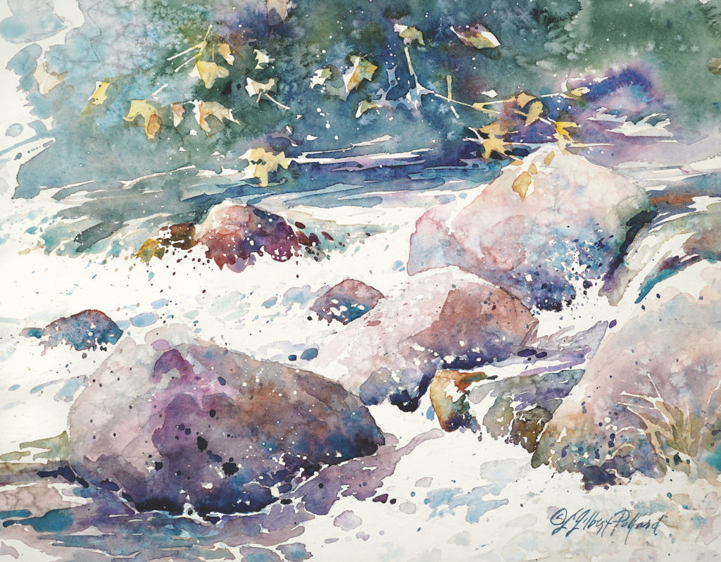
Quick answer: To Paint Rocks in Watercolor, start with the safest first step for the material involved, test a small area when needed, and follow the process in thin, controlled stages. Use proper ventilation and protective gear when chemicals, sanding, spraying, or solvents are involved.
Planning Before You Start: Observation and Reference
The success of a rock painting hinges entirely on the quality of your initial observation. You are not just painting colors; you are painting *geological processes*. Before touching your brushes, spend time analyzing your reference subject—be it a photograph or a cluster of real rocks.
Understanding the rock’s identity is crucial. A basalt flow will have a different texture and color gradient than a limestone deposit, and both require different techniques. When studying your reference, focus on these key elements:
- Geological Form and Erosion: Look for signs of weathering. Are the edges sharp (suggesting volcanic rock) or rounded and smoothed (suggesting river stones)? Note the cracks, fissures, and natural seams—these lines dictate where your darkest lines and deepest shadows must fall.
- The Light Source (Value): Determine the single, consistent direction of the light. If the light hits from the upper left, all shadows must fall to the lower right. Identifying this source is the single most important step in making the painting look three-dimensional.
- Color Palette Analysis: Do not just list the colors; analyze the *undertones*. Does the gray rock lean toward blue (suggesting cool, damp conditions) or brown (suggesting iron content and earth)? A subtle color shift—the difference between ochre and burnt sienna—can completely change the mood of the piece.
Materials and Tools: Your Essential Watercolor Kit
Having the right supplies ensures that the process is enjoyable and that the final piece can last. For rock painting, specialized materials are more beneficial than general-purpose ones.
| Rock Type | Attributes |
|---|---|
| Granite | Speckled texture, variety of colors |
| Sandstone | Grainy texture, warm earthy tones |
| Limestone | Smooth texture, light shades of gray |
| Basalt | Rough texture, dark shades of black/grey |
Paper Selection: Do not use standard printer paper. You need high-quality watercolor paper. The *cold press* (or NOTAP) grain is generally preferred for rock painting because its slight texture allows dry brushing and granular details to adhere beautifully, mimicking the uneven surface of natural stone. If you prefer extreme detail, hot press can be used, but it lacks the necessary “tooth” for texture.
Pigments and Paints: Always opt for artist-grade, professional-grade watercolors. These paints contain a higher concentration of pigment and binder, allowing for deeper saturation and richer washes without fading or becoming transparent too quickly. A good set should include neutrals (grays, umbers, blacks) to build shadows and a wide spectrum of earth tones (ochres, siennas, muted greens) to mimic natural mineral stains and lichens.
Brushes and Tools: You need variety. Include a large, soft wash brush (for initial washes), a medium round brush (for washes and general coverage), and a fine, pointed detail brush (for cracks and final accents). A natural sponge or sea sponge is invaluable for creating irregular, weathered patches.
Step-by-Step Guide to Painting Rocks in Watercolor
The painting process is a careful progression, moving from broad washes to minute details. Patience is paramount, as each layer must dry completely before the next begins.
- The Initial Wash (Wet-on-Wet): Start by wetting the entire area where the rocks will sit. Using a very diluted wash of a neutral background color (e.g., a pale sky blue or muted green), apply this wash. The wet-on-wet technique allows the colors to bleed and mingle softly, creating a natural, atmospheric environment for the rocks to rest in.
- Establishing the Base Tones (Mid-Tones): Once the initial wash is tacky but not wet, begin applying the base color of the largest rock. Use a slightly more concentrated mix than the background wash. Focus on the main, visible planes of the rock. Do not worry about perfect detail yet; focus on defining the general mass and shape.
- Building Depth through Glazing: Glazing is the act of applying thin, transparent layers of color over a dried base layer. This is how you build depth. Mix a slightly darker, more muted version of your base color and gently glaze it over the areas that would naturally be in shadow or recessed. Because glazes are transparent, they allow the underlying color to show through, giving the rock a complex, multi-layered appearance.
- Defining Form with Value: This is where you introduce the concept of value (lightness to darkness). For every major surface, identify the brightest point (the highlight) and the darkest point (the shadow). Use the darkest washes (like deep umber or Payne’s gray) to define the major shadow areas, particularly where one rock meets another, or where a crevice is deepest.
Mastering Texture and Detail
To elevate a rock painting from merely colored shapes to realistic geological specimens, you must master texture. Texture is what makes the rock look solid, rough, and ancient.
Dry Brushing Techniques
Dry brushing is the single most effective technique for mimicking rough, porous, or eroded surfaces. The principle is simple: the brush is loaded with minimal paint and most of the pigment is wiped off, leaving only enough to catch on the tooth (the slight roughness) of the paper.
How to apply it: Dip your brush lightly into a color, then gently wipe it on a paper towel until it feels almost dry. Use short, brisk, cross-hatching strokes across the desired textured area. Varying the pressure of the brush will give you different results, from fine, crystalline dust to coarse, weathered patches.
Advanced Texturing Methods
Beyond dry brushing, incorporating these methods adds variety and realism:
- Lifting: If you accidentally over-saturate an area or want a soft highlight, use a clean, damp brush or a crumpled tissue to gently lift pigment while the paint is still wet. This creates subtle, atmospheric highlights, mimicking mineral sheen.
- Scumbling: This involves layering a semi-opaque color over a dry, darker base. By moving the brush in small, circular motions, you create a muted, speckled effect, perfect for depicting lichen growth or mineral staining on a weathered surface.
- Salt and Spattering: For a truly natural, crystalline look, apply a wet wash and then sprinkle coarse salt across the surface. As the salt dries, it will draw the water and pigment away from the edges, creating beautiful, mineral-like crystalline formations.
Adding Life: Light, Shadow, and Environment
The difference between a good rock painting and a great one is the convincing portrayal of light and shadow. This is not just about painting dark areas; it’s about understanding how light *interacts* with form.
The Core Principle of Value: Value refers to the lightness or darkness of a color. The most dramatic parts of your painting are found in the extreme values: the deepest shadow (the darkest point) and the brightest highlight (the lightest point). Shadows are never uniform; they are deepest in crevices and corners, and they soften gradually as the surface curves away from the light source.
Creating the Illusion of Depth: To make a rock look round or jutting out, the shadow must be cast *under* it and *behind* it, relative to the light source. Use a graduated wash—starting darkest at the point of shadow and fading out to the mid-tone color on the surface. This gradient, or tonal recession, is what convinces the viewer that the rock has physical volume.
Environmental Accents: Don’t forget the life around the rocks. Use muted greens, dusty yellows, and pale browns to paint moss, lichen, and small clumps of grass. These accents should be painted *after* the main rock structure is dry, using the dry brushing technique to give them a slightly fuzzy, organic texture that contrasts with the hardness of the stone.
Mistakes to Avoid
Even experienced watercolor artists encounter pitfalls. Knowing these common mistakes will save time, frustration, and paint.
- The Muddy Color Trap: The most frequent mistake is mixing too many colors on the palette without a clear purpose. If a color looks “muddy,” it means it lacks a strong underlying value. Always aim to mix colors that are variations of the same hue (e.g., three shades of blue-gray) rather than mixing five unrelated colors.
- Overworking the Paint: Watercolor thrives on letting things dry and blending naturally. Touching wet paint repeatedly or trying to force colors to blend will lift the pigment, muddy the wash, and destroy the subtle, atmospheric quality you worked hard to create.
- Ignoring the Drying Time: Never layer paint on top of wet paint unless you are deliberately executing a wet-on-wet blend. Wait until the underlying wash is completely dry to apply the next layer, allowing the pigments to set properly and maintain their intended value.
- Forgetting the Light Source: If the shadows and highlights feel arbitrary or randomly placed, you have failed to establish a clear, consistent light source. Always ask yourself: “If the sun were shining here, where would the shadows fall?”
Safety and Practical Notes
While painting is generally safe, working with pigments, solvents, and specialized materials requires careful attention to safety and proper studio practices.
Get the Fail-Safe Paint Color Playbook (Free PDF)
36 proven colors • 8 ready palettes • trim & sheen guide • printable testing cards.
- Ventilation: Always work in a well-ventilated area, especially if you are using fixatives, spray fixatives, or strong solvents for cleaning brushes.
- Material Handling: Keep all paints and pigments away from food and drink. Use dedicated palettes and rinse brushes thoroughly before switching colors to prevent cross-contamination.
- Archival Care: When painting on paper that will be framed, use archival-quality materials. If you use fixatives, ensure they are designed for watercolors and are non-acidic to prevent yellowing over time.
- Outdoor Painting: If painting rocks found outdoors, be mindful of changing weather conditions. Keep your supplies covered and protected from sudden rain or dew, which can ruin the paint wash.
Frequently Asked Questions
What is the best type of watercolor paper for painting rocks?
For rock painting, we recommend high-quality, cold-press watercolor paper. The slight texture, or “tooth,” of cold press allows the pigments to grip the surface beautifully, which is essential for achieving realistic dry-brushing techniques and mimicking the natural roughness of stone. Avoid standard printer paper, as it is too smooth to hold the necessary detail and texture.
How do I make the painting look three-dimensional?
The key to depth is mastering “value,” which is the contrast between light and dark. Always establish a single, consistent light source before you begin. To create volume, apply the darkest washes in the crevices, underneath the rocks, and in the deepest shadows. Use a gradual, soft transition (a gradient) from the deepest shadow to the main body color, rather than harsh lines, to convince the viewer that the rock has physical depth.
What is the difference between glazing and washing in this technique?
A wash is a very diluted wash of color applied over a large area (like the initial background environment). Glazing is the technique of applying a thin, transparent layer of color *over* a completely dry base layer. Glazing is how you build complexity and depth; because the glaze is transparent, it allows the underlying colors to peek through, making the rock look like it has multiple mineral layers or stains.
Do I need professional-grade paints, and what is the safest way to work?
Yes, using professional-grade watercolors is highly recommended because they contain a higher concentration of pigment, providing richer, more saturated washes that resist fading. For safety, always work in a well-ventilated area, and remember to thoroughly rinse your brushes and dedicate separate palettes to different colors to prevent cross-contamination of pigments.
Conclusion
Painting rocks in watercolor is a rewarding journey of combining natural science with artistic vision. By treating your rocks not just as objects, but as complex records of time, erosion, and light, you elevate your technique. Remember that every mistake—a slightly muddy patch, a poorly placed shadow—is simply a lesson in observation, guiding you toward a deeper understanding of the medium. Practice these techniques, study the subtle variations of nature, and let the beauty of the earth inspire your next masterpiece.