
18 Heritage Nursery Palettes Inspired by Famous Children’s Books
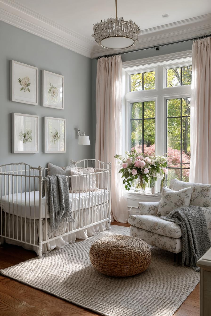
There’s something magical about stepping into a nursery that feels like a page from your favorite childhood book. The gentle tones, nostalgic textures, and whimsical charm all work together to create a space that speaks to both memory and imagination. These aren’t just rooms—they’re storybook sanctuaries designed to wrap little ones in warmth, wonder, and timeless beauty.
Heritage nursery palettes draw from the enduring appeal of classic children’s literature. From the cozy warmth of Winnie-the-Pooh’s Hundred Acre Wood to the dreamlike stillness of Goodnight Moon, each story brings a unique emotional resonance. Translating these tales into vintage-inspired color schemes not only celebrates the stories we love but also creates calming, cohesive environments for early childhood.
Get the Fail-Safe Paint Color Playbook (Free PDF)
36 proven colors • 8 ready palettes • trim & sheen guide • printable testing cards.
This guide explores 18 nursery color palettes inspired by beloved children’s books—each one a tribute to storytelling traditions that never go out of style. Whether you’re creating a space for your baby or refreshing a family heirloom room, these palettes offer the perfect blend of comfort, character, and creativity. Let’s step into a world where every wall tells a tale.
The Magic of Storybook-Inspired Nurseries
The Emotional Connection
Children’s books are often our first introduction to wonder, empathy, and imagination. Titles like Peter Rabbit, The Velveteen Rabbit, and Charlotte’s Web aren’t just stories—they’re emotional milestones. By designing nurseries that reflect these tales, parents can create an environment rooted in affection and memory. These spaces help instill a lifelong love of reading and storytelling from the very beginning.
Colors play a significant role in this emotional connection. The soft blues and garden greens of Peter Rabbit, for example, remind us of nature’s calm and curiosity, while the cozy reds and golds of Goodnight Moon echo a soothing bedtime ritual. Each palette becomes more than aesthetic—it’s a sensory bridge to cherished stories and the feelings they evoke.
Heritage Palettes Defined
Heritage palettes are color schemes that carry a sense of timelessness and nostalgia. Unlike trendy brights or ultra-modern tones, heritage hues are grounded in history and warmth. Think muted pastels, rich earth tones, and weathered neutrals that mirror the color printing styles of vintage picture books.
These palettes are often inspired by traditional design sensibilities, such as English cottage interiors or early 20th-century textiles. Their appeal lies in their quiet charm and ability to grow with a child. By anchoring the nursery in classic color stories, parents ensure the space feels relevant and inviting for years to come.
Benefits of a Storybook-Themed Nursery
Designing a nursery inspired by beloved books offers more than just visual delight—it brings a host of developmental and emotional benefits. Here’s why this approach stands out:
- Promotes Early Literacy: Being surrounded by visual cues from favorite tales encourages curiosity and a love for reading.
- Creates a Calming Atmosphere: Soft, cohesive colors help regulate mood and provide a sense of security.
- Offers Personalization: A story-themed nursery reflects the family’s values, memories, and creative spirit.
- Supports Thematic Learning: Subtle decor elements can introduce animals, nature, or historical themes organically.
18 Heritage Nursery Palettes Inspired by Classic Children’s Books
Each of these storybook palettes evokes the emotions, themes, and settings of timeless children’s literature. Alongside curated colors, you’ll find practical design ideas to turn any nursery into a vintage-inspired literary escape.
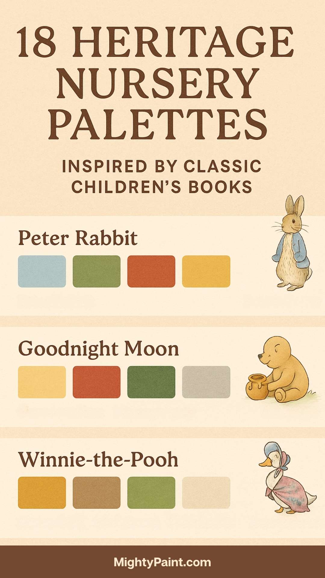
1. Peter Rabbit by Beatrix Potter

Color Palette:
- Soft Sky Blue (#C3DDE6)
- Garden Green (#A8CBB7)
- Earthy Brown (#8B7355)
- Butter Yellow (#F6E6A7)
Design Inspiration:
Inspired by the English countryside where Beatrix Potter’s beloved characters roamed, this palette reflects nature’s gentle hues—lush gardens, blue skies, and earthy tones. Start with a sky blue wall color to create a tranquil foundation. Accent with green through curtains or rugs that mimic Mr. McGregor’s garden. Introduce brown in furniture—opt for weathered wood cribs and antique dressers to ground the palette.

Styling Tips:
- Frame original illustrations from the book in rustic wooden frames.
- Add soft knitted or quilted bedding in floral patterns.
- Include handmade or vintage rabbit plush toys for a tactile, story-rich feel.
- Consider botanical wallpaper or a mural with radishes and cabbages to pay homage to Peter’s adventures.
This setting is perfect for evoking the charm and calm of country life, nurturing both curiosity and comfort.
2. Goodnight Moon by Margaret Wise Brown

Color Palette:
- Mustard Yellow (#E3B448)
- Crimson Red (#A42F2B)
- Forest Green (#3C6E47)
- Moonlight Gray (#DADADA)
Design Inspiration:
The rhythmic prose and iconic illustrations of Goodnight Moon make it a bedtime favorite. The book’s color scheme—distinctive and cozy—translates seamlessly into a bold yet soothing nursery. Use forest green for accent walls or textiles, and bring in mustard yellow via lighting or wall art. Crimson red works beautifully in smaller bursts—perhaps a bookshelf or a picture frame.
Get the Fail-Safe Paint Color Playbook (Free PDF)
36 proven colors • 8 ready palettes • trim & sheen guide • printable testing cards.
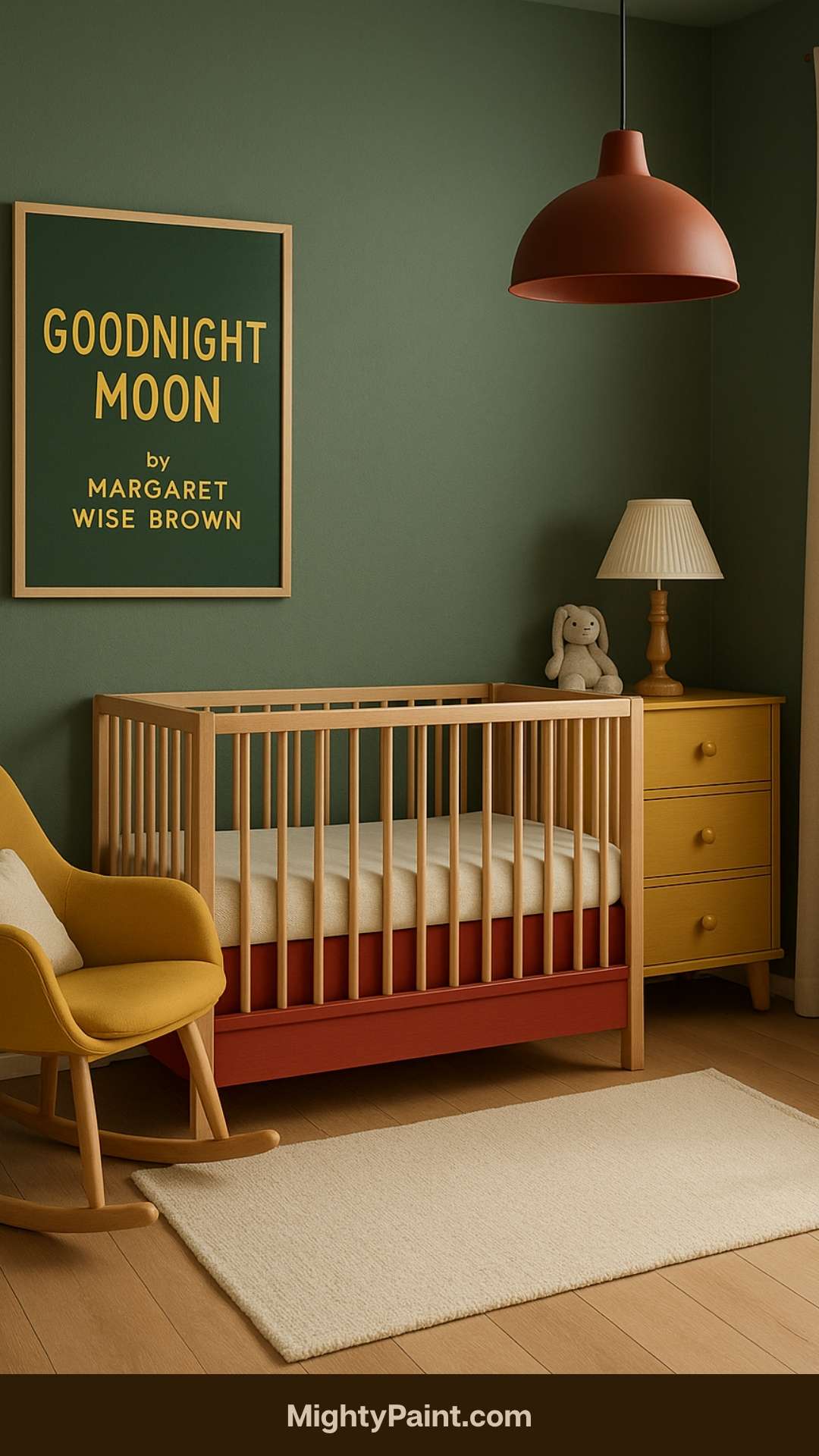
Styling Tips:
- Recreate elements from the book: a red armchair, a toy house, or a framed bunny portrait.
- Use star-and-moon-themed wall decals or a celestial mobile above the crib.
- Choose soft gray or neutral bedding to balance the richness of the other colors.
- Place a reading nook in one corner with a red checkered cushion and dimmable warm light.
This palette is ideal for creating a grounded, ritualistic environment that encourages rest and imagination.
3. Winnie-the-Pooh by A.A. Milne
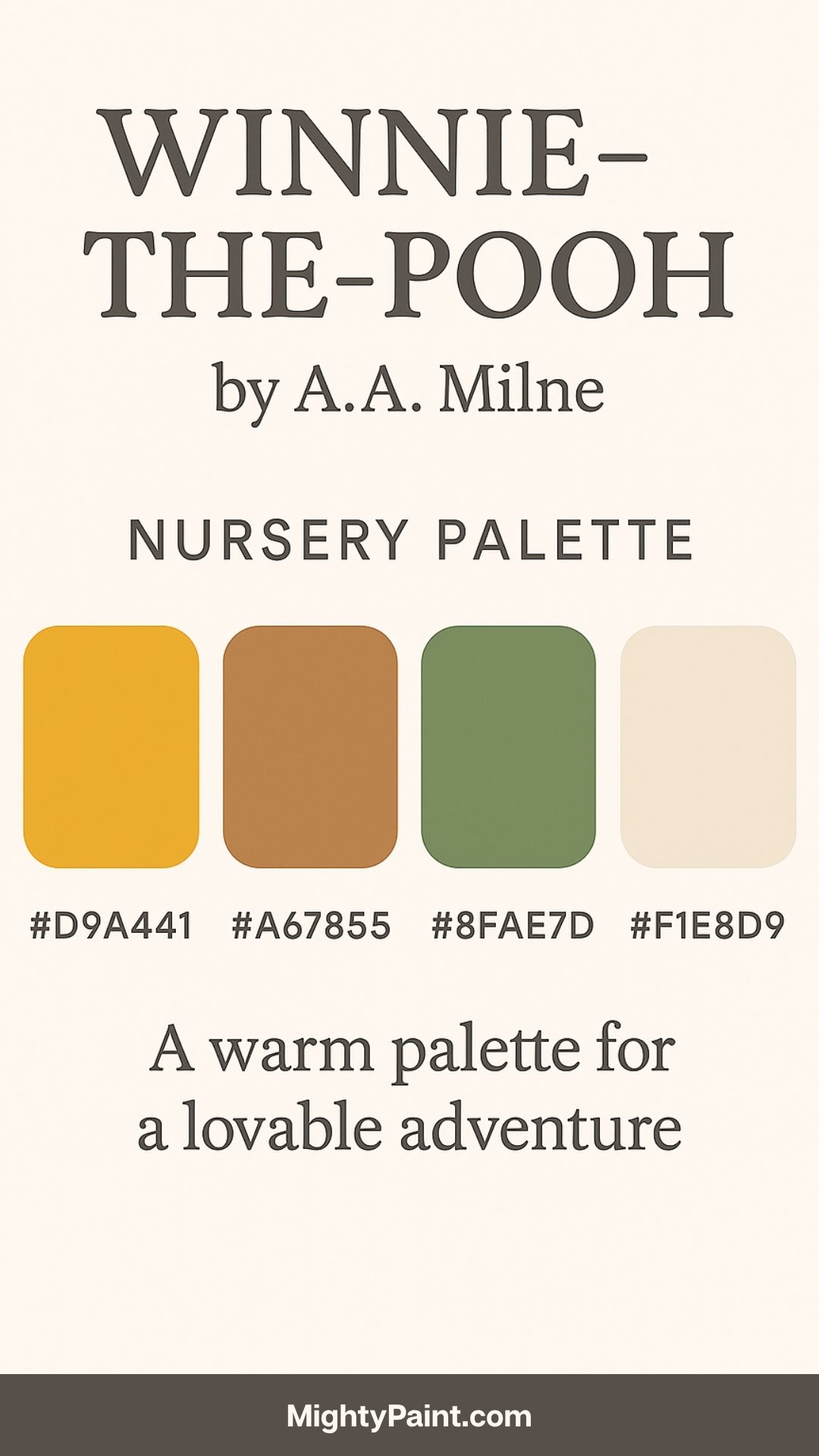
Color Palette:
- Honey Gold (#D9A441)
- Soft Brown (#A67855)
- Leafy Green (#8FAE7D)
- Pale Cream (#F1E8D9)
Design Inspiration:
Few fictional worlds feel as warm and enduring as the Hundred Acre Wood. This palette reflects the comforting warmth of Pooh’s world—rich with friendship, adventure, and gentle humor. Use honey gold as a dominant hue on feature walls or in crib linens. Complement it with leafy green accents in decor or window treatments and pair with pale cream backgrounds for light and airiness.

Styling Tips:
- Hang classic quotes in playful fonts like “You are braver than you believe…”
- Include plush toys of Pooh, Piglet, and friends in a vintage woven basket.
- Decorate with nature-inspired elements like leaf mobiles, acorns, and tree stumps as footstools.
- Opt for cozy materials—flannel curtains, knitted blankets, and wool rugs.
With its nostalgic richness, this palette fosters a warm, love-filled space that feels like a hug in room form.
4. The Tale of Jemima Puddle-Duck by Beatrix Potter
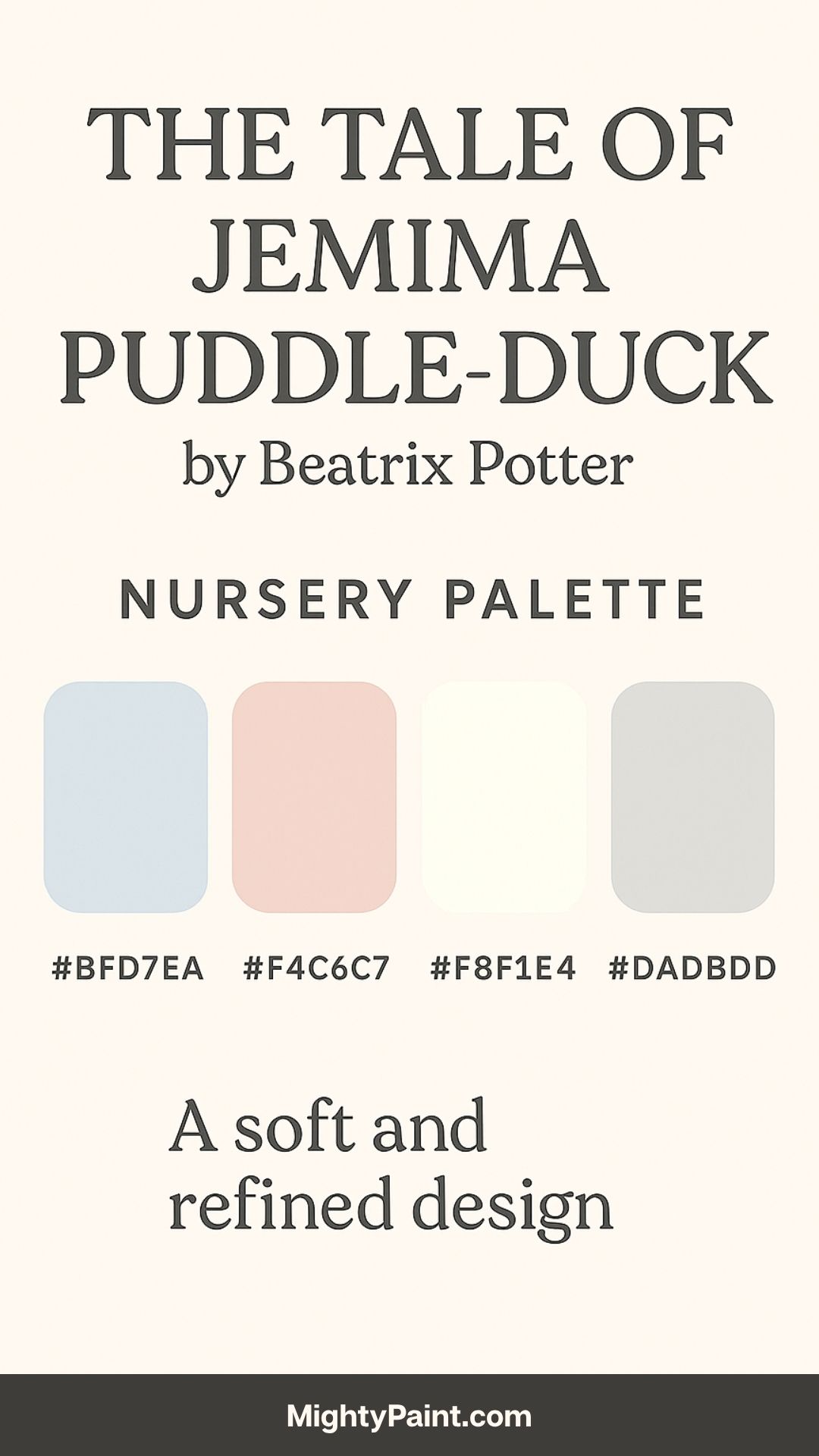
Color Palette:
- Pastel Blue (#BFD7EA)
- Blush Pink (#F4C6C7)
- Linen White (#F8F1E4)
- Feather Gray (#DADBDD)
Design Inspiration:
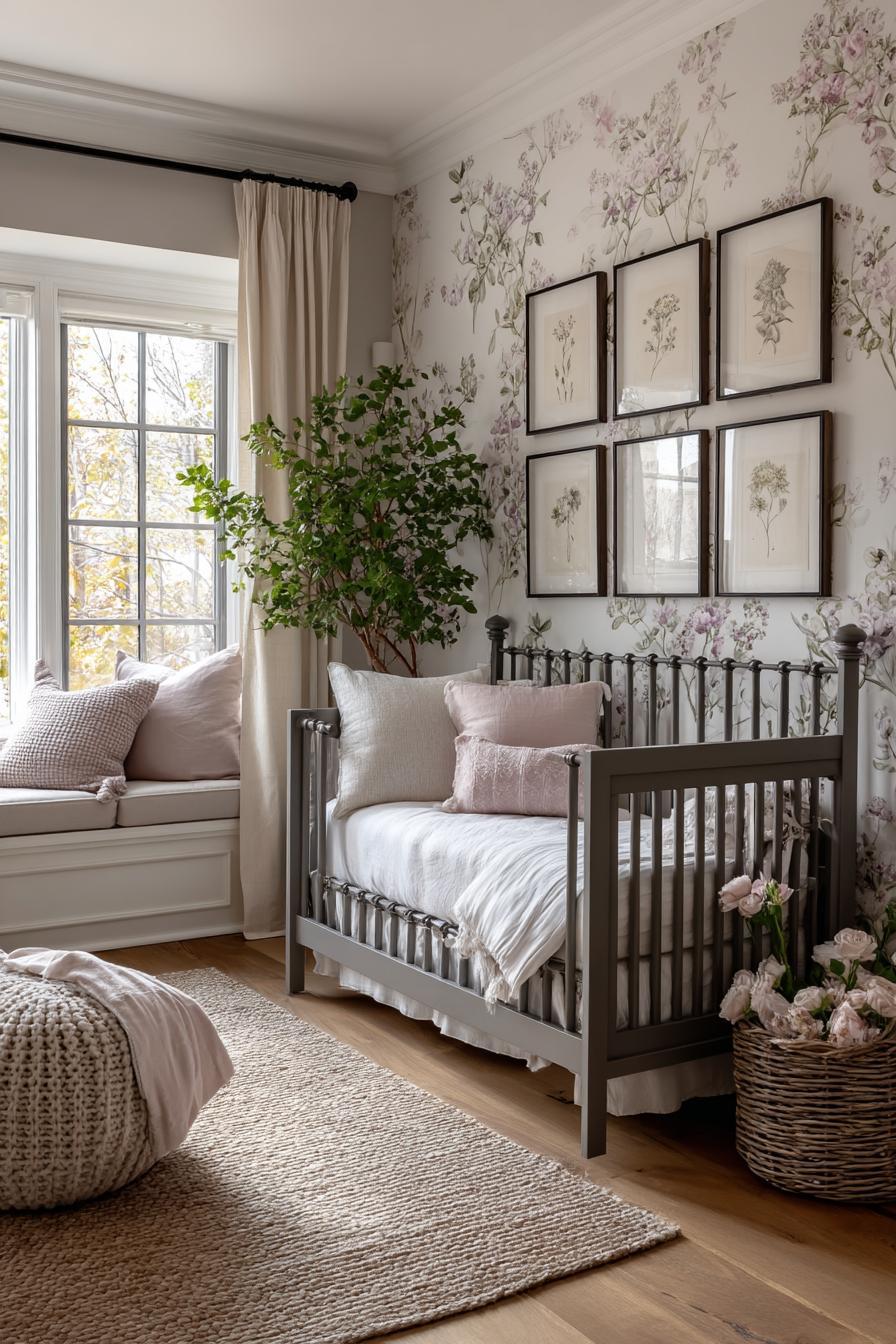
This story’s soft and refined countryside setting lends itself to a delicate, feminine nursery design. Think of a serene English parlor garden—full of gentle colors and antique charm. Begin with pastel blue walls for a calming backdrop, then layer in blush pink through curtains, throws, or cushions. Linen white should dominate the furniture for a clean, vintage feel, while feather gray can be used in accents like baskets or picture frames.
Styling Tips:
- Incorporate floral motifs through wallpaper borders or upholstery.
- Use heirloom-style furnishings such as a wrought iron crib or a lace-trimmed bassinet.
- Add framed illustrations of Jemima Puddle-Duck or vintage Beatrix Potter prints.
- Layer textiles—think ruffled crib skirts, embroidered pillows, and crocheted blankets.
This color scheme offers timeless elegance with a whimsical twist, perfect for a nursery that feels like a refined retreat into nature.
5. The Velveteen Rabbit by Margery Williams
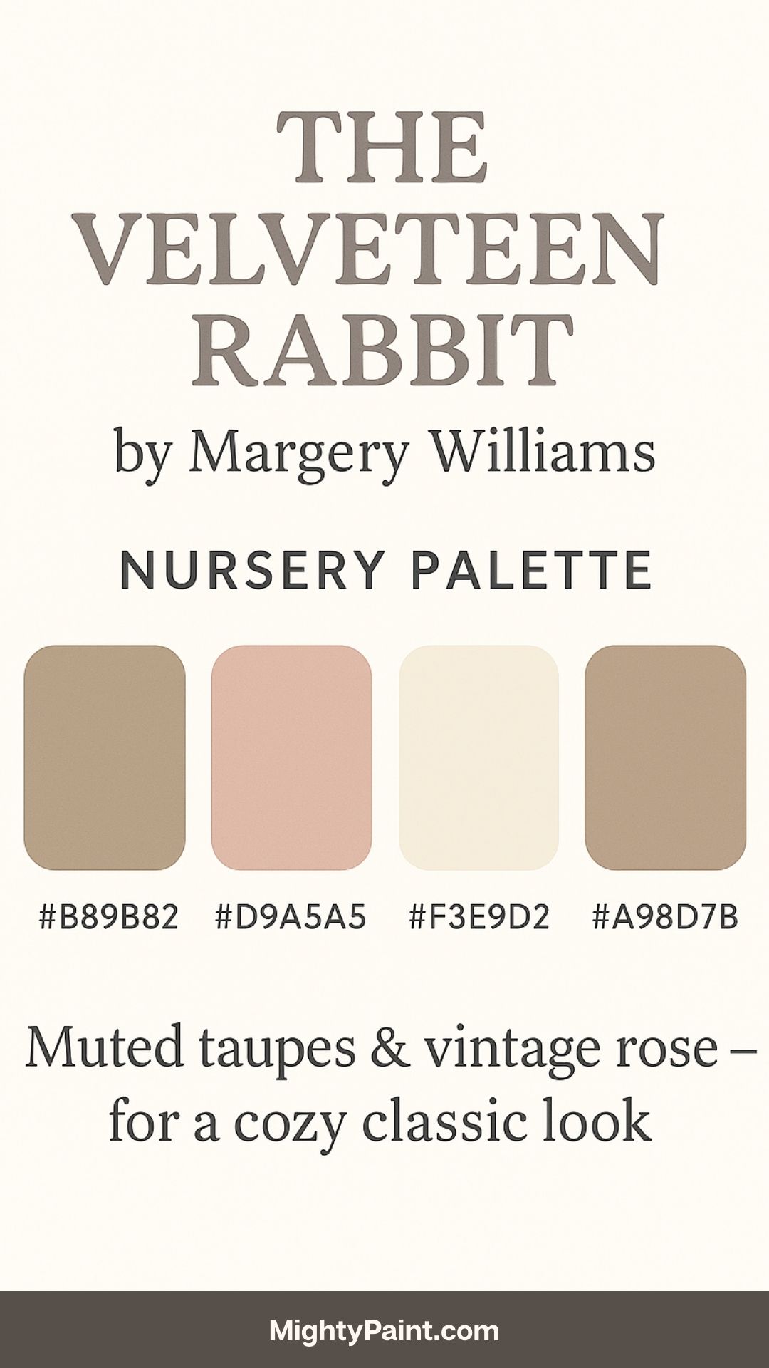
Color Palette:
Get the Fail-Safe Paint Color Playbook (Free PDF)
36 proven colors • 8 ready palettes • trim & sheen guide • printable testing cards.
- Warm Taupe (#B89B82)
- Faded Rose (#D9A5A5)
- Ivory (#F3E9D2)
- Soft Cocoa (#A98D7B)
Design Inspiration:
This tale about love, aging, and transformation is beautifully reflected in muted, lived-in colors. The palette is gentle and soothing, ideal for creating a nursery that feels safe and emotionally rich. Taupe or cocoa tones on the walls provide a warm base, while ivory offers balance through textiles and decor. Use faded rose as a soft accent in artwork, pillows, or bunting.
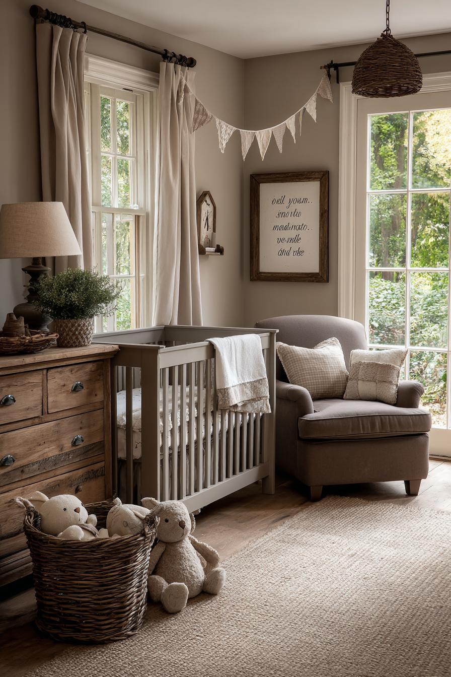
Styling Tips:
- Incorporate velvety textures and plush stuffed animals, especially worn or vintage ones.
- Display quotes from the book in scripted fonts like “Real isn’t how you are made…”
- Choose antique or repurposed furniture with a distressed finish for authenticity.
- Add personal touches like a handmade memory board or patchwork quilt.
This palette is ideal for a sentimental space, connecting the nursery to deeper themes of love, identity, and emotional growth.
6. Where the Wild Things Are by Maurice Sendak

Color Palette:
- Moss Green (#6B8E23)
- Stormy Gray (#778899)
- Goldenrod (#DAA520)
- Inky Black (#333333)
Design Inspiration:
Bold and imaginative, this palette channels the adventurous energy of Max’s journey. Moss green can dominate walls or textiles, setting a moody, enchanted forest tone. Pair with goldenrod to evoke wild crowns and regal fantasy, while stormy gray and inky black add contrast and mystery.
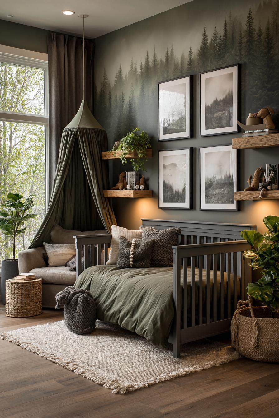
Styling Tips:
- Paint a mural or use decals to create a forest backdrop with hidden Wild Things among the trees.
- Add a canopy tent for a “private boat” or reading corner.
- Incorporate natural textures—wooden shelves, faux fur rugs, rope details.
- Frame pages or silhouettes of the Wild Things and Max in shadow boxes.
This nursery style encourages exploration and imagination, a spirited space where stories unfold in every corner.
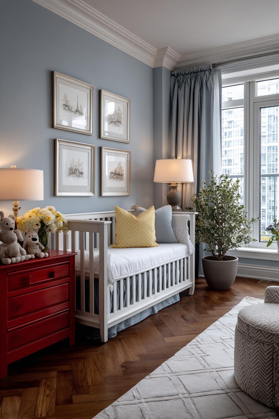
7. The Snowy Day by Ezra Jack Keats
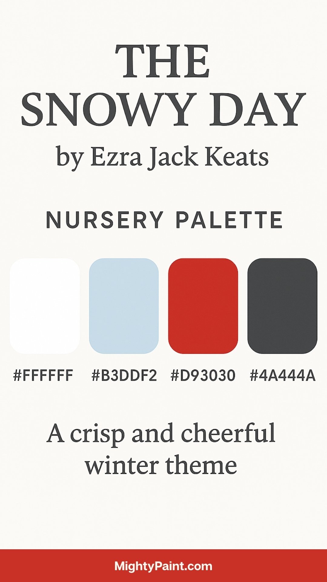
Color Palette:
- Bright White (#FFFFFF)
- Icy Blue (#B3DDF2)
- Crimson (#D93030)
- Charcoal Gray (#4A4A4A)
Design Inspiration:
The Snowy Day captures the simple wonder of a child experiencing snow for the first time. The palette draws directly from the book’s illustrations—sharp contrasts of red against snowy landscapes and city blues. Icy blue or white walls can create an open, airy canvas, while crimson accents add energy and excitement.
Get the Fail-Safe Paint Color Playbook (Free PDF)
36 proven colors • 8 ready palettes • trim & sheen guide • printable testing cards.

Styling Tips:
- Use snowflake decals, felt garlands, or paper mobiles to evoke snowfall.
- Layer different shades of white and gray in textures like knits, faux fur, and corduroy.
- Frame minimalist art inspired by Keats’ paper collage style.
- Choose modular storage in cool tones to keep the space clean and organized.
This palette suits modern nurseries with a minimalist aesthetic, while still delivering whimsy and color through thoughtful accents.
8. Madeline by Ludwig Bemelmans

Color Palette:
- Parisian Blue (#A7C7E7)
- Bright Yellow (#F6C85F)
- Classic Red (#D83A3F)
- Marble White (#F9F9F9)
Design Inspiration:
Set in a Parisian boarding school, Madeline is full of cheerful discipline and French charm. Parisian blue forms an elegant base, complemented by bright yellow (echoing Madeline’s hat) and red accents. Marble white can be used on trim and ceilings for a clean, classical touch.
Styling Tips:
- Include architectural elements like paneled walls or moldings to mimic French interiors.
- Add Eiffel Tower decals, travel-themed art, or vintage European toys.
- Create symmetry in decor (matching nightstands, twin shelves) to nod to the “twelve little girls in two straight lines.”
- Use gingham or striped fabrics reminiscent of classic French school uniforms.
This theme is chic and structured, ideal for parents who appreciate European elegance and playful order.
9. The Little Prince by Antoine de Saint-Exupéry
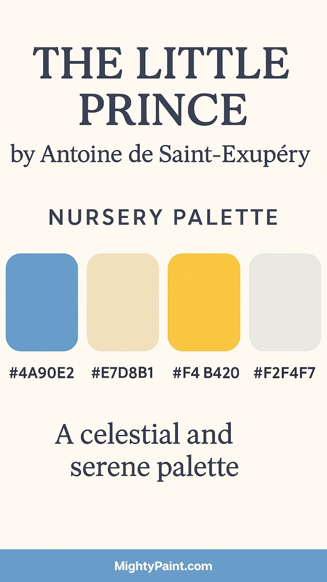
Color Palette:
- Starry Blue (#4A90E2)
- Sandy Beige (#E7D8B1)
- Sunset Gold (#F4B942)
- Moon White (#F2F4F7)
Design Inspiration:
Rich in metaphor and philosophy, The Little Prince encourages wonder, curiosity, and the value of inner life. This palette reflects the book’s celestial and desert settings—cosmic blues, warm sand tones, and radiant golden highlights.
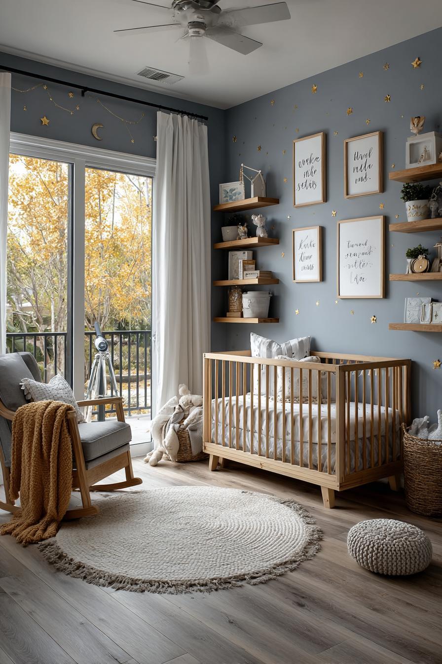
Styling Tips:
- Use star-themed wall decals or murals featuring the Prince and his planets.
- Incorporate globes, telescopes, or constellation charts in the decor.
- Choose a minimalist aesthetic—open shelves, clean lines, and soft, quiet colors.
- Display quotes in both English and French, like “What is essential is invisible to the eye.”
Ideal for thoughtful parents, this nursery balances dreaminess with introspection, inspiring a space that feels expansive and serene.
10. Charlotte’s Web by E.B. White

Color Palette:
- Barn Red (#A23E48)
- Hay Yellow (#F4E285)
- Sky Blue (#A7C6ED)
- Rustic White (#F5F3F0)
Design Inspiration:
Charlotte’s Web brings the rural charm of a farm to life through friendship, growth, and the cycles of nature. The palette reflects this pastoral simplicity—deep reds of barns, sunny yellows of straw, and the calm sky blue of open fields. Barn red can be used as an accent wall or in furniture pieces like a toy chest or changing table, while hay yellow and sky blue work beautifully in textiles and soft furnishings.
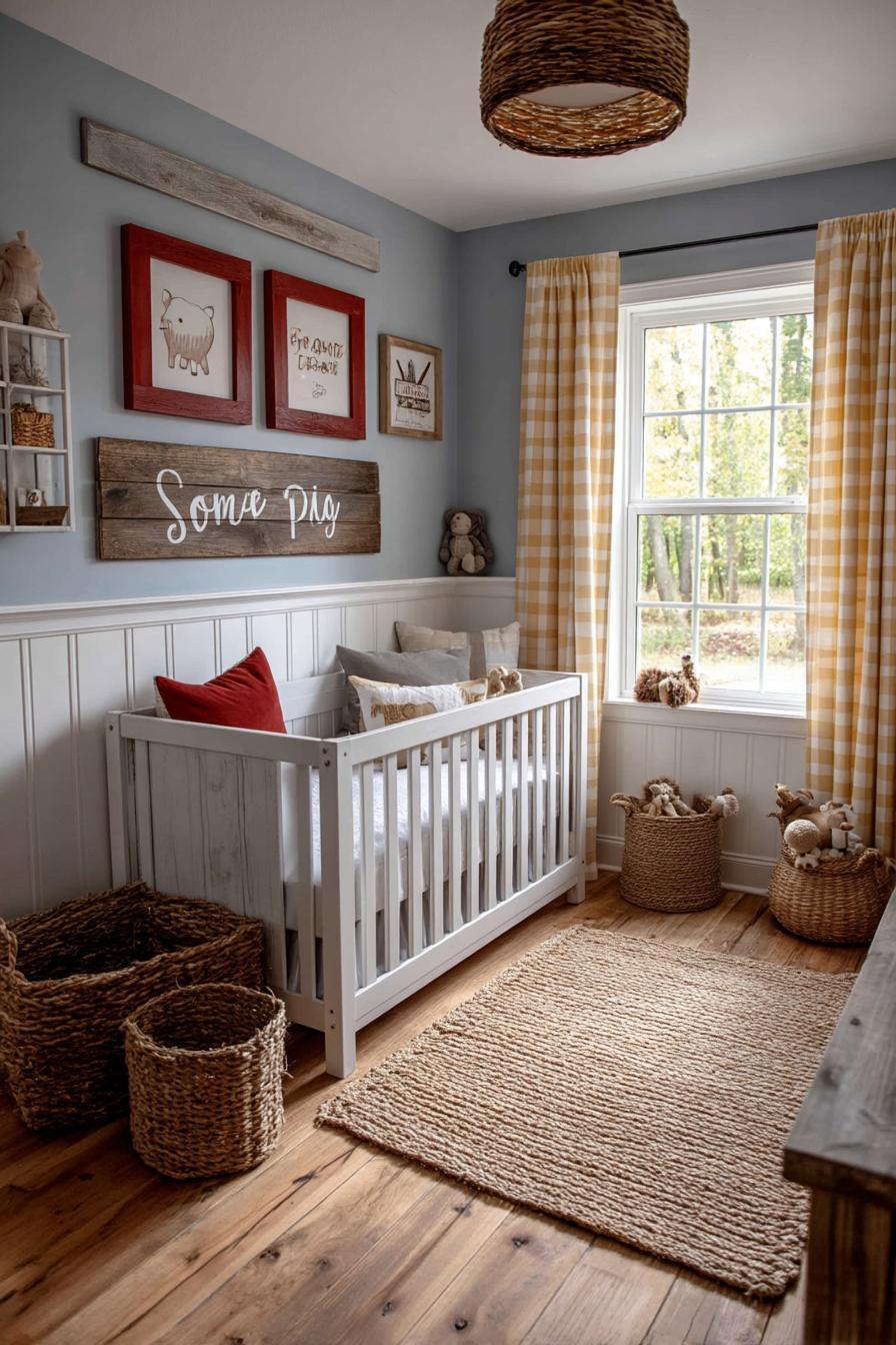
Styling Tips:
- Use natural materials like jute rugs, wicker baskets, and reclaimed wood shelves.
- Add farm-themed elements: wooden animal toys, wall art of Wilbur and Charlotte, and a mobile shaped like a web.
- Choose gingham or plaid patterns for curtains or crib skirts to evoke country living.
- Frame lines from the book like “Some Pig” or “You have been my friend.”
This theme creates a nurturing, wholesome environment where rustic elements meet heartfelt storytelling.
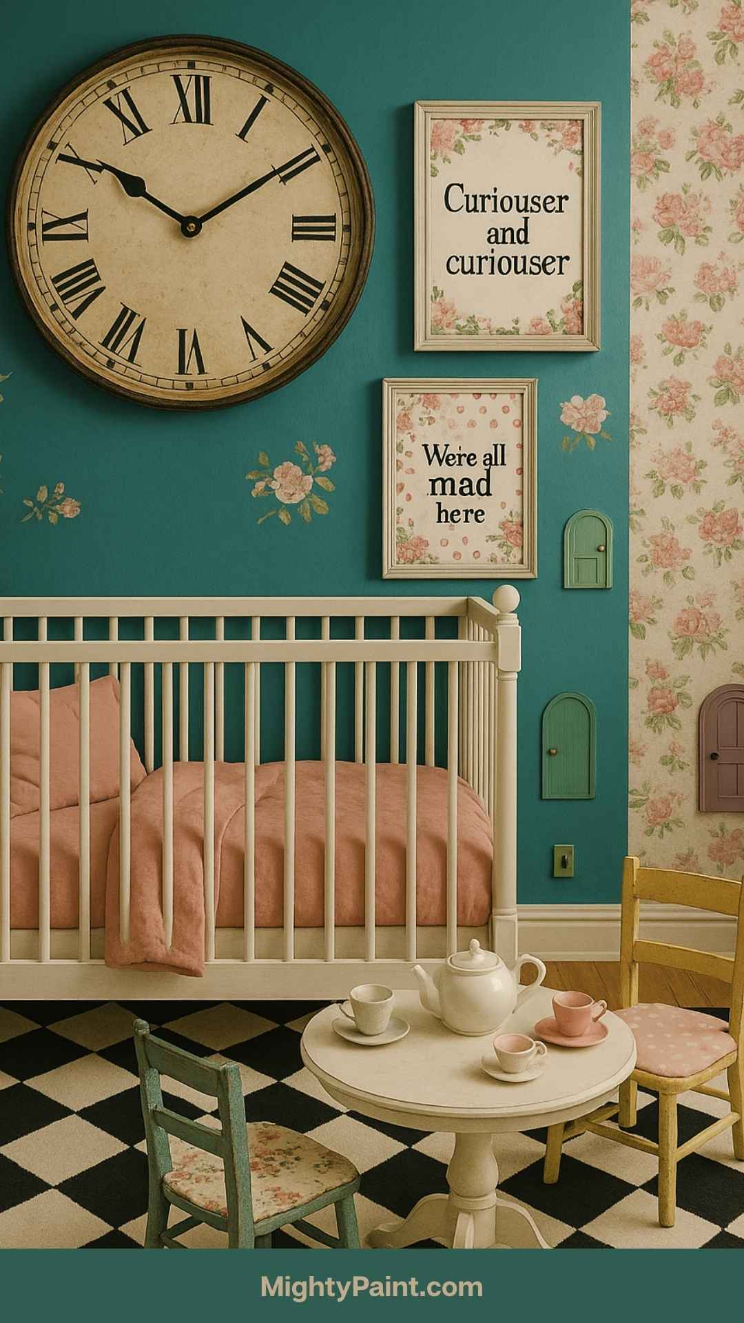
11. Alice’s Adventures in Wonderland by Lewis Carroll
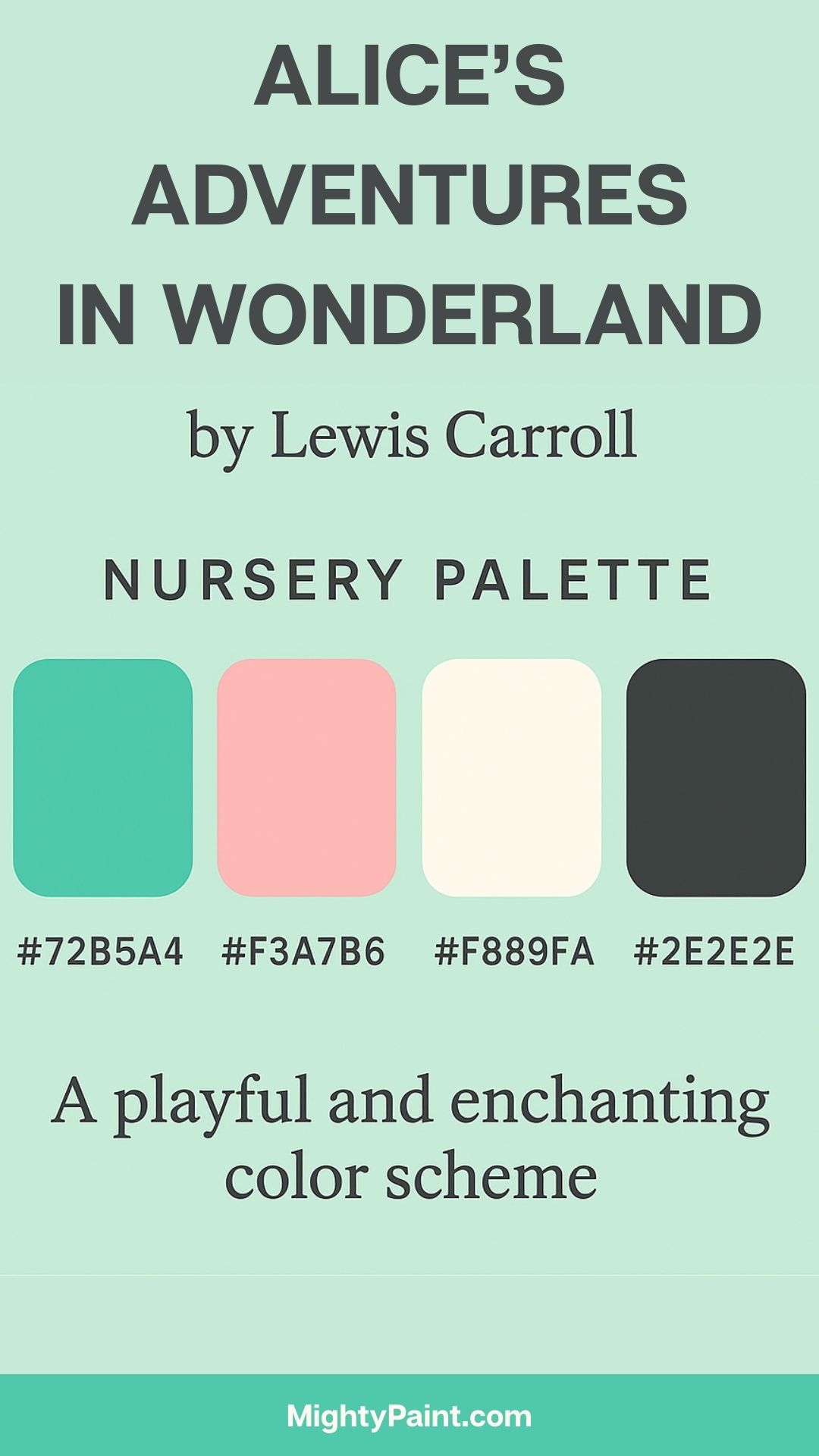
Color Palette:
- Whimsical Teal (#72B5A4)
- Rosy Pink (#F3A7B6)
- Crisp White (#F8F9FA)
- Playing Card Black (#2E2E2E)
Design Inspiration:
Wonderfully eccentric and surreal, Alice’s Adventures in Wonderland offers a bold, eclectic visual feast. The palette reflects both whimsy and elegance—teal and pink provide pops of unexpected color, while white and black ground the space with a vintage playing-card flair.
Styling Tips:
- Mix patterns—floral wallpaper with polka dot rugs or checkered floors.
- Create themed corners like a “tea party” area with a small table and mismatched chairs.
- Use oversized objects (like large wall clocks or letters) to play with scale.
- Add playful signs with quotes like “Curiouser and curiouser” or “This way, that way.”
This nursery will appeal to families who enjoy maximalism, creativity, and spaces that double as playful wonderlands.
12. The Secret Garden by Frances Hodgson Burnett
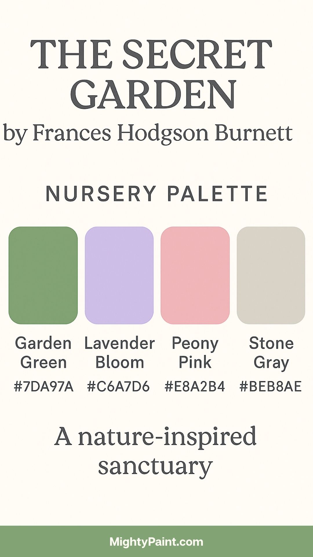
Color Palette:
- Garden Green (#7DA97A)
- Lavender Bloom (#C6A7D6)
- Peony Pink (#E8A2B4)
- Stone Gray (#BEB8AE)
Design Inspiration:
This story of discovery and healing unfolds in a hidden, lush garden. The palette draws on the natural colors of blossoms, vines, and stone pathways. Begin with a garden green wall or a floral mural, and incorporate pink and lavender through bedding, rugs, or soft furnishings. Stone gray adds a mature balance to the palette.
Styling Tips:
- Use floral wallpaper or decals, especially behind the crib or in reading nooks.
- Bring in botanical illustrations, faux ivy, and garden sculptures.
- Choose wrought iron furniture or garden-style wall hooks and sconces.
- Decorate with quotes like “Where you tend a rose, a thistle cannot grow.”
This theme turns the nursery into a dreamy botanical retreat that fosters calmness, growth, and imagination.
13. Paddington Bear by Michael Bond
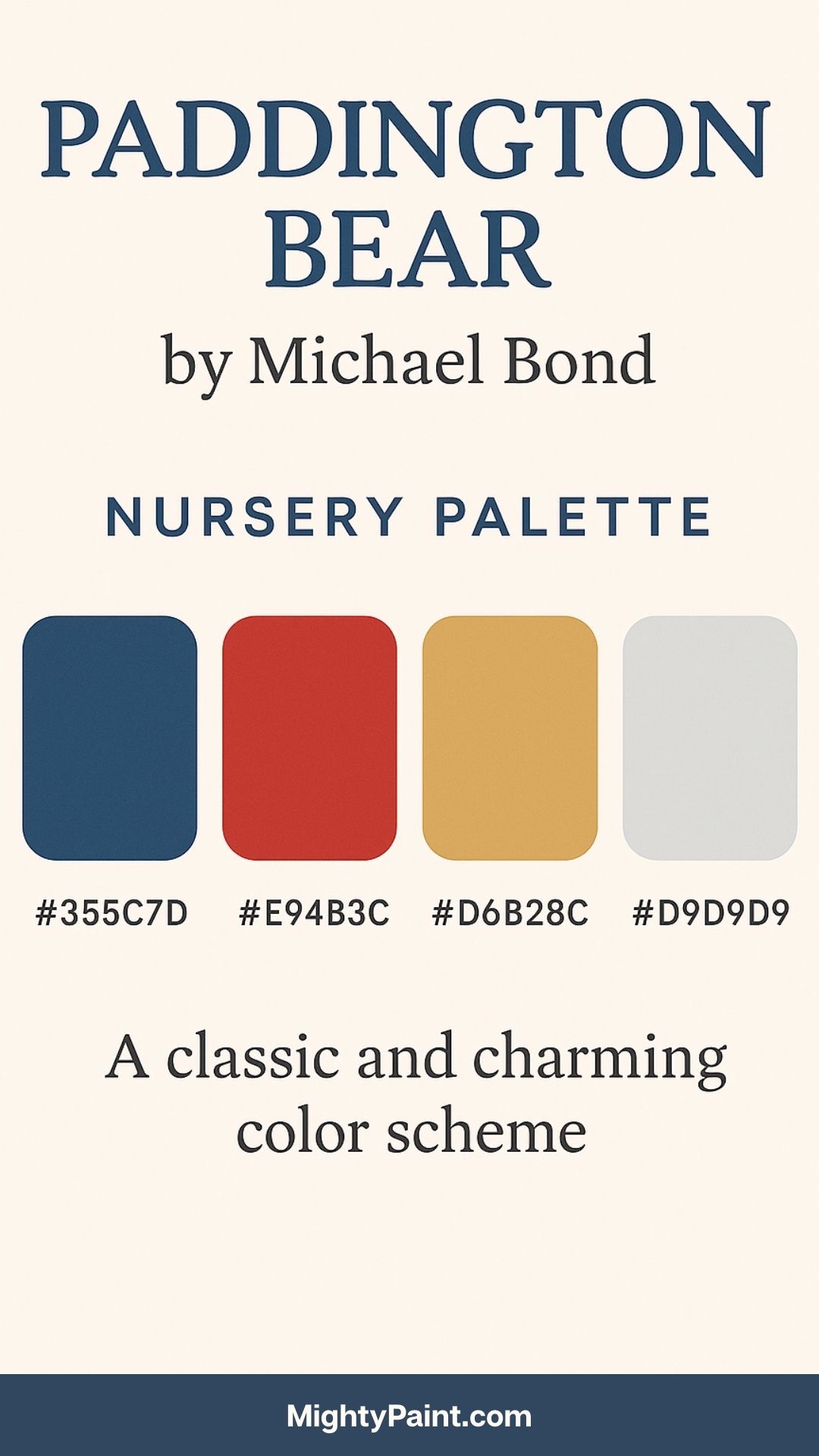
Color Palette:
- Paddington Blue (#355C7D)
- Bright Red (#E94B3C)
- Biscuit Beige (#D6B28C)
- Cloud Gray (#D9D9D9)
Design Inspiration:
Paddington Bear brings a sense of British charm and playful mischief, centered around its iconic duffle-coat-wearing protagonist. The palette echoes London’s palette—cool blues and grays, with vibrant pops of red and warm beige to evoke his coat, hat, and the city’s streets.
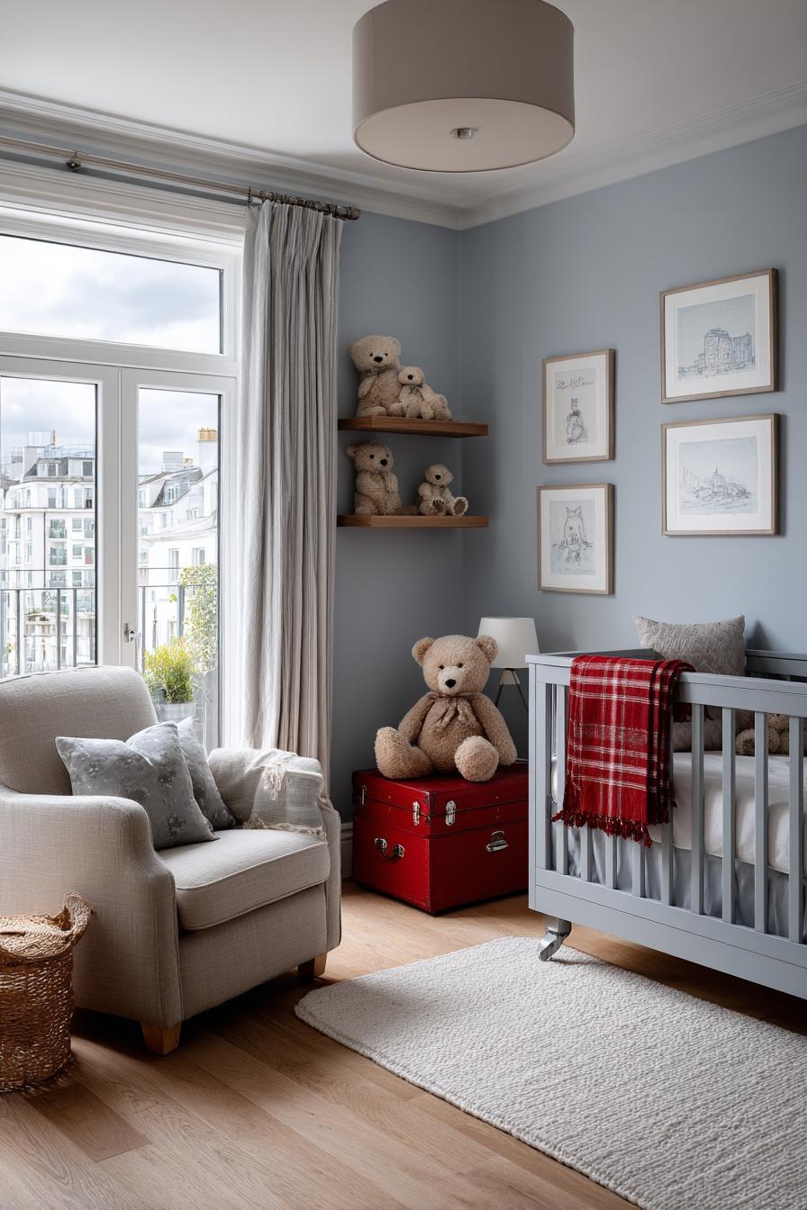
Styling Tips:
- Use blue as a base wall color or on larger furniture pieces like a dresser.
- Accent with red through pillows, bookshelves, or art frames.
- Incorporate travel motifs like suitcases, maps, and train signs (“Paddington Station”).
- Feature teddy bear accessories and prints of marmalade jars to tie in key story elements.
This palette balances structure with whimsy, giving a nod to adventure while retaining urban elegance and comfort.
14. Anne of Green Gables by L.M. Montgomery
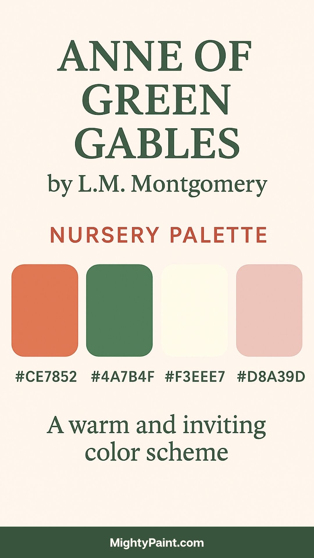
Color Palette:
- Rustic Orange (#CE7852)
- Forest Green (#4A7B4F)
- Cream Linen (#F3EEE7)
- Soft Rose (#D8A39D)
Design Inspiration:
Anne’s vivid imagination and love of nature are central to this story. These tones reflect Prince Edward Island’s pastoral beauty and old-world simplicity. Use cream as a soothing base color on walls and ceilings. Incorporate forest green and rustic orange in accent furniture or woodwork, while soft rose appears in fabrics and decorative touches.
Styling Tips:
- Add vintage touches like floral bedspreads, lace curtains, and painted furniture.
- Frame excerpts like “Dear old world, you are very lovely…” as wall art.
- Include dried flowers in mason jars, antique books, and embroidered pillows.
- Consider a wallpapered reading nook with a vintage rocking chair and a woven rug.
This nursery embraces nostalgia and literary charm, creating a space that’s cozy, heartfelt, and full of character.
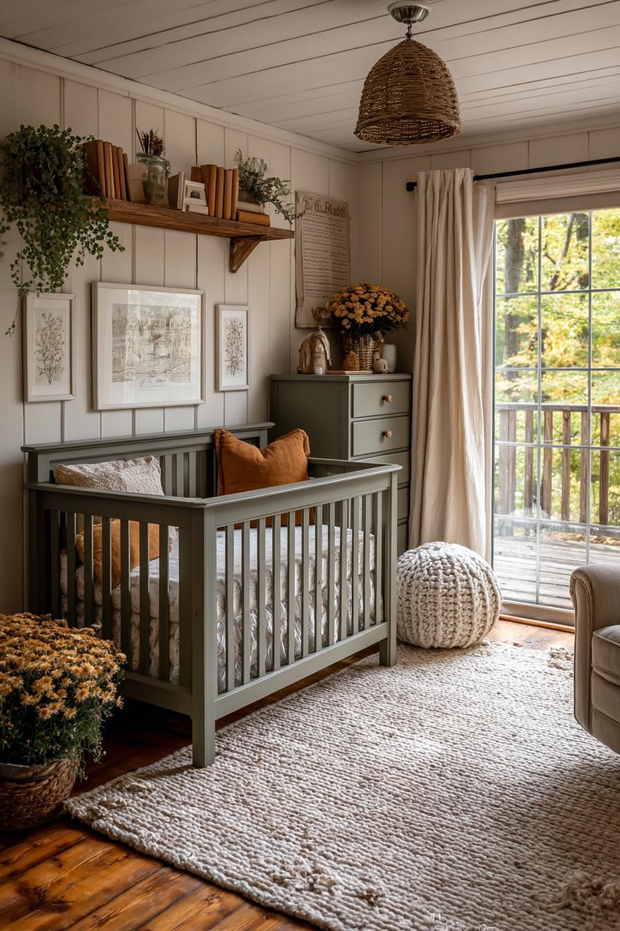
15. The Wind in the Willows by Kenneth Grahame
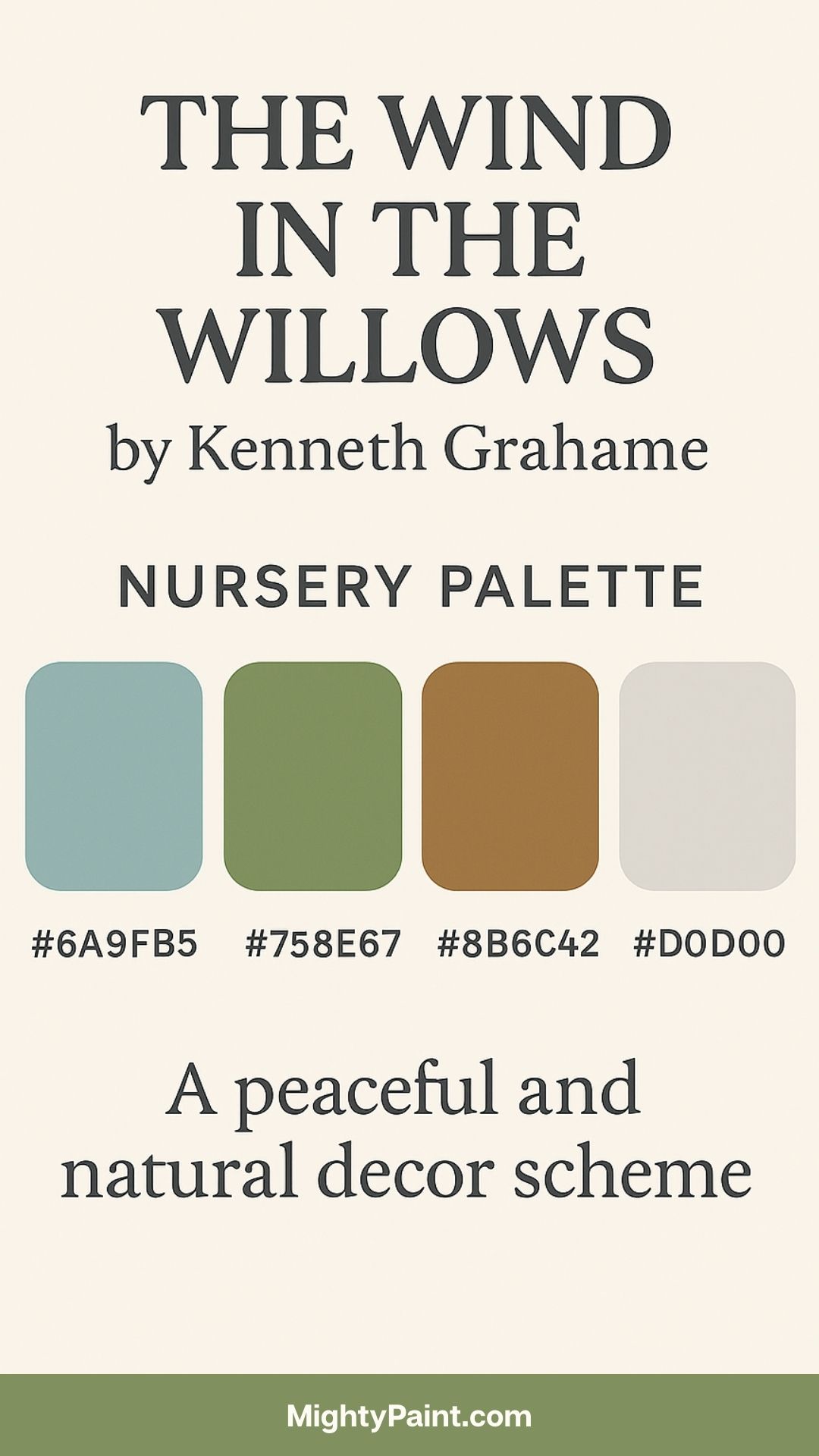
Color Palette:
- River Blue (#6A9FB5)
- Moss Green (#758E67)
- Bark Brown (#8B6C42)
- Misty Gray (#D0D0D0)
Design Inspiration:
This tale of riverside life and woodland whimsy offers a peaceful, nature-centric design. The palette mimics riverbanks and shaded glades. River blue and moss green are perfect for walls or drapery, while bark brown and misty gray lend themselves to wooden furniture and soft textiles.
Styling Tips:
- Incorporate illustrations or scenes featuring Mole, Ratty, and Toad.
- Use wood grain textures and earthy fabrics to ground the space.
- Add animal-themed accessories: hedgehogs, badgers, and ducks.
- Decorate with a nature motif: leafy garlands, mushroom-shaped lamps, or a painted river path on the floor.
This nursery theme is soothing and earthy, encouraging quiet play, reading, and appreciation for nature’s rhythms.
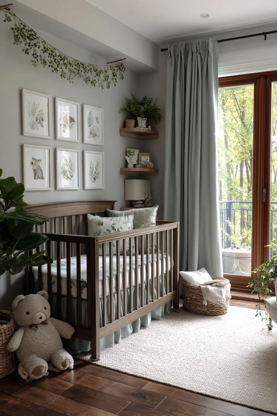
16. Heidi by Johanna Spyri
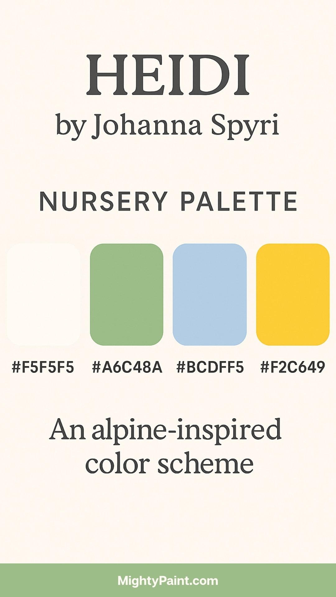
Color Palette:
Get the Fail-Safe Paint Color Playbook (Free PDF)
36 proven colors • 8 ready palettes • trim & sheen guide • printable testing cards.
- Alpine White (#F5F5F5)
- Meadow Green (#A6C48A)
- Sky Blue (#BCDFF5)
- Sunflower Yellow (#F2C849)
Design Inspiration:
Heidi is a story of resilience and joy set in the majestic Swiss Alps. The palette captures mountain freshness and the vibrancy of highland meadows. Use alpine white on walls for a crisp, clean look. Sky blue and meadow green can highlight accent walls, rugs, or fabrics, while sunflower yellow brings a cheerful pop.

Styling Tips:
- Incorporate wooden elements to echo alpine chalets—pine cribs, birch shelves, or wood-paneled walls.
- Decorate with nature-themed items: sheep plush toys, mountain landscape art, and pressed flower frames.
- Add cozy textures like woolen throws, faux fur rugs, and flannel curtains.
- Include quotes like “Let us be grateful to the people who make us happy…”
This palette creates a serene, sunlit retreat perfect for nurturing warmth, gratitude, and a love for the outdoors.
17. Black Beauty by Anna Sewell
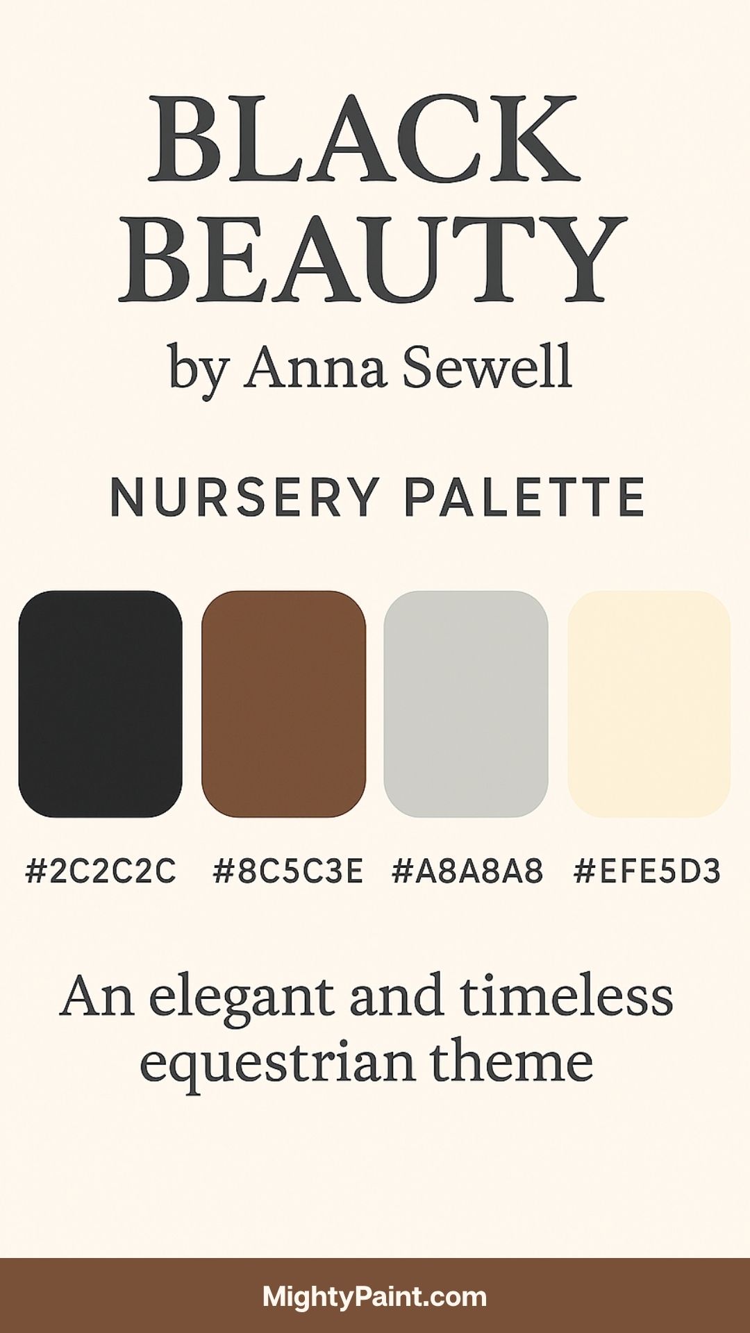
Color Palette:
- Ebony Black (#2C2C2C)
- Saddle Brown (#8C5C3E)
- Dusty Gray (#A8A8A8)
- Cream Beige (#EFE5D3)
Design Inspiration:
This classic novel about kindness and dignity through the eyes of a horse lends itself to a rich, refined aesthetic. The palette combines strong contrasts with muted neutrals for a stable-like charm. Use saddle brown in wooden furnishings and trims. Let cream and dusty gray lighten the mood through fabrics and walls, with ebony used tastefully in picture frames, accent items, or textiles.
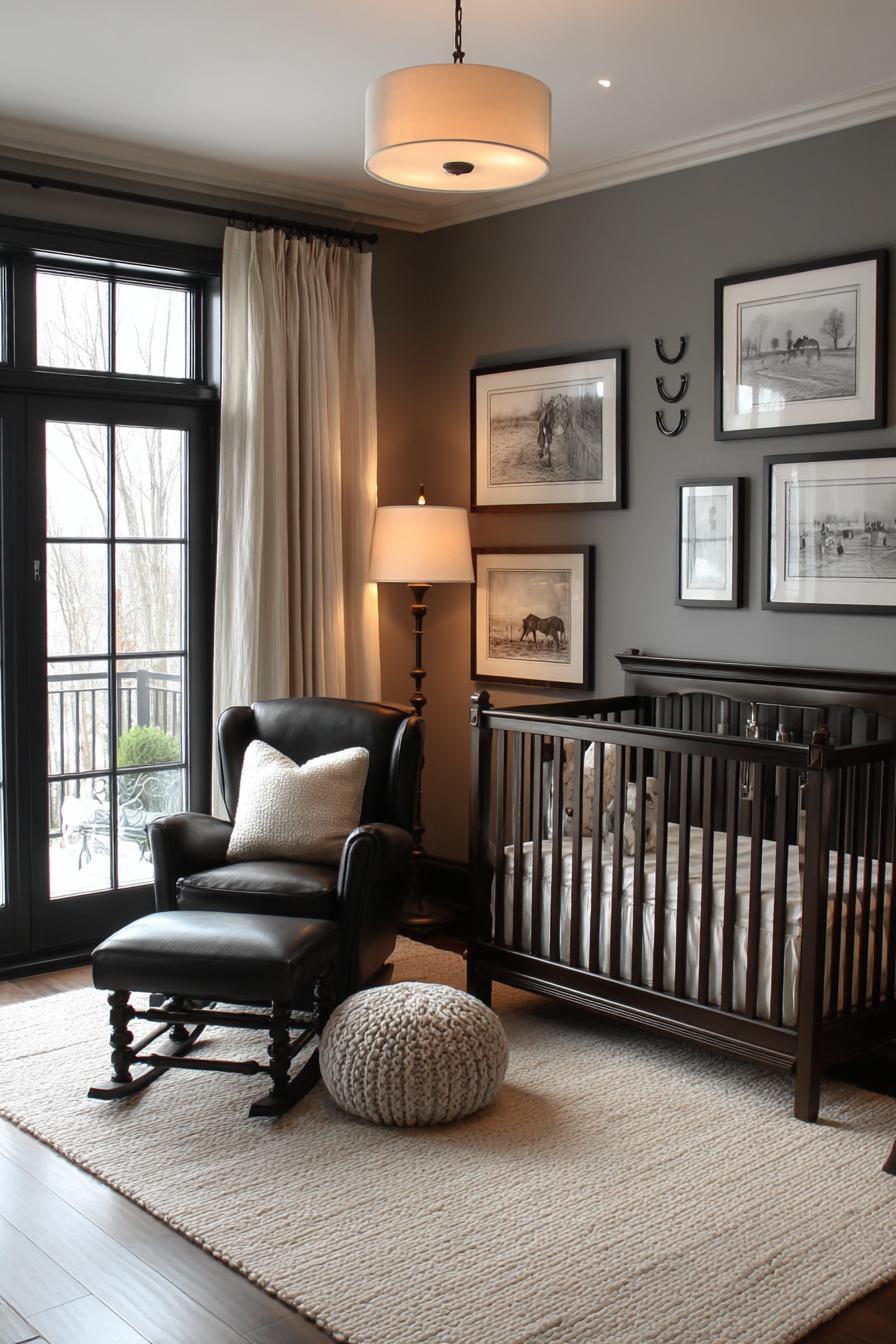
Styling Tips:
- Feature equestrian elements like horseshoe hooks, riding-themed art, or stable stripes.
- Use leather details—rocking horses, chair accents, or vintage luggage storage.
- Mix traditional English country decor with nursery-friendly touches.
- Display lines from the book such as “It is good people who make good places.”
This theme feels noble and grounded, offering a balance of classic elegance and storytelling depth.
18. The Jungle Book by Rudyard Kipling
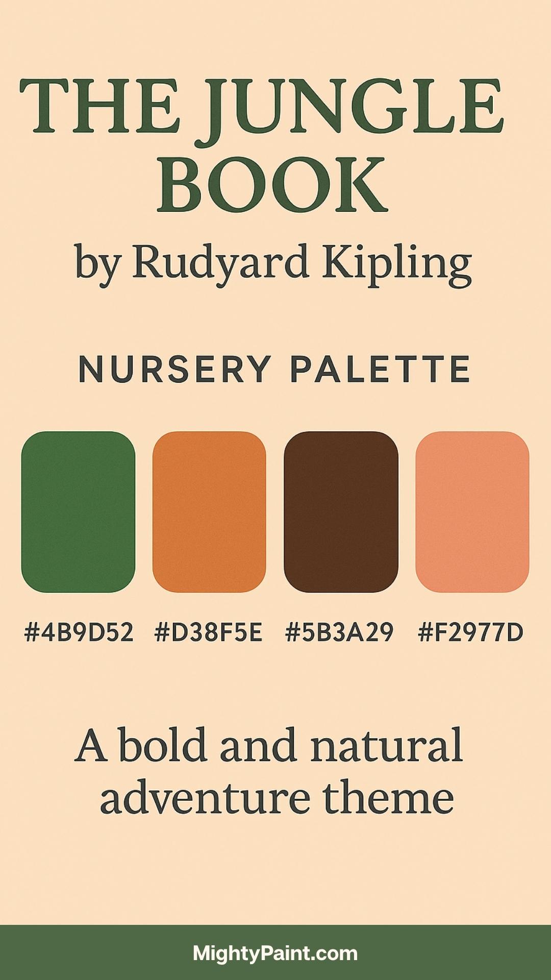
Color Palette:
- Tropical Green (#4B9D52)
- Earthy Orange (#D38F5E)
- Deep Brown (#5B3A29)
- Sunset Coral (#F2977D)
Design Inspiration:
Vivid and rhythmic, The Jungle Book presents a world alive with color, music, and movement. This palette reflects the dense greens of the jungle, earthy browns of tree trunks, and warm tropical accents. Green works well for walls or leafy decals, while earthy orange and coral shine in accessories and art.
Styling Tips:
- Use jungle motifs: palm leaf prints, animal silhouettes, or vine decals.
- Add layered textures—rattan, bamboo, or jute elements.
- Create a safari corner with animal plush toys, books, and binoculars.
- Use ambient lighting like lanterns or sunset-toned lamps for a cozy glow.
Perfect for adventurous spirits, this nursery encourages exploration, movement, and story-driven play.
Implementing Heritage Palettes in Modern Nurseries
Designing a nursery inspired by vintage literature doesn’t mean sacrificing modern convenience or safety. By thoughtfully blending old-world aesthetics with today’s materials and layouts, parents can create a nursery that is not only timeless but also functional and nurturing.
Balancing Vintage and Contemporary Elements
Integrating heritage palettes into a modern home is all about harmony. The key lies in juxtaposing classic colors with clean, contemporary lines. For instance, a crib with minimalist design in a traditional hue like navy or cream brings together the best of both eras. Pair painted wood furniture with updated finishes such as brass or matte black hardware to strike a sophisticated tone.
Tips for balancing styles:
- Use heritage colors on walls or larger furnishings, and keep other elements neutral to avoid visual clutter.
- Opt for streamlined lighting fixtures with vintage-inspired bulb shapes.
- Combine antique or vintage store finds (like a rocking chair or mirror) with new, safety-compliant essentials.
- Use modern storage solutions (modular bins, convertible dressers) in classic color tones.
This fusion approach respects nostalgic storytelling while ensuring the space meets the needs of today’s caregivers.
Accessorizing Thoughtfully
The accessories make or break a heritage-themed nursery. It’s tempting to over-decorate when drawing from richly illustrated books, but restraint ensures the space feels inviting rather than overwhelming. Accessories should reinforce the theme subtly and serve functional purposes when possible.
Ideas for curated storytelling through decor:
- Display framed illustrations or quotes from the chosen book above the crib or changing table.
- Add book-themed throw pillows, hand-sewn mobiles, or custom name signs in a coordinating palette.
- Include a rotating bookshelf filled with classic titles for easy access and visual charm.
- Use thematic fabric for curtains, crib bedding, or even a reading tent.
Less is more—let a few intentional pieces speak loudly rather than crowding the space with unrelated items.
Sustainability and Safety Considerations
Creating a nursery that honors the past also invites a thoughtful approach to the future. Many heritage-style items, such as natural wood furniture or organic textiles, naturally align with sustainable living. Choose eco-friendly paints, non-toxic finishes, and heirloom-quality furniture that can grow with your child or be passed down.
Get the Fail-Safe Paint Color Playbook (Free PDF)
36 proven colors • 8 ready palettes • trim & sheen guide • printable testing cards.
Best practices for a safe and eco-conscious nursery:
- Select low-VOC or VOC-free paints, especially for cribs and walls.
- Choose organic cotton, wool, or bamboo textiles that are soft, breathable, and chemical-free.
- Ensure all decor items are securely fastened and age-appropriate—avoid small or breakable pieces near the crib.
- Reuse and repurpose family heirlooms when safe, such as a refinished dresser or an antique toy chest (with updated safety hinges).
By merging eco-responsibility with classic design, you create a space that feels enduring and values-driven—just like the stories that inspired it.
Conclusion
A nursery inspired by the pages of a cherished children’s book is more than just a design choice—it’s a heartfelt gesture that nurtures imagination, comfort, and connection. By drawing from heritage palettes rooted in timeless stories, parents create spaces that not only look beautiful but also carry meaning and memory in every hue.
These color schemes evoke emotions tied to characters, places, and moments from literature that span generations. Whether it’s the pastoral calm of Peter Rabbit, the celestial charm of The Little Prince, or the rustic warmth of Anne of Green Gables, each palette offers a doorway into a world that can shape a child’s early experiences with wonder and warmth.
In embracing classic colors and themes, we honor the enduring legacy of these tales while building environments that are both practical and poetic. The stories may be old, but the magic they bring to a child’s world—through color, design, and love—never fades.