
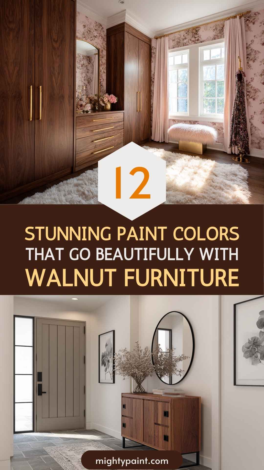
12 Stunning Paint Colors That Go Beautifully with Walnut Furniture
Walnut furniture has a richness and timeless elegance that anchors any room. Whether it’s a sleek mid-century sideboard, a classic dining set, or a stately bed frame, its deep brown tones and intricate grain demand the right surroundings to truly shine. But pairing it with the perfect paint color? That’s where many of us get stuck.
I learned this firsthand after dragging a vintage walnut dresser into a newly painted gray room. Instead of the warm, grounded feel I’d imagined, the dresser looked almost lost—like it didn’t belong. That’s when I realized the power of undertones, contrast, and the subtle art of color pairing.
Get the Fail-Safe Paint Color Playbook (Free PDF)
36 proven colors • 8 ready palettes • trim & sheen guide • printable testing cards.
If you’re staring at your walls wondering what shade will enhance (not fight with) your walnut pieces, this guide is for you. Below, you’ll find twelve paint colors—from soft creams to dramatic navies—that not only work with walnut but help elevate it. Whether you’re going for light and airy or rich and cozy, there’s a palette here that can make your space feel both cohesive and elevated. Let’s dive in.
1. Soft White
Examples: Benjamin Moore Swiss Coffee, Sherwin-Williams Alabaster
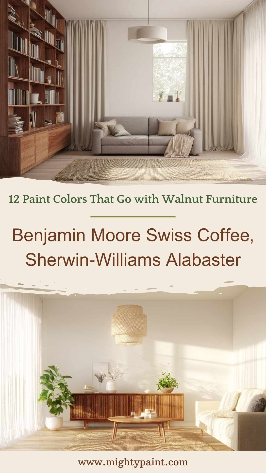
A soft, warm white is one of the most foolproof companions to walnut. These shades don’t feel sterile like pure white and instead bring a creamy richness that enhances walnut’s natural warmth without overpowering it. The result is a light and balanced atmosphere that feels open yet grounded.
Why it works:
Walnut has deep, complex brown tones that can easily make a room feel dark or heavy. Soft white walls act as a neutral backdrop that reflects natural light, softens the room, and draws attention to the furniture’s craftsmanship and grain.
Best for:
- Living rooms with large walnut pieces like coffee tables or media centers
- Minimalist or Scandinavian interiors
- Rooms where you want to maintain brightness but still highlight warmth
Styling tip: Add natural fibers like jute rugs or woven pendant lights to tie in warmth and prevent the space from feeling too stark.
2. Warm Cream or Beige
Examples: Benjamin Moore Pale Oak, Magnolia Home Gatherings
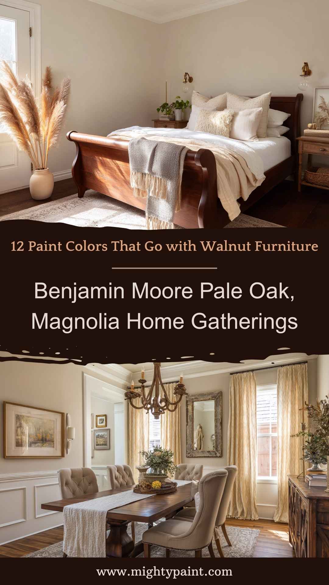
Cream and beige tones are often underestimated, but they’re secret weapons for pairing with rich woods. When you want a room that feels serene, timeless, and cozy, a warm cream wall color acts like a bridge between walnut’s boldness and the rest of your decor.
Why it works:
Warm neutrals echo the subtle undertones found in walnut—whether it leans slightly red, gold, or chocolate brown. Instead of competing, these colors cushion the contrast and let walnut integrate seamlessly into the space.
Best for:
- Bedrooms with walnut headboards or dressers
- Traditional or farmhouse-inspired interiors
- Dining rooms with matching table and chair sets
Styling tip: Layer different neutral textures—linen, rattan, aged brass—for added visual interest without deviating from the soft palette.
3. Light Greige
Examples: Sherwin-Williams Accessible Beige, Benjamin Moore Edgecomb Gray
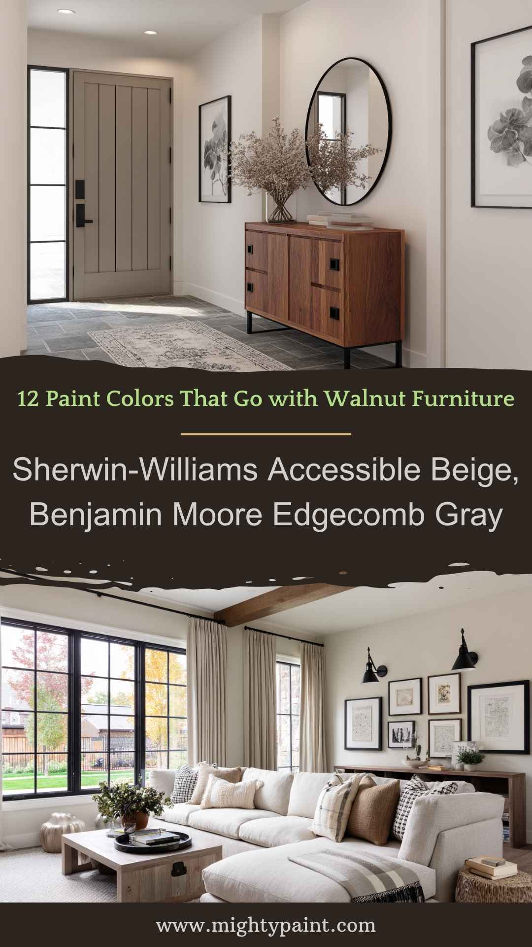
Greige—a blend of gray and beige—is a modern favorite, and for good reason. It brings the clean sophistication of gray while keeping the warmth of beige, making it a perfect neutral companion for walnut.
Why it works:
Greige adapts easily to both warm and cool lighting, and depending on your walnut finish, it can either soften or subtly contrast. This color is ideal if you want something more layered than white but not as deep as green or navy.
Best for:
- Entryways and hallways where you want to set a soft but elevated tone
- Open-plan spaces that connect several rooms
- Homes with a blend of modern and rustic décor
Styling tip: Pair with black or matte bronze accents—picture frames, lighting, or table legs—for a balanced, modern look that grounds the softness of greige.
4. Sage Green
Examples: Benjamin Moore Saybrook Sage, Behr Nature’s Gift
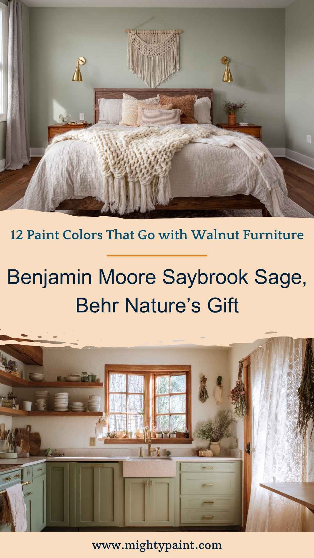
Sage green has become a darling of modern design for good reason—it’s calming, earthy, and sophisticated without feeling stuffy. When paired with walnut furniture, it brings out the wood’s natural tones while creating a cozy, nature-inspired environment.
Why it works:
Walnut’s deep brown grain plays beautifully against the softness of sage. The green doesn’t overpower but instead adds contrast in a subtle, balanced way—like placing a rich tree trunk against lush foliage.
Best for:
- Bedrooms or reading nooks with vintage walnut pieces
- Cottagecore, farmhouse, or boho interiors
- Kitchens with walnut lower cabinets or open shelving
Styling tip: Add matte black or aged brass hardware for contrast, and incorporate soft textiles like linen curtains or knitted throws in cream or ivory.
5. Forest or Olive Green
Examples: Sherwin-Williams Ripe Olive, Benjamin Moore Essex Green
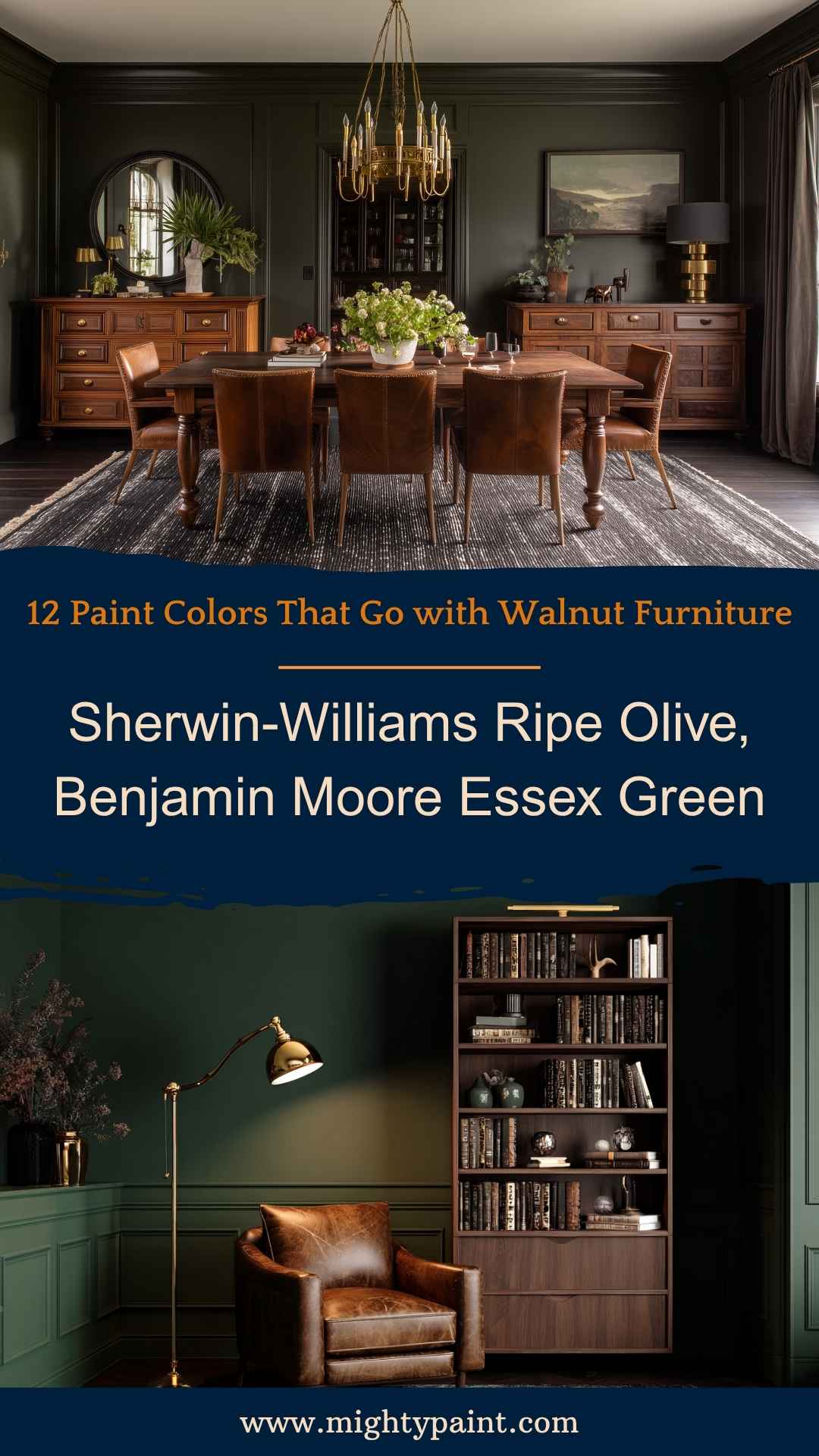
If sage is the gentle whisper of nature, forest and olive greens are its deep, bold voice. These rich, grounded shades bring a touch of drama while staying perfectly in tune with walnut’s warmth.
Why it works:
These deep greens pull out the wood’s golden and chocolate undertones, adding dimension and richness. They’re also excellent choices for adding mood to a space—especially in rooms that benefit from a sense of intimacy and depth.
Best for:
- Dining rooms or libraries with walnut built-ins or buffets
- Accent walls behind a walnut bed or dresser
- Rustic or masculine-inspired interiors
Styling tip: Incorporate leather, terracotta, or linen for textural depth. Brass sconces or vintage artwork look especially striking against dark green walls.
6. Navy Blue
Examples: Benjamin Moore Hale Navy, Sherwin-Williams Naval
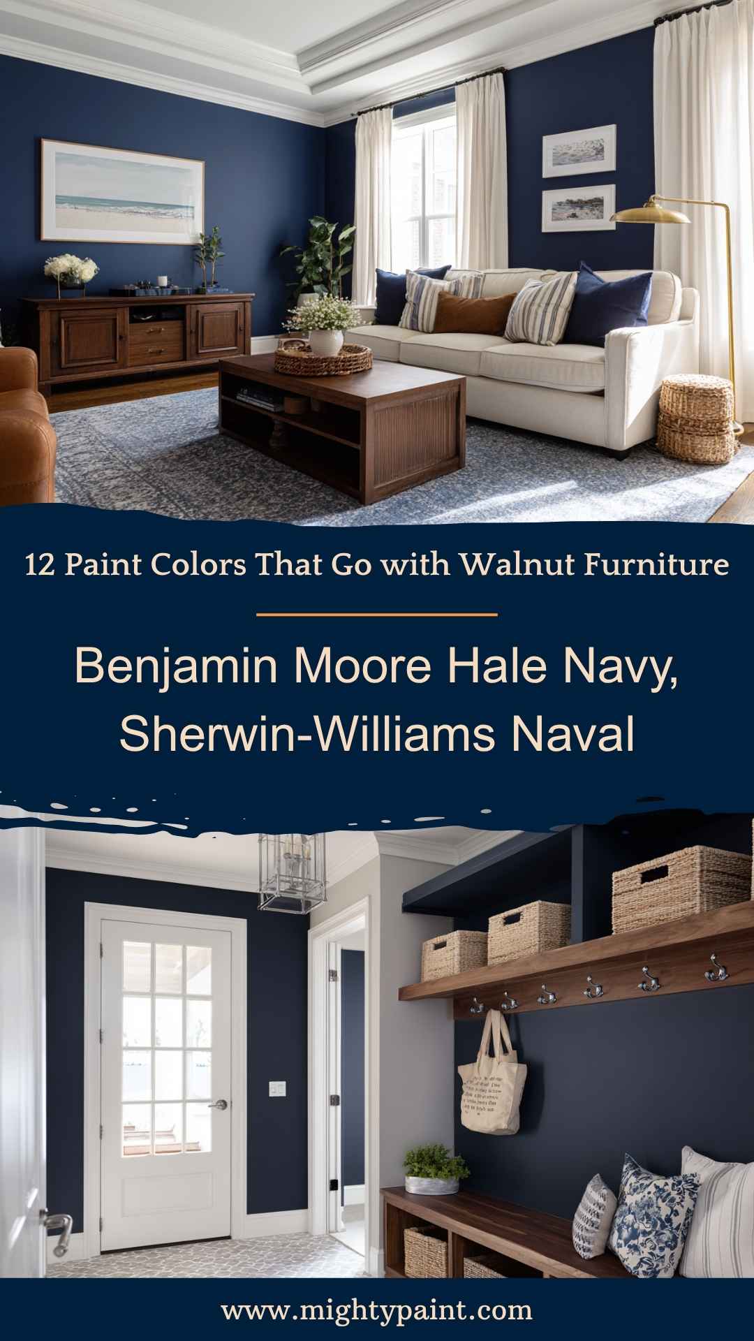
Navy blue is classic, commanding, and endlessly versatile. When set against walnut furniture, it delivers a level of contrast that feels both polished and inviting. This pairing can lean traditional, nautical, or even preppy—depending on the surrounding elements.
Why it works:
Navy’s cool, deep tones play well with walnut’s inherent warmth, creating contrast without feeling jarring. It’s a mature color choice that helps walnut furniture become a standout feature in the room.
Best for:
- Living rooms with walnut coffee tables, bookcases, or sideboards
- Entryways or powder rooms where boldness makes a lasting impression
- Homes styled in coastal, traditional, or modern Americana aesthetics
Styling tip: Offset the richness with crisp white trim, metallic fixtures (brass or chrome), and soft furnishings in creams or tans to prevent the room from feeling too heavy.
7. Charcoal or Soft Black
Examples: Sherwin-Williams Iron Ore, Benjamin Moore Wrought Iron
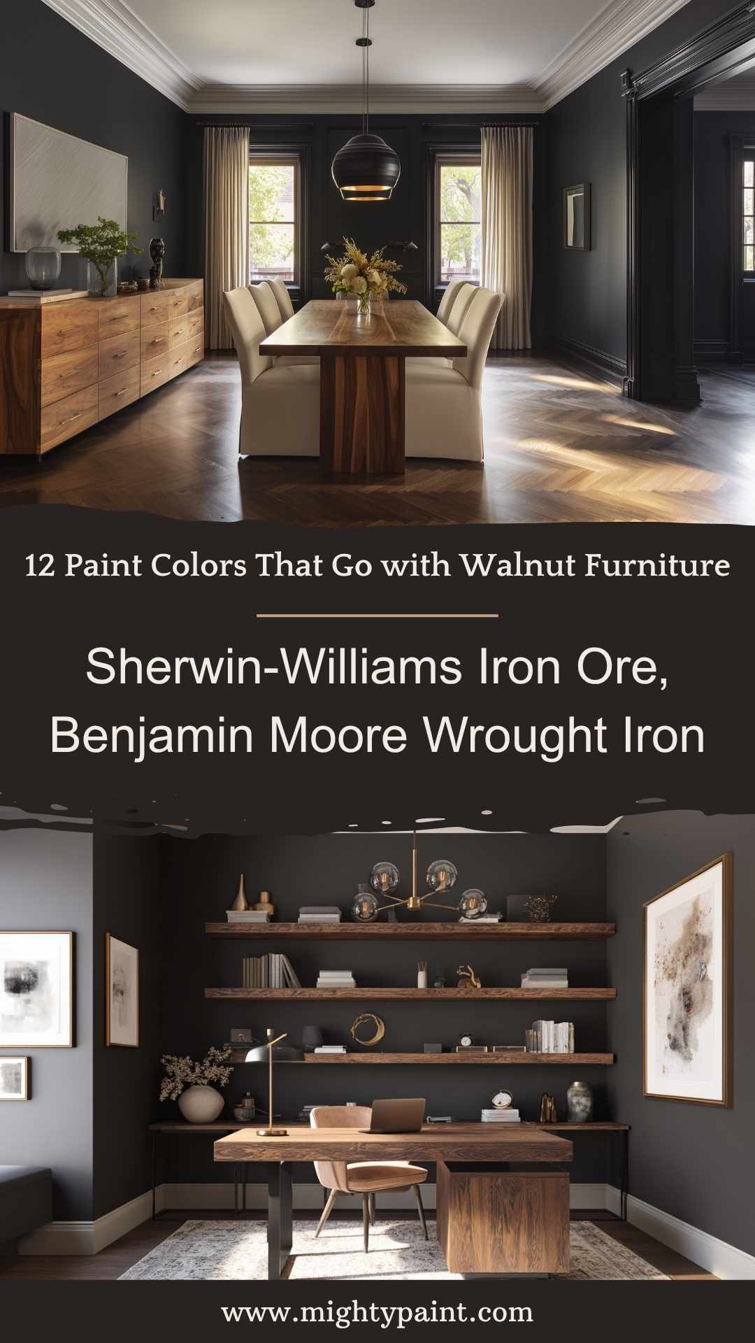
If you’re looking for a moody, modern, and dramatic effect, charcoal or soft black is an exceptional match for walnut furniture. These dark tones add depth and definition to a room, allowing walnut’s warm, complex grain to visually pop.
Why it works:
The deep brown of walnut provides just enough warmth to balance the coolness of charcoal or soft black walls. This pairing is striking but sophisticated—perfect for rooms where you want to make a bold design statement without feeling overwhelming.
Best for:
- Offices or dens with walnut desks or bookcases
- Dining rooms with walnut sideboards or formal tables
- Urban lofts or minimalist modern homes
Styling tip: Use plenty of layered lighting (e.g., sconces, lamps, pendant lights) and accent with warm metals like brass or copper to avoid making the space feel too closed-in.
8. Soft Blue-Gray
Examples: Benjamin Moore Boothbay Gray, Sherwin-Williams Misty
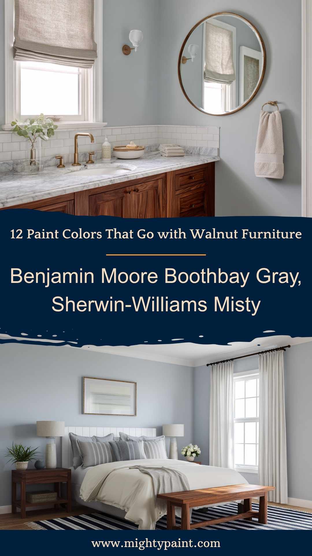
A soft blue-gray brings a sense of tranquility and lightness to a space, especially when offset by the rich tones of walnut. This combination evokes a coastal or spa-like vibe—perfect for creating calm, relaxing environments.
Why it works:
Blue-grays act as a cool contrast to walnut’s warmth, offering subtle variation without clashing. This is particularly effective in smaller spaces where you want light reflection but still want the furniture to stand out.
Best for:
- Bedrooms with walnut nightstands or headboards
- Bathrooms featuring walnut vanities or accents
- Coastal, Scandinavian, or transitional interiors
Styling tip: Add accents in ivory, soft gold, or pale wood tones for a breezy, layered look.
9. Terracotta or Clay
Examples: Sherwin-Williams Cavern Clay, Benjamin Moore Potters Clay
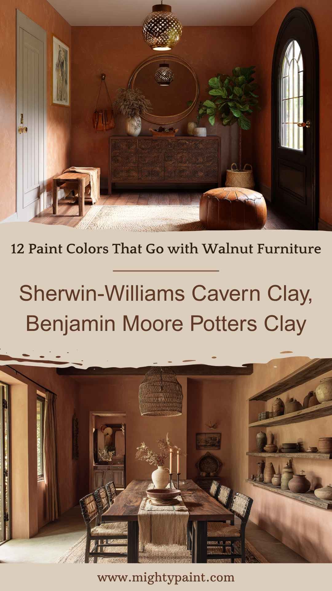
Terracotta isn’t just for tiles and pottery—it’s a rising star on the paint color scene. This warm, sunbaked hue pairs beautifully with walnut by echoing its reddish undertones and introducing a sense of coziness and grounded energy.
Why it works:
Terracotta and walnut share warmth, but in slightly different registers. This makes them visually compatible while still offering contrast. The result is earthy, welcoming, and incredibly stylish—especially when combined with natural textures.
Best for:
- Entryways or accent walls in eclectic or global-style homes
- Dining areas with walnut tables or hutches
- Rooms with leather, rattan, or handwoven textiles
Styling tip: Pair with neutral upholstery, black iron accents, and layered rugs to enhance the organic, travel-inspired aesthetic.
10. Dusty Rose or Mauve
Examples: Benjamin Moore Mauve Desert, Sherwin-Williams Rosy Outlook
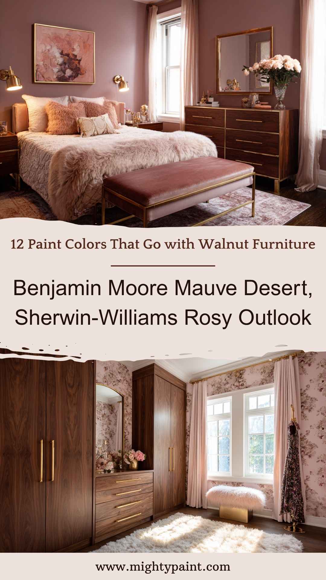
If you want to add softness and elegance to a room with walnut furniture, dusty rose or mauve might surprise you. These muted pinks carry a romantic, mature tone that pairs beautifully with walnut’s rich wood grain—especially in rooms where comfort and coziness are the goal.
Why it works:
The red undertones in both walnut and mauve create a natural synergy, while the gray base in dusty rose keeps the palette grounded. It’s a great option for those who want a warm but subtle pop of color without veering into pastel territory.
Best for:
- Bedrooms or dressing areas with walnut wardrobes or nightstands
- Vintage or feminine-leaning interiors
- Accent walls behind a walnut headboard or vanity
Styling tip: Use brass or rose gold accents and soft lighting to enhance the warmth. Add ivory bedding or curtains for contrast and airiness.
11. Warm Taupe or Mushroom
Examples: Farrow & Ball Elephant’s Breath, Sherwin-Williams Perfect Greige
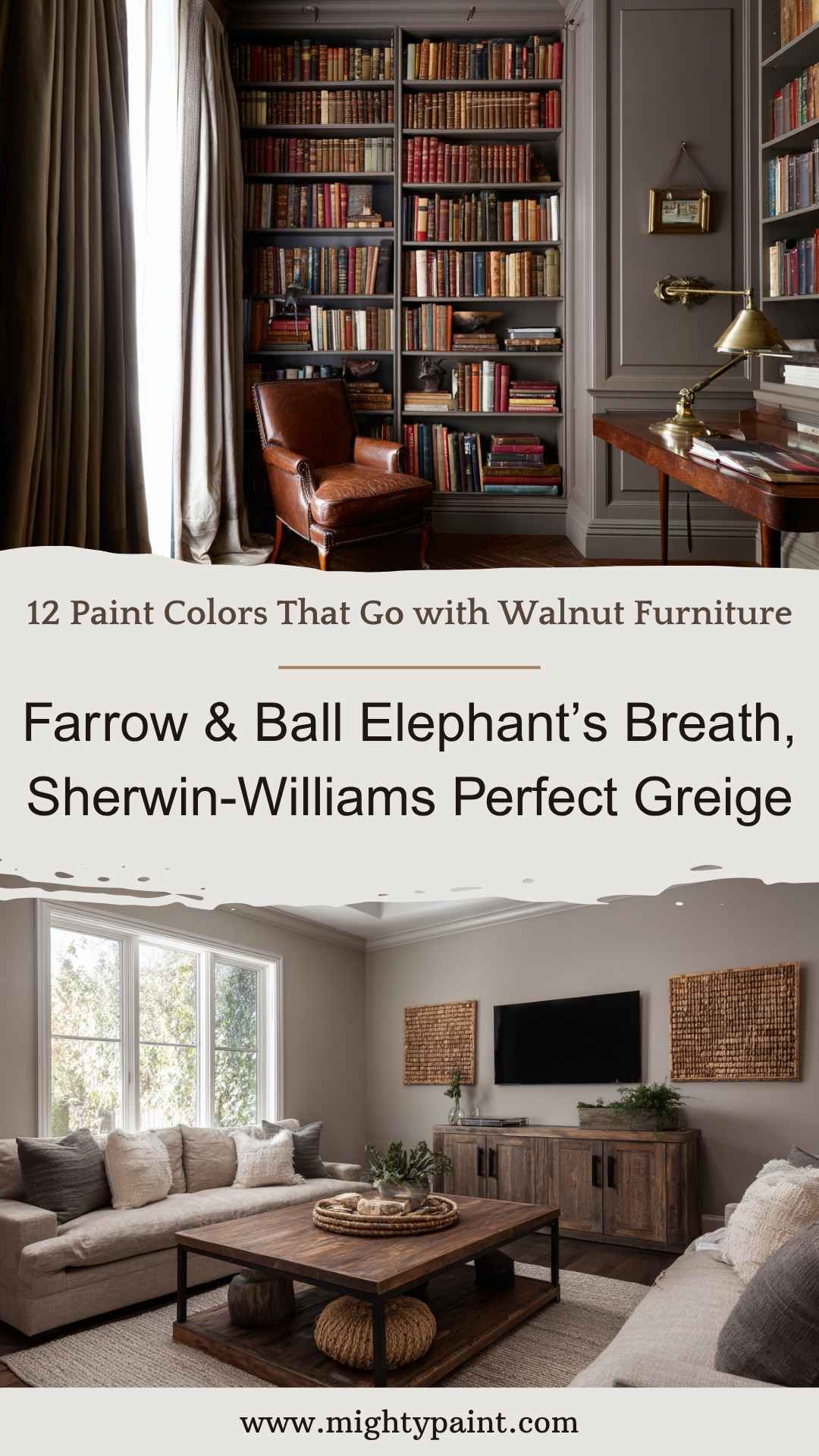
Taupe and mushroom tones are timeless, complex neutrals that fall somewhere between gray and brown—making them an ideal match for walnut. They bring understated elegance and work in both modern and traditional spaces.
Why it works:
These mid-tone neutrals echo the depth of walnut without overwhelming the room. They’re especially helpful if you want to create a cozy, cocoon-like feel with a unified palette.
Best for:
- Living rooms or home libraries with lots of walnut shelving or millwork
- Farmhouse, modern rustic, or classic interiors
- Rooms where you want a neutral that still feels rich
Styling tip: Combine with creamy whites, textured fabrics, and matte black hardware for a well-balanced, layered look.
12. Deep Plum or Aubergine
Examples: Benjamin Moore Black Raspberry, Sherwin-Williams Plum Brown
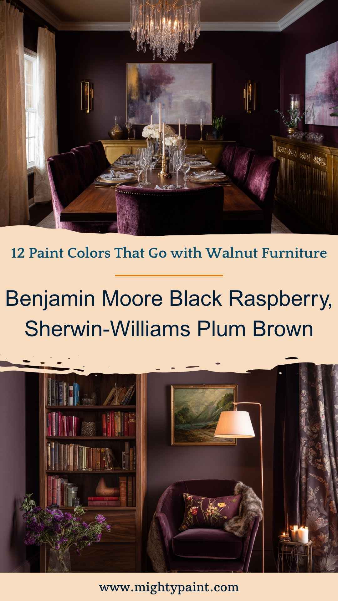
For those who aren’t afraid of bold choices, deep plum or aubergine adds a luxurious, moody flair. These shades exude richness and elegance, pairing beautifully with walnut for a palette that feels both daring and timeless.
Why it works:
Purple tones sit opposite to walnut’s warm, reddish hues on the color wheel, which makes them complementary in a sophisticated way. Together, they create a high-contrast, upscale vibe that’s ideal for rooms where drama and intimacy are welcome.
Best for:
- Dining rooms, powder rooms, or cozy reading spaces
- Glam, eclectic, or dramatic traditional interiors
- Accent walls in spaces with gold-framed art or vintage lighting
Styling tip: Offset the richness with pale accents—ivory, champagne, or soft gold—and add plush textures like velvet or silk for visual and tactile luxury.
Tips for Choosing the Right Color
Even with a curated list of colors that pair beautifully with walnut furniture, your space, lighting, and style play a huge role in how a paint color will look. These tips will help you make the best choice for your specific room.
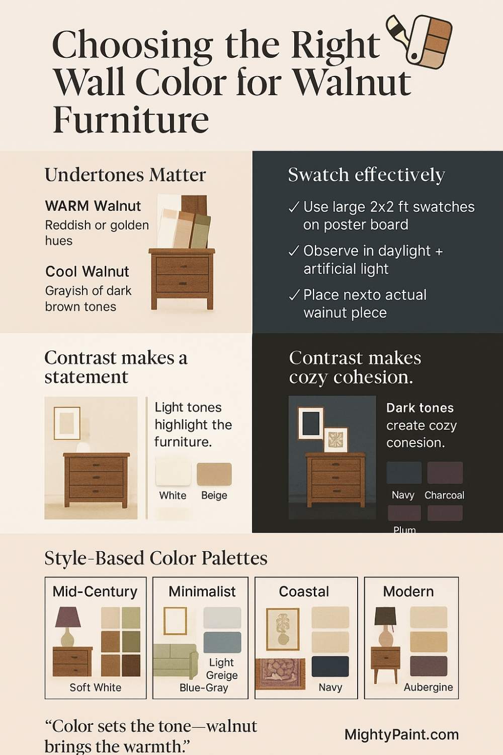
Match Undertones
Not all walnut pieces are the same. Some lean warm with reddish or golden undertones, while others have cooler, grayish hues. To find the right paint:
- If your walnut has warm undertones, lean into soft whites, terracotta, or cream.
- If your walnut is cooler, opt for sage, navy, or greige to enhance contrast without clashing.
Use Large Swatches
Don’t rely on tiny paint chips. Instead:
- Paint large swatches (at least 2×2 feet) directly on your wall or on poster board.
- View them throughout the day, in both natural and artificial light.
- Place your walnut furniture nearby to see how the colors interact in real space.
Play with Contrast
A lighter wall color (like white or beige) will make your walnut pieces stand out. On the other hand, a darker tone (navy, plum, or charcoal) can make the space feel cozier and the furniture more integrated.
Get the Fail-Safe Paint Color Playbook (Free PDF)
36 proven colors • 8 ready palettes • trim & sheen guide • printable testing cards.
Coordinate Accents
Don’t forget about the accessories. Area rugs, curtains, and throw pillows should echo your chosen palette to tie everything together. For instance:
- Pair navy walls with cream pillows and brass lamps.
- Combine greige walls with black hardware and textured linens.
Style-Based Color Palette Guide
Here’s a quick-reference table that connects common design styles with ideal paint options for rooms featuring walnut furniture:
| Design Style | Recommended Paint Colors |
|---|---|
| Mid-Century Modern | Soft White, Olive Green, Navy, Warm Taupe |
| Minimalist | Soft White, Light Greige, Blue-Gray |
| Farmhouse | Warm Cream, Sage Green, Mushroom |
| Coastal | Soft Blue-Gray, Warm White, Navy |
| Eclectic/Boho | Terracotta, Mauve, Deep Plum, Forest Green |
| Modern Traditional | Charcoal, Navy, Warm Beige, Deep Aubergine |
Conclusion
Walnut furniture brings unmatched richness and warmth to a space—but the right paint color can make it feel either bold and contemporary or soft and classic. Whether you’re drawn to light and airy whites or moody greens and plums, the key is in contrast, undertone harmony, and intentional layering.
Start by studying your walnut tones, test generously in your own lighting, and don’t be afraid to mix in texture and metallic accents. With the right color backdrop, your walnut pieces won’t just blend into the room—they’ll be the feature you built your style around.
Let your walls work with your furniture, not against it—and watch your space come to life.