
7 Exterior House Paint Color Combinations That Make Curb Appeal Feel Cohesive
Exterior colors look different once they meet your roof, brick, stone, trim, and the light around your home. These seven combinations offer starting points—from crisp white and navy to earthy brown and cream—so you can compare how body, trim, and accent colors work together.
Before choosing a palette, note the finishes you are keeping and test large samples on the house at different times of day. A combination that looks balanced on a screen may read differently on your own siding and in your local light.
Get the Fail-Safe Paint Color Playbook (Free PDF)
36 proven colors • 8 ready palettes • trim & sheen guide • printable testing cards.
The accompanying generated photographs are illustrative color inspiration, not exact paint-chip matches.
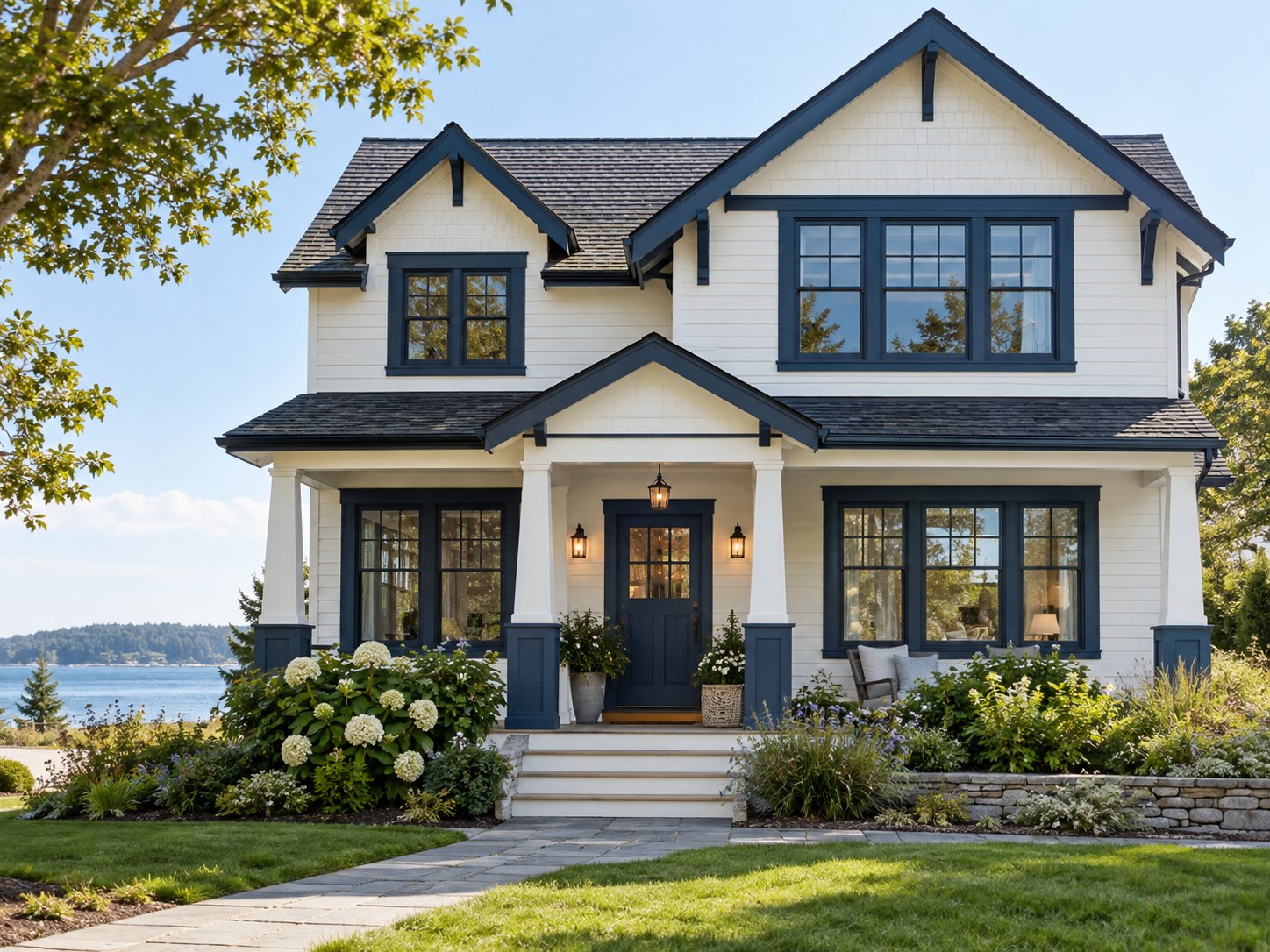
1. Classic white with navy trim
White siding and navy trim create a clear, high-contrast outline around windows, doors, and porch details. The look suits homes with strong trim lines, such as a farmhouse or a house with traditional window casings. Keep the white warm or cool in step with nearby stone, roof color, and the rest of the exterior; a stark white beside warm masonry can feel disconnected.
Use navy selectively on shutters, fascia, or the front door if a full dark trim package would overpower the facade. The visual is an example of the palette, not a promise of a specific paint formula. For exterior color sampling, Benjamin Moore recommends observing samples outdoors as light and shade change through the day. See its exterior color guidance.
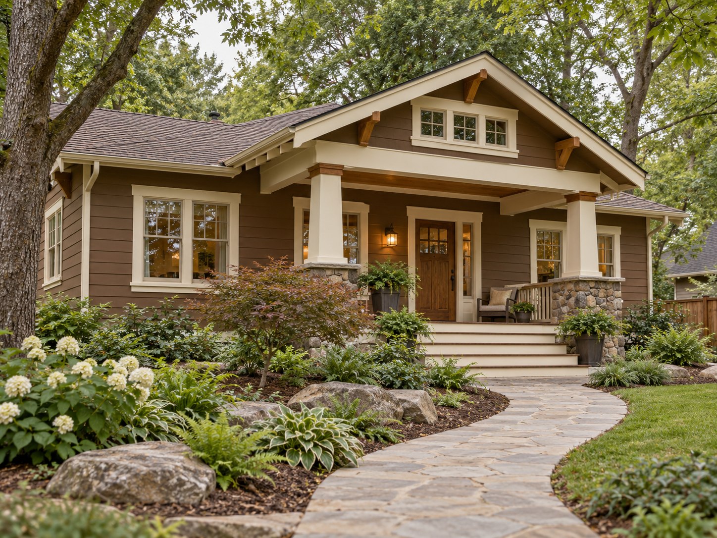
2. Earthy brown with cream accents
Brown siding paired with cream trim gives a home a grounded, warm appearance. The contrast is gentler than black-and-white, so it can work especially well beside stone paths, mature trees, or other warm natural finishes. Choose the brown with the roof in mind: a red-brown roof may make a red-leaning paint feel too close, while a cooler roof can sharpen the difference.
Use cream on window frames, porch posts, or fascia to keep the darker body color from reading as one uninterrupted block. If the house already has cream-colored stone or brick, bring a sample beside that material before choosing the trim. A related guide to making cream-colored paint can help explain the undertones behind the accent shade.
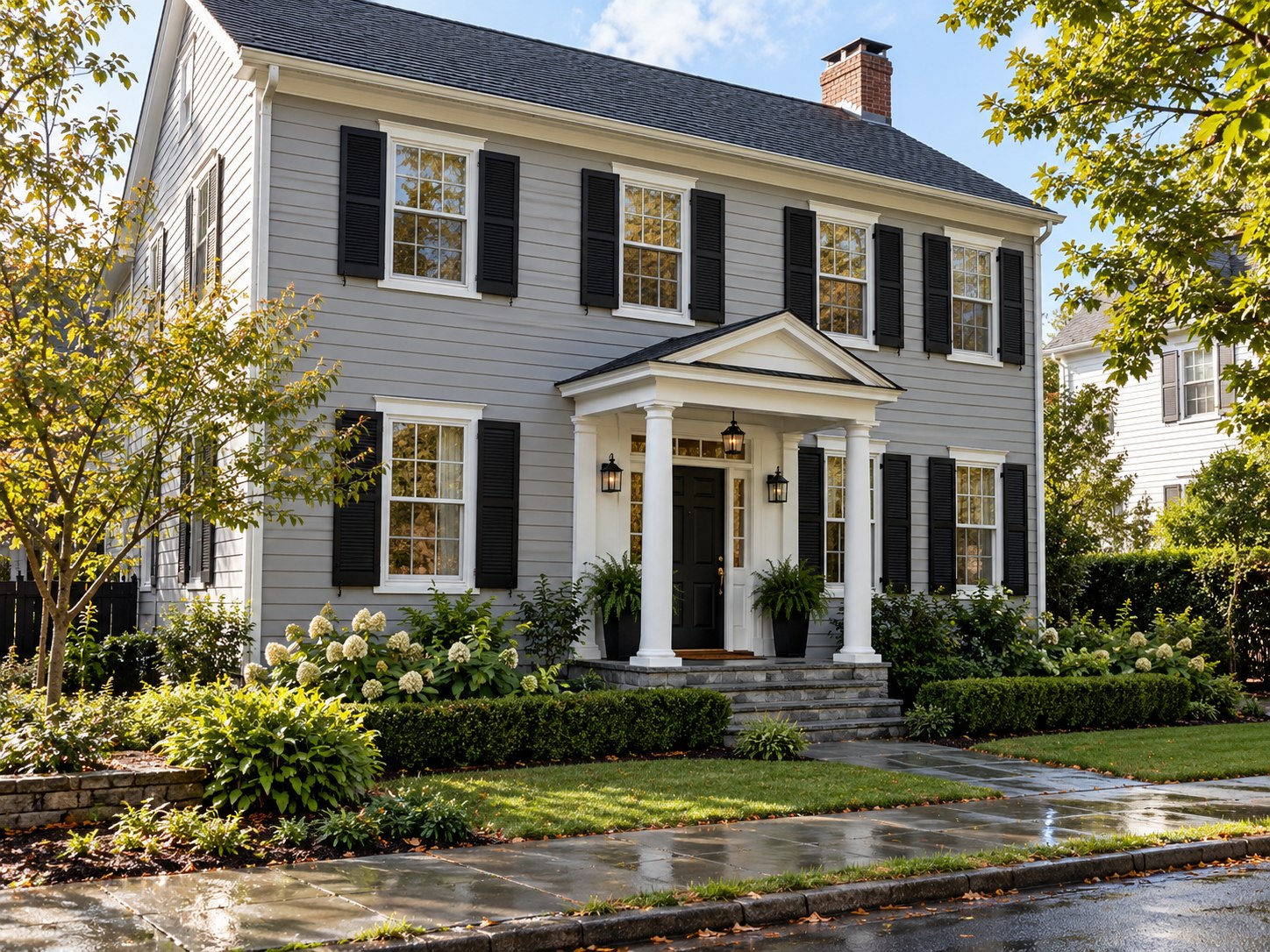
3. Soft gray with bold black shutters
Soft gray siding and black shutters create a defined, contemporary contrast without relying on a bright accent color. This pairing is easiest to read when the facade has distinct window shapes and the shutters are proportioned to them. If the roof is also very dark, consider a lighter gray body or a softer charcoal for the shutters so the exterior retains visible separation.
Gray can lean blue, green, violet, or beige depending on its undertone and the light. Compare the sample with roof shingles, paving, and fixed masonry rather than choosing from a screen. Use black consistently on a small number of features—shutters, a door, or metalwork—so the contrast feels intentional. The image illustrates a gray-and-black direction; it does not identify a manufacturer shade.
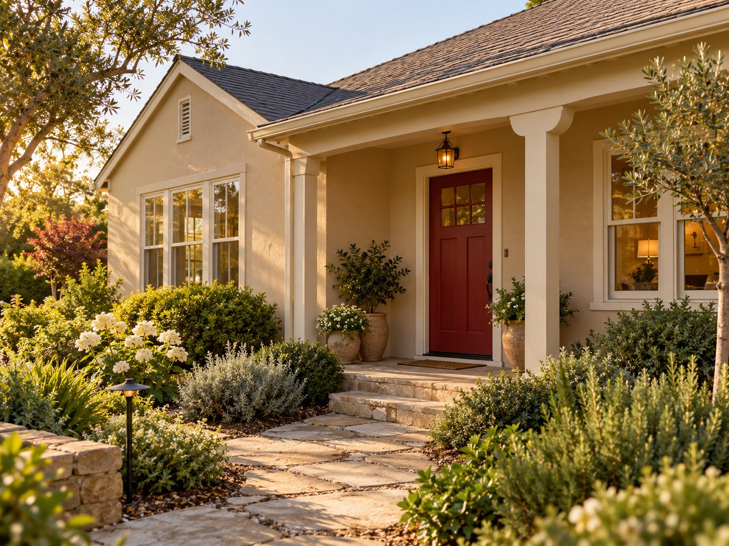
4. Warm beige with a deep red door
Warm beige is a flexible body color, while a deep red door creates a memorable focal point at the entrance. The combination works best when the red is repeated sparingly or supported by another warm detail, such as brick, stained wood, or a terracotta planter. A vivid red can compete with warm masonry, so compare the door color next to the actual brick or stone before committing.
Keep the trim light if the architecture benefits from a crisp outline; choose a softer cream when bright white would feel too sharp beside the beige. The red door does not need to cover additional features to make the palette feel complete. For related entry inspiration, see these front-door ideas for curb appeal.
5. Light blue with white trim
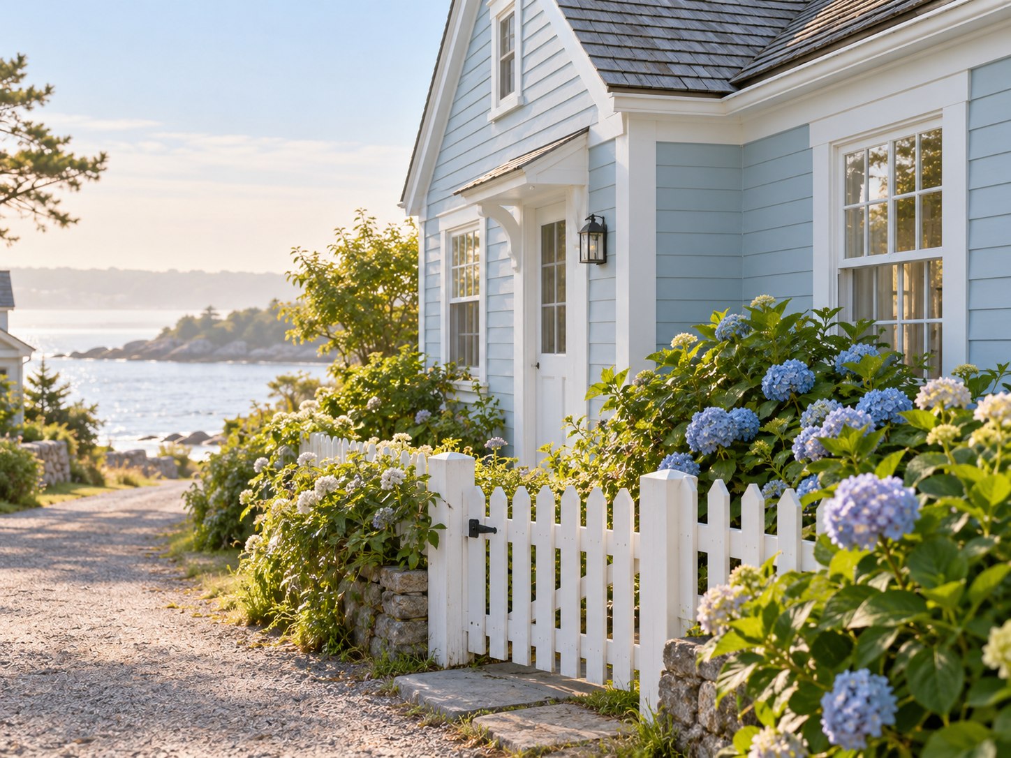
Light blue siding and white trim give a home a fresh, airy palette. The effect can shift from coastal to cottage-like depending on the blue's undertone, roof, and surrounding landscape. A gray-leaning blue often sits more quietly beside stone, while a clearer blue can look brighter in open sun.
Check the existing roof and hardscape before choosing the blue. If those elements have warm brown or red undertones, a very cool blue may create an unexpected clash. White trim can tie the palette together, but it should coordinate with any existing white windows or doors. Test a large sample on more than one side of the home because sun and shade can change how the blue reads.
6. Dark green with restrained gold accents
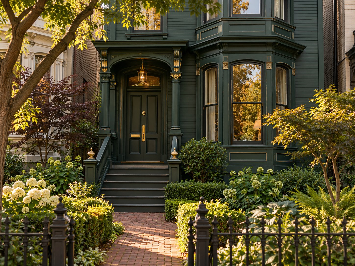
Deep green siding brings a strong connection to surrounding trees and garden colors. Small warm-metal details—such as a brass light, house numbers, or a door handle—can add definition without turning the whole scheme into a high-contrast statement. Think of gold as a finish accent, not a substitute for a coordinated trim color.
Cream, soft white, or a natural wood tone can balance the green, depending on the fixed finishes. On a shaded facade, a very dark green may appear nearly black; compare a sample in the shade as well as in direct light. Check the trim and roof together so the green has enough contrast to show its architectural details.
7. Pale yellow with a charcoal roof
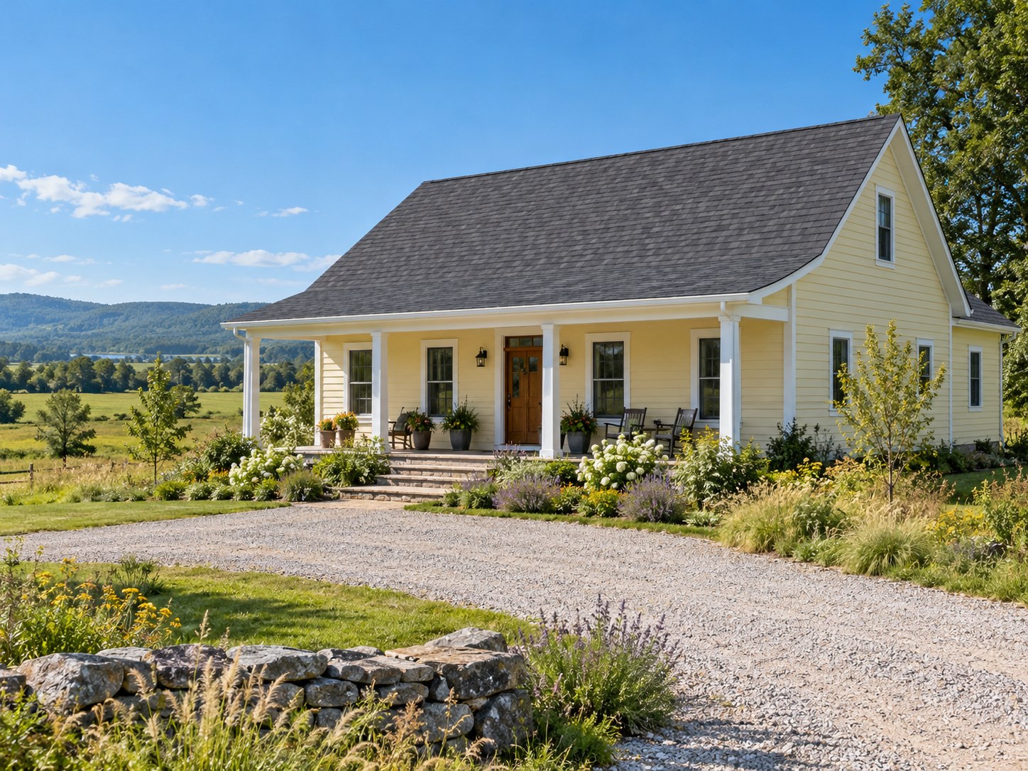
Pale yellow siding with a charcoal roof pairs a warm body color with a crisp, dark top edge. White trim can keep the combination bright, while natural wood on a porch or door can soften it. The balance depends on how much roof is visible: a large dark roof can dominate a small facade, so test the yellow against the actual roofing rather than a generic swatch.
Choose a muted yellow if you want the color to remain subtle in strong sun. A more saturated yellow may appear much brighter across a large exterior surface. If the home has stone or brick, check that its undertones work with the yellow before finalizing trim and accent colors.
Get the Fail-Safe Paint Color Playbook (Free PDF)
36 proven colors • 8 ready palettes • trim & sheen guide • printable testing cards.
How to choose a combination for your exterior
Start with the materials you are not painting: roofing, brick, stone, concrete, and permanent metalwork. Identify whether each leans warm, cool, or relatively neutral, then select a body color that sits comfortably beside those surfaces. After that, assign separate roles to the body, trim, and one smaller accent color. This keeps the palette easy to evaluate before you add more shades.
Test the actual paint system and color on the intended surface when its manufacturer permits it. Benjamin Moore's exterior guidance recommends viewing a sample outdoors through changing sun and shade, and notes that its liquid samples are formulated for interior use, so use the manufacturer's specified exterior sampling method. Compare the sample from the sidewalk and near the trim, not only up close. Read the exterior sampling guidance.
Frequently asked questions
How should I test an exterior color combination before painting?
Test body, trim, and accent colors together near the fixed materials they must coordinate with. Follow the selected paint manufacturer's directions for exterior sampling; some interior sample products are not intended to withstand outdoor exposure. Look at the samples in sun and shade and from the street before making a final selection.
How many colors should an exterior palette use?
Begin with three roles: body, trim, and a smaller accent. A home may include additional existing colors from masonry, roofing, and windows, so count those as part of the overall view. Add another paint color only when it clarifies an architectural feature or entrance.
Should the front door match the shutters?
It can, but it does not have to. Matching them creates a coordinated look; using a distinct door color gives the entrance its own focal point. Check the door against the body, trim, roof, and any masonry before deciding.