20 Best Paint Colors for Home: Trendy Choices to Elevate Your Space
Choosing the right paint colors for your home can completely transform your living space.
Have you ever wondered about the best hues to make your space feel warm, vibrant, or even spacious?
Get the Fail-Safe Paint Color Playbook (Free PDF)
36 proven colors • 8 ready palettes • trim & sheen guide • printable testing cards.
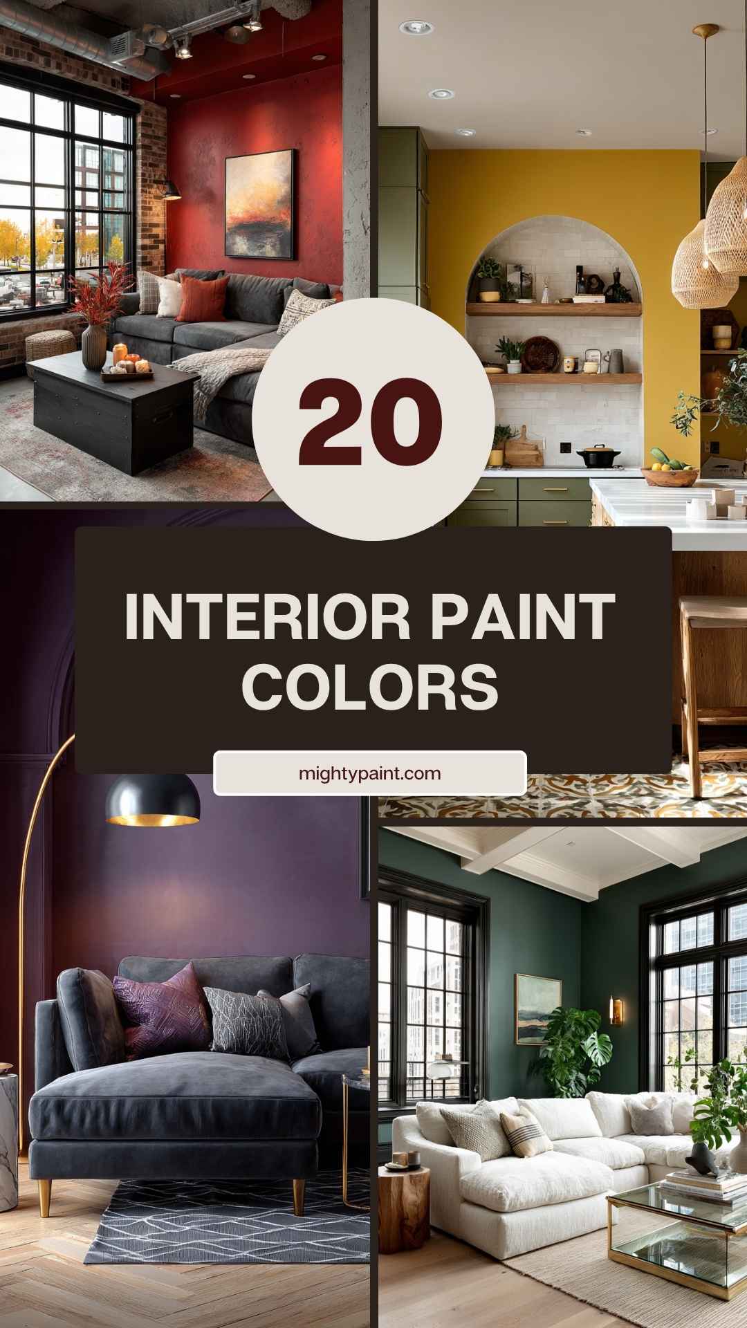
You’re in the right place to discover the top paint colors that can refresh your entire home.
Colors influence our emotions and set the mood in any room.
Whether you’re interested in classic neutrals, soothing blues, or refreshing greens, you’ll find colors that perfectly fit each room’s unique character.
Ready to explore the best paint colors that designers swear by?
Dive in and get inspired to revamp your home.
1. Skyline Steel
Skyline Steel (SW 1015) by Sherwin-Williams is a fantastic choice if you want a warm, neutral paint color.
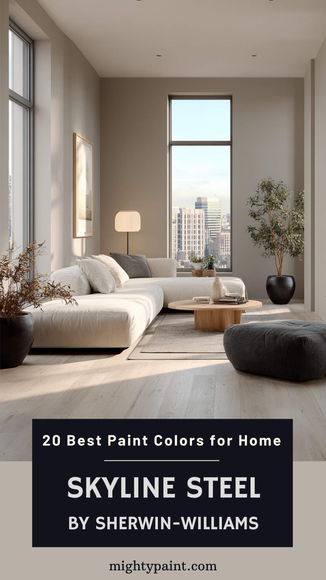
It has warm beige undertones that give it a cozy and welcoming feel.
This paint color fits perfectly in living rooms, bedrooms, and even kitchens. Its versatility makes it easy to pair with various decor styles, from modern to traditional.
Skyline Steel has a Light Reflectance Value (LRV) of 52, which means it falls between light and mid-tone colors. This makes it a great option for rooms with different lighting conditions, helping spaces feel brighter and more spacious.
Testing your paint in your own home’s lighting is always a good idea.
Colors can look different depending on light sources in each room. Skyline Steel is no exception. Swatch it on your walls to see how it interacts with your unique lighting before making a final decision.
2. Ocean Mist
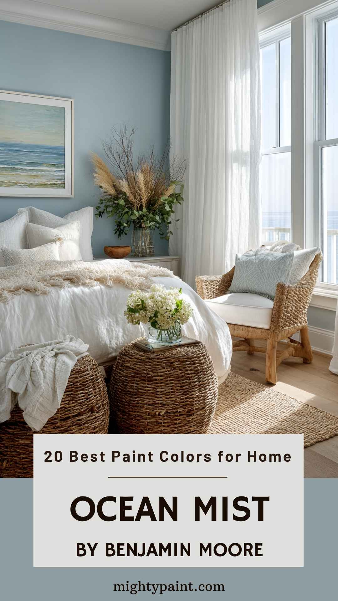
Imagine waking up every day to a room that feels like a gentle sea breeze. “Ocean Mist” is your go-to for achieving this coastal vibe.
This color is a blend of light blue with subtle yellow undertones, reminiscent of distant fogs. It brings a calm and soothing energy to any space.
Get the Fail-Safe Paint Color Playbook (Free PDF)
36 proven colors • 8 ready palettes • trim & sheen guide • printable testing cards.
Perfect for bedrooms or living rooms, this shade creates a serene atmosphere. Use it on walls, or even as an accent on furniture pieces. Pair it with whites and beige for a fresh, airy look.
Ready to bring the beach to your home? Think about adding Ocean Mist to your palette.
3. Midnight Blue
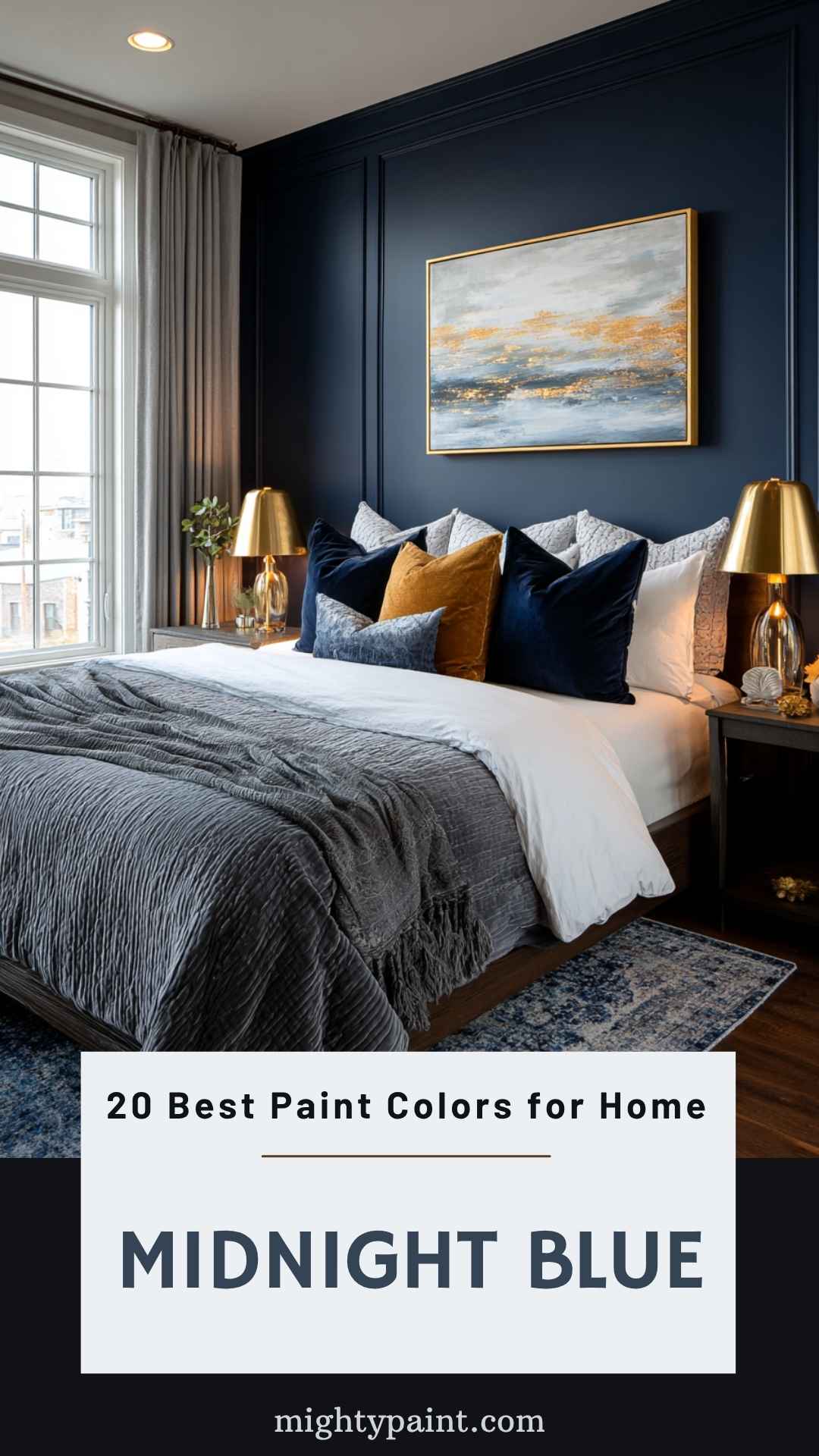
Midnight Blue is a bold and deep color that transforms your bedroom into a serene escape. This rich shade of blue is perfect for creating a calming atmosphere.
Imagine lying in bed, surrounded by the deep hues of a night sky. It’s both cozy and sophisticated, making your bedroom feel like a luxurious retreat.
Midnight Blue pairs well with lighter accents, adding contrast and interest to your space.
You can use this color for an accent wall to create a focal point, or go all out and paint every wall for an immersive experience.
Consider using white or light gray bedding to balance the depth of the blue and keep the room feeling open and inviting.
Adding metallic accents like gold or silver can elevate the elegance, giving your bedroom a touch of glamour.
4. Tuscan Sun
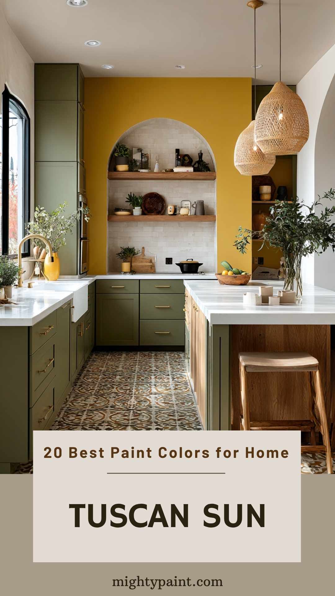
Tuscan colors are warm and inviting. Sunny Tuscan Yellow is a great example. Imagine having a paint color that makes you think of sunflowers and long sunny days. Behr’s Bicycle Yellow is perfect for this. Use it in an eating nook or on your front door. Bright yellow can make any space feel cheerful.
Another popular Tuscan color is Olive Green. This color is often seen in Italian kitchens. Deep olive green works well with gold, plums, and even purple. Picture your kitchen with these rich, earthy tones.
Then there’s the Baked Earth color. This deep brown mimics the wood beams in many Tuscan homes. It adds a dark, warm touch to any room. It’s rustic and charming.
Get the Fail-Safe Paint Color Playbook (Free PDF)
36 proven colors • 8 ready palettes • trim & sheen guide • printable testing cards.
Mix these colors with rustic elements like wood beams or stone walls. Your home will feel cozy and stylish.
5. Forest Green
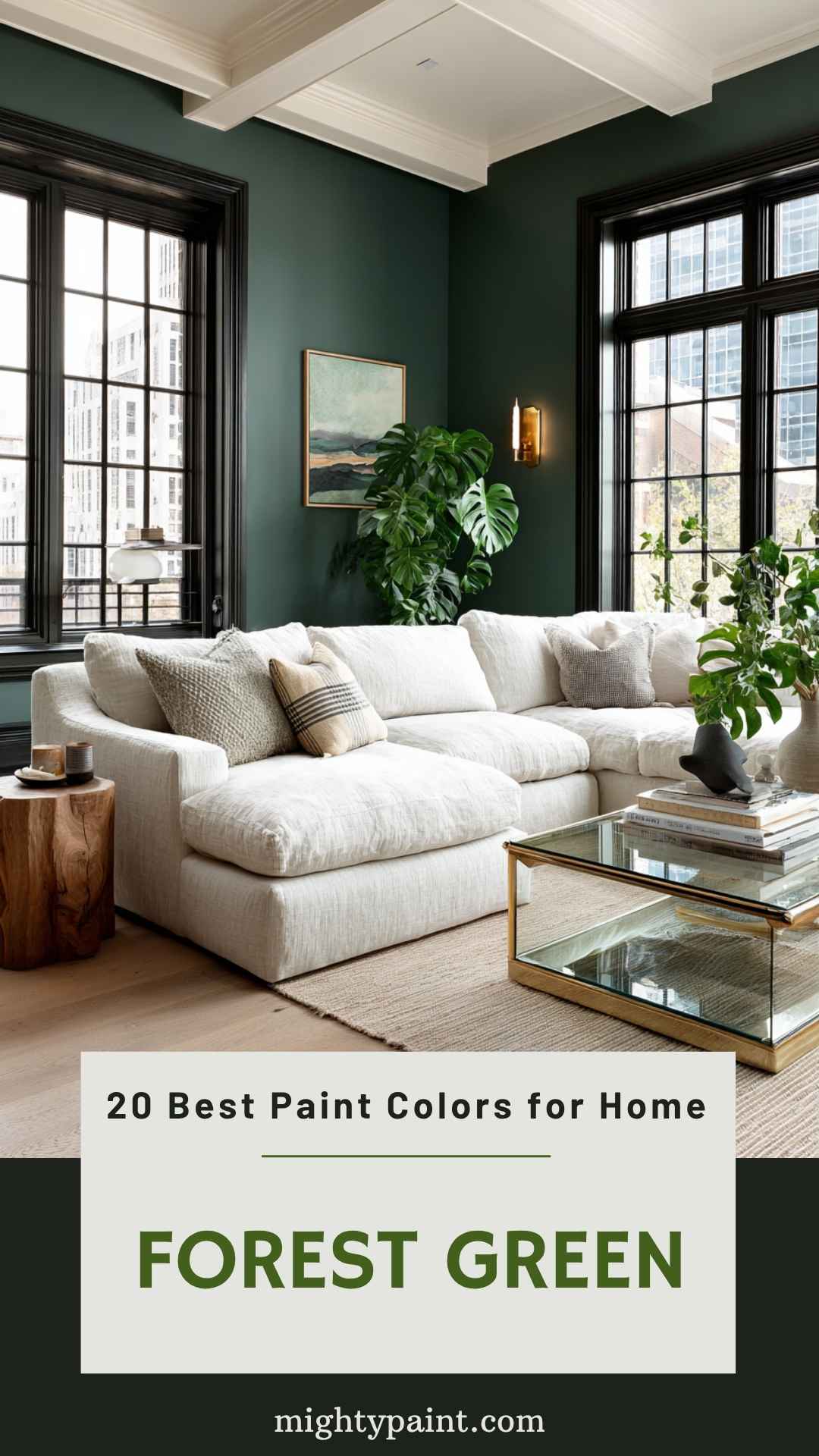
Forest Green paint colors offer a rich, deep hue that brings the lush feel of nature into your home.
Benjamin Moore’s Deep Jungle (2055-20) is a favorite choice, reflecting the dense foliage of untouched woodlands. This paint works wonders in creating a cozy yet vibrant atmosphere.
Another excellent pick is Kennebunkport by Benjamin Moore. This color brings the charm of coastal Maine straight to your walls. When paired with clean white trim, it stands out beautifully.
Use Forest Green in living rooms, bedrooms, or even kitchens for a bold, stylish look.
It combines well with natural wood tones and gold accents. You’ll find it versatile enough to suit various decor styles, from modern to rustic.
Experiment with different shades to find the perfect balance for your space. Forest Green can truly transform any room, giving it a lush, inviting feel.
6. Mystic Purple
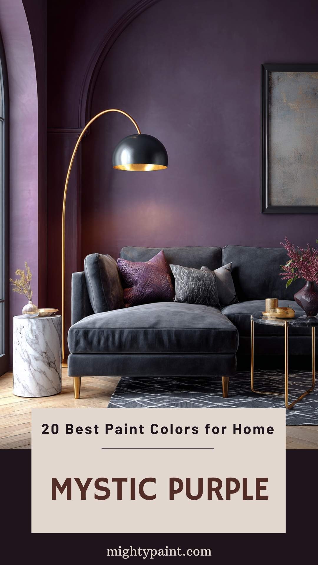
Mystic Purple brings a sense of magic to any room. Are you wondering where to use it? Your living room is a great choice. This shade works well with both traditional and modern decor.
Why not try it in your bedroom? It creates a calming and soothing atmosphere. Pair it with lighter shades for a balanced look.
Get the Fail-Safe Paint Color Playbook (Free PDF)
36 proven colors • 8 ready palettes • trim & sheen guide • printable testing cards.
Thinking about a statement wall? Mystic Purple adds drama without being too dark. It’s perfect for making a bold impression.
Would you use Mystic Purple in your home? It’s versatile and stylish, making it a favorite for many design enthusiasts.
7. Creamy Beige
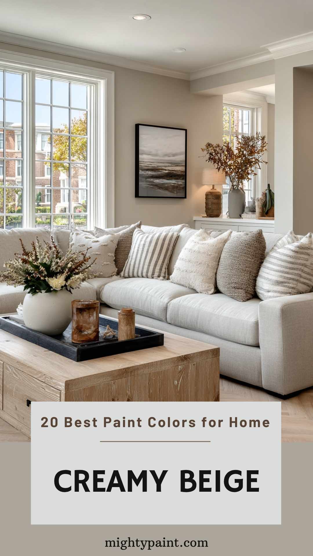
Are you looking for a paint color that offers warmth and versatility? Creamy beige might be the perfect choice for you!
Creamy beige combines the softness of cream with the neutrality of beige. This makes it a popular option for those seeking a warm yet subtle backdrop.
You can use creamy beige in any room. It’s great for living rooms, bedrooms, and even kitchens.
This color works well with most furniture styles and can make any room feel cozy and inviting.
Pairing creamy beige with white trim can create a clean, crisp look. It lets the creamy tones stand out without overwhelming the space.
Some popular creamy beige shades include Canvas by Annie Sloan and others you might find in Sherwin Williams and Benjamin Moore collections.
These shades typically have a hint of taupe, adding depth without making the room too dark.
8. Autumn Red
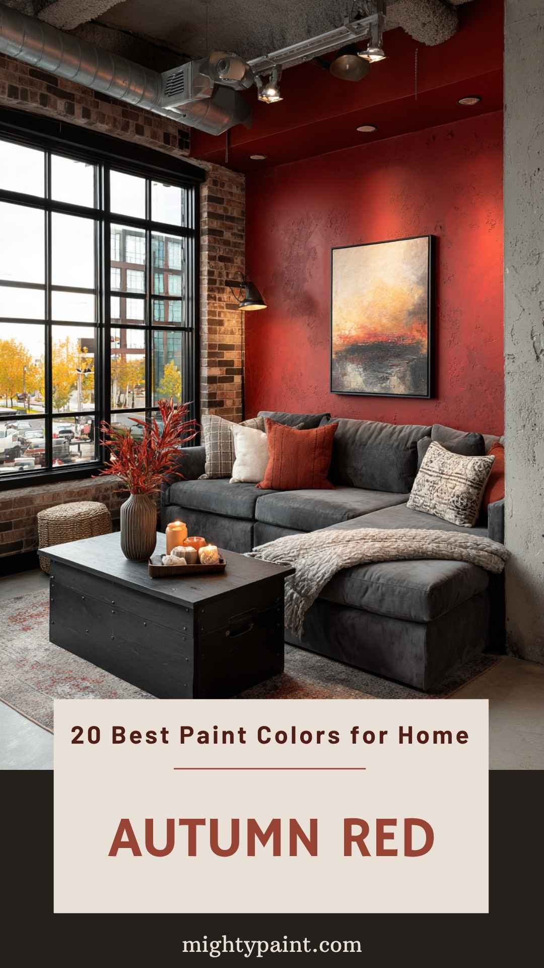
Autumn Red is a vibrant and cozy color. It mirrors the hues of fall leaves, giving your home a warm and inviting feel. Just imagine coming home to a space that feels like a crisp October day!
This color works well with white trim. The contrast makes the red pop even more. If your home has a lot of natural light, Autumn Red will shine beautifully.
You can use this color on an accent wall or paint an entire room.
Either way, it will add a bold and energetic vibe to your home. Pair it with neutral furniture for a balanced look.
Do you love seasonal décor? Autumn Red will be the perfect backdrop.
Many paint experts recommend Autumn Red for its timeless appeal. It’s a classic choice that never goes out of style.
Ready to bring a touch of autumn into your home all year round? Autumn Red might be the perfect pick for you.
9. Silent Snow
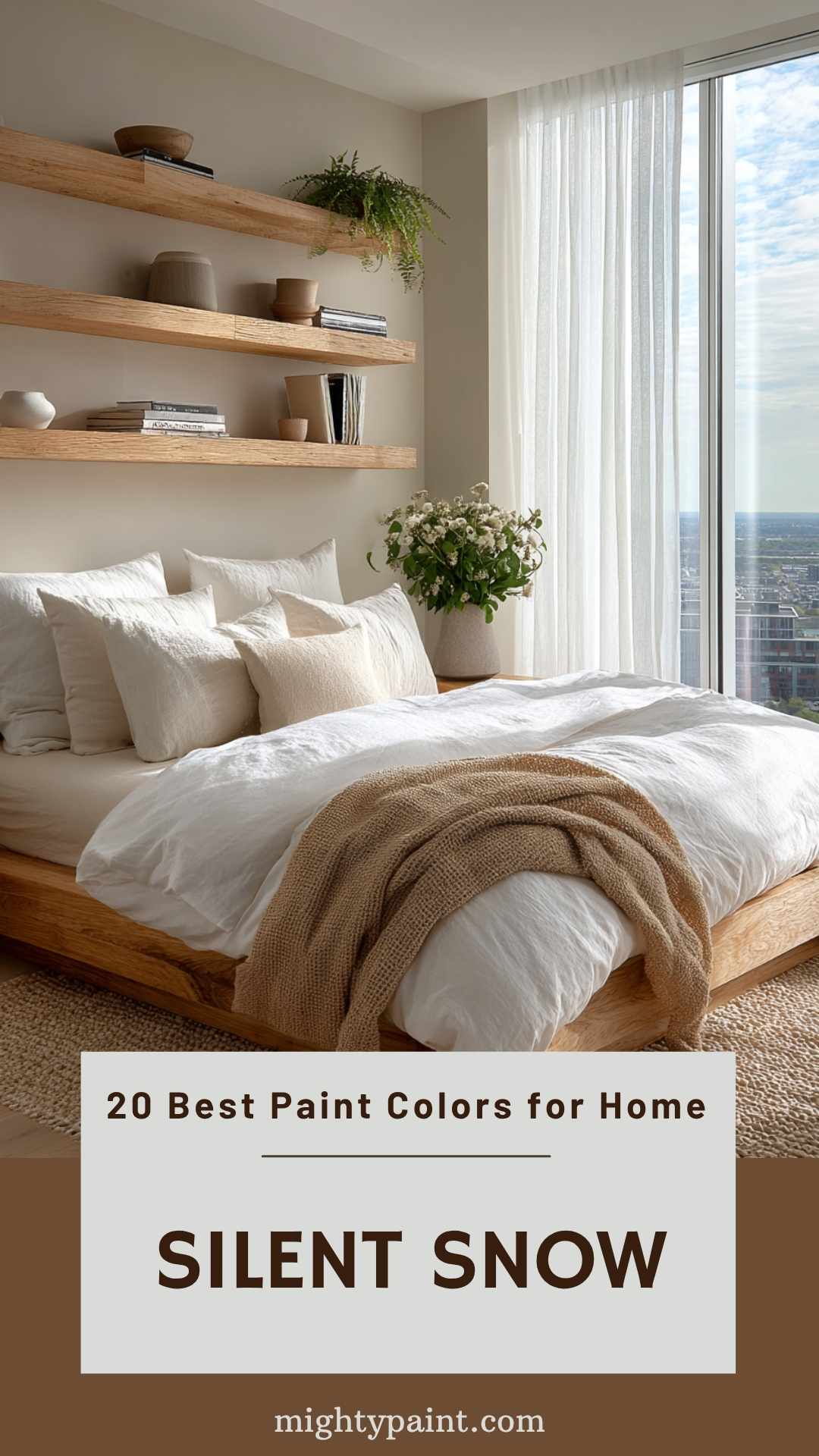
Silent Snow is perfect for creating a calm, peaceful vibe in your home.
This soft white shade works well in spaces where you want to relax, like bedrooms or living rooms.
It brings a sense of serenity and openness, making your room feel larger and more inviting.
Think about pairing Silent Snow with natural textures like wood or linen. This combination can make your home feel warm, even on the coldest days.
Does your room get a lot of natural light? Silent Snow will amplify it, brightening up the space without feeling harsh.
It’s also a versatile backdrop for any decor style, whether modern or traditional.
You can even make it pop with colorful accents or keep it subtle with neutral tones.
10. Seafoam Green
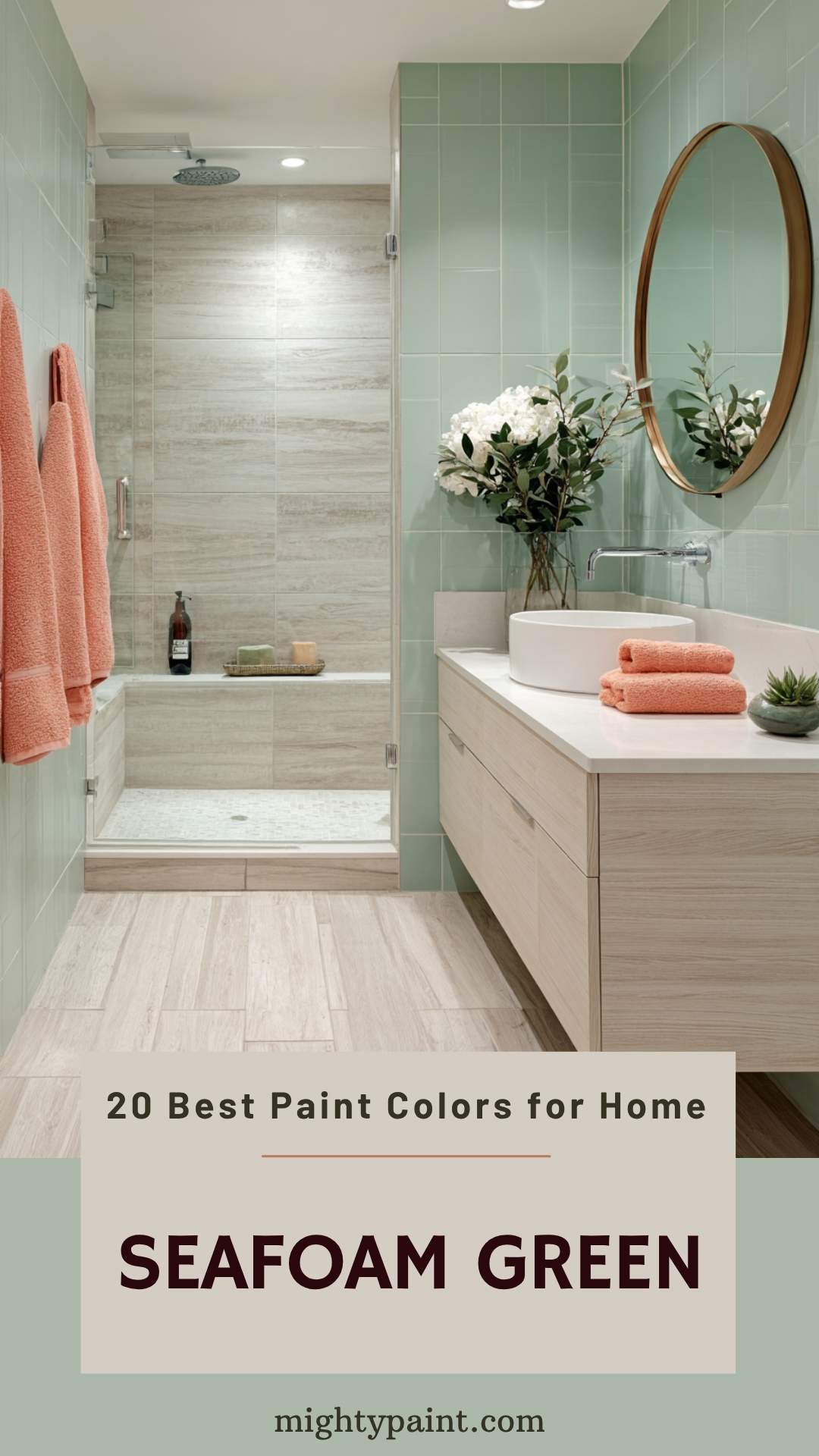
Seafoam green is a soft, muted shade of green. It’s like the gentle waves in a calm ocean. This color brings a relaxing and calming atmosphere to any room.
Want to add a pop of color? Try pairing seafoam green with coral or orange. These bright colors can make your space feel more energetic and lively.
If you prefer a more sophisticated look, combine seafoam green with navy blue. The deep blue contrasts nicely, creating a balanced and stylish palette.
For something more subtle, seafoam green works well with gray, taupe, or dusty rose. These muted tones complement seafoam green without overpowering it.
Seafoam green is versatile enough for various styles.
Whether you use it as an accent or a main color, it can fit into any design scheme comfortably. Give it a try—you might just fall in love with this soothing hue!
11. Coral Reef
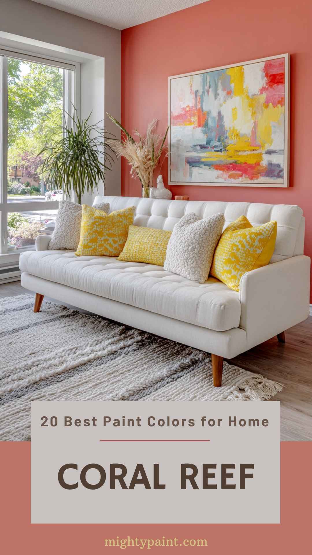
Thinking of adding a splash of color to your home? Coral Reef by Sherwin Williams might just be the answer. This warm, inviting hue has a distinctive reddish undertone. It’s softer than pure red but still packs quite a punch.
Coral Reef is versatile and works well in various rooms. Imagine it in a living room, paired with vibrant yellow pillows and lamps. It’s a cheerful, warm space that welcomes everyone in.
Many people love Coral Reef for its ability to create a cozy atmosphere. It mixes the warmth of red and the vibrancy of orange. This makes it perfect for creating a lively yet comfortable environment. Consider using it in your bedroom for a soothing yet energetic vibe.
12. Sandstone
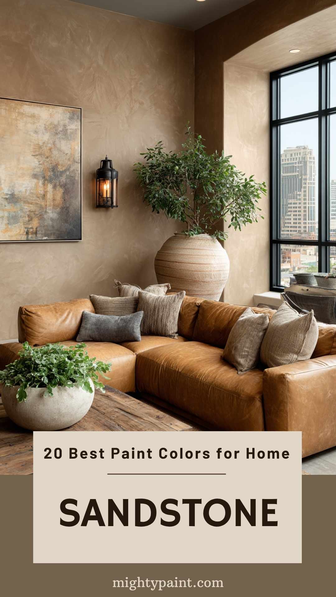
Sandstone is a natural rock with earthy tones like yellow, tan, orange, brown, and gray. These colors are great for creating a warm and inviting atmosphere in your home.
Pair earthy shades with other neutral tones like beige, taupe, and off-whites. This combination will give your space a classic and timeless feel.
For a pop of color, try vibrant hues like aqua, lime green, red, or orange. These bright colors can create an interesting contrast and bring energy to the room.
Soft greens and blues also look great with sandstone. They add a fresh, natural look to your home. Consider using turquoise, sky blue, or gentle greens to complement the muted tan of the stone.
Experimenting with different color palettes can help you find the best match for your space.
13. Amber Honey
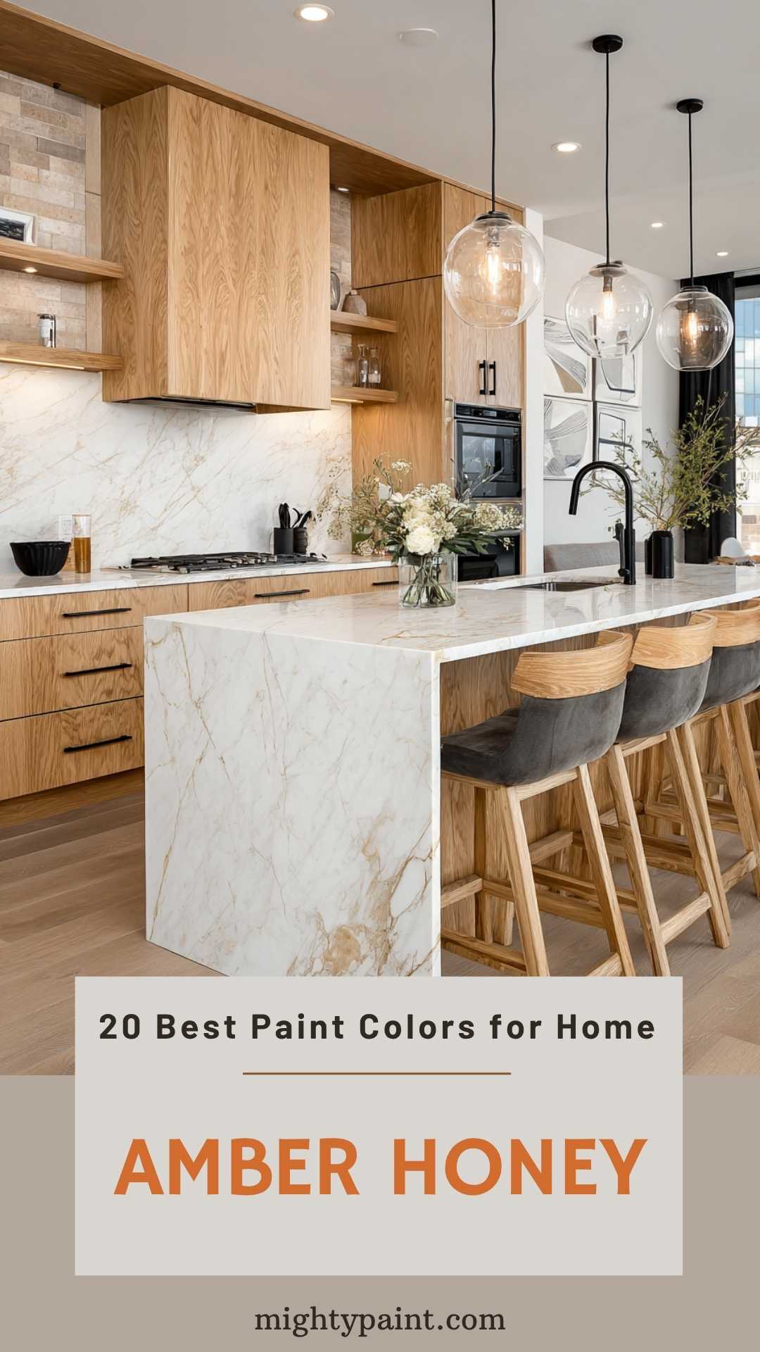
Amber Honey is a warm and inviting color that can transform any room. It’s perfect for creating a cozy atmosphere in your home.
This color pairs beautifully with natural wood tones, especially honey oak cabinets and trim. Amber Honey enhances the wood’s natural beauty without overpowering it.
Don’t be afraid to use Amber Honey in your living room or kitchen. It works well with both modern and traditional styles. Try it on a feature wall to add depth and interest to your space.
Adding Amber Honey to your home can make it feel more inviting and comfortable. Give it a try and see how it changes your space!
14. Pastel Pink
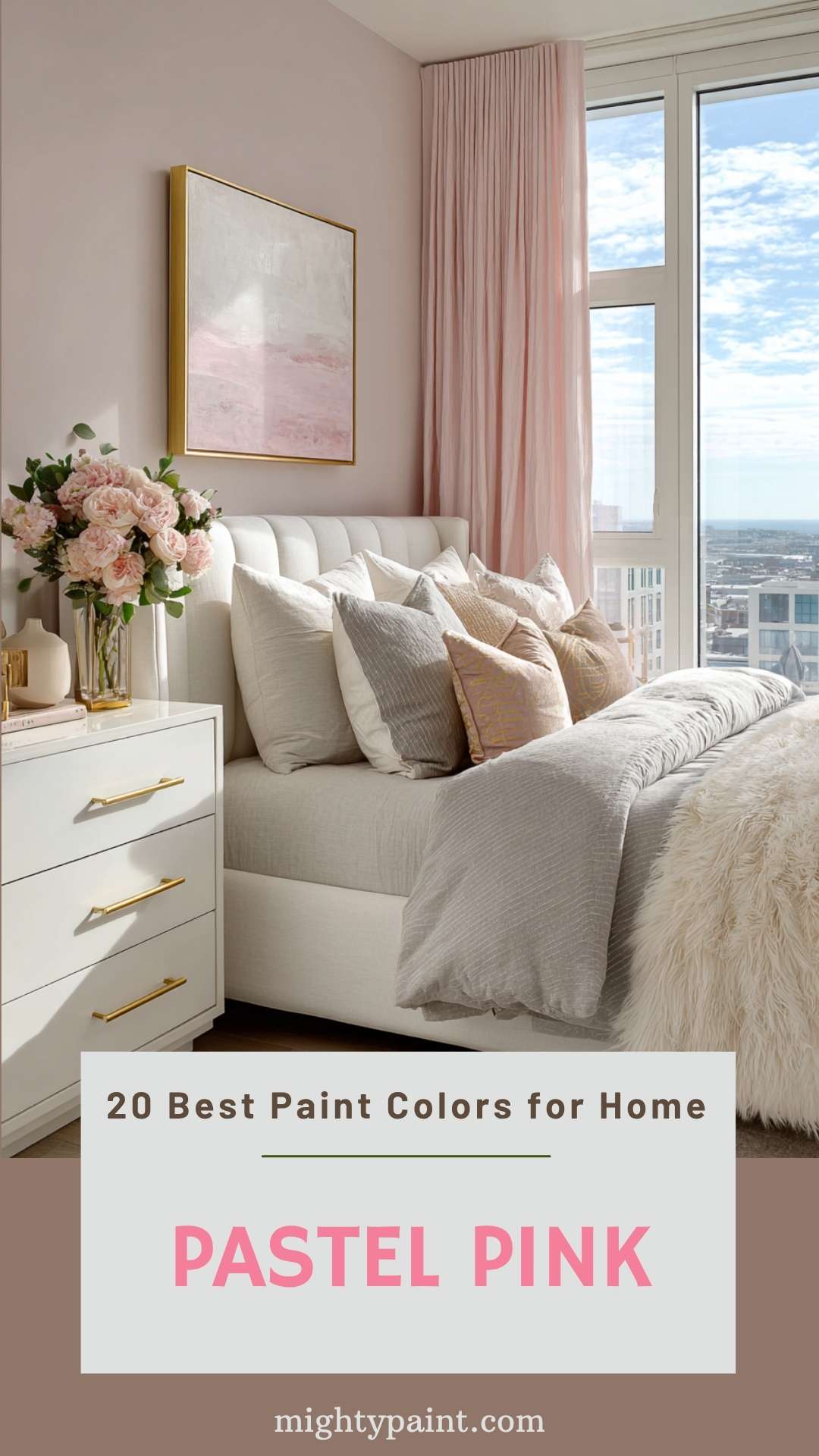
Pastel pink is a soft, soothing color that works almost anywhere in your home. It creates a warm, inviting atmosphere, perfect for living rooms or bedrooms.
Benjamin Moore’s “Melted Ice Cream” is a popular choice. Designer Shea McGee loves its delicate tone, which pairs nicely with bright whites and metallic finishes. It’s subtle enough to be used as a background without overwhelming the space.
Another favorite is Farrow & Ball’s “Sulking Room Pink.” Don’t be fooled if it looks brown at first; it dries into a deep, muted rose with a chalky finish. This color adds sophistication to any room, making it a versatile option for all sorts of interior styles.
Pastel pink walls can brighten up a home office, like in the example from Better Homes & Gardens. Pairing this color with white trim and black-and-gold accents creates a polished, feminine look.
Pastel pink is not just for nurseries or children’s rooms. It brings a touch of elegance and calm to your home, making it a timeless choice.
15. Lavender Field
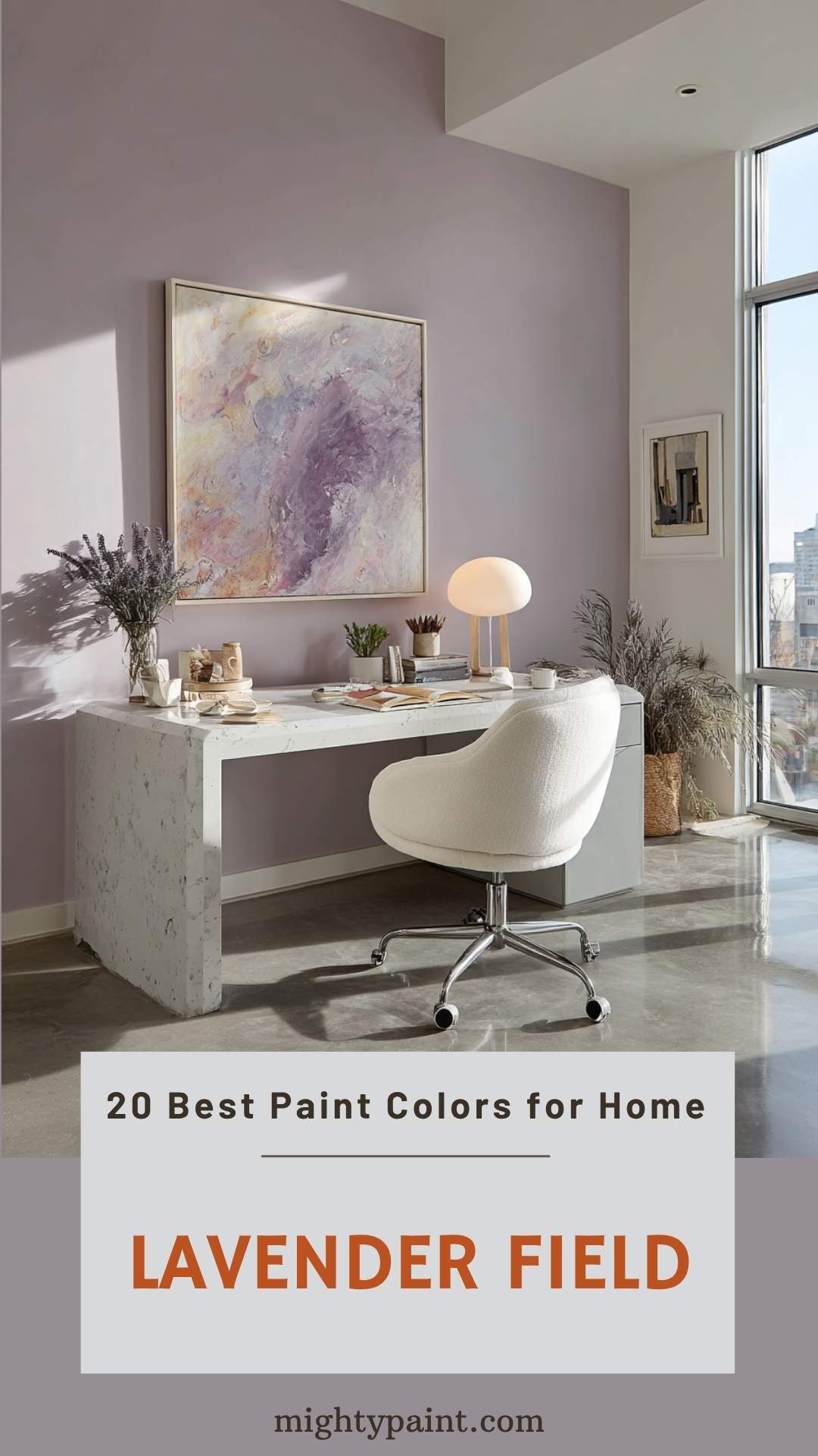
Is there anything more calming than a field of lavender? Using lavender paint like “Peignoir” from Farrow & Ball can bring a sense of calm into your home. This color works well in bedrooms and living rooms.
Pairing it with colors like white or soft gray can create a serene space. Lavender matches well with these shades, making your room feel fresh and airy.
You can also try “Queen’s Wreath” by Benjamin Moore for a slightly bolder look. It’s a great way to add some personality without overwhelming the space.
For a more neutral blend, “Dove Tale” from Farrow & Ball offers a subtle hint of lavender. It’s perfect if you prefer understated elegance. Adding lavender to your home is a simple way to refresh any room and invite tranquility.
16. Charcoal Gray
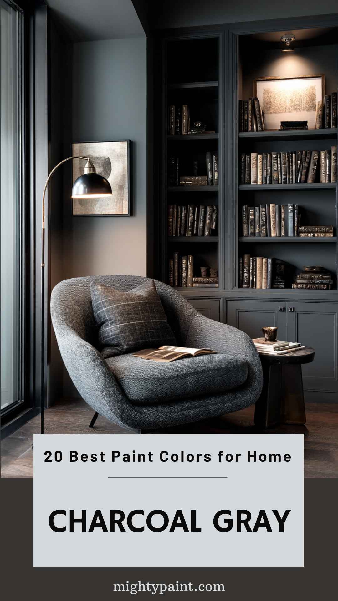
Charcoal Gray is a versatile, dramatic color that can add depth to any room. It has different shades and undertones, making it suitable for various styles.
One popular option is Benjamin Moore’s Overcoat CC-544. This shade has a strong violet undertone that makes it perfect for feature walls.
Another great pick is Chelsea Gray by Benjamin Moore. This warm charcoal gray, with taupe undertones, works well especially with metal accents.
For a deep earthy tone, consider Kendall Charcoal. This dark gray shade, warmed by yellow and green undertones, pairs beautifully with crisp or creamy whites.
Sherwin-Williams’ Rock Bottom is another excellent choice. It’s a dark green-gray that brings a moody aesthetic, resembling stones in a riverbed.
17. Whispering Willow
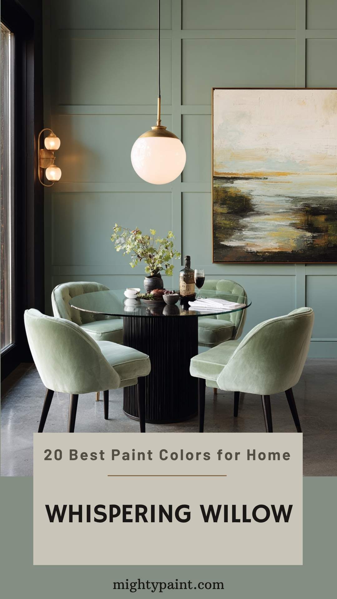
Whispering Willow is a versatile paint color that adds a calm vibe to any room. It combines a midtone gray with a hint of tree branch yellow. This mix creates an earthy undertone that’s perfect for a cozy dining room.
Imagine sitting down to dinner in a room painted with Whispering Willow. The color pairs beautifully with light-tinted greens on adjoining walls.
This paint color comes from PPG and is known for its neutral qualities, making it easy to match with various décor styles. Plus, it’s part of the Historic Color Family by Vista Paint, adding a touch of timeless charm.
Give Whispering Willow a shot for your next painting project. You’ll love how it transforms your space into a serene retreat.
18. Daffodil Yellow
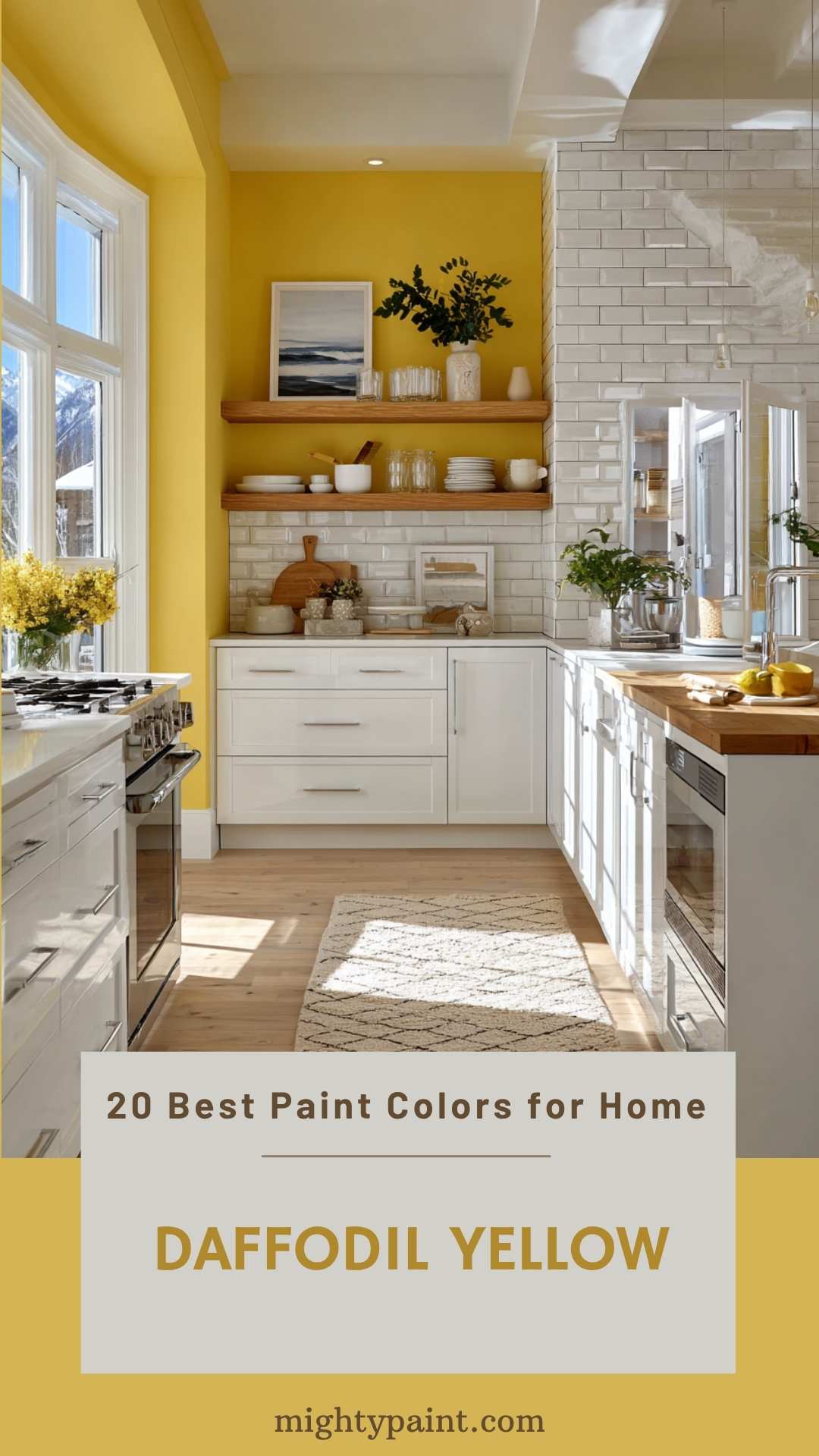
Imagine walking into a room painted in Daffodil Yellow. This cheerful shade, also known as Sherwin-Williams SW 6901, brings warmth and brightness to any space. It’s got an HSL code of 45, 93%, 73%, which means it leans toward a warm yellow.
Daffodil Yellow works great in spaces where you want to create a sunny and inviting atmosphere, like kitchens or living rooms. Its vibrant tone can make even the dullest day feel a bit brighter. Plus, it’s versatile enough to pair well with both modern and traditional decor.
Don’t just take our word for it—many interior designers love this shade too. Because of its lively vibe, it’s perfect for accents like pillows and rugs, helping you tie the room together. Go ahead, try Daffodil Yellow, and you might just fall in love with it.
Get the Fail-Safe Paint Color Playbook (Free PDF)
36 proven colors • 8 ready palettes • trim & sheen guide • printable testing cards.
19. Olive Branch
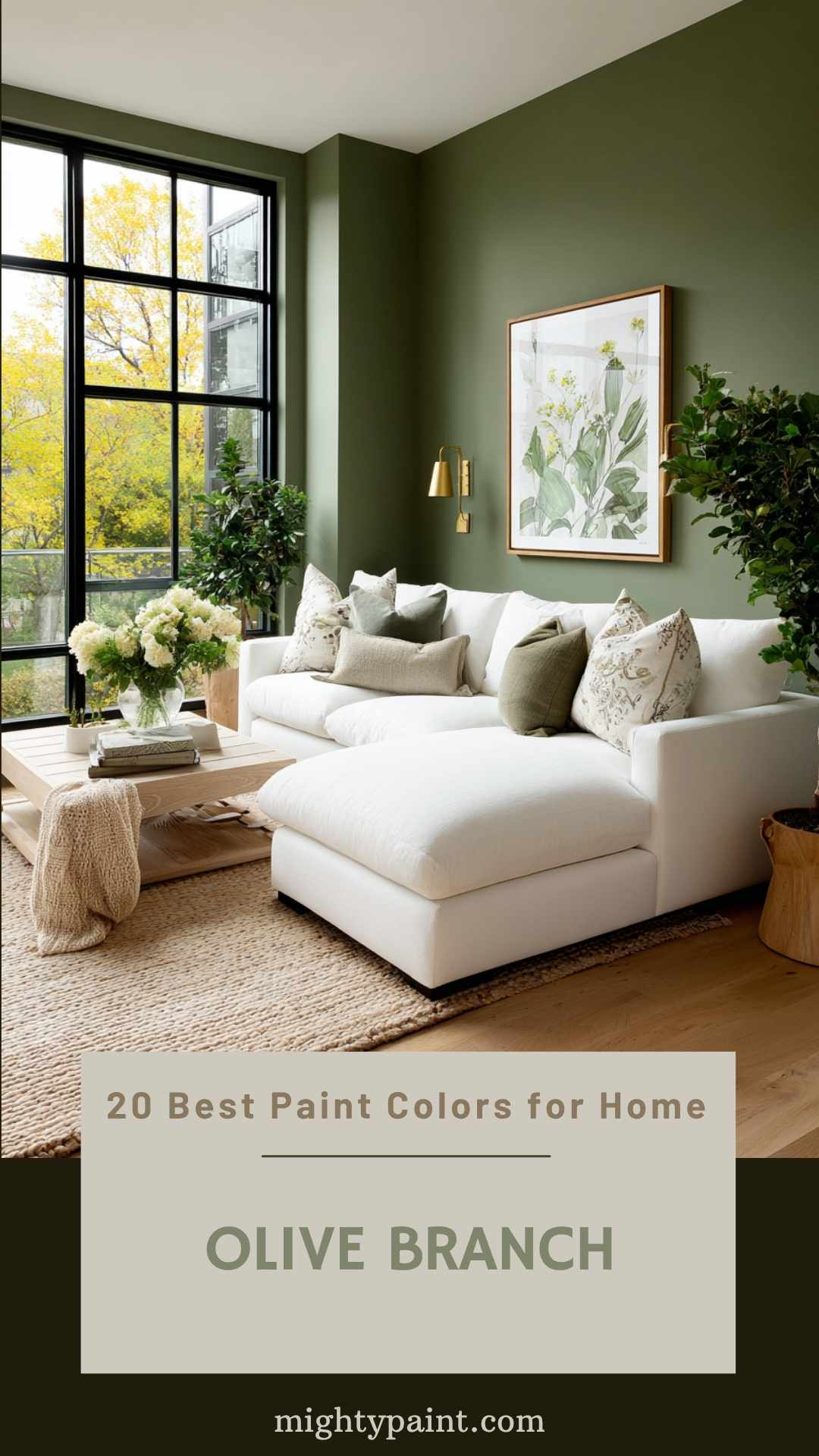
Olive Branch by Benjamin Moore (2143-30) is a cozy, warm green that can transform even large rooms.
Unlike some greens that can feel cold, Olive Branch has golden undertones, making spaces feel intimate and inviting.
Paint experts often recommend it for living rooms, bedrooms, and even kitchen cabinets. It’s perfect if you’re looking to add a touch of nature indoors. Try using it on an accent wall for a pop of color, or go bold and paint an entire room.
20. Dove Gray
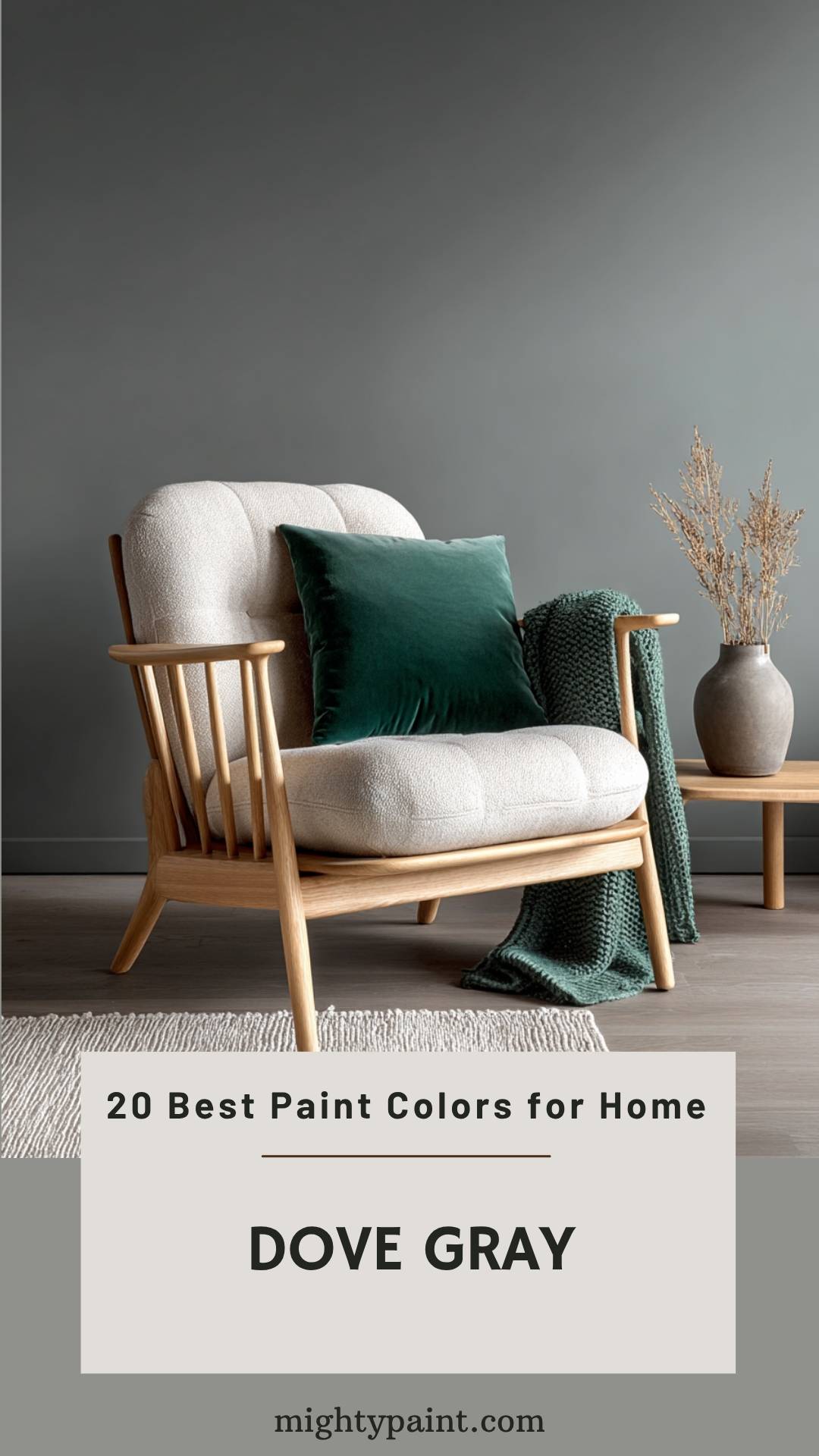
Dove gray is a versatile and soothing color that fits nearly any room in your home. Its subtle shade pairs well with a variety of color schemes making it a favorite among interior designers.
Why Dove Gray? This color creates a calm and peaceful atmosphere. It’s perfect for living rooms, bedrooms, or even kitchens where you want a relaxed vibe.
Pair dove gray with emerald green for a vibrant yet balanced look. The green brings energy, while dove gray tones it down, creating a stylish space.
For a softer look, try combining dove gray with natural elements like wood, linen, or leather. This creates a warm and inviting feel that’s perfect for cozy spots like reading nooks or family rooms.
Looking for a paint recommendation? Consider Classic Gray OC-23 by Benjamin Moore. It’s a neutral that adapts to any room making it versatile and easy to use.
Choosing the Right Paint Color
Picking the perfect paint color for your home involves understanding how different shades affect mood and how natural light can alter them. Let’s explore these key points to help you make the best choice.
Understanding Color Psychology
Colors can impact how you feel in a room. Warm colors like reds, oranges, and yellows can make spaces feel cozy and welcoming. For example, a bold red can add energy to a dining room, making it a lively space for gatherings.
Cool colors like blues, greens, and purples bring calmness and relaxation. A soft blue might be perfect for a bedroom, offering a sense of peace and tranquility.
Neutral colors such as grays, whites, and beiges provide a versatile backdrop. These can be especially useful in areas like living rooms or hallways where you might not want the wall color to overpower your decor.
Considering how a color makes you feel can be a crucial step in choosing the right paint for each room.
Considering Natural Light
Natural light greatly influences how paint colors look. Rooms with lots of sunlight can handle darker shades since the light keeps them from feeling too gloomy. For example, a sunny living room might benefit from a deep forest green or navy blue, giving it a sophisticated touch.
In contrast, rooms with little natural light may appear smaller and darker with bold colors. In these spaces, choosing lighter shades like pale pinks or light grays can help make them feel more open and bright.
The direction your windows face also matters. North-facing rooms get cooler, bluish light, making warm colors work better to balance the coldness. South-facing rooms receive warm, yellowish light, which can brighten up cool colors.
Remember to always test paint samples on your walls and observe them at different times of the day to see how the changing light affects the color. It can make all the difference in ensuring you choose the right paint color for your space.
Tips for Testing Paint Colors
When testing paint colors, using paint samples and exploring different shades will help you find the perfect shade for your home. Gather a variety of samples and tools to visualize how each color will appear in your space.
Using Paint Samples
Testing paint samples directly on the wall is key. Paint small sections of the wall to see how colors look in natural and artificial light. Don’t use white boards; colors may look different compared to your actual wall.
Get the Fail-Safe Paint Color Playbook (Free PDF)
36 proven colors • 8 ready palettes • trim & sheen guide • printable testing cards.
Buy small sample pots of various colors. Then, paint a large piece of poster board or foam core with two coats of each sample. Double-stick tape can help adhere these to your wall temporarily. Move the samples around the room to see them in different areas and lighting.
Trying Different Shades
Sampling similar shades can uncover subtle differences. Sometimes, the slightest variation can make a world of difference in your room’s atmosphere.
Get samples of at least three shades closer to the one you’re considering. Then, use a paint visualizer tool to try colors virtually before committing.
This helps you narrow down choices without buying too many samples. Remember, colors can look different under various lighting conditions, so check shades in the morning, afternoon, and evening light.
