
What Color To Paint Walls With Light Grey Couch
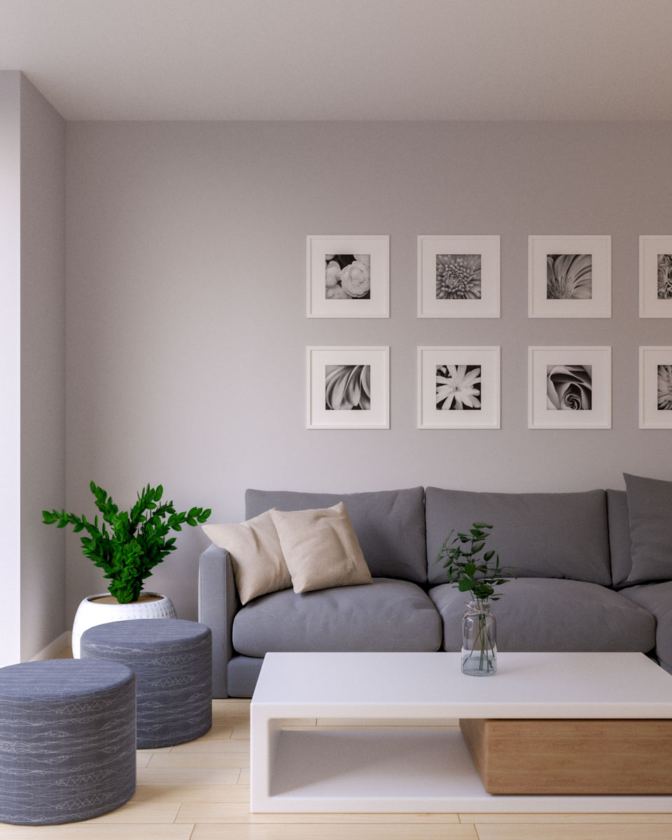
Choosing the right wall color to complement a light grey couch is one of the most rewarding—and sometimes daunting—decisions in home decor. The couch, being a large, neutral piece, acts like a sophisticated blank canvas, giving you incredible flexibility. However, because light grey is inherently versatile, it can also be confusing, making it hard to know if a color will feel harmonious or clash with the piece.
The goal is not just to pick a color that “looks nice” next to the couch, but to select a shade that enhances the entire room’s atmosphere, complements your existing furniture (like wood tones and metals), and interacts beautifully with the natural light. With a comprehensive plan, we can guide you through the theory, the practical steps, and the finishes needed to create a cohesive, stunning space.
Get the Fail-Safe Paint Color Playbook (Free PDF)
36 proven colors • 8 ready palettes • trim & sheen guide • printable testing cards.
Quick answer: The right color depends on lighting, undertones, surrounding finishes, room size, exterior exposure, and the mood you want. Test samples in real light before committing, because paint can look very different on the wall than it does on a chip.
Planning Your Palette: Understanding Your Variables
Before you even look at paint chips, you must gather three pieces of information: the undertone of the couch, the quality of the light, and the function of the room. These three variables are the foundation of a successful color pairing.
Identifying the Couch’s Undertone
Light grey is not a single color; it contains hidden pigments. Knowing if your couch leans cool or warm is the most critical step. A cool undertone will have hints of blue or green, while a warm undertone will have hints of beige, taupe, or brown. The wall color you choose must either reinforce this undertone or provide a deliberate, complementary contrast.
- If the couch is Cool-Toned (Blue/Green hints): Opt for cool wall colors (soft blues, sage greens, or deep charcoals) to maintain a serene, crisp atmosphere.
- If the couch is Warm-Toned (Beige/Brown hints): Opt for warm wall colors (creams, taupes, soft terracotta, or deep olive) to maintain a cozy, inviting feel.
Assessing Natural Light Direction
The direction your room faces dictates the color temperature and intensity of the light, which radically changes how any paint color appears. This is non-negotiable: a color that looks perfect on a chip can look sickly green or muddy in the actual room.
- North-Facing Rooms: Receive consistent, cool, indirect light. These rooms often benefit from warm tones (creams, pale yellows, soft taupe) to counteract the natural coolness and prevent the space from feeling cold or sterile.
- South-Facing Rooms: Receive intense, warm, and consistent light throughout the day. These rooms can handle cooler, crisp colors (slate blue, soft grey) because the light itself is so vibrant.
- East-Facing Rooms: Get gentle, cool light in the morning and warm light in the afternoon. Neutral, balanced colors (greige, mushroom) work best, allowing the room to transition smoothly from cool to warm.
- West-Facing Rooms: Receive intense, dramatic, and warm light in the afternoon/evening. These rooms can handle deep, rich jewel tones (navy, emerald) that look incredible in the golden hour, but be careful, as the intense warmth can wash out pale colors.
Choosing the Perfect Wall Color Palettes
Once you understand your undertones and light, you can narrow down your options. Here, we explore the best color families to build around your light grey couch, ranging from safe bets to dramatic statements.
| Wall Color | Description |
|---|---|
| Off-White | Off-white hues, such as ivory or cream, enhance the elegance and brightness of a light grey couch. They create a clean and sophisticated aesthetic, perfect for a contemporary or minimalist style. |
| Cream | Cream-colored walls add warmth and create a cozy ambiance in the room. This choice works well if you prefer a softer and more inviting atmosphere. |
| Beige | Beige is a versatile neutral that acts as a canvas for various décor styles. It provides a warm and earthy backdrop, allowing you to play with different accent colors and textures. |
Complementary Neutrals: The Safe & Elegant Choice
Neutrals are the easiest pairing because they are designed to blend, allowing the couch and any art or textiles to provide the main pops of color. The key here is avoiding “muddy” neutrals—the mix of beige and grey that looks dull.
- Greige (Grey + Beige): This is perhaps the most popular pairing. If your light grey couch has warm undertones, a light greige wall will feel seamless and sophisticated. For a cooler couch, choose a greige that leans more towards the blue-grey side.
- Off-White/Cream: Instead of stark white (which can look harsh), opt for creamy off-whites. These mimic natural bone color and reflect light beautifully, making the space feel airy while still providing depth against the grey upholstery.
- Taupe/Mushroom: These medium-toned neutrals are excellent for grounding a room, especially in living spaces. They add warmth without the commitment of a full color, pairing beautifully with natural wood furniture.
Monochromatic Shades: The Minimalist Approach
Creating a monochromatic palette means using varying shades of the same color (e.g., light grey, medium slate, deep charcoal). This technique provides continuity and depth without introducing visual conflict. This works exceptionally well in modern, minimalist, or Scandinavian-inspired spaces.
- The Effect: The space feels unified and sophisticated. The shift in shade, rather than hue, provides the visual interest.
- Execution Tip: To prevent the room from looking flat, vary the *texture* or the *sheen* of the paint across different surfaces (e.g., matte walls, satin trim).
Warm Tones: For Coziness and Inviting Spaces
If your goal is a cozy, enveloping, or rustic feel (perfect for a reading nook or den), warm tones are ideal. They counteract the inherent coolness of the grey couch, adding a welcoming glow.
| Wall Color | Description |
|---|---|
| Light Grey | Opting for a lighter shade of grey for the walls emphasizes the couch as the focal point. This monochromatic approach creates a serene and sophisticated ambiance. |
| Charcoal Grey | To add depth and contrast, consider painting the walls in a deeper charcoal grey. This creates a striking visual effect and can work well in modern or industrial-style spaces. |
| Silver | For a touch of glamour and sophistication, silver-toned walls can be a captivating choice. This metallic shade adds a subtle shimmer and a sense of luxury to the room. |
- Soft Sage Green: This is a highly versatile choice. Sage green is inherently calming and works across multiple styles. It adds a natural, organic element that feels fresh without being overpowering.
- Terracotta/Dusty Rose: These muted, earthy reds and pinks bring a Mediterranean warmth. They pair exceptionally well with light grey and natural wood accents, creating a warm, artistic ambiance.
- Mustard Yellow (Used Sparingly): Yellow is a high-impact color. If using it, restrict it to a deep mustard or ochre on a single accent wall, as pure yellow can feel too overwhelming.
Cool Tones: For Serene and Modern Vibes
If you are aiming for a calm, airy, or dramatic museum-like feel, cool tones are your best bet. They maximize the perception of space and tranquility.
- Pale Blue/Periwinkle: Blues are classic pairings for grey. A very pale, desaturated blue (like a robin’s egg blue) evokes the sky and brings a sense of serene calm, perfect for bedrooms or bathrooms.
- Slate Blue/Steel Blue: These deeper, muted blues work wonderfully on accent walls and add depth. They look particularly dramatic in rooms with high ceilings or abundant natural light.
- Seafoam Green: This light, blue-green tone is refreshing and modern. It works well to brighten a room without resorting to stark white, pairing beautifully with chrome or nickel hardware.
Bold Accents: Adding Personality and Drama
Bold colors should be used intentionally. They should act as a punch of personality, not as the main wall color. The light grey couch is perfect for this, as it allows the bold color to be the focal point while remaining anchored by the neutral furniture.
- Navy Blue: A timeless choice. A deep navy accent wall paired with a light grey couch and brass/gold accents creates a sense of tailored luxury and depth.
- Emerald Green: This jewel tone is rich and luxurious. It pairs beautifully with gold metals and deep wood tones, making it ideal for a formal living room.
- Deep Plum/Indigo: These colors work well in rooms with limited natural light, as they absorb and reflect the ambient light in a rich, dramatic way.
Selecting the Right Finish and Sheen
The paint finish—or sheen—is often overlooked, but it profoundly impacts the perceived color and durability of the paint. It refers to how reflective the paint is.
| Wall Color | Description |
|---|---|
| Soft Taupe | Soft taupe walls create a soothing and balanced environment. This warm, earthy shade pairs well with light grey and promotes a relaxed and inviting atmosphere. |
| Light Warm Grey | As the name suggests, this shade of warm grey strikes a delicate balance between warmth and neutrality. It adds a touch of coziness without overpowering the room. |
| Pale Yellow | If you’re looking to introduce a cheerful and sunny feel to the space, consider painting the walls in a pale yellow hue. This warm and inviting color creates a vibrant and energetic ambiance, especially when combined with a light grey couch. |
Paint Finish Comparison Chart
- Matte/Flat:
Appearance: Non-reflective, velvety, and absorbs light.
Best For: Living room walls, bedroom walls, and any area where you want a sophisticated, soft, non-glare look.
Pros: Hides imperfections, provides depth.
Cons: Not highly durable; prone to scuffing if bumped often. - Eggshell/Satin:
Appearance: A slight, subtle glow; semi-reflective.
Best For: Living rooms, dining rooms, and areas with moderate traffic. This is the most recommended finish for general walls.
Pros: Easier to clean than matte, maintains a soft look.
Cons: Can highlight imperfections slightly more than matte. - Semi-Gloss:
Appearance: High shine, very reflective.
Best For: Trim, baseboards, doors, and wainscoting.
Pros: Extremely durable, highly washable, and resistant to moisture.
Cons: Highly reflective, emphasizes every wall flaw (patching, drips, etc.).
Materials and Tools for Preparation
A perfect paint color is useless if the surface isn’t properly prepared. Dedicating time to prep work is the single most important factor in achieving a professional, flawless finish.
| Wall Color | Description |
|---|---|
| Soft Blue | Painting the walls in a soft blue shade brings a calming and serene vibe to the room. This cool color complements the light grey couch beautifully and promotes a peaceful atmosphere. |
| Pale Green | If you’re drawn to nature-inspired palettes, consider pale green walls. This color creates a connection with the outdoors, bringing a sense of freshness and vitality into the space. |
| Lavender | For a touch of elegance and femininity, lavender walls can be a captivating choice. This soft and sophisticated color adds a subtle pop while maintaining a serene and relaxing ambiance. |
- Cleaning: Wash all surfaces (walls, trim) with a mild detergent solution and rinse thoroughly. Grease and dirt prevent proper paint adhesion.
- Repairing: Patch all holes and cracks with spackle or drywall compound. Sand the patches smooth, feathering the edges out so the repair is invisible.
- Priming: Use a high-quality primer (especially if painting over a drastically different color or porous surface). Primer seals the surface, ensuring the paint adheres evenly and prevents the old color from bleeding through.
- Tools: You will need high-quality painter’s tape (to mask trim and edges), drop cloths (to protect floors), a roller frame and appropriate nap roller (the nap size depends on the texture of the wall), and angled sash brushes for “cutting in” the edges.
Mistakes and Misconceptions to Avoid
Even with the best intentions, DIY painting can run into common pitfalls. Recognizing these mistakes will save you time, money, and frustration.
| Wall Color | Description |
|---|---|
| Navy Blue | Painting an accent wall in navy blue can create a dramatic and modern look. The deep contrast against the light grey couch brings depth and visual interest to the room. |
| Deep Plum | Infuse richness and a touch of luxury by opting for a deep plum accent wall. This bold color choice creates a captivating focal point and adds a sense of opulence to the space. |
| Emerald Green | If you’re seeking a vibrant pop of color, consider painting an accent wall in emerald green. This lush and energetic hue adds freshness and a dynamic feel to the room. |
- Ignoring Existing Elements: Never pick a wall color that only looks good next to the couch. You must consider the wood tones of the floors and tables, the metal finish of the hardware (brushed brass, matte black, chrome), and the colors of any large pieces of art. These elements must be unified by the wall color.
- Underestimating the Light: Assuming a color looks the same indoors and outdoors, or under fluorescent light, is a common mistake. Always sample in the room, facing the direction of the primary natural light source.
- Choosing a Sheen for the Wrong Surface: Using a high-gloss finish on an entire wall will make the room look overly institutional and reflective. Reserve high sheen for durable trim pieces only.
- Over-Contrasting: While accent walls are fun, choosing a color that is *too* far removed from the rest of the palette (e.g., deep purple with yellow curtains) creates a jarring, mismatched look rather than a harmonious one.
Mistakes to Avoid
Do not skip assessment just because the project looks simple. Most paint, cleaning, repair, and tool-care problems come from poor prep, incompatible products, rushed drying time, or using a method that does not match the material.
Avoid working without ventilation, gloves, eye protection, or a cleanup plan when coatings, solvents, sanding dust, or business/studio supplies are involved. Test first, read manufacturer directions, and pause if the surface, tool, or client setting creates safety questions you cannot answer confidently.
Safety, Ventilation, and Professional Notes
Painting is a physical process that involves chemicals, and safety must be the top priority. Never compromise on preparation and safety measures.
- Ventilation is Key: Always open multiple windows and use fans to ensure maximum air circulation. Paint fumes, solvents, and drying chemicals require fresh air to prevent headaches and respiratory irritation.
- Protective Gear: Wear appropriate Personal Protective Equipment (PPE), including gloves, safety goggles, and a respirator mask rated for VOCs (Volatile Organic Compounds) when handling solvents or mixing paint.
- Manufacturer Guidelines: Always read and follow the manufacturer’s instructions regarding drying time, priming requirements, and necessary curing time. Do not attempt to paint over wet paint or surfaces that have not fully dried.
- When to Call a Pro: If the room requires major structural changes, involves lead paint (pre-1978 homes), or if you are dealing with extensive mold remediation, hire a licensed professional.
Achieving the Perfect Harmony
The light grey couch is a wonderful starting point because it accepts almost any color, but its versatility demands a thoughtful approach. By treating the wall color selection as a design equation—where the variables are the couch’s undertone, the room’s natural light, and your desired mood—you can move past guesswork and make a confident, informed choice. Remember that the most sophisticated rooms are not those with the most vibrant colors, but those where every element, from the paint sheen to the throw pillow, feels like it belongs together.
Start your journey by gathering those paint samples, taping off a small area, and observing the colors at sunrise, noon, and sunset. This process of real-world testing is the final, crucial step that will empower you to select a wall color that not only complements your light grey couch but truly defines the character of your home.
Frequently Asked Questions
How do I test paint samples to ensure the color looks right in my specific room?
Never rely on a small paint chip or a store sample. The key is to test large swatches (at least 2 ft x 2 ft) applied directly to the wall. Repeat this process at different times of day—test the samples in the morning, at noon, and in the evening. This process allows you to see how the color shifts under natural light, which is the single most critical factor in the final appearance of the paint.
Get the Fail-Safe Paint Color Playbook (Free PDF)
36 proven colors • 8 ready palettes • trim & sheen guide • printable testing cards.
What is the difference between matte and eggshell finishes, and which should I choose?
The difference is reflectivity. Matte/Flat finishes are non-reflective and provide a velvety, sophisticated depth, making them ideal for the main wall surfaces. Eggshell or Satin finishes are slightly more reflective and are generally the most recommended for general living areas because they offer a good balance: they are easier to wipe clean than matte paint, but they still maintain a soft, non-harsh look.
When should I hire a professional painter instead of doing the project myself?
While DIY painting is rewarding, you should call a professional if the project involves structural changes, if the home contains lead paint (pre-1978), or if the walls require extensive mold remediation. Professionals have the necessary equipment and safety certifications to handle these hazardous or complex tasks safely and correctly.
How can I select a neutral color (like greige or taupe) that doesn’t look dull or “muddy”?
The secret to avoiding muddy neutrals is matching the wall color to the undertone of your largest piece of furniture—in this case, the light grey couch. If your couch leans cool (blue/green), choose a greige that incorporates a subtle blue undertone. If your couch is warm (beige/brown), choose a greige that leans towards taupe or mushroom. Always select a neutral that has a clear undertone rather than a completely balanced, dull mix.
Conclusion
What Color To Paint Walls With Light Grey Couch works best when the plan, materials, safety steps, and finish goals all line up before work begins. Review the surface or tool condition, choose compatible products, and leave enough time for drying, cleanup, and final checks.
Use the guidance above as a practical checklist, then adjust it to the specific surface, workspace, product directions, and risk level. When the project involves fumes, damaged materials, business liability, or uncertain conditions, slow down and get qualified help before moving forward.