9 Best Paint Colors for Media Room: Top Shades to Enhance Your Viewing Experience
When creating the perfect media room, choosing the best paint color can make all the difference. You want your movie nights to feel cozy and immersive, right? The paint color you pick for your media room can greatly influence the overall ambiance and enhance your viewing experience. Finding the right shade can help minimize light reflection, making your screen the star of the show.
You might be wondering which colors are best for achieving that cinematic feel. Well, get ready to discover the top nine paint colors that can transform any space into your personal theater heaven. Each option has its unique perks that can complement any room décor and furniture, ensuring your media room isn’t just a place to watch movies, but a stylish retreat you’ll love spending time in.
Get the Fail-Safe Paint Color Playbook (Free PDF)
36 proven colors • 8 ready palettes • trim & sheen guide • printable testing cards.
1. Sherwin-Williams Tricorn Black
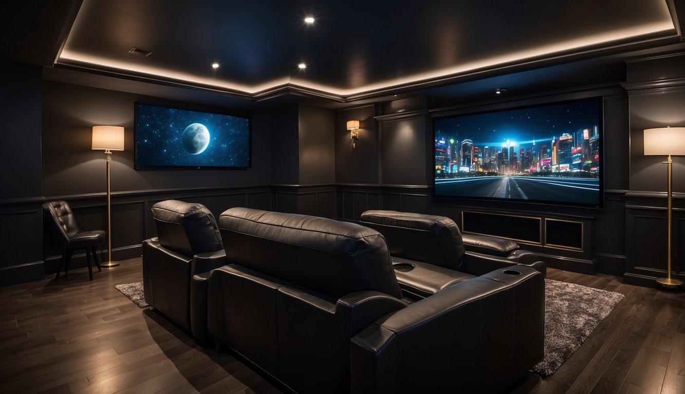
If you’re looking for a bold choice for your media room, consider Sherwin-Williams Tricorn Black (SW 6258). This color is a true black, making it perfect for creating that dark, theater-like atmosphere. With an LRV of just 3, it absorbs almost all light, minimizing reflections and immersing you in your movie experience.
Tricorn Black is well-loved by designers for its neutral undertones, meaning it won’t shift color in different lighting. This makes it a reliable choice whether your media room gets lots of sunlight or stays pretty dark.
This paint is not just for walls; it’s also a popular option for trim and doors. It pairs well with almost any decor style, from modern to classic. If you want an intense, dramatic look, Tricorn Black might be your best friend.
2. Benjamin Moore Hale Navy
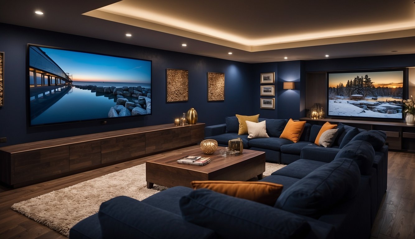
Benjamin Moore Hale Navy (HC-154) is a popular choice for media rooms. Its rich navy shade brings a calming, inviting vibe to the space.
Hale Navy has a Light Reflectance Value (LRV) of 6.3, making it slightly lighter than similar shades like Polo Blue. This is great if your media room doesn’t get a lot of natural light.
This color doesn’t have typical violet or green undertones. Instead, it maintains a true navy appearance, which can look more vibrant in south-facing rooms. In north-facing rooms, it might appear bolder and darker, with gray undertones becoming more apparent.
The cool nature of Hale Navy ensures it fits well in many settings, enhancing the atmosphere without clashing with other elements. It’s perfect for creating that cinema-like feel in your media room.
3. Farrow & Ball Hague Blue
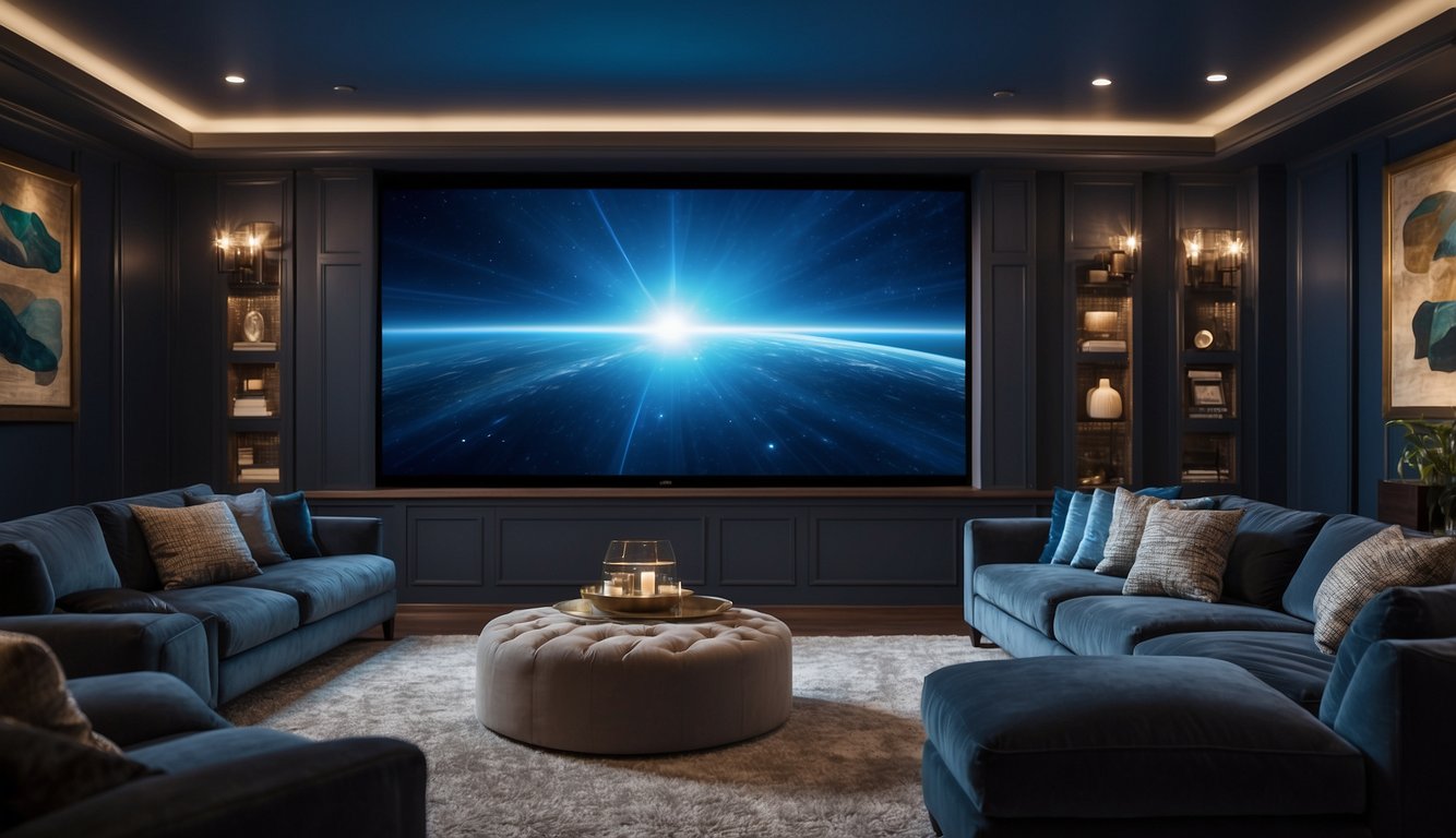
Looking for a deep, rich color for your media room? Farrow & Ball’s Hague Blue might just be the perfect choice.
Hague Blue is a bold and moody shade. With an LRV (Light Reflectance Value) of 7, it stands out as a very dark blue. A low LRV means it absorbs most light, making it ideal for creating a cozy space.
The magic of Hague Blue lies in its versatility. It can turn your media room into a sophisticated enclave, enhancing the sense of intimacy. This color balances well with bright accents and complements various decor styles.
Moreover, this shade isn’t just for walls. You can use it on cabinets, doors, and trim to add a touch of drama. Its depth and intensity make it a great choice for a media room where you want to focus on the screen.
Give Hague Blue a try!
4. Behr Dark Cobalt Blue
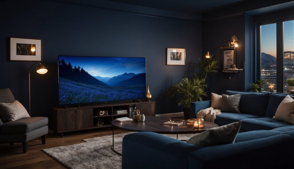
Behr Dark Cobalt Blue is a striking and bold choice for your media room. This color brings a sense of depth and richness, making any space feel more intimate and sophisticated.
Get the Fail-Safe Paint Color Playbook (Free PDF)
36 proven colors • 8 ready palettes • trim & sheen guide • printable testing cards.
Imagine sinking into your cozy chair, surrounded by the deep, intense hue of Dark Cobalt Blue. It enhances the movie-watching experience by reducing light reflection on the walls, keeping the focus on the screen.
This shade pairs beautifully with classic silver or white trim, adding contrast and interest. It also complements various furniture styles, from modern to traditional, ensuring it fits your existing decor seamlessly.
Ready to give your media room an eye-catching upgrade? Behr’s Dark Cobalt Blue might just be the perfect fit.
5. Valspar Dutch Licorice
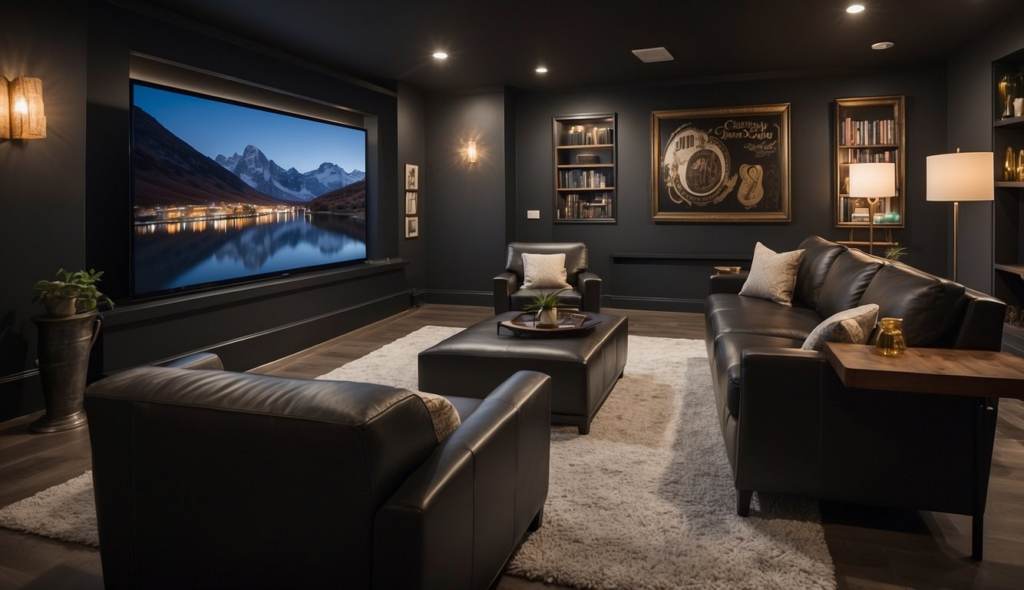
Have you heard about “Dutch Licorice” from Valspar? It’s a deep, rich navy that’s perfect for media rooms. This paint has a Light Reflective Value (LRV) of 5.82, making it excellent for creating a cozy, dark atmosphere. You want your media room dark, right? This navy can make your space feel like a true theater!
Pair Dutch Licorice with lighter furniture and decor for contrast. A light-colored couch or some bright throw pillows can pop against this stunning blue. Don’t worry, it won’t make the room feel too small if used wisely. Just make sure there’s enough light sources to balance it out.
Dutch Licorice can also work with other colors. Think about using greys or lighter blues for trim and accents. It’s versatile enough to blend with different styles, from modern to traditional. So, if you’re aiming for a sophisticated look, this color should be on your radar!
6. Dunn-Edwards Black
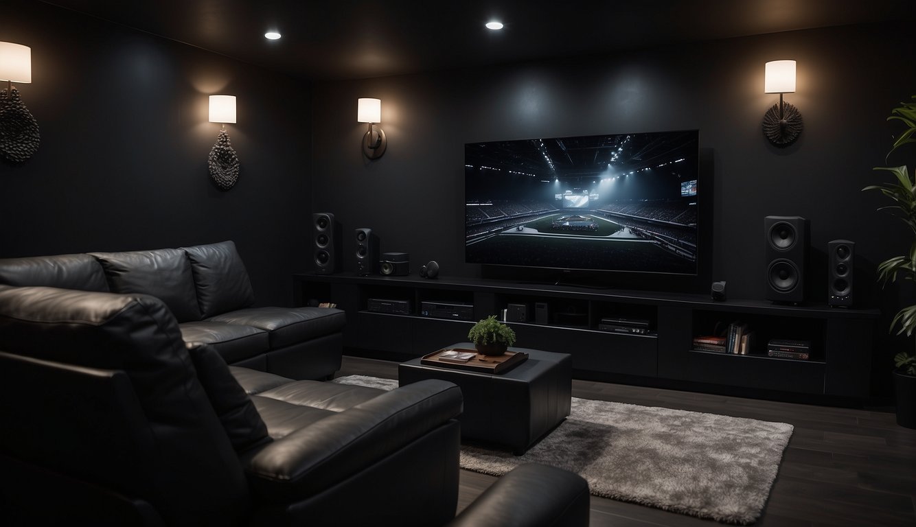
Do you want to add drama to your media room? Dunn-Edwards Black might be just what you’re looking for. This paint color gives your space an edgy and sophisticated vibe.
Black is versatile. Pair it with dark gray furniture or bold accent colors like burgundy or blue for a stylish look.
Since media rooms need a dark environment for the best viewing experience, black walls make the room cozier and help reduce glare on the screen.
7. Glidden Midnight
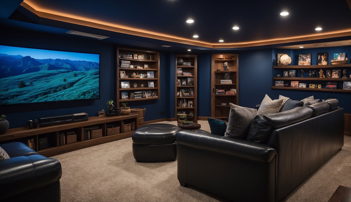
If you want a deep and versatile color for your media room, Glidden Midnight is a great pick. This dark neutral shade creates a cozy and intimate environment.
Glidden Midnight belongs to the neutrals paint colors family. It’s dark enough to minimize reflections without making the room feel too closed in or small.
Get the Fail-Safe Paint Color Playbook (Free PDF)
36 proven colors • 8 ready palettes • trim & sheen guide • printable testing cards.
Pairing Glidden Midnight with lighter accents can add balance and some contrast to your space. You might try different textures or materials to make the room interesting while staying visually comfortable.
Get the Fail-Safe Paint Color Playbook (Free PDF)
36 proven colors • 8 ready palettes • trim & sheen guide • printable testing cards.
8. PPG Black Magic
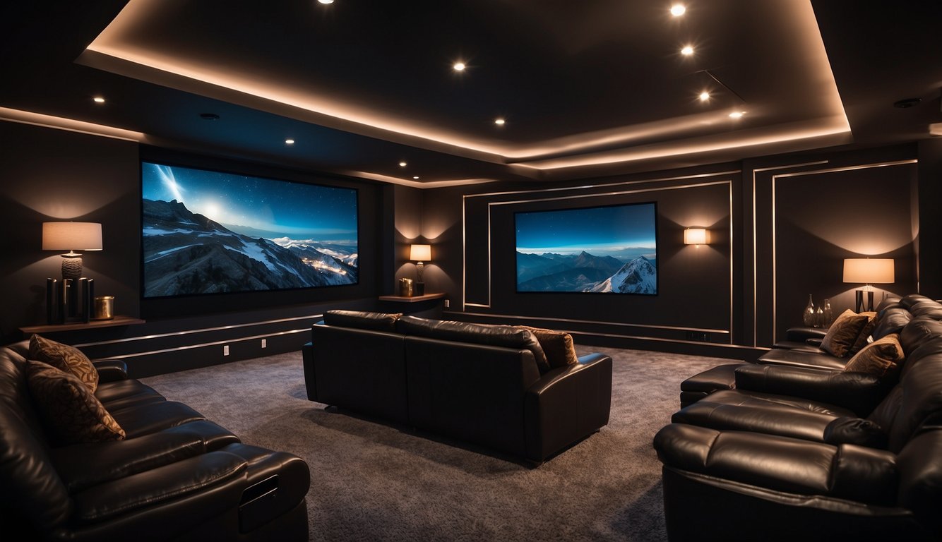
PPG Black Magic is a dark, warm black with a true black undertone. This color adds drama and elegance to any media room.
You can use it for an accent wall, trim, or even cabinets.
Pair it with white for a clean look, or add a pop of color to make it stand out.
One of the best things about PPG Black Magic is how it helps focus attention on your screen. This shade won’t reflect light, so it’s perfect for reducing glare during your movie nights.
Also, PPG Black Magic has an LRV of 4, which means it absorbs a lot of light, creating a cozy and immersive atmosphere.
If you want a sleek, modern look, PPG Black Magic is a great choice.
9. Olympic Black Magic

Want a timeless look for your media room? Olympic Black Magic could be the perfect choice. This color stands out for being versatile and elegant.
Black Magic complements blush pinks, trendy grays, and warm whites. It pairs well with different decors, making it easy to create a cohesive look.
Get the Fail-Safe Paint Color Playbook (Free PDF)
36 proven colors • 8 ready palettes • trim & sheen guide • printable testing cards.
Dark colors are great in media rooms. They reduce light reflection and enhance the movie-watching experience. Olympic Black Magic absorbs light, making screen visuals crisper.
If you want a stylish and functional media room, this color is definitely worth considering.
Color Theory and Media Rooms
Choosing the right paint color for your media room isn’t just about preference; it’s about understanding how colors impact your viewing experience and mood. Different colors can make a room feel cozy, exciting, or calm.
The Role of Color in Your Media Experience
The paint color you choose affects your media room’s ambiance. Dark colors like black, dark brown, burgundy, and dark green are great because they minimize light reflection, creating an immersive experience. Black, in particular, is popular because it doesn’t reflect light, making for a cinema-like feel.
Dark gray behind the screen offers a good contrast, enhancing picture clarity. Colors like silver blue and gold can add elegance without overwhelming the space. Matte finishes for walls also prevent glare, making them ideal for media rooms.
How Different Colors Affect Mood and Perception
Dark colors create a cozy, intimate feel, perfect for a media room where you want to feel wrapped in the experience. Burgundy and dark green can evoke a sense of comfort and richness.
Lighter shades, like silver blue and gold, can keep the room elegant and sophisticated. They add a touch of brightness, making the room feel larger while still maintaining a cozy vibe.
Gray tones are neutral and versatile. They provide a calm, balanced environment without clashing with furniture or decor. Selecting the right color can also influence perception of space, making it feel bigger or more compact depending on the shade and finish.
Tips for Choosing Paint Colors
Choosing the right paint color for your media room can transform the space, making it more enjoyable and visually appealing. Here are some key factors you should consider to make the best choice.
Consider Lighting Conditions
Natural and artificial lighting can change how paint colors look in your room. A paint color might look amazing in the store, but it can look different in your media room. Test paint samples on your walls and see how they change throughout the day.
If your room has lots of natural light, you might want dark colors like dark gray, brown, or burgundy. These colors reduce glare and make the room feel cozy. For rooms with limited natural light, consider using dark colors; they can still provide a great viewing experience by reducing reflections.
Get the Fail-Safe Paint Color Playbook (Free PDF)
36 proven colors • 8 ready palettes • trim & sheen guide • printable testing cards.
Also, take note of the type of artificial lighting you have. LED lights often give off a bluish tint, while incandescent lights have a warm, yellowish glow. Adjust your paint color choices based on your lighting.
Complementary Furniture and Decoration
Your paint color needs to match your furniture and decor. Think about the color of your couches, chairs, and other furniture pieces. Dark colors can create an elegant look but may make the room feel smaller.
For example, if you have a dark brown couch, dark gray or burgundy walls might complement it well. If your furniture is light-colored, deeper hues like dark blue or black can set a striking contrast. Add pops of white or metallics to balance the dark walls.
Rugs, curtains, and accessories should also match your wall color. It’s all about creating a cohesive look. For instance, if you have a dark blue rug, a matching or complementary paint color can pull the room together beautifully.
Make a small color palette. Having two primary colors and one accent color can keep your décor simple but stylish. This method helps in maintaining visual harmony in your media room.
