
Color Theory Basics: Enhance Your Design Skills with the Color Wheel
Color is everywhere, shaping our experiences and influencing our emotions, often without us even realizing it. So, how does color theory help you craft better designs? Understanding the color wheel is a key part of creating visually appealing designs, as it guides you to combine colors that enhance your message and captivate your audience. By grasping the relationships of primary, secondary, and tertiary colors, you’ll have a powerful toolkit to shift perceptions and improve user interactions.
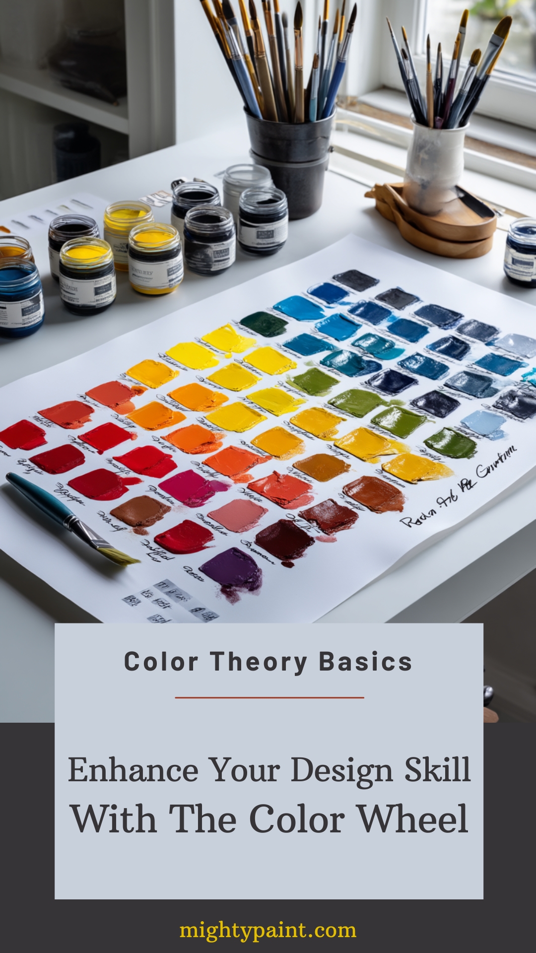
Diving into color theory isn’t just about mixing and matching—it’s about creating an experience. Imagine how different shades can evoke specific feelings or how complementary and analogous colors can help communicate your brand’s identity. While the color wheel may seem like a simple tool, it’s actually your map to navigating this vibrant world. From subtle color choices that suggest calmness to bold motifs that demand attention, the possibilities are endless.
Get the Fail-Safe Paint Color Playbook (Free PDF)
36 proven colors • 8 ready palettes • trim & sheen guide • printable testing cards.
Think about how everything from your favorite website to the movie posters you’re drawn to uses color to influence attention and interest. Isn’t it fascinating how something as basic as color can shape experiences? With this knowledge, you’ll enhance both your confidence as a designer and the impact of your work. Are you ready to see how colors can work for you? Dive in and discover the full potential of the color wheel!
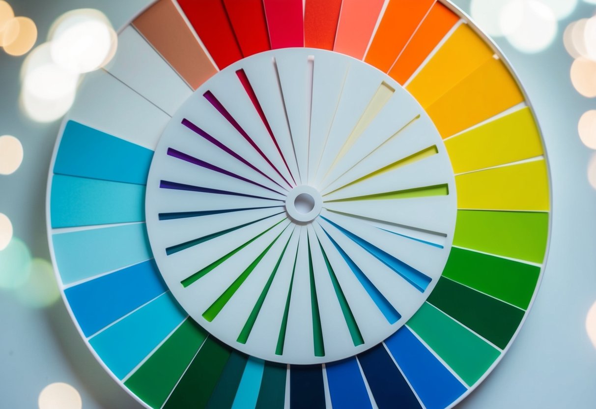
Exploring the Color Wheel
Understanding the color wheel can help you make better design choices. This tool lets you see how colors mix and interact with each other. You’ll learn about primary colors, secondary blends, and more complex models like RGB and CMYK.
Composition and Types of Color Wheels
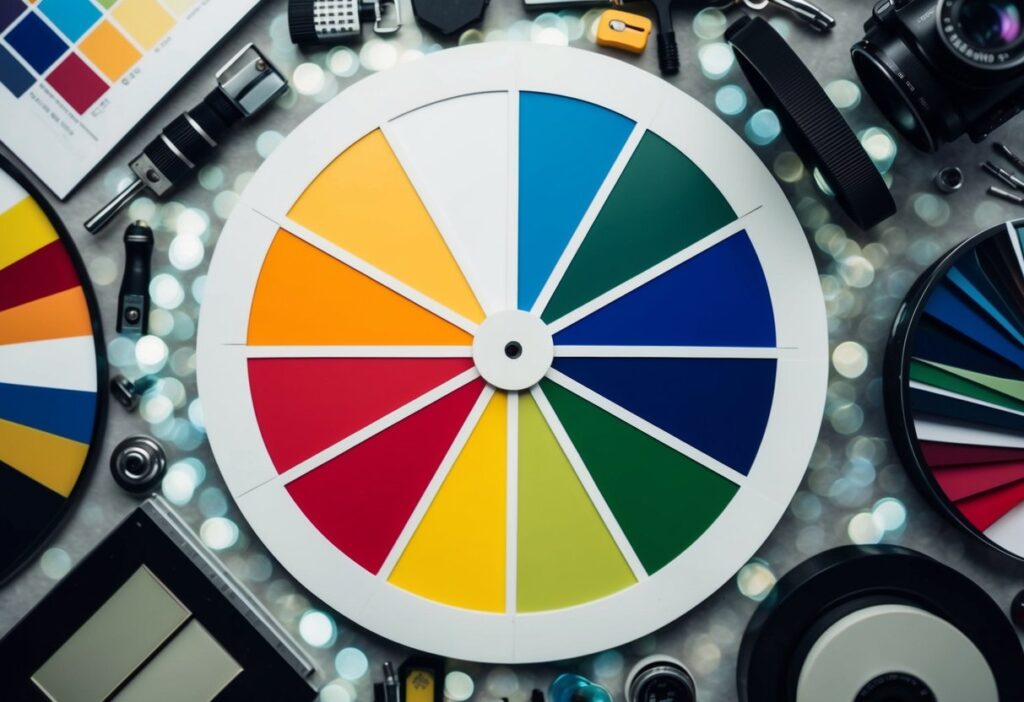
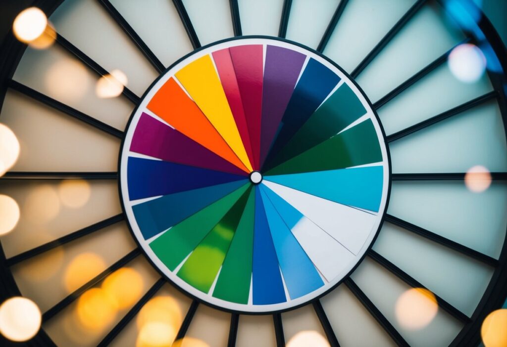
The color wheel is a circular chart that organizes colors in a way that shows their relationships. It often starts with three primary colors: red, yellow, and blue. By mixing these, you get secondary colors like green and purple. There are several types of color wheels, but the most common one used is the RYB model.
Another popular wheel is based on the RGB model, used in digital displays. Here, the primary colors are red, green, and blue. Mixing these in various combinations gives you an array of colors. In print, the CMYK color model (cyan, magenta, yellow, and key/black) is standard. Each type serves a different purpose based on its application.
Understanding Primary, Secondary, and Tertiary Colors
Primary colors are the building blocks of the color wheel. In RYB, the primary colors are red, yellow, and blue. Mix these, and you get secondary colors: green, orange, and purple. It’s like magic! Whenever you combine a primary and a secondary color, you get a tertiary color—like red-orange or blue-green.
These combinations allow for more depth in design. They create varying shades and hues which can evoke different emotions and settings. Understanding this helps you pick the right color combinations for your projects, making them visually appealing. It’s all about experimenting, so don’t be afraid to play around!
Color Models: RGB and CMYK Explained
The RGB color model is mainly used for digital screens, like your phone or computer. The primary colors here are red, green, and blue. By mixing them in different ways, you can create millions of colors. This model’s flexibility is perfect for anything digital.
On the flip side, the CMYK model is for printing. It uses four inks: cyan, magenta, yellow, and black. This method subtracts brightness from white, so it works better on paper. Each model has its unique purpose, and knowing which to use can enhance your design work.
Diving into Color Theory
Explore how color theory has evolved from traditional methods to modern understandings. Discover how colors interact with each other and the role of different systems like the Munsell Color System in organizing these interactions.
Historical Perspective: From Traditional to Modern Color Theory
Traditional color theory began with early artists and scientists like Johannes Itten. They laid out the basics of the color wheel, using primary, secondary, and complementary colors. Think of it as the color world’s founding fathers laying the groundwork.
As we’ve moved into modern times, modern color theory has added more layers. It now includes digital color models and expanded palettes. This evolution helps designers like you better manipulate color for digital and print media, ensuring vibrant and consistent results across all platforms.
Color Harmony and Relationships
Ever wondered why some colors just work well together? It’s all about color harmony. When colors form a pleasing arrangement, they’re in harmony. Common relationships include analogous, complementary, and triadic colors.
- Analogous colors live next to each other on the color wheel, like green and blue.
- Complementary colors, like red and green, sit opposite each other and create high contrast.
- Triadic groups use three colors evenly spaced around the wheel, providing balance.
Understanding these relationships helps you create designs that attract the eye and convey the right message.
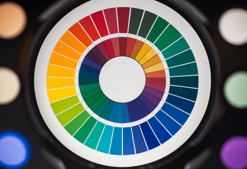
The Munsell Color System Overview
The Munsell Color System? It sounds complex, but it’s a super helpful tool for anyone working with color. Albert Munsell developed this system to describe and organize colors more precisely. It uses three dimensions: hue, value, and chroma.
- Hue is the color itself, like red or blue.
- Value indicates how light or dark the color is.
- Chroma shows the color’s intensity or purity.
This method is different from the typical wheel, offering a more scientific approach to colors and how you see them. It ensures that when you pick a color, you know exactly what you’re getting—no surprises!
The Psychology of Color
Colors can affect how we feel and what we think. They play a big role in how we see brands and how we interact with products. Let’s explore how colors make us feel, impact marketing, and affect accessibility.
Color and Emotions
Colors can change our emotions. You know how blue skies make you feel calm? That’s no coincidence. Blue is linked to peace and calm. Red is different. It’s linked to energy and excitement. Yellow can make you feel cheerful like a sunny day.
If you’ve ever felt hungry when seeing a red and yellow fast-food sign, that’s because red can boost your appetite. Green is soothing and can be about nature or growth. These connections can be used in design. The right color can make you feel happy, calm, or excited.
The Impact of Color in Marketing and Branding
You probably know that colors matter in branding. But did you know they can boost sales? Red gets attention and urges people to act fast, often used in sales tags. Blue is reliable and builds trust. Many banks and tech companies use this color.
Want a luxury feel? Black and gold evoke elegance. Brands like Chanel often use these too. Green works great for eco-friendly products. It tells customers the product is natural or sustainable. Simply put, color choices in logos, ads, and websites can shape how you see a brand.
Color and Accessibility
Ever struggled to read text on a bright background? That’s a common issue. Color combinations must be accessible. It’s not just for aesthetics but for readability. Design must think about those with color vision deficiency. Use strong contrast for better clarity.
For instance, a light font on a white background is hard to read. Dark text on a light background is easier and better for everyone. Websites and apps must follow accessibility guidelines to make sure that everyone can access content, regardless of visual abilities. This includes not just color contrasts but also shapes and patterns to differentiate information.
Creating Color Schemes
Color schemes are essential in design, helping you set the mood and convey messages. By selecting colors thoughtfully, you can create visual harmony. This section explores warm and cool colors, monochromatic schemes, and more advanced setups like triadic and tetradic arrangements.
Warm vs. Cool Colors
Warm colors like red, orange, and yellow evoke feelings of warmth and energy. They can make spaces feel cozy and inviting. Picture a vibrant sunset; it draws attention and adds excitement.
In contrast, cool colors such as blue, green, and purple have a calming effect. Imagine a serene landscape with a gentle blue sky; it brings relaxation. Understanding the emotional impact of these colors helps in creating the right atmosphere for your design.
When you know how to balance warm and cool colors, you can create more engaging and balanced designs. Try using a mix to create contrast or emphasis in different areas.
Developing a Monochromatic Color Scheme
A monochromatic color scheme uses variations of a single color. It includes shades, tints, and tones to add depth without overwhelming the viewer. These schemes are simple and elegant.
Imagine using different shades of blue for a coastal-themed room. Light blue for the walls, navy for accents, and a soft turquoise for pillows. This scheme creates unity and is easy to implement.
Monochromatic schemes work well in minimalist designs. They provide visual interest while maintaining simplicity. Just make sure to vary the brightness to avoid monotony.
Mix and Match: Analogous and Complementary Colors
Analogous color schemes consist of three colors next to each other on the color wheel. They are harmonious and pleasing to the eye. Think about an autumn theme using red, orange, and yellow, reflecting the colors of fall leaves. This setup creates a smooth transition in designs.
On the other hand, complementary colors are opposite each other on the color wheel, like red and green. They create strong contrast and can make elements stand out. For example, using a vibrant red cushion on a green sofa creates visual interest.
Both analogous and complementary schemes offer unique effects. Choose depending on whether you want harmony or contrast in your design.
Advanced Schemes: Triadic and Tetradic Explained
Triadic schemes involve three colors evenly spaced on the color wheel, like red, blue, and yellow. This approach offers vibrant and balanced combinations. Use this scheme for lively and energetic designs, making sure the colors complement each other.
A tetradic color scheme uses four colors, forming a rectangle on the color wheel. It includes two complementary pairs, such as blue and orange, combined with red and green. This creates a rich palette with more variety.
When working with triadic or tetradic schemes, balance is key. Use one dominant color with the others as accents to ensure the design remains cohesive without clashing.
Working with Color Variations
In design, playing with color variations like shades, tints, and tones can help create a wide range of effects. Understanding value and chroma is key to mastering these subtle differences.
Shade, Tint, and Tone: Definitions and Uses
Ever wondered how to make a color darker or lighter? That’s where shade, tint, and tone come into play.
Shade occurs when black is added to a color, making it darker. You’re essentially reducing its brightness.
Tint is achieved by adding white, lightening the color and giving it a softer look.
Tone, on the other hand, is made by mixing gray with the color, which adjusts its intensity without changing its brightness too much.
Using shades, tints, and tones can help you create depth and interest in your design projects. Want a sophisticated look? Dark shades can do the trick. Looking for something calm and peaceful? Light tints are your friend. These elements let you play with perception and mood, transforming your design into something unique and personal.
Manipulating Value and Chroma
When you’re working with colors, value and chroma are critical variables. Value refers to how light or dark a color is. Moving from high to low value significantly affects the mood and emphasis within your design. High value captures attention and appears airy, while low value adds drama and mystery.
Chroma measures a color’s purity or intensity. High chroma colors are vivid and bold, perfect for making a statement. On the other hand, low chroma colors are muted and can give a serene, understated vibe. Balancing value and chroma helps in guiding the viewer’s eye and emphasizing vital elements in your design. Understanding this balance will elevate your color game, turning even simple layouts into captivating visuals.
The Role of Color in Design
Colors significantly impact design, influencing mood, functionality, and accessibility. From interior spaces to digital interfaces, color choices shape environments and user experiences profoundly.
Interior Design: Setting the Atmosphere with Colors
In interior design, color sets the mood. Think about walking into a room painted in calm blues or vibrant reds. Colors like blue often create a tranquil atmosphere, perfect for bedrooms, while red adds energy and warmth, making it ideal for dining areas.
Designers use these principles to create spaces that evoke specific emotions. They might choose lighter colors to make rooms feel more spacious or darker tones for intimacy. Got a small room? Try pastel shades to make it seem bigger.
Also, cultural significance plays a role. For example, red is lucky in some cultures, while it’s a warning in others. Choosing the right palette can transform a space, affecting how people experience it.
Evaluating Color Palettes for User Experience
Color palettes aren’t just about aesthetics; they’re crucial for user experience. Imagine a website where text is unreadable due to poor color contrast. You’d likely click away, frustrated. In design, high contrast helps readability, enhancing user satisfaction.
Brands often select colors that reflect their identity. For instance, blue conveys trust—used by companies like banks. Tools like Adobe Color help in picking complementary and contrasting colors. Ever noticed how apps like Instagram use vibrant colors to engage users? That’s strategic!
When choosing colors, consider their psychological impacts. Warm colors can invoke excitement, while cool shades might be soothing. A well-selected palette guides users smoothly, ensuring they enjoy the interaction.
Design for Inclusivity: Color and Accessibility
Designing for all users means considering accessibility, especially color vision deficiencies. Approximately 8% of men and 0.5% of women worldwide have color blindness. Imagine missing information on a chart just because colors aren’t distinguishable.
Tools like the WCAG (Web Content Accessibility Guidelines) help designers ensure color contrast meets standards. This ensures readability for everyone. Schemes with strong contrast and textures aid in distinction. For example, instead of just using green and red for indicators, differentiate with patterns or labels.
By making thoughtful color choices, you ensure inclusivity, allowing everyone to access and appreciate your designs fully.
Practical Color Application
Applying color theory in design can transform how your audience perceives your work. Knowing the basics of mixing colors, choosing the right palette, and understanding how color affects consumer behavior is essential for success.
Mixing Colors: Tips and Techniques
Mixing colors is not just for artists; it’s a crucial part of design. Primary colors are red, yellow, and blue. By mixing these, you can create secondary colors like green, orange, and purple.
Techniques like using complementary colors can make your designs pop! Complementary colors sit opposite each other on the color wheel (e.g., blue and orange). They create contrast and energy.
You can also try analogous colors, which are next to each other on the wheel for a harmonious look. Balance is key. If you’re mixing paint, remember the old rule: less is more. Always add a little color at a time!
Choosing the Right Color Palette for Your Brand
Your brand’s colors are like its signature. Choosing the right palette can help convey the right brand identity and message to your audience. Are you aiming for bold and energetic? Try bright reds and oranges. Want something calming? Soft blues and greens might be your friends.
Get the Fail-Safe Paint Color Playbook (Free PDF)
36 proven colors • 8 ready palettes • trim & sheen guide • printable testing cards.
Think about the user experience. You might not want bright yellow on a financial site or dark colors on a kid’s toy page.
Consistency is vital. Use the same colors across your website, logo, and marketing materials to build recognition. You can use tools like Coolors or Adobe Color to experiment with combinations. Also, the 60-30-10 rule helps balance your design: 60% your main color, 30% secondary, and 10% an accent.
Understanding the Influence of Color in Consumer Behavior
Colors can impact how people feel and act, a science known as color psychology. Ever noticed how restaurants use reds and oranges? These colors can make you feel hungry! In contrast, blues and purples tend to be calming and trustworthy—great for banks or tech brands.
Research suggests that up to 85% of customers say color is a primary reason for buying a product. Crazy, right?
Knowing how to use these psychological triggers can boost sales. For instance, red might create a sense of urgency in a sale sign, while green can signal eco-friendliness or savings. Make sure your color choices reflect the emotions and actions you want from your audience.