
What Color Paint Goes With Black Granite Countertops
Designing a space featuring black granite countertops is inherently dramatic, and the countertops themselves often serve as the room’s most striking focal point. Because black granite is such a visually heavy, rich material, the paint color you choose for the walls, cabinetry, and trim is not merely an aesthetic choice—it is a structural design element that dictates the entire room’s mood, formality, and overall harmony. Finding the perfect pairing requires more than just matching tones; it requires understanding color theory, light interaction, and the unique undertones of the stone.
With countless shades of paint available, selecting a color that allows the black granite to shine without overwhelming the space can feel like an impossible task. This comprehensive guide moves beyond simple color pairing rules. We will equip you with expert knowledge on how to approach the design process, helping you make informed, confident choices that ensure your black granite is beautifully framed by a cohesive and sophisticated color palette.
Get the Fail-Safe Paint Color Playbook (Free PDF)
36 proven colors • 8 ready palettes • trim & sheen guide • printable testing cards.
Quick answer: The right color depends on lighting, undertones, surrounding finishes, room size, exterior exposure, and the mood you want. Test samples in real light before committing, because paint can look very different on the wall than it does on a chip.
Planning and Assessment: What to Know Before Choosing a Color
Before you even look at a paint swatch, the most critical step in the design process is thorough assessment. The black granite countertop is only one element in a complex ecosystem of materials—it interacts with the cabinetry, the flooring, the hardware, and the natural light. A color that looks stunning under direct midday sun might appear muddy or too stark under evening lamplight. Take time to document every existing element.
Consider the function of the room. A high-traffic, utilitarian kitchen might benefit from more durable, low-sheen paints and highly resilient neutrals, while a formal bathroom might allow for deeper, more dramatic jewel tones. The purpose of the space should inform the color palette. Furthermore, pay attention to the existing hardware. If you plan to use brushed gold faucets, choosing a cool, icy paint tone might clash with the warmth of the metal, while a creamy neutral might complement both.
The Color Theory Guide: Pairing Paint with Black Granite
Black granite provides a dramatic, grounding base, meaning it can support both soft, airy colors and deep, saturated tones. The key is deciding whether you want the granite to be the primary focus (using light, neutral paint) or if you want the paint to establish a powerful, enveloping mood (using deep, contrasting colors). Understanding the undertones of both the stone and the paint is non-negotiable.
The Power of Neutrals: Timeless and Elegant
Neutrals are the safest and most versatile pairing, allowing the intricate veining of the black granite to remain the undisputed star. However, “neutral” is a broad term, and undertones matter deeply. A cool-toned neutral (like a slate gray or dove gray) will enhance the cool, icy aspects of the black granite, creating a sophisticated, modern, and crisp look. Conversely, a warm-toned neutral (like a creamy off-white, warm taupe, or soft beige) will soften the contrast, giving the space a welcoming, classic, and grounded feel. When in doubt, choosing a warm neutral is often safer, as it counteracts the potential coldness of black stone.
Creating Contrast: Bold and Jewel-Toned Accents
For a high-impact, dramatic statement, deep, saturated colors work exceptionally well. These pairings are best suited for a defined style—such as a modern industrial kitchen or a traditional library—and should be used deliberately. Deep navy blues, forest greens, and rich charcoals are phenomenal choices. These colors create a sense of luxury and enclosure. To prevent the look from becoming overwhelming, use these deep tones on cabinetry or a single accent wall, and keep the remaining elements (like trim or complementary walls) in a lighter neutral shade.
Harmonious Palettes: Earth Tones and Soft Hues
If your style leans toward natural, Mediterranean, or farmhouse aesthetics, muted earth tones are ideal. Think soft sage greens, dusty blues, and terracotta. These colors are inherently calming and provide a gentle contrast to the severity of black granite. They ground the space while keeping the overall feel light and inviting. These palettes work especially well when paired with natural wood elements, helping to create a cohesive, organic flow throughout the room.
The finish of your paint and the materials surrounding the granite are just as important as the color itself. The sheen (or finish) dictates how light interacts with the surface, which can dramatically change the perceived color.
Finish Comparison:
- Matte (Flat): Absorbs light, providing a sophisticated, non-reflective, and velvety look. Ideal for walls in living areas or bedrooms where you want a subtle, enveloping color. It minimizes glare and emphasizes the color itself.
- Satin: Offers a slight sheen and is highly practical for areas prone to splatters, like kitchen and bathroom walls and cabinets. It is durable, washable, and provides a balance between the drama of gloss and the subtlety of matte.
- Semi-Gloss: The most durable and easiest to clean, often used on trim, doors, and cabinetry. It reflects more light, which can make the room feel brighter but may also exaggerate imperfections. Use sparingly and ensure the color is chosen to handle the higher level of reflection.
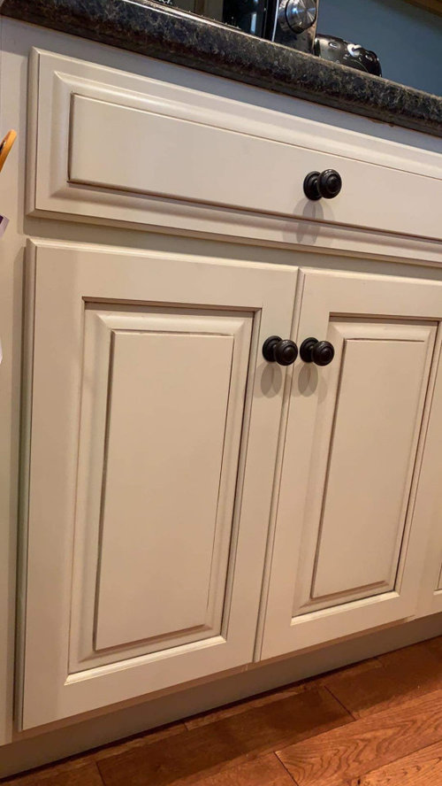
Hardware and Wood Integration: The metal fixtures (faucets, cabinet pulls) and wood tones must be factored into the equation. If your hardware is warm brass or antique gold, incorporating warm paint undertones (creams, warm grays) will help the metals feel cohesive. If your hardware is cool chrome or matte black, cool paint undertones will maintain a sharp, modern alignment.
Common Color Mistakes to Avoid
The allure of dramatic color can lead to common design mistakes. Avoiding these pitfalls can save you significant time, money, and frustration.
- Ignoring Undertones: Never assume a “neutral gray” is purely gray. Many grays have a blue, green, or brown undertone. If your black granite has a strong blue undertone, painting the walls with a cool, blue-based gray will amplify the coolness and potentially make the room feel icy.
- Pattern Overload: Do not pair black granite (which has its own pattern) with overly patterned wallpaper or heavily veined backsplash tiles. Let the granite be the main pattern; keep surrounding surfaces relatively clean and simple to avoid a chaotic, busy look.
- Matching Granite to Paint: Avoid choosing a paint color that exactly matches the veining or the black base of the granite. This creates a jarring, artificial look, making the stone appear pasted onto the wall rather than integrated into the design.
Safety and Practical Application Notes
Painting, especially in functional areas like kitchens and bathrooms, requires proper preparation to ensure the longevity and appearance of the finish. Proper prep work is not optional—it is the foundation of the entire project.
Surface Preparation: For cabinets, sanding the existing surfaces is critical to ensure the new paint adheres properly. Use appropriate primers, especially if switching from a glossy finish to a matte one, or painting over stained wood. Always follow the manufacturer’s recommended priming schedule.
Ventilation and Safety: When working with paint and solvents, always ensure adequate ventilation to prevent the buildup of fumes. Wear protective gear, including gloves and appropriate respiratory masks, and always follow the manufacturer’s instructions for mixing, application, and curing times. Never ignore the drying time, as painting over a wet surface can lead to peeling, blistering, or poor adhesion.
Selecting the perfect paint color to complement black granite countertops is a journey of informed experimentation. By viewing the process through the lens of color theory—understanding undertones, considering the impact of light, and balancing the dramatic weight of the stone with the surrounding elements—you transform a daunting design problem into a manageable, creative process. Remember that the goal is not merely to choose a color, but to craft a harmonious environment that enhances the inherent beauty of your stone and reflects your unique personal style.
Frequently Asked Questions
How do I test paint colors to ensure they complement black granite?
Never rely on swatches viewed in a store. The appearance of black granite and paint changes drastically with light. Buy several samples and paint large swatches (at least 2 ft by 2 ft) on a wall. Observe these swatches throughout the day—in the morning light, midday sun, and under evening lamplight. This process will reveal the true undertones and how the paint color interacts with the granite’s veining, ensuring the color remains harmonious regardless of the time of day.
Get the Fail-Safe Paint Color Playbook (Free PDF)
36 proven colors • 8 ready palettes • trim & sheen guide • printable testing cards.
What paint finish (sheen) is best for high-traffic areas like a kitchen?
For areas prone to splatters and heavy use, Satin or semi-gloss paint is highly recommended over matte. Satin offers a good balance of durability, washability, and a subtle sheen that doesn’t look overly reflective. Semi-gloss is the most durable and easiest to clean, making it ideal for cabinets and trim, but remember that high reflection can exaggerate surface imperfections. Always choose a finish appropriate for the surface material and the required level of protection.
How do I coordinate my paint color with my hardware (faucets and cabinet pulls)?
The metal hardware dictates whether your palette should lean cool or warm. If your hardware is brushed nickel, chrome, or matte black, select cool-toned paints (like icy grays or crisp whites) to maintain a modern, sharp contrast. If your hardware is brass, oil-rubbed bronze, or antique gold, incorporate warm undertones (creamy off-whites, warm taupes, or sage greens) to create a cohesive, welcoming feel.
What is the most crucial step before painting kitchen cabinets?
The single most critical step is thorough surface preparation. Simply painting over an old, glossy finish will lead to peeling and poor adhesion. You must sand the existing cabinet surfaces to create a porous, rough texture that allows the new paint to grip. Furthermore, always use a high-quality primer designed for cabinets, especially if you are switching from a glossy finish to a matte one. Proper priming is the foundation of the entire project’s longevity.
Conclusion
What Color Paint Goes With Black Granite Countertops works best when the plan, materials, safety steps, and finish goals all line up before work begins. Review the surface or tool condition, choose compatible products, and leave enough time for drying, cleanup, and final checks.
Use the guidance above as a practical checklist, then adjust it to the specific surface, workspace, product directions, and risk level. When the project involves fumes, damaged materials, business liability, or uncertain conditions, slow down and get qualified help before moving forward.