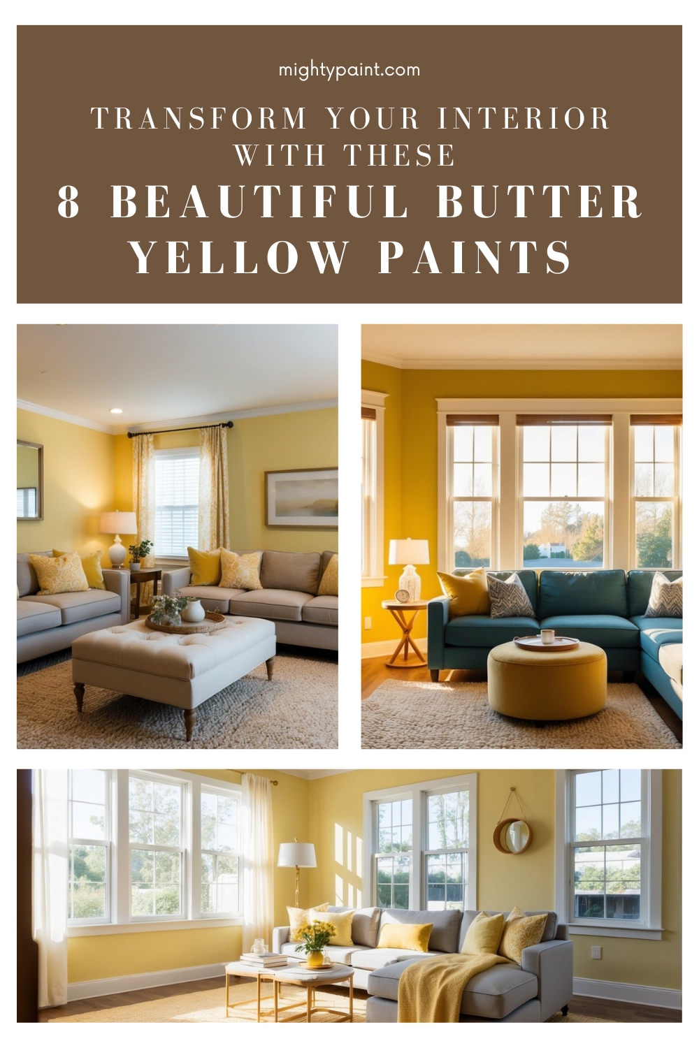
8 Best Butter Yellow Paint Colors for Your Interior: Top Picks and Tips
If you’re looking to add a touch of warmth and cheer to your home, butter yellow might just be the perfect shade for you. This delightful color sits comfortably between a pale yellow and a creamy off-white, offering a cozy and inviting feel to any space it graces. Wondering how butter yellow can transform your interiors?
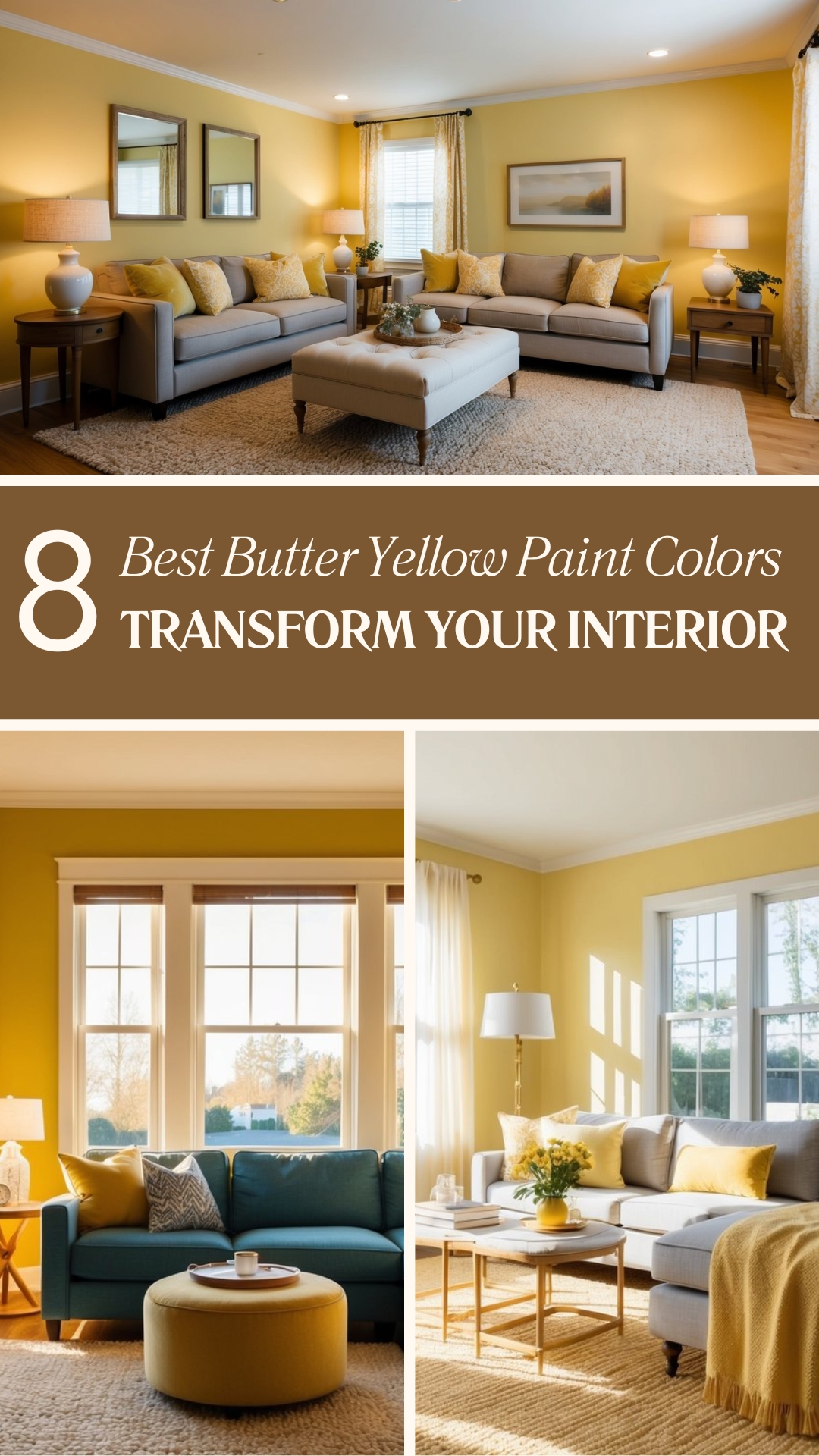
Butter yellow is a favorite among designers for its versatility and ability to complement various decor styles. It captures the essence of sunlight without being too overpowering, making it an excellent choice for both accent walls and full-room applications. Whether you’re aiming to brighten a dim room or enhance a space flooded with natural light, butter yellow can meet your needs.
Get the Fail-Safe Paint Color Playbook (Free PDF)
36 proven colors • 8 ready palettes • trim & sheen guide • printable testing cards.
1. Sherwin-Williams Butter Up
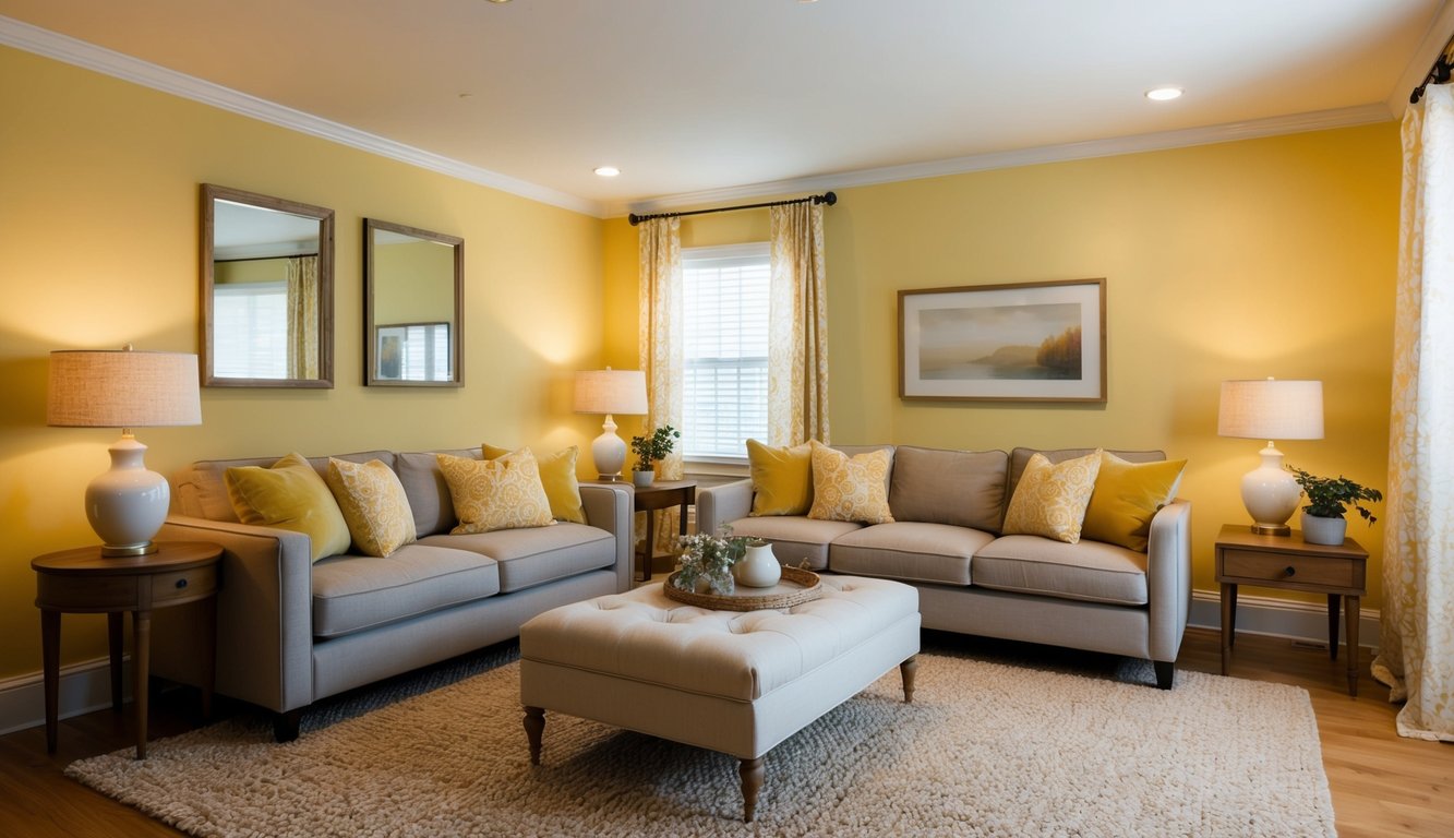
Sherwin-Williams Butter Up (SW 6681) is a delightful yellow that brings warmth to any room. If you’re looking to add a pop of color, this could be the perfect choice. It’s suitable for both interior and exterior spaces, making it really versatile.
Butter Up is a warm hue with a color wheel degree of 42°. This gives it a rich, inviting feel. The HSL code for Butter Up is 42, 82%, 80%, ensuring that it’s a vibrant and cheerful yellow.
You’ll love how this color catches attention without being too bright. Its Light Reflectance Value (LRV) is 74, which means it reflects a good amount of light, brightening up your space beautifully.
When decorating, consider pairing it with warm whites or gentle greens for a balanced look. Coordinating colors can range from Amaranth Pink to Very Light Green, giving you lots of flexibility.
Butter Up has been favored by many for its soft, clean appearance. It’s a pure form of yellow that brings cheerful vibes into any room. Ready to try something new? Butter Up might just be the sunny boost your space needs.
2. Benjamin Moore Hawthorne Yellow
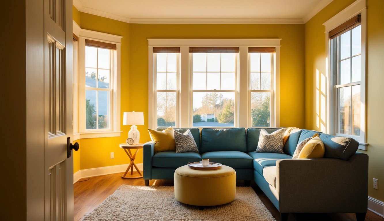
Thinking about adding a splash of color to your home? Benjamin Moore Hawthorne Yellow (HC-4) could be the perfect choice. This bold yet balanced yellow is popular for both interiors and exteriors.
Hawthorne Yellow is loved for its warm, welcoming tone. With a hue of 45 degrees on the color wheel, it sits comfortably in the yellow range. Its Light Reflectance Value (LRV) is 71.33, meaning it reflects a good amount of light, making rooms feel brighter.
You might be wondering about its versatility. Well, it pairs wonderfully with other colors. Whether you’re opting for traditional designs or modern spaces, Hawthorne Yellow can add that cheerful touch you’re looking for.
This shade isn’t just about looks; it’s practical too. Designers often recommend it for spaces where you want to invite warmth and comfort. Think about painting an accent wall in your living room or bringing some sunshine into your kitchen.
Are you curious about how it would look in real life? Imagine a cheery-hued front door in Hawthorne Yellow, offering a warm welcome to anyone who visits. It’s all about making an impression!
3. Glidden Creamy Buttermilk
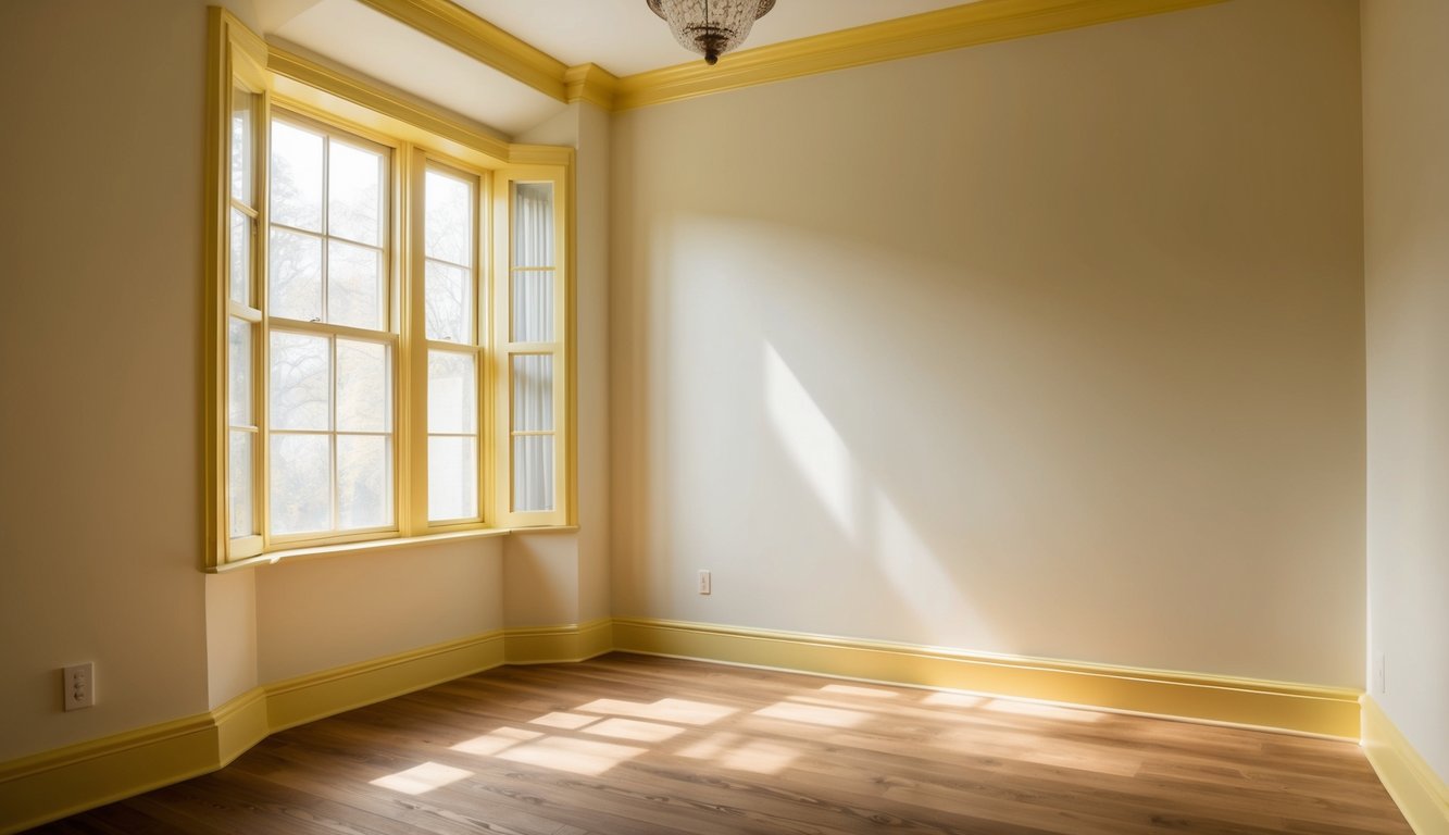
Looking for a warm yellow color that exudes comfort? Glidden’s Creamy Buttermilk might be your match. This shade radiates joy and pairs excellently with natural light. Imagine your kitchen or bathroom bathed in this soft, inviting color. It’s like a splash of sunshine indoors!
One great aspect of Creamy Buttermilk is its versatility. You can use it in various rooms without overwhelming the space. It works well in both large, open areas and smaller, cozier settings.
This color choice also helps to brighten up darker spaces. If your room gets limited natural light, the warmth of Creamy Buttermilk can make it feel more inviting. It’s almost like having a bit of summer year-round.
Get the Fail-Safe Paint Color Playbook (Free PDF)
36 proven colors • 8 ready palettes • trim & sheen guide • printable testing cards.
Feedback from designers often notes the cheerfulness this color brings. Plus, it’s easy to combine with other neutral shades, making it a flexible option for your decorating needs. Try pairing it with soft whites or light grays for a balanced look.
Lastly, it is important to know that Creamy Buttermilk is also available as a peel-and-stick sample, so you can see how it looks in your home before fully committing. Give it a try and see the difference it can make!
4. Behr Softened Yellow
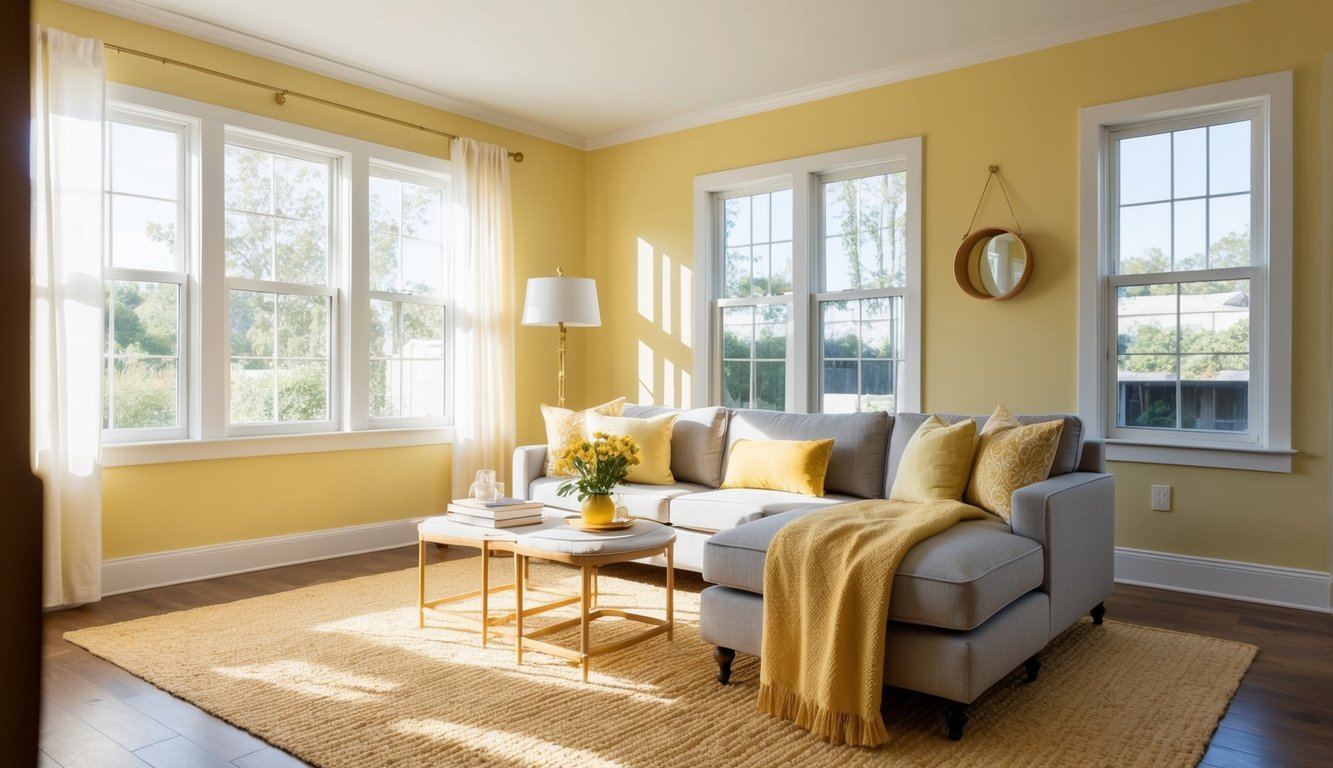
Behr Softened Yellow brings a calming and cheerful vibe to any room. This gentle shade of butter yellow is perfect for those who want a touch of warmth without overpowering the space.
Imagine walking into a sunlit room and feeling instantly comforted. That’s the magic of Behr Softened Yellow.
Pair this color with white trim for a classic look. It also works great with natural wood furniture. Whether it’s for your living room, kitchen, or bedroom, Behr Softened Yellow adapts beautifully.
Visualize creating a cozy reading nook or a welcoming entryway. This shade creates an inviting atmosphere wherever it’s applied.
Adding Behr Softened Yellow to your walls can make even the smallest room feel open and bright. If you want a color that’s versatile and soothing, this might be the one for you.
5. Valspar Lemon Sorbet
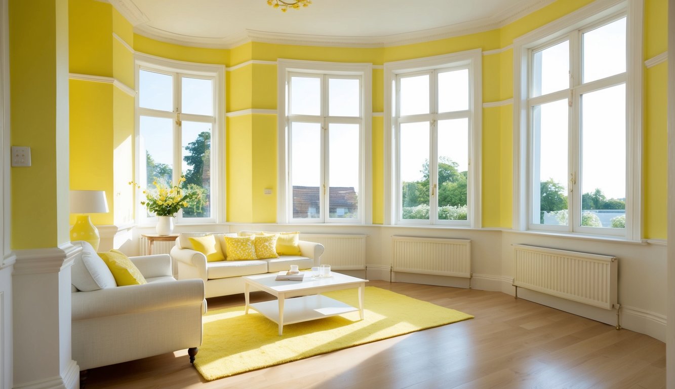
If you’re seeking a cheerful and light yellow for your interior, Valspar Lemon Sorbet could be the perfect choice. This shade brings a sunny feel without becoming overpowering.
Lemon Sorbet works exceptionally well in rooms with plenty of natural light. It helps to brighten the space, making it feel more open and welcoming.
Be cautious if using it in darker rooms, as yellow can sometimes appear dingy without sufficient light. Pairing it with white trim can create a crisp and clean look.
Valspar’s Lemon Sorbet is especially lovely in kitchens and dining areas, where a happy, fresh atmosphere is desired. This color pairs well with light woods and white accents, giving your space an airy, cohesive feel.
Get the Fail-Safe Paint Color Playbook (Free PDF)
36 proven colors • 8 ready palettes • trim & sheen guide • printable testing cards.
6. Farrow & Ball Pale Hound
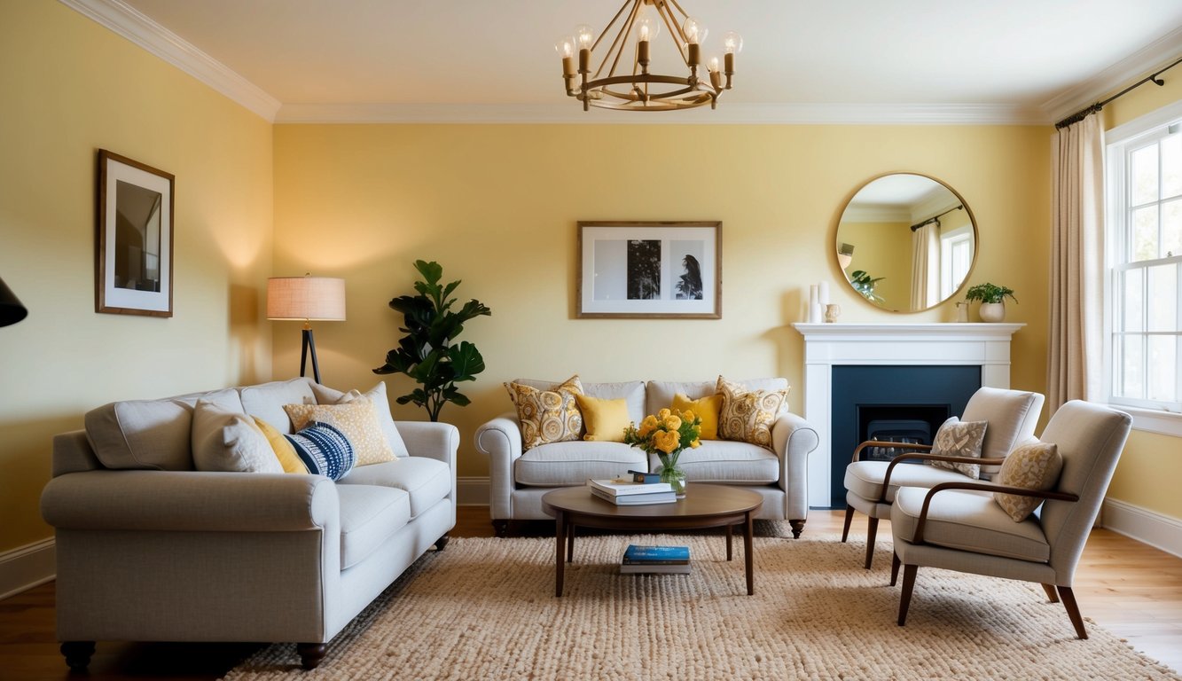
Farrow & Ball’s Pale Hound is a popular choice if you’re looking for a soft, aged yellow. It brings a warm, nostalgic touch to any room. The color is subtle, making it perfect for creating a cozy atmosphere.
This shade of yellow is ideal for those who want something more understated. It works well in living rooms, where you can pair it with vintage furniture. The color’s gentle tone adds a touch of elegance without being overpowering.
You can use Pale Hound in bedrooms too. The soft yellow provides a calming environment, ideal for a restful night’s sleep. It complements both light and dark furniture, allowing you to personalize your space easily.
For kitchens, Pale Hound creates a sunny, inviting atmosphere. It’s a great backdrop for both modern and rustic designs. Think wooden cabinets or sleek countertops; this color pairs well with both.
Are you worried about too much yellow? Accent walls in Pale Hound are an excellent way to introduce the color without overwhelming the room. Accessories like pillows or rugs can also help tie everything together.
7. Dunn-Edwards Buttery
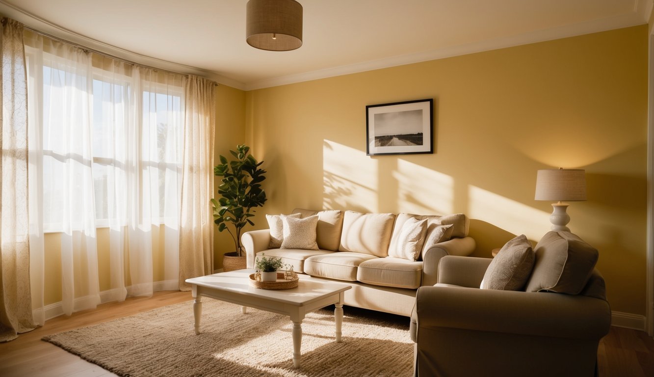
Dunn-Edwards Buttery is a fantastic choice for anyone looking to add a touch of warmth to their home. It’s a modern take on the classic Butter Cream hue, offering a fresh and versatile look.
This color is perfect for both traditional and contemporary settings. The taupe base gives it a unique twist, making it more than just a simple yellow.
One of the best things about Dunn-Edwards Buttery is its ability to work in various spaces. Use it in your kitchen, living room, or even in a cozy reading nook. Its warm tone creates a welcoming atmosphere.
Dunn-Edwards Buttery isn’t limited to just walls. You can use it on furniture, cabinets, and even small décor pieces to add subtle pops of color throughout your home.
Get the Fail-Safe Paint Color Playbook (Free PDF)
36 proven colors • 8 ready palettes • trim & sheen guide • printable testing cards.
8. Clark+Kensington Sunbeam
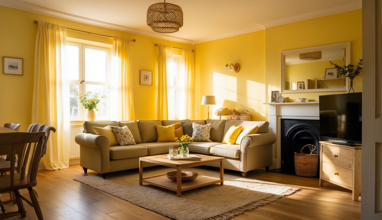
Are you looking for a cheerful addition to your home? Clark+Kensington’s Sunbeam might be just what you need. This paint color offers a bright and inviting shade of butter yellow. It’s perfect for adding warmth and light to any room.
You can use Sunbeam to spruce up your kitchen or living room. It pairs well with both light and dark furniture. This yellow is vibrant without being too overpowering.
If you have a room that gets lots of natural light, Sunbeam will shine even more. It’s a great choice to make your home feel cozy and welcoming.
Understanding Butter Yellow Paint
Butter yellow paint is a soft shade of yellow that can add warmth and brightness to any space. It’s become a popular choice for interior designers due to its cheerful and versatile nature. Let’s explore what makes butter yellow paint special, its psychological effects, and the best times to use it.
What is Butter Yellow Paint?
Butter yellow paint is a creamy, light shade of yellow that resembles the color of butter. It’s often described as having a hint of gray or beige, which keeps it from being overpowering. This subtle tone makes it a fantastic neutral that can brighten up a room without overwhelming it.
Designers like Theresa Butler and Jen Levy praise its ability to make spaces feel open and inviting. Benjamin Moore’s “Banana Cream” and “You Are My Sunshine” are popular choices. These paints provide a sunny, muted glow that’s perfect for various settings.
Psychological Effects of Butter Yellow
Butter yellow is known for its calming and uplifting effects. This color is often associated with happiness and optimism. When you use it in your home, it can create a cheerful and welcoming atmosphere.
Studies have shown that yellow can stimulate mental activity and generate a sense of warmth. In spaces like kitchens and living rooms, butter yellow can make family gatherings feel cozier. Its soft hue is also known to enhance comfort and promote relaxation, making it ideal for bedrooms and reading nooks.
When to Use Butter Yellow
Butter yellow is versatile enough to be used in various rooms and works well with many design styles. If you have a room that lacks natural light, butter yellow can help make it feel brighter and more open. It pairs wonderfully with both modern and traditional décor.
In a Victorian-style entryway, for instance, a paint like “You Are My Sunshine” can provide a gorgeous glow. Bedrooms benefit from its relaxing qualities, while kitchens enjoy its fresh and inviting feel. Don’t hesitate to use this lovely shade to bring a touch of sunshine to any space in your home.
Get the Fail-Safe Paint Color Playbook (Free PDF)
36 proven colors • 8 ready palettes • trim & sheen guide • printable testing cards.
Designing with Butter Yellow Paint
Butter yellow is a versatile and warm color that can brighten up your space while adding a cozy feel. Let’s explore how to pair it with other colors and the best rooms to use this cheerful hue.
Complementary Colors and Pairings
Butter yellow pairs beautifully with a variety of colors. For a classic look, consider deep navy or charcoal gray to balance the warmth.
- For a fresh and airy feel, white or cream works wonders.
- Add pops of coral or turquoise for a more playful vibe.
- Mixing in natural wood tones adds a rustic charm.
Don’t be afraid to experiment with metallic accents like gold or brass. These materials enhance the richness of butter yellow, making the space feel more luxurious.
Ideal Rooms for Butter Yellow
Butter yellow is a great choice for many rooms in your home.
- Kitchens benefit from its warmth, creating an inviting atmosphere.
- Living rooms feel cozier and more welcoming with butter yellow walls or accents.
- In bedrooms, it provides a soft, calming effect that promotes relaxation.
- Don’t forget nurseries; this color is gender-neutral and soothing for babies.
Smaller spaces, like hallways and powder rooms, can also benefit from butter yellow. It can make these areas feel brighter and more spacious. Whether you go for a full wall color or just accents, butter yellow can transform your interiors.
