
How to Paint a Waterfall
Waterfalls have long been a profound source of inspiration for artists, captivating our senses with their powerful rush, glistening spray, and mesmerizing, relentless beauty. Painting such a scene is not merely replicating a photograph; it is an act of translating dynamic natural energy and serene atmosphere onto a two-dimensional surface. As an artist, you possess the remarkable ability to capture the fleeting moment and immortalize these enchanting natural wonders through the controlled movement of your brush.
This comprehensive guide will take you through the entire artistic process of painting a waterfall, transforming a daunting subject into a rewarding, achievable masterpiece. We will move far beyond simple instructions, providing you with the technical knowledge—from color theory and composition to specialized techniques like wet-on-wet blending—needed to create a stunning, believable depiction of a cascading natural scene. Whether your chosen medium is the versatile permanence of acrylics or the ethereal transparency of watercolors, the principles of capturing light, depth, and movement remain the same.
Get the Fail-Safe Paint Color Playbook (Free PDF)
36 proven colors • 8 ready palettes • trim & sheen guide • printable testing cards.
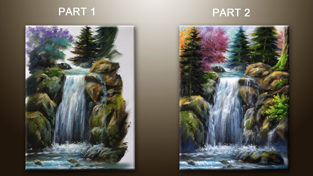
Quick answer: To Paint a Waterfall, start with the safest first step for the material involved, test a small area when needed, and follow the process in thin, controlled stages. Use proper ventilation and protective gear when chemicals, sanding, spraying, or solvents are involved.
By the end of this guide, you will understand how to observe the physics of water, the geometry of rock, and the subtle interplay of light and shadow that defines a waterfall. Prepare to immerse yourself in the world where natural grandeur meets meticulous artistic expression. This journey promises to elevate your technical skills and allow you to capture the profound magic and enduring allure of waterfalls, creating artwork that resonates deeply with the viewer’s soul.
Planning and Composition Before You Start
The most crucial step in painting any complex natural scene, especially a waterfall, is the planning phase. This is where you transition from being an observer to being an artist, understanding not just what you see, but how the scene is structured. A strong composition is the invisible backbone of your painting, guiding the viewer’s eye and creating visual harmony.
| Tools and Supplies | Purpose |
|---|---|
| Palette | Mixing and blending colors |
| Water containers | Diluting and rinsing brushes |
| Palette knives | Creating texture and adding details |
| Masking tape or frisket | Preserving white areas for highlights and accents |
| Pencils, erasers, rulers | Sketching the initial outlines (if needed) |
| Reference photos or sketches | Inspiring your composition and capturing details |
Analyzing the Reference and Compositional Flow
Before touching paint, study your reference photo extensively. Look for the “flow” of the water—it rarely moves in straight lines; it curves, splashes, and pools. Use the rule of thirds or the leading lines technique to place the main cascade or the most dramatic section of the waterfall off-center. This naturally draws the viewer’s eye into the heart of the scene.
Furthermore, identify the dominant light source. Is the light coming from above (dappled sunlight), or is the scene shrouded in diffused, misty light? The light source dictates the direction of shadows, the intensity of highlights on the water, and the overall mood (e.g., bright and airy vs. mysterious and moody). Note where the light hits the rocks and how that reflection might be caught in the pooling water.
Mapping the Elements
Mentally break the scene into three distinct layers: the foreground (closest, most detailed), the middle ground (the main fall and surrounding rocks), and the background (distant foliage, mist, or jungle canopy). The foreground should feature high contrast and sharp detail, while the background should use atmospheric perspective—making colors lighter, less saturated, and softer to suggest distance.
Materials and Tools Selection
The choice of materials dictates the techniques you can employ. Since a waterfall demands a variety of textures—smooth water, rough rock, soft mist—you must select tools suited for these diverse needs. Consider the comparison below when making your purchase decisions.
Acrylic vs. Watercolor for Waterfalls:
Watercolor: Best suited for achieving delicate, translucent washes, soft mist effects, and highly diffused light. It excels at conveying the ephemeral quality of spray and distant water bodies. However, it requires careful control to prevent colors from bleeding into muddy, indistinct patches.
Acrylic: Offers greater versatility and opaque coverage, making it ideal for painting heavily textured, solid rocks (using impasto) and achieving vibrant, saturated colors in the foreground. Acrylic mediums can also be used to create durable, layered depth that holds up well to mixing washes.
Essential Tools Checklist:
- Paints: Primary acrylic or watercolor set, plus specific colors like deep indigo, cerulean blue, viridian green, raw umber, and titanium white.
- Mediums (If Acrylic): Flow aid (to thin paint for washes), gel medium (for impasto texture on rocks), and glazing liquid (to layer colors transparently).
- Brushes: A variety is crucial: Large flat brushes (for washes/sky), round brushes (for detailing/foliage), fan brushes (for soft mist and spray), and small, stiff brushes (for dry brushing rock textures).
- Surfaces: Canvas board (for acrylic) or heavy watercolor paper/panel (for watercolor).
- Preparation: Gesso (for canvas priming) and artist tape/masking tape.
The Step-by-Step Guide to Painting a Waterfall
The painting process must be methodical, moving from the largest areas and lightest values to the smallest details and darkest values. Do not attempt the details until the entire composition has been established.

Phase 1: Establishing the Base Wash and Form
Start by blocking in the overall color zones. Use large, thin washes (diluted paint) to define the general areas: the deep green of the surrounding jungle, the warm browns and grays of the rock formations, and the pale blues of the distant sky or mist. Do not worry about detail yet; focus only on establishing the correct values and color temperature. Use the darkest values (shadows) to define the edges and the lightest values (highlights) to establish the brightest source of light.
Phase 2: Defining the Rock and Earth Textures
Once the base washes are dry, focus on the rocks. Rocks are solid, geometric, and contrast sharply with the water. Use techniques like dry brushing—dipping a brush in paint and wiping almost all of it off, then dragging it lightly over the rock surface—to create the appearance of rough, weathered stone. Use contrasting colors; even if the rocks are wet, they should show dry, earthy tones (browns, ochres) that contrast with the cool blue-greens of the water.
Phase 3: Capturing Water Movement and Depth
This is the most challenging phase. Water is defined by its movement and its interaction with light. Use thin, highly diluted washes (especially with watercolors, or acrylic flow aid) to create the main body of the falls. To simulate depth, use darker, more saturated blues and greens in the deepest pools and shadows. For the fast-moving curtain of the falls, use thin, vertical strokes, allowing the paint to flow naturally. Remember, the water’s color is rarely pure blue; it is often tinted by the surrounding minerals and earth, giving it a turquoise or jade quality.
Phase 4: Integrating Mist, Spray, and Atmosphere
Mist and spray are achieved through soft, translucent washes and controlled application. Use a fan brush dipped in a very light, pale color (like diluted titanium white mixed with a touch of blue or gray) and gently tap or flick the paint into the air above the main falls. This mimics the spray. For the overall atmosphere, use a blending technique called wet-on-wet (especially with watercolor) where you apply wet paint to a damp surface, allowing the colors to bleed softly into each other, creating the diffused, mysterious quality of the air.
Phase 5: Final Details and Refinements
The final touches bring the painting to life. Revisit the foliage, adding individual dabs of dark green and yellow-green paint for life. Use the smallest brushes to place details like small river stones or streaks of light reflecting off the wet rock. Check your composition one last time: does the light source feel consistent? Are the deepest shadows the darkest? This final review ensures all elements work together toward a unified, realistic whole.
Even experienced painters encounter challenges when tackling a complex subject like a waterfall. Knowing these common pitfalls allows you to troubleshoot proactively and maintain a confident workflow.
The Pitfall of Muddy Colors
Problem: Mixing too many different pigments (especially greens, browns, and blues) in the same area can result in dull, brownish, or gray “mud.” Solution: Always mix your colors on a palette first, testing the mixture on a scrap piece of paper. When painting water, stick to a narrow, consistent value range of blues and greens. When painting foliage, select two or three complementary greens and work within that limited palette.
The Pitfall of Flat Lighting
Problem: Making the entire scene look uniformly lit, losing the drama and depth of a real natural environment. Solution: Force yourself to identify at least three distinct value zones: the brightest highlight (where the sun hits the water), the mid-tone (the general color), and the deepest shadow (under the overhangs or within the water’s basin). The contrast between these three zones is what makes the scene feel three-dimensional.
The Pitfall of Over-Blending
Problem: Trying to blend every edge and transition perfectly, which makes the painting look painted and artificial, losing the natural spontaneity. Solution: Embrace contrast. Some edges—especially where the rock meets the water, or where foliage meets the sky—should be sharply defined. Reserve soft blending techniques (like wet-on-wet) only for the mist and the most diffused areas of the water’s surface.
Studio Safety and Material Handling
Art is a creative pursuit, but it must be handled with respect for your workspace and your health. Proper preparation ensures a smooth and safe painting session.
Ventilation and Ventilation: When working with solvents (like thinning mediums) or strong pigments, always ensure your workspace is well-ventilated. Open windows or use an exhaust fan to disperse fumes. Never work in a poorly ventilated area.
Protective Gear: Wear appropriate protective gear, including gloves and a dust mask, especially when using dry pigments, sanding surfaces, or handling strong chemical mediums. Clean up spills immediately and dispose of solvents according to local environmental guidelines.
Drying Times: Always check the manufacturer’s guidelines for drying times. Acrylics often require a full day or more for deep washes to dry completely before subsequent layers can be added without lifting or disturbing the paint underneath. Patience is essential for achieving the best results.
Completing Your Masterpiece
Congratulations! You have successfully navigated the complex process of painting a waterfall, mastering everything from foundational composition to the delicate art of capturing mist. Remember that art is a journey of continuous learning. Every painting you complete, every color you mix, and every brushstroke you make builds your technical vocabulary and expands your creative voice.
Never fear experimentation. If a technique doesn’t work, treat it as a lesson, not a failure. Continue studying the world around you—the way light hits a puddle, the texture of bark, the color shift in a sunset. By integrating real-world observation with these systematic techniques, your future paintings will not just look like waterfalls; they will feel like they breathe with the raw, untamed power of nature.
Mistakes to Avoid
Do not skip assessment just because the project looks simple. Most paint, cleaning, repair, and tool-care problems come from poor prep, incompatible products, rushed drying time, or using a method that does not match the material.
Avoid working without ventilation, gloves, eye protection, or a cleanup plan when coatings, solvents, sanding dust, or business/studio supplies are involved. Test first, read manufacturer directions, and pause if the surface, tool, or client setting creates safety questions you cannot answer confidently.
Safety and Practical Notes
Work in a well-ventilated space and wear gloves, eye protection, and a respirator when needed. Keep children and pets away from wet surfaces and open containers.
Follow manufacturer drying times between coats. Dispose of rags and leftover materials according to local regulations. If the project involves heights, lead paint, or structural work, consider hiring a licensed professional.
Frequently Asked Questions
What is the biggest mistake beginners make when painting a waterfall?
The most common mistake is focusing on detail too early or attempting to paint the water as a solid blue color. Remember that a waterfall is defined by contrast and movement. Instead of painting the water itself, focus on painting the *edges* where the water meets the rock, and the *shadows* within the pools. This contrast—between the dark, stable rock and the bright, flowing water—is what creates the illusion of depth and life.
Get the Fail-Safe Paint Color Playbook (Free PDF)
36 proven colors • 8 ready palettes • trim & sheen guide • printable testing cards.
How can I make the water look dynamic and moving?
To achieve a sense of motion, avoid painting the water in flat, solid planes. Use thin, highly diluted washes of paint and incorporate vertical, directional strokes. For the immediate impact of the falls, use quick, thin washes that suggest a curtain of water. For the pooling areas, use slightly darker, more saturated tones to suggest depth, and then use lighter, slightly scumbled washes over the top to suggest surface reflection and movement.
My colors are turning muddy; how do I fix it?
Muddy colors happen when you mix too many unrelated pigments in one small area. The solution is to establish a narrow, consistent palette for specific elements. If you are painting the jungle, limit yourself to two or three complementary greens and work within that range. Always mix and test your colors on a separate palette area before applying them to the painting. If the mud is already applied, sometimes a light wash of a complementary color (like a pale yellow or ochre) can help lift the dullness.
Do I need to paint the entire scene before I paint the water?
No, but you must establish the values and structure first. Use thin washes to block in the major color zones (sky, rock, foliage) first. Once the base structure is dry, you can then focus on the water. The rock and surrounding elements provide the necessary contrast and frame for the water. By completing the surrounding forms first, the water will feel anchored and believable, rather than floating aimlessly on the canvas.
Conclusion
How to Paint a Waterfall works best when the plan, materials, safety steps, and finish goals all line up before work begins. Review the surface or tool condition, choose compatible products, and leave enough time for drying, cleanup, and final checks.
Use the guidance above as a practical checklist, then adjust it to the specific surface, workspace, product directions, and risk level. When the project involves fumes, damaged materials, business liability, or uncertain conditions, slow down and get qualified help before moving forward.