
What Color Neutralizes Blue In Paint: A Complete Guide
Blue paint can sometimes feel way too bold or just kind of overwhelming in a room. Maybe you mixed too much blue in, or the paint looked totally different once it dried on your wall. Either way, you’re probably looking for a fix.
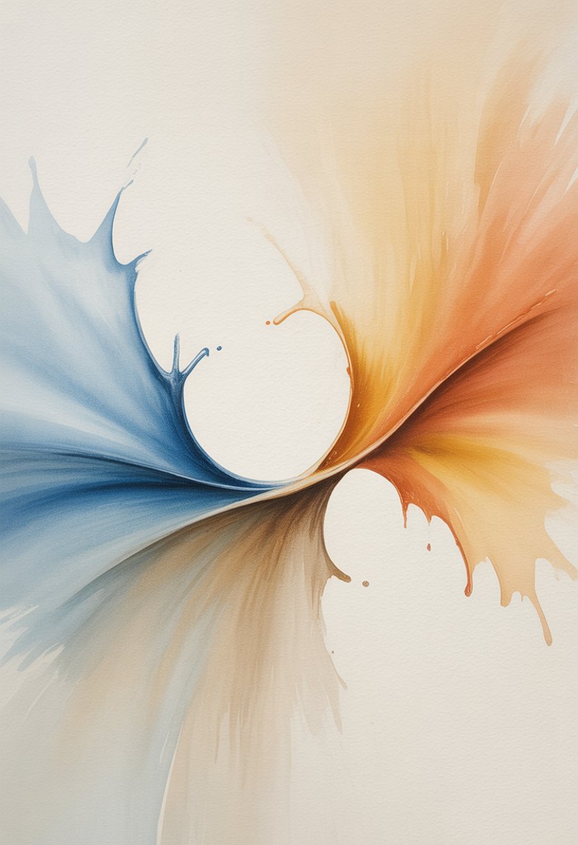
Orange is the color that neutralizes blue in paint because it sits directly opposite blue on the color wheel. That’s why orange knocks back blue’s intensity so quickly. You can also use colors close to orange, like yellow-orange or red-orange, to tone things down.
Get the Fail-Safe Paint Color Playbook (Free PDF)
36 proven colors • 8 ready palettes • trim & sheen guide • printable testing cards.
Fixing blue paint doesn’t have to be some mysterious process. Once you get the basic color theory, you’ll see how easy it is to neutralize blue, mix colors that actually work, and dodge that dreaded muddy look. With a little patience, you can turn that too-blue paint into something you’ll actually like on your walls or canvas.
What Color Neutralizes Blue In Paint?
Orange is the go-to color for neutralizing blue paint because of their spot on the color wheel. When you mix them, you get balance and less of that in-your-face blue.
How Orange Cancels Out Blue
Orange works as blue’s opposite on the wheel, so when you mix them, they basically cancel each other out and give you a neutral result.
To neutralize blue, just add tiny bits of orange straight into your blue paint. Go slow—orange is pretty strong and can take over fast.
The amount you need depends on how intense your blue is. Bright blues need more orange; pale blues, not so much. Add a little at a time and mix it up well after each drop.
Key mixing tips:
- Add orange slowly, just a bit at a time
- Mix really well between each addition
- Test the color on a scrap or a hidden spot
- Write down your ratios in case you need to do it again
Colors close to orange work too—yellow-orange or red-orange will give you slightly different neutrals, but still do the job.
Why Neutralizing Blue Matters
Blue can look cold or just way too much in some paintings. Neutralizing helps you get better color balance and harmony.
Maybe your blue sky is just screaming, or the shadows are a little too harsh. Sometimes, blue straight from the tube just doesn’t match what you see in real life.
Using orange instead of random colors keeps things cleaner and less muddy.
Benefits of neutralizing blue:
- More natural-looking colors
- Better color harmony overall
- No more colors fighting for attention
- More control over warm vs. cool
Common Scenarios for Neutralizing Blue
Water scenes almost always need a little neutralizing—real oceans aren’t pure blue. Same goes for skies, especially near the horizon. Orange can really help with those subtle shifts.
In portraits, blue shadows can make skin look weird and cold. Landscape painters use this trick for distant hills and mountains too, to get that atmospheric effect.
Get the Fail-Safe Paint Color Playbook (Free PDF)
36 proven colors • 8 ready palettes • trim & sheen guide • printable testing cards.
Typical situations:
- Mixing realistic water colors
- Painting natural sky tones
- Making shadows look believable
- Adding depth in landscapes
Sometimes you just need to knock back the blue so it doesn’t mess with your whole color scheme.
Understanding Color Theory for Paint Mixing
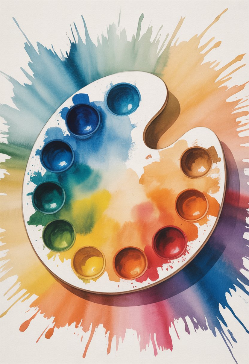
Color theory is basically the cheat sheet for mixing paint. The color wheel shows you which colors cancel each other out—blue has a very clear opposite, and that’s orange.
Complementary Colors Explained
Complementary colors are straight across from each other on the wheel. When you mix them, they don’t make a brighter color—they neutralize each other.
For blue, that means orange is your best bet for neutralizing.
How complementary colors work:
- They knock down each other’s intensity
- They make gray or brown tones when mixed
- They balance out warm and cool
This isn’t just for blue and orange—red cancels green, yellow cancels purple. Just look for the opposite on the wheel.
Add orange to blue and you get a muted, neutral tone instead of something super bright.
The Color Wheel and Blue’s Position
Blue is one of the three primary colors (the others are red and yellow). You can’t mix blue from other colors—it just is what it is.
On the wheel, blue sits between green and purple. Orange is right across from it, so that’s why it works so well for neutralizing.
Blue’s spot on the wheel:
Get the Fail-Safe Paint Color Playbook (Free PDF)
36 proven colors • 8 ready palettes • trim & sheen guide • printable testing cards.
- Primary color: Can’t mix it from others
- Cool color: Feels calm or peaceful
- Opposite orange: Orange neutralizes blue best
- Next to green and purple: These can dull blue a little, but orange does it better
The stronger or darker your blue, the more orange you’ll need. Bright blue? Add more orange. Soft blue? Less is more.
Neutralization Versus Mixing
Neutralizing and regular mixing aren’t the same thing. Neutralizing cuts the intensity without turning blue into a totally different color.
Regular mixing makes new colors—blue plus yellow gives you green, blue plus red makes purple.
Neutralization uses opposites to tone things down—blue plus orange gives you a muted blue-gray or brownish tone.
Go slow with the orange. A little goes a long way, and you can always add more, but you can’t take it out if you go too far.
The idea isn’t to change blue into something else, just to calm it down a bit.
Practical Ways to Neutralize Blue in Paint
Orange is your best friend for neutralizing blue since they’re opposites on the wheel. Picking the right orange shade and mixing carefully is what really makes the difference.
Selecting the Right Orange Shade
Not all oranges are created equal. The orange you pick should depend on which blue you’re working with.
Burnt orange is great for deep blues like navy or royal blue. It’s got some brown in it, so it really takes the edge off those intense blues.
Get the Fail-Safe Paint Color Playbook (Free PDF)
36 proven colors • 8 ready palettes • trim & sheen guide • printable testing cards.
Cadmium orange is your go-to for brighter or medium blues. It’s pure and does the job without making things muddy.
Yellow-orange works if you’re dealing with teal or blue-greens. The yellow helps balance out the green in those shades.
Always test your orange on a bit of blue before diving in. Mix a small batch and see how it looks—saves you a headache later.
Step-By-Step Neutralizing Techniques
Start with blue paint in your mixing cup. Always add orange to blue, not the other way around—it’s just easier to control.
Step 1: Add a tiny drop of orange to your blue. Use a palette knife or brush to mix it up really well.
Step 2: See how the color changes. The blue should start to look less bright and a bit more muted.
Step 3: Keep adding orange, just a little at a time. Mix after each addition.
Step 4: Stop when you hit the neutral you want. Remember, you can always add more, but you can’t pull it out once it’s in.
If you’re working on a big project, jot down your ratios so you can match the color again later.
Blending and Testing Results
Always test your new neutral blue on a small spot first. Paint can look totally different on the wall than it does in your mixing cup.
Paint a 2-inch square somewhere out of the way. Let it dry before you decide if you like it—wet paint can be deceiving.
Check it in different lighting too. Morning, afternoon, and evening light can all change how the color looks.
If it’s still too blue, add a touch more orange. If it’s gone gray or brown, you probably added too much orange—try adding a bit more blue to bring it back.
Keep track of which orange you used and how much. It’ll save you a lot of guesswork if you need to mix more later.
Adjusting Paint Shades: From Blue to Neutral
Turning blue paint into a nice neutral takes some trial and error, but it’s all about balancing colors. You can get gray or beige neutrals by mixing orange with blue and then tweaking with some earth tones or warm colors.
Fine-Tuning for Gray or Beige
Start with your blue and add orange little by little. You’ll get a brownish-gray base, and from there, you can adjust.
If you want gray neutrals, add a touch of black or white to darken or lighten it. Raw umber is great for cooler grays that don’t get muddy.
For beige neutrals, toss in some warm earth tones like burnt sienna or yellow ochre. Those will nudge the mix toward a warmer, softer beige.
Always add colors slowly and mix really well before adding more. And test it out on a small spot—colors shift as they dry, and what you see wet isn’t always what you get.
Balancing Warmth and Coolness
The temperature of your neutral really depends on which colors take over in the mix. Cool neutrals lean toward gray, while warm neutrals shift toward beige or taupe.
To get cool neutrals, try adding more blue-based colors like ultramarine or even a dab of purple. That’ll keep things from getting too warm and muddy.
For warm neutrals, bump up the orange or toss in some yellow-based colors like cadmium yellow or raw sienna. These nudge the color closer to earthy territory.
Watch out for undertones in your paint. Some blues hide green undertones and need different tweaks than pure blue.
Lighting in the room changes everything. North-facing rooms make colors look cooler, while south-facing rooms tend to warm them up a bit.
Tips for Avoiding Common Mistakes
Adding too much neutralizing color can wreck your paint mix. Knowing how to correct weird color shifts can save you a lot of hassle (and cash).
Over-Neutralizing and Its Effects
When you add orange to blue paint, start tiny. Even a small drop can totally change the color.
Add color gradually using this method:
- Mix in 1/8 teaspoon of orange per quart of blue paint
- Stir really well before adding more
- Test on a small spot first
Too much orange turns your blue paint into a muddy brown. That’s because the orange just overpowers the blue.
Once you go too far, it’s almost impossible to fix over-neutralized paint. Usually, you’re stuck with brown unless you start over.
How to tell you’ve overdone the orange:
- Paint looks muddy or dirty
- Color goes brown instead of a softer blue
- Paint loses its blue vibe completely
Mix up small test batches before you commit to the whole can. It’s way less painful if you mess up.
Dealing With Unwanted Hues
Sometimes your neutralized blue ends up purple or green, not the gray-blue you wanted. That’s usually because your base blue has sneaky undertones.
Common color problems and quick fixes:
- Purple tint: Add a bit of yellow
- Green cast: Mix in a touch of red or pink
- Too gray: Bring back a little of the original blue
North-facing rooms can make blue paint look punchier. Your neutralized color might still seem too blue in that kind of light.
Always test your mix in different lighting—morning, afternoon, evening. It’s surprising how much it can shift.
Tricks for stubborn blue tones:
- Try brown instead of orange for a warmer look
- Use black for a cooler gray
- Mix in white to soften strong colors
Keep notes on what you add and how much. Seriously, it’ll save you from repeating mistakes or wondering how you got that perfect shade last time.
Recommended Tools and Products for Paint Neutralization
The right paints and tools just make neutralizing color way less stressful. Good materials give you more control when you’re adding orange to blue.
Choosing Quality Paints
Artist-grade paints are the way to go for neutralizing blue. They pack in more pigment than student-grade, so you get cleaner mixes and less frustration.
Consider these paint types:
- Acrylic paints: Easy to mix and clean up
- Oil paints: Dry slower, so you get more time to tweak
- Watercolors: Nice for subtle neutral effects
Pick orange paints with strong pigment. Cadmium orange and burnt orange are solid choices—they’re bold enough to take on strong blues without getting muddy.
Skip the cheap paints with lots of fillers. They just make everything dull. Sure, quality costs more, but it’s worth it for better control and results.
Essential Mixing Tools
A palette knife mixes colors smoothly, no streaks. Go for a flexible metal blade, about 3-4 inches. Plastic works in a pinch, but metal just blends better.
You’ll want a good mixing surface too. Glass palettes are easy to clean and don’t soak up paint. Disposable paper palettes are handy for smaller jobs.
Grab these basics:
Get the Fail-Safe Paint Color Playbook (Free PDF)
36 proven colors • 8 ready palettes • trim & sheen guide • printable testing cards.
- Palette knife for mixing
- Small brushes for adding tiny bits of orange
- Glass or paper palette for clean mixing
- Paint tubes or bottles in a few sizes
Small brushes let you control how much orange you add. Start with less than you think you’ll need—you can always add more, but you can’t take it out.
Frequently Asked Questions
Orange is the main color for neutralizing blue in paint, but there are always questions about how to mix and what to use. Here are some of the ones that come up the most.
What shade should I add to balance out too much blue in my paint mixture?
Orange balances out too much blue. It’s right across from blue on the color wheel, so it’s the go-to complement.
Use tiny amounts of orange, and mix slowly until you like the look.
No orange? You can make your own by mixing red and yellow, then add that bit by bit to your blue paint.
How do I use a color wheel to determine which paint color will tone down blue?
Find blue on the color wheel and look straight across. That’s orange—your main neutralizer.
Colors near orange, like red-orange or yellow-orange, can also work. They’ll tone down blue, just with a slightly different effect.
The closer you stick to orange, the better it’ll neutralize blue. Stray too far and you’ll get different results, not true neutralization.
Can you suggest a method for neutralizing a strong blue tint in my painting project?
Start with tiny drops of orange in your blue mix. Mix well after each addition and watch the color change.
Take it slow. It’s way easier to add more orange than to fix a mix that’s gone too far.
Test your color on a small area first. Paint always looks a little different when it dries.
Jot down how much orange you add—it’ll help you match the color again later.
What are complementary colors to blue that I can use for paint correction?
Orange is blue’s main complement and gives the strongest neutralizing effect.
Red-orange creates a warmer neutral, while yellow-orange gives a softer, more muted result.
Brown works too, since it contains orange tones. Burnt orange or burnt sienna are nice for subtle tweaks.
Which colors can I mix with blue to create a more subdued or neutral hue?
Mixing small amounts of orange with blue gives you gray or more neutral tones. More orange equals a more neutral color.
Yellow will warm up blue and tone it down, but go easy or you’ll end up with green.
Brown and blue together make deeper, muted colors—great for neutrals with some character.
A little red can also calm down a bright blue, but too much and you’ll veer into purple territory.
Get the Fail-Safe Paint Color Playbook (Free PDF)
36 proven colors • 8 ready palettes • trim & sheen guide • printable testing cards.
What’s the best approach to color match acrylic paint when working with shades of blue?
Different blue shades call for different amounts of orange to neutralize them. Bright blues usually need a bit more orange than the paler ones—strange, but true.
Try mixing small test batches first. Acrylic paint can surprise you; it often dries a different color than it looks when it’s wet.
Keep your original blue paint off to the side while you experiment. That way, if you mess up, you’ve still got your starting point.
Snap a few photos of your color tests in decent lighting. Later, you’ll thank yourself for having a quick reference to see which mix actually nailed the shade you wanted.