11 Best Benjamin Moore Paint Colors for Home Office
Are you looking to spruce up your home office to make it both stylish and productive? Choosing the right paint color is a great place to start!
Benjamin Moore offers a variety of amazing shades that can transform your workspace. From calming blues to energizing yellows, the perfect paint color can boost your mood and enhance creativity.
Get the Fail-Safe Paint Color Playbook (Free PDF)
36 proven colors • 8 ready palettes • trim & sheen guide • printable testing cards.
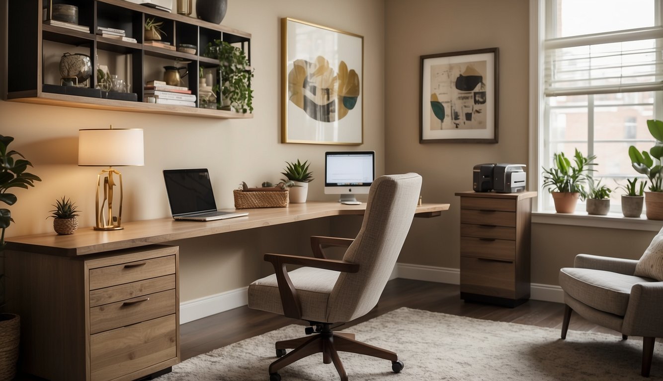
No matter what your style is, there’s a Benjamin Moore paint that fits your needs. By setting the right tone with your wall color, you’ll find yourself more eager to dive into work and stay focused throughout the day.
Let’s explore the best paint options to create an inspiring home office environment.
1. Simply White OC-117
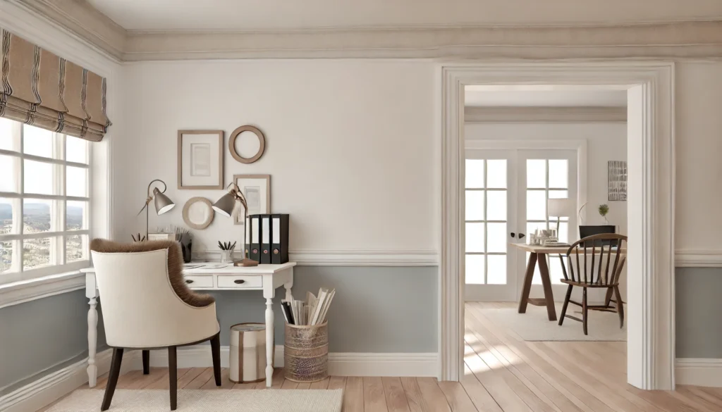
Thinking about giving your home office a fresh look? Simply White OC-117 by Benjamin Moore is a fantastic choice.
With its clean and crisp appearance, it’s easy on the eyes and creates a calm workspace.
Simply White OC-117 is known for its slight hint of warmth, making it more inviting than a stark white. This paint color was even named Benjamin Moore’s Color of the Year in 2016!
Its high Light Reflectance Value (LRV) means it reflects a considerable amount of light, making your office feel bright and spacious. Whether your room gets a lot of natural light or not, this color will help brighten things up.
From walls to trims and even cabinets, Simply White OC-117 can be used all over your office space. It blends well with various other colors, should you want to add some accents.
Looking for inspiration? This color has been popular on walls, ceilings, and furniture in many homes. Give it a try, and you might find it perfect for your productive haven.
2. Revere Pewter HC-172
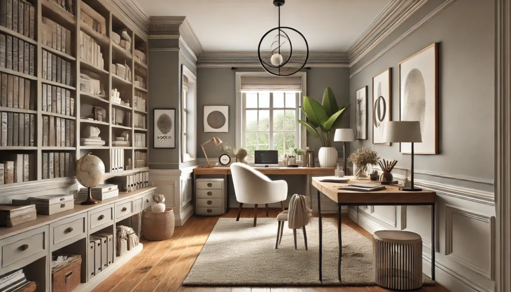
Revere Pewter HC-172 is a classic choice for home offices. This neutral paint color by Benjamin Moore is known for its versatility.
It has a Light Reflectance Value (LRV) of 55.05, meaning it reflects a moderate amount of light, helping to keep your workspace bright without being overpowering.
This color is a perfect blend of gray and beige, often referred to as “greige.” It sits comfortably between warm and cool tones, making it adaptable to various lighting conditions. Revere Pewter works well with many other colors, so you won’t struggle to match your office decor.
You might like how Revere Pewter’s warmth can make your home office feel inviting. Its popularity speaks for itself—it’s been a top seller for years and is beloved by interior designers. If you need a reliable, elegant option, Revere Pewter is worth considering.
3. Balboa Mist OC-27
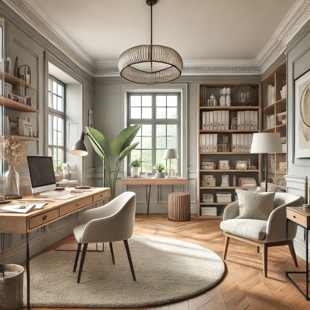
Looking for a versatile paint color for your home office? Balboa Mist OC-27 by Benjamin Moore might be just what you need.
Get the Fail-Safe Paint Color Playbook (Free PDF)
36 proven colors • 8 ready palettes • trim & sheen guide • printable testing cards.
This shade is a warm, light gray often referred to as “greige.” It’s a blend of gray and beige, making it adaptable to different lighting and room styles.
Balboa Mist has a Light Reflectance Value (LRV) of 67, meaning it reflects light well. This can make your home office feel brighter and more open, even if natural light is limited.
People love this color because it complements many other shades. Whether you pair it with bright colors or neutral tones, it creates a calming and professional atmosphere.
Balboa Mist appears in 163 real home pictures online. You can see it paired with different furniture and decor styles. This makes it easier to envision in your space.
4. Edgecomb Gray HC-173
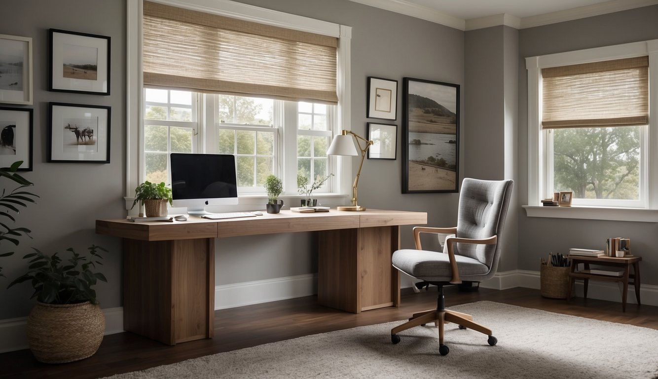
Thinking about a warm, inviting color for your home office? Edgecomb Gray HC-173 by Benjamin Moore might be the perfect choice for you.
This paint color is a mix of gray and beige, also known as greige. It’s a soft, warm neutral that fits well in different lighting conditions.
Edgecomb Gray has an LRV (Light Reflectance Value) of 63. This means it can reflect a fair amount of light, helping your office feel brighter.
Perfect for creating a cozy and productive workspace, it pairs well with many other colors, adding versatility to your decor.
5. Palladian Blue HC-144
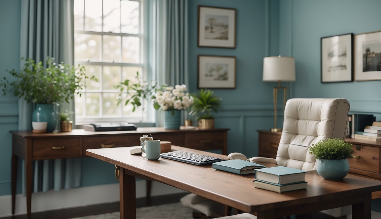
Palladian Blue HC-144 by Benjamin Moore is a fantastic choice for your home office. Its soft, airy blue color creates a calming and soothing environment.
With an LRV (Light Reflectance Value) of 60.4, it balances light and color well.
You’ll find that Palladian Blue conjures images of clear skies. With hints of green, it’s perfect for a relaxed, productive atmosphere.
Get the Fail-Safe Paint Color Playbook (Free PDF)
36 proven colors • 8 ready palettes • trim & sheen guide • printable testing cards.
Natural light enhances its beauty, making it appear lighter in bright rooms and deeper in dimmer spaces. Paladian Blue stands out but doesn’t overwhelm, offering a great backdrop for your office decor.
Palladian Blue isn’t just about looks. It’s versatile, fitting well with both traditional and modern office aesthetics. Add it to your workspace, and you might find your focus and creativity improving.
6. Hale Navy HC-154
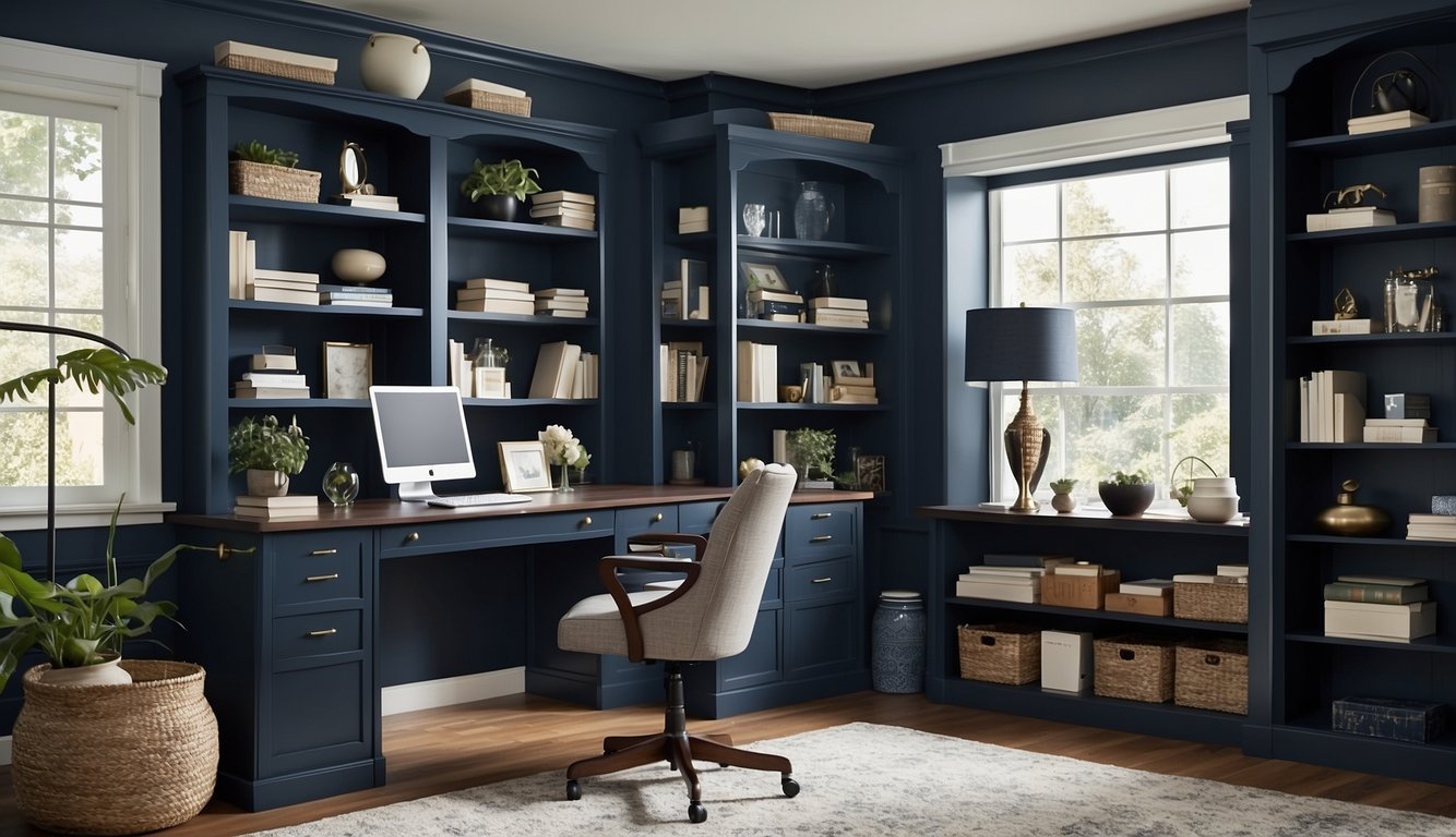
Looking to add depth and elegance to your home office? Hale Navy HC-154 might be just the color for you. This shade is loved by many for its rich, dark blue tone.
Hale Navy HC-154 works wonders on accent walls. Picture it behind your desk, providing a sophisticated backdrop for virtual meetings.
What’s cool about this color is its Light Reflectance Value (LRV) of 8.36, which means it reflects a small amount of light. This makes it a great choice for creating a cozy, focused environment.
Hale Navy HC-154 can make your built-in shelves pop. It pairs wonderfully with warm wood tones and metallic accents.
Worried about it being too dark? Use it with white trim or light-colored furniture to balance it out.
7. Manchester Tan HC-81
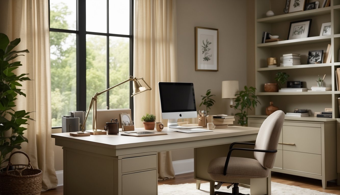
Are you looking for a paint color that feels both cozy and versatile? Manchester Tan HC-81 might just be what you need!
This warm beige, offered by Benjamin Moore, has a Light Reflectance Value (LRV) of 64. This makes it a great option for rooms with a lot of natural light since it reflects light well without washing out.
Get the Fail-Safe Paint Color Playbook (Free PDF)
36 proven colors • 8 ready palettes • trim & sheen guide • printable testing cards.
In darker spaces, Manchester Tan adds just the right amount of depth and personality. It won’t make a room feel too dark or heavy but instead provides a subtle warmth that can make your home office inviting.
Interestingly, Manchester Tan is also known as Berber White 955. Whether you’re working late into the night or enjoying morning sunlight, this color adjusts beautifully to different lighting conditions.
Feeling adventurous? Try pairing Manchester Tan with darker accents or furniture for a striking contrast! This color works wonders in creating a balanced and inviting workspace.
8. Wickham Gray HC-171
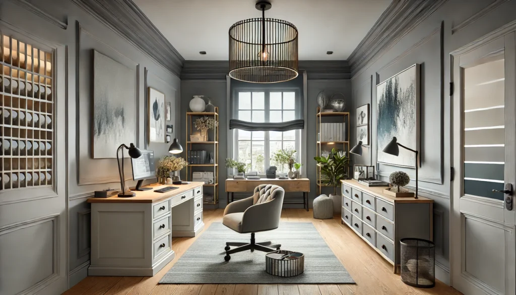
Wickham Gray HC-171 by Benjamin Moore is a fantastic choice for your home office. This light-medium gray has captivating blue and green undertones.
You’ll love how it shifts with different lighting, making your workspace feel dynamic and interesting.
Do you have a north-facing office? Expect a cooler, almost icy feel. More south or west light? The paint warms up, showing off its subtle blue or green hints. This paint is a chameleon, adapting beautifully.
With its Light Reflectance Value (LRV) of around 68, Wickham Gray has a good balance of brightness and depth. It reflects light well without feeling too stark.
Whether you’re on video calls or hunkering down for deep work, Wickham Gray gives your office a professional and stylish look. Plus, it’s been a staple in Benjamin Moore’s lineup, proving its versatility and popularity.
9. Stonington Gray HC-170
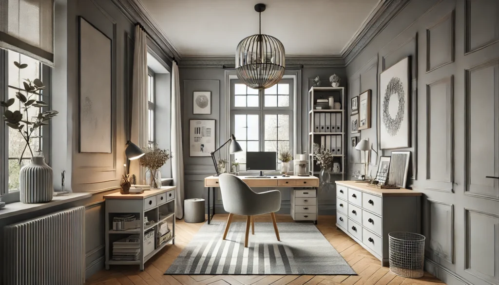
Stonington Gray HC-170 is a popular choice for home offices. This silvery gray has neutral undertones, making it adaptable.
Its Light Reflectance Value (LRV) is 59.36, which means it reflects a good amount of light but isn’t overly bright. This can create an atmosphere that boosts productivity without too much glare.
Do you prefer a space that feels peaceful yet modern? Stonington Gray achieves this balance. Thanks to its subtle undertones, it pairs well with almost any other color.
This flexibility is key when your office might double as another room. Plus, it’s neutral enough to not distract during video calls—a huge bonus!
10. Van Deusen Blue HC-156
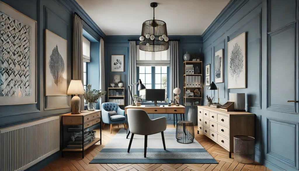
Van Deusen Blue HC-156 is a cool blue paint color from Benjamin Moore. It stands out due to its deeper hue, making it perfect for a home office. The color feels sophisticated and calming, helping you stay focused during work hours.
This shade has a lower Light Reflectance Value (LRV), which means it doesn’t reflect a lot of light. This can make your space feel more intimate.
If your home office has a lot of natural light, Van Deusen Blue can balance out the brightness.
Another great thing about Van Deusen Blue is its versatility. It looks good with both modern and traditional decor.
You can pair it with whites for a crisp look or with wooden furniture for a cozier feel.
If you want your office to feel professional and inviting, Van Deusen Blue is a great choice.
11. Gray Owl OC-52
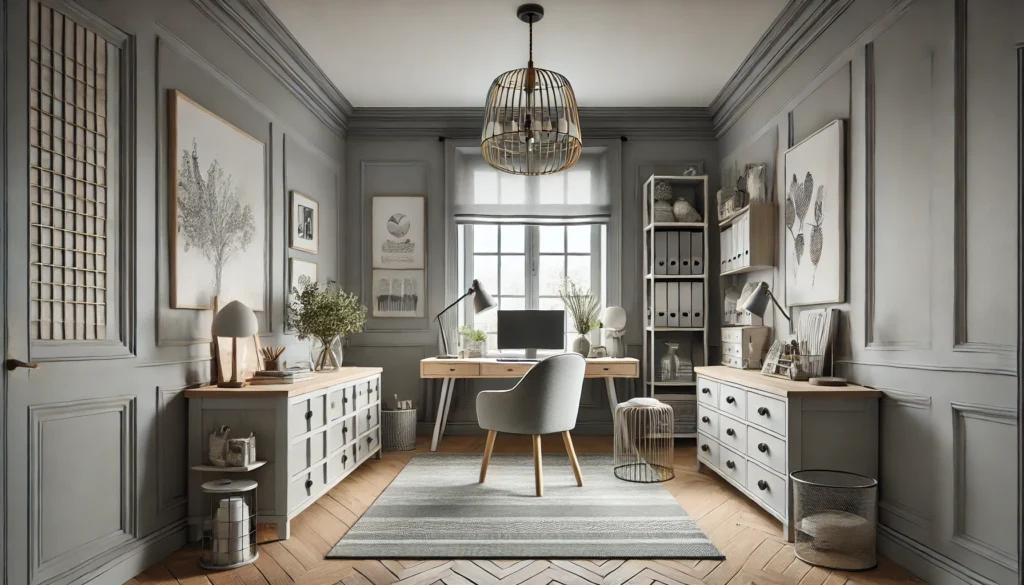
Benjamin Moore’s Gray Owl OC-52 is a popular choice for home offices. This light, cool gray has a versatility that can suit almost any room. Its subtle green undertones create a soothing environment, perfect for concentrating on work.
Gray Owl has an LRV (Light Reflectance Value) of 65.77. This means it reflects a decent amount of light, which can help brighten up your workspace.
Whether you have natural or artificial light, Gray Owl adapts well.
If your home office has north-facing windows, Gray Owl might look a bit cooler. On the other hand, south-facing light can give it a warmer hue.
Get the Fail-Safe Paint Color Playbook (Free PDF)
36 proven colors • 8 ready palettes • trim & sheen guide • printable testing cards.
Pair it with warm whites for trim to balance these effects and enhance the overall look.
For added flair, consider using Gray Owl on an accent wall. It’s also a great choice if you’re planning to sell your home, as it appeals to many buyers.
Creating the Perfect Home Office Ambiance
Choosing the right paint color can make a huge difference in creating a productive and comfortable home office. The combination of color psychology and strategic use of natural light can completely transform your workspace.
Understanding Color Psychology
Colors affect how you feel. Blue promotes calm and focus, perfect for long work hours.
Green, especially shades like Fort Pierce Green by Benjamin Moore, may reduce anxiety.
Consider soft yellows for an energizing boost but avoid overly bright shades.
Red can stimulate and increase energy levels, great for dynamic tasks.
Whites and neutrals offer a clean, uncluttered look that some find helpful.
Remember, the goal is to match the color to the job you do.
Leveraging Natural Light and Paint
Natural light not only helps you see better but also enhances the color of your walls. Place your desk near windows if possible.
North-facing rooms benefit from warmer shades to balance cooler light. South-facing rooms can handle cooler tones due to warm natural light.
For mixed light, Benjamin Moore’s soft, neutral colors like White Dove work well.
Reflective paint finishes can amplify natural light, making even small spaces feel larger and more open.
Using mirrors can also increase light flow and create a brighter atmosphere.
Mix and match both color psychology and natural light to ensure your home office is a place where you truly want to work.
Combining Functionality with Design
Picking the right paint color for your home office is crucial to balancing style and function. Consider how room size and furniture influence this decision.
Choosing Paint Based on Room Size
When choosing paint, size really does matter! In small offices, light colors like Benjamin Moore’s “Pale Oak” can make the space feel larger and more open.
If your office is roomy, you might opt for darker shades like “Hale Navy” to create a cozy, intimate feel.
Imagine painting a small, cramped room with bold hues. It can feel even smaller.
Get the Fail-Safe Paint Color Playbook (Free PDF)
36 proven colors • 8 ready palettes • trim & sheen guide • printable testing cards.
Light colors bounce light around, opening up the space. Large rooms, on the other hand, can handle dark and moody tones without feeling claustrophobic.
How Paint Colors Compliment Office Furniture
Do you ever think about your office furniture when picking paint? You should! A beautiful shade like “White Dove” can make your oak desk pop. Meanwhile, “Edgecomb Gray” might blend seamlessly with modern, metal features.
Matching paint to your furniture isn’t just about aesthetics; it’s about creating harmony. Think about your dominant furniture pieces. If your desk is dark wood, lighter walls can balance the room. Conversely, light furniture pairs well with a richer wall color that adds depth.
Choosing the right paint can highlight key features of your workspace. Look at the overall color palette and ensure everything works together to create a cohesive, inviting space.
