15 Best Paint Colors for Exterior of House: Top Shades to Transform Your Home
Choosing the right paint color for the exterior of your house can instantly boost its curb appeal and give it a fresh, modern look.
Whether you’re planning to sell your home or simply want to spruce it up, selecting the right color combination is key.
Get the Fail-Safe Paint Color Playbook (Free PDF)
36 proven colors • 8 ready palettes • trim & sheen guide • printable testing cards.
With numerous options available, you might feel a bit overwhelmed, but don’t worry—we’ve got you covered.
In this article, we’ll explore the top 15 exterior paint colors that can transform any home, injecting personality and style into your facade.
These color choices are inspired by trends and classic selections that homeowners love.
From deep, dramatic shades to soft, inviting hues, you’ll find a color scheme that suits your taste and complements your home’s architecture.
1. Navy Blue
Looking to give your house a classic yet modern touch? Navy blue might be the perfect choice for you. It’s a timeless color that works well with many styles.
Navy blue is known for its versatility. It pairs beautifully with white trim, making your home look fresh and clean.
Think about using it for an accent wall or even the entire exterior.
Many experts recommend navy blue for a sophisticated look. Whether your house is traditional or contemporary, this color can bring out the best in its design. Plus, it’s got that calming vibe everyone loves.
Give it a try and see how navy blue transforms your home’s exterior. You’ll be amazed at how this deep, rich color can make such a bold statement.
2. Charcoal Gray
Thinking about a sleek and modern exterior? Charcoal gray is a timeless choice.
This neutral shade suits many home styles, making it a favorite. You can pair charcoal gray with white trim for a crisp contrast. It also looks great with stone accents.
Charcoal gray works well with different textures and materials. Whether you have wood siding or brick, it offers a polished look.
Have you noticed how it stands out without being too flashy? This color creates a sophisticated appearance that many homeowners love.
Get the Fail-Safe Paint Color Playbook (Free PDF)
36 proven colors • 8 ready palettes • trim & sheen guide • printable testing cards.
Charcoal gray looks fantastic with lush greenery around your home. It allows your landscaping to pop, adding to your house’s curb appeal.
Consider using charcoal gray for your shutters, front door, or garage. These accents can transform the entire feel of your exterior.
3. Sage Green
Thinking about a timeless color for your home’s exterior? Sage green is worth considering. This calming shade blends nature with elegance, giving your home a warm yet sophisticated look.
Sage green comes in various shades. For instance, Benjamin Moore’s “Sage Tint” is a lighter option. Its blend of blue, green, and gray provides a calming effect.
In contrast, “Hollingsworth Green” offers a muted, silvery finish, ideal for a subtle but stunning appearance.
One thing to note is the lighting in your surroundings. Sage green looks great with different lighting.
In bright light, it appears light and fresh, whereas in dim light, it takes on a deeper, more muted tone.
Pair sage green with other colors to enhance its beauty. It goes well with soft neutrals, buttery yellows, and even refreshing blues.
You can create a cohesive look by adding neutral trims or accents in these colors.
Is your home north-facing or south-facing? This can affect how sage green appears. North-facing homes might need a sage green with more yellow to avoid looking too blue.
4. Classic White
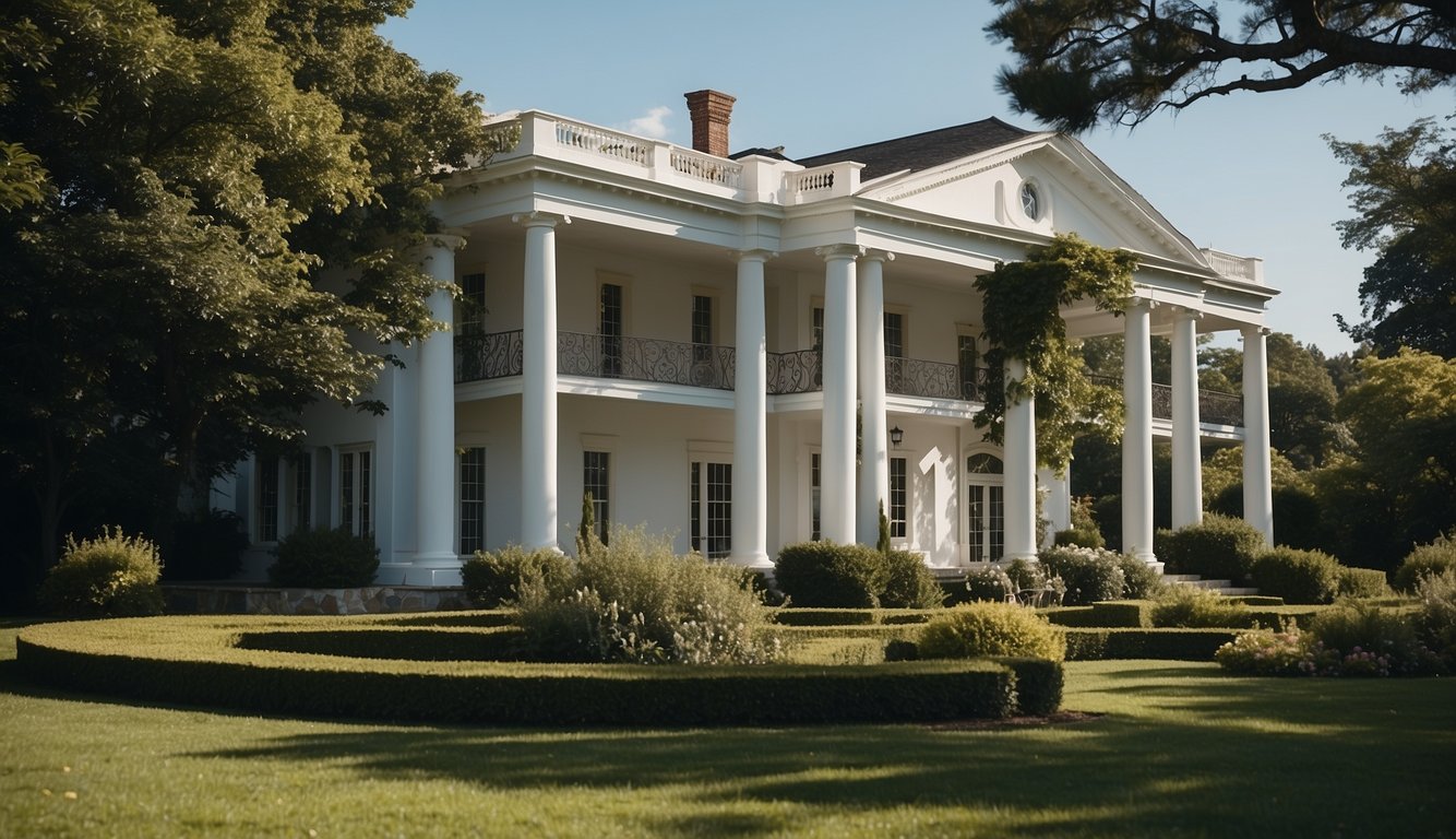
White is the go-to choice for many homeowners. It’s clean, crisp, and timeless. When you think of a classic look, white often comes to mind.
Get the Fail-Safe Paint Color Playbook (Free PDF)
36 proven colors • 8 ready palettes • trim & sheen guide • printable testing cards.
If you want your home to look bigger and more inviting, paint it white. It works especially well with black trim and a green front door for a striking contrast.
Benjamin Moore’s White Dove is a popular option. It’s soft, with slight gray undertones, making it less stark and more welcoming.
Another excellent choice is Sherwin Williams Snowbound. It’s a pure, clean white that stands out beautifully in any light.
Try using Oyster White by Sherwin Williams if you want a softer look. It’s not too bold but still maintains that classic appeal.
5. Dusty Blue
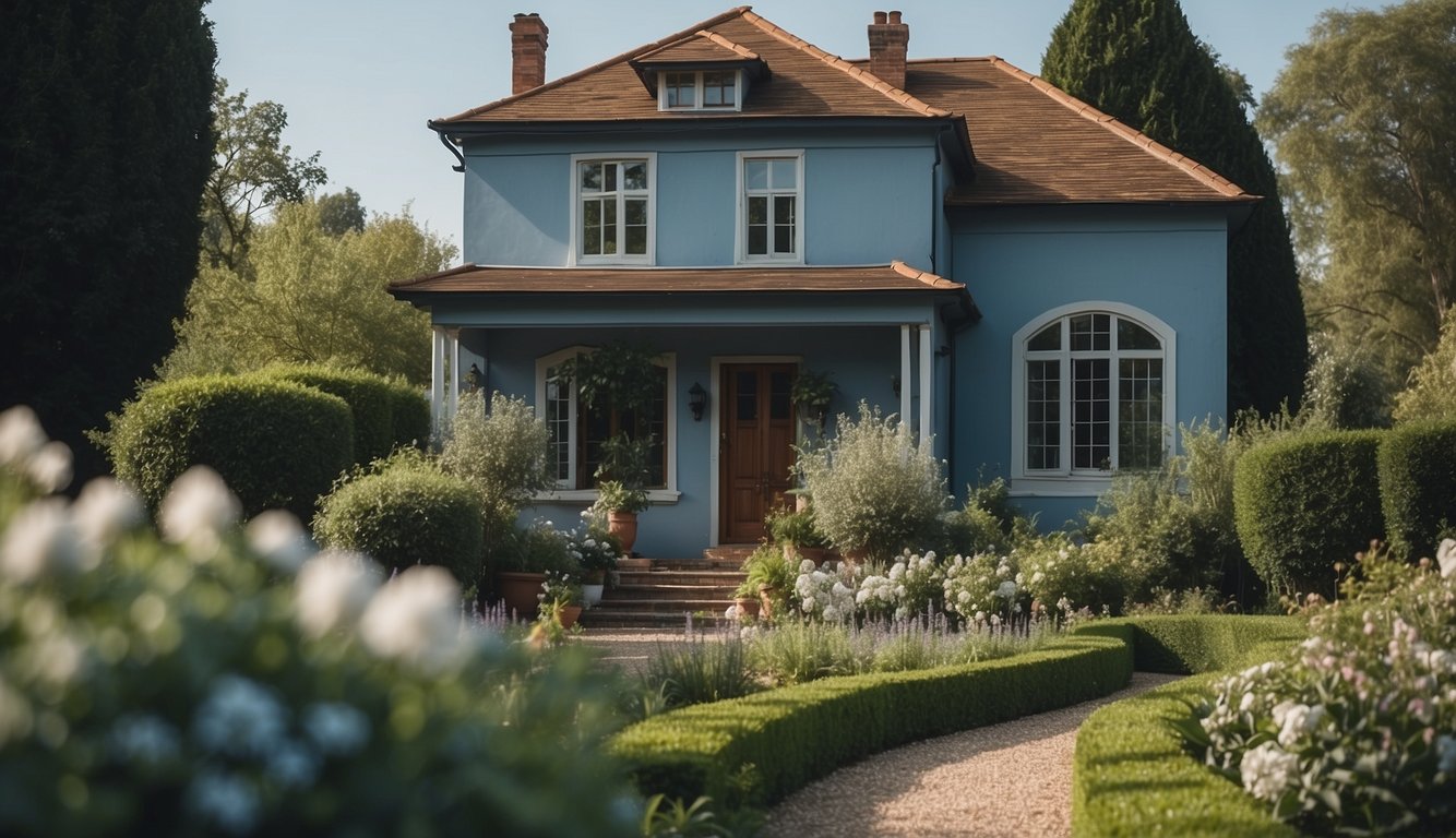
Dusty Blue is a versatile exterior paint color that offers a calm and elegant look. It works beautifully on various house styles, from modern to classic.
This shade brings a unique charm to your home’s exterior. Not too bright, it has subtle hints of gray that make it sophisticated yet welcoming.
Pair Dusty Blue with white trim for a crisp and clean appearance. Add a bold front door in a contrasting color like red or yellow if you want to make a statement.
Dusty Blue is perfect for those who want a color that stands out without being too loud. It’s a great choice if you are aiming for a timeless look.
This color also looks stunning with natural elements like stone or wood accents.
Get the Fail-Safe Paint Color Playbook (Free PDF)
36 proven colors • 8 ready palettes • trim & sheen guide • printable testing cards.
6. Creamy Beige
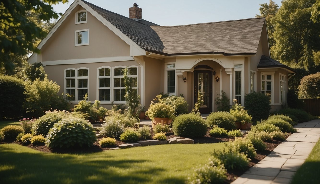
Creamy beige is a cozy and warm choice for your home’s exterior. It offers a classic look that never goes out of style.
Picture a soft, buttery hue that makes your house feel inviting and elegant.
This color pairs well with white trim, giving your home a crisp and clean appearance. You can also match it with darker accents like navy or black for a striking contrast.
What’s great about creamy beige is its versatility. It looks good on various home styles, from traditional to contemporary. Plus, it blends seamlessly with natural surroundings.
7. Warm Taupe
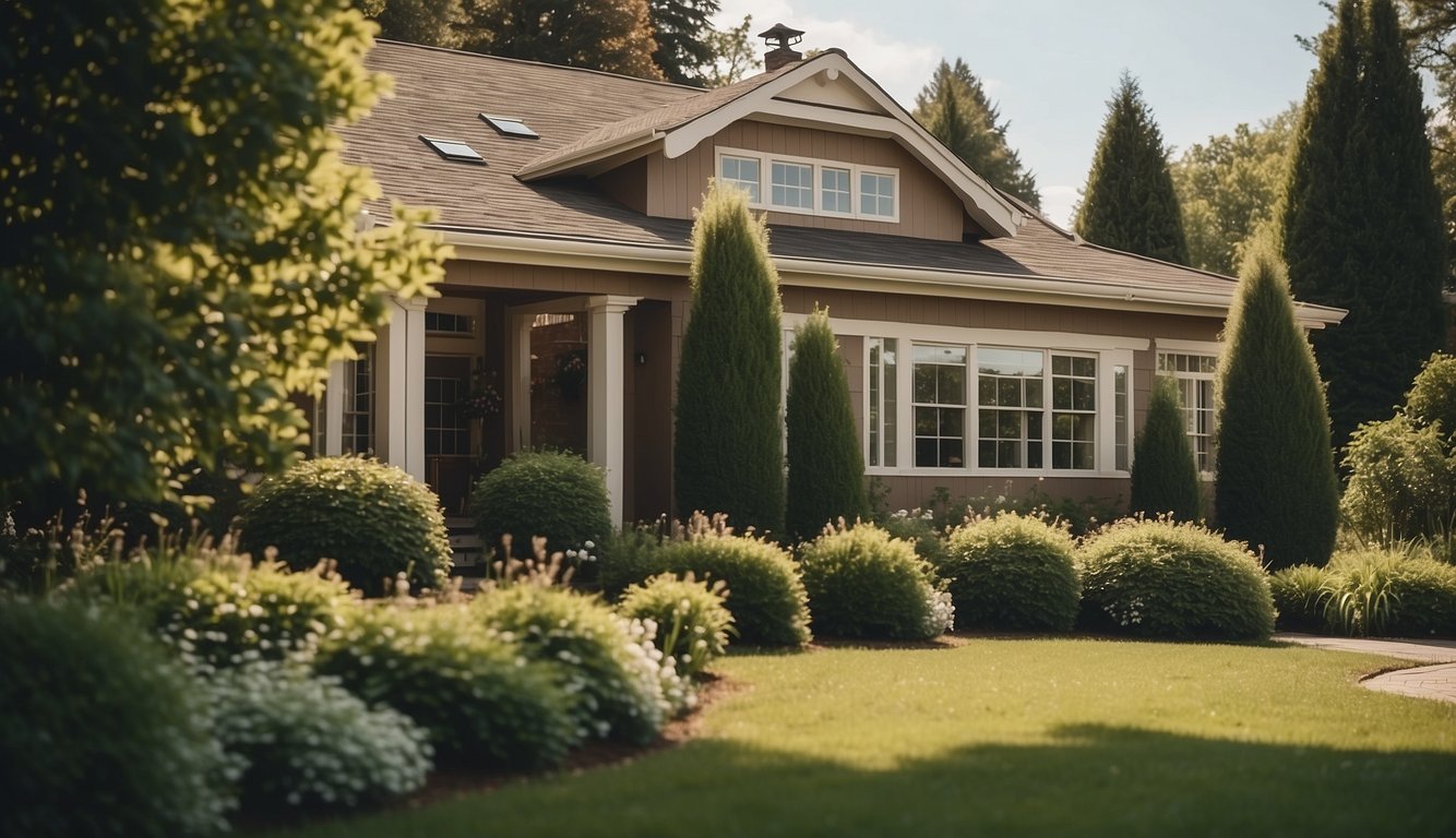
Thinking about a cozy look for your house exterior? Warm taupe can be your go-to color. This shade sits perfectly between brown and gray, giving a lovely neutral base.
Pair taupe siding with a black roof for high contrast. This combination stands out. Add olive green accents on shutters or the front door for an earthy touch.
Warm taupe looks fabulous in many settings. Whether your home is in a bustling street or a quiet suburb, taupe adds a welcoming feel. This color is versatile and fits with various architectural styles.
Using taupe with other natural colors creates a balanced look. Think about adding brown or green hues to enhance the coziness. Your home will feel inviting and harmonious.
8. Olive Green

Olive green is a fantastic choice for your house exterior. It’s bold yet earthy. This color works great with various architectural styles, from modern to rustic.
Many designers love Benjamin Moore’s Aegean Olive for its deep and rich shade. It’s been featured as a top pick for good reason.
You might consider mixing in natural materials like wood or stone to enhance its look.
Olive green can also create a calming and serene feel. This makes it perfect for houses surrounded by greenery.
Picture your home blending harmoniously with your garden or wooded surroundings!
9. Earthy Mustard

Looking for a unique and cheerful color for your home exterior? Earthy Mustard might be just the pick for you.
This shade blends the warm tones of yellow with a grounding earthiness. It’s particularly stunning when used on homes with wood or stucco exteriors.
Imagine walking up to a mustard yellow house with white trim. Charming, right?
Earthy Mustard works well in both urban and rural settings. If your house has a lot of natural surroundings, this color can complement the greenery and create a cozy feel.
It’s also a standout choice for houses in sunnier climates, where the shade shines brightly.
Some homeowners pair Earthy Mustard with darker colors like navy or charcoal to create a balanced look.
This combination can make your home look sophisticated yet approachable.
10. Brick Red

Brick red is a top choice for house exteriors with a classic and timeless look. It’s a versatile color that blends well with various accents and trims.
Pair brick red with cream-colored trim and columns. Cream doesn’t look like a primer, making the exterior pop more.
For a chic look, consider using Tricorn Black on shutters and doors. It offers a sophisticated contrast that highlights the red brick’s earthy feel.
Another great option is SW Alabaster, a creamy off-white for a modern farmhouse style. Using Alabaster brightens the exterior without overpowering the brick’s natural beauty.
Brick red can be complemented with warm-tinted deep charcoal paint like Iron Ore. This combination delivers a polished, sophisticated appearance.
11. Stone Gray

Stone gray is a fantastic choice for your home’s exterior. It has a timeless appeal that works well with various architectural styles.
This color pairs beautifully with natural materials like wood and brick. Imagine a stone gray house with wooden shutters and a brick pathway—charming!
You can also use stone gray for all sorts of accents. Think about painting your front door or trim in a contrasting color to make it pop. This creates a welcoming and stylish look.
12. Soft Black

Soft black paint colors give your house a subtle yet sophisticated look. Unlike true black, which can sometimes feel harsh, soft black contains brown or gray undertones. This makes it versatile and welcoming.
Black Magic (PPG1001-7 by PPG) is a warm black with brown undertones. It’s perfect if you want a color that is closer to true black but slightly softer.
Another fantastic option is Graphite. By day, it appears dark grey. In shadows, it pulls true black without overt undertones. This makes Graphite a flexible choice for various lighting conditions.
Benjamin Moore’s Black Panther (2125-10) leans into the bold side of soft black. It’s perfect if you aim to make a timeless statement on your home’s exterior. This shade has an LRV (Light Reflectance Value) of 6.51, which means it effectively absorbs light.
Pairing soft black with white or wood trim can enhance its subtle beauty. Give it a try for a modern yet elegant look!
13. Pale Yellow

Pale yellow is a charming choice for your home’s exterior. Imagine the soft, inviting color greeting you and your guests. It offers a cheerful yet calm vibe.
Pair pale yellow with crisp white trim. It highlights the architectural features, making them pop. This combination is perfect for creating a welcoming look.
Adding accents like charcoal black shutters or a red door can add depth to your exterior. These elements create a balanced and cohesive appearance.
Pale yellow is also versatile. It works well with different styles, from classic to modern. Whether you have a traditional or contemporary home, pale yellow can fit right in.
This color also looks great with natural surroundings, blending seamlessly with green landscapes. It enhances the beauty of your home’s environment.
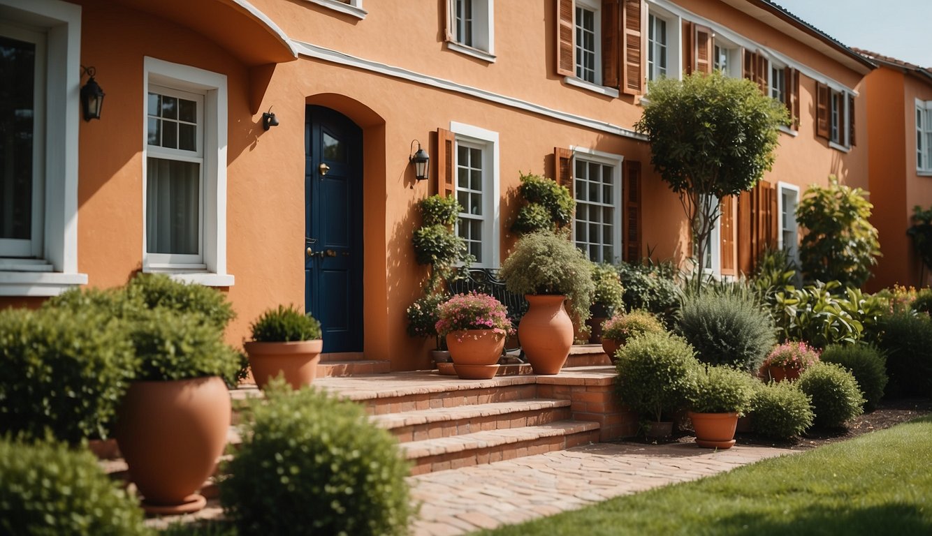
14. Terracotta

Looking for a warm, inviting exterior color? Terracotta might be just what you need. This paint color brings a cozy vibe to any home, thanks to its red and brown undertones.
Terracotta pairs well with neutrals like white, black, beige, and gray. You can also mix it with bold colors like mustard yellow, navy blue, and sage green for a striking effect.
Benjamin Moore and Sherwin Williams have some great shades of terracotta in their collections. Benjamin Moore even included it in their 2023 and 2024 color trends. Don’t overlook Savannah Clay, a medium-dark terracotta with an LRV of 30, which adds depth without overwhelming your space.
15. Timeless Tan

Tan is a popular choice for exterior house colors. It gives homes a warm, welcoming look.
You can pair tan with many other colors. For example, black trim adds a modern touch. Wood accents bring in a natural feel.
Tan works well on different types of homes, from bungalows to modern houses. It provides a neutral backdrop that can highlight your home’s features.
Experiment with shades of tan. Some have hints of beige or even a bit of red. These subtle differences can change the look and feel of your home.
Consider adding white columns or railings. They can make your tan house stand out more.
Understanding Exterior Paint Colors
Choosing the right paint color for your house exterior is important because it affects curb appeal and the home’s overall look. Your choice should consider various factors, be it personal preferences, architectural styles, or the environment.
Importance of Choosing the Right Color
Picking the right exterior paint color can transform the look of your home. Imagine pulling into your driveway every day and feeling delighted by a fresh, vibrant color. On the other hand, a dull or inappropriate color might make you wince every time you look at your house.
The color you choose reflects your personality and can either complement or clash with your neighborhood. Bright colors might look great on Victorian houses, but modern homes often fare better with neutral tones. Blues and greens are often favored in coastal areas. In contrast, earthy tones work well in desert regions.
Get the Fail-Safe Paint Color Playbook (Free PDF)
36 proven colors • 8 ready palettes • trim & sheen guide • printable testing cards.
A fresh coat of paint can also boost your home’s value. Real estate agents often emphasize curb appeal, and the right color can make your home more attractive to potential buyers. Benjamin Moore’s “White Dove” or Sherwin-Williams’ “Tricorn Black” are some popular choices known for enhancing the look of a house.
Factors Influencing Paint Choice
Several factors influence your choice of exterior paint. First, consider the architectural style of your home. French Colonial homes might look best in shades of blue-gray, for instance.
The surroundings play a big role too. A house in a wooded area might blend beautifully with shades of green or browns. If you live in a bustling urban area, sophisticated colors like “Elephant Skin” by Behr could be a chic option.
Climate is another consideration. Homes in sunny areas can benefit from lighter colors that reflect heat, while darker colors can be cozy for cooler climates.
Personal preference can’t be ignored. You might love bold, statement colors like Behr’s “Baked Sienna” or something more subdued like “Greige”, a trendy mix of gray and beige.
Durability is a key factor. High-quality paints last longer and can protect your house from the elements. Brands like Farrow & Ball and Sherwin-Williams are known for their longevity and quality. Picking a durable paint can save you money and hassle in the long run.
Popular Color Trends
Choosing the right color for your house’s exterior can transform it completely. Here are some trends to help guide your choice.
Neutral Tones
Neutral tones remain a popular choice. People love them because they are versatile and timeless. Colors like warm honey from Glidden offer a fresh, inviting vibe without being too loud. It’s excellent if you’re tired of gray or beige.
Sherwin Williams’ Amazing Gray is also a favorite. It’s subtle and works well with various architectural styles. These shades create a calm and classic look, appealing to a wide audience.
You might also consider earthy tones like sand, clay, or stone. These hues blend well with natural surroundings and provide a warm and grounded feel to your home.
Bold Accents
Bold accents are a great way to make a statement. Dark blues, for example, are in vogue for 2024. Benjamin Moore’s Newburyport Blue is a striking choice that offers both boldness and elegance.
Another popular option is the deep and dramatic Nightfall from Benjamin Moore. It brings a moody and sophisticated touch to any exterior.
Don’t forget bright reds and vibrant greens. These colors can provide a lively contrast when paired with neutral bases. Accent your front door or shutters to add personality and charm to your home’s curb appeal.
Tips for Selecting Exterior Paint
Choosing the right exterior paint for your house involves more than just picking a color you like. It requires considering architectural details and testing colors on your house’s exterior before making a final decision.
Consider the Architecture
Your home’s style and age play a significant role. For example, a Victorian home might look stunning in bold colors like deep greens and reds, while a modern house often looks best in neutrals like gray or white.
Pay attention to fixed elements. Coordinate paint colors with the roof, brick, or stone that won’t change. Select hues that blend and unify these elements for a cohesive look. A white exterior often pairs beautifully with green or black trim.
Think about the setting. Beachfront homes often look great in light blues, while countryside homes might go well with earthy tones. Keep in mind that your house should complement, not clash with, its surroundings.
Test Before You Commit
Always try samples first, even if you’re confident in your choice.
Paint small sections of your wall with each color. This way, you can see how they look in different lighting conditions and times of the day.
Get the Fail-Safe Paint Color Playbook (Free PDF)
36 proven colors • 8 ready palettes • trim & sheen guide • printable testing cards.
Consider the effect of weather.
Moisture and sunlight can change a color’s appearance. Houses at higher elevations might need lighter tones. This is because colors brighten with less moisture in the air.
Evaluate from a distance.
Stand back and look at the test areas from the street. Sometimes colors appear different from afar. You want your home to look as good from a distance as it does up close.
