The Future of Color Trends: Bold Predictions for 2025 and Beyond
If you’ve ever wondered how colors will shape our world in the next few years, you’re in the right place. Adore ruby reds and bold jewel tones? Rich colors like Behr’s “Rumors,” a warming ruby red, are predicted to stand strong in 2025, adding sophistication to any space. As we move forward, color trends won’t just be about aesthetics; they’ll influence moods and environments, playing crucial roles in our homes, designs, and lifestyles.
Get the Fail-Safe Paint Color Playbook (Free PDF)
36 proven colors • 8 ready palettes • trim & sheen guide • printable testing cards.
Imagine your living space looking like it just stepped out of the 1970s, but with a modern twist. That’s where we’re headed! The upcoming years will see a blend of vibrant 70s-inspired hues and contemporary styles. Expect to see everything from soft neutrals to striking colors, as predicted by various design forecasts. These colors will be versatile, adaptable to different settings, and sure to capture the essence of both the past and the future.
As color takes on a more significant role, the next decade promises a colorful journey filled with creativity and expression. You’ll find hues that inspire change and evoke emotions, redefining the spaces where you live, work, and play. So, if you’re curious about what’s next on the color horizon, stick around—there’s a lot more to explore in this vibrant world of color trends!
Evolving Aesthetics and Color Philosophy
In the ever-changing world of design, color trends are influenced by many factors. Focus on sustainability, a blend of nostalgia and future ideas, and an understanding of color’s psychological impact are key.
Sustainability and Color
Colors inspired by nature are growing popular due to a push for sustainability. Earthy greens, ocean blues, and clay browns remind us of the world’s need for protection. Choosing these colors can make spaces feel connected to the earth.
You’re likely to come across materials boasting low environmental impact. Painting with eco-friendly choices is becoming common. Open your home to palettes reflecting the environment to join the eco-friendly revolution. It’s about decorating stylishly while being kind to the planet.
With growing awareness, consumers prefer brands promoting green solutions. Enjoy colors reflecting eco-consciousness and innovation, creating a better world. Engage with this trend and let your space show your commitment.
Nostalgia Meets Future
Nostalgia in color trends brings comfort but is combined with future vibes to stay relevant. Think about your grandma’s old pastel kitchen merged with futuristic metallics. Old meets new in this fascinating blend. Isn’t it intriguing how shades of the past can look modern with a twist?
Colors such as deep reds, soft pinks, and vintage blues make a comeback. These tones paired with sleek designs close the gap between different eras, providing the best of both worlds. Reliving the past but keeping one eye on the future in your design choices.
This synergy thrives by balancing familiar hues with forward-looking applications. Dive into a playful mix of vintage and modern. Trendy interiors today embrace a kind of timelessness.
Psychology of Future Tones
Colors affect emotions. Know the impact before choosing paint for your bedroom or office. Future color trends focus on how hues shape feelings. For soothing spaces, soft greys and blues work well. Want energy? Go for vibrant oranges or bright yellows.
The psychology behind your chosen palette is key. Paint with purpose to shape moods and enhance experiences. Those in tune with this create environments uplifting and inspiring.
Designers increasingly use color to influence emotional responses. Connect with spaces not just visually, but emotionally, with just the right shade. This knowledge brings insight into how environments are more than just aesthetics—they’re experiences.
Get the Fail-Safe Paint Color Playbook (Free PDF)
36 proven colors • 8 ready palettes • trim & sheen guide • printable testing cards.
Predictive Color Systems and Tools
When diving into predictive color systems, you’ll discover a fascinating process of how color speaks to the future in design. Companies employ unique approaches to predict which hues will reign supreme. Let’s explore how Coloro and WGSN, Pantone, Sherwin-Williams, and Behr set the tone.
Coloro and WGSN
In the world of color forecasting, Coloro and WGSN stand out like the dynamic duo of trend prediction. Coloro uses a precise 1,600-color system to nail down future trends. It’s all about numbers here. By analyzing data and blending it with WGSN’s qualitative insights, they capture emerging trends that hit the sweet spot between science and creativity.
With tools like their trend evolution chart, you glimpse how colors transition over seasons. They even forecast two years ahead, keeping industries ahead of the curve. Imagine knowing the color of your living room before the collection even hits the market. Isn’t that like seeing into the future?
Pantone’s Influence
Pantone is the big kahuna when it comes to color trends. Ever heard of the Color of the Year? Pantone’s pick often shapes industries from fashion to home decor. Their system, with thousands of shades, is all about setting a global language for color. They don’t just choose a color; they tell a story with it.
Their reports offer insight into how cultural events and technological advances impact color choices. Pantone’s team combines psychology and market research, ensuring their predictions resonate with you. It’s like they have a magic ball, predicting what colors will make waves. Pretty cool, right?
Sherwin-Williams Paint Forecasts
Sherwin-Williams is like a color psychic for home spaces. They release a yearly Color of the Year, shaping interior design trends. Think of them as curators of the perfect palette, balancing timeless classics with trendy new tones. How many times have you seen a wall that looks fresh but familiar?
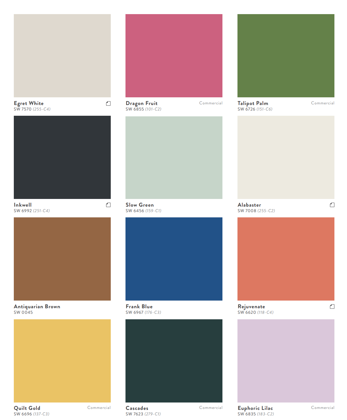
Their forecasts are based on a careful review of industry movements and design trends. They even consider global cultural trends, making sure their hues speak to your mood and lifestyle. Did you know their color forecast involves 75 shades grouped into four themes? That’s like a color buffet for your walls.
Behr’s Color Exploration
Behr gets into the nitty-gritty with its color exploration. They focus on how colors make you feel in your space. Behr’s Color of the Year aims to inspire a sense of comfort and personal expression. Their predictions are practical, rooted in how we live and interact with spaces daily.
Using consumer insights and design influences, Behr’s palettes are perfect for real-life applications. They look at what colors will be used in homes and workspaces, reflecting broader lifestyle trends. If you’ve ever painted a room and felt the vibe shift, you know what Behr’s forecasts mean to real life. Isn’t it amazing how a splash of color can change everything?
Color Trends in Different Industries
Get the Fail-Safe Paint Color Playbook (Free PDF)
36 proven colors • 8 ready palettes • trim & sheen guide • printable testing cards.
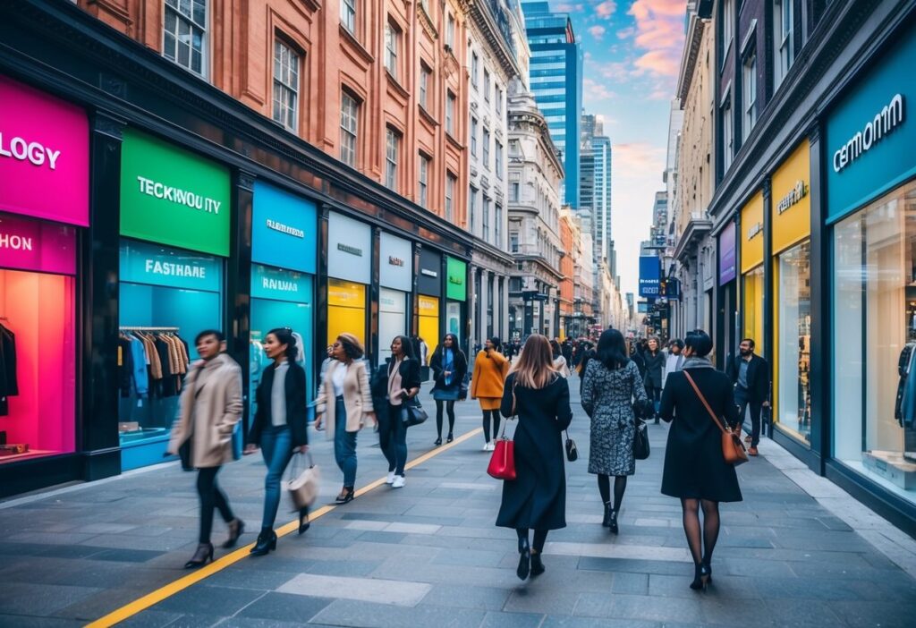
The world of color is constantly evolving, and it’s fascinating to see how different shades impact various industries. From sleek and sophisticated in fashion to calming and soothing in interiors, color trends shape our everyday lives.
Fashion Industry Foresight
You’re probably wondering what’s hot in fashion these days, right? Expect a blend of vibrant hues and muted tones dominating the runway. Bright colors like electric blue, neon green, and vivid pink are making waves, symbolizing optimism and change. These are perfect for bold fashion statements.
On the flip side, earthy tones such as terracotta and sage green deliver a sense of calm and sustainability. Designers often embrace these for their eco-friendly fashion lines.
Metallics are also in the spotlight, adding a futuristic feel to any outfit. These shimmering colors make accessories and evening wear truly pop. Keep an eye out for these trends as they continue to influence both high fashion and streetwear.
Beauty and Cosmetic Hues
How about your makeup bag? Is it ready for a makeover? Warm tones like amber, bronze, and burnt sienna are popular in beauty, offering every skin tone a glow. Look for these in lipsticks and eyeshadows to stay on-trend.
In contrast, you might notice a trend toward pastels in nail colors. Lilac, mint, and baby blue evoke a sense of nostalgia and playfulness, perfect for a softer look.
Bold eyeliner colors such as cobalt blue and emerald green give your eyes that extra pop. The beauty industry is all about embracing individuality, so there’s plenty of room to play with colors and find what suits you best.
Interior Design Directions
Looking to refresh your living space? Interior design trends are steering towards earthy and warm tones. Think soft browns, beiges, and the ever-popular greige (a mix of grey and beige). These colors bring warmth and coziness to your home.
Bring in biophilic colors that mimic nature like deep greens and sky blues, creating a calming atmosphere. This approach enhances well-being by connecting indoor spaces with the outdoors.
Get the Fail-Safe Paint Color Playbook (Free PDF)
36 proven colors • 8 ready palettes • trim & sheen guide • printable testing cards.
Bold accent colors like burnt orange and honey gold are ideal for adding character and energy to any room. These trends offer exciting opportunities to personalize your space and keep it fresh.
Innovations in Home Design
When it comes to home design, balance is key. Innovative designs often feature dual-color palettes. Imagine a sleek, modern kitchen with a black and white theme or a navy and cream living room offering a nautical feel.
Consider applying statement wall colors like mustard yellow or copper red to highlight specific areas without overpowering the entire room. These colors can define a space and make it inviting.
Technology also influences color choices. Smart lighting can change the hue of a room with just a few taps, allowing you to adapt to different moods and times of day. Keep these trends in mind to create a stunning and adaptable home environment.
Color Trends Influenced by Global Events
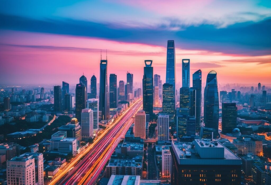
Color trends are being shaped by exciting changes like space exploration and digital innovations like the metaverse. These global events are influencing how we choose colors, creating new palettes and styles.
Space Exploration and Its Palette
Space exploration has a fascinating impact on color trends. Imagine deep-space blues mimicking the vastness of the universe or fiery reds resembling Mars’ surface. As we explore beyond Earth, these adventurous hues capture society’s imagination.
Space tourism is growing. Companies like SpaceX and Blue Origin make space travel more accessible. This growth impacts color choice, making futuristic silvers and versatile grays popular. Space-themed designs often embody these trends, challenging traditional styles and introducing cosmic elements.
The Impact of the Metaverse
The metaverse revolution is also reshaping color trends. This digital landscape, where virtual and augmented realities merge, plays with color in new ways. Bright neons and bold digital hues are the new black, showcased in immersive digital environments.
The metaverse is about creativity without limits. This freedom drives designers to experiment with colors that may not exist in the real world. In virtual worlds, colors shift rapidly, reflecting moods or actions, and can create experiences pulling users deeper into the digital realm. As a result, these vibrant and dynamic colors influence actual color choices, inspiring digital-inspired patterns and aesthetics in real life.
The New Era of Color Marketing
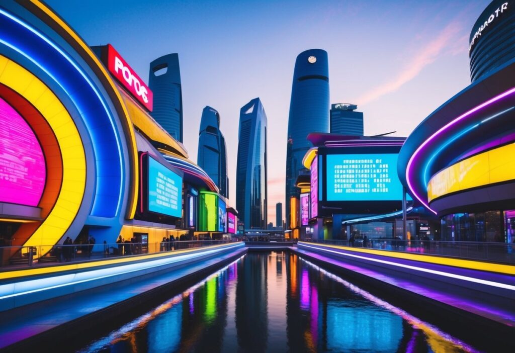
Color marketing is shifting as brands embrace new trends. Stealth wealth and appreciation for antiques and chrysalis themes drive fresh color palettes, reflecting societal changes and consumer desires.
Stealth Wealth and Luxury
Welcome to luxury reimagined. Stealth wealth and quiet luxury emphasize understated elegance over flashy displays. Think deep greens like “Forever-green,” capturing nature’s endurance and charm. These hues offer a sense of calm and sophistication.
You may notice classic colors like subtle grays or muted blues taking center stage. They convey sophistication without shouting for attention. Rich textures and materials complement these hues, elevating the overall feel. Brands focus on quality and timelessness, staying relevant in changing times.
Stealth wealth prioritizes depth and thoughtfulness in every shade. Exploring earthy palettes, it nurtures an appreciation for natural beauty. Color selection carries intention, offering a seamless blend of luxury and sustainability.
Antiques and Chrysalis
Antiques draw from rich histories and cherished memories, while chrysalis represents transformation and rebirth. You’ve probably seen antique-inspired colors embody nostalgia as well as modern renewal. Deep reds, mellow yellows, and dusty pastels echo the charm of bygone eras. These shades exude warmth and familiarity, yet bring a modern twist.
The concept of chrysalis in color marketing signifies change and hope. As consumers embrace new beginnings, they lean towards lively hues that inspire. Bright, emerging tones signal growth and positivity. Colors reflecting natural elements and organic evolution are taking over.
Antiques meet chrysalis when timeless hues evolve with contemporary ideals. This balance highlights enduring beauty while embracing fresh innovation. A perfect blend of the old and the new, these trends resonate across many industries today.
Specific Color Predictions and Their Meanings
Colors play a vital role in design and fashion, reflecting cultural trends and influencing emotions. Warm tones like earth colors and warm neutrals provide a sense of comfort, while greens and blues bring a fresh and calming vibe. Berry shades add depth, and euphoric lilac offers a playful touch to any palette.
Warm Tones and Neutrals Forecast
Warm tones and neutrals are all about comfort and connection. Imagine cozying up with a warm cinnamon latte — that’s the feeling these colors evoke. Found in earth and sand tones, warm colors connect us to the natural world. They are expected to dominate home interiors, fashion, and graphic design.
Why are they so popular? These tones are versatile, working well with other shades. Beige, taupe, and soft terracottas are calming, while strong burgundies and rusts offer that cozy feel. The flexibility of these hues suits many tastes, making them staples in future trends.
The Rise of Greens and Blues
Greens and blues symbolize freshness and tranquility, echoing nature’s serenity. You might think of lush forests or open skies, bringing the outside in. These colors are more than just pretty; they represent eco-consciousness and sustainability. Forecasters predict richer emerald greens and deep navy blues will be favorites.
They’re not just bold and beautiful. These shades also provide a powerful backdrop for other design elements. Pairing them with neutral tones allows bold accessories to stand out, balancing vibrancy with calm. Greens correlate with renewal, while blues suggest trust, making them popular in branding.
Regal Reds and Berry Shades
Regal reds and berry shades are making a comeback. Reds like ruby are often associated with luxury and power, catching the eye with their vibrant glow. Meanwhile, juicy berry shades, think cranberries and raspberries, bring richness and sophistication.
These colors work well in fashion and design, offering a dramatic edge. They pair beautifully with neutral tones or make a statement on their own. Designers use them to add passion and energy to their creations. Outside the fashion bubble, berry hues in interior design give a touch of elegance.
Eclectic Expression with Euphoric Lilac
Euphoric lilac is the wild child in the color world. Its playful, dreamy vibe encourages creativity and joy. Lilac stands out with its soft yet striking appearance, ideal for whimsical designs.
Get the Fail-Safe Paint Color Playbook (Free PDF)
36 proven colors • 8 ready palettes • trim & sheen guide • printable testing cards.
This color radiates a sense of calm and hopefulness. It pairs well with both pastel and bolder hues, making it versatile for creative projects. Think about lilac paired with soft pink or deeper purples for a balanced, dynamic palette. Experts predict it will be big in tech interfaces, as its calming nature helps reduce screen time stress.
Integrating Color Trends into Lifestyle
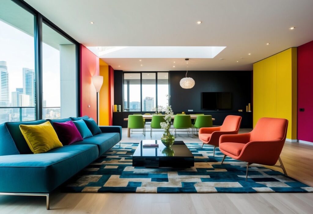
Colors play a big role in how we live, dress, and take care of ourselves. Embracing color trends can refresh personal style and surroundings. This guide covers the latest trends in fashion, beauty, and home decor, showing how you can easily incorporate these colors into your daily life.
Fashion and Wardrobe
Fashion trends often embrace colors in bold ways. You might see vibrant hues like Cherry Tomato and Rain Forest showing up in coats, hats, and even shoes. Adding these colors to your wardrobe can make a statement and bring a fresh vibe to your look. Mixing and matching with neutral tones makes these bold choices more wearable.
Accessories are an easy way to introduce new color trends. Look for scarves, belts, or bags in the season’s hottest shades. Even socks or laces in these colors can add an unexpected twist that catches the eye. Being fashionable doesn’t have to mean changing your entire wardrobe—just a few pops of color can do the trick.
Beauty and Personal Care
In the world of beauty, color trends might revolve around new lipstick shades or eye-catching nail polish colors. Red tones, like Behr’s Rumors, are expected to stick around and are perfect for making a statement. Nail art in rich, warm colors can add a touch of style to your everyday look.
Hair color trends can also follow these palettes, with highlights or tips in trending hues. Consider adding subtle colored streaks or trying out a new shade entirely. Even makeup brands are likely to release palettes that feature these popular colors, making it easy to experiment with new looks.
Living Spaces and Decor
Interior design benefits from fresh color trends with new paint colors, furniture, and decor items. Using nature-inspired shades like sepia and warm neutrals, you can make your home feel calming and inviting. These colors remind us of the great outdoors and add a soothing touch to any room.
Consider throwing pillows, area rugs, or wall art to incorporate trending colors without major changes. You might also consider reupholstering furniture in new fabrics that feature these hues. This approach not only adds style but refreshes spaces in a sustainable way.
Adding trendy colors through smaller decor items, such as vases or candles, can also keep things exciting. Engaging with these trends helps keep your living space feeling modern and inspiring.
Innovative Color Trends for the Future
Bold and unique color trends are shaping the future with hues inspired by nature and technology. From deep dusks to bright aquatic tones, these colors not only reflect innovation but also a desire for balance and connection to our environment.
Future Dusk and Aquatic Awe
Imagine the serene beauty of a future dusk sky. This deep, calming hue, Future Dusk, brings tranquility and depth to spaces. You might find this color in relaxing bedrooms or cozy reading nooks. It’s like wrapping a gentle twilight around your room.
Paired with the refreshing tones of Aquatic Awe, a bright and invigorating blue, you create a splash of energy. This color is perfect for areas where creativity thrives, like home offices or kitchens.
Together, they balance peace and vitality, offering a modern take on classic shades. Using these colors in combination can inspire both relaxation and motivation, ideal for spaces where you need to unwind and energize.
Sunset Coral and Ray Flower
Now, get ready to embrace the warmth of Sunset Coral. This vibrant hue captures the romance of a setting sun, bringing a cheerful yet sophisticated vibe to living spaces. It’s perfect for adding life to neutral palettes without overpowering them.
Ray Flower complements this with its bright, floral yellow. Think of it as nature’s highlighter, bringing attention and brightness to any corner of your home. You can use it in accessories or accent walls for maximum effect.
These colors embody optimism and joy, making rooms feel alive and inviting. Together, they blend warmth and zest, crafting a lively ambiance that echoes the beauty of a sunset.
Icy Lemonade and Sun Bleached Ochre
If cool tones are more your style, Icy Lemonade offers a refreshing pop. This crisp, frosty yellow is invigorating and perfect for modern, minimalist designs. It pairs seamlessly with clean lines and open spaces, creating a refreshing atmosphere.
In contrast, Sun Bleached Ochre provides a warm, earthy balance. This muted yellow-grey combination adds depth and rustic charm, reminding you of sunlit landscapes and vintage aesthetics. Use it in textiles or furniture for a subtle hint of character.
Get the Fail-Safe Paint Color Playbook (Free PDF)
36 proven colors • 8 ready palettes • trim & sheen guide • printable testing cards.
Together, these hues mix cool sharpness with grounded warmth, ideal for creating balanced and harmonious spaces. Whether used individually or together, they provide cohesion and elegance for the discerning decorator.
Conclusion: Embracing the Spectrum of Tomorrow
You might be wondering how color trends will shape the future. Trend forecasting plays a huge role in this. Experts predict colors that resonate with upcoming styles, technology, and emotions. You can already see these predictions in action with companies like Pantone annually highlighting colors that define the times.
Colors of the future aren’t just about what’s new—they often tap into nostalgia. Think retro shades from the 80s or 90s. They’re making a comeback in fashion and design, offering comfort and familiarity. This mix of old and new creates a fun vibe!
Bold innovations are also on the horizon. Imagine colors that change based on touch or mood! These advances will push boundaries and surprise you in the years ahead. As technology evolves, so will the way we experience and interact with colors.
Whether it’s owning a car in a color that mirrors today’s tech or decorating your room with shades that evoke the past, you’ve got plenty to look forward to. Embrace the spectrum of tomorrow!
