How to Make the Color Orange with Paint: A Simple Guide for Beginners
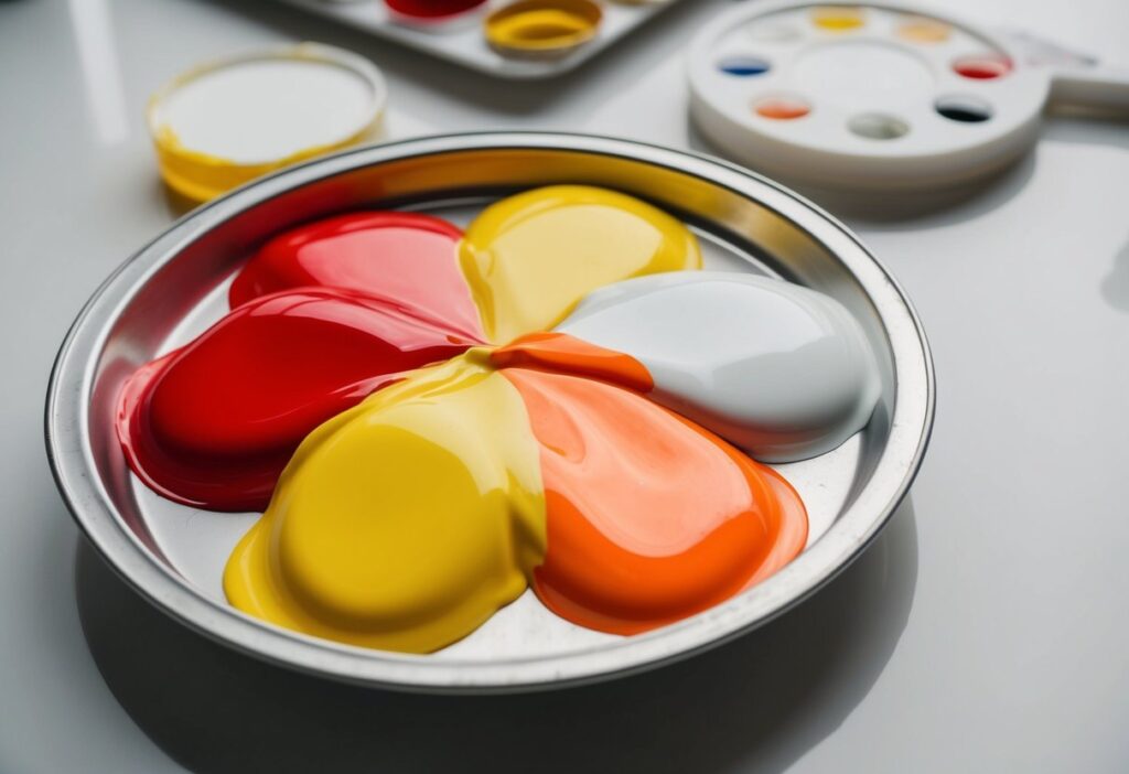
Making the vibrant color orange is easier than you might think! To create orange paint, simply mix equal parts of red and yellow. This classic combination opens the door to a world of shades, from bright and bold to soft and muted tones. Whether you’re painting a sunset or working on a fun art project, getting the right shade of orange can add warmth and energy to your work.

As you experiment with mixing paint, you can adjust the shades of orange by changing the ratios of red and yellow. For a darker orange, add more red to your mix. If you want a lighter or brighter orange, you can introduce more yellow. Additionally, surrounding your orange with blues can enhance its brightness through contrast.
Get the Fail-Safe Paint Color Playbook (Free PDF)
36 proven colors • 8 ready palettes • trim & sheen guide • printable testing cards.
With just a few colors and a little practice, you’ll be able to create the perfect orange shade for any of your artistic needs. So grab your paintbrush and let’s get mixing!
Understanding Color Basics
Color is an essential part of art and design. It helps create mood and communicate feelings. To understand how to make orange, you first need to know about the color wheel.
The color wheel shows the relationship between colors. There are three primary colors:
- Red
- Yellow
- Blue
When you mix two primary colors, you get a secondary color. For orange, you mix red and yellow. Adjusting the amounts changes the hue of orange, making it lighter or darker.
Hue, saturation, and brightness are important:
- Hue: The actual color, like orange.
- Saturation: The intensity of the color. A saturated color looks vivid.
- Brightness: How light or dark a color appears.
Complementary colors are those directly opposite on the color wheel. For orange, the complementary color is blue. Using complementary colors can create contrast and interest in your artwork.
Materials and Tools
To make the color orange with paint, you’ll need a few key materials and tools. Here’s a simple list:
- Red paint: You can use acrylic paint or watercolor. Both work well.
- Yellow paint: Choose a similar type as your red, such as acrylic or watercolor.
- Palette or mixing surface: This is where you’ll mix your colors. A simple piece of cardboard or a plastic palette will do.
- Palette knife: A palette knife helps you mix the paint together smoothly.
Optional Tools
- Brushes: Use these for applying the paint once you mix your orange.
- Water: This is mainly for watercolor paints to help in mixing and cleaning your brushes.
- Paper towels: Handy for cleaning up spills and excess paint.
Mixing Tips
You can adjust the shade of orange by changing the ratio of red to yellow. More red will give you a darker orange. More yellow will create a lighter shade.
Collect all these materials before you start. This way, you’ll be ready to create your vibrant orange without any interruptions!
Getting Started with Primary Colors

To create the color orange, you need to focus on two primary colors: red and yellow. Understanding these hues helps you get the right shade when mixing your paint.
Understanding Red and Yellow Hues
Red and yellow are the building blocks for making orange. Red represents warmth and energy, while yellow adds brightness and cheer.
When mixing, you can choose different types of red and yellow to change the orange’s tone. For example:
- Cadmium Red: A strong, vibrant option that creates a bold orange.
- Cadmium Yellow: A bright, sunny yellow that can lighten your orange.
The amount of each color you mix will affect the final hue. More red will yield a deeper orange, while more yellow will give a lighter, sunnier orange.
Get the Fail-Safe Paint Color Playbook (Free PDF)
36 proven colors • 8 ready palettes • trim & sheen guide • printable testing cards.
Choosing Your Reds and Yellows
Selecting the right shades of red and yellow is key. You can look for paints labeled as cadmium or other similar names.
When you shop for paint, consider:
- Cadmium Red: Excellent for rich, warm oranges.
- Cadmium Yellow: Perfect for bright and lively mixes.
Mix small amounts of red and yellow until you achieve the color you like. Test your mix on a separate surface to see how it looks when dry. This way, you can adjust before using it on your masterpiece.
Color Mixing Techniques

Mixing colors can be fun, and orange is no exception. There are various methods to create orange using acrylics, watercolors, or even a palette knife. Each method has unique techniques that can help you achieve the perfect shade you desire.
Mixing Orange with Acrylic Paint
To mix orange with acrylic paint, start with equal parts of red and yellow. This method creates a bright and vibrant orange. If you want a darker orange, try using 2 parts red and 1 part yellow. This will give you a richer tone.
If you need a subdued or neutralized orange, add a small amount of your opposite color, blue, to your mixture. This creates a duller effect, sometimes called a greyed orange.
Remember to use a palette to experiment with different ratios until you find the shade you like best.
Mixing Orange in Watercolors
Creating orange with watercolors is similar to acrylics. Mix equal amounts of red and yellow watercolor paint on your palette. Use a wet brush to blend them smoothly.
If you want a lighter shade, you can add more water to your mixture. To make a darker orange, increase the ratio of red.
One tip is to layer your colors. Start with a light orange and build it up by adding darker tones. This method offers a beautiful depth to your artwork.
Using a Palette Knife for Mixing
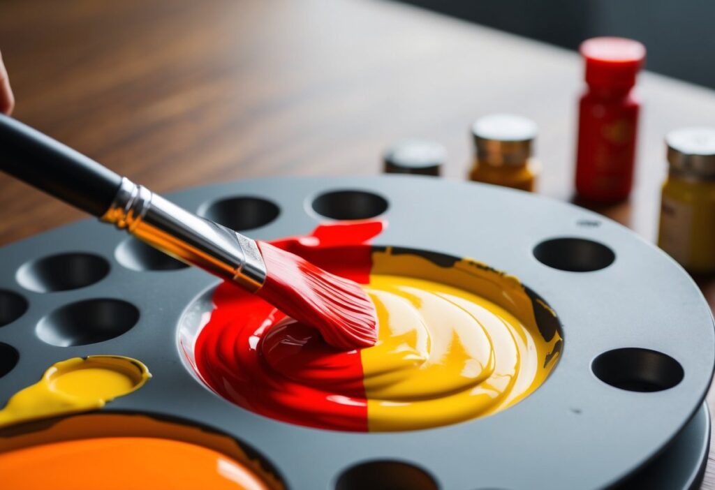
Using a palette knife is a great technique for mixing colors. Start with a dab of yellow and red paint on your palette. Use the knife to slice and blend the colors together until fully combined.
Get the Fail-Safe Paint Color Playbook (Free PDF)
36 proven colors • 8 ready palettes • trim & sheen guide • printable testing cards.
This method allows you to mix larger amounts of paint and create unique textures. It also gives you more control over the mixing process.
You can easily adjust the shades by adding more red for a warmer tone or more yellow for a brighter orange.
Creating Different Shades of Orange
Mixing orange is fun and easy! By adjusting the amounts of red and yellow, you can create various shades of orange.
Basic Orange
Start by blending equal parts of red and yellow. This creates a bright, basic orange.
Making Lighter Shades
To make light orange, add more yellow. A mix like two parts yellow to one part red is a great way to achieve this.
Creating Dark Orange
For dark orange, increase the amount of red. You could try two parts red to one part yellow to get a richer hue.
Dull Orange Variations
If you want a dull orange, mix in a small amount of black or brown. This will mute the color and give it a earthier feel.
Vivid Orange
For a vivid orange, you can add extra yellow and a splash of red to brighten it up. This makes the color pop!
Burnt Orange
To create burnt orange, add a little more red and a hint of black. This beautiful, warm tone resembles autumn leaves.
Get the Fail-Safe Paint Color Playbook (Free PDF)
36 proven colors • 8 ready palettes • trim & sheen guide • printable testing cards.
Apricot Color
Want a soft touch? Mix more yellow with a hint of red to get an apricot color. It’s gentle and pleasing, perfect for many projects.
Understanding Color Bias
Color bias refers to the tendency of a color to lean toward either warm or cool tones. It’s essential for mixing paint and achieving the right shades.
Warm Colors:
- Warm Red: Has a hint of yellow, making it bright and lively.
- Warm Yellow: This yellow also leans toward red and creates vibrant oranges.
Cool Colors:
- Cool Red: Contains blue, giving it a deeper and slightly muted appearance.
- Cool Yellow: With a touch of blue, this yellow can help in creating duller tones.
When mixing colors, consider their biases. For example, combining a warm yellow with a warm red gives you a bright orange. Mixing a cool yellow with a cool red, however, might lead to a dull orange or brown.
To achieve the perfect shade of orange, choose your reds and yellows wisely. Having both warm and cool options allows for more versatility.
You can even create a dull orange by mixing a warm red with a cool yellow or vice versa. This combination neutralizes the brightness and creates a more muted tone.
Tertiary Colors and Beyond
Tertiary colors are created by mixing a primary color with a secondary color. This gives you a range of exciting new shades.
For example, to make yellow-orange, you mix yellow (a primary color) with orange (a secondary color). This shade brings warmth and brightness to your artwork.
Another example is red-orange. You create this by blending red with orange. It’s a vibrant color that can add energy to your designs.
Here’s a simple list of some common tertiary colors:
- Yellow-Orange: Yellow + Orange
- Red-Orange: Red + Orange
- Blue-Green: Blue + Green
- Red-Violet: Red + Violet
These colors can help you express different moods in your work.
When you play with tertiary colors, think about how they complement each other. Mixing and matching can lead to beautiful combinations.
A color wheel can help you visualize how these colors interact. The more you experiment, the more you’ll find unique shades that resonate with your style. Enjoy mixing!
Adjusting Value and Saturation
Adjusting the value and saturation of orange is an essential part of painting. It helps you create the perfect shade for your artwork. Here’s how you can do it:
Value refers to how light or dark the color is. To change the value of orange:
- Add White: This creates a tint of orange, making it lighter and more pastel.
- Add Black: This produces a shade, making the orange darker and richer.
Saturation is about how intense or dull the color looks. To adjust saturation:
Get the Fail-Safe Paint Color Playbook (Free PDF)
36 proven colors • 8 ready palettes • trim & sheen guide • printable testing cards.
- Add more Red or Yellow: This makes the orange more vibrant.
- Add Gray: This will mute the color, giving it a softer appearance.
You might want to experiment with these methods. Here are two quick tips:
- To achieve a vibrant orange, mix equal parts of red and yellow.
- For a bright orange, lean a bit more toward yellow.
Small changes can make a big difference! Mixing gradually helps you find the exact shade you like.
If your orange looks too dull, try adding a bit of white for brightness. If it’s too bright, adding a touch of gray can bring it down nicely.
Experimenting with these adjustments helps you gain control over your color palette!
Practical Applications
Making the color orange with paint opens up various possibilities in art and design. You can use orange in different projects, whether in paintings, graphic design, or even crafting. Here are some practical applications of mixing orange.
Creating Orange for Paintings
When you paint, orange can bring warmth and vibrancy to your artwork. To make orange paint, mix equal parts of red and yellow. Adjust the ratio to create different shades. For a brighter orange, use more yellow. For deeper tones, add more red.
You can also experiment with other colors. Mixing orange with a touch of blue may bring out a muted shade, perfect for creating shadows or backgrounds. Test your mixtures on a separate palette before adding them to your canvas.
Using Orange in Design
In design, orange is bold and eye-catching. It can be used in logos, advertisements, and website graphics. When creating a color palette, combine orange with complementary colors like blue or green for balance.
Consider the meaning of orange, as it often represents enthusiasm and creativity. Use bright oranges for energetic designs and subdued tones for more sophisticated projects. This approach can help convey the right emotions to your audience.
Mixing Orange for Frosting and Fabric Dyes
Mixing orange isn’t just for paint; it can also be used in baking or crafting. For frosting, combine yellow and red food coloring until you reach the desired shade. Start with a small amount of red, as it can easily overwhelm the yellow.
For fabric dyes, create orange by mixing red and yellow dye in warm water. Keep the ratios in mind, as more red will give a deeper color, while more yellow creates a lighter, sunny hue. Test small samples before dyeing larger pieces to ensure you achieve the right orange.
Tips for Perfecting Orange Shades
To mix the perfect shade of orange, start with red and yellow. These two colors are the backbone of orange.
Color Choices
- Alizarin Crimson: This deep red can create a rich, warm orange.
- Golden Yellow: Using this bright yellow can give you a lively, vibrant orange.
Adjusting Shades
If you want a darker orange, try adding a small amount of Burnt Sienna. This will give your orange a more earthy tone.
For a softer, muted orange, mix in some Yellow Ochre. This adds a bit of warmth without overwhelming the color.
Creating Variations
- For a light orange, add more yellow than red.
- For a deep orange, increase the amount of red.
Remember to mix small amounts at first. This way, you can control the shade better and avoid wasting paint.
Experiment with different blends of red and yellow to find your ideal orange. Be patient, enjoy the process, and have fun mixing!
Exploring Color Combinations
Mixing colors can be fun and rewarding. To make orange, you start with two main colors: red and yellow.
Basic Combinations
- Red + Yellow = Orange
This is the classic method. Adjust the ratio to lighten or darken the shade of orange.
Other Combinations
- Yellow + Red
This is just a different order, but it gives you the same result. Both colors are primary colors, so they blend well. - Adding Green
Introducing a small amount of green to orange creates a different tone. This mixture gives you a more muted orange.
Using Complementary Colors
Complementary colors are opposites on the color wheel. To dim the brightness of orange, mix it with a small bit of blue. This creates a more subdued orange.
Practice Tips
- Start Small: Use small amounts of paint to test combinations.
- Keep Track: Write down your mixtures for future reference.
- Be Creative: Don’t hesitate to experiment with other shades. You might discover something wonderful!
Enjoy the process and see what unique shades of orange you can create!
Get the Fail-Safe Paint Color Playbook (Free PDF)
36 proven colors • 8 ready palettes • trim & sheen guide • printable testing cards.
The Role of Food Coloring
Using food coloring is a fun and easy way to create vibrant colors, including orange. To make orange, you simply need red and yellow food coloring.
Mixing Colors
- Start with red food coloring.
Add a few drops to your mixture. This will be your base. - Add yellow food coloring.
Gradually mix in yellow until you achieve the shade of orange you want.
You can adjust the amounts based on how bright or soft you want the orange to be.
Types of Food Coloring
There are different types of food coloring you can use:
- Liquid food coloring: Easy to find and use.
- Gel food coloring: Provides more intense colors.
Choosing the right type can affect the brightness of your orange.
Tips for Best Results
- Use a light-colored base.
This can be icing or batter. It helps the color show up better. - Mix slowly.
This allows you to control the final shade of orange.
