12 Best Paint Colors for Furniture: Refresh Your Space with These Trendy Hues
If you’re ready to transform your old furniture, choosing the right paint color can make all the difference. Picking the perfect shade can breathe new life into your space and reflect your personal style. Whether you’re looking for something bold and vibrant or calm and neutral, finding the best hue for your furniture is key.
We’ve compiled a list of the top 12 paint colors for furniture to help you on your way. With so many options available, you’re sure to find a color that not only fits your aesthetic but also enhances the overall feel of your home. Let’s dive into the best shades that will make your furniture stand out and your room shine.
Get the Fail-Safe Paint Color Playbook (Free PDF)
36 proven colors • 8 ready palettes • trim & sheen guide • printable testing cards.
1. Antique White by Sherwin-Williams
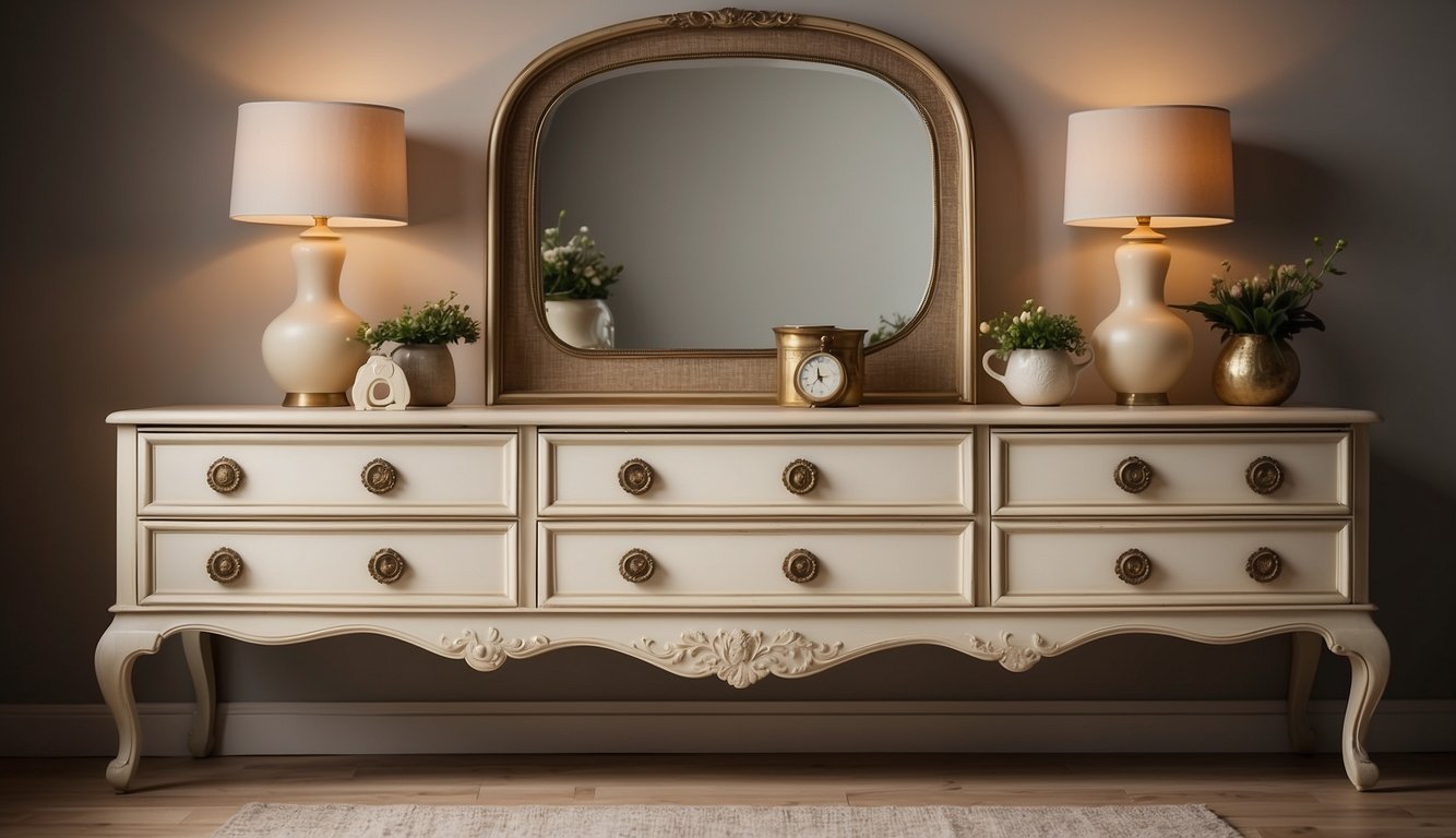
Antique White by Sherwin-Williams (SW 6119) is a popular choice for furniture. This shade of white adds a timeless look to any piece. It fits well in both modern and classic styles.
This color has a warm undertone. With an HSL code of 39° hue, 42% saturation, and 84% lightness, Antique White is cozy and inviting. The warmth comes from its high red content in the RGB value, which is 232 red, 220 green, and 198 blue.
Do you have a room with lots of natural light? Antique White will look amazing in such a space. It works especially well in southern-facing rooms. The color complements furniture and cabinets that are also in the antique white family.
If your furniture has granite with browns, greys, and even some purple specks, this paint color will blend beautifully. Imagine an open kitchen or dining area painted in Antique White. It creates a bright yet warm atmosphere.
This versatile paint can be used for both interior and exterior projects. Whether you are painting a vintage dresser or a set of kitchen cabinets, this color will not disappoint. So, grab a sample and see how it transforms your furniture.
2. Classic Navy by Behr
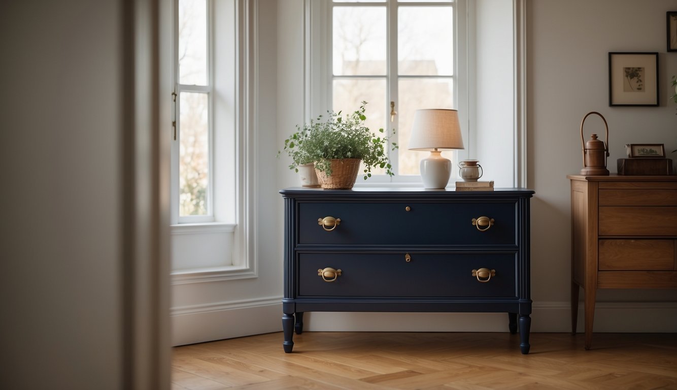
Have you ever wanted a color that screams sophistication without being too flashy? Classic Navy by Behr might be just what you’re looking for!
This shade is versatile. Use it on your dining table or even a bookshelf.
The color has gray undertones, giving it a balanced look that feels both modern and timeless.
Classic Navy works well in various lighting conditions. It looks bold in sunlight but cozy under evening lights.
Pair it with white or gold accents for a striking contrast.
Elevate your room’s style with this dependable yet exciting choice!
3. Dusty Rose by Benjamin Moore
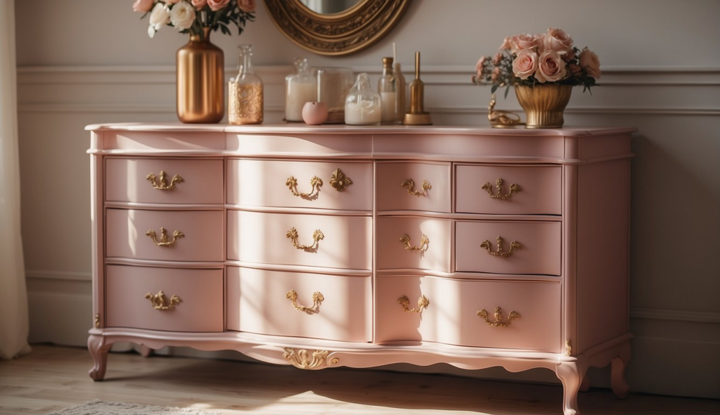
Are you looking to add a touch of elegance to your furniture? Dusty Rose by Benjamin Moore could be your answer. This shade combines the softness of rose with a hint of beige, creating a warm and sophisticated look.
This color has a Light Reflectance Value (LRV) that measures its ability to reflect light. The LRV for Dusty Rose is 49, making it neither too dark nor too light. It’s perfect for brightening up a room without overwhelming it.
Get the Fail-Safe Paint Color Playbook (Free PDF)
36 proven colors • 8 ready palettes • trim & sheen guide • printable testing cards.
Dusty Rose works well in various settings. Picture this hue on a small side table or an entire dresser. It can add charm and personality without shouting for attention.
If you have existing decor in neutral tones, Dusty Rose will blend beautifully. Pair it with whites, creams, or even darker shades for a balanced look.
One tip: If you’re worried about the pink tones being too strong, try it in a smaller space first. Perhaps a bathroom cabinet or a hallway bench. This way, you can see how it interacts with your lighting and other colors in the room.
4. Drift of Mist by Sherwin-Williams
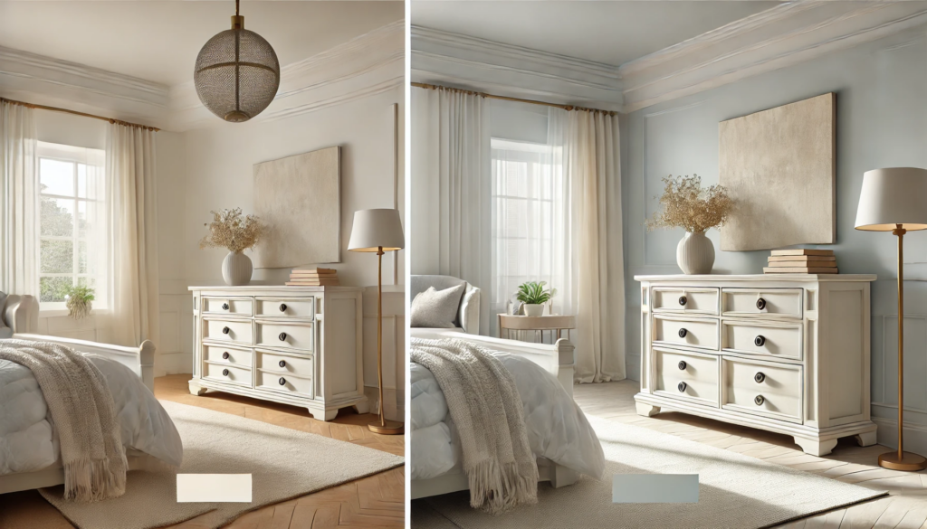
Drift of Mist by Sherwin-Williams is a fabulous choice for furniture. This off-white color is so versatile. It fits perfectly in both modern and classic settings.
This paint color has a light reflectance value (LRV) of 69. What does that mean for you? It means it can really brighten up your furniture without being too stark. It’s soft yet lively.
Take a closer look. In bright rooms, Drift of Mist tends to look like a soft off-white. In dimmer areas, it shifts slightly to a greige. This flexibility makes it an excellent fit for various lighting conditions.
Hate picking colors? Drift of Mist is great because it pairs well with lots of other hues. You can match it with almost anything, from bold, vibrant colors to other delicate neutrals.
Want a timeless look? Drift of Mist has been described as timeless and balanced, blending warm and cool tones. This makes it easy to match with just about any decor you have or might get in the future.
5. Mossy Green by Valspar
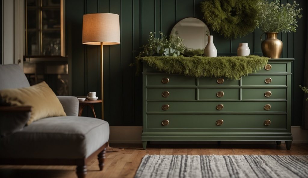
Mossy Green by Valspar adds a touch of nature to your furniture. This color gives off a calming and grounding vibe which is perfect for creating a cozy atmosphere.
Mossy Green is versatile. It pairs well with neutrals like white or beige, but also looks stunning against dark woods.
Why choose Mossy Green? It’s a timeless shade, ensuring your furniture looks chic for years. This shade is great for pieces in living rooms, bedrooms, or entryways.
Get the Fail-Safe Paint Color Playbook (Free PDF)
36 proven colors • 8 ready palettes • trim & sheen guide • printable testing cards.
You might worry about durability. With Valspar, you can relax. Their paint is known for long-lasting coverage and vibrant color retention.
Want tips on using it? Try painting a vintage dresser or a set of dining chairs. This green can revive old furniture, giving it fresh life.
6. Deep Onyx by Glidden
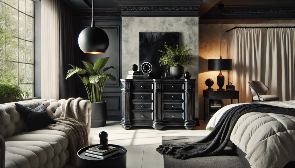
Deep Onyx by Glidden is a dark, cool black with stone undertones.
It’s perfect for giving your furniture a sleek, modern look. The deep, rich color pairs well with white for a clean, classic vibe. Want something bolder? Deep Onyx can make other colors pop.
Use it on a main wall to create a dramatic focal point. Or use it as an accent to balance lighter hues in your space.
This paint color doesn’t just work on walls. It looks amazing on cabinets, tables, and chairs too.
If you are thinking about touching up old paint, keep in mind that new paint might not match exactly due to light exposure over time. To get the best results, consider repainting the entire surface.
Deep Onyx is versatile. It’s great for both modern and traditional styles. Plus, this shade of black can add a relaxing, sultry feel to your rooms.
You can buy it online or find it in stores. Don’t forget to check out free swatches to see how it looks before committing.
Get the Fail-Safe Paint Color Playbook (Free PDF)
36 proven colors • 8 ready palettes • trim & sheen guide • printable testing cards.
7. Oceanside by Sherwin-Williams
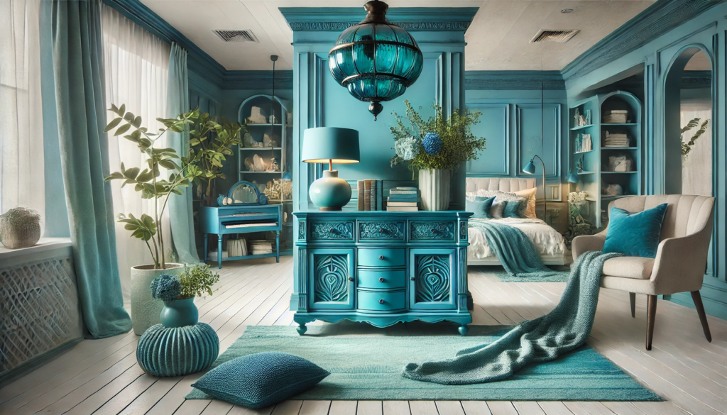
Looking to add a pop of color to your furniture? Oceanside by Sherwin-Williams might be what you’re after. It’s a stunning blue that blends teal and emerald undertones, making it unique. Imagine a piece of furniture that not only stands out but also feels soothing.
Sherwin-Williams named Oceanside their Color of the Year in 2018, and it remains popular today. The color works well for both modern and classic decor. You can use it on anything from chairs to cabinets and see an instant transformation.
For a real-life example, many homeowners have used Oceanside on kitchen islands. It’s striking and adds a vibrant, yet calming, touch to the room. If you’re worried about matching it, don’t be. This color pairs nicely with neutral tones like white, gray, and beige. It can also complement darker shades like navy or charcoal.
Oceanside has a Light Reflectance Value (LRV) of 21, which means it absorbs more light than it reflects. It’s ideal for creating an intimate, cozy atmosphere. If you’re looking for something that captures attention without being too bold, give Oceanside a try.
Why not visualize it in your space before committing? Sherwin-Williams offers tools to help you see this color on your own furniture. So, go ahead and make that furniture piece a centerpiece with Oceanside!
8. Pale Oak by Benjamin Moore
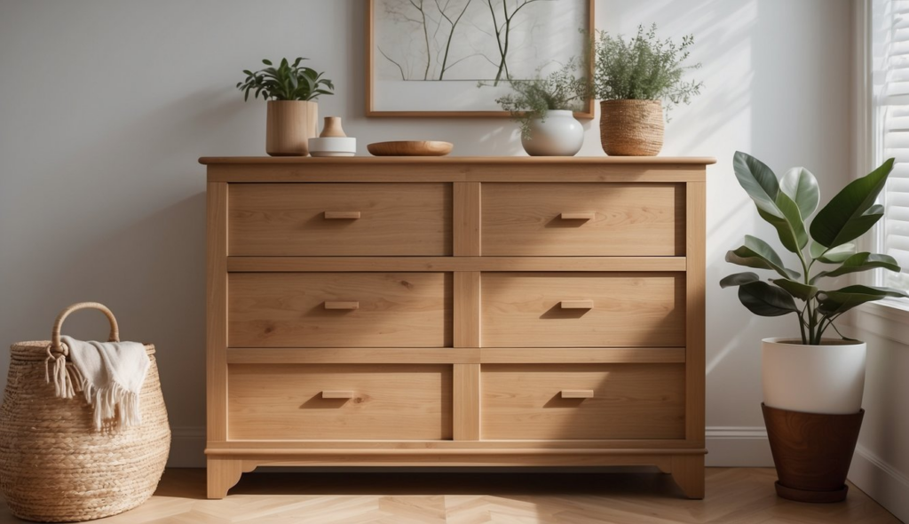
Pale Oak by Benjamin Moore is a terrific choice if you’re looking for a versatile paint color for your furniture. It’s a light, neutral greige (a mix of gray and beige) that adapts beautifully to different lighting conditions.
In rooms with lots of natural light, Pale Oak appears as a warm off-white. This can make your furniture look fresh and airy. If your space lacks natural light, Pale Oak reads as a soft, light greige, giving your furniture a cozy feel.
The warm, yellow undertones of Pale Oak make it blend effortlessly with other warm colors. You can pair it with soft blues, rich greens, or even other neutrals like creams and taupes to create a harmonious look in your space.
One of the best parts about Pale Oak is its adaptability. Whether used on a vintage dresser, modern coffee table, or sleek bookcase, it adds elegance without overpowering other elements in the room. This paint color is also quite popular because it delivers a timeless, sophisticated look.
If you’re someone who loves to mix and match decor styles, Pale Oak offers the perfect neutral backdrop. It complements various textures and finishes, making it a favorite among interior designers and homeowners alike.
9. Muted Sage by Behr
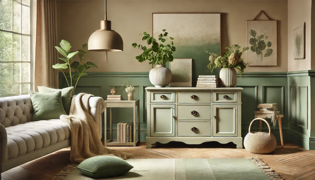
Thinking about refreshing your furniture with a soothing green shade? Consider Muted Sage N350-5 by Behr. This color brings a calming vibe to any room.
Muted Sage has a hue of 51°, making it a warm green color. It’s perfect if you love the balance between green and beige. This particular shade looks great with natural wood tones and neutral browns.
You can also pair Muted Sage with lighter blues or deep, dark greens for contrast. For a fun pop of color, try mustard yellow or coral. Don’t worry about matching colors; Muted Sage is versatile and easy to coordinate.
A cool feature of Muted Sage is its lightness. With a Hue, Saturation, Lightness (HSL) value of 54%, it brings just the right amount of brightness to your furniture. This shade adds a touch of elegance without being overwhelming.
Thinking about longevity? Behr’s paints are known for being durable and long-lasting. When you use Muted Sage, you’re not just choosing a trendy color. You’re also investing in a quality finish that will keep your furniture looking fresh for years.
If you’re aiming for a modern and sleek look, or a cozy and warm atmosphere, Muted Sage is a fantastic choice. Happy painting!
10. Dovetail Gray by Sherwin-Williams
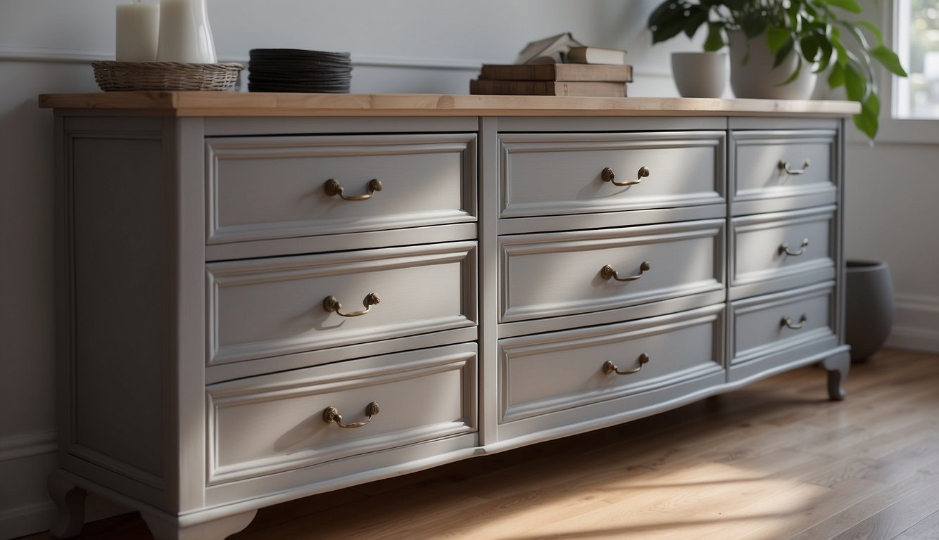
Dovetail Gray is a fantastic choice for your furniture projects. This paint color is a warm, earthy gray with brown undertones. It’s perfect for adding some depth and character to your pieces without overwhelming the space.
You might notice that Dovetail Gray pairs beautifully with blues. Sherwin-Williams even recommends combining it with Inky Blue for a striking contrast. Imagine a dresser painted in Dovetail Gray with Inky Blue drawers—stunning, right?
Its Light Reflectance Value (LRV) of 26 means it’s on the darker side, offering a rich look. It’s great for accent pieces like a statement chair or an elegant table. Despite its depth, the color isn’t too dark to feel heavy.
Dovetail Gray isn’t just about looking good; it’s versatile too. You can use it on various furniture types, from rustic wood pieces to sleek, modern designs. It also has subtle blue undertones that occasionally show through, adding an extra layer of interest.
Get the Fail-Safe Paint Color Playbook (Free PDF)
36 proven colors • 8 ready palettes • trim & sheen guide • printable testing cards.
Perfect for those who want a neutral but distinctive color, Dovetail Gray can make your furniture stand out. If you’re on the hunt for a reliable and beautiful gray, give this one a try.
11. Midnight Blue by Behr
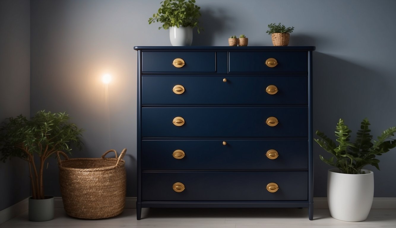
Midnight Blue by Behr is a stunning choice for furniture. This deep blue-gray color has a hint of black, making it perfect for adding a touch of elegance to any piece.
Its HSL code is 207, 11%, and 33%, which means it has a hue of 207°. It’s classified as a cool paint shade.
This shade can bring a sense of calm and tranquility to your space. Imagine painting an old dresser or a set of chairs in Midnight Blue. The transformation can be quite striking!
One of the best features is its one-coat hide guarantee when tinted into BEHR DYNASTY Interior paint. This means you won’t have to spend hours applying multiple coats.
Whether you are updating a piece of vintage furniture or giving a modern piece new life, Midnight Blue can be a fantastic choice. It pairs well with metallic accents and lighter colors, making it versatile for various styles and decors.
12. Soft Fern by Benjamin Moore
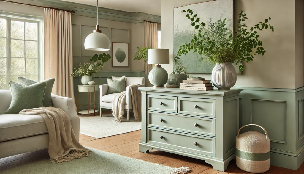
Ever thought about giving your furniture a fresh, natural look? Soft Fern by Benjamin Moore might be your next go-to paint color. It’s a gentle, pale green with a hint of gray. This combination makes it perfect for adding a subtle yet stylish touch to your home.
Soft Fern has an LRV (Light Reflectance Value) of 56.67. This means it reflects a decent amount of light, which helps brighten up spaces. Great for furniture in rooms with moderate lighting!
Looking for complementary colors? Soft Fern pairs well with both neutral shades and bolder colors. Think light beige or even a deep navy.
Choosing the Right Color
Picking the perfect paint color for your furniture can be tricky. Factors like color psychology, room decor, and the latest color trends play crucial roles.
Understanding Color Psychology
Colors impact your mood and perception. Blue can bring a calming effect, making it great for bedrooms. Red, on the other hand, boosts energy and is perfect for a living room centerpiece. Green signifies tranquility and harmony, suitable for spaces meant for relaxation. Black lends sophistication but might make a piece look bulky.
Understanding these nuances helps you choose a color that not only looks good but also feels right in the room’s context.
Matching Colors with Room Decor
It’s important to consider the existing decor when choosing a paint color. Assess the colors of your walls, flooring, and other furniture. Use tools like the 60-30-10 rule: 60% should be a dominant color, 30% a secondary color, and 10% an accent color.
For example, if your walls are a soft white, a bold blue piece of furniture can serve as a striking focal point. On the other hand, complementary colors like beige with pale blue or white with light gray can create a cohesive, balanced look.
Popular Color Trends
Keeping up with color trends can also guide your choice. Currently, pale blue tones like Sherwin Williams Stardew and soft whites like Benjamin Moore White Dove are in vogue. These shades are versatile and add a contemporary touch to your space.
Trending shades like light gray, such as Sherwin-Williams Repose Gray, offer a modern, neutral base that pairs well with almost any decor. If you’re feeling adventurous, try greens or even deep reds to make a bold statement. Styles come and go, but classic colors often provide timeless appeal.
Painting Techniques for Furniture
Refresh your furniture by learning essential painting techniques. From prepping surfaces to putting on the final touches, each step impacts the final look.
Preparation and Priming
Start by cleaning the furniture. Remove any grime using a damp cloth with mild soap. Sand the surface lightly with fine-grit sandpaper. This ensures the primer and paint will adhere properly.
Once cleaned and sanded, apply a primer. This is crucial, especially if your furniture is dark or has stains. Use a good-quality primer, and apply it evenly. If you’re using a water-based paint, use a water-based primer, and if using oil-based paint, use an oil-based primer. Let the primer dry completely before moving to the next step.
Get the Fail-Safe Paint Color Playbook (Free PDF)
36 proven colors • 8 ready palettes • trim & sheen guide • printable testing cards.
Application Methods
Brushes and rollers are common tools for applying paint. Brushes are great for detailed work and corners, while rollers cover large surfaces smoothly. Always start with thin coats and build up. This prevents drips and uneven coverage.
If you want a super smooth finish, consider using a paint sprayer. This method can save time but requires practice. Spray in even strokes, keeping the nozzle at a consistent distance from the furniture. Always practice on a piece of cardboard first.
Finishing Touches
After painting, you’ll want to seal your work. A clear wax or polyurethane finish provides durability and a polished look. Apply clear wax with a soft cloth in circular motions, then buff to a shine.
For a protective finish, use water-based polyurethane for light colors and oil-based for dark. Apply one to two thin coats with a brush or roller, and let it dry between coats. Sand lightly between coats for a smoother finish.
These techniques ensure your painted furniture not only looks great but also lasts for years. Happy painting!
