What Paint Colors Make Burgundy: A Complete Guide
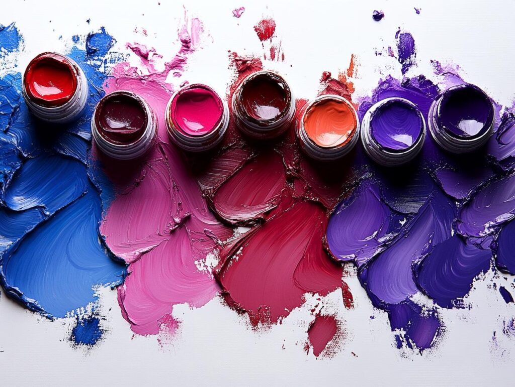
Creating the color burgundy is a fun and creative process that combines the rich tones of red and subtle hints of other colors. To achieve burgundy, you mix a base of red with a little blue or purple to add depth and richness. This combination results in the lush, reddish-brown color that’s associated with sophistication and elegance.

When you start mixing, it’s helpful to experiment a bit to find the perfect shade that suits your project. For a deeper hue, adding more purple can accentuate the richness, while a touch of brown can make it warmer. The beauty of mixing your own colors is in the ability to tailor and adjust to your liking.
Get the Fail-Safe Paint Color Playbook (Free PDF)
36 proven colors • 8 ready palettes • trim & sheen guide • printable testing cards.
With a solid understanding of these basic mixes, you’ll soon be able to create a stunning burgundy that stands out in any design or artistic endeavor. The transformation of simple colors into a vibrant, complex shade is sure to spark your creativity and inspire future projects. Whether you’re painting a canvas, designing a room, or finding the right shade for a web design, there’s so much potential to explore.
Understanding Burgundy as a Color
Burgundy is a rich, dark shade often associated with red wine. This color brings thoughts of warmth and elegance. The shade is deeper than red and it’s sometimes confused with maroon. Maroon is similar but less purple and doesn’t carry the same depth as burgundy.
On the color wheel, burgundy sits alongside other dark reds. It is usually created by mixing primary colors, like red, with secondary colors, such as purple or brown, to add depth. Mixing blue and red can also get you close to a burgundy hue.
You can adjust the shade of burgundy by tweaking the mix. More blue adds a cooler tone, while extra red leans towards a warmer shade. Play with these colors to find your perfect burgundy tone.
Burgundy isn’t just a color; it has strong ties to color psychology. It represents ambition, wealth, and power. Adding touches of burgundy to a room or outfit can create a sense of luxury and confidence.
When you explore color theory, you see how burgundy can complement other shades. Pairing it with greens or light neutrals enhances its boldness. Use burgundy as an accent or main color, and watch your space or outfit transform.
The Basics of Color Mixing
To make burgundy paint, you will want to understand how different colors interact. Starting with primary colors, you can create secondary colors, like green and purple, and go further with tertiary colors for intricate shades and nuances.

Primary Colors and Burgundy
The three primary colors are red, blue, and yellow. These are the building blocks of any color you want to create. For burgundy, red and blue are the main focus.
When you mix red and blue, you get purple, which is close to burgundy. Adjust the amounts to shift towards the rich, deep burgundy you desire. Consider 2 parts red and 1 part blue as a starting point.
Adding Depth with Secondary Colors
Secondary colors enhance the base created by primary ones. You get secondary colors by mixing two primary colors: for instance, red + yellow gives you orange.
When making burgundy, you might want to add a little yellow to adjust the shade. A small dash can make the burgundy warmer and add depth. Carefully experiment with amounts until you find the perfect balance that suits your needs.
Tertiary Colors and Burgundy Nuances
Tertiary colors add subtlety to your palette. These come from mixing a primary color with a nearby secondary color. For example, blending red with orange gives you a red-orange, enriching burgundy.
Adding a hint of brown can deepen burgundy, making it appear more wine-like. You can make brown by mixing all primary colors. Keeping track of the amounts ensures you achieve a consistent shade. Tertiary mixes offer a canvas for creativity and finding that unique burgundy.
Get the Fail-Safe Paint Color Playbook (Free PDF)
36 proven colors • 8 ready palettes • trim & sheen guide • printable testing cards.
Burgundy in Design and Fashion

Burgundy is a rich and versatile color that adds an air of sophistication and warmth to various settings and styles. From interior design to fashion and beauty, burgundy brings an elegant touch wherever it is used.
Interior Design with Burgundy
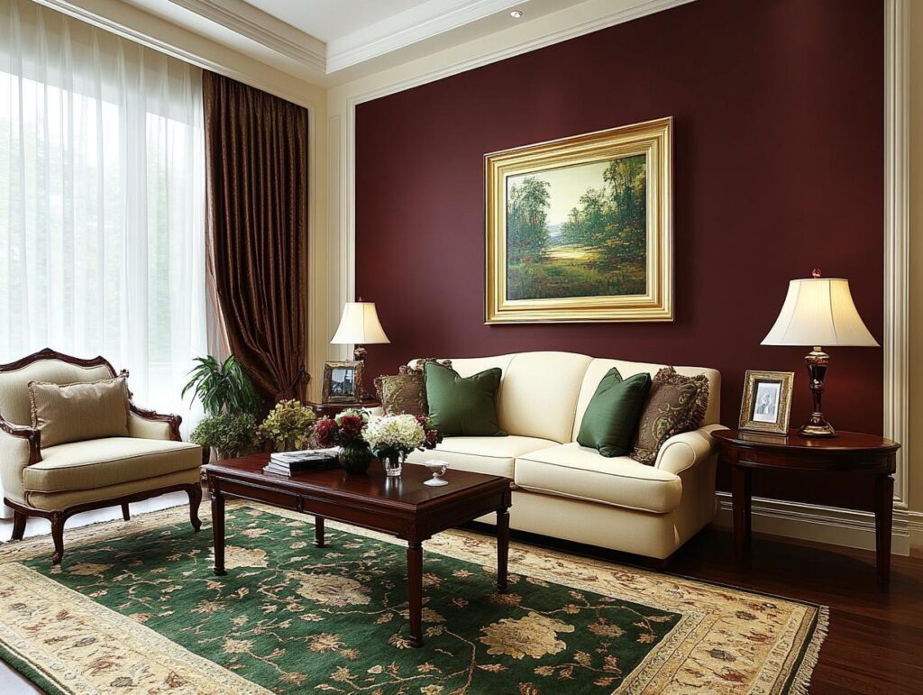
In the world of interior design, burgundy is a favorite for creating cozy and stylish spaces. You might use it on walls to give rooms a warm, inviting feel. Burgundy pairs beautifully with dark wooden floors and furnishings, adding a touch of elegance. This color is also great for accent pieces, such as cushions, curtains, and rugs. Mixing burgundy with lighter shades like cream or gray creates a balanced and sophisticated look in your home.

Burgundy in Fashion
Burgundy stands out in fashion as a color of elegance and depth. You can see it in a variety of clothing items, from sweaters to dresses. It’s perfect for the fall and winter seasons, providing warmth and richness to outfits. The color works well with neutral shades like black, gray, and taupe, making it a versatile choice for many occasions. Burgundy accessories like bags and scarves add a pop of color without being overpowering.
Burgundy in Makeup and Hair Dye
Burgundy is also a popular choice in beauty, especially for makeup and hair dye. A burgundy lipstick can add drama and sophistication to your look, perfect for special occasions or a night out. In hair dye, burgundy offers a bold yet classy option, giving your hair a vibrant sheen with shades ranging from deep red to purple tones. This color complements various skin tones, making it a flexible choice in beauty routines.
Color Codes and Digital Representation
When working with burgundy in digital formats, different color codes are key. RGB and CMYK spaces offer ways to understand how burgundy comes alive on screen, while hex codes provide a simple way to use burgundy in web designs.
Burgundy in the RGB Color Space
The RGB color space defines colors based on the combination of red, green, and blue light. For burgundy, you’ll find the values focusing heavily on red, with very little green and blue.
In RGB, burgundy is commonly represented as 128, 0, 32, emphasizing a strong red component. This means, in digital images or design software, you’ll see burgundy appear with its rich, dark red tone, ideal for dramatic and elegant designs.
Most design tools will allow you to directly input these values to achieve consistent, accurate colors. Experimenting with these settings can help get just the right shade of burgundy you desire.
Burgundy in the CMYK Color Space
CMYK, which stands for cyan, magenta, yellow, and key (black), is a color model used in color printing. It’s crucial for any print work involving burgundy shades.
In the CMYK color space, burgundy has values around 0%, 100%, 75%, 50%. These numbers denote no cyan, full magenta, moderate yellow, and substantial black, ensuring that burgundy prints as a deep, impactful color.
This code helps in print media to maintain the dark, classic allure of burgundy on paper and other materials. Understanding these percentages will aid you in achieving the desired look in printed materials.
Get the Fail-Safe Paint Color Playbook (Free PDF)
36 proven colors • 8 ready palettes • trim & sheen guide • printable testing cards.
Hex Codes and Burgundy
Hexadecimal codes provide an easy way to specify colors in digital devices, especially browsers.
The hex code for burgundy is #800020. Simply enter this into your web design tools or CSS files to ensure a precise match. This six-digit figure corresponds directly with RGB values, illustrating the balance of elements that form burgundy.
Hex codes are a quick, reliable way to implement burgundy across websites or digital designs, keeping your colors both consistent and professional-looking. Make use of this code to maintain uniformity in your digital projects.
Creating Burgundy with Paint
To make burgundy paint, you can mix different colors, choose the right painting tools, and adjust your mix for different shades and tints. This guide will help you create the perfect burgundy tone for your next project.
Mixing Acrylic Paints for Burgundy
Start with acrylic paints as they offer vibrant colors and blend well. To make burgundy, you’ll need red, blue, and yellow paint. Use two parts red and one part blue to get a deep base. Add a small touch of yellow to adjust warmth.
You can use the following simple formula:
- 2 parts red
- 1 part blue
- 1/4 part yellow
Always mix small amounts first to test the resulting color. Adjust the mix to suit your needs, adding more red for a richer hue or more blue for depth.
Get the Fail-Safe Paint Color Playbook (Free PDF)
36 proven colors • 8 ready palettes • trim & sheen guide • printable testing cards.
Using the Painter’s Palette
A painter’s palette is essential. It allows you to see how colors interact. Use a palette knife to mix paints smoothly without wasting paint. Spread each color on the palette before you start blending.
This tool gives you control over the mixing process. You can better see changes in the burgundy shade and make adjustments as needed. A well-mixed palette results in superior color consistency in your artwork.
Get the Fail-Safe Paint Color Playbook (Free PDF)
36 proven colors • 8 ready palettes • trim & sheen guide • printable testing cards.
Shades and Tints in Burgundy
Shades and tints alter burgundy’s appearance. To create different shades of burgundy, add black or more blue to darken the color. For lighter tints, mix in white or a light neutral color.
Experiment on paper or canvas before applying to your main project. You can achieve a variety of effects for different parts of a painting. Consider how these changes might affect the mood or style of your artwork and adjust as needed.
Exploring the Variations of Burgundy
Burgundy is a deep, rich color with various shades that can influence style and mood in different ways. Each variation offers unique characteristics and uses in design and fashion.
Old Burgundy vs. Vivid Burgundy
Old Burgundy presents a subdued tone with a hint of brown. It feels warm and timeless, often found in vintage or classic design settings.
In contrast, Vivid Burgundy pops with a lively, intense shade. It’s brighter and more energetic, making it a popular choice for modern and fashionable palettes.
To put it simply, Old Burgundy is for those who enjoy understated elegance, while Vivid Burgundy suits bold, attention-grabbing styles.
Cordovan and Oxblood
The Cordovan shade features brownish tones and a polished, elegant appearance. It commonly appears in high-end leather goods, like shoes and belts.
Oxblood, meanwhile, boasts a deeper red hue with purple undertones. It’s often used in luxury fashion to convey sophistication and depth.
Both Cordovan and Oxblood can serve as versatile choices for accessories, each adding a different touch of richness and refinement.
Maroon and Cranberry
Maroon is a darker, brownish-red color that feels warm and inviting. It works well in cozy spaces or in clothing to evoke comfort and tradition.
Cranberry, on the other hand, is lighter and more vibrant. This shade fits perfectly in fresh, modern designs, or as an energetic pop of color in your wardrobe.
When choosing between Maroon and Cranberry, consider whether you want something more classic and cozy, or bright and refreshing.
Burgundy Color Guide
A useful tool for those working with these shades is the Burgundy Color Guide. It helps you navigate the various tones and find complementary colors for your project.
The guide sheds light on how each burgundy variant works in different settings, from home decor to fashion.
Whether you lean toward Old Burgundy or wish to experiment with Cranberry, this guide will assist in finding the perfect match and in creating cohesive designs.
Complementary Colors for Burgundy
When you think of complementary colors, pairing burgundy with the right shades can bring out its beauty. You’re looking at colors that sit opposite burgundy on the color wheel. In this case, green tones work wonders. Consider a deep forest green for a calming contrast.
In interior design, neutral colors like beige and cream can balance the richness of burgundy. These soft shades can make your space feel warm and inviting. Picture a cozy room where burgundy and cream create a sophisticated look.
Get the Fail-Safe Paint Color Playbook (Free PDF)
36 proven colors • 8 ready palettes • trim & sheen guide • printable testing cards.
If you’re into fashion, mixing burgundy with navy or gold can be striking. Navy offers a classic feel, while gold adds a touch of luxury. Imagine a navy dress paired with burgundy shoes or a burgundy sweater with gold accessories.
For a bold color combination, try light blue or mint with burgundy. These cooler tones can give a fresh twist, making burgundy pop. It’s an unexpected pairing that works well in both clothing and home decor.
Here’s a handy list of colors to pair with burgundy:
- Green (forest, olive)
- Cream or beige
- Navy
- Gold
- Light blue or mint
Using these colors can help you craft a look or room that’s both stylish and unique. Whether you’re redecorating or updating your wardrobe, these combinations can give burgundy a whole new dimension.
