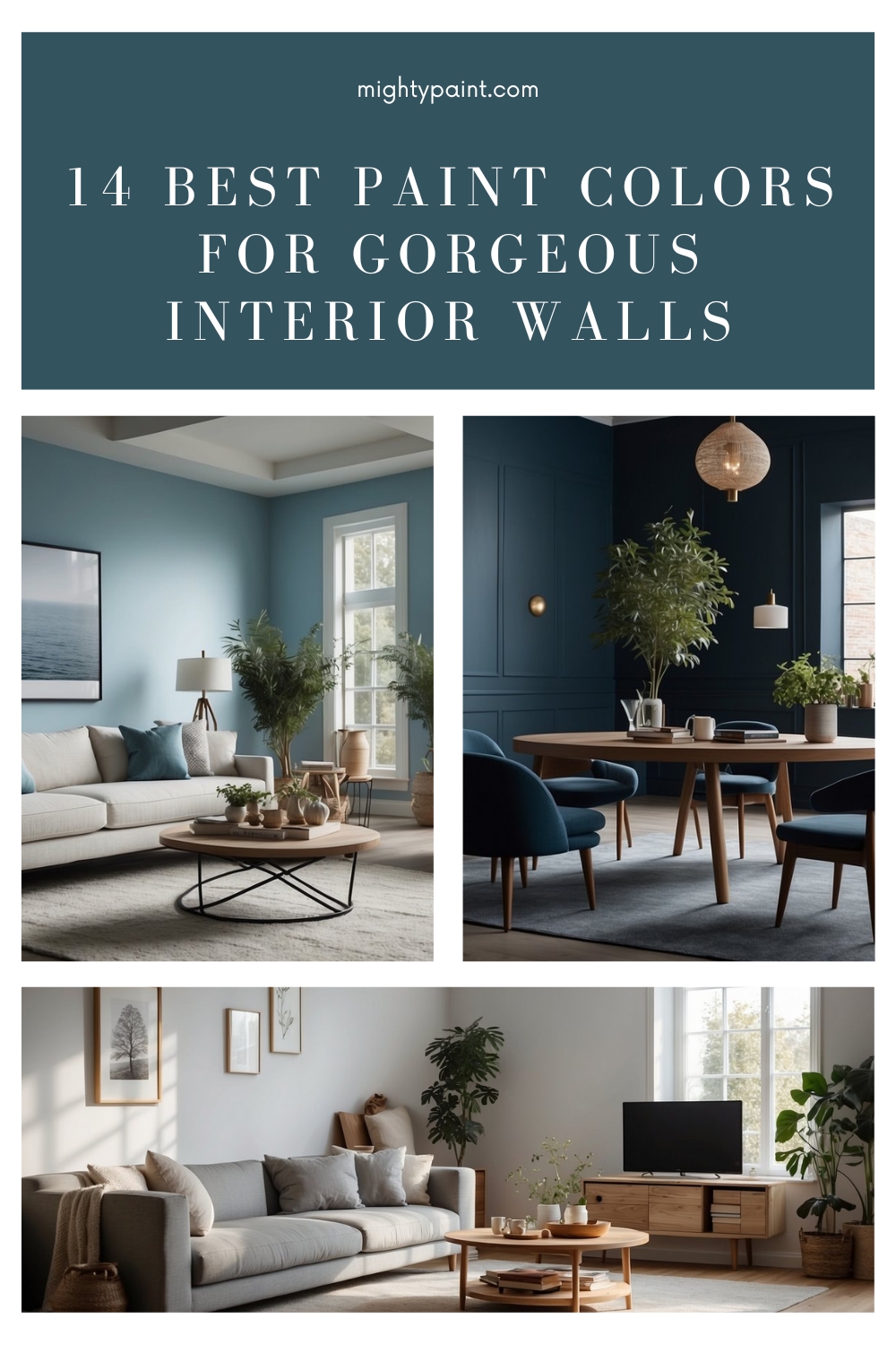
14 Best Paint Colors for Interior Walls: Transform Your Space Instantly
Choosing paint colors for your home’s interior can be both exciting and overwhelming. With so many options available, it’s easy to feel lost. This guide aims to simplify your decision-making process by highlighting 14 of the best paint colors for interior walls.
By focusing on top recommendations and expert picks, we’ll help you find the perfect hue to complement your home’s style. Whether you’re redecorating a single room or your entire house, these choices will provide inspiration and insight. Let’s dive into the colors that could transform your living space.
Get the Fail-Safe Paint Color Playbook (Free PDF)
36 proven colors • 8 ready palettes • trim & sheen guide • printable testing cards.
1. Benjamin Moore Revere Pewter
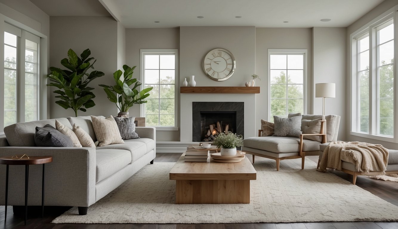
Benjamin Moore Revere Pewter (HC-172) is a favorite for many. It’s a versatile color that blends gray and beige, often called “greige.”
This color works well in almost any room. You can use it in living rooms, bedrooms, or even kitchens. It’s a great pick for open floor plans since it complements a variety of spaces.
Want to know a secret? Revere Pewter is also known as “Ice Formations” (973). It’s like having two colors in one! This paint manages to be both warm and cool, making it a go-to neutral.
Pair it with white trims for a crisp look. If you’re looking for coordinating colors, try Benjamin Moore Classic Gray for a softer touch or Stonington Gray for a cooler vibe.
It’s no wonder that Revere Pewter often tops the “Best Neutral Paint Colors” lists. You might see it compared to Sherwin-Williams’ Agreeable Gray, but many prefer Revere Pewter because it’s cleaner and crisper.
Even interior designers rave about it. Caroline Lizarraga, a well-known interior designer, often chooses Revere Pewter for its balanced tone.
2. Sherwin-Williams Alabaster
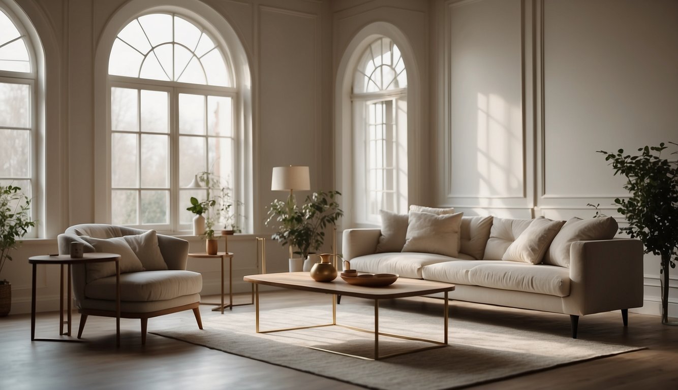
Sherwin-Williams Alabaster (SW 7008) is a favorite among homeowners. This paint color stands out due to its warm, soft white shade. It really brightens up any space without feeling too stark or extreme. Its Light Reflectance Value (LRV) of 82 means it reflects plenty of light, making rooms look open and airy.
You’ll notice that Alabaster’s warmth comes from its subtle undertones. Unlike other whites, it avoids that overly yellow look. This soft, creamy quality makes it an excellent choice for trim, cabinets, and walls. Even in north-facing rooms, where light is cooler, Alabaster maintains its inviting glow.
When paired with other colors, Alabaster is quite versatile. It works well with neutral tones like browns and tans for a cozy feel. You can also combine it with bolder colors if you want more contrast. For instance, try pairing it with a dark color like Urbane Bronze for a striking look.
Alabaster has won accolades, too. It was named Sherwin-Williams’ Color of the Year in 2016 and remains popular for good reason. If you’re looking for a dependable white that pairs well with various styles, Alabaster is a solid choice. Have you tried this color in your home yet?
3. Farrow & Ball Hague Blue
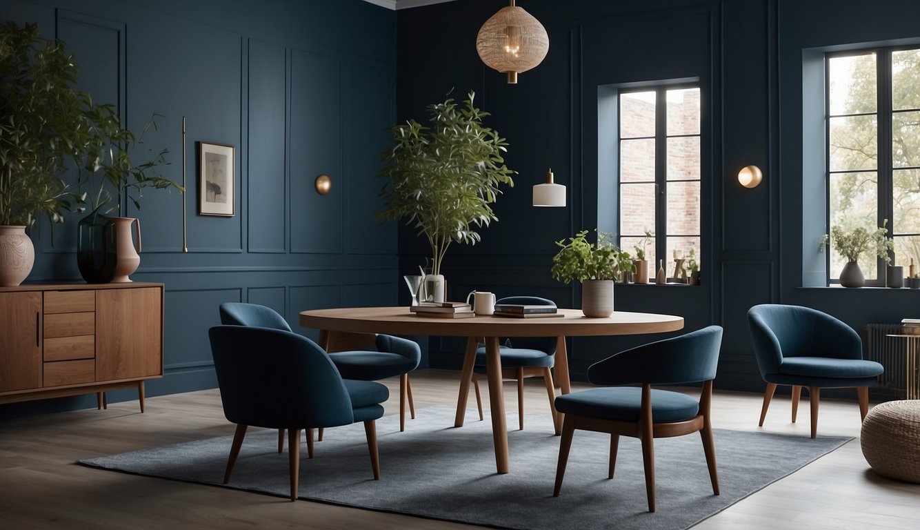
Hague Blue by Farrow & Ball is a deep, dramatic color that can transform a room. This rich shade of blue has an LRV (Light Reflectance Value) of 7, which means it’s quite dark. It’s close to black! So, if you love bold and moody hues, this might be perfect for you.
Wondering where to use Hague Blue? It shines in spaces with lots of light. Think of bright living rooms or sunlit kitchens. Without good lighting, it might feel a bit too dark. Many designers recommend it for cozy lounges or intimate libraries too. It adds drama and depth like no other color.
Design experts like Laura Jenkins have praised Hague Blue for its depth and elegance. She used it to create a classy, intimate library with built-in cabinetry. Does that sound like something you’re into? If so, consider how this color can change your space.
Get the Fail-Safe Paint Color Playbook (Free PDF)
36 proven colors • 8 ready palettes • trim & sheen guide • printable testing cards.
In fact, Farrow & Ball’s Hague Blue looks stunning with abstract art and modern decor. Pair it with metallic accents or crisp white trims to make the color pop. It creates a chic, sophisticated look that’s hard to beat.
So, if you’re up for experimenting with deep blues, give Hague Blue a try. Grab a paint sample and see how it looks in your space. You might just fall in love with its rich, vibrant character.
4. Behr Swiss Coffee
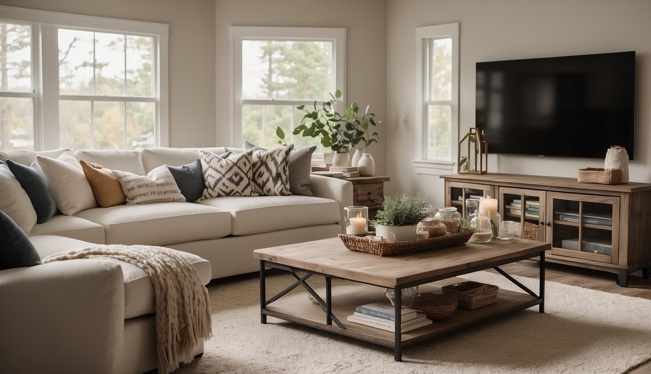
Behr Swiss Coffee is a top choice for interior walls. With its Light Reflectance Value (LRV) of 84, it’s bright and inviting.
This color straddles the line between off-white and pure white. It has a slight yellow undertone, giving rooms a warm and cozy feel. Imagine sipping on creamy coffee on a chilly morning—that’s the vibe!
Behr Swiss Coffee works well in various settings. Whether you’re painting a living room, kitchen, or bedroom, it delivers consistent results. It fits seamlessly with other colors, making it versatile for mixing and matching in your home.
What’s neat about Behr Swiss Coffee is that it rarely looks yellow, even in rooms with warm lighting. It mostly appears white, perfect for those who love a clean, neutral space without going fully stark white.
Don’t forget to try a swatch in your home first. Lighting and room orientation can affect how a color looks. South-facing rooms, for example, might bring out those warm undertones more significantly.
5. Benjamin Moore Hale Navy
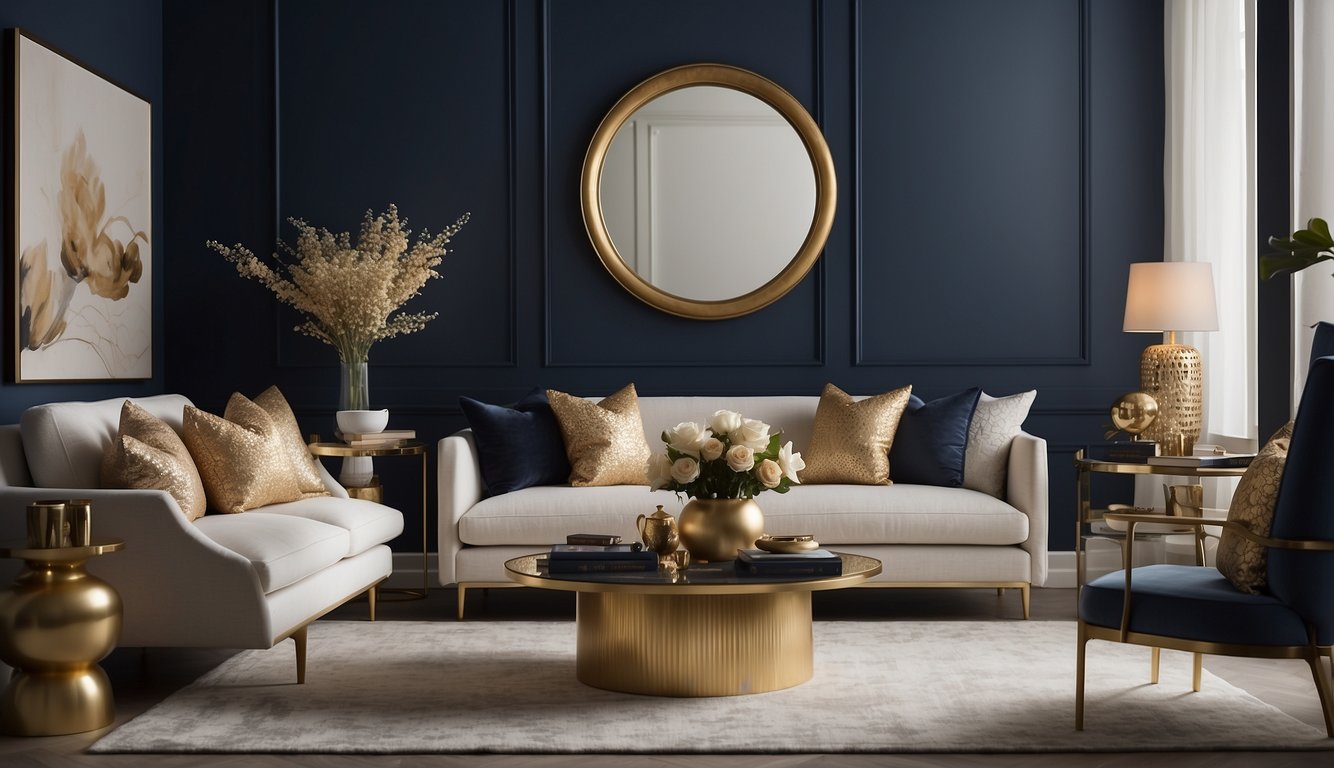
Benjamin Moore Hale Navy (HC-154) is a classic navy blue that you might just fall in love with. It’s one of Benjamin Moore’s best-selling colors and part of their Historical Colors collection.
This deep blue paint color is super versatile. You can use it for walls, cabinets, and even front doors. In fact, Hale Navy is often praised for how well it works in different spaces.
In rooms with good interior lighting, Hale Navy shines. It can sometimes look a bit black if the lighting isn’t right, but it still maintains its charm. It doesn’t have those typical violet or green undertones that many navy paints do.
In south-facing rooms, expect Hale Navy to appear slightly lighter and warmer. Meanwhile, in north-facing rooms, it may look bolder, darker, and even show some gray undertones.
Get the Fail-Safe Paint Color Playbook (Free PDF)
36 proven colors • 8 ready palettes • trim & sheen guide • printable testing cards.
Hale Navy is perfect for creating a bold statement without overpowering the room. If you want a classic, timeless color that fits with many styles, Hale Navy is a great choice.
6. Valspar Sea Salt Blue
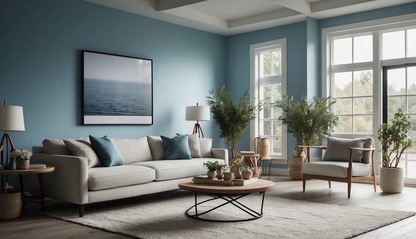
Looking for a calming color that brings a coastal vibe to your home? Valspar’s Sea Salt Blue might be what you need. It’s a soft, muted blue that evokes the feeling of a tranquil seaside retreat.
Sea Salt Blue can make your room feel more expansive and serene. It’s perfect for bedrooms, living rooms, or any space where you want a soothing atmosphere.
Pair this serene blue with white or light gray furniture to keep the look fresh and airy. You can also add natural elements like wooden accents or sea-themed decor to complete the coastal look.
Have you considered using it in a bathroom? The cool blue shade can evoke a spa-like ambiance, turning your bathroom into a relaxing oasis. Plus, it’s versatile enough to complement various styles, from traditional to modern.
Feeling adventurous? Try combining Sea Salt Blue with bolder accents like deep navy or vibrant coral for a striking contrast. It works well with metallic finishes too, adding a touch of elegance.
Valspar’s paint offers excellent coverage, so you won’t have to worry about multiple coats. This makes your painting project quicker and easier, perfect for a weekend DIY task. So, are you ready to transform your space with Sea Salt Blue?
7. Sherwin-Williams Agreeable Gray
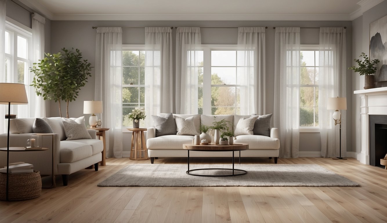
Agreeable Gray is one of the most popular paint colors from Sherwin-Williams. It has gained a lot of fans for good reasons.
This color is a beautiful blend of gray and beige, often referred to as “greige.” It works wonderfully with various design styles.
Get the Fail-Safe Paint Color Playbook (Free PDF)
36 proven colors • 8 ready palettes • trim & sheen guide • printable testing cards.
With a Light Reflectance Value (LRV) of 60, Agreeable Gray reflects a decent amount of light. This makes it a bright choice without being too overpowering.
Agreeable Gray is versatile. You can use it on walls, cabinets, trim, and even furniture. Many people love how it pairs with other colors.
For darker rooms, this shade might look a bit flat. But in spaces with average or bright natural light, it shines.
One of the best aspects is how Agreeable Gray complements other shades. It pairs exceptionally well with whites like Sherwin-Williams Pure White. Whether you use it in a bedroom, living room, or kitchen, it can create a warm and inviting space.
8. Farrow & Ball Cornforth White
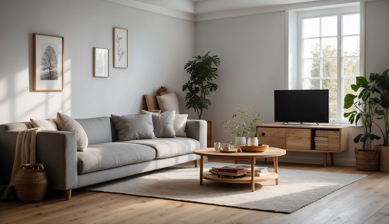
Farrow & Ball Cornforth White is a favorite for many interior decorators. It’s a mid-tone gray, not a true white, which makes it unique. This versatile color can fit any space, offering a calming backdrop.
Named after the architectural historian John Cornforth, this elegant gray shines in various lighting conditions. Sometimes it can show a slight violet undertone, giving it a subtle, unique charm.
You will appreciate Cornforth White’s ability to blend with different colors. Pair it with muted greens like sage or olive to create a natural and relaxing atmosphere. These earthy tones complement the gray perfectly.
This color isn’t too warm or too cool. If you want to emphasize its gray tones, try it with Farrow & Ball’s Wevet. Wevet is a complementary white that enhances Cornforth White’s soft, balanced look.
With its hue of 34° on the color wheel and HSL (Hue, Saturation, Lightness) values of 34, 13%, and 79%, Cornforth White offers a well-balanced neutral. Its versatility and elegance make it a wonderful choice for many interior styles.
Try Cornforth White in bedrooms, living rooms, or any space where you want a touch of soft, sophisticated gray. The color adapts beautifully to both modern and traditional settings, making it a top pick for any interior project.
9. Behr Silver Drop
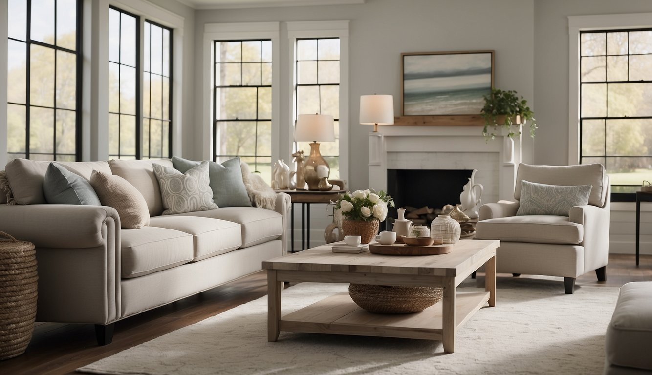
Behr Silver Drop is a popular choice for interior walls. It’s a light gray that fits well in any room. With an LRV of 70, it reflects a good amount of light, making spaces feel airy and bright.
One of the best things about this color is its versatility. Silver Drop is neutral, so it pairs nicely with other colors. You can use it alongside bolder hues or keep it subtle with other neutrals.
This paint also has excellent coverage. Behr Marquee paint, which includes Silver Drop, provides stain-blocking and durability in fewer coats. This can save you time and effort during your painting projects.
If you’re looking for a slightly darker option, consider Behr Dolphin Fin. It is one shade darker on the same color strip, offering a nice contrast if you want more depth.
Many people compare Silver Drop to Sherwin Williams Repose Gray. They are similar, but Silver Drop is a bit softer. It’s great for creating a calm and inviting atmosphere in your home.
10. Benjamin Moore Kendall Charcoal
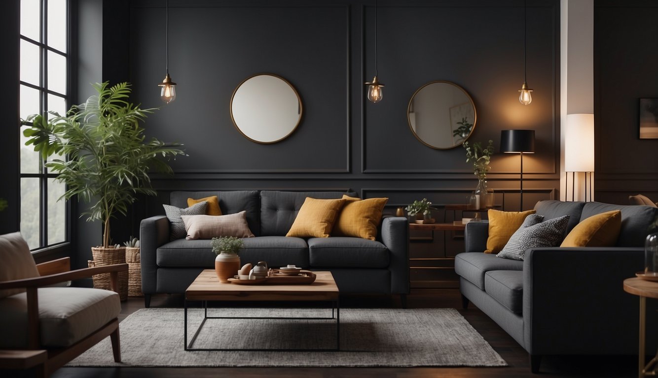
Benjamin Moore Kendall Charcoal, also known as HC-166, is a standout choice for interior walls. This paint color is a rich, deep gray with a hint of brown, making it both bold and luxurious.
Do you love a moody vibe? Kendall Charcoal is perfect for that! It brings a sense of elegance and drama to any room.
This color is super versatile. It works great for feature walls, kitchen cabinets, and even front doors. Pair it with lighter tones like whites, creams, or neutrals to balance its depth.
If you’re about variety, Kendall Charcoal looks amazing with fun shades too. Imagine pairing it with a bright yellow or a soft pastel for a modern twist.
One of the best things about Kendall Charcoal is how it never goes out of style. Its deep tone gives it an understated elegance that’s both classic and modern.
If you’re curious about how it looks in real homes, there are plenty of examples to check out. From living rooms to bathrooms, Kendall Charcoal works everywhere.
11. Sherwin-Williams Sea Salt
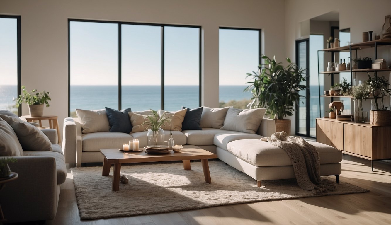
You’re going to love Sherwin-Williams Sea Salt (SW 6204). This paint color is a favorite among homeowners and designers for its soothing and versatile nature. It’s a soft, muted blue-green with gray undertones, making it a perfect backdrop for many spaces.
Sea Salt can transform a room into a calm and relaxing retreat. Imagine walking into a bathroom that feels like a spa, thanks to its beachy vibe. It’s like bringing a bit of the ocean into your home!
One thing that many people appreciate about Sea Salt is its Light Reflectance Value (LRV) of 63. LRV measures how much light a paint color reflects. For context, pure white has an LRV of 100, and absolute black has an LRV of 0. With Sea Salt’s LRV, your room will feel light and airy without being overly bright.
Now, a little heads up: Sea Salt can sometimes look more blue in certain lighting conditions. It’s fascinating how this color changes with the light, giving your walls a bit of character and intrigue.
Whether you’re painting a living room, bedroom, or even a kitchen, Sea Salt pairs beautifully with white trim and wood accents. It blends well with both modern and traditional decor, making it an adaptable choice for any home.
Curious to see it in action? Check out some real-life photos and reviews for inspiration or try a sample on your wall. You might find it’s the perfect color you’ve been searching for.
12. Farrow & Ball Stiffkey Blue
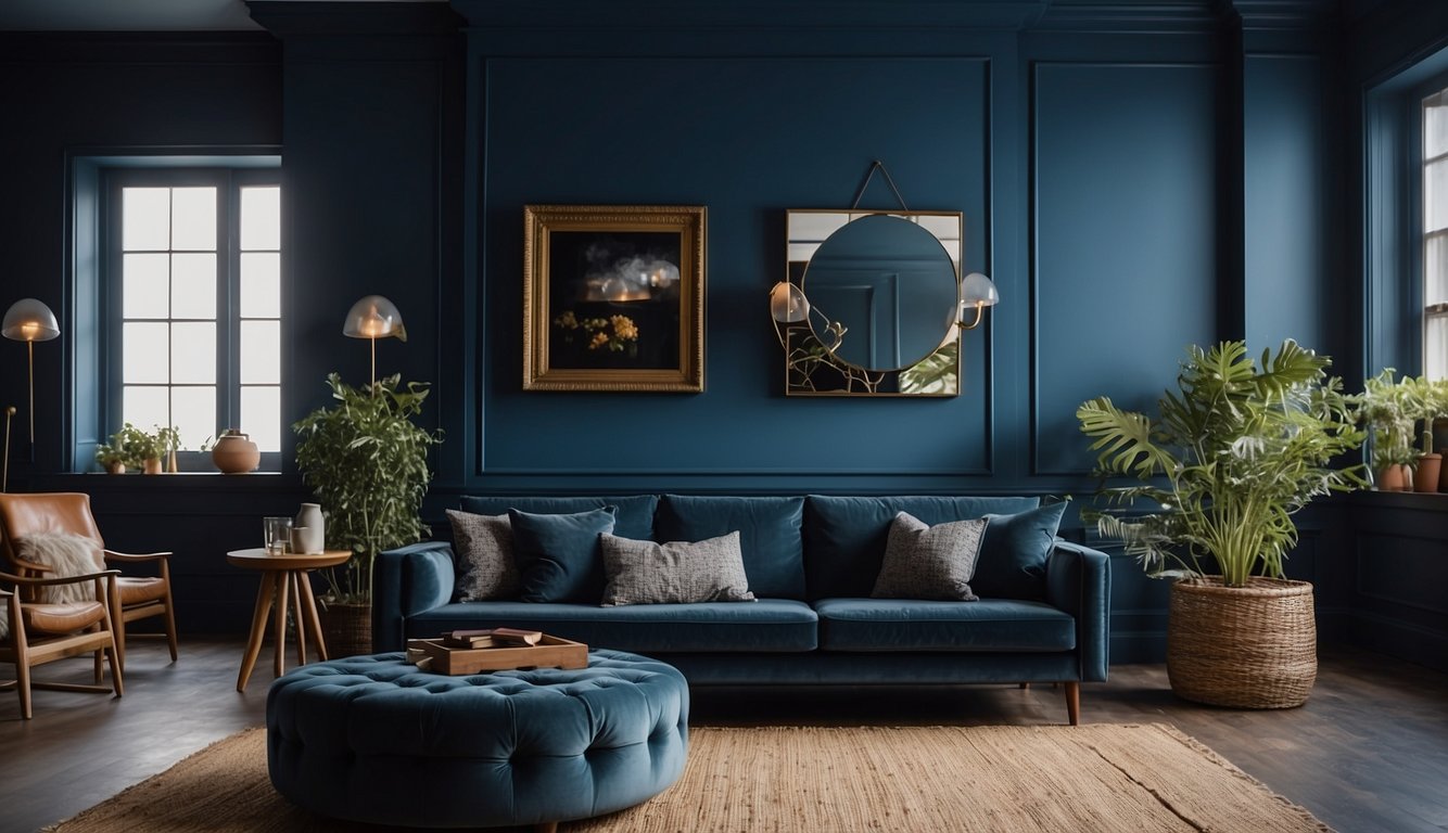
Looking for a rich, deep blue for your walls? Farrow & Ball’s Stiffkey Blue No. 281 might just be the answer. This inky blue gets its name from the north Norfolk beach, known for its unique blue-tinted mud.
Stiffkey Blue is perfect for interior walls, especially if you want a dramatic feel. It works great in both traditional and modern spaces, adding a touch of elegance and depth.
What’s cool about Stiffkey Blue is its versatility. You can use it in your kitchen or bathroom, thanks to its washable and mold-resistant properties. This means your walls will look amazing and be easy to maintain.
If you prefer a more dramatic look, Stiffkey Blue pairs well with lighter trim colors to create a striking contrast. Additionally, it holds up well in rooms with varying light conditions, maintaining its rich tone whether in natural or artificial light.
Consider using it in your living room or dining room if you’re after a bold statement. With its rich hue, Stiffkey Blue can make your space feel cozy yet sophisticated.
13. Benjamin Moore White Dove
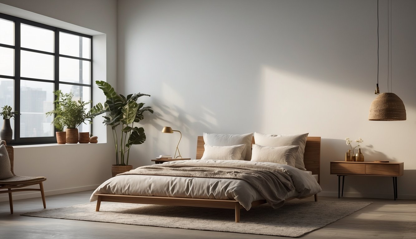
Looking for a warm, inviting white? Benjamin Moore White Dove could be perfect! It’s OC-17, a top pick for walls, trim, and cabinets.
White Dove stands out because of its versatility. It has soft gray undertones that make it look great in various light conditions. No wonder it’s a favorite among designers and homeowners!
Used on cabinets, it brings a fresh, clean look. On walls, it can brighten up spaces without feeling too clinical. Ever seen those dreamy, airy rooms on Pinterest? White Dove is often why they look so good.
This shade is also one of Benjamin Moore’s best-sellers. It’s a trusted choice that many find both modern and timeless. Who wouldn’t want paint that fits any style?
Afraid it might be too plain? Pair it with bold colors or natural textures. It works nicely with both cool and warm tones, making it a flexible choice for any room.
Ever walked into a room and felt instantly at ease? That’s the magic of White Dove. Whether it’s a cozy bedroom or a bustling kitchen, this color makes any space feel like home.
Try it out and see why it’s in so many top paint color lists!
14. Behr Bit of Sugar
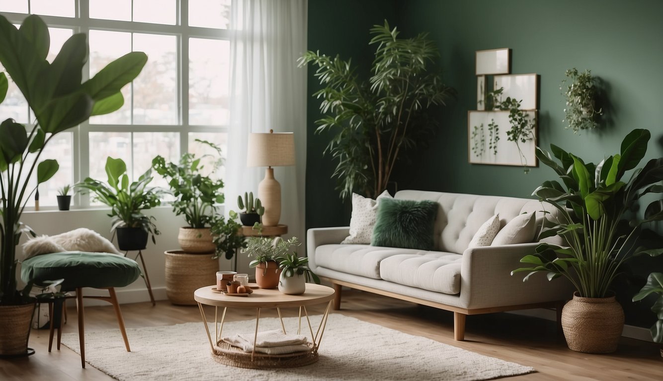
Behr Bit of Sugar (PR-W14) is a versatile off-white hue. This color creates a bright and uplifting atmosphere in any room.
With a Light Reflectance Value (LRV) of 89, Behr Bit of Sugar is slightly darker than Polar Bear, which has an LRV of 90.
Bit of Sugar leans cooler with a slight gray undertone, while Polar Bear has warmer pink or yellow undertones. This property makes Bit of Sugar a versatile choice for both modern and classic interiors.
Do you need a color that brightens dark spaces? Bit of Sugar does that perfectly. It gives a creamy appearance and a lovely glow, making it ideal for areas like hallways or rooms with limited natural light.
Bit of Sugar is not only great for walls but also works wonders on trim, interior doors, and even exterior surfaces. If you’re looking for a uniform look throughout your home, consider using this color all around, just like many in farmhouses do.
Test it in different rooms and lighting conditions before committing. A small swatch can help you see how it interacts with your space’s unique lighting and existing décor.
This subtle yet effective color can definitely make your rooms look more spacious and elegant.
Factors to Consider When Choosing Paint Colors
When selecting paint colors, think about the room’s function, the lighting, and the psychological impact of colors. These factors can help you create the perfect atmosphere for any space.
Room Function and Mood
The function of a room hugely impacts your color choice. Different rooms serve different purposes, and the colors should reflect that. For instance, a bedroom is a place for relaxation. Warm and calming colors like blues and greens are best here. Painting the kitchen? Go for stimulating colors like reds and yellows, which can encourage appetite.
Get the Fail-Safe Paint Color Playbook (Free PDF)
36 proven colors • 8 ready palettes • trim & sheen guide • printable testing cards.
Think about how people will use the room. A home office benefits from colors that boost productivity like soft greens or light blues. For living rooms, consider neutral tones like beige or gray, which can suit various activities. Consider the mood you want to set and choose accordingly.
Lighting and Paint Colors
Lighting plays a crucial role. Both natural and artificial light affect how colors look on your walls. Natural light varies throughout the day, changing the paint color’s appearance. North-facing rooms get cooler light, great for warm colors. Meanwhile, south-facing rooms get warm light, highlighting cool colors beautifully.
Artificial lighting also matters. LED lights can make colors look brighter, while incandescent bulbs give a yellowish tone, making colors look warmer. Always test paint samples under different lighting conditions. Use sample boards to see how paint looks in various lights. This ensures you get the right shade for your space.
Color Psychology and Impact
Color psychology explores how colors affect your feelings and behavior. Blues and greens generally promote calm and relaxation, excellent for bedrooms and bathrooms. On the other hand, Reds and oranges are energetic and stimulating, perfect for social spaces like dining rooms or kitchens.
Color affects your mind daily. Yellow can cheer you up, suitable for kitchens, while purple adds a touch of luxury and creativity to any room. Neutrals like white, beige, and gray create balance and can match with accent colors easily. These help in modern and minimalist designs. Select colors that align with the emotions you want to evoke in each room.
Trendy Paint Colors and Their Benefits
Choosing the right paint colors for your interior walls can transform your living space. From versatile neutrals to bold and standout hues, each color choice offers unique benefits.
Neutral Colors for Versatility
Neutral colors like beige, gray, and white are incredibly popular. These shades provide a flexible backdrop that fits any style. Gray-blue shades, like Sherwin-Williams’ Sea Salt, blend the calmness of blue with the neutrality of gray, making them a favorite among designers.
You can pair neutrals with practically any other color, so they’re perfect if you like to change your decor often. White walls create a clean, bright look and make rooms appear larger. Meanwhile, beige offers warmth without overwhelming a space.
Neutrals are timeless and won’t go out of style, ensuring your walls look modern for years. If you plan to sell your home, neutral walls are a safe bet, appealing to many buyers.
Bold Colors for a Statement
If you want your space to stand out, go bold with colors like black, deep blue, or vibrant yellow. Black paint, such as HGTV Home’s Darkroom by Sherwin-Williams, is trending. It’s bold yet neutral and pairs well with many other colors.
Yellow, like Clare’s Golden Hour, brings energy and happiness into a room, making it ideal for living spaces or creative areas. Meanwhile, Deep blue tones, such as Behr’s Nocturne Blue, add a touch of luxury and depth, perfect for a sophisticated look.
Bold colors can make a room memorable and reflect your personality. Use them on accent walls or in smaller spaces if a full room feels overwhelming. They work best in rooms that you want to make a real impression.
Pastel Colors for Calmness
Pastels like light pink, soft lavender, and pale blue bring a sense of calm and tranquility to a room. These colors are perfect for bedrooms, bathrooms, and nurseries.
Light blue or gray-blue, such as Sherwin-Williams’ Sea Salt, is soothing and versatile. It can look both blue and green depending on the lighting, adding a soft, relaxing atmosphere. Meanwhile, blush pink is gentle and warm, making it ideal for cozy spaces.
Pastels create a peaceful environment, helping to reduce stress. They’re also versatile and can complement a range of furniture styles. These lighter shades add a delicate touch without overpowering your decor.
Common Mistakes to Avoid
It’s easy to get carried away with the excitement of repainting your home. However, several common mistakes can ruin the final look.
Choosing Colors in Poor Lighting
Don’t pick colors when your room’s lighting is bad. Colors look different in natural light versus artificial light. Make sure to examine how the paint looks during different times of day. Overhead lighting can cast shadows that change how a color looks, making it seem darker or lighter than it is.
If you’re choosing colors at night, use daylight bulbs to mimic natural light. Always assess your chosen color in both natural and artificial light to see if it matches your expectations. Getting this right can save you from regretting your paint choice later.
Ignoring Undertones
Undertones are the subtle hues beneath the main color that can affect how it looks on your walls. For example, a beige might have a pink, yellow, or green undertone. If you ignore these, you might end up with a room that feels off.
Get the Fail-Safe Paint Color Playbook (Free PDF)
36 proven colors • 8 ready palettes • trim & sheen guide • printable testing cards.
Compare paint chips against a true white background to see the undertones clearly. Speak to paint store professionals; they can help identify undertones and suggest complementary colors.
Consider existing décor and how undertones will interact with it. This step helps create a harmonious space rather than a jarring clash of colors.
Not Testing Samples
Testing samples is crucial for avoiding surprises. Just because paint looks good on a swatch doesn’t mean it will on your wall. Small samples can be misleading, especially in large spaces.
Before committing, buy small sample pots of the colors you’re considering. Paint small sections or use foam boards to test them on various walls. Observe them for a few days to see how they change under different lighting conditions and times of day.
Testing reduces the risk of committing to a color you later regret. It might take extra time but guarantees better satisfaction with your final choice.
