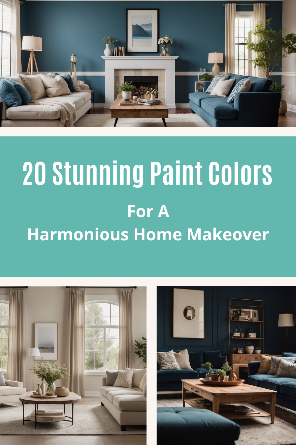
20 Best Paint Colors for Whole House: Transform Your Space Effortlessly
Choosing the perfect paint colors for your entire house can be a daunting task. With countless shades and hues available, finding ones that create a cohesive and inviting atmosphere might feel overwhelming. Whether you’re looking for something light and airy or deep and cozy, there are fantastic options to suit any style or preference. In this article, you’ll discover the 20 best paint colors for a whole house, providing you with excellent choices to transform your living spaces.

A well-chosen color palette can make a big difference in your home’s ambiance. The right colors not only enhance the beauty of your interior but also set the mood for each room. By learning about the best paint colors, you can achieve a stylish and harmonious look throughout your house. Get ready to explore colors that perfectly balance trends and timeless appeal.
Get the Fail-Safe Paint Color Playbook (Free PDF)
36 proven colors • 8 ready palettes • trim & sheen guide • printable testing cards.
1) Sherwin-Williams Agreeable Gray
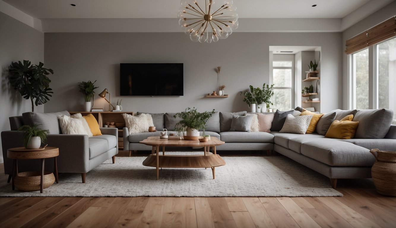
Sherwin-Williams Agreeable Gray (SW 7029) is a versatile and popular choice for whole-house painting. It’s not too light or too dark and can suit various types of spaces.
Agreeable Gray reflects a good amount of light with an LRV (Light Reflective Value) of 60. It works well in rooms with average or bright natural light, bringing a warm feel.
One cool thing about Agreeable Gray is its flexibility. It pairs beautifully with whites, such as Sherwin-Williams Pure White. This makes it easy to coordinate with trim, ceilings, and other elements.
If you’re thinking about exterior options, Agreeable Gray is a great candidate. It adapts to outdoor lighting conditions and complements various exterior finishes.
In darker rooms, this color may appear a bit drab. So, it’s better suited for more naturally lit spaces. This characteristic makes it a good fit for living rooms, bedrooms, and kitchens.
Many homeowners favor Agreeable Gray because it blends well with other colors. It pairs nicely with other shades like SW Repose Gray, creating a cohesive and stylish look.
This paint color is celebrated for its balanced appearance. It offers enough warmth without feeling too yellow or beige, ensuring your home feels welcoming and comfortable.
2) Benjamin Moore White Dove
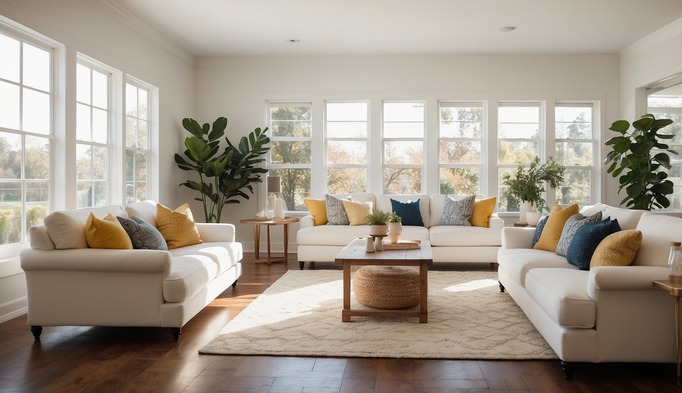
Benjamin Moore White Dove OC-17 is a top pick for many homeowners. This paint color is well-loved for its warm and inviting tone. It works great on walls, trim, and cabinets.
One reason you might like White Dove is its versatility. It pairs well with many colors, making it ideal for a whole-house palette. Whether you’re updating your living room or kitchen, White Dove can fit right in.
White Dove has a soft, warm undertone that keeps spaces feeling cozy. Unlike some stark whites, it adds a touch of warmth to any room. It’s especially effective in creating a calm and relaxing atmosphere.
If you’re concerned about natural light, White Dove performs well in different lighting conditions. It doesn’t turn too yellow or too blue, keeping its lovely neutral shade throughout the day.
Many designers and homeowners consider White Dove a staple. It’s frequently recommended and praised for its ability to adapt to various styles and decor. So, if you’re looking for a reliable white paint, Benjamin Moore White Dove is a fantastic option.
3) Farrow & Ball Hague Blue
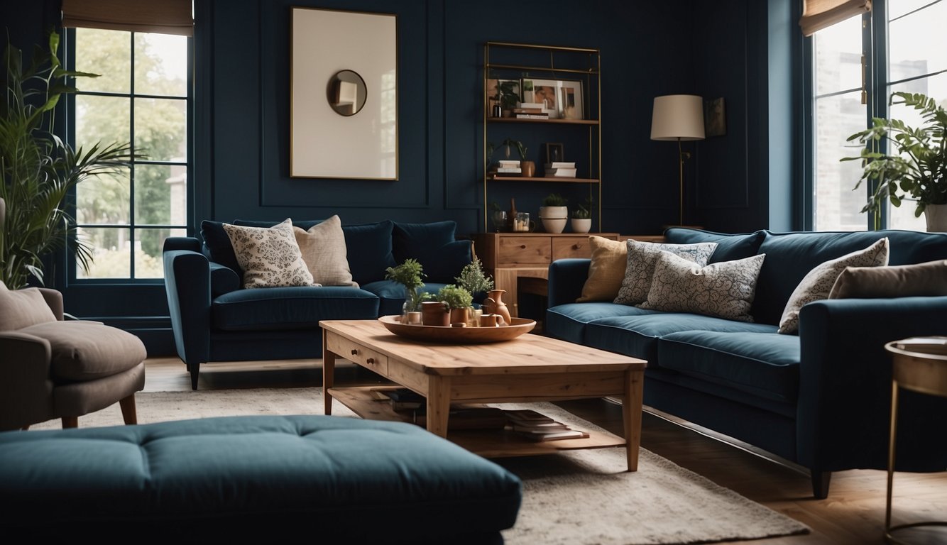
Farrow & Ball’s Hague Blue is a popular choice for its deep, rich hue. This color has an LRV (Light Reflective Value) of 7, making it a very dark shade. The LRV scale ranges from 1 (black) to 100 (white), so Hague Blue is quite intense.
Get the Fail-Safe Paint Color Playbook (Free PDF)
36 proven colors • 8 ready palettes • trim & sheen guide • printable testing cards.
You can use Hague Blue to create a cozy and intimate atmosphere. It’s perfect for bedrooms, libraries, or living rooms where you want a moody and sophisticated vibe. Interior designers like Laura W. Jenkins often use it in built-in cabinetry and walls to achieve this effect.
Because Hague Blue is so dark, it’s best used in rooms with plenty of natural light. This helps balance the deep tone and prevents the space from feeling too enclosed. Consider using it alongside white or lighter shades for contrast.
This color also gained popularity on social media. In 2021, it was the number one most Instagrammed paint color. If you enjoy decorating and sharing your home online, Hague Blue could make your spaces stand out.
So, whether you’re updating a single room or applying it throughout your house, Hague Blue by Farrow & Ball can add a touch of elegance and drama.
Ready to make a bold statement in your home? Give Hague Blue a try!
4) Behr Blueprint
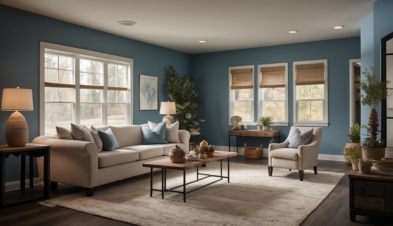
Behr Blueprint is like a breath of fresh air for your home. This cool, muted blue can make spaces feel calm and peaceful. It works well in a variety of settings, from bedrooms to living rooms.
Blueprint matches beautifully with warm, chalky browns like Kindling N200-6. You can use it as an accent against such tones for a balanced look.
Pair Blueprint with trim colors like Swiss Coffee 12 to create striking contrasts. This soft white trim highlights the blue and keeps your space feeling bright and open.
Blueprint isn’t just a soothing color; it also adds character to any room. It’s perfect for achieving a modern yet timeless look.
5) Valspar Summer Gray
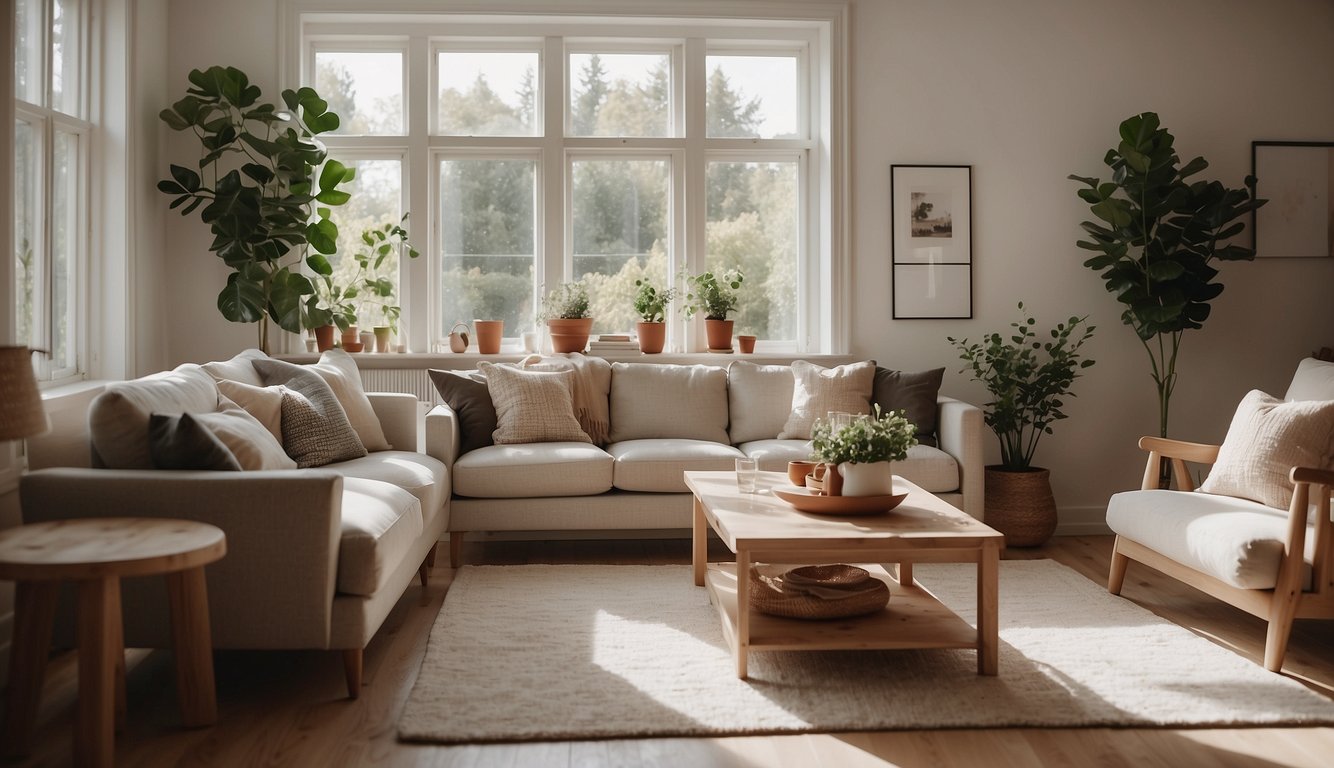
Thinking about a fresh look for your rooms? Valspar Summer Gray (7006-17) might be the perfect color for you. This shade is versatile, making it easy to use in different spaces throughout your home.
Valspar Summer Gray is a toned-down, neutral gray. It works well in living rooms, bedrooms, kitchens, and even bathrooms. The soft hue adds a calming effect to any room.
Get the Fail-Safe Paint Color Playbook (Free PDF)
36 proven colors • 8 ready palettes • trim & sheen guide • printable testing cards.
One of the great things about this shade is its adaptability. It pairs nicely with various colors and fits different design styles, from modern to traditional. Whether you want a cozy or a sleek look, Summer Gray can do the job.
Are you worried about how different lighting affects paint colors? No problem with Summer Gray! This paint color holds up well in both natural and artificial light, maintaining its pleasant tone throughout the day.
One user described how they used Summer Gray in their living room and loved the welcoming and serene ambiance it created. This personal touch can make your home feel more inviting and comfortable.
So, if you’re looking for a dependable and stylish paint color, give Valspar Summer Gray a try. It just might be the simple, elegant solution you’ve been searching for.
6) Benjamin Moore Pale Oak
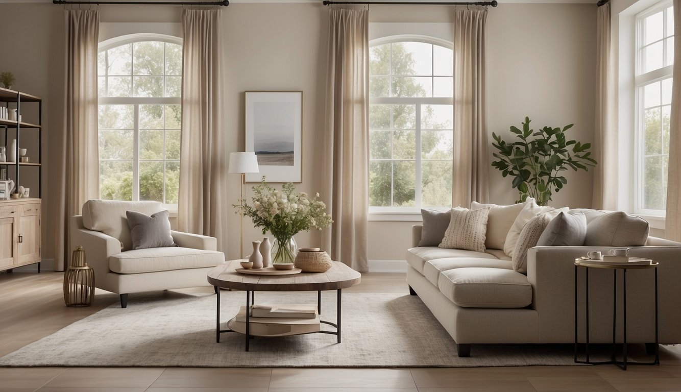
If you’re after a paint color that feels warm but not too overpowering, Benjamin Moore Pale Oak might be your perfect match.
Pale Oak creates a cozy atmosphere with its warm gray undertones. When paired with bright, natural light, it looks like a soft off-white. In rooms that don’t get as much sunlight, it comes across as a light greige, which is a mix of gray and beige.
The color has a Light Reflectance Value (LRV) of 69. LRV measures how much light a color reflects, with 0 being absolute black and 100 being pure white. This means Pale Oak is quite bright and can make your spaces feel larger and more open.
One of the coolest things about Pale Oak is its versatility. It works well in both modern and traditional spaces. Whether you have a living room full of natural light or a cozy bedroom with less, this color adapts beautifully.
Many interior designers love using Pale Oak because it pairs well with virtually any color palette. You can mix it with both cool and warm tones, making it super easy to change your décor without needing to repaint.
Get the Fail-Safe Paint Color Playbook (Free PDF)
36 proven colors • 8 ready palettes • trim & sheen guide • printable testing cards.
For a timeless and adaptable neutral, you can’t go wrong with Pale Oak.
7) Sherwin-Williams Alabaster
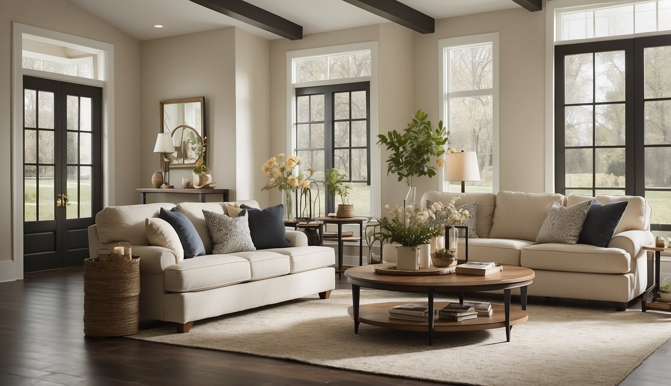
Sherwin-Williams Alabaster is a soft, warm white that’s highly versatile. With an LRV of 82, it’s bright enough to open up a room but warm enough to feel cozy.
This shade works wonderfully on kitchen cabinets, walls, and trim. Imagine your kitchen glowing with a subtle warmth that makes it feel inviting and homely.
Using Alabaster gives you a neutral backdrop that pairs well with many accent colors. It’s perfect for a cohesive look across different rooms since it complements both warm and cool tones.
If you’re looking for external use, Alabaster shines here too. It looks great with warm stone or other earthy tones, making your home exterior inviting.
The best part is, Alabaster doesn’t go overly yellow like some other warm whites. This makes it an excellent choice for those who want a soft white without the risk of it looking too creamy or off-color.
Have a room with a lot of natural light? Alabaster will enhance it, creating a bright and airy feel. In spaces with less light, Alabaster keeps the room feeling open without clashing with your decor.
8) Farrow & Ball Cornforth White

Looking for a neutral paint color that can do it all? Cornforth White by Farrow & Ball might be just what you need.
This color is described as a mid-tone grey. It’s not too warm and not too cool, making it incredibly versatile. Cornforth White fits in well with a variety of styles and settings.
Despite its name, Cornforth White is actually more of a grey. It has a slight violet undertone, so it can sometimes look a bit purple, depending on the lighting.
This paint color is great for creating calm and cozy spaces. It can work beautifully in living rooms, bedrooms, or even kitchens. Cornforth White is often paired with other neutral shades but works well with wood tones and more colorful accents too.
When planning your decor, consider how the lighting in your space might change the appearance of this color. In some lights, Cornforth White can appear darker or lighter, adding depth and interest to your rooms.
This paint color is popular among those who want a classy, understated look that still feels modern. Whether you’re painting a whole house or just a room, Cornforth White offers a subtle, sophisticated charm without being bland or boring.
9) Behr Swiss Coffee
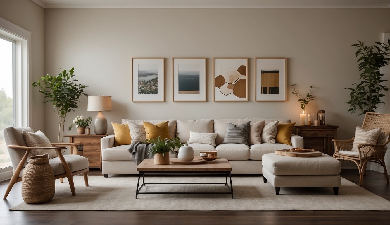
Behr Swiss Coffee is your go-to warm, creamy off-white color. It has an LRV (Light Reflectance Value) of 84, making it quite bright. This paint color keeps your rooms looking cheerful and spacious.
Swiss Coffee has slight yellow undertones that give it a cozy, inviting feel. Don’t worry—it mainly appears white. The yellow is more noticeable under warm lighting, like in south-facing rooms.
With hues perfect for both modern and classic interior designs, Behr Swiss Coffee is versatile. It’s great for walls, ceilings, and trim. You can use this shade to create a seamless, unified look throughout your home.
Swiss Coffee pairs well with other colors. Try it with neutral tones, soft greys, or even bold accents. It’s not just for walls—this color works well on furniture too.
When picking a paint, always test a swatch in your space. Lighting can change how a color looks. Swiss Coffee may look different in your home than in a store.
If you’re seeking a reliable, warm white to brighten up your home, Behr Swiss Coffee might be the perfect choice for you. Its inviting hue and versatility make it a favorite in many homes.
10) Valspar Sea Salt Blue
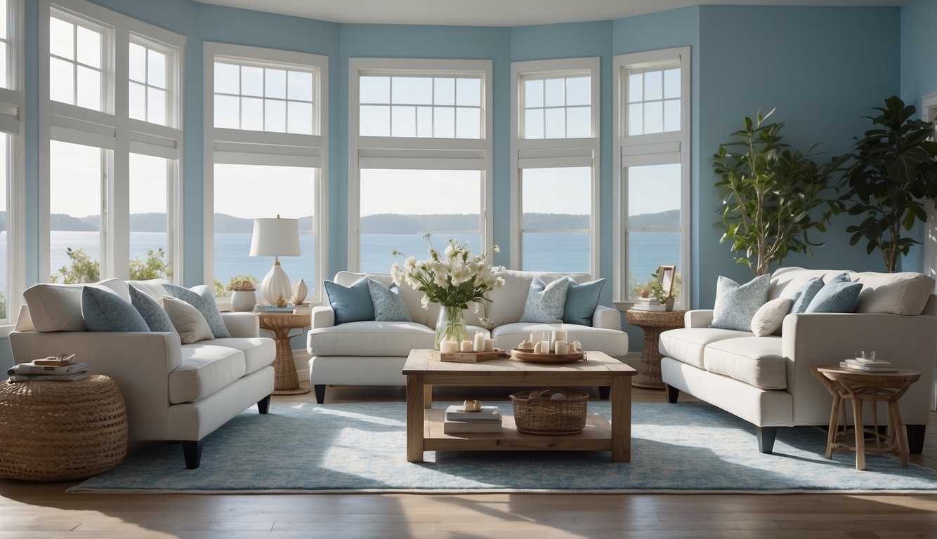
Valspar Sea Salt Blue is a versatile and calming shade. This color has a light, cool tone with a hint of gray. It works well in many rooms of your home.
One of the best things about Sea Salt Blue is its ability to change with the lighting. In bright rooms, it looks more blue, while in dimmer spaces, it looks more gray. This makes it a great choice if you want a dynamic, interesting wall color.
The LRV (Light Reflectance Value) of Valspar Sea Salt Blue is 61.187. This means it can reflect a good amount of light, keeping the room bright and welcoming. It is an excellent option for living rooms, bedrooms, or even kitchens.
If you’re looking to match this paint, consider how it compares to other popular colors. For instance, it is a bit cooler and grayer than Sherwin Williams Sea Salt. This helps create a peaceful and neutral backdrop, which can be ideal for various décor styles.
Valspar Sea Salt Blue pairs well with whites and soft neutrals. Try it with cream-colored trim or light wood furniture to enhance its soothing qualities. This color also works nicely with accents in navy or charcoal for a bit more contrast.
11) Benjamin Moore Revere Pewter
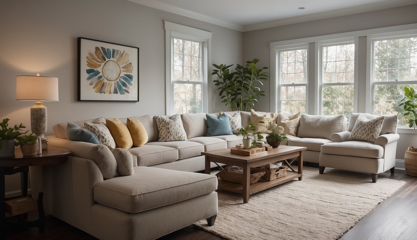
Have you heard of Benjamin Moore’s Revere Pewter? It’s a paint color that many people love for its versatility. This shade is known for being a “greige,” or a combination of gray and beige. Because of this mix, Revere Pewter works well with both warm and cool color schemes.
Revere Pewter, also known by its code HC-172 or Ice Formations (973), has an LRV (Light Reflectance Value) of 55.05. The LRV indicates how much light the color reflects. With this value, it provides a good amount of light without being too stark or too dark.
People often choose Revere Pewter for living rooms, dining rooms, and hallways because it creates a cozy yet modern look. Some even use it for the entire house to maintain a consistent, neutral backdrop for other design elements.
You might find Revere Pewter similar to Sherwin-Williams’ Agreeable Gray. Though they are close, many prefer Revere Pewter for its cleaner and crisper appearance. It’s a timeless choice that can make your home feel both contemporary and inviting.
Besides its main use in living areas, Revere Pewter pairs nicely with colors like Buxton Blue and Quiet Moments for a cohesive color palette throughout your home. If you’re after a shade that bridges various tones beautifully, this paint color could be just what you need.
12) Sherwin-Williams Pure White
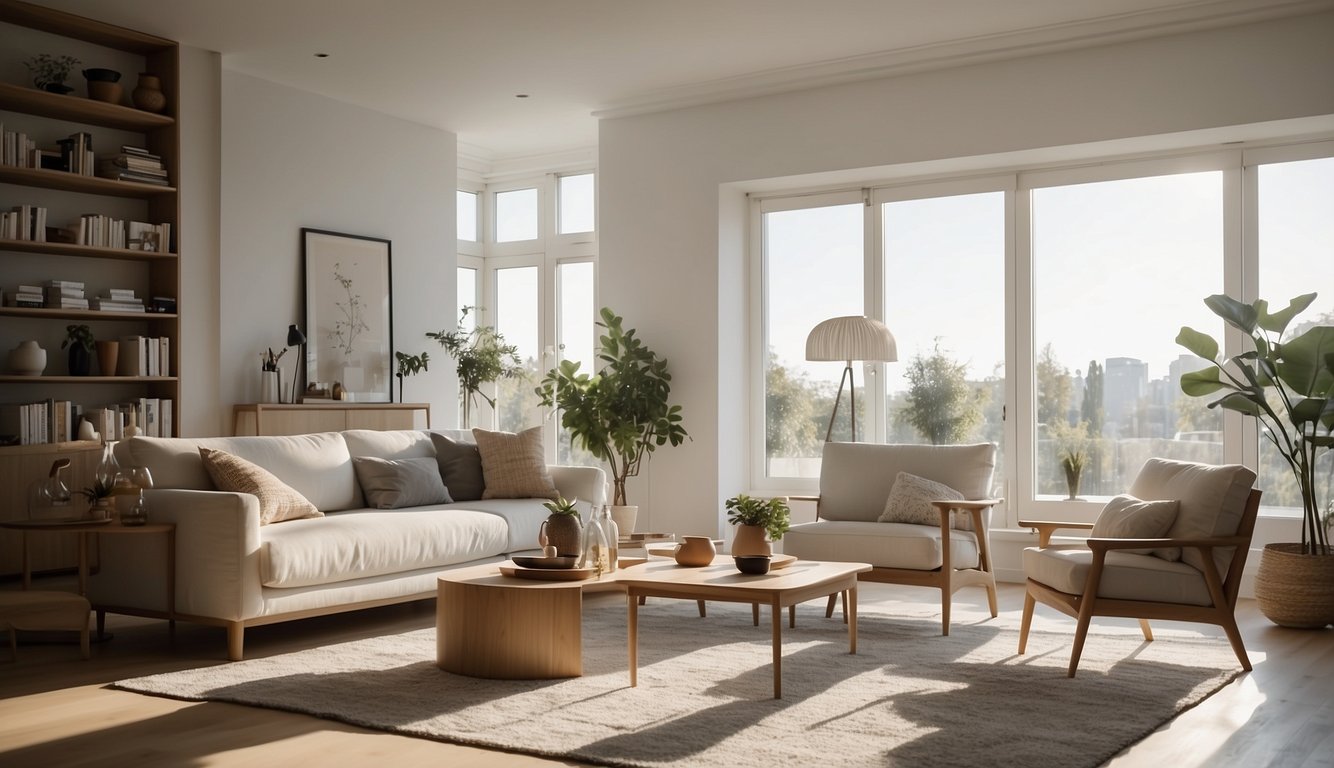
Sherwin-Williams Pure White (SW 7005) is a versatile paint choice that fits almost any home. It has an LRV (Light Reflectance Value) of 74, making it bright but not too stark. This means it reflects a lot of light, perfect for making small spaces feel bigger and more open.
Do you love the look of clean, crisp walls? Pure White can give you just that. It’s great for living rooms, kitchens, and even bedrooms. You can use it on walls, ceilings, trims, and cabinets.
Wondering if it will look too plain? Pure White has a subtle grayish beige tint that adds depth, unlike some whites that can appear one-dimensional. It pairs well with almost any color, from bold to pastel.
Have you ever thought about consistency in your home’s color scheme? Using Pure White throughout can bring a sense of harmony and flow from room to room. It’s especially popular for mouldings and trims, giving a polished and uniform look.
Mixing your white paint with different textures can add more interest to your spaces. Try it with matte walls and glossy trim. This can create a beautiful contrast without changing the color.
13) Farrow & Ball Elephant’s Breath
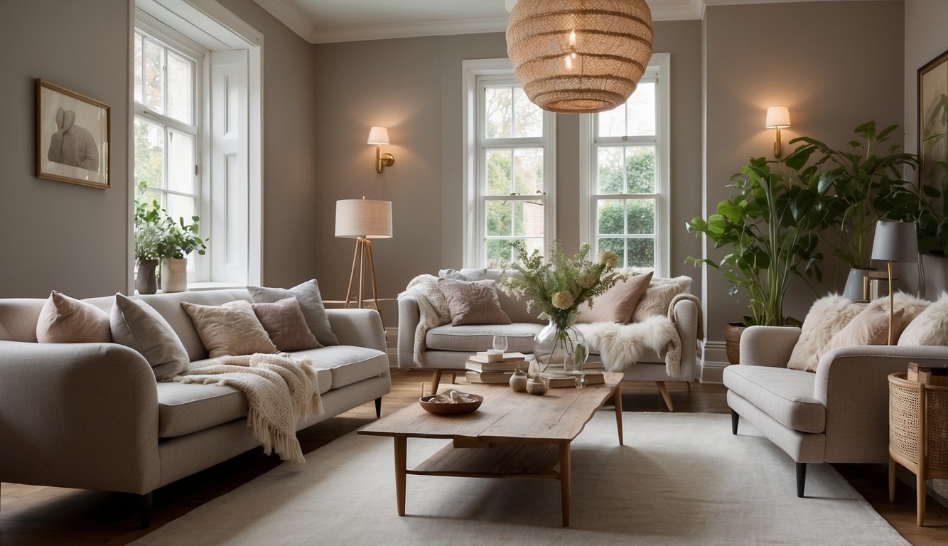
Farrow & Ball Elephant’s Breath is a classic neutral paint color. It’s a mid-grey shade that can look different depending on the light in the room.
In west-facing rooms, sometimes it takes on a lilac tone. Imagine how fun it would be to see your walls change colors from day to night. This makes it a versatile choice for any part of the house.
You may be impressed that this shade works beautifully with many colors. Think about pairing it with deep blues or rich reds for a bold look. Or you can match it with other neutral tones for a calm and sophisticated feel.
If you’re looking for examples, many homeowners have used Elephant’s Breath in living rooms, bedrooms, and even kitchens. Photos of these spaces showcase just how great this color looks on walls. It’s like getting a sneak peek into your home makeover.
14) Behr Ultra Pure White
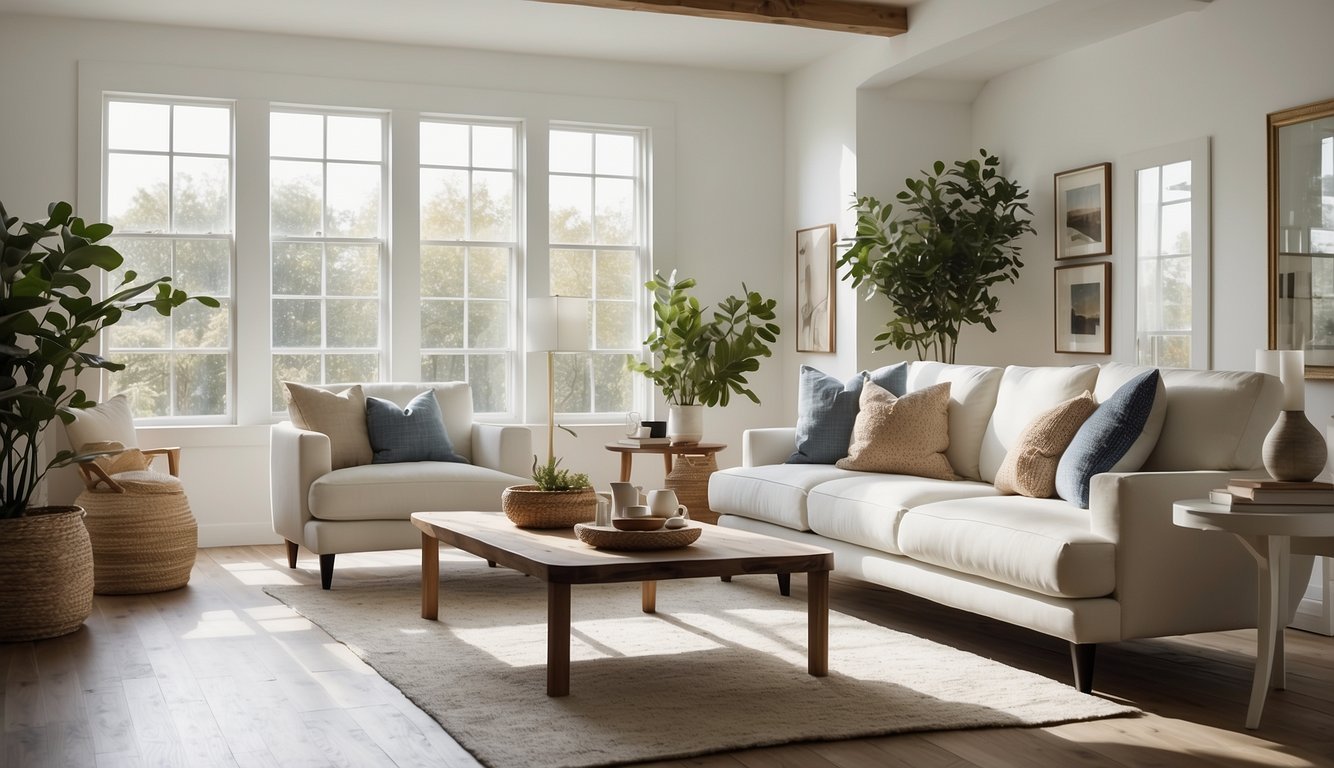
Looking for a versatile white paint? Behr Ultra Pure White might just be the answer. It’s super popular among homeowners and designers.
With a Light Reflectance Value (LRV) of 94, Behr Ultra Pure White is extremely bright. This means it can make any room feel spacious and airy. Perfect for small spaces like bathrooms or hallways.
No worries about weird undertones here. This paint is a true, clean white. It’s great for those who want a crisp, modern look. Many people love using it for trim and cabinetry. Plus, it’s easy to match with different colors and decor styles.
If you’re wondering about technical stuff, Behr Ultra Pure White has an HSL code with a hue of 70°, saturation of 33%, and lightness of 96%. That’s just fancy talk for how pure and bright it is.
In real life, this paint shines! Just check out the pictures online. Whether it’s paired with bold colors or used in a monochrome scheme, it delivers. If you want your home to feel fresh and vibrant, it’s definitely worth considering.
15) Valspar Blue Kiss
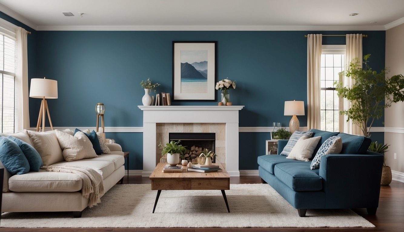
Valspar’s Blue Kiss is a soft blue paint color that feels both calming and cheerful. Imagine the sky on a clear, sunny day — that’s the kind of vibe Blue Kiss will bring into your home.
If you’re looking to refresh a room, Blue Kiss is an excellent choice. It’s versatile enough to fit in a bedroom, living room, or even a bathroom. You’ll love how it brightens the space while keeping it tranquil.
This shade has just the right amount of color to add interest without being overwhelming. It looks amazing paired with white trim or light wood finishes.
Blue Kiss also works well with other colors. You can combine it with deeper blues for a harmonious look or add pops of yellow for a playful touch.
Whether you have modern decor or a more traditional style, Valspar Blue Kiss can seamlessly fit in. It’s a favorite for a reason!
16) Sherwin-Williams Accessible Beige

Sherwin-Williams Accessible Beige (SW 7036) is a versatile paint color that fits perfectly in any room.
It’s a warm greige—balancing beige with enough gray to keep it neutral. With an LRV (Light Reflectance Value) of 58, it’s considered a light color but not too bright. This means it reflects a moderate amount of light, making your space feel open and inviting.
Accessible Beige is a popular choice because it pairs well with different styles and furniture. Whether you’re going for a modern look or a cozy, traditional vibe, this color works brilliantly.
Natural light plays a significant role in how this paint looks. In rooms with lots of sunlight, Accessible Beige leans more towards gray. In darker rooms, it appears more beige. This adaptability makes it a great choice for a whole-house color.
You’ll also find that this paint works well with white trim or cabinetry, providing subtle contrast without being too bold. Plus, it’s one of Sherwin-Williams’ top 50 colors and is trending on Pinterest, so you know you’re making a stylish choice.
If you’re looking for a paint that’s more muted than other beige tones but warmer than most grays, Accessible Beige is a fantastic option. It’s ideal for living rooms, bedrooms, and even kitchens.
17) Farrow & Ball Skimming Stone
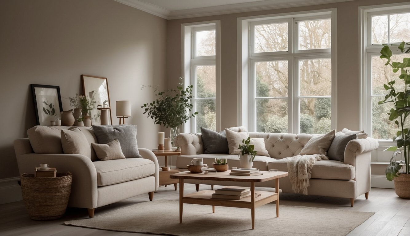
Hey there! Have you ever thought about using Skimming Stone in your home? It’s a soothing, soft cream hue from Farrow & Ball. This paint color brings a calm and neutral vibe to any room.
Skimming Stone gets its name from a 19th-century plaster color. It often reminds people of lazy afternoons skimming stones. It’s a great choice for spaces where you want an easygoing, breezy feel.
This color works well in living rooms, bedrooms, hallways, and bathrooms. Its versatility makes it a favorite among many interior designers. You can pair it with other neutrals, or even bolder colors, to create a balanced look.
Are you looking for paints that are both sophisticated and versatile? Skimming Stone fits the bill perfectly. It’s part of Farrow & Ball’s most popular paint colors, which means it’s tried and trusted.
Thinking of redesigning your space? Give Skimming Stone a shot. It’s available in-store and online, so getting your hands on it is pretty easy. Plus, it matches well with a range of furnishings and decor styles.
18) Behr Mineral
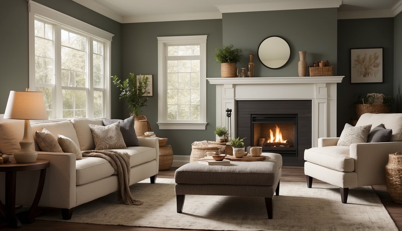
Behr Mineral is a calming and versatile paint color. It’s perfect if you want a neutral tone that isn’t too gray or too beige. This shade strikes a balance, making your rooms feel warm and welcoming.
You might wonder where to use Behr Mineral in your home. It’s great for living rooms, bedrooms, or even kitchens. Because it pairs well with white trim and wood accents, you can use it almost anywhere.
Are you concerned about how it looks under different lighting? Behr Mineral stays consistent and doesn’t shift colors dramatically. Whether you have lots of natural light or rely on indoor lighting, this color remains stable.
Need a color that complements various styles? Behr Mineral works well with modern, traditional, and rustic decor. Its versatility can adapt to your evolving tastes and preferences.
Afraid of committing to a full room? Try using it on an accent wall first. You can see how it fits with your furnishings and get a feel for its charm and warmth.
19) Benjamin Moore Stonington Gray

Have you ever wondered what color can give your home a timeless, elegant look? Benjamin Moore Stonington Gray might be your answer!
Stonington Gray, known as HC-170, is a muted, cool gray paint color. It has an LRV (Light Reflectance Value) of 59. This means it reflects a good amount of light, making your rooms feel bright and airy.
Stonington Gray has very subtle undertones, so it pairs well with almost any other color. That makes it a versatile choice for any space in your home, whether it’s the living room, kitchen, or even bedrooms.
Many people compare Stonington Gray with Wickham Gray, which is somewhat lighter with an LRV of 69. If you want a more muted tone, Stonington Gray is the one to pick!
Wondering if it will blend with your furniture? Because it’s neutral and cool, it complements various styles and finishes. Imagine a living room with soft gray walls and colorful accents!
Ready to test it out? You can get a peel and stick sample to see how it looks in your space without the commitment of painting first. This way, you can be sure it’s the perfect shade for your home.
20) Sherwin-Williams Sea Salt
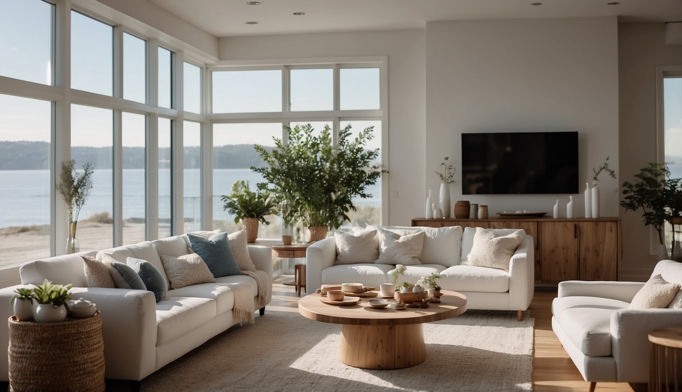
Sherwin-Williams Sea Salt is a beautiful soft blue-green with gray undertones.
It’s great for almost any room in your house, providing a calm and soothing atmosphere.
With an LRV (Light Reflectance Value) of around 63, Sea Salt reflects a moderate amount of light.
This makes it neither too dark nor too bright.
One reason many love this color is its versatility. It pairs well with other neutral tones like whites, beiges, or grays. It can fit into different design styles, whether modern, coastal, or farmhouse.
Sea Salt sometimes looks more green, other times blue, depending on your lighting.
In general, it’s known to work well in bathrooms, living rooms, and even bedrooms.
Get the Fail-Safe Paint Color Playbook (Free PDF)
36 proven colors • 8 ready palettes • trim & sheen guide • printable testing cards.
If you like this color but want to explore similar shades, you might also look at Sherwin-Williams Silver Strand or Behr Shy Green.
Just remember, colors can appear differently based on the lighting in your home, so always test a swatch before fully committing. You’ll love the calming vibes Sea Salt can bring to your space!
Choosing the Right Paint Color for Each Room
When choosing paint colors for your home, focusing on each room’s function and feel is vital. Different spaces benefit from distinct color choices to enhance their specific purposes and create the desired atmosphere.
Living Room Ambiance
The living room is where you relax and entertain, so choosing the right color is crucial. Light gray or beige are popular choices, offering a neutral base that works with many decor styles. For a more inviting feel, you can incorporate an accent wall in deep blue or forest green.
Neutral tones can make your living room feel more spacious, while warmer colors like soft yellows or light oranges can create a cozy ambiance.
–Accent colors: Use shades like bold red or rich navy for throw pillows, rugs, or other decor items. This adds personality without overpowering the room.
Using the 60-30-10 rule can also help balance the colors. For instance, 60% dominant color (walls), 30% secondary color (furniture), and 10% accent color (decor) ensures a harmonious look.
Creating a Calm Bedroom
Your bedroom is your sanctuary, so calming colors are essential. Soft blues and greens are excellent for creating a peaceful atmosphere. These colors are known for their relaxing effects and can help you unwind after a long day.
Pastel shades like lavender or light pink can also add a soothing touch without being overpowering.
–Bedding and decor: Complement these wall colors with white or neutral-colored bedding and simple decor to maintain a serene environment.
Avoid overly bright or dark colors; they can disrupt the tranquility you want in your bedroom. Instead, focus on softer hues that promote relaxation and restfulness.
The Impact of Lighting on Paint Colors
How paint colors look in your home can vary greatly based on lighting. Natural and artificial light play big roles in affecting how colors appear at different times of the day.
Natural vs. Artificial Light
Natural light changes throughout the day. Morning light is soft and cool, while midday light is bright and harsh. By evening, natural light turns warm. Since natural light varies, it’s crucial to test paint colors on all walls before making a final decision.
Artificial light from light bulbs also influences paint colors. Incandescent bulbs give off a warm, yellowish light, which can make colors look warmer. Meanwhile, fluorescent bulbs emit a blue-tinged light, affecting how cool or warm a paint color appears. Consider the type of light bulbs in your home when choosing paint colors.
Directional Lighting Considerations
The direction your room faces impacts how colors look. North-facing rooms get less sunlight and have cooler, often bluish light. Paint colors may appear darker and cooler in these rooms.
East-facing rooms get morning light, bright and warm, but can turn cooler and softer by the afternoon. South-facing rooms have the most consistent light, which is warm all day; paint colors look truest here. Meanwhile, west-facing rooms get warm, rich light in the afternoon and evening.
Different times of the day and directions can make walls appear different shades, so always consider the direction when picking your perfect paint color.
Color Psychology in Interior Design
Different colors can create different moods in your home. By understanding what each color represents, you can make better choices for your interior spaces.
Energizing with Warm Colors
Warm colors like red, yellow, and orange can make a room feel lively and energetic. Red is the color of passion and can stimulate excitement, making it ideal for social areas like the kitchen or living room.
Get the Fail-Safe Paint Color Playbook (Free PDF)
36 proven colors • 8 ready palettes • trim & sheen guide • printable testing cards.
Yellow, often associated with happiness, can brighten up spaces and make them feel more welcoming. It’s great for areas where you want to foster creativity and positivity, like a home office or craft room.
Orange combines the energy of red and the joy of yellow. This vibrant color works well in spaces where you want to spark enthusiasm and conversation.
Calming Effects of Cool Colors
Cool colors like blue, green, and purple have a calming effect. Blue is often linked to serenity and peace, making it a top choice for bedrooms or bathrooms where you want to relax and unwind.
Green is connected with nature and brings a refreshing and soothing vibe to any room. It’s particularly effective in home offices or living rooms where a calm atmosphere can boost productivity.
Purple, while less common, can offer a touch of luxury and calm. It works well in spaces where you want to incorporate a sense of tranquility and elegance, such as a reading nook or meditation space.
