
How to Use Color to Tell a Story: Transform Your Home Decor
Ever walk into a room and feel like you’ve just stepped into a postcard of someone’s life? Colors have the power to narrate stories about you and your space. Using the right color combinations across your home can transform it into a unique narrative that represents your history, dreams, and passions. Think about the walls as the backdrop to your story and how every shade contributes to the tale you want to tell.
Get the Fail-Safe Paint Color Playbook (Free PDF)
36 proven colors • 8 ready palettes • trim & sheen guide • printable testing cards.
When you’re designing your home, those subtle undertones can speak volumes. Just imagine, a rich, deep blue might whisper tales of ocean voyages and adventure, while soft pastels might recall a gentle spring afternoon. The key is to build your color story around the permanent fixtures in your home. These are like the bones upon which you layer the vibrant details of your unique story.
Engaging with color is also about experimentation and personal connection. Picture mixing family heirlooms with modern elements, or creating a cozy reading nook with warm hues. It’s not just about aesthetic appeal; it’s about crafting a space that’s undeniably yours. Wouldn’t it be fun to see how color tells your own story?
The Power of Color in Home Decor
Colors in your home do more than just look pretty; they tell a story. The color wheel helps guide you in picking shades that work well together, while a thoughtful color palette sets the mood and theme of your space.
Understanding the Color Wheel
Start by getting to know the color wheel. It’s a tool that shows how colors relate to each other. Primary colors are red, blue, and yellow. Mix them to create secondary colors like green, orange, and purple.
Colors next to each other form analogous schemes, perfect for harmony. Opposites create contrast, known as complementary schemes. If you want an exciting look, go complementary and see how your space pops. Using this knowledge, you can easily create a space that feels balanced and lively.
Choosing Your Color Palette
A well-picked color palette can make your home cozy or energetic. Consider using neutral colors as your base. They create a calm, versatile backdrop. Add bright colors like yellow or red for a lively accent. Want peace and quiet? Soft blues and greens will work wonders.
To get started, think about the mood you want to set. Then, choose colors from the wheel that match that feeling. Try painting a small area to see how the colors look before committing. With the right palette, you can transform any room into the perfect escape.
Setting the Mood with Color

Color has the power to change how you feel in a room. Bright hues can stimulate energy, while softer shades might make a space feel calm. Here’s how different colors can shape the vibe in your home.
Emotional Impact of Colors
Did you know red can make your heart race a bit faster? It’s true! Red is intense and can give a room a lively feel. It’s perfect for spaces where you entertain a lot, like dining rooms or living rooms.
Blue, on the other hand, can bring peace to mind. It’s why many people choose blue for bedrooms or bathrooms, where relaxation is key. Green, the color of nature, brings freshness indoors. It helps create a balanced and soothing environment, making it suitable for almost any room.
Feeling adventurous? Try purple, a color often linked with creativity and luxury. It can elevate a home’s aesthetic, giving it a unique flair. Each color has its unique touch, affecting how it feels to be in a certain space.

Color Psychology in Interior Design
Color psychology isn’t just for artists and storytellers—it’s a major tool in home decor, too! It involves choosing colors that evoke specific feelings. Picture your home as a canvas. The colors you choose can transform it magically.
Blue is calming, while red brings energy. Green is refreshing, and purple adds sophistication. Knowing these traits helps you make smart choices. For a harmonious look, pick colors that work well together.
Designers often use sophisticated palettes to balance warmth and coolness, making rooms feel welcoming and cohesive. By balancing different shades, you can tailor each room to make it perfect for its purpose. Let your colors speak for themselves, setting the stage for warmth, excitement, or calmness.
Incorporating Personal Touches

Adding personal touches to your home decor creates a space that truly reflects who you are. By bringing family heirlooms and favorite colors into your design, you infuse your home with meaningful elements and vibrant stories.
Utilizing Family Heirlooms
Family heirlooms can add depth and sentimental value to your home. Consider displaying an antique clock from your grandparents’ house or a vintage painting that tells a story from a bygone era. These items are more than decorative pieces; they’re windows to your past.
Why not frame an old quilt or use a collection of vintage teacups on your dining table? Each item can be a conversation starter or simply a reminder of cherished memories. Arrange them thoughtfully around your home to ensure they shine. Rotate these items periodically to keep your decor fresh while honoring your family’s history.
Showcasing Your Favorite Colors
Your favorite colors are a powerful way to express yourself within your home. A cozy room painted in a shade of blue might remind you of the ocean, evoking feelings of calm. Imagine the energy of a bright red in the kitchen, sparking inspiration for cooking adventures.
Combine colors with different textures for added interest. Use colorful cushions, vibrant throws, or patterned rugs to set the tone of a room without overwhelming it. You can balance bold colors with neutral tones to maintain harmony. This allows your personality to shine through in a subtle yet impactful way.
Strategic Use of Natural Light

Natural light can change the way colors appear and create a sense of openness in your home. Understanding how to harness daylight will help you highlight decor in new ways. Dive into these strategies to brighten your home with style.
Enhancing Colors with Daylight
Imagine waking up to soft morning sunlight streaming through your window. Daylight brings out the best in colors, making them vibrant and full of life. Want those blues to pop or the yellows to zing? Place your key decorative items near windows to catch the light.
During the day, colors can transform. A bright red vase might look fiery during midday and take on a subtler hue by evening. This dynamic change adds depth to your decor, allowing you to experience your space in varied moods.
Remember, the direction your windows face can make a difference! South-facing windows tend to get more intense sunlight, enhancing warm tones. Try to experiment with different arrangements to see what best fits your aesthetic. Using mirrors is another handy trick, reflecting sunlight to illuminate corners that might otherwise remain dark.
The Role of Natural Light in Color Perception
Did you know natural light impacts how your eyes perceive color? It varies during the day—from golden mornings to cooler evenings. This variation means the same color can appear different several times throughout the day.
Colors like green and blue are perceived as cooler under natural light, lending a calming feeling to rooms. Warm colors, on the other hand, can appear more inviting. This interplay is essential when choosing wall colors or fabric designs for your home.
Numerous studies show that exposure to natural light boosts mood and productivity. So, your choice of colors combined with natural light can make your home not just beautiful, but also a more enjoyable place to live.
Creating a Cohesive Look

Creating a cohesive look in your home isn’t as tricky as it may seem. By balancing neutral and bold colors or exploring a monochromatic scheme with contrasts, you can create a space that feels both organized and inviting.
Balancing Neutral and Bold Colors
Neutral colors like whites, beiges, and grays are your best friends when creating a cohesive look. They’re like the reliable friend who’s always there. You can use these shades to anchor your décor, making spaces feel open and airy. 60-30-10 formula can be handy here—60% of a room in a neutral shade, 30% in a secondary color, and the last 10% in a bold accent.
Bold colors—think emerald green or deep navy—add personality and can be featured in pillows or artwork. Play around to see what colors make you feel at home. A splash of bold color among neutrals keeps things exciting without overwhelming the senses.
Monochromatic Scheme and Contrasts
A monochromatic scheme uses one color in varying shades. Imagine a room that’s various shades of blue. Light blues for walls, navy shades for furnishings. This approach brings serenity and unity to a space.
Contrast can help. Even in a single color range, you can use textures and patterns to create interest. Consider sleek fabrics or differing finishes. The trick is in subtle changes that make each element stand out while still playing nicely with everything else.
By focusing on the right mix of colors, you craft a harmonious space that tells your personal story.
Accentuating Spaces with Pops of Color
Adding pops of color can breathe new life into your home. Whether you choose dramatic color drenching or carefully selected accent colors, these techniques can transform any room into a vibrant, welcoming space. Let’s explore these creative ways to tell a story with color and make your home come alive.
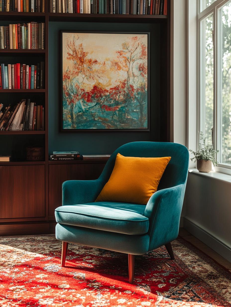
Accent Colors That Tell a Story
Accent colors are like the spices in your favorite dish—they add flavor and personality. Imagine walking into a room where a bright blue vase catches your eye. It’s not just a beautiful object, it could remind you of a coastal vacation.
Choosing accent colors means looking at items like cushions, wall art, or even plants. Think about shades that reflect a memory, an experience, or even your mood.
Another idea: Use contrasting colors to highlight specific areas, like a bright pillow on a dark chair. This way, every piece tells part of your story, reflecting your unique style.
Color Drenching for Dramatic Effect
Color drenching is the bold cousin of accenting. It involves using one color throughout the room to create a powerful, cohesive look. Imagine a room painted in rich emerald green. The furniture, walls, and even some of the decor might share variations of this color, creating a unified and immersive environment.
This technique can make a small space feel larger by removing visual barriers. Pro-tip: Use textiles like curtains or rugs in slightly different shades to add depth. By saturating the space, you create a canvas that highlights your chosen hue, making everything pop against this backdrop.
Don’t forget the importance of lighting. A room drenched in dark color might need focused lighting to keep it welcoming and warm.
Choosing Wall Colors and Paint

Finding the perfect color scheme for your home can make a big difference in creating the right mood and style. It’s all about choosing colors that speak to your personality and the function of each room.
The Best Paint Colors for Each Room
Every room in your house serves a different purpose. Living rooms often benefit from warm, inviting tones like soft blues or earthy greens. These colors encourage relaxation and social interaction.
In contrast, a home office might need something more stimulating, such as a sunny yellow or crisp white, to boost creativity and focus. Meanwhile, bedrooms work well with calming colors like muted grays or blush pinks for a serene atmosphere that helps you unwind.
Remember the 60-30-10 rule for balanced colors: 60% of the room in one dominant color, 30% in a secondary color, and 10% as an accent. Whether it’s a kitchen or bathroom, this rule helps maintain harmony and interest throughout your space.
Tips for Testing Paint Colors
Before you commit to any paint color, always test it out first. Get some small sample cans or large stick-on samples that you can put straight on your wall. It’s the easiest way to avoid that dreaded “paint regret” when the color doesn’t look quite right.
See how these samples look at different times of the day. Colors can change dramatically in varying light conditions.
For even more peace of mind, consider placing the sample near your furniture or decor. Does it match your couch? How does it look with your curtains? This step ensures that the wall color complements everything else in the room.
Tips for Cohesion and Flow
Creating a harmonious color flow in your home involves mindful transitions and a unified decorating scheme. Learn how color acts as a story-teller, transforming spaces into a connected narrative with these practical tips.
Navigating Color Transitions Between Rooms
Think of your home as a storybook. Each room is a new chapter, and colors are your words. You might love your living room’s bold red, but suddenly switching to bright yellow in the hallway? That could be like jumping genres from thriller to romance.
To keep the story smooth, select a few core colors and carry them throughout your spaces. For instance, if you start with navy blue as your primary shade, consider using lighter blue shades or related neutrals in adjoining rooms.
Using the 60-30-10 rule can also guide you. Paint 60% of a room with a base color, 30% with a secondary color, and spice it up with 10% of an accent hue. This ensures that every room is a different scene in a cohesive tale.
Maintaining a Unified Decorating Scheme
A unified decorating scheme ensures the entire house feels like a single narrative, even if each room has its own personality. Decide on a general style or theme—whether it’s modern, rustic, or eclectic—and let this guide your color choices.
Keep main furniture pieces consistent in color or style. This consistency in large items helps unify spaces. For example, using a natural wood finish in the dining room and continuing it into the kitchen visually ties the spaces together.
Various decorative accents, like pillows or artwork featuring similar shades, can act as visual bookmarks. They don’t have to match exactly, but should carry a thread of similarity. By steering clear of clashing styles, you let your color story shine through each unique space.
Accessorizing with Color
Using color in home decor is like adding spices to a meal. It brings out the depth and flavor of your space. Let’s dive into how you can select decor items that not only add vibrancy but also enhance your existing design elements.

Selecting Colorful Decor that Complements
Choosing the right color accents is crucial. Turquoise and coral are excellent choices if you want to add a splash of energy. These colors stand out beautifully against neutral backgrounds like cream and beige.
Experiment with different textures and materials, such as a velvet coral cushion on a cream sofa or a turquoise vase on a beige shelf. When selecting decor, consider using sage green plant pots or navy blue picture frames. These can introduce subtle color without overwhelming the space.
Mix and match these colors with different patterns. For example, a navy-striped throw or sage polka dot curtains can enhance the room’s personality. Check out color samples to see what resonates with your style. This playful approach makes sure your room feels lively yet coherent.
Using Color to Highlight Decorative Elements
Colors can cleverly highlight the details you love most in your decor. Imagine a set of cream candles placed on a turquoise tray; such combinations draw attention effortlessly.
Identify key elements like a feature wall, a mantelpiece, or a unique piece of art that can benefit from a pop of color. Use accessories like coral cushions or navy rugs to anchor these focal points. They naturally guide the eye where you want it to go.
For rooms that need a bit of contrast, add some beige pillows to a navy couch or a sage table lamp in a cream-dominant room. It’s all about creating balance while making the standout pieces shine even more.
Final Touches for a Cohesive Story
Picture this: your home tells a story with colors. To make it work, follow these simple steps. Use a mood board. Gather colors, textures, and items you love. It helps keep your vision clear and focused. This board is your go-to guide for decorating.
Get the Fail-Safe Paint Color Playbook (Free PDF)
36 proven colors • 8 ready palettes • trim & sheen guide • printable testing cards.
Next, find your inspiration. A favorite painting, a piece of furniture, or even a memory can inspire your color palette. Let it drive the mood and feeling you want in your home. Remember that inspiration is personal—make it unique to you.
Experiment with balance. Imagine walking into a room where every wall screams different colors. Confusing, right? Use the 60-30-10 rule. Choose one main color for 60% of the space, a secondary one for 30%, and a bold accent for 10%.
Bold colors can add drama. For example, red is often linked with energy and strength. Meanwhile, blue might calm you down, promoting trust and tranquility. A bold splash can be through a chair or artwork. Balance creates harmony in your story.
Patterns and textures add flavor. Think of them as details in your story. Use them sparingly, like a sprinkle of seasoning, to keep the narrative engaging. A soft throw, a textured rug, or patterned curtains can tie everything together.
Finally, check the lighting. It can change how colors look. Different light bulbs or sunlight can shift hues. Adjust your story with the right lighting to ensure your colors shine as they should. Test things out at different times of the day for the perfect look.