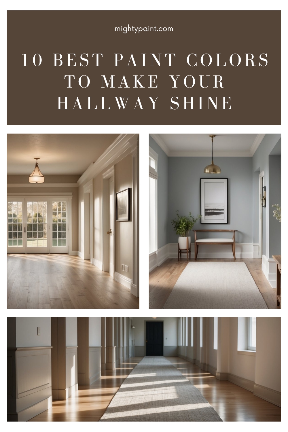
10 Best Paint Colors for Hallways: Transform Your Space Today
Choosing the right paint color for your hallway can make a big difference in your home’s feel and flow. This often-overlooked space is a key area because it’s one of the first things people see when they step inside. Picking the perfect color can brighten up the space, complement your decor, and create a welcoming atmosphere.
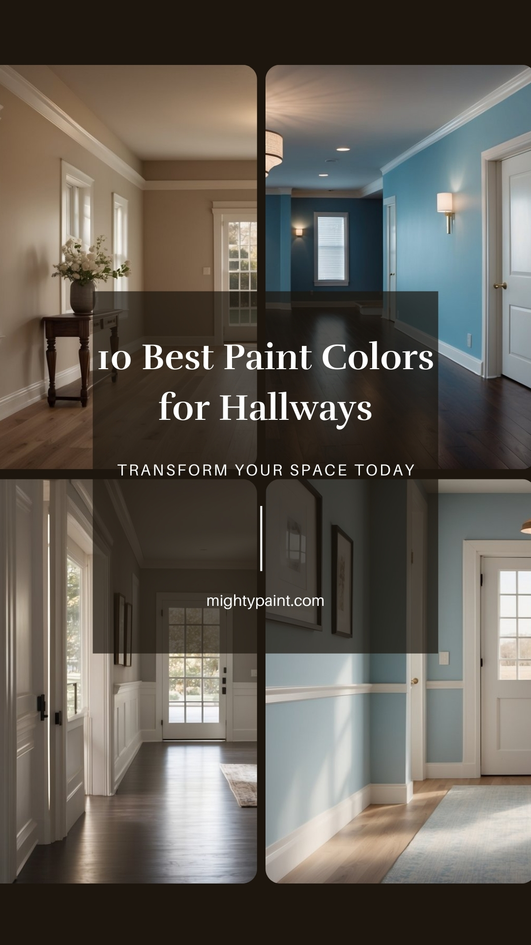
In our article, we’ll explore ten of the best hallway paint colors that designers love for 2024. Whether you prefer bold, modern hues or timeless neutrals, we’ll help you find a shade that fits your style and transforms your hallway into a standout feature of your home.
1. Rainwashed by Sherwin-Williams
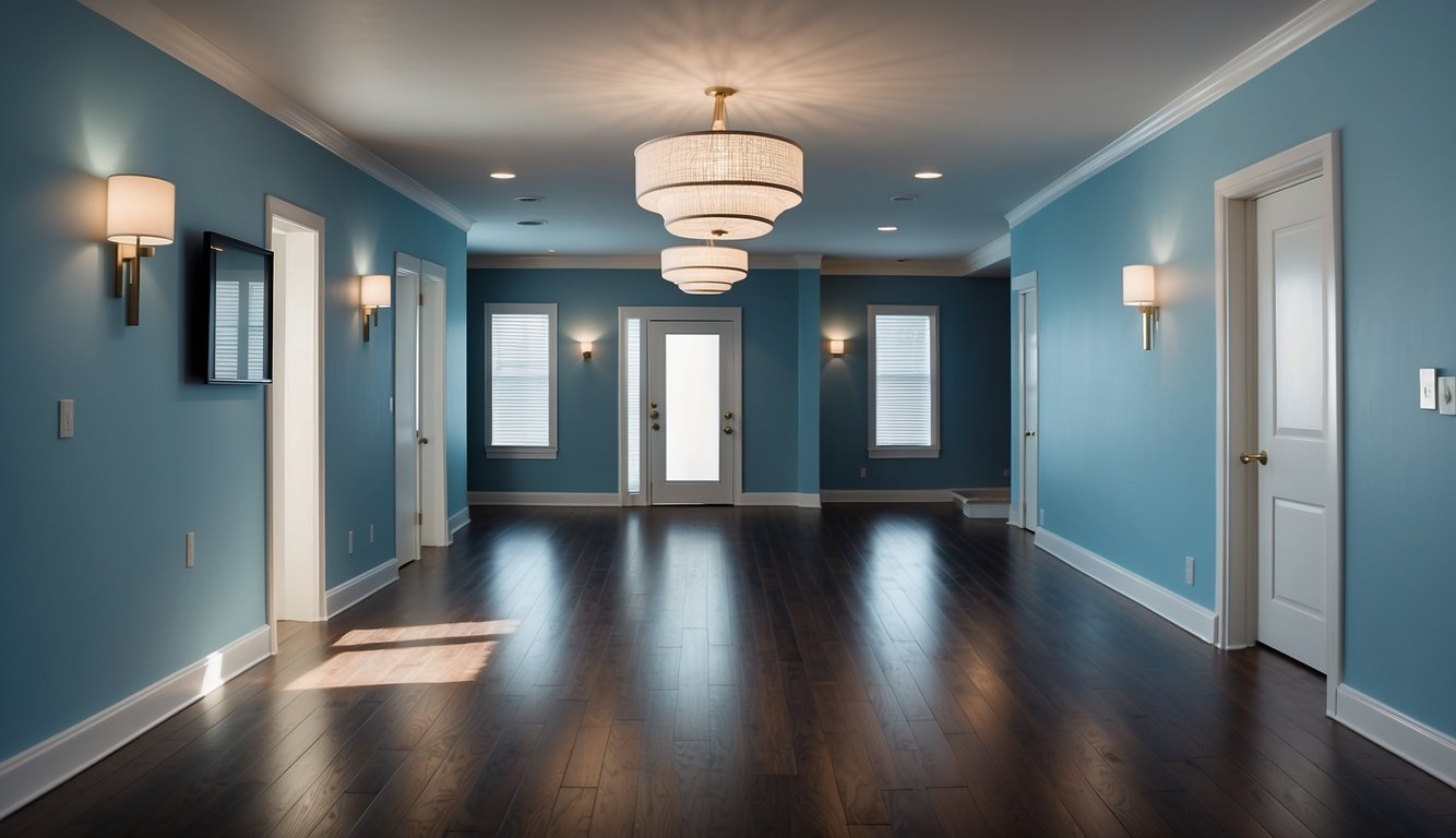
Rainwashed by Sherwin-Williams is a great choice for hallways. This paint color is classified as green but has noticeable blue tones, giving it the vibe of the ocean or a clear sky. Imagine walking through a breezy hallway every day!
With a Light Reflectance Value (LRV) of 59, Rainwashed reflects a moderate amount of light. It won’t wash out in bright rooms and stays vibrant in darker spaces. Perfect for hallways, right?
One cool thing about Rainwashed is its gray undertones. This makes the color feel calm and a bit moody, like a rainy day. Great for those chill vibes if you’re into that.
You can pair Rainwashed with crisp white trim. This really makes the color pop and creates a fresh, inviting look. Your guests will notice the welcoming atmosphere as soon as they enter your home.
Lastly, Rainwashed brings spa-like relaxation into your hallway. It’s like having a mini spa experience every time you walk through. What’s not to love about that? If you want a blend of calmness and style, Rainwashed is a top pick.
2. Edgecomb Gray by Benjamin Moore
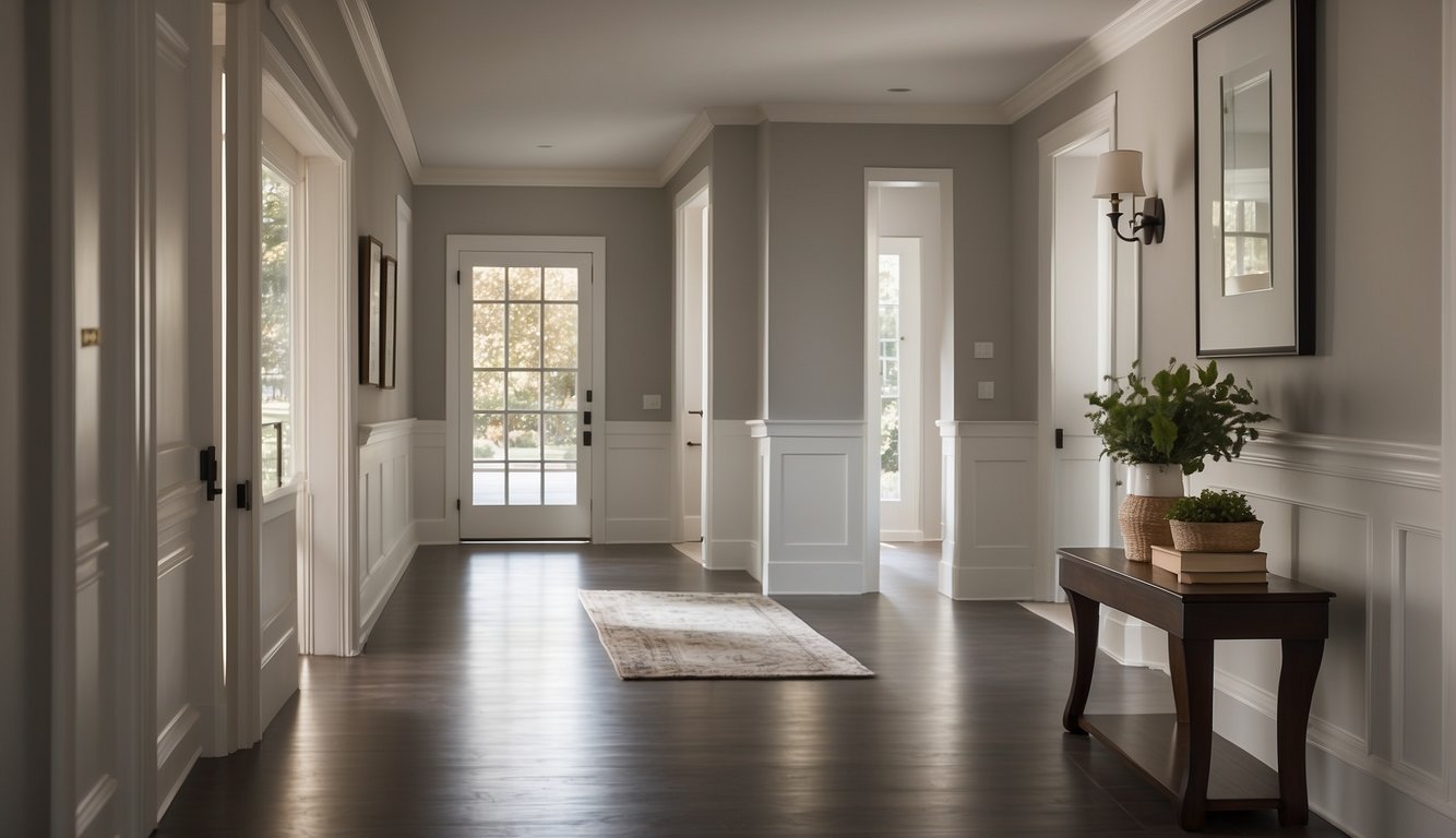
Edgecomb Gray by Benjamin Moore is a fantastic choice for hallways. This shade, known also as HC-173 or Baby Fawn OC-15, sits right in the middle of gray and beige, making it a popular greige color.
Why is it loved so much? It’s versatile! Edgecomb Gray pairs well with both warm and cool tones. Do you have wooden floors or trim? It works. Got white accents? Perfect match.
This paint creates a soft, welcoming vibe. It’s neutral enough to fit in with almost any decor, but still adds a touch of sophistication. If you want to keep your hallway looking fresh and open, it’s a great option.
You can find it in many homes and from various online images, indicating its broad appeal. If you’re unsure which color to choose, Edgecomb Gray is a safe and stylish bet.
Have you ever tried this shade? If not, grab a sample and see how it feels in your space. You might just fall in love with it!
3. Revere Pewter by Benjamin Moore
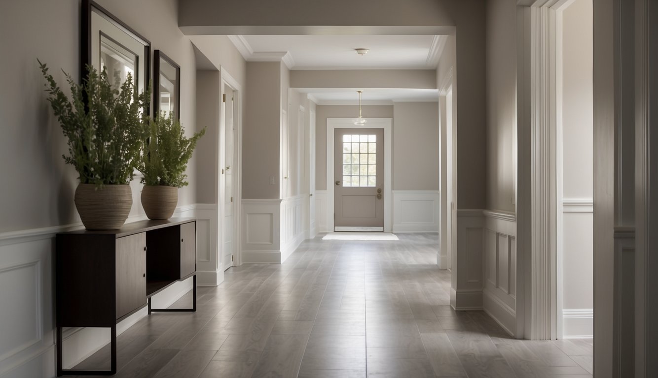
Revere Pewter by Benjamin Moore is a crowd favorite for many homeowners. It’s a warm, gray paint color with green undertones. You’ll see it shine in spaces with lots of warm natural or artificial light.
Feeling worried about a gloomy hallway? This might not be the best pick for a dark, cool-lit space. Yet, when the lighting is just right, it’s a wonderful choice.
It’s considered a “greige,” which means it balances between gray and beige. This makes it easy to pair with other colors. It’s true versatility in a can!
Imagine your hallway walls in Revere Pewter. Now, add different décor or furniture without worrying about clashing colors. This paint adapts beautifully, giving you plenty of styling options.
Many people rave about its softness and calming effect. It isn’t too bold and not too dull. It’s that perfect middle-ground shade that gives your hallway a cozy, inviting feel.
Thinking about resale value? This neutral hue appeals to many, making it a smart choice. You can refresh your entire hallway space effortlessly.
4. Agreeable Gray by Sherwin-Williams
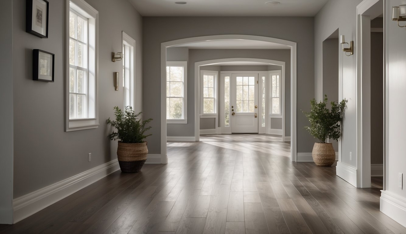
Agreeable Gray by Sherwin-Williams is a popular choice for hallways. This shade, also known as SW 7029, combines gray and beige, making it a versatile and warm neutral.
Why might you love it? Agreeable Gray fits well in various lighting situations. It has an LRV (Light Reflectance Value) of 60, meaning it reflects a decent amount of light. That makes your hallway feel bright without overwhelming the eyes.
Do you have a dark hallway? Agreeable Gray can still work, though it might look a bit flat. For better results, try pairing it with some good artificial lighting.
Agreeable Gray is like a chameleon. It can look different throughout the day. In the morning, it might feel cooler, and by evening, it takes on warmer tones. That can add a lot of visual interest to your hallway.
Colors that go well with Agreeable Gray include crisp whites like Sherwin-Williams Pure White, making the space feel fresh and clean. For some contrast, you can mix it with deeper shades like navy or rich greens.
Thinking about repainting your hallways? Give Agreeable Gray a shot. You might just find the perfect balance of style and comfort for your home.
5. Sea Salt by Sherwin-Williams
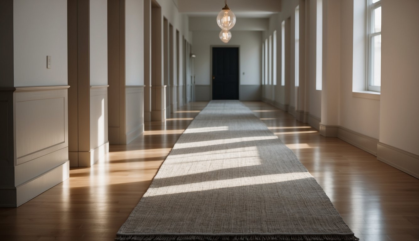
Ready to add a touch of elegance to your hallway? Sherwin-Williams Sea Salt (SW 6204) could be just what you need.
Sea Salt is a mix of blue, green, and gray tones. This unique blend makes it a versatile choice for many settings. Think of it as a serene, slightly beachy backdrop. It’s perfect for hallways where you want to create a calming vibe.
One interesting thing about Sea Salt is its Light Reflectance Value (LRV). It has an LRV of 63, which means it reflects a decent amount of light. Not too dark, not too bright—just right for a hallway that doesn’t always get a lot of natural light.
Pair it with white for a crisp, clean look. Or, if you’re feeling adventurous, try it with warm accent colors like coral or mustard. You won’t be disappointed.
So, why not give Sea Salt a try? A fresh coat of this beautiful paint might just transform your hallway into a tranquil oasis.
6. Pale Oak by Benjamin Moore
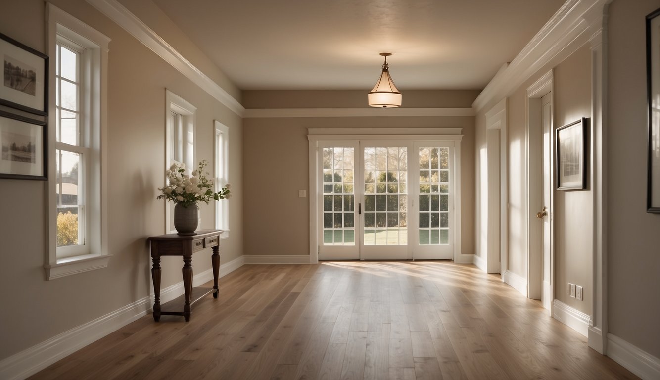
Pale Oak by Benjamin Moore is a versatile favorite for hallways. It’s a light neutral color that gives off a warm vibe, making your space feel welcoming and cozy.
In well-lit hallways, Pale Oak looks like a warm off-white. This brightens up the area, making it feel larger and more open.
In dimly lit areas, this paint appears as a soft, light greige. It adds a subtle touch of elegance without overpowering the room.
If you’re debating between a greige or a white, Pale Oak provides a perfect middle ground. It has enough warmth to avoid feeling cold, yet it remains neutral enough to match various decor styles.
Many homeowners love using Pale Oak in transitional spaces. This paint color effortlessly connects rooms and provides a seamless look throughout your home’s hallways.
Wondering about furniture and decor? Pale Oak pairs well with both modern and traditional styles. Think warm wood tones, crisp white trims, and even pops of color.
Give your hallway a fresh, timeless look with Benjamin Moore’s Pale Oak. It’s a popular choice for a reason!
7. Balboa Mist by Benjamin Moore

Balboa Mist by Benjamin Moore is a timeless color choice for hallways. This shade falls in the off-white range with an LRV (Light Reflectance Value) of 66. Light Reflectance Value measures the percentage of light a paint color reflects. The higher the LRV, the lighter the color.
Balboa Mist offers a sophisticated look without being too stark. It sits comfortably between stark white and darker neutrals. This makes it perfect for hallways, giving them an open and airy feel.
Unlike many other colors, Balboa Mist balances warm and cool undertones. This makes it a versatile choice for various hallway decors and lighting conditions. The warm undertones prevent it from feeling too cold, while the cool undertones keep it fresh.
It pairs well with white trim, providing a clean and crisp contrast. If your hallway has white accents, moldings, or wainscoting, Balboa Mist can elevate the overall appearance.
Given its balanced nature, you can easily transition this color to adjacent rooms. Hallways often connect different parts of your home, and Balboa Mist blends effortlessly with other color schemes.
8. Accessible Beige by Sherwin-Williams
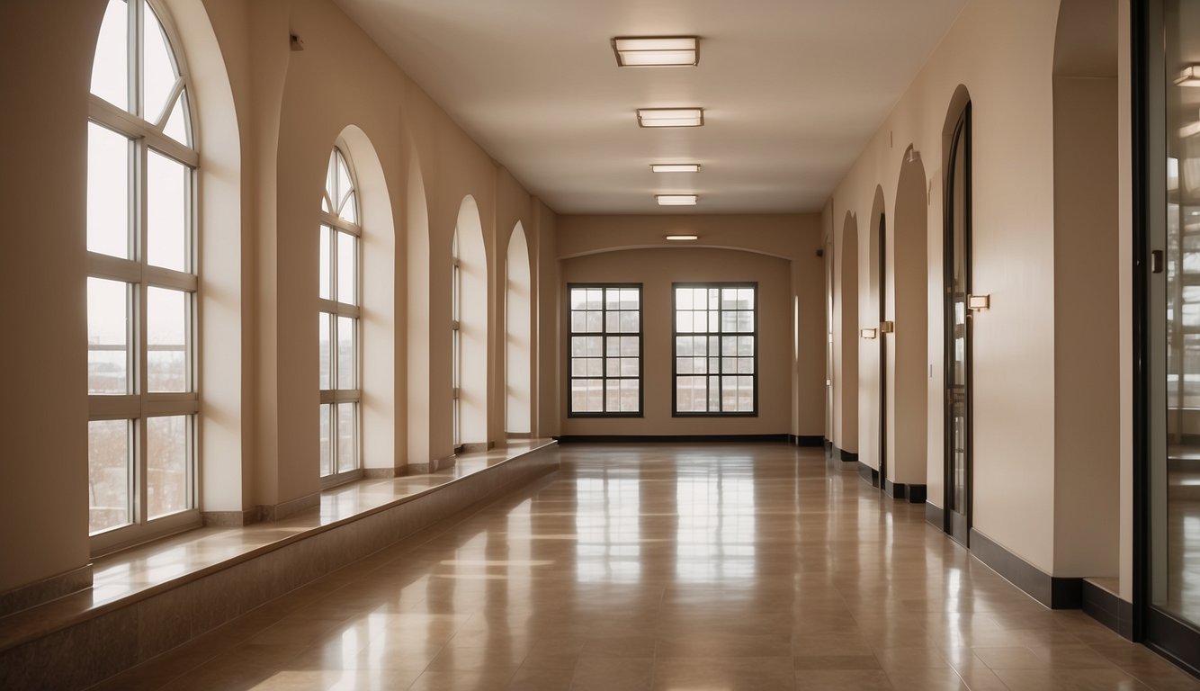
Accessible Beige by Sherwin-Williams is a great option for hallways. Its light reflectance value (LRV) of 58 means it will reflect light well, making your hallway feel bright and spacious.
This versatile hue is a warm tan-beige color. It doesn’t have pink undertones, so you don’t have to worry about it clashing with other colors. Many homeowners describe it as having slight gray and yellow-green undertones. This makes it quite adaptable to various lighting conditions.
In homes with plenty of natural light, you might find that Accessible Beige leans more towards a soft greige. That’s a blend of gray and beige. It creates a cozy yet sophisticated atmosphere, perfect for welcoming guests.
If you have white trim or cabinets, Accessible Beige offers a subtle but pleasing contrast. Unlike darker shades, it won’t overpower the space. It’s ideal if you’re looking for a light-medium depth paint color that feels modern yet timeless.
9. Silver Strand by Sherwin-Williams

Silver Strand by Sherwin-Williams is a fantastic choice for hallways. This paint color is a mix of grey with green undertones. It creates a soothing and calm environment, perfect for any hallway.
Having an LRV (Light Reflectance Value) of 64, Silver Strand brightens up the space without being too overpowering. This quality helps in making your hallways feel open and airy.
Need a versatile option? Silver Strand works well with various styles, from modern to traditional. It pairs beautifully with both bold and neutral accents, offering plenty of flexibility in decorating.
If you’re looking for a paint color that adds a subtle touch of color without going overboard, Silver Strand is a great choice. It gives your hallway a polished look while maintaining a relaxed vibe.
Silver Strand isn’t just beautiful; it’s practical too. It can hide minor scuffs and marks, making it an excellent option for high-traffic areas. Your hallway will look fresh and clean for longer.
10. Classic Gray by Benjamin Moore
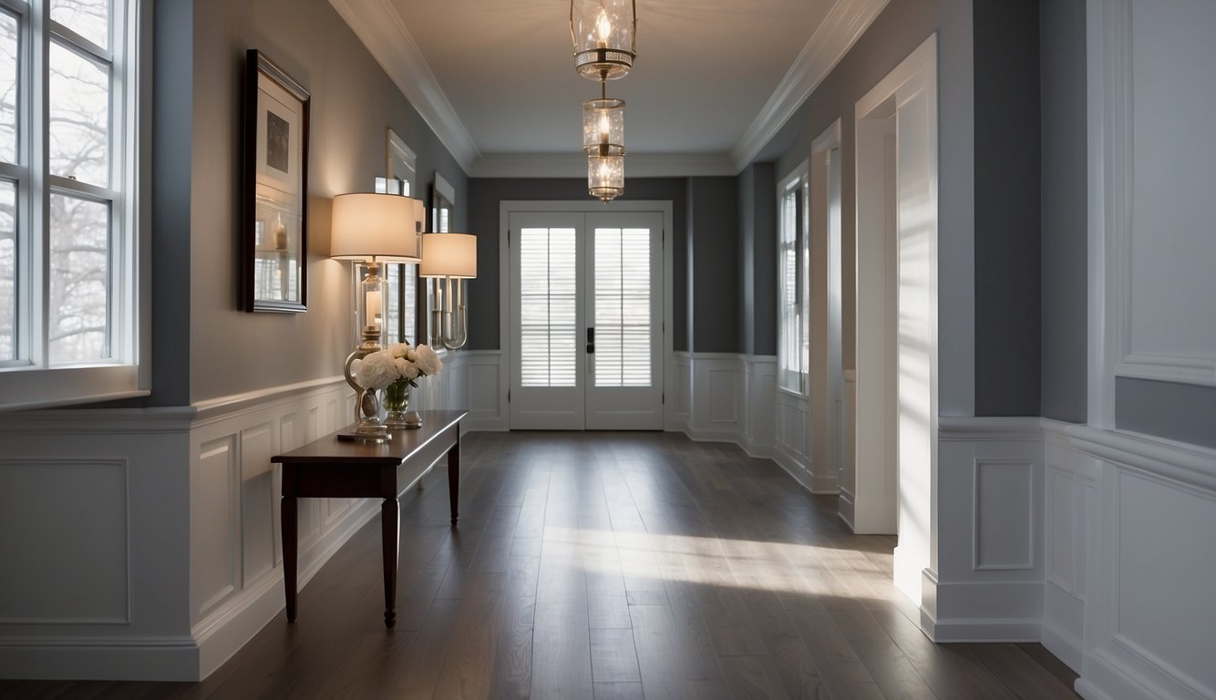
Classic Gray by Benjamin Moore is a top pick for hallways. It’s a warm, neutral off-white that suits many spaces.
Do you worry about undertones? Classic Gray may show subtle hints of blue, purple, or green. That’s normal, and it often depends on the room’s lighting.
In South-facing rooms, white paint can look too stark. Classic Gray offers a softer look, providing warmth without overwhelming the space.
You might wonder how it pairs with other colors. Classic Gray is versatile and can work well with many other hues in your home. It’s a great option if you need a color that blends seamlessly with both walls and decor.
Need more proof? This color is popular and well-reviewed in blogs like “Jenna Kate at Home” and “Color Concierge”. Homeowners love how it adds just the right amount of pigment.
Impact of Color on Hallway Spaces
Choosing the right paint color for your hallway can transform the space. The right hue can affect your mood and even change how spacious it feels.
Psychological Effects of Different Colors
Colors play a big role in how you feel.
- Blue: Calm and serene, perfect for a relaxing vibe.
- Yellow: Energetic and cheerful, great for brightening up a dark hallway.
- Green: Balances and restores, ideal for a peaceful and welcoming space.
Neutral colors like gray and beige are versatile, making them perfect for connecting spaces. A warm gray can add a cozy touch, while a cooler gray feels modern and sleek.
Using Color to Enhance Space Appearance
Paint can do wonders for the perception of space.
- Light Colors: White, soft pastels, or light neutrals make your hallway look bigger and open.
- Dark Colors: Shades like navy or charcoal can make a large hallway feel more intimate and cozy.
- Accent Colors: Use these on one wall to add character without overwhelming the space.
Pairing paint with lighter wood tones and crisp whites can maximize light and make the hallway feel airy. Choosing the right color for your hallway can make it a focal point in your home.
Color Coordination Tips for Hallways
Choosing the right paint color for your hallway involves considering how it matches with your flooring and trim, as well as ensuring it flows well with adjacent rooms. These two aspects are crucial for creating a cohesive look.
Matching with Flooring and Trim
Select paint colors that complement your existing flooring and trim. Dark wooden floors pair well with lighter shades like soft beige or pale gray, making spaces feel open and airy.
If you have light wood or tile flooring, warm tones such as cream or light yellow can add warmth without clashing. White trim is versatile and works with almost any wall color. If your trim is stained wood, opt for neutral colors such as taupe or greige to highlight the natural wood tones.
Choosing Colors that Flow with Adjacent Rooms
Hallways shouldn’t feel disconnected from the rest of the house. If your living room is painted a rich navy blue, consider a lighter shade of blue or gray for the hallway. This creates a smooth transition and keeps the aesthetic consistent.
For homes with an open floor plan, stick to neutral colors like white, beige, and light gray to maintain a cohesive look. Use the same undertone across different rooms for harmony.
Accent walls can also help blend spaces. For example, if your dining room walls are a bold red, a single hallway wall painted in a soft red can tie the two spaces together nicely.
Test samples of your chosen colors before committing. Lighting can change how a color looks, so make sure it works well in both natural and artificial light.
