
8 Paint Colors That Go Well With Cherry Wood: Enhance Your Space
Choosing the right paint color to complement your cherry wood can truly transform a space, enhancing the natural beauty of the wood and creating a stunning visual impact. With so many options available, this can feel overwhelming. The right paint can make your cherry wood pop and give your room a fresh, cohesive look.

Whether you’re updating a living room, dining area, or office, color plays a crucial role in setting the mood and aesthetic. Understanding how different shades can work with cherry wood will help you make informed decisions. Stay with us as we explore the top paint colors that can complement and elevate your cherry wood furniture and decor.
Get the Fail-Safe Paint Color Playbook (Free PDF)
36 proven colors • 8 ready palettes • trim & sheen guide • printable testing cards.
1. Soft Sage Green

Are you in love with the calming vibes of nature? Soft sage green might be the answer if you’re looking to pair paint with cherry wood. This gentle color evokes thoughts of a peaceful garden, adding a serene touch to any room.
Soft sage green works well with cherry wood because it balances the richness of the wood. It offers a subtle contrast that lets the natural beauty shine without overpowering. Soft sage brings elegance to your space while keeping things down-to-earth.

Picture a room where the cherry wood furniture stands out against a backdrop of soft sage walls. Doesn’t it create a cozy and inviting atmosphere? It’s like having a bit of the outdoors inside your home. This combination also makes an excellent choice for living rooms or bedrooms.

Add accessories in similar tones, like cushions or curtains, to enhance this look. You can even throw in other natural elements, such as potted plants, to complete the vibe. So, if you’re ready to bring more tranquility into your space, give soft sage green a try. The outcome will surely be both classic and stylish!
2. Warm Beige
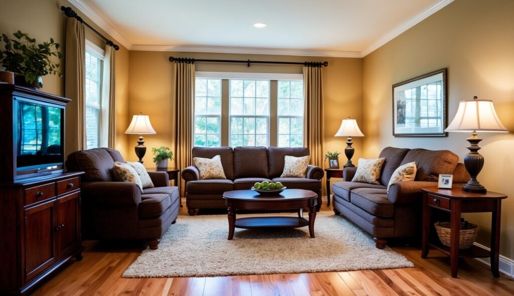
Picture warm beige as the trusty friend you can always rely on. It pairs wonderfully with cherry wood, enhancing its rich, reddish tones. This warm, neutral shade won’t clash with your wood’s natural beauty. Instead, it complements the warm undertones, creating a cozy and inviting atmosphere.
Choosing warm beige can make your living space feel more expansive and open. It’s like a warm hug for your walls that never goes out of style. If you have cherry wood furniture or cabinets, warm beige acts as a perfect backdrop, helping these pieces stand out without overpowering the room.

Think about how this color effortlessly fits with various styles, from modern to traditional. In a dining room, this combo can make every meal feel like a special occasion. Whether you’re hosting a dinner or enjoying a quiet evening, warm beige amplifies the warmth and sophistication of cherry wood.
3. Pale Blue

Ever wondered how to bring a touch of calm elegance to your room with cherry wood? Try pale blue! This soft color creates a relaxing atmosphere, making it a great choice for bedrooms or living rooms. It complements the rich tones of cherry wood without overpowering them.
Think about painting an accent wall or even using pale blue in your decor. You can incorporate blue throw pillows or curtains. This color pairs well with natural light, highlighting the warmth of cherry wood during the day.
Are you worried about matching other elements in your room? Pale blue is quite versatile. It harmonizes with various design styles, whether you lean traditional or modern. Imagine pale blue walls with cherry wood floors—a perfect combo for a sophisticated look!
4. Rich Espresso

Imagine walking into a room where cherry wood meets rich espresso paint—it’s like stepping into a cozy, elegant retreat. Rich espresso is more than just a delicious coffee; it’s a paint color that brings out the deep red tones in cherry wood furniture or floors.
This color creates a warm and sophisticated atmosphere.
If you love neutral colors but crave something bolder, rich espresso is your go-to choice. It’s darker and moodier than beige, yet it complements cherry wood beautifully. Pair this shade with light creamy accents to balance its depth.

This combination can transform your living room or dining area into a stylish haven.
Many designers adore how rich espresso pairs with cherry wood in home offices and libraries. These spaces become inviting and inspiring, perfect for work or relaxation. Think about adding soft lighting and plush fabrics to enhance the overall feel.
5. Dusty Rose

Dusty rose is a lovely choice if you’re looking to bring out the warmth in cherry wood. This soft pinkish hue adds a touch of elegance and coziness to any space. It works well if you’re aiming for a gentle and inviting atmosphere. Imagine an afternoon with soft light streaming through the windows—it creates such a pleasant mood!
When you pair dusty rose with cherry wood, you notice how the colors complement each other. The subtle pink shows off the reddish tones in the wood beautifully. This can be a great option for a living room or a bedroom where you want a cozy, warm feeling. Plus, it gives a slight vintage vibe without feeling outdated.

Don’t worry if you’re concerned about overpowering your space. Dusty rose is gentle and blends well with other colors. Consider pairing it with textiles or accessories in similar shades. Add some crisp white or cream accents to keep it fresh. You’ll see how nicely everything ties together when you use dusty rose.
Feeling adventurous? Go for dusty rose on your walls, and add some bold art pieces. This color is like your quiet friend who surprises everyone at a party with their witty comments. It’s understated but makes a memorable impression.
6. Soft Gray
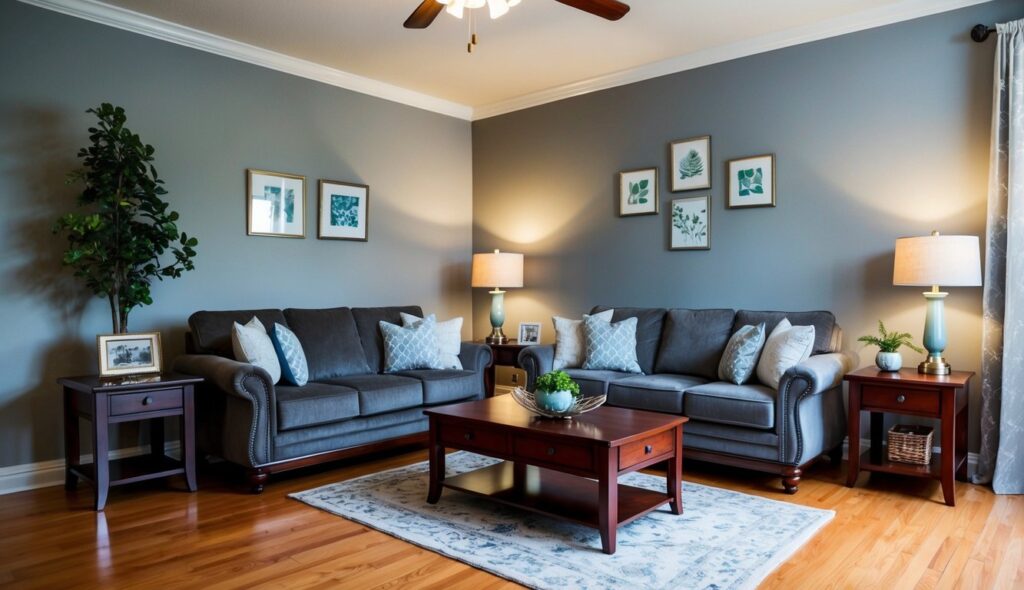
Soft gray is like the loyal friend who goes with everything. When paired with cherry wood, this color creates a gentle and elegant atmosphere. The cool, muted tones of soft gray allow the warm red hues of cherry wood to truly stand out.

Imagine a living room where cherry wood furniture takes center stage. Soft gray walls can add balance, keeping the space from feeling too dark or heavy.
Whether you’re updating a kitchen or refreshing a bedroom, this color can work wonders. It provides a versatile backdrop that complements both traditional and modern styles. The subtle undertones in soft gray paint create a seamless, stylish look when matched with cherry wood.
7. Deep Teal

Feeling adventurous with your color choices? Deep teal might be just the right shade for you. This bold color pairs beautifully with cherry wood, offering a rich contrast that enhances the warm tones in the wood.
Deep teal has a unique ability to bring a sense of calm to a room. Its blend of blue and green creates a cozy atmosphere, perfect for a living room or bedroom.
Wondering where to use this striking color? Try deep teal on an accent wall or use it for accessories like pillows or curtains. These touches can add a pop without overwhelming the space.
Pairing deep teal with cherry wood can transform your space into a stylish retreat. This color combo is a fantastic choice if you’re looking to mix elegance with a little bit of flair.
8. Warm Ivory
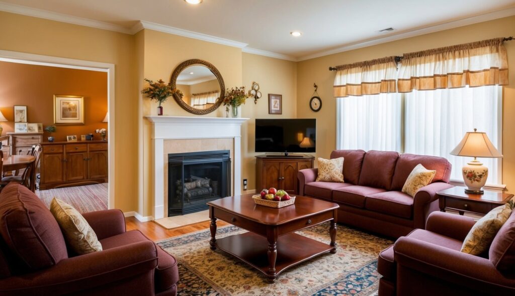
You might wonder why warm ivory is a fantastic choice with cherry wood. This color creates a cozy and welcoming vibe. It blends nicely with the rich, reddish tones of cherry wood, giving your space a balanced and harmonious look.

When you paint your walls in warm ivory, it acts as a lovely backdrop. It highlights the natural beauty of cherry wood without overpowering it. Your furniture will stand out, becoming a focal point in the room.

Warm ivory is versatile. It works well in living rooms, bedrooms, or kitchens. Whether your style is modern, traditional, or somewhere in between, warm ivory offers a smooth transition. It’s like a warm hug in color form, wrapping your room in comfort.
Understanding The Undertones
When you’re working with cherry wood, identifying the right paint colors means looking at undertones. Warm undertones bring out the rich reds, while cool ones add contrast. Here’s a guide to help you make sense of it all.
Warm vs Cool Undertones
Ever wonder why some colors seem just right, and others don’t? It’s all about undertones! Warm undertones have hints of red, yellow, or orange. Think of how a sunset feels cozy and inviting. On the other hand, cool undertones remind you of water or the sky, with blues, greens, or violets.
Warm undertones can create a cozy space, complimenting traditional settings. Cool hues, meanwhile, offer a sleek, modern feel. Understanding the temperature of a color can make a room feel balanced and welcoming.
Pairing Undertones with Cherry Wood
How do you choose paint for cherry wood? Cherry wood has a natural warm red undertone. So, pairing it with warm colors—like cream or a deep golden yellow—enhances its richness. Imagine your living room glowing with warmth.
For contrast, you can use cool tones. Pale greens or subtle silvers can modernize a room, giving it an elegant edge. By balancing these undertones, you showcase the cherry wood without overwhelming your space. Focus on how contrasts or complements will make the wood shine.
How Lighting Affects Paint Color Choices
Choosing paint colors for your home? Pay attention to how different lighting impacts those choices. Lighting can dramatically shift how paint colors appear, so you need to consider both natural and artificial lighting when picking colors. Let’s explore what makes each type of lighting unique.
Natural Light vs Artificial Light
Natural light changes throughout the day and plays a big role in how colors look. In the morning, sunlight casts a warm glow, which can make colors appear warmer and more inviting. By midday, the sun is brighter and more direct, causing colors to appear lighter or washed out. Ever notice how a room looks different in the evening? That’s because the fading sunlight gives off a cooler tone, adding a different vibe to your chosen color.
On the other hand, artificial lighting comes from bulbs, and it depends largely on the bulb’s color temperature. Bulbs with lower temperatures (2,700K-3,000K) give off a warm glow, much like the morning sun. Cooler bulbs (4,500K-5,000K) might make colors feel a bit sterile or harsh. So, when choosing paint, think about how it will look at different times of the day.
Adjusting Colors for Different Rooms
When matching paint colors to different rooms, consider the amount of light each room gets. A room flooded with natural light will showcase a color’s true hue, while a darker room might need a lighter shade to appear vibrant.
Rooms facing north receive cooler, bluish light, so using warmer tones can counterbalance this effect. Conversely, rooms with south-facing windows get more sunlight, making any color seem warmer.
Artificial lighting can also dramatically change how a paint looks at night. Use lamps and overhead lights to test your color choices, making sure they align with the overall mood you want. Keep these tricks in mind, and your paint choices will shine under any light!
Complementary Colors and Design Principles
When choosing paint colors for cherry wood, understanding complementary colors and design principles can enhance your space. This section explores using the color wheel and balancing contrast to bring out the beauty of cherry wood.
Using The Color Wheel
Have you ever wondered how to pick colors that really pop with cherry wood? The color wheel is your best friend here! You see, cherry wood has rich, warm tones. Using the color wheel helps you find complementary colors that can make these tones stand out.
Try jewel tones like emerald green or amethyst purple. These rich shades are opposite warm colors on the wheel, creating a nice contrast. If bold isn’t your thing, go for softer shades like greige or creamy ivory. They match cherry wood’s warmth without overpowering it, creating a more subtle blend.
Get the Fail-Safe Paint Color Playbook (Free PDF)
36 proven colors • 8 ready palettes • trim & sheen guide • printable testing cards.
By using opposite colors, you automatically make cherry wood the star of the room. So, whether bold or soft, the color wheel is the way to go for a harmonious balance in your home.
Balance and Contrast
Let’s talk about balance and contrast. The idea is to find colors that highlight the beauty of cherry wood while maintaining balance.
Consider using neutral shades like taupe or beige. These colors provide a gentle backdrop that allows the warmth and depth of cherry wood to shine. You can also add contrast through textures or patterns.
Mixing textures offers another layer of contrast. A soft rug or patterned curtains can provide visual interest without clashing. Balancing contrast helps keep your space inviting and cohesive, making the most of that lovely cherry wood.