
The Revival of Vintage Colors: Are Nostalgic Hues Making a Stylish Comeback?
If you’re a fan of colors that tell a story, you’re in for a treat. In the world of design, nostalgia is making a grand entrance, and vintage colors are leading the way. Bold jewel tones, earthy hues, and soft pastels from decades past are reclaiming their glory, bringing a mix of vintage charm and fresh inspiration to modern spaces. Whether it’s the emerald greens of the Victorian era or the grubby greens reminiscent of the ’70s, these timeless shades have a knack for weaving personality into any room.
Ever wondered why those retro shades are popping up everywhere from Pinterest boards to interior design catalogs? There’s something undeniably comforting about colors that echo the past, as if each hue whispers a story from another time. Nostalgic hues draw from a palette soaked in history, rekindling the love affair with colors like the rosy peach of aged plaster, or the zesty limes that define lively decor.
You’re not just painting a wall; you’re painting a mood. With these vintage colors making a splash, your home can echo the elegance of bygone eras while maintaining a contemporary twist. Ready to bring some nostalgia into your life? Let’s dive deeper into the magic of these iconic shades.
The Allure of Nostalgia in Color
Nostalgia can create a strong pull, especially when it comes to color. By recognizing how certain shades reconnect with memories and emotions, designers can craft spaces that feel inviting and personal.
Emotional Connections and Color
Have you ever walked into a room and felt immediately at home? This might be because certain colors evoke emotions.
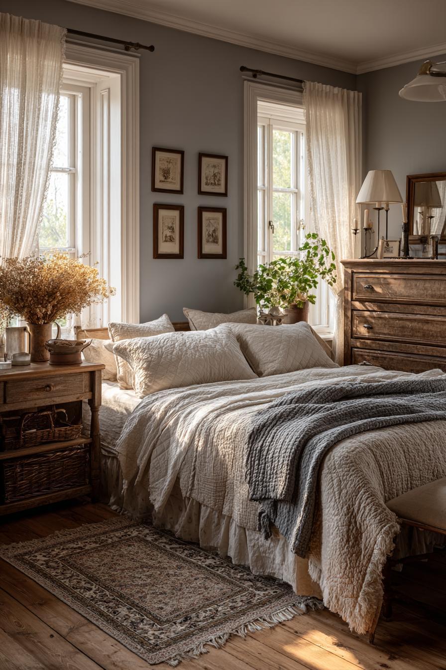
Shades from the past, like the soft pastels of the ’50s or the bold tones of the ’70s, often resonate deeply. They aren’t just colors; they are vessels of cherished memories and feelings. When you see these tones, they can transport you to another time.
Designers use these connections to evoke warmth and comfort. By leaning into nostalgic colors, they can tap into a collective memory that feels familiar and safe.
Authenticity in Design
Creating genuine spaces isn’t just about style; it’s about authenticity. Vintage colors play a vital role in achieving this.
Green, brown, and yellow tones can reflect periods known for their simplicity and charm. Designers who embrace these palettes often bring a timeless quality to their work.
Such colors help you feel genuine and connected to the past. This is why retro shades are sprouting up in modern homes—they’re both a nod to history and a fresh embrace of character and authenticity.
Historical Color Palettes in Modern Design
How often do you find yourself drawn to those warm, muted colors that seem to whisper stories of the past? It’s no surprise. From mid-century modern styles to retro revivals, these historical color palettes add a touch of nostalgia and authenticity to modern design.
Mid-Century Modern Influence
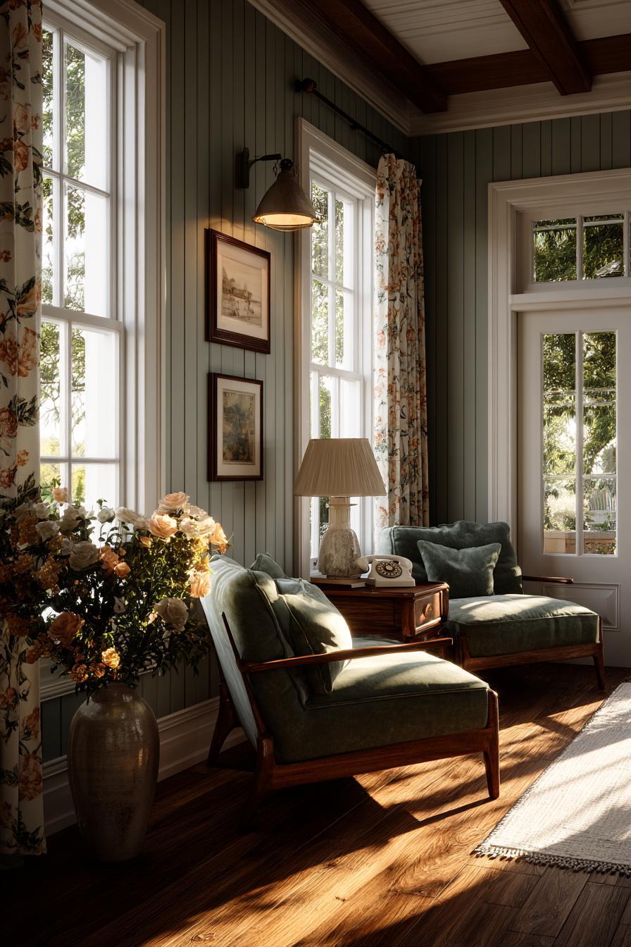
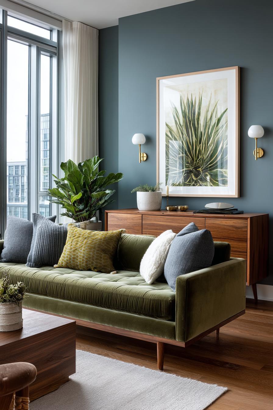
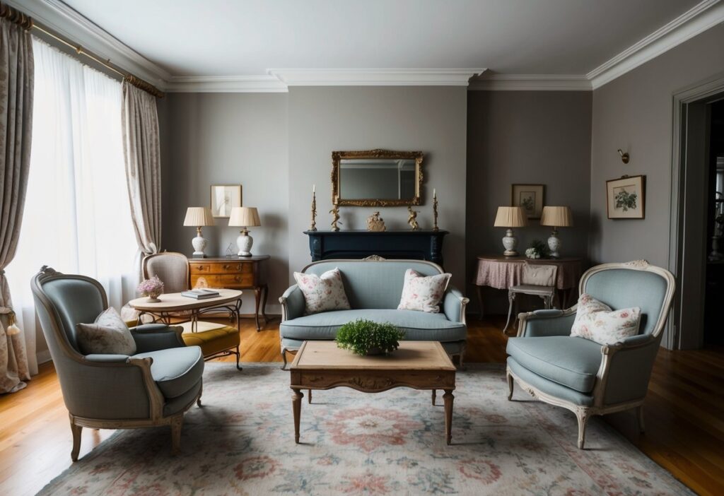
Ah, the 1950s and 60s. This era of design is all about clean lines and organic forms with a color palette to match. You can spot rich earth tones like avocado green and mustard yellow bringing warmth into spaces.
Designers love these colors for their calming and classic feel. Think of a living room with teak furniture and walls painted in soft olive or turquoise. These colors create a cozy vibe while maintaining sophistication.
Why these colors? They evoke a sense of simplicity and functionality. They also pair beautifully with materials like wood and leather. Whether it’s in fashion or interiors, mid-century hues add a timeless touch you might find irresistible.
Retro Revival Across Eras
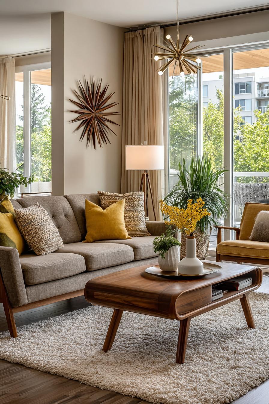
The retro color revival isn’t limited to one decade. From the bold reds and oranges of the 70s to the pastel pinks and blues of the 80s, each era brings its unique flair. These vintage color palettes are versatile, fitting perfectly into various aspects of design.
You might see a retro-inspired cafe using these palettes to create a nostalgic atmosphere. Or perhaps a designer uses buttery yellows and rosy pinks from old-school posters to craft a modern brand logo.
Retro palettes allow you to play with contrasting colors and textures. They offer endless possibilities to bring historical charm into any modern project. Whether you’re working on digital design or interior decorating, these colors bring out a lively and nostalgic aura that appeals to many.
Incorporating Vintage Colors in Today’s Interiors
Vintage colors are finding their way back into modern interiors with a fresh appeal. Using them in choices like wallpaper and furniture can transform your home atmosphere dramatically.
Wallpaper and Fabric Choices
When it comes to picking wallpaper, look for patterns inspired by the past. Florals from the 1960s or geometrics from the 1970s can set a nostalgic vibe. You might think those days are gone, but they’re making a stylish return!
Choose fabrics with eye-catching prints to match your walls. Think of paisleys in bright hues or bold stripes. These can contribute a lot to the overall retro feel of your space.
Experiment with different combinations. For instance, mixing dark greens with mustard yellows or soft pastels allows for a versatile look. Textured wallpapers, like those imitating natural fibers, can add depth. Wrap it all up with matching cushions and curtains for a complete look.
Selecting Furniture with a Retro Aesthetic
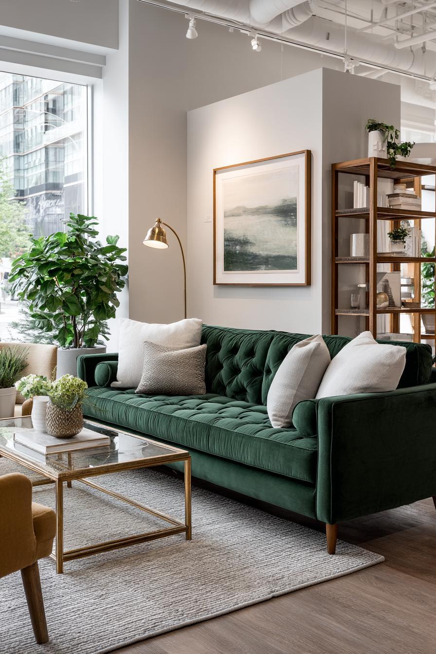
Retro-inspired furniture plays a massive role in capturing that vintage vibe. You’re not just looking for any furniture here. Pieces from the mid-century modern era, with their clean lines and sleek finishes, are quite popular. These designs are both functional and stylish.
A velvet sofa in deep blue or a mustard armchair can bring retro colors to life in any room. Don’t forget tables and lamps as important elements. Teak wood coffee tables or metallic floor lamps with colorful shades can add a pop of character.
If you’re feeling bold, consider mixing various styles and eras. An Art Deco dresser or a victorian-inspired mirror can work wonders. Keep your eyes open for unique pieces in vintage shops. Your goal? Make your space feel fresh yet nostalgic.
Color Trends: Past and Present
Color trends have an exciting journey. Vintage beauty is enjoying a revival, drawing from earthy tones and vibrant colors. These hues tell stories of times gone by, yet they’re fresh magnets for modern design.
The Resurgence of Earthy Tones
Earthy tones are not your grandma’s old paint set—though they do nod to the past. Imagine shades of beige, brown, and green, bringing nature indoors. These colors hint at a 1970s palette, with mustard yellows and mossy greens leading the parade.
Do you remember shag carpets and wood-paneled rooms? Earth tones recreate that warmth today in furniture, rugs, and wall paints. Many homes opt for this calming vibe, tapping into a desire for comfort and simplicity.
The Popularity of Bold and Vibrant Colors
Bold and vibrant colors shout ‘look at me!’ They’ve made a colorful splash not only in fashion but also in interior design. Picture bright oranges and deep blues, channeling the lively spirit of the 1960s and 1980s.
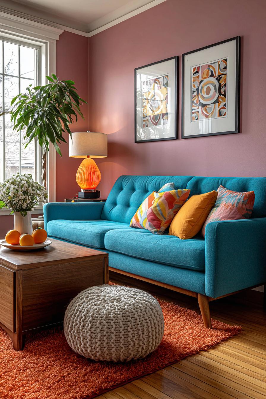
These shades are not just for clothes. Imagine them in your living room, on throw pillows and posters, each piece sparking a bit of nostalgia while celebrating individuality. Whether you’re scrolling for decor inspiration or shopping for that perfect outfit, these lively hues add excitement to any setting.
Psychological Impacts of Color Usage
Colors influence how you feel and act. Pastel colors calm the mind, creating a peaceful atmosphere. Vibrant hues, such as those in psychedelic colors, energize and stimulate, impacting your mood significantly.
Calming Effects of Pastel Hues
Pastel colors are soft and gentle, creating a soothing environment. Think of pale blues, soft pinks, and gentle lavenders. These hues promote relaxation and help reduce stress. That’s why many hospitals and wellness centers use pastels in their decor.
You might have noticed how a light blue room feels serene. Studies show that these colors lower heart rate and anxiety levels. A sprinkle of pastel in your living room can transform it into a peaceful retreat. These hues have a unique way of dissipating tension, making your space feel safe.
Energizing Influences of Psychedelic Colors
Psychedelic colors take you on a visual journey. Bright and bold, they include vibrant yellows, bold oranges, and electric blues. These colors are known to energize and excite. They draw attention and inspire creativity.
Think of a room painted in hot pink or lime green. It not only catches the eye but sparks motivation. Artists often use these hues to drive inspiration. A splash of psychedelic color in workspaces can stimulate innovation and focus, keeping energy levels high. In short, these hues are like caffeine for your eyes!
Implementing Vintage Colors in Modern Wardrobes
Retro colors are making waves in fashion, adding vibrant and nostalgic hues to our clothing choices. This trend is about using shades like earthy browns, bright oranges, and mustard yellows to create a modern look with a nod to the past. It’s all about blending old-school charm with today’s styles.
Fashion Industry’s Retro Colors Craze
You’ve probably seen retro colors popping up on runways and in stores. The fashion industry loves this playful palette from the past. Designers use colors from the ’60s and ’70s like burnt orange, avocado green, and mustard yellow. These hues bring warmth and character to outfits, making them feel fresh and exciting.
Mixing these vivid tones with current trends creates unique pieces. Picture a classic brown corduroy jacket combined with modern, sleek tailoring. These nostalgic hues are everywhere, from streetwear to high fashion collections. They offer people a way to express individuality while staying on-trend.
Vintage Colors Meet Contemporary Clothing
Blending vintage colors with current styles is easier than you might think. Add accessories in retro shades to any outfit for a fresh twist. A mustard scarf or an orange handbag can brighten up a simple look. You can also try pairing earthy tones with neutral basics for an effortless balance.
Mixing patterns and textures enhances your wardrobe. Try bold prints with solid retro hues for an eye-catching style. This approach keeps vintage colors vibrant yet contemporary. The key is experimenting with combinations until you find what suits your personal style best.
Sustainable Practices and Natural Materials
Embracing sustainable practices with natural materials offers stylish and eco-friendly design options. You can create a cozy and inviting space using materials like reclaimed wood and warm, neutral colors.
Reclaiming Wood Tones and Textures
Imagine walking into a room filled with rich, reclaimed wood, bringing warmth and character to your home. Using reclaimed wood keeps forests healthy and reduces waste. This material often features unique textures and tones, adding charm to any space.
Do you prefer a rustic look? Reclaimed wood might be just what you’re looking for. It transforms furniture into storytelling pieces, each with a unique history. Consider using it for floors, tables, or accent walls to truly highlight its natural beauty.
Conscious Choices in Color and Material
Choosing natural colors and eco-friendly materials is more important than ever. Warm neutrals like terracotta, moss green, and sandy beige connect your space with nature. These hues create a peaceful atmosphere, ideal for relaxation.
When selecting materials, aim for those sourced ethically and created sustainably. This might include recycled metal, glass, or natural fibers. By paying attention to these choices, you contribute to a healthier planet while enjoying the aesthetic benefits in your home.
Graphics and Branding: A Nostalgic Palette
Retro colors are not just about recreating the past; they breathe life into modern graphic design and branding. These hues capture attention and invoke emotion, offering a unique way to connect with audiences through bold style choices and timeless charm.
Vintage Hues in Graphic Design
Graphic designers use retro color schemes to blend creativity with nostalgia. Think about those bright 1980s neon hues or the earthy tones of the 1970s.
Marketers know that familiar colors can capture attention and instill comfort, evoking memories of past eras. This connection is vital in an age where digital content is consumed rapidly.
Brands can use colors like mustard yellow, burnt orange, and olive green to create striking visuals that’s both modern and vintage.
These colors don’t just follow trends but also express individuality, crafting an authentic aesthetic that stands out in digital spaces.
Color’s Role in Brand Authenticity
Color plays a crucial role in how brands are perceived. When integrating vintage palettes into branding, companies can tap into a well of consumer nostalgia.
Retro hues lend a sense of authenticity, connecting the old with the new. This approach helps brands to create trust and familiar connections. For instance, using soft pastels from the 1950s can make a brand seem both gentle and trustworthy.
The goal is not about copying the past but incorporating its charm into present-day designs. By doing so, brands can enhance their identity, making their products more relatable and memorable in the process.